Creating a Pure CSS Tooltip
Build a pure CSS tooltip with ::after, data-tooltip, and opacity transitions, plus focus-visible support and key accessibility limits.

If you need a lightweight tooltip and don’t want to pull in a JavaScript library to build one, CSS alone can handle the job surprisingly well. No dependencies, no event listeners — just a few well-placed CSS rules.
This article walks through a practical, modern implementation using pseudo-elements, data attributes, and transitions, along with the accessibility considerations you actually need to know about.
Key Takeaways
- A pure CSS tooltip can be built using a
::afterpseudo-element,content: attr(data-tooltip), and a:hover/:focus-visibletrigger. - Use
opacityandvisibility(notdisplay) so the tooltip can fade in and out smoothly. pointer-events: noneprevents flicker by stopping the tooltip itself from receiving hover events.- CSS tooltips have real accessibility limits — they don’t reliably reach screen readers and hover behavior is inconsistent on touch devices.
- For mission-critical UI hints, reach for JavaScript, the Popover API, or proper
aria-describedbyreferences to visible elements.
How a Pure CSS Tooltip Works
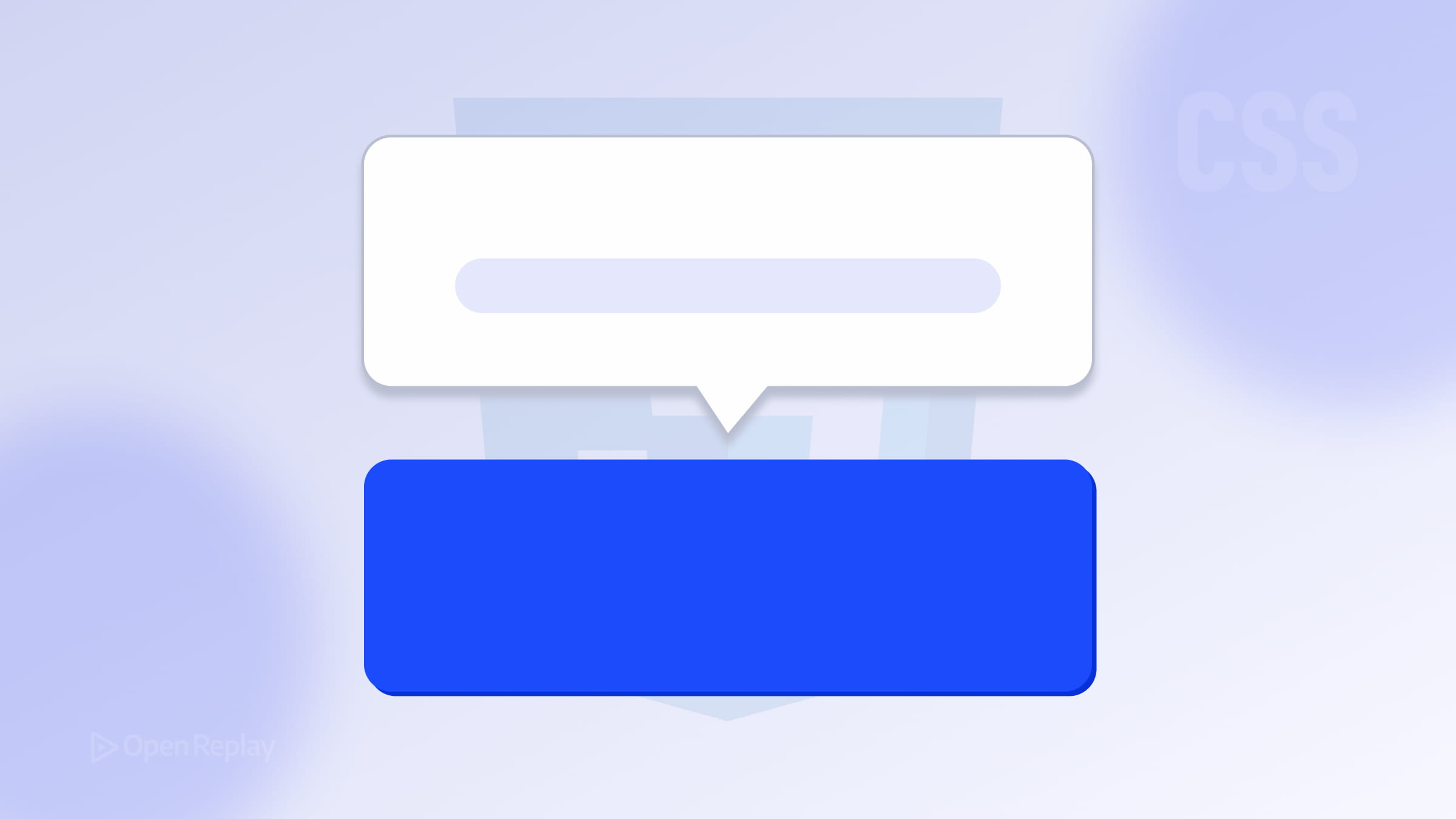
The core idea is simple: apply position: relative to the trigger element, then use an ::after pseudo-element as the tooltip bubble, positioned absolutely relative to its parent. Hide it by default, and reveal it on :hover and :focus-visible.
Because pseudo-elements can’t read from the DOM directly, you pass the tooltip text through a data-tooltip attribute and pull it in with content: attr(data-tooltip). This keeps your HTML clean and avoids duplicating text in a hidden <span>.
The HTML Structure
<button
  class="tooltip-trigger"
  data-tooltip="Saves your current progress"
>
  Save
</button>
Using a <button> or an anchor (<a>) as the trigger element is important. These elements are natively focusable, which means keyboard users can reach them without any extra work.
Note: If you want to use
aria-describedby, it must point to theidof a real, visible element in the DOM — not a pseudo-element. Since this technique uses::after, omitaria-describedbyunless you also render the tooltip text inside a real element.
The CSS
.tooltip-trigger {
  position: relative;
  cursor: pointer;
}

/* Tooltip bubble */
.tooltip-trigger::after {
  content: attr(data-tooltip);
  position: absolute;
  bottom: calc(100% + 8px);
  left: 50%;
  transform: translateX(-50%);

  background-color: #1a1a1a;
  color: #fff;
  font-size: 0.8rem;
  white-space: nowrap;
  padding: 5px 10px;
  border-radius: 4px;

  /* Hidden by default */
  opacity: 0;
  visibility: hidden;
  transition: opacity 0.2s ease, visibility 0.2s ease;

  z-index: 10;
  pointer-events: none;
}

/* Show on hover and keyboard focus */
.tooltip-trigger:hover::after,
.tooltip-trigger:focus-visible::after {
  opacity: 1;
  visibility: visible;
}
Why opacity + visibility Instead of display?
Switching between display: none and display: block can’t be transitioned — the tooltip would just snap in and out. Using opacity together with visibility: hidden lets you fade the tooltip smoothly while still removing it from pointer interaction when hidden. Using visibility together with opacity also prevents the hidden tooltip from remaining visually interactive.
Why pointer-events: none?
Without it, the tooltip bubble itself can trigger a hover state, causing the tooltip to flicker as the cursor moves over it. Setting pointer-events: none on the ::after element prevents that entirely.

Discover how at OpenReplay.com.
Why transform: translateX(-50%) for Centering?
Setting left: 50% moves the tooltip’s left edge to the center of the trigger. The translateX(-50%) shift then pulls it back by half its own width, centering it regardless of how wide the tooltip text is — no hardcoded pixel math required.
Accessibility Limitations to Know
A pure CSS hover tooltip has real limitations:
- Screen readers may not announce it. The
contentproperty on a pseudo-element is not reliably read by all screen readers. For critical information, include it in the visible UI or usearia-describedbypointing to a real element. - Hover behavior is inconsistent on touch devices. CSS-only tooltips should not be relied on for essential information.
- No role or live region. CSS alone can’t communicate tooltip semantics to assistive technology.
For simple supplemental hints on interactive elements, a CSS tooltip is fine. For anything essential to completing a task, you’ll want JavaScript to manage focus, announcement, and ARIA state.
Looking Ahead: CSS Anchor Positioning and the Popover API
CSS Anchor Positioning makes tooltip placement far more flexible — you can tether a tooltip to any element without relying on position: relative on the parent. Browser support for Anchor Positioning is now broadly available in modern browsers according to Can I Use.
For richer interactive behavior, the Popover API is worth exploring as a native alternative for interactive floating UI.
Conclusion
A pure CSS tooltip built with ::after, content: attr(data-tooltip), and a visibility/opacity transition is clean, fast, and dependency-free. Pair it with :focus-visible for keyboard support and you have a solid baseline. Just be honest about where CSS tooltips fall short — for anything beyond supplemental hints, reach for JavaScript or a native platform feature like the Popover API.
FAQs
Can I position a CSS tooltip above, below, or beside the trigger?
Yes. The position is controlled by the offset properties on the pseudo-element. Use bottom with calc(100% + 8px) to place it above, top with calc(100% + 8px) to place it below, or use right and left for horizontal placement. You can also create variant classes like tooltip-bottom or tooltip-right that override these properties.
Why doesn't my tooltip appear when I tap a button on mobile?
Hover behavior is inconsistent on touch devices, so CSS-only tooltips should not be relied on for essential information. If your tooltip content matters on mobile, render it in a real element controlled by JavaScript, or use the Popover API, which provides a more robust foundation for interactive floating UI across input types.
How do I keep a long tooltip from overflowing the viewport?
The white-space: nowrap rule keeps tooltips on a single line, which can overflow narrow screens. Replace it with a max-width and allow wrapping, for example max-width: 240px and white-space: normal. For dynamic edge detection, you'll need JavaScript or CSS Anchor Positioning, which supports more flexible native positioning behavior in modern browsers.
Is a CSS tooltip accessible enough for production use?
It's acceptable for non-essential, supplemental hints on focusable elements like buttons and links. It is not sufficient when the tooltip carries information required to complete a task, since pseudo-element content is not reliably announced by screen readers and hover behavior is inconsistent on touch devices. For critical content, use a real DOM element with aria-describedby and JavaScript-managed behavior, or consider the Popover API.
Truly understand users experience
See every user interaction, feel every frustration and track all hesitations with OpenReplay — the open-source digital experience platform. It can be self-hosted in minutes, giving you complete control over your customer data.
Star on GitHub12k