
ResizeObserver vs Window Resize: When to Use Each

You’re building a chart component that needs to redraw when its container shrinks. You reach for window.addEventListener('resize', ...) and it mostly works—until the panel resizes due to a sidebar collapsing, and nothing fires. That’s the core problem this article addresses.
Key Takeaways
- The
windowresize event only fires when the browser viewport changes size. It knows nothing about individual DOM elements. ResizeObserverwatches specific elements and fires whenever their dimensions change, regardless of the cause.- Polling element sizes after a viewport resize is fragile—it misses changes from CSS toggles, dynamic content, font loading, and more.
- For container-based styling without JavaScript, CSS container queries are the preferred tool.
What Each API Actually Observes
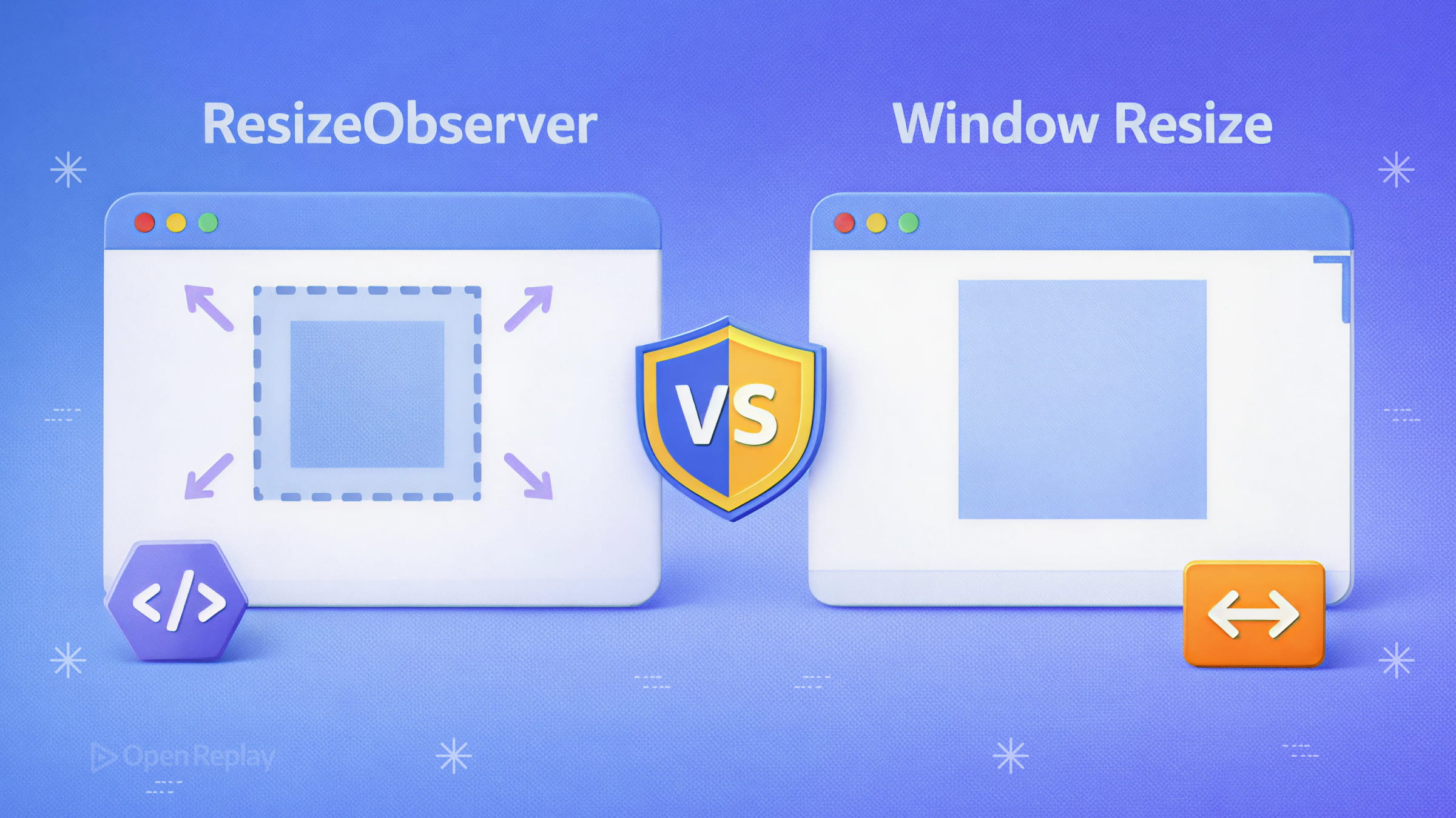
The window resize event fires when the browser viewport changes size. That’s its entire scope. It knows nothing about individual DOM elements.
ResizeObserver watches specific elements and fires whenever their dimensions change—regardless of what caused it. A viewport resize, a DOM insertion, a CSS class toggle, a parent flexbox reflow—all of these trigger the observer if the element’s size changes.
This is the fundamental distinction. They observe different things and are usually chosen for different jobs.
When to Use the Window Resize Event
The window resize event is the right tool when your logic genuinely depends on the viewport dimensions, not any particular element’s size:
- Toggling a mobile navigation layout at a viewport breakpoint
- Resizing a full-page canvas or WebGL context to
window.innerWidth/window.innerHeight - Adjusting global layout state that depends on screen real estate
window.addEventListener('resize', () => {
  canvas.width = window.innerWidth
  canvas.height = window.innerHeight
  render()
})
For purely visual, CSS-driven responses to viewport size, prefer media queries over JavaScript entirely.
When to Use ResizeObserver
ResizeObserver use cases center on component-level behavior that must respond to an element’s actual rendered size:
- A chart that recalculates axis scales when its container width changes
- A text editor that adjusts toolbar layout based on available space
- A resizable panel or split-pane widget
- Any embedded widget that doesn’t control its own container
const ro = new ResizeObserver((entries) => {
  for (const entry of entries) {
    const { inlineSize, blockSize } = entry.contentBoxSize[0]
    chart.resize(inlineSize, blockSize)
  }
})

ro.observe(document.querySelector('.chart-container'))
Reading the Modern API Shape
The current ResizeObserver API exposes contentBoxSize and borderBoxSize arrays on each entry—each containing inlineSize (width in horizontal writing modes) and blockSize (height). The older contentRect property still works but exists primarily for backward compatibility. Prefer contentBoxSize[0] in new code.

Discover how at OpenReplay.com.
Why Not Just Poll After a Window Resize?
A common pattern—listening to the window resize event and then calling getBoundingClientRect() on elements—is fragile. It misses size changes that have nothing to do with the viewport: dynamic content loading, toggled CSS classes, injected children, font loading. ResizeObserver catches all of these. Polling after a viewport resize does not.
Performance and Feedback Loops
ResizeObserver callbacks run after layout and before paint, which means DOM reads inside the callback reflect the current layout without forcing a reflow. This is structurally safer than reading layout properties inside a resize event handler.
One gotcha: if you modify an observed element’s size inside its own callback, you trigger another observation. ResizeObserver handles this by processing observations at progressively deeper DOM depths within the same frame and eventually reporting an error if the cycle doesn’t resolve—preventing infinite loops. You should still be deliberate about what you write inside the callback.
The performance advantage of ResizeObserver becomes meaningful when your callback touches layout or when element size changes occur independently of viewport resizing.
The CSS Container Queries Alternative
If your goal is styling an element based on its container’s size, CSS container queries are the right tool—no JavaScript needed. Reserve ResizeObserver for cases where runtime logic, not styling, must respond to size changes.
| Scenario | Best Tool |
|---|---|
| Viewport-wide layout changes | window resize event |
| Element dimensions drive JS logic | ResizeObserver |
| Container-based styling only | CSS container queries |
Conclusion
Use the window resize event when you care about the viewport. Use ResizeObserver when you care about an element. Use CSS container queries when you only need to change styles. These three tools cover the full space of responsive behavior—pick the one that matches what you’re actually measuring.
FAQs
ResizeObserver fires when an element's dimensions change, so collapsing an element to zero width or height will trigger it. However, it does not fire for visibility or opacity changes that leave dimensions intact. For true visibility detection, use IntersectionObserver instead.
The observer automatically stops tracking an element once it is garbage collected. However, explicitly calling unobserve or disconnect is good practice, especially in single-page applications or framework components with mount and unmount lifecycles, to avoid stale references and unexpected callbacks.
Yes. ResizeObserver has broad support across Chrome, Firefox, Safari, and Edge. If you need to support older browsers, a polyfill is available, though it relies on polling and mutation observers internally, so it will not match native performance.
Usually not for lightweight UI updates. ResizeObserver already batches notifications efficiently within the rendering pipeline. However, if your callback triggers expensive downstream work such as network requests or heavy computation, debounce that specific work rather than the entire callback.
Complete picture for complete understanding
Capture every clue your frontend is leaving so you can instantly get to the root cause of any issue with OpenReplay — the open-source session replay tool for developers. Self-host it in minutes, and have complete control over your customer data.
Check our GitHub repo and join the thousands of developers in our community.
