Responsiveness is an important aspect of today’s modern applications, as it determines how well our device content adapts to different screen sizes and orientations. With Flutter, developing applications that look amazing on any device is relatively easy. Responsiveness in Flutter can be achieved with the use of widgets, which are the basic building blocks of any Flutter user interface (UI). In this tutorial, we will see how to use these widgets to achieve responsiveness in a Flutter application.
What Does Responsive?
Before setting up our Flutter project, it is important to know what the word Responsive means. Responsive simply refers to an application’s ability (Web or Mobile) to adjust its content to fit the screen size and orientation of the device it is being viewed on. It is important to make your apps responsive to help them look and function well on any device, be it on mobile, web, desktop, etc.
Setting Up Our Flutter Project
To follow up with this tutorial, click here to clone the Flutter project created for this tutorial and run the command below:
flutter create .This will add the missing dependencies to your Flutter project. The project’s structure will be as follows:
┣ lib
 ┃ ┣ model
 ┃ ┃ ┗ task.dart
 ┃ ┣ widget
 ┃ ┃ ┣ new_task.dart
 ┃ ┃ ┣ task_content.dart
 ┃ ┃ ┣ task_list.dart
 ┃ ┃ ┗ task_section.dart
 ┃ ┗ main.dart
In our project/lib folder, we have the following file:
- The
modelfolder contains thetask.dartfile. This tells us what each task should contain. - The
widgetfolder contains thenew_task.dart,task_content.dart,task_list.dart,task_section.dart. These are files that make up the task app. - Lastly, you have the
main.dartfile, which is the starting point of our application.
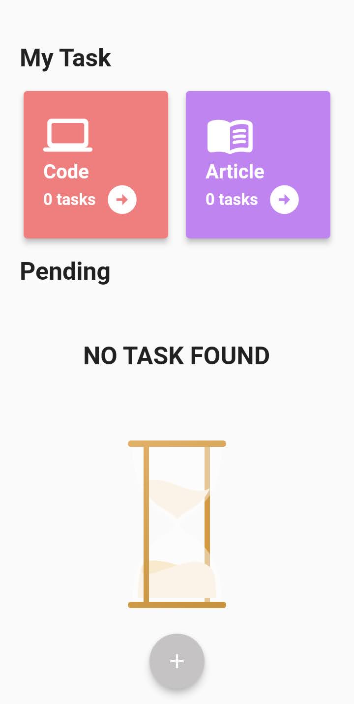
This is our app’s UI, and we will be making this app responsive.
Calculating Sizes Dynamically
In the Flutter project, we see that the sizes assigned are not dynamic; for example, we gave the TaskList() a height of 400. It might look good on your device, but on devices with smaller or larger screen sizes, it might not be structured the same way. To tackle this issue, we will have to get the device size. Flutter provides us with a widget called MediaQuery. With MediaQuery, we can get the size of any device and also assign a widget a particular height/width, and it will be the same on any device.
Let’s apply this concept on the main.dart file.
SizedBox(
  height: (MediaQuery.of(context).size.height MediaQuery.of(context).padding.top) * 0.3,
  child: TaskSection(
    tasks: _task,
  ),
),
const Text(
  'Pending',
  style: TextStyle(fontSize: 25, fontWeight: FontWeight.bold),
),
SizedBox(
  height: (MediaQuery.of(context).size.height - MediaQuery.of(context).padding.top) * 0.5,
  width: double.infinity,
  child: TaskList(
    task: _task,
  deleteTask: _deleteTask,
  ),
)
Our main.dart file contains two custom widgets, the TaskSection() and the TaskList(). In the code above, we assigned the TaskSection() a height of 30 percent and the TaskList() a height of 50 percent. This ensures that the widget takes their respective heights assigned to them after getting the device height.
Using The LayoutBuilder() Widget
The LayoutBuilder() widget is a more simplified version of MediaQuery.This widget tells you how big its parent is so you can create child components appropriately and know how much room you have for the widget.
Head over to the task_list.dart file so we can implement this.
LayoutBuilder(
  builder: (context, constraints) {
    return Column(
    mainAxisAlignment: MainAxisAlignment.spaceEvenly, children: [
        const Text(
          "NO TASK FOUND",
          style: TextStyle(
            fontSize: 25,
            fontWeight: FontWeight.bold,
          ),
        ),
        SizedBox(
          height: constraints.maxHeight * 0.6,
          child: Image.asset('images/waiting.png'),
        ),
      ],
    );
  },
)
Here, we used the LayoutBuilder() widget, which takes a builder parameter, a function that takes BuildContext and BoxConstraints as function parameters. We removed the width parameter on the image and assigned the height parameter a maxHeight of 60 percent. This will position the image and assign it a maximum height.
Controlling Device Orientations
They are two ways you can control the orientation of your app:
- You can write some functionality, and your app will always be in portrait mode
- Secondly, you can make the landscape mode responsive too.
To perform the first option, on the main() method, write the code below:
void main() {
  WidgetsFlutterBinding.ensureInitialized();
  SystemChrome.setPreferredOrientations([
    DeviceOrientation.portraitUp,
    DeviceOrientation.portraitDown,
  ]);
  runApp(const MyApp());
}
This ensures that your app is always in portrait mode.
Let’s see how we can also make our app responsive in landscape mode. Now if we change the device orientation to landscape, we will have an overflow error as such:
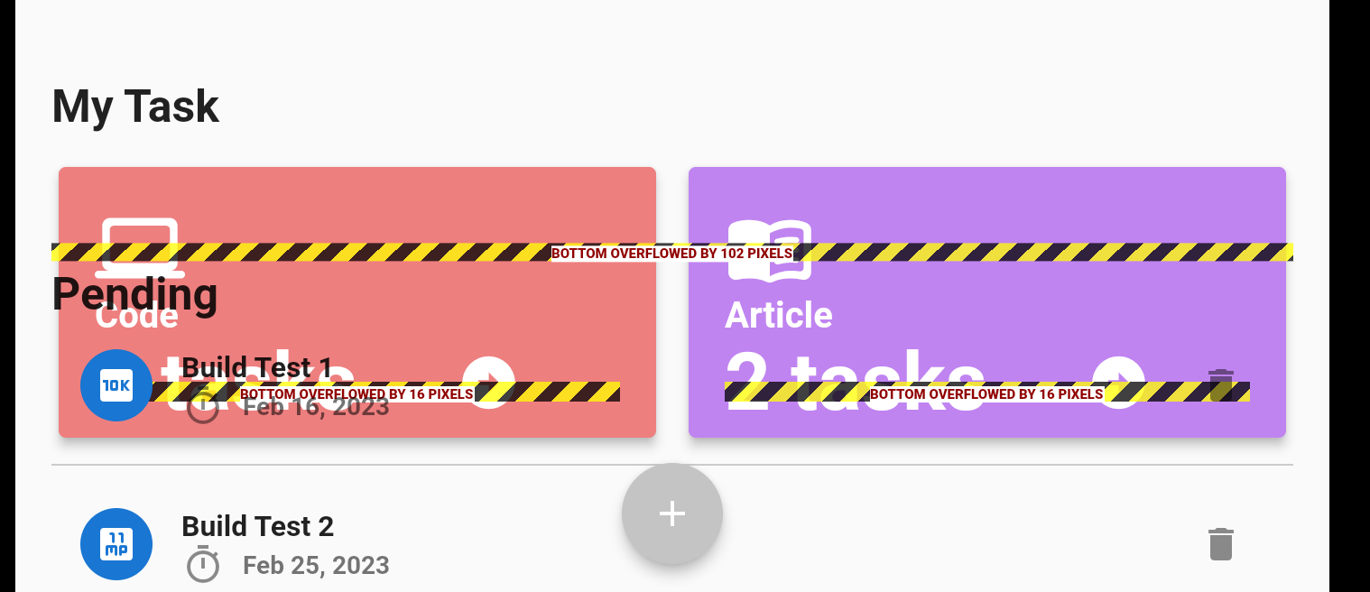
You see that our list of tasks is also not positioned correctly, and this is because we have been working on the portrait mode. We need to make certain changes to make our app look better on the landscape.
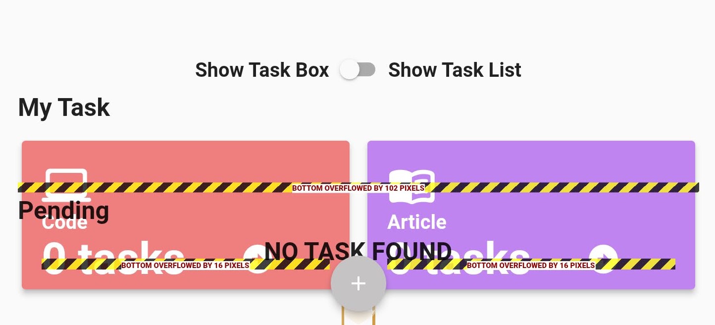
Many methods can be used to tackle this, but we will be using a toggle switch to achieve this. Head over to the main.dart file, and let’s create a switch that will be used to display different sections on our app, depending on what the user chooses.
Row(
  mainAxisAlignment: MainAxisAlignment.center,
  children: [
    const Text(
      'Show Task Box',
      style: TextStyle(
        fontSize: 20,
        fontWeight: FontWeight.w600,
      ),
    ),
    Switch(
      value: _showTaskBox,
      onChanged: (val) {
        setState(() {
          _showTaskBox = val;
        });
      },
    ),
    const Text(
      'Show Task List',
      style: TextStyle(
        fontWeight: FontWeight.bold,
        fontSize: 20,
      ),
    )
  ],
),
Here, we created a Row() widget and passed a Text() and also a Switch() widget. At the top of the build() create a boolean variable_showTaskBox and set it equal to false
To make all this function as we want to, we have to know how to display content based on device orientation.
Session Replay for Developers
Uncover frustrations, understand bugs and fix slowdowns like never before with OpenReplay — an open-source session replay tool for developers. Self-host it in minutes, and have complete control over your customer data. Check our GitHub repo and join the thousands of developers in our community.
Showing Different Content Based On Device Orientation
First, create a variable to check if the orientation is landscape. On your main.dart file, add the code below the build() method.
final isLandscape = MediaQuery.of(context).orientation == Orientation.landscape;To show different contents based on the device orientation, we will be making lots of if-checks.
if(isLandscape) Row(
  mainAxisAlignment: MainAxisAlignment.center,
    children: [
      const Text(
        'Show Task List',
        style: TextStyle(
          fontSize: 20,
          fontWeight: FontWeight.w600,
        ),
      ),
      Switch(
        value _showTaskBox,
        onChanged : (val){
          setState((){
            _showTaskBox = val;
          });
        },
      ),
      const Text(
        'Show Task Box',
        style: TextStyle(
          fontWeight: FontWeight.bold,
          fontSize: 20,
        ),
      ),
    ]
  )
Here we checked to see if the device orientation was in landscape mode, then displayed the toggle switch.
if(!isLandscape)
  SizedBox(
    height: (MediaQuer.of(context).size.height - MediaQuery.of(context).padding.top) * 0.3,
    child: TaskSection(
      tasks: _task,
    ),
  ),

if(!isLandscape)
  const Text(
    'Pending',
    style: TextStyle(
      fontSize: 25,
      fontWeight: FontWeight.bold
    ),
  ),

if(!isLandscape)
  SizedBox(
  height: (MediaQuery.of(context).size.height - MediaQuery.of(context).padding.top) * 0.5,
  width: double.infinity,
    child: TaskList(
      task: _task,
      deleteTask: _deleteTask,
    ),
  ),
Here we checked to see if the device orientation was not in landscape, then displayed the content in portrait mode.
if(isLandscape)
  _showTaskBox
  ? SizedBox(
      height: (MediaQuery.of(context).size.height - MediaQuery.of(context).padding.top) * 0.66,
      child: TaskSection(
        tasks: _task,
      ),
    )
    : SizedBox(
        height: (MediaQuery.of(context).size.height - MediaQuery.of(context).padding.top) * 0.5,
        child: TaskList(
          task: _task,
          deleteTask: _deleteTask,
        ),
      )
Lastly, we made an if-check to see if the device orientation is true and the _showTaskBox is true, then display the TaskSection() widget; else, display the TaskList() widget.
With all that done, we have successfully handled how the content should look on landscape and portrait now.
Testing The App
With all that done, let’s test the app. On your terminal, run the command below:
flutter runThis will build and install the application on your device or emulator.
Conclusion & Resources
In this article, we saw how easy it is to make an app responsive using the MediaQuery widget. We also learned the importance of making an application responsive because it increases user experience and our application’s functionality. Here is s link to the GitHub Source Code.
Gain Debugging Superpowers
Unleash the power of session replay to reproduce bugs and track user frustrations. Get complete visibility into your frontend with OpenReplay, the most advanced open-source session replay tool for developers.