
Creating a Responsive Admin Dashboard in React with ReCharts and MaterialUI


In today’s world, almost every online application contains a page where you can see and monitor information and data about customers, clients, and consumers. This information could be based on purchases, financial transactions, or consumer service statistics. An Admin Dashboard is a visual representation of your whole data set. While it can be used in many ways, its primary function is to allow quick access to information.
So, today, we’ll develop a responsive and interactive Admin Dashboard using ReactJS, plus the Material UI and Recharts libraries
Getting Started
All we have to do here is to create our React app and install the necessary dependencies for our project using NPM.
npx create-react-app admin-dashboard
cd admin-dashboard
npm i recharts
npm i @mui/material @emotion/react @emotion/styled
npm i react-router-dom
Creating Components Folders
First, we’ll build our components folder, there we’ll save a few components to work with, such as Chart.jsx, FeaturedInfo.jsx, and Sidebar.jsx.
Charts.jsx
The Chart.jsx is where we’ll build our chart component, based on the recharts library.
Recharts is a library built with React (and meant for React applications) that will let you create visually appealing charts with very little effort.
While it is true that you can do the same (and probably even more dynamic) type of charts using React and D3, the learning curve for the latter makes it a choice for advanced users. If you’re looking for an entry-level library with powerful features, then Recharts is the right choice.
We’ll use Recharts here to build a responsive chart interface. And we’ll use that UI in other components like the Home.jsx and Product.jsx.
import '../css/component/chart.css'
import {
  LineChart,
  Line,
  XAxis,
  CartesianGrid,
  Tooltip,
  ResponsiveContainer,
} from "recharts";
function Chart({ title, data, dataKey, grid }) {
  return (
    <div className="chart">
      <h3 className="chartTitle"> {title}
      <ResponsiveContainer width="100%" aspect={4 / 1}>
        <LineChart data={data}>
          <XAxis dataKey="name" stroke="#5550bd" />
          <Line type="monotone" dataKey={dataKey} stroke="#5550bd" />
          <Tooltip />
          {grid && <CartesianGrid stroke="#e0dfdf" strokeDasharray="5 5" />}
        </LineChart>
      </ResponsiveContainer>
    </div>
  );
}
export default Chart;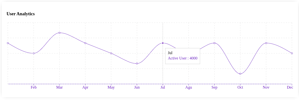
FeaturedInfo.jsx We’ll need a dialog at the top of our dashboard that prints our monthly costs, the money generated, and the total sales for the month. The following code will take care of that:
import '../css/component/featuredInfo.css'
import { ArrowDownward, ArrowUpward } from "@material-ui/icons";
function FeaturedInfo() {
  return (
    <div className="featured">
      <div className="featuredItem">
        <span className="featuredTitle"> Revenue
        <div className="featuredMoneyContainer">
          <span className="featuredMoney"> $2,415
          <span className="featuredMoneyRate">
            -11.4 <ArrowDownward className="featuredIcon negative"/>
          </span>
        </div>
        <span className="featuredSub"> Compared to last month
      </div>
      <div className="featuredItem">
        <span className="featuredTitle"> Sales
        <div className="featuredMoneyContainer">
          <span className="featuredMoney"> $4,415
          <span className="featuredMoneyRate">
            -1.4 <ArrowDownward className="featuredIcon negative"/>
          </span>
        </div>
        <span className="featuredSub"> Compared to last month
        </div>
        <div className="featuredItem">
          <span className="featuredTitle"> Cost
          <div className="featuredMoneyContainer">
            <span className="featuredMoney"> $2,225
            <span className="featuredMoneyRate">
              +2.4 <ArrowUpward className="featuredIcon">
            </span>
          </div>
          <span className="featuredSub"> Compared to last month
        </div>
      </div>
    );
}
export default FeaturedInfo;
Sidebar.jsx The Sidebar component will be our main navigation menu. It’ll contain our home, analytics, product, and other routing buttons.
import '../css/component/sidebar.css'
import {
  LineStyle,
  Timeline,
  TrendingUp,
  PermIdentity,
  Storefront,
  AttachMoney,
  BarChart,
  MailOutline,
  DynamicFeed,
  ChatBubbleOutline,
  WorkOutline,
  Report,
} from "@material-ui/icons";
import { Link } from "react-router-dom";
function Sidebar() {
  return (
    <div className="sidebar">
      <div className="sidebarWrapper">
        <div className="sidebarMenu">
          <h3 className="sidebarTitle">Dashboard
          <ul className="sidebarList">
            <Link to="/" className="link">
            <li className="sidebarListItem active">
              <LineStyle className="sidebarIcon" />
              Home
            </li>
            </Link>
            <li className="sidebarListItem">
              <Timeline className="sidebarIcon" />
              Analytics
            </li>
            <li className="sidebarListItem">
              <TrendingUp className="sidebarIcon" />
              Sales
            </li>
          </ul>
        </div>
        <div className="sidebarMenu">
          <h3 className="sidebarTitle">Quick Menu
          <ul className="sidebarList">
            <Link to="/users" className="link">
              <li className="sidebarListItem">
                <PermIdentity className="sidebarIcon" />
                Users
              </li>
            </Link>
            <Link to="/products" className="link">
              <li className="sidebarListItem">
                <Storefront className="sidebarIcon" />
                Products
              </li>
            </Link>
            <li className="sidebarListItem">
              <AttachMoney className="sidebarIcon" />
              Transactions
            </li>
            <li className="sidebarListItem">
              <BarChart className="sidebarIcon" />
              Reports
            </li>
          </ul>
        </div>
        <div className="sidebarMenu">
          <h3 className="sidebarTitle">Notifications
          <ul className="sidebarList">
            <li className="sidebarListItem">
              <MailOutline className="sidebarIcon" />
              Mail
            </li>
            <li className="sidebarListItem">
              <DynamicFeed className="sidebarIcon" />
              Feedback
            </li>
            <li className="sidebarListItem">
              <ChatBubbleOutline className="sidebarIcon" />
              Messages
            </li>
          </ul>
        </div>
        <div className="sidebarMenu">
          <h3 className="sidebarTitle">Staff
          <ul className="sidebarList">
            <li className="sidebarListItem">
              <WorkOutline className="sidebarIcon" />
              Manage
            </li>
            <li className="sidebarListItem">
              <Timeline className="sidebarIcon" />
              Analytics
            </li>
            <li className="sidebarListItem">
              <Report className="sidebarIcon" />
              Reports
            </li>
          </ul>
        </div>
      </div>
    </div>
  );
}
export default Sidebar;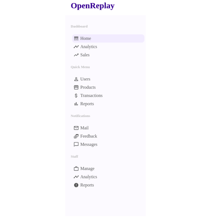
Topbar.jsx
The Topbar contains the company logo as an iconbadge that indicates notifications, settings, and of course, user id.
import React from "react";
import '../css/component/topbar.css'
// import "./topbar.css";
import { NotificationsNone, Language, Settings } from "@material-ui/icons";
function Topbar() {
  return (
    <div className="topbar">
      <div className="topbarWrapper">
        <div className="topLeft">
          <span className="logo">OpenReplay
        </div>
        <div className="topRight">
          <div className="topbarIconContainer">
            <NotificationsNone />
            <span className="topIconBadge">2
          </div>
          <div className="topbarIconContainer">
            <Language />
            <span className="topIconBadge">2
          </div>
          <div className="topbarIconContainer">
            <Settings />
          </div>
          <img src="https://images.pexels.com/photos/1526814/pexels-photo-1526814.jpeg?auto=compress&cs=tinysrgb&dpr=2&w=500" alt="" className="topAvatar" />
        </div>
      </div>
    </div>
  );
}
export default Topbar;
WidgetLg.jsx To list the latest transactions on the application, we’ll use this widget. It will also have a toggle icon to indicate if a transaction was approved or declined.
import '../css/component/widgetLg.css'

function WidgetLg() {
  const Button = ({ type }) => {
    return <button className={"widgetLgButton " + type}>{type};
  };
  return (
    <div className="widgetLg">
      <h3 className="widgetLgTitle">Latest transactions
      <table className="widgetLgTable">
        <tr className="widgetLgTr">
          <th className="widgetLgTh">Customer
          <th className="widgetLgTh">Date
          <th className="widgetLgTh">Amount
          <th className="widgetLgTh">Status
        </tr>
        <tr className="widgetLgTr">
          <td className="widgetLgUser">
            <img
              src="https://images.gr-assets.com/authors/1561336084p8/4123863.jpg"
              alt=""
              className="widgetLgImg"
            />
            <span className="widgetLgName">Federico Kereki
          </td>
          <td className="widgetLgDate">14 May 2022
          <td className="widgetLgAmount">$2100.00
          <td className="widgetLgStatus">
            <Button type="Approved" />
          </td>
        </tr>
        <tr className="widgetLgTr">
          <td className="widgetLgUser">
            <img
              src="https://media-exp1.licdn.com/dms/image/C4D03AQFsohsj7miS2w/profile-displayphoto-shrink_800_800/0/1651377283409?e=1657756800&v=beta&t=rHN6C2GAljYKMZKQkAhR5DZyXfGtPv2r3PCo0Zqw7aU"
              alt=""
              className="widgetLgImg"
            />
            <span className="widgetLgName">Ikechi Fortune
          </td>
          <td className="widgetLgDate">12 May 2022
          <td className="widgetLgAmount">$1202.00
          <td className="widgetLgStatus">
            <Button type="Declined" />
          </td>
        </tr>
        </table>
    </div>
  );
}
export default WidgetLg;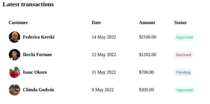
WidgetSm.jsx
And because we’ll also need a small version of the same widget, we’ll create it as a separate one:
import '../css/component/widgetSm.css'
import { Visibility } from "@material-ui/icons";
function WidgetSm() {
  return (
    <div className="widgetSm">
      <span className="widgetSmTitle">New Join Members
      <ul className="widgetSmList">
        <li className="widgetSmListItem">
          <img
            src="https://pps.whatsapp.net/v/t61.24694-24/145137748_979282972786108_6637272315922901895_n.jpg?ccb=11-4&oh=50b54050bfe01133a2dcd9016d7eb42f&oe=628F8D9A"
            alt=""
            className="widgetSmImg"
          />
          <div className="widgetSmUser">
            <span className="widgetSmUsername">Saviour Blessing
            <span className="widgetSmUserTitle">Software Engineer
          </div>
          <button className="widgetSmButton">
            <Visibility className="widgetSmIcon" />
            Display
          </button>
        </li>
        <li className="widgetSmListItem">
          <img
            src="https://images.pexels.com/photos/3992656/pexels-photo-3992656.png?auto=compress&cs=tinysrgb&dpr=2&w=500"
            alt=""
            className="widgetSmImg"
          />
          <div className="widgetSmUser">
            <span className="widgetSmUsername">Anna Keller
            <span className="widgetSmUserTitle">Software Engineer
          </div>
          <button className="widgetSmButton">
            <Visibility className="widgetSmIcon" />
            Display
          </button>
        </li>
      </ul>
    </div>
  );
}
export default WidgetSm;
Creating the Page Folder
We’ll create our page folder for the routing to our pages such as Home .jsx, NewProduct .jsx, NwUser .jsx, etc.
Home.jsx
To have a friendly dashboard interface, our Home.jsx component will have the chart, widget, and user data.
Since we’re only doing the UI, the user data will be dummy data right now. You should add a back-end API to provide this information in the future.
import Chart from '../component/Chart';
import FeaturedInfo from '../components/FeaturedInfo'
import '../css/page/home.css'
import { userData } from "../dummyData";
import WidgetSm from '..components/WidgetSm';
import WidgetLg from '..components/WidgetLg';
function Home() {
  return (
    <div className="home">
      <FeaturedInfo />
      <Chart data={userData} title="User Analytics" grid dataKey="Active User"/>
      <div className="homeWidgets">
        <WidgetSm/>
        <WidgetLg/>
      </div>
    </div>
  );
}
export default Home;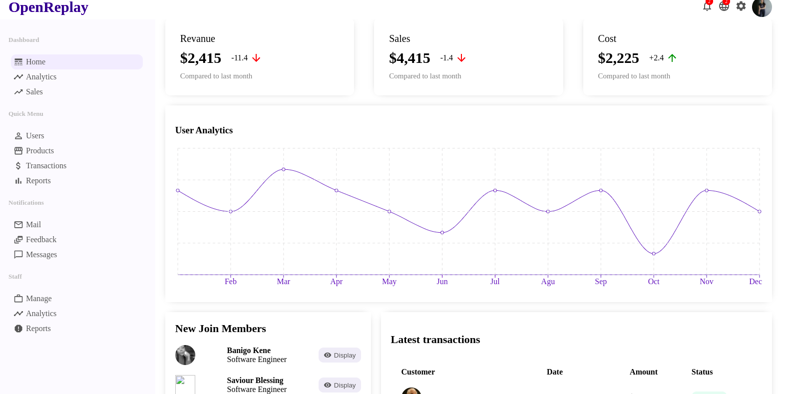
Open Source Session Replay
OpenReplay is an open-source, session replay suite that lets you see what users do on your web app, helping you troubleshoot issues faster. OpenReplay is self-hosted for full control over your data.

Start enjoying your debugging experience - start using OpenReplay for free.
Product.jsx
This is the page where we display information about products.
import { Link } from "react-router-dom";
import '../css/page/product.css'
import Chart from '../components/Chart';
import { productData } from "../dummyData";
import {Publish} from '@material-ui/icons'
function Product() {
  return (
    <div className="product">
      <div className="productTitleContainer">
        <h1 className="productTitle">Product
        <Link to="/newproduct">
          <button className="productAddButton">Create
        </Link>
      </div>
      <div className="productTop">
          <div className="productTopLeft">
              <Chart data={productData} dataKey="Sales" title="Sales Performance"/>
          </div>
          <div className="productTopRight">
              <div className="productInfoTop">
                  <img src="https://images.pexels.com/photos/7156886/pexels-photo-7156886.jpeg?auto=compress&cs=tinysrgb&dpr=2&w=500" alt="" className="productInfoImg" />
                  <span className="productName">Apple Airpods
              </div>
              <div className="productInfoBottom">
                  <div className="productInfoItem">
                      <span className="productInfoKey">id:
                      <span className="productInfoValue">123
                  </div>
                  <div className="productInfoItem">
                      <span className="productInfoKey">sales:
                      <span className="productInfoValue">5123
                  </div>
                  <div className="productInfoItem">
                      <span className="productInfoKey">active:
                      <span className="productInfoValue">yes
                  </div>
                  <div className="productInfoItem">
                      <span className="productInfoKey">in stock:
                      <span className="productInfoValue">no
                  </div>
              </div>
          </div>
      </div>
      <div className="productBottom">
          <form className="productForm">
              <div className="productFormLeft">
                  <label>Product Name
                  <input type="text" placeholder="Apple AirPod" />
                  <label>In Stock
                  <select name="inStock" id="idStock">
                      <option value="yes">Yes
                      <option value="no">No
                  </select>
                  <label>Active
                  <select name="active" id="active">
                      <option value="yes">Yes
                      <option value="no">No
                  </select>
              </div>
              <div className="productFormRight">
                  <div className="productUpload">
                      <img src="https://images.pexels.com/photos/7156886/pexels-photo-7156886.jpeg?auto=compress&cs=tinysrgb&dpr=2&w=500" alt="" className="productUploadImg" />
                      <label for="file">
                          <Publish/>
                      </label>
                      <input type="file" id="file" style={{display:"none"}} />
                  </div>
                  <button className="productButton">Update
              </div>
          </form>
      </div>
    </div>
  );
}
export default Product;
ProductList.jsx
The ProductList.jsx components will hold a list of all products, their id, status (whether active or not), price, and stock.
import '../css/page/productList.css'
import { DataGrid } from '@mui/x-data-grid';
import { DeleteOutline } from "@material-ui/icons";
import { productRows } from "../dummyData";
import { Link } from "react-router-dom";
import { useState } from "react";
function ProductList() {
  const [data, setData] = useState(productRows);
  const handleDelete = (id) => {
    setData(data.filter((item) => item.id !== id));
  };
  const columns = [
    { field: "id", headerName: "ID", width: 90 },
    {
      field: "product",
      headerName: "Product",
      width: 200,
      renderCell: (params) => {
        return (
          <div className="productListItem">
            <img className="productListImg" src={params.row.img} alt="" />
            {params.row.name}
          </div>
        );
      },
    },
    { field: "stock", headerName: "Stock", width: 200 },
    {
      field: "status",
      headerName: "Status",
      width: 120,
    },
    {
      field: "price",
      headerName: "Price",
      width: 160,
    },
    {
      field: "action",
      headerName: "Action",
      width: 150,
      renderCell: (params) => {
        return (
          <>
            <Link to={"/product/" + params.row.id}>
              <button className="productListEdit">Edit
            </Link>
            <DeleteOutline
              className="productListDelete"
              onClick={() => handleDelete(params.row.id)}
            />
          </>
        );
      },
    },
  ];
  return (
    <div className="productList">
      <DataGrid
        rows={data}
        disableSelectionOnClick
        columns={columns}
        pageSize={8}
        checkboxSelection
      />
    </div>
  );
}
export default ProductList;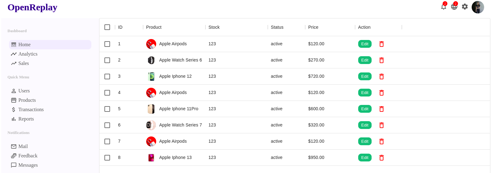
User.jsx
The User.jsx component will show the user’s essential information, such as name, occupation, account information, contact information, etc.
import {
    CalendarToday,
    LocationSearching,
    MailOutline,
    PermIdentity,
    PhoneAndroid,
    Publish,
  } from "@material-ui/icons";
import { Link } from "react-router-dom";
import '../css/page/user.css'

function User() {
  return (
    <div className="user">
      <div className="userTitleContainer">
        <h1 className="userTitle">Edit User
        <Link to="/newUser">
          <button className="userAddButton">Create
        </Link>
      </div>
      <div className="userContainer">
        <div className="userShow">
          <div className="userShowTop">
            <img
              src="https://images.pexels.com/photos/1152994/pexels-photo-1152994.jpeg?auto=compress&cs=tinysrgb&dpr=2&w=500"
              alt=""
              className="userShowImg"
            />
            <div className="userShowTopTitle">
              <span className="userShowUsername">Anna Becker
              <span className="userShowUserTitle">Software Engineer
            </div>
          </div>
          <div className="userShowBottom">
            <span className="userShowTitle">Account Details
            <div className="userShowInfo">
              <PermIdentity className="userShowIcon" />
              <span className="userShowInfoTitle">annabeck99
            </div>
            <div className="userShowInfo">
              <CalendarToday className="userShowIcon" />
              <span className="userShowInfoTitle">10.12.1999
            </div>
            <span className="userShowTitle">Contact Details
            <div className="userShowInfo">
              <PhoneAndroid className="userShowIcon" />
              <span className="userShowInfoTitle">+1 123 456 67
            </div>
            <div className="userShowInfo">
              <MailOutline className="userShowIcon" />
              <span className="userShowInfoTitle">annabeck99@gmail.com
            </div>
            <div className="userShowInfo">
              <LocationSearching className="userShowIcon" />
              <span className="userShowInfoTitle">New York | USA
            </div>
          </div>
        </div>
        <div className="userUpdate">
          <span className="userUpdateTitle">Edit
          <form className="userUpdateForm">
            <div className="userUpdateLeft">
              <div className="userUpdateItem">
                <label>Username

                  type="text"
                  placeholder="annabeck99"
                  className="userUpdateInput"
                />
              </div>
              <div className="userUpdateItem">
                <label>Full Name

                  type="text"
                  placeholder="Anna Becker"
                  className="userUpdateInput"
                />
              </div>
              <div className="userUpdateItem">
                <label>Email

                  type="text"
                  placeholder="annabeck99@gmail.com"
                  className="userUpdateInput"
                />
              </div>
              <div className="userUpdateItem">
                <label>Phone

                  type="text"
                  placeholder="+1 123 456 67"
                  className="userUpdateInput"
                />
              </div>
              <div className="userUpdateItem">
                <label>Address

                  type="text"
                  placeholder="New York | USA"
                  className="userUpdateInput"
                />
              </div>
            </div>
            <div className="userUpdateRight">
              <div className="userUpdateUpload">
                <img
                  className="userUpdateImg"
                  src="https://images.pexels.com/photos/1152994/pexels-photo-1152994.jpeg?auto=compress&cs=tinysrgb&dpr=2&w=500"
                  alt=""
                />
                <label htmlFor="file">
                  <Publish className="userUpdateIcon" />
                </label>
                <input type="file" id="file" style={{ display: "none" }} />
              </div>
              <button className="userUpdateButton">Update
            </div>
          </form>
        </div>
      </div>
    </div>
  );
}
export default User;
UserList.jsx
We’ll create a UserList.jsx page, containing details of clients and customers with purchased items and other transaction details. We will also have a function to edit and delete any user on this page.
// import "./userList.css";
import '../css/page/userList.css'
import { DataGrid } from '@mui/x-data-grid';
import { DeleteOutline } from "@material-ui/icons";
import { userRows } from "../dummyData";
import { Link } from "react-router-dom";
import { useState } from "react";
function UserList() {
  const [data, setData] = useState(userRows);
  const handleDelete = (id) => {
    setData(data.filter((item) => item.id !== id));
  };

  const columns = [
    { field: "id", headerName: "ID", width: 90 },
    {
      field: "user",
      headerName: "User",
      width: 200,
      renderCell: (params) => {
        return (
          <div className="userListUser">
            <img className="userListImg" src={params.row.avatar} alt="" />
            {params.row.username}
          </div>
        );
      },
    },
    { field: "email", headerName: "Email", width: 200 },
    {
      field: "status",
      headerName: "Status",
      width: 120,
    },
    {
      field: "transaction",
      headerName: "Transaction Volume",
      width: 160,
    },
    {
      field: "action",
      headerName: "Action",
      width: 150,
      renderCell: (params) => {
        return (
          <>
            <Link to={"/user/" + params.row.id}>
              <button className="userListEdit">Edit
            </Link>
            <DeleteOutline
              className="userListDelete"
              onClick={() => handleDelete(params.row.id)}
            />
          </>
        );
      },
    },
  ];
  return (
    <div className="userList">
      <DataGrid
        rows={data}
        disableSelectionOnClick
        columns={columns}
        pageSize={8}
        checkboxSelection
      />
    </div>
  );
}
export default UserList;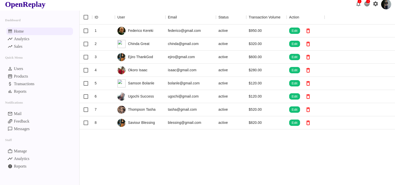
DummyData.js It contains all the dummy data used in this project since we are not using a client/server side yet. Once you’re ready to add the back-end, you’ll replace this component with the code to interface with that API.
export const userData = [
  {
    name: "Jan",
    "Active User": 4000,
  },
  {
    name: "Feb",
    "Active User": 3000,
  },
];
export const productData = [
  {
    name: "Jan",
    "Sales": 4000,
  },
  {
    name: "Feb",
    "Sales": 3000,
  },
];
export const userRows = [
  {
    id: 1,
    username: "Federico Kereki",
    avatar:
      "https://images.gr-assets.com/authors/1561336084p8/4123863.jpg",
    email: "federico@gmail.com",
    status: "active",
    transaction: "$950.00",
  },
  {
    id: 2,
    username: "Chinda Great",
    avatar:
      "https://images.gr-fb.com/fb/1561349084p8/4123868.jpg",
    email: "chinda@gmail.com",
    status: "active",
    transaction: "$320.00",
  },
];
export const productRows = [
  {
    id: 1,
    name: "Apple Airpods",
    img:
      "https://images.pexels.com/photos/7156886/pexels-photo-7156886.jpeg?auto=compress&cs=tinysrgb&dpr=2&w=500",
    stock: 123,
    status: "active",
    price: "$120.00",
  },
  {
    id: 2,
    name: "Apple Watch Series 6",
    img:
      "https://www-konga-com-res.cloudinary.com/w_auto,f_auto,fl_lossy,dpr_auto,q_auto/media/catalog/product/G/I/174379_1610801608.jpg",
    stock: 123,
    status: "active",
    price: "$270.00",
  },
];
App.js
All we have to do now is import all the components, followed by the router from react-router-dom. The Router will be used to set up the routing in our application.
import Sidebar from './components/Sidebar'
import Topbar from "./components/Topbar";
import "./App.css";
import Home from "./pages/Home";
import { BrowserRouter as Router, Routes, Route } from "react-router-dom";
import UserList from "./pages/UserList";
import User from "./pages/User";
import NewUser from "./pages/NewUser";
import ProductList from "./pages/ProductList";
import Product from "./pages/Product";
import NewProduct from "./pages/NewProduct";
function App() {
  return (
    <Router>
      <Topbar />
      <div className="container">
        <Sidebar />
        <Routes>

          {
          userId" element={
          newUser" element={
          {
          productId" element={
          newproduct" element={
        </Routes>
      </div>
    </Router>
  );
}
export default App;
Configuring CSS File
Now we’ll both configure and implement our CSS file. Although we used Material UI to style most of our components, we still need to apply our CSS. So now we need to style all of our components, pages, and dummy data. Note: For the full CSS code block, click here.
Conclusion
That’s it for this article, if you made it here, you now know:
- How to use Material UI to create a responsive UI.
- How to set up React router for am multi-page application.
- And how to use Recharts to create composable charts.
If you’d like to see a live version of the app, click here. And if you want to take a look at the source code on GitHub, you can click here.