
PIN inputs are a crucial component of many React applications, particularly those that handle sensitive information like two-factor authentication (2FA) codes or one-time passwords (OTPs). They provide a secure and user-friendly way for users to enter sensitive information without compromising their data, and this article will show you how to do it with a React library.

Discover how at OpenReplay.com.
React-pin-input emerges as a versatile and customizable library, empowering developers to craft secure and user-friendly PIN input interfaces for their React applications. Its masking capabilities, input validation, and callback mechanisms ensure user data protection while delivering a seamless input experience. Its customizable styles and additional APIs further enhance its adaptability, making it an ideal choice for building robust PIN input functionalities in React forms.
Implementing PIN input holds significant importance for several reasons:
-
Quick and Convenient Authentication: PINs provide a faster and more convenient authentication process. Users can quickly input a short numeric code, reducing friction in the login or verification process.
-
Enhanced Security: PIN inputs offer a more secure alternative to traditional text inputs for entering sensitive data. By limiting user input to numeric characters and masking the entered digits, PIN inputs reduce the risk of accidental data exposure or unauthorized access.
-
Improved User Experience: PIN inputs provide a visually distinct and easy-to-use interface for entering sensitive information. The clear separation of individual PIN digits and the visual feedback upon input make it easier for users to enter their PINs without confusion or errors.
-
Real-world Applications: PIN inputs are widely used in various React applications, including:
- Two-factor authentication (2FA): PIN inputs are commonly used to enter 2FA codes during login or financial transactions.
- One-time passwords (OTPs): PIN inputs are employed to enter OTPs during account activation or reset passwords.
- Payment processing: PIN inputs are used to enter PINs for card payments or secure transactions.
- Device authentication: PIN inputs can be used to secure device unlocking or access to sensitive data.
PIN inputs are vital in enhancing security, improving user experience, and ensuring accessibility in React applications that handle sensitive information. Developers can create secure, user-friendly interfaces for various use cases by incorporating PIN inputs.
Introduction to the React-pin-input Library
React-pin-input is a popular open-source React component library designed to streamline the integration of secure PIN entry functionality into React applications. This library simplifies the process of implementing PIN input, offering developers a robust and customizable solution for enhancing the security of user authentication and verification processes.
You might be wondering why choose React-pin-input among the options available. The answer lies in its simplicity, flexibility, and robust features. It’s not just a library; it’s a toolkit that empowers developers to effortlessly enhance both security and user experience. Here are some of the reasons to consider using the React-pin-input library for your React applications:
- Simple and Intuitive API: React-pin-input boasts a straightforward and intuitive API, making it easy for developers to integrate PIN input fields into their React applications. The component’s props are clearly defined and well-documented, allowing developers to quickly grasp its functionality and customize it to their needs.
- Customizable PIN Input Styles: React-pin-input offers a high degree of customization, enabling developers to tailor the appearance of the PIN input field to match their application’s design aesthetic. They can style individual PIN input digits, the input container, and the error message area using CSS or styled components.
- Real-time Feedback: React-pin-input enables real-time feedback to users as they enter their PIN. This interactive feature enhances the user experience by providing immediate visual cues, such as highlighting completed digits.
- Support for Various Input Lengths: React-pin-input supports a range of input lengths, catering to different use cases. Developers can specify the PIN input field’s desired length, four or six digits, for secure transactions.
- Lightweight: React-pin-input is designed to be lightweight, minimizing its impact on application performance. It is optimized for efficient rendering, making it suitable for production-grade applications.
React-pin-input provides a comprehensive and user-friendly solution for implementing secure and customizable pin-input fields in React applications. Its simplicity and flexibility make it a valuable tool for developers seeking to enhance their applications’ security and user experience.
Installation
The library is easy to install and set up, and it offers a variety of features to make it a versatile tool for developers.
- Navigate to your project directory and install the React-pin-input library:
npm install react-pin-input
or
yarn add react-pin-input- Import the React-pin-input component into your React component:
import React from "react";
import PinInput from "react-pin-input";

const App = () => {
  return <div>App</div>;
};
export default App;
The PinInput component from the react-pin-input library provides the functionality to create a PIN input component in a React application.
Creating a Basic PIN input Component
Creating a basic React-pin-input component is a straightforward process that enhances a React application’s security and user experience. After installing the library, developers can craft a dedicated component that utilizes the PinInput component from the library.
import React, { useState } from "react";
import PinInput from "react-pin-input";
const App = () => {
  const [pin, setPin] = useState("");
  const handleComplete = (value) => {
    // Handle the completed PIN input
    setPin(value);
  };
  console.log("Submitting PIN:", pin);
  return (
    <div className="flex flex-col items-center justify-center min-h-screen bg-gray-100">
      <h1 className="text-4xl font-bold mb-8">
        Basic Example of React-Pin-Input{" "}
      </h1>
      <PinInput
        length={4} // Set the PIN length
        onComplete={handleComplete}
      />
    </div>
  );
};
export default App;
We will use the useState hook to manage the state of the PIN. The pin variable holds the current PIN value, and setPin is a function to update the PIN. This component typically includes a callback function, such as handleComplete, which captures and handles the completed PIN input. The length prop allows developers to customize the required PIN length, providing adaptability based on security and user experience considerations.
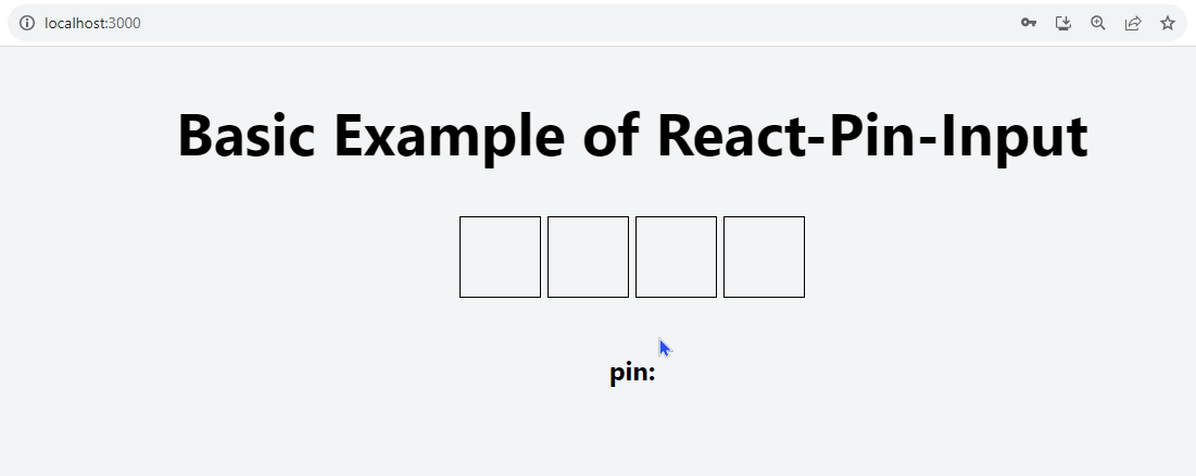
This basic setup lays the foundation for a secure and user-friendly PIN entry system within a React application, with room for further customization and integration into various use cases.
React-pin-input APIs
The API for the library includes:
length: Thelengthattribute refers to the number of individual input boxes or slots that comprise the entire PIN entry. Essentially, it defines how many characters or digits the user is expected to input when entering their PIN.
<PinInput length={4} />initialValue: TheinitialValueattribute specifies the initial content or value of the input boxes when the component is rendered. This is useful when you want to pre-fill the PIN input with a default or previously saved value.
<PinInput length={4} initialValue="1234" />secret: Thesecretattribute adds a layer of security by hiding the actual characters or digits as they are entered. This is particularly useful in scenarios where privacy and security are crucial, such as when entering PINs for sensitive transactions or passwords. Thesecretattribute enhances the confidentiality of the entered information, ensuring that even if someone is looking over the user’s shoulder, they won’t be able to discern the actual values.
<PinInput length={4} secret />secretDelay: ThesecretDelayAPI in thereact-pin-inputcomponent allows you to specify a millisecond delay before the input values are hidden when thesecretprop is set to true. This delay is useful if you want to show the input values for a brief period before hiding them for greater security. For example, you might use a delay of 500 milliseconds (half a second) so that the user can confirm they have entered the correct PIN before it is hidden.
<PinInput length={4} secret secretDelay={500} />disabled: Thedisabledattribute is used to make the entirePinInputcomponent unresponsive, preventing the user from interacting with it. This is commonly used when you want to temporarily disable user input, perhaps during a loading state or when certain conditions are met.
<PinInput length={4} disabled />focus: Thefocusattribute sets the default focus on the first input element when thePinInputcomponent is rendered. This means that when the page loads or the component is mounted, the cursor or focus will be automatically placed in the first input box, allowing the user to start entering their PIN without having to click on the input field.
<PinInput length={4} focus />type: Determines the type of input, whether it’s numeric, alphabetic, or alphanumeric.
<ReactPinInput type="numeric" />
<ReactPinInput type="alphanumeric" />
<ReactPinInput type="alphabet" />onChange: TheonChangeattribute in the context of thePinInputcomponent is a callback function that gets invoked whenever there’s a change in the PIN input. This callback provides information about the current value being entered and the index of the focused input box.
<PinInput length={4} onChange={(value, index) => handlePinChange(value, index)} />The onChange attribute is set to a function called handlePinChange, which takes two parameters: value - represents the current value of the PIN input at a specific index. index - Indicates the position or index of the input that is currently in focus.
onComplete: TheonCompleteattribute in the context of thePinInputcomponent is a callback function that gets invoked when all the inputs have valid values and the PIN input is considered complete.
<PinInput length={4} onComplete={(value, index) => handlePinComplete(value, index)} />The onComplete attribute is set to a function called handlePinComplete, which also takes two parameters: value - represents the final value of the PIN input. This is the complete PIN entered by the user. index - Indicates the position or index of the current input in focus when the completion occurs.
inputMode: TheinputModeattribute is used to specify the keyboard type that should be displayed when the user interacts with the input boxes. Thenumbervalue forinputModeindicates that the user should be presented with a numeric keypad, which is particularly useful when you expect the user to enter numerical values, as in the case of PINs.
<PinInput length={4} inputMode="number" />With this configuration, when a user taps or clicks on the PIN input, it will trigger a numeric keyboard on mobile devices or a numerical input mode on desktops. This provides a more user-friendly experience, as it guides users to enter only numeric values.
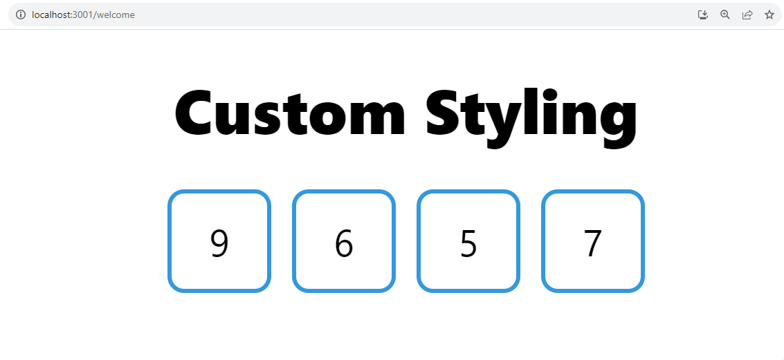
Custom Styling
The inputStyle prop is used to apply custom styling to components that accept user input. This prop allows you to pass a string representing a class or inline styles to style the input elements within the component.
import React from "react";
import PinInput from "react-pin-input";
const App = () => {
  return (
    <div className="flex items-center pt-8 h-screen  flex-col">
      <h2 className=" font-extrabold text-3xl p-4"> Custom Styling</h2>
      <PinInput
        length={4}
        inputStyle={{
          border: "2px solid #3498db", // Customize the border color
          borderRadius: "8px", // Adjust border radius
          fontSize: "18px", // Change font size
          padding: "10px", // Add some padding
          margin: "5px", // Adjust margin
        }}
      />
    </div>
  );
};
export default App;
The padding, border, borderRadius, and fontSize can be customized using the inputStyle prop.
Practical Example of React-pin-input in a Real-life Project
When incorporating the react-pin-input library into a real-life project, such as building a school login page, you can enhance the user experience by implementing a secure and user-friendly PIN authentication system. By integrating react-pin-input, users can input their PINs securely, providing an additional layer of authentication. Upon successful login, the system can seamlessly transition to a welcome page for users.
We will create a LoginAuth component that authenticates the PIN when it is inputted. We will make use of the useState hook for state management, overseeing variables such as the entered PIN, error messages, and success messages. For demonstration purposes, a fixed PIN is stored in the correctPin variable.
Create a handlePinComplete function that updates the component’s state pin when the user completes entering their PIN. It receives the entered PIN as the value parameter and uses the setPin function, which updates the state. The handleLogin function is invoked when the user clicks the login button. Its primary responsibility is to validate the entered PIN against the correct PIN.
import React, { useState } from "react";
import PinInput from "react-pin-input";

const LoginAuth = () => {
  const correctPin = "9657"; // Fixed PIN for demonstration
  const [pin, setPin] = useState("");
  const [errorMessage, setErrorMessage] = useState("");
  const [successMessage, setSuccessMessage] = useState("");

  const handlePinComplete = (value) => {
    setPin(value);
  };

  const handleLogin = () => {
    // Validate the entered PIN
    if (pin === correctPin) {
      // PIN is correct
      setSuccessMessage("🎉 Welcome back! Login successful!");
      setErrorMessage("");
      console.log("User logged in successfully");

    } else {
      // PIN is incorrect
      setErrorMessage("❌ Incorrect PIN. Please try again.");
      setSuccessMessage("");
      console.log("Incorrect PIN attempt");
    }
  };

  return (
    <div>
    </div>
  );
};

export default LoginAuth;
Now, we will design the UI of the login component to make the application come together. To facilitate navigation within the application, the component leverages the useNavigate hook from the "react-router-dom" library. This hook enables programmatic redirection after a successful login attempt.
// Welcome Page
import React, { useState } from "react";
import PinInput from "react-pin-input";
import { useNavigate } from "react-router-dom";
const LoginAuth = () => {
const correctPin = "9657"; // Fixed PIN for demonstration
const [pin, setPin] = useState("");
const [errorMessage, setErrorMessage] = useState("");
const [successMessage, setSuccessMessage] = useState("");
const navigate = useNavigate();
const handlePinComplete = (value) => {
setPin(value);
};
const handleLogin = () => {
// Validate the entered PIN
if (pin === correctPin) {
// PIN is correct
setSuccessMessage("🎉 Welcome back! Login successful!");
setErrorMessage("");
console.log("User logged in successfully");
// Navigate to WelcomePage
navigate("/welcome");
} else {
// PIN is incorrect
setErrorMessage("❌ Incorrect PIN. Please try again.");
setSuccessMessage("");
console.log("Incorrect PIN attempt");
}
};
return (
<div>
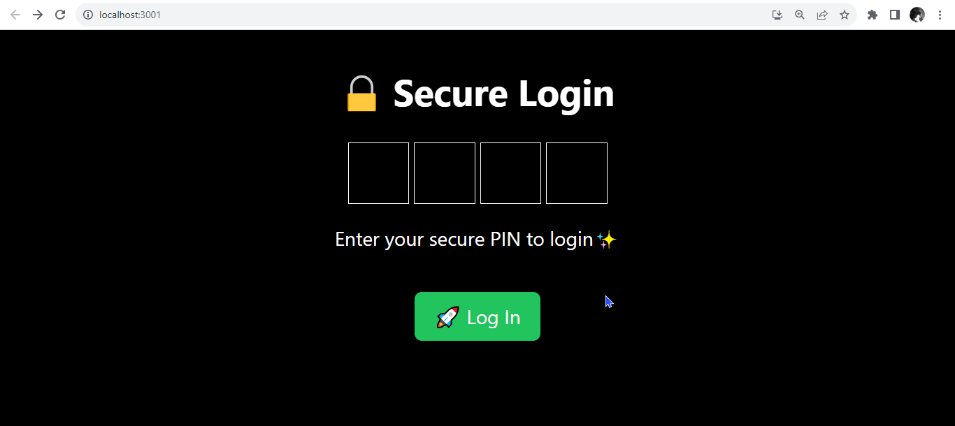
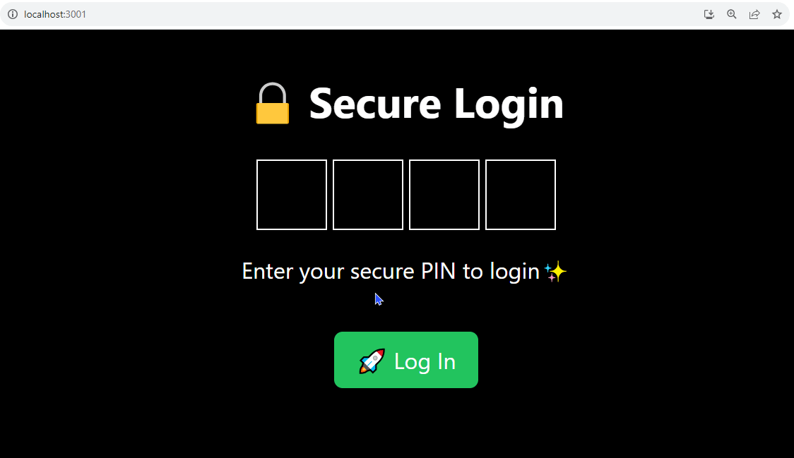
<div className="flex flex-col items-center justify-center h-screen bg-black text-white">
<h1 className="text-3xl font-bold mb-6">🔒 Secure Login</h1>
<PinInput
onComplete={handlePinComplete}
length={4}
focus
secret
secretDelay={500}
inputStyle={{ borderColor: "white", color: "white" }}
inputFocusStyle={{ borderColor: "lightgray" }}
/>
<p className="mt-4">Enter your secure PIN to login✨</p>
<button
onClick={handleLogin}
className="mt-8 bg-green-500 text-white py-2 px-4 rounded-md hover:bg-green-600 focus:outline-none focus:ring focus:border-green-300"
>
🚀 Log In
</button>
{errorMessage && (
<div className="mt-6 text-red-600 font-semibold">{errorMessage}</div>
)}
{successMessage && (
<div className="mt-6 text-green-600 font-semibold">
{successMessage}
</div>
)}
</div>
</div>
);
};
export default LoginAuth;The <PinInput/> component is configured with various attributes to enhance both security and user experience. The onComplete prop is set to the handlePinComplete function, ensuring that the application responds dynamically as the user completes their PIN entry.
The length prop is specified as 4, indicating the expected length of the PIN to be entered, aligning with common security practices for four-digit PINs. The secret and the secretDelay props are used to obscure the entered PIN digits, enhancing privacy and security during the input process. The focus prop sets the default focus on the first input element.
// Welcome Page
import React from "react";
const Welcome = () => {
  return (
    <div className="flex flex-col items-center pt-8 h-screen px-8 text-center bg-gray-100 text-gray-800">
      <h1 className="text-4xl font-extrabold mb-6">
        📚 Welcome to Maitama High!
      </h1>
      <p className="text-lg mb-4">
        Get ready for an exciting academic journey!
      </p>
      <div className="text-center">
        <p className="mb-4">
          Explore the vast resources and opportunities within the school portal.
          🏫
        </p>
        <p>
          Your learning adventure begins now. Embrace knowledge, connect with
          peers, and excel in every endeavor. 🚀
        </p>
        <button className="bg-blue-500 text-white px-16 py-2 rounded-full mt-8 hover:bg-blue-600 transition duration-300">
          Explore
        </button>
      </div>
    </div>
  );
};
export default Welcome;
We use the useNavigation hook to redirect to a welcome page upon successful login. If the entered PIN matches the predefined correct PIN, the handleLogin function invokes the navigate function. This function directs the user to the "/welcome" route, effectively transitioning them to the welcome page.
Next, import the Welcome and LoginAuth components to the App.js component. Within it, import the BrowserRouter component from the react-router-dom library for navigation.
// App.js
import React from "react";
import { BrowserRouter, Route, Routes } from "react-router-dom";
import LoginAuth from "./LoginAuth";
import Welcome from "./Welcome";
const App = () => {
  return (
    <div>
      <BrowserRouter>
        <Routes>
          <Route path="/" element={<LoginAuth />} />
          <Route path="/welcome" element={<Welcome />} />
        </Routes>
      </BrowserRouter>
    </div>
  );
};
export default App;
When the PIN input is correct, the user is seamlessly navigated to a welcome page.
When the PIN input is wrong, an error message is rendered to show that the PIN input is incorrect.
Common Challenges
- Limited input options: Restricting input to numbers only might be inconvenient for users who need to enter special characters (e.g., @ or -).
- Mobile responsiveness: PIN input fields might not adapt well to smaller screens.
- Integration with Form Libraries: Integrating the PIN input into larger forms managed by libraries like Formik or Redux Form.
- PIN visibility: Unmasked PINs can be vulnerable to shoulder surfing, where unauthorized individuals observe the entered digits
- Data interception: Intercepted network requests could expose sensitive PIN data.
Targeted Solutions: How React-pin-input Addresses These Challenges
Addressing common PIN input pain points, the React-pin-input library comes equipped with solutions to address common PIN input-related challenges. Some of these are:
- Configurable input types: Allow users to choose between numeric and alphanumeric input based on their specific needs.
- Custom keyboard options: Integrate custom keyboards with larger, well-spaced keys for improved PIN entry on mobile screens.
- Integration with Form Libraries: Ensures that the PIN input integrates seamlessly with form states and validations.
- Visual masking: React-pin-input allows masking PIN characters with dots or asterisks for increased privacy.
- Secure data handling: The library encrypts PINs during transmission and storage, preventing unauthorized access.
Conclusion
React-pin-input empowers developers to create secure, user-friendly, and visually appealing PIN input experiences in their React applications. Its flexibility, accessibility, and robust API make it a go-to choice for handling sensitive user data seamlessly and securely.
By understanding the significance of PIN input and the advantages of using a library like React-pin-input, you can confidently design and implement secure and user-friendly PIN entry solutions in your React applications.