Building sensible UI components with React Suite


When building a React application, developers tend to spend most of the time writing CSS and JSX code to make the application look appealing and easy to use to the end user. React Suite is, to quote its developers, “a suite of React components, sensible UI design, and a friendly development experience”. So, in this tutorial, you’ll learn how to build a sensible React Component UI using this suite.
What is React Suite?
React Suite is a set of react component libraries for enterprise system products. It is a well-thought-out and developer-friendly UI framework that supports the latest, stable releases of all major browsers and platforms. 0. React Suite is designed and implemented for use on modern desktop browsers rather than mobile browsers; in fact, Internet Explorer version 10 or earlier is no longer supported. React Suite V5 has been released with lots of cool features, and let’s look at some of them.
- Improve accessibility: All the components provided by React Suite has an improved keyboard operation and screen reading devices.
- Add a set of high contrast themes: React Suite has improved on the standard for color contrast requirements and has made significant improvements to the components to meet most users.
- Use SVG Icon instead of Icon font: Icon font has some rendering problems, which makes the icon blurry, the need to load the font file, and the content area flickers. For better accessibility, Version 5 prefers SVG Icon, which is compatible with third-party icon resources.
- Support CSS variables: Provision has been made in version 5 to provide a set of component CSS variable configurations to make theme customization and theme switching more convenient.
- Refactoring React Class Components with Hooks: Most of the React Suite components have been refactored using function and adopted the new features brought by React Hooks to enhance the development experience.
- Import on Demand: Version 5 removes the distinction between
cjsandesmwhen importing React Suite components
// v4: cjs
import Button from 'rsuite/lib/Button';
// v4: esm
import Button from 'rsuite/es/Button';

// v5
import Button from 'rsuite/Button';
What we are building
In this tutorial, we’ll be building a Photo gallery application to demonstrate how to build a sensible React component with React Suite. The project we’ll be building will look like the one on the screenshot below:

Let’s start by setting up the new React project. Run the command below to create a React project.
npx create-react-app react-suite-app && cd create-react-app react-suite-appThe above command will scaffold a new React application and change the directory into the project folder. Now open the project in your favorite text editor. For the demonstrations in this tutorial, I will be using Virtual Studio Code. Install the rsuite module with the command below:
npm i rsuite --save
 #or
yarn add rsuite
Once the installation is completed, let’s create our components using React Suite.
Creating App Components
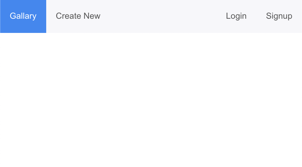
We’ll create a navbar in our App component where the users can navigate between our components. Open the ./src/App.js file and update the code with the code snippets below:
import "rsuite/dist/rsuite.min.css";
import { Navbar, Nav, Header, Container, Content } from "rsuite";
function App() {
return (
    <div className="show-fake-browser navbar-page">
      <Container>
        <Header>
          <Navbar appearance="inverse">
            <Navbar>
              <Nav>
                <Nav.Item>Gallary</Nav.Item>
                <Nav.Item>Create New</Nav.Item>
              </Nav>
              <Nav pullRight>
                <Nav.Item >Login</Nav.Item>
                <Nav.Item>Signup</Nav.Item>
              </Nav>
            </Navbar>
          </Navbar>
        </Header>
        <Content>

        </Content>
      </Container>
    </div>
  );
}

export default App;
In the above code snippet, we imported the React Suite minified style, which will apply styles to our components. We also imported the following components:
Container, that defines the frame of our pageNavbarto add navigation to our pageNavto add the list of the navigation menuHeaderto add a header to our pageContentto define the contents of the page
If you open the application on your browser, you should see the output below.
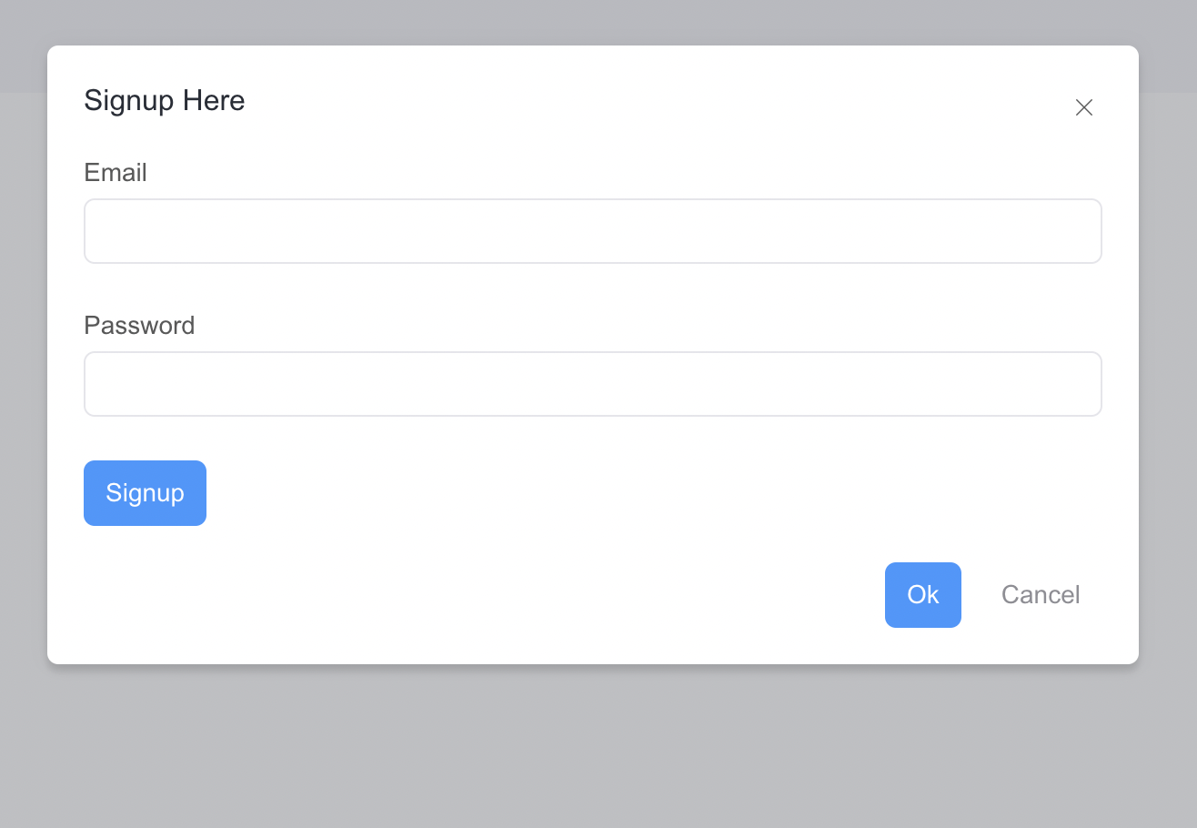
Creating a Signup Form
We need to ensure that a user is signed into the application before they can view or add their photos. We’ll create a signup component to enable users to sign up. To create a components folder in the src folder, create an AuthModal.jsx file and add the code snippet below:
import { Button, Modal, Form, ButtonToolbar, Message } from "rsuite";

export const AuthModal = (props) => {
  const handleClose = () => props.setOpen(false);
  return (
    <div className="modal-container">
      <Modal open={props.open} onClose={handleClose}>
        <Modal.Header>
          <Modal.Title>
            {props.isLogin ? "Login Here" : "Signup Here"}
          </Modal.Title>
        </Modal.Header>
        <Modal.Body>
          <Form fluid onSubmit={props.isLogin ? props.login : props.signUp}>
            <Form.Group controlId="email-1">
              <Form.ControlLabel>Email</Form.ControlLabel>
              <Form.Control
                name="email"
                type="email"
                onChange={props.setEmail}
              />
            </Form.Group>
            <Form.Group controlId="password-1">
              <Form.ControlLabel>Password</Form.ControlLabel>
              <Form.Control
                name="password"
                type="password"
                autoComplete="off"
                onChange={props.setPassword}
              />
            </Form.Group>
            <Form.Group>
              {props.error && (
                <Message showIcon type="error">
                  {props.error}
                </Message>
              )}
            </Form.Group>
            <ButtonToolbar>
              <Button appearance="primary" type="submit">
                {props.isLogin ? "Login" : "Signup"}
              </Button>
            </ButtonToolbar>
          </Form>
        </Modal.Body>
        <Modal.Footer>
          <Button onClick={handleClose} appearance="primary">
            Ok
          </Button>
          <Button onClick={handleClose} appearance="subtle">
            Cancel
          </Button>
        </Modal.Footer>
      </Modal>
    </div>
  );
};
Here we imported the Modal, Form, Button, Message, and ButtonToolbar components to create a modal and form fields for users to sign up. We made this component reusable so that if we navigate to log in or sign up, the same Modal will be used for signup and login. Now update the code in the App.js to show this modal. First, import useState and the AuthModal component.
...
import { useState } from "react";
import { AuthModal } from "./components/AuthModal";
...
Then add onClick events to the login and signup nav.
 <Nav.Item onClick={openLogin}>Login</Nav.Item>
 <Nav.Item onClick={openSignup}>Signup</Nav.Item>
Next, create the state variables, the openLogin, openSignUp, and signup methods with the code snippet below:
...
 const [open, setOpen] = useState(false);
  const [isLogin, setIsLogin] = useState(true);
  const [users, setUser] = useState([]);
  const [email, setEmail] = useState(null);
  const [password, setPassword] = useState(null);

  const signUp = () => {
        setUser([...users, { email, password }]);
      };
  const openLogin = () => {
    setOpen(true);
    setIsLogin(true);
  };

  const openSignup = () => {
    setOpen(true);
    setIsLogin(false);
  };
...
Finally, Add the AuthModal component in the Content component and pass in the state variables and the methods as props to the AuthModal component.
...
 <Content>
  <AuthModal
    open={open}
    setOpen={setOpen}
    isLogin={isLogin}
    setEmail={setEmail}
    setPassword={setPassword}
    signUp={signUp}
  />
</Content>
...
If you go back to your browser, this time you should be able to open the signup modal.
Create Sign-in Form
Now let’s create and implement the logic to log a user in when they have signup into our application. In the App.js file, add the following state variables.
const [error, setError] = useState(null);
const [isLoggedIn, setIsLoggedIn] = useState(false);
Then create a login method. In this method, we’ll use the Javascript filter function to search for the record that matches the email and password provided by the user and reset the isLogin state, or set an error message.
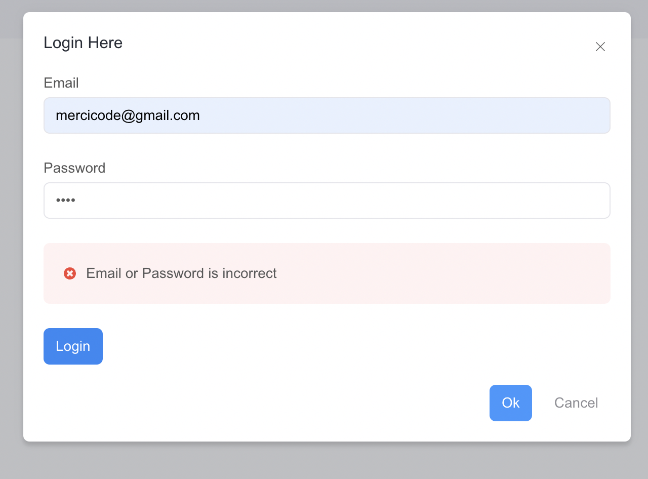
const login = () => {
    const foundUser = users.filter(
      (user) => user.email === email && user.password === password
    );
    if (foundUser.length > 0) {
      setIsLoggedIn(true);
      setError(null);
    } else {
      setError("Email or Password is incorrect");
    }
};
Next, we’ll update the props in the AuthModal component with the state variables and login method we just created.
 <AuthModal
   open={open}
   setOpen={setOpen}
   isLogin={isLogin}
   setEmail={setEmail}
   setPassword={setPassword}
   error={error}
   login={login}
   signUp={signUp}
 />
Now, if you open the login modal and try to log in as a user, you should see the output below.
Open Source Session Replay
OpenReplay is an open-source, session replay suite that lets you see what users do on your web app, helping you troubleshoot issues faster. OpenReplay is self-hosted for full control over your data.

Start enjoying your debugging experience - start using OpenReplay for free.
Creating the Gallery component
Now that we’ve implemented the login and signup features, let’s create our photo gallery. To do that, create a new component in the components folder, name it Photo.jsx and add the code snippet below:
import { Row, Col } from "rsuite";

export const Photo = (props) => {
  return (
    <Row>
      {props.photos.map((photo) => {
        return (
          <Col md={4} key={photo.id}>
            <img
              src={photo.URL}
              alt={photo.name}
              onClick={() => props.setOpenModal(true)}
            />
          </Col>
        );
      })}
    </Row>
  );
};
In the above code snippet, we imported the Row and Col components from React Suite to define a row and column for the photos in our application. Then we loop the photos array (we’ll create it shortly) using the Javascript map function and display the columns. Our photo array has the URL and name properties that store the image’s name and the URL, respectively. In the App.js file, import the Photo component and create the photos array state variable.
...
import { Photo } from "./components/Photo";

function App() {
...
const [photos, setPhotos] = useState([]);
...
}
Then add the Photo to the Content component and pass in the required props.
<Content>
...
{isLoggedIn && <Photo photos={photos}></Photo>}
</Content>
In the above code snippet, we used the isLoggedIn state variable to check if the user is logged in before rendering the Photo component.
Creating an Add Photo component
Now let’s create another component to allow logged-in users to create and add new photos/images to the application. To do that, create a PhotoModal.jsx file in the component folder and add the code snippet below;
import { Button, Modal, Form, ButtonToolbar } from "rsuite";
export const PhotoModal = (props) => {
  const handleClose = () => props.setOpenModal(false);
  return (
    <div className="modal-container">
      <Modal open={props.openModal} onClose={handleClose}>
        <Modal.Header>
          <Modal.Title>Create New Photo</Modal.Title>
        </Modal.Header>
        <Modal.Body>
          <Form fluid onSubmit={props.addPhoto}>
            <Form.Group controlId="name">
              <Form.Group controlId="name">
                <Form.ControlLabel>Image URL</Form.ControlLabel>
                <Form.Control
                  name="name"
                  onChange={(input) => props.setName(input)}
                />
                <Form.HelpText>Required</Form.HelpText>
              </Form.Group>
            </Form.Group>
            <Form.Group controlId="image">
              <Form.Group controlId="image">
                <Form.ControlLabel>Image URL</Form.ControlLabel>
                <Form.Control
                  name="name"
                  onChange={(input) => props.setPhoto(input)}
                />
                <Form.HelpText>Required</Form.HelpText>
              </Form.Group>
            </Form.Group>
            <ButtonToolbar>
              <Button appearance="primary" type="submit">
                Create
              </Button>
            </ButtonToolbar>
          </Form>
        </Modal.Body>
        <Modal.Footer>
          <Button onClick={handleClose} appearance="primary">
            Ok
          </Button>
          <Button onClick={handleClose} appearance="subtle">
            Cancel
          </Button>
        </Modal.Footer>
      </Modal>
    </div>
  );
};
Here we created another modal with form fields using the React suite components. Then we created a handleClose method to handle the closing of the modal, and used other methods and props from the App component like the setPhoto, setName, and addPhoto.
Now import the PhotoModal component.
...
import { PhotoModal } from "./components/PhotoModal";
Add the following state variables and methods.
  ...
  const [openModal, setOpenModal] = useState(false);
  const [photo, setPhoto] = useState(null);
  const [name, setName] = useState(null);

  const addPhoto = () => {
    setPhotos([...photos, { name, URL: photo }]);
  };

  const openPhotoModal = () => {
    setOpenModal(true);
  };
 ...
In the above code snippet, we created the photo and name variables to get the URL and name of the photo from the form fields. Then the addPhoto method to add a new photo to the array of photos and openPhotoModal method to open the PhotoModal. Next, add PhotoModal to the Content component and pass the methods and properties as props.
<Content>
  ...
  <PhotoModal
	  openModal={openModal}
	  setOpenModal={setOpenModal}
	  addPhoto={addPhoto}
	  setPhoto={setPhoto}
	  setName={setName}
	/>
</Content>
Finally, update the Create New nav by adding an onClick action that will allow the user to open the modal when logged in.
{isLoggedIn && <Nav.Item onClick={openPhotoModal}>Create New</Nav.Item>}
Now you can log in and add a new photo to the application.
Adding Custom Styling
Now update the styles in the App.css file with the code below to give all the images/photos a fixed width.
img{
  width: 100%;
}
Then import the file into the App.js file.
import "./App.css";Testing the application
I have added two more photos to the application; it should look like the image below.
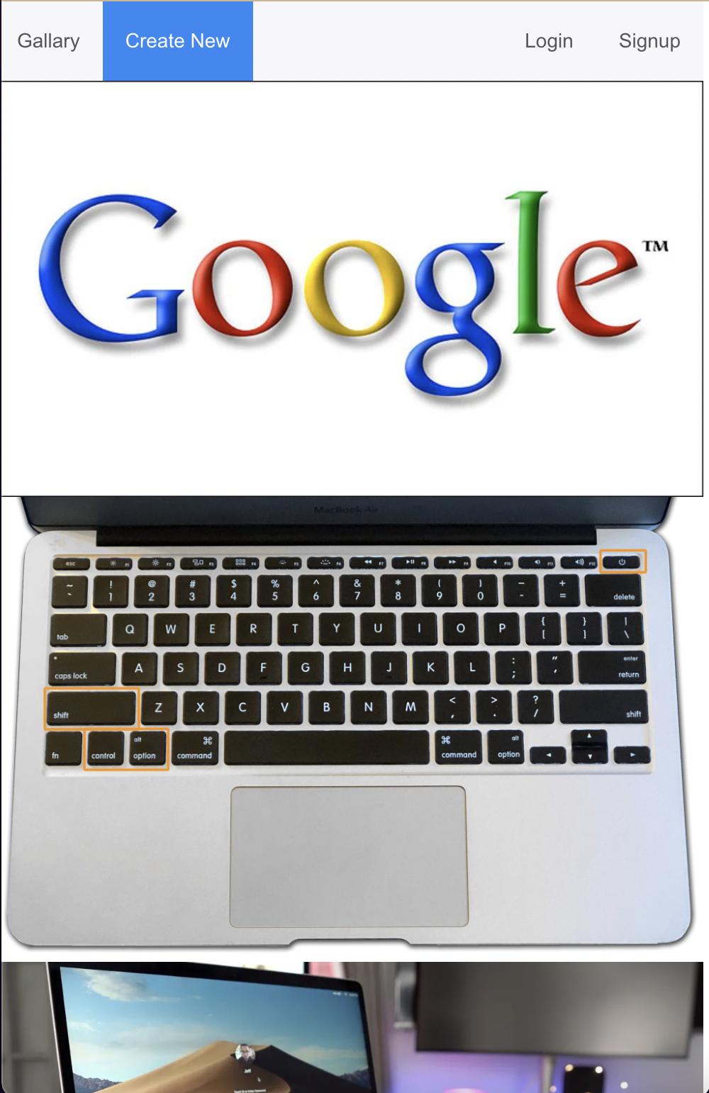
Go ahead and add more to test it out.
Conclusion
So far, you’ve created a Photo gallery application using React and React Suite components. We started with introducing new features in v5 and then creating a demo application. I believe practice makes a difference, so feel free to clone the Github repo for this project and extend the functionalities of the application.
Bye for now, see you in the next one.