Simple Sidebars with React-Pro-Sidebar and Material UI
Use this pair of tools to easily create a sidebar.


Creating seamless navigation is crucial in web development to ensure a positive user experience.
React-Pro-Sidebar is a customizable and responsive React sidebar library with dropdown menus and unlimited nested submenus. It provides a set of components for creating high-level and customizable side navigation.
This tutorial will guide you on creating customizable and responsive sidebars with React Pro Sidebar library and Material-UI for pre-built icon components in React applications.
What is React-Pro-Sidebar?
React-Pro-Sidebar is a powerful and lightweight library that allows developers to create responsive, collapsible, customizable dropdown menus and unlimited nested submenus for web applications. It provides a set of pre-built components and APIs that can be used to manage the sidebar.
The React-Pro-Sidebar library provides a set of components for creating high-level and customizable side navigation. It features a smooth transition effect when interacted with. It also includes additional features such as a search bar, a notifications drawer, and the ability to toggle the sidebar from anywhere within your application.
While the React-Pro-Sidebar library is one among many for creating responsive sidebars, it is efficient and popular among developers. It is a popular choice for building navigation that needs to be concealed or revealed on demand.
What is Material-UI?
Material-UI is an open-source JavaScript library for building user interfaces that executes Google’s Material Design. It provides a set of pre-built components, which we will use to create a consistent look and feel.
Material-UI provides a wide range of pre-built icons that can be easily integrated into a React application. The Material-UI Icon component can easily integrate these icons into the application.
Using icons on the sidebar to visually represent the menu items and help users quickly identify available options is vital. They can also help users understand the purpose or function of the menu items, making it easier for users to navigate the menu and find the option they’re looking for.
Why React-Pro-Sidebar?
React-pro-sidebar, like other libraries, has its own set of features and functionalities, some of which includes.
- It enables developers to efficiently design a responsive sidebar that adapts to various screen sizes.
- Seamless integration with other React libraries.
- It allows for customizable animations and transitions.
- It is a lightweight library and is easy to install and use.
- Offers documentation to guide you throughout the development process.
It is a simple tool for adding a sidebar to a React-based web application with little effort.
Installation
To get started, we will install the React-Pro-Sidebar to get access to the library’s API and Material-UI for access to menu icons.
Installing and Setting up React-Pro-Sidebar
Once you have created your react application, use any of the commands below to install the React-Pro-Sidebar library.
// NPM
$ npm install react-pro-sidebar

// YARN
$ yarn add react-pro-sidebar
After the installation is complete, we will import it into our component.
Installing and setting up Material-UI
To install the Material-UI icons in the same react application, first install the package with any of the commands below.
// NPM
$ npm install @mui/material @emotion/react @emotion/styled

// YARN
$ yarn add @mui/material @emotion/react @emotion/styled
Next, install the Material-UI icons with any of the commands below.
// NPM
$ npm install @mui/icons-material

// YARN
$ yarn add @mui/icons-material
After the installation, we can import as many icons as we need into our component.
Usage
To have complete access to the React-Pro-Sidebar library, we have to take care of a few things:
Wrapping within a ProSidebarProvider Component
Here, we will import the ProSidebarProvider component from react-pro-sidebar as shown below.
import { ProSidebarProvider } from "react-pro-sidebar";We will wrap our entire application within a ProSidebarProvider component. This allows the sidebar to be accessible throughout the application and provides the necessary context for the other components in the library to function correctly, as shown below.
import React from "react";
import ReactDOM from "react-dom/client";
import "./index.css";
import App from "./App";
import { ProSidebarProvider } from "react-pro-sidebar";
const root = ReactDOM.createRoot(document.getElementById("root"));
root.render(
  <React.StrictMode>
    <div>
      <ProSidebarProvider>
        <App />
      </ProSidebarProvider>
    </div>
  </React.StrictMode>
);
Importing React-Pro-Sidebar to your Component
Our App.js component will import the Sidebar component from the React-Pro-Sidebar package, as shown below.
import { Sidebar } from "react-pro-sidebar";We will use the Sidebar component to add the sidebar to our application.
Getting Started
After successfully importing the Sidebar component and Material-UI icons into our App.js component, we will create a primary sidebar.
Building a basic sidebar
Building a basic sidebar is quite simple. We will add the sidebar navigation in our layout component. Here, we will import a few components from the React-Pro-Sidebar library, as shown below.
import { Sidebar, Menu, MenuItem } from "react-pro-sidebar";In our App.js component, we will build our basic sidebar with the imported components and add some basic styling, as shown below.
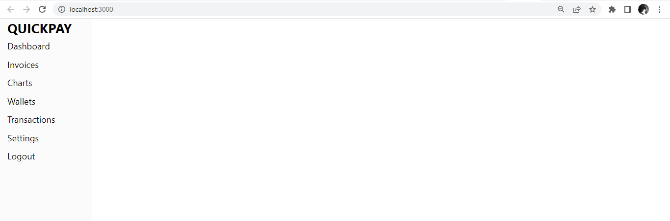
const App = () => {
return (
<div style={{ display: "flex", height: "100vh" }}>
<Sidebar className="app">
<Menu>
<MenuItem className="menu1">
<h2>QUICKPAY</h2>
</MenuItem>
<MenuItem> Dashboard </MenuItem>
<MenuItem> Invoices </MenuItem>
<MenuItem> Charts </MenuItem>
<MenuItem> Wallets </MenuItem>
<MenuItem> Transactions </MenuItem>
<MenuItem> Settings </MenuItem>
<MenuItem> Logout </MenuItem>
</Menu>
</Sidebar>
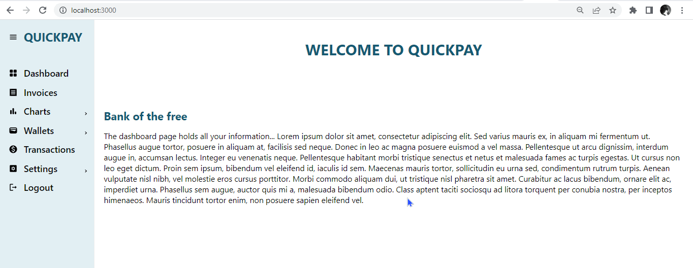
<h1>WELCOME TO QUICKPAY</h1>
</div>
);
};
export default App;It will look like this:
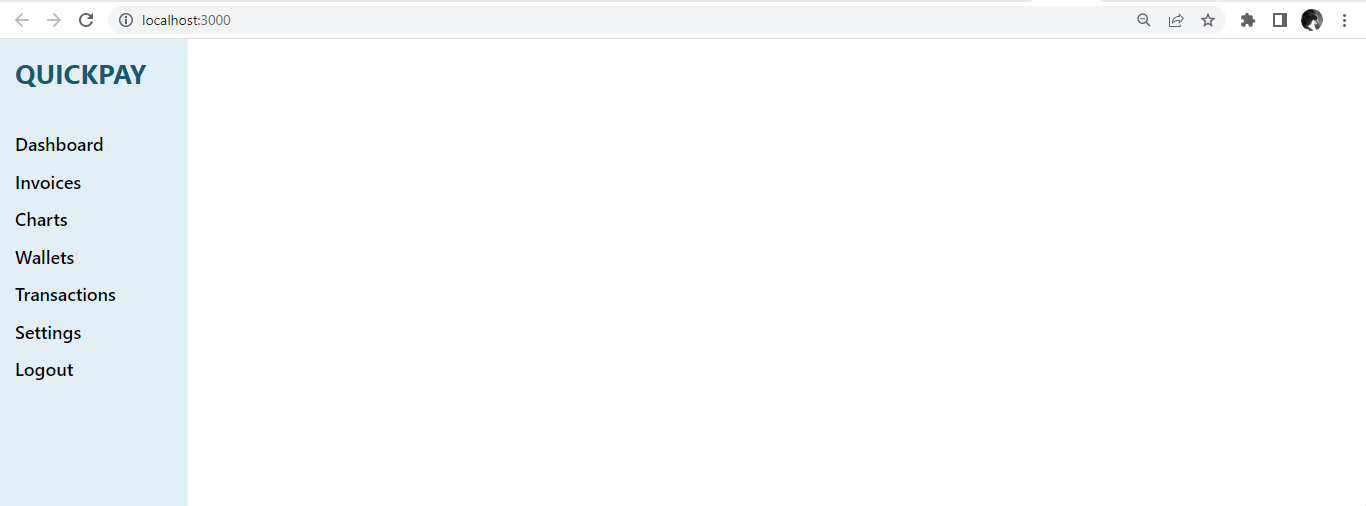
We will add basic styling to our sidebar to improve the UI.
body {
margin: 0;
font-family: "Figtree", -apple-system, BlinkMacSystemFont, "Segoe UI", "Figtree", "Oxygen", "Ubuntu", "Cantarell", "Fira Sans", "Droid Sans", "Helvetica Neue", sans-serif;
-webkit-font-smoothing: antialiased;
-moz-osx-font-smoothing: grayscale;
height: 100vh;
background: #ffffff;
font-size: 24px;
}
.app {
background: #a8d5e5;
}
h1 {
color: #165a72;
margin: 50px auto;
font-size: 40px;
}
.menu1 {
margin-bottom: 40px;
margin-top: 20px;
}
h2 {
color: #165a72;
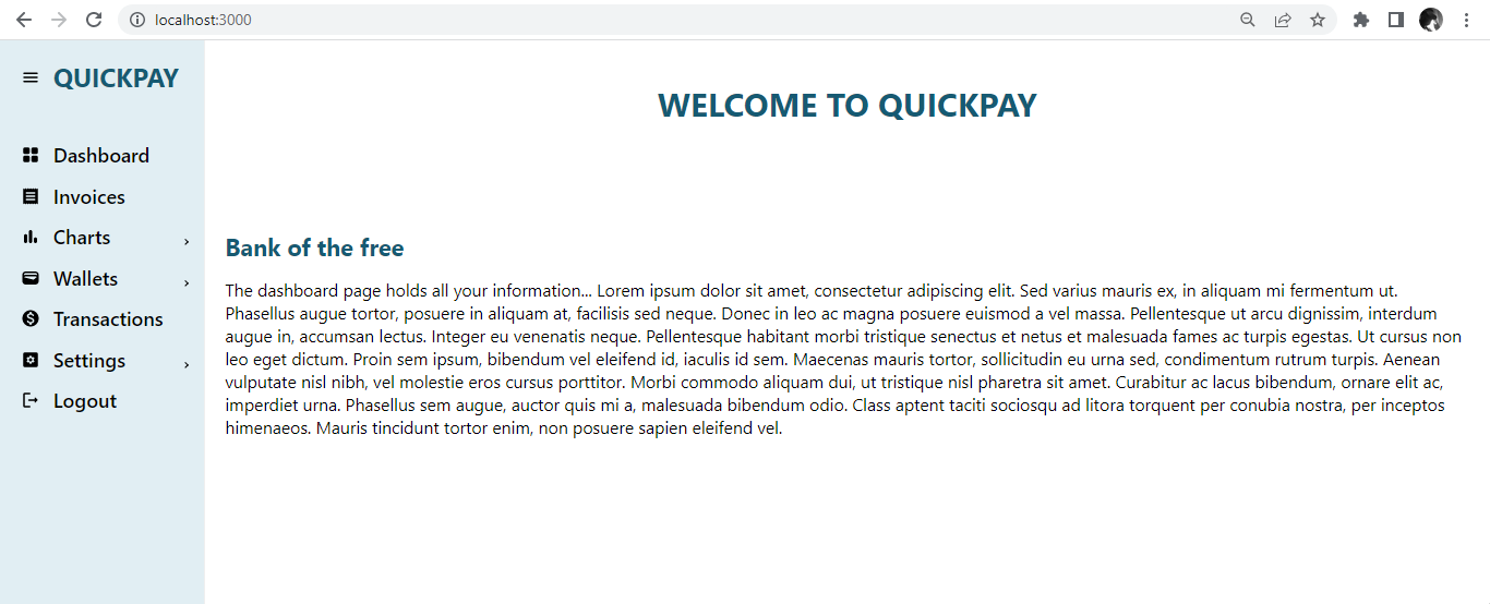
}After styling is applied, it will look like this.
The React-Pro-Sidebar library also allows for implementing dropdown menus, submenus, and nested menus in your React application, as shown below.
import { Sidebar, Menu, MenuItem, SubMenu } from "react-pro-sidebar";
const App = () => {
  return (
    <div style={{ display: "flex", height: "100vh" }}>
      <Sidebar className="app">
        <Menu>
          <MenuItem className="menu1">
            <h2>QUICKPAY</h2>
          </MenuItem>
          <MenuItem> Dashboard </MenuItem>
          <MenuItem> Invoices </MenuItem>
          <SubMenu label="Charts">
            <MenuItem> Timeline Chart </MenuItem>
            <MenuItem> Bubble Chart </MenuItem>
          </SubMenu>
          <SubMenu label="Wallets">
            <MenuItem>Current Wallet</MenuItem>
            <MenuItem>Savings Wallet</MenuItem>
          </SubMenu>
          <MenuItem> Transactions </MenuItem>
          <SubMenu label="Settings">
            <MenuItem> Account </MenuItem>
            <MenuItem> Privacy </MenuItem>
            <MenuItem> Notifications </MenuItem>
          </SubMenu>
          <MenuItem> Logout </MenuItem>
        </Menu>
      </Sidebar>
      <h1>WELCOME TO QUICKPAY</h1>
    </div>
  );
};
export default App;
It will look like this.
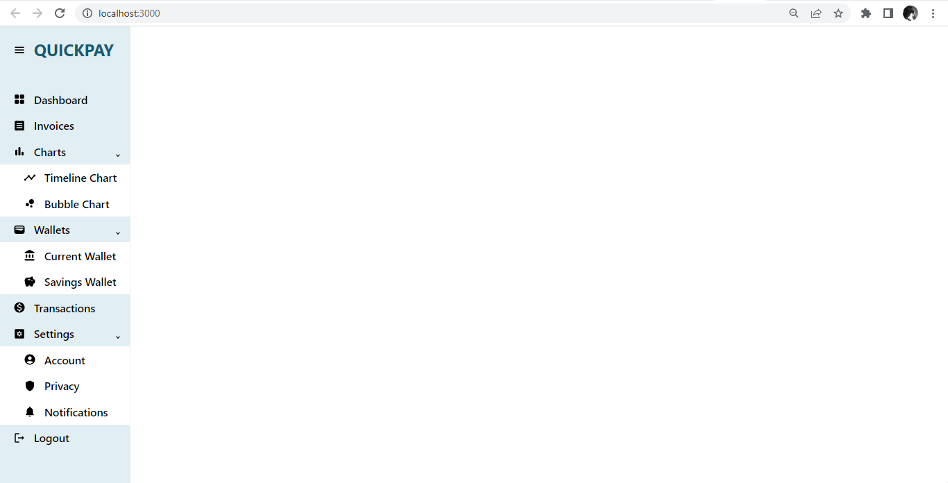
Importing icons with Material-UI
Earlier, we stated the use of icons in your sidebar. Icons visually represent the menu items and help users quickly identify the available options. We will import the icons from the Material-UI icon library.
import MenuRoundedIcon from "@mui/icons-material/MenuRounded";
import GridViewRoundedIcon from "@mui/icons-material/GridViewRounded";
import ReceiptRoundedIcon from "@mui/icons-material/ReceiptRounded";
import BarChartRoundedIcon from "@mui/icons-material/BarChartRounded";
import TimelineRoundedIcon from "@mui/icons-material/TimelineRounded";
import BubbleChartRoundedIcon from "@mui/icons-material/BubbleChartRounded";
import WalletRoundedIcon from "@mui/icons-material/WalletRounded";
import AccountBalanceRoundedIcon from "@mui/icons-material/AccountBalanceRounded";
import SavingsRoundedIcon from "@mui/icons-material/SavingsRounded";
import MonetizationOnRoundedIcon from "@mui/icons-material/MonetizationOnRounded";
import SettingsApplicationsRoundedIcon from "@mui/icons-material/SettingsApplicationsRounded";
import AccountCircleRoundedIcon from "@mui/icons-material/AccountCircleRounded";
import ShieldRoundedIcon from "@mui/icons-material/ShieldRounded";
import NotificationsRoundedIcon from "@mui/icons-material/NotificationsRounded";
import LogoutRoundedIcon from "@mui/icons-material/LogoutRounded";
As shown below, we will now integrate the icons we imported with the menu items.
const App = () => {
  return (
    <div style={{ display: "flex", height: "100vh" }}>
      <Sidebar className="app">
        <Menu>
          <MenuItem className="menu1" icon={<MenuRoundedIcon />}>
            <h2> QUICKPAY</h2>
          </MenuItem>
          <MenuItem icon={<GridViewRoundedIcon />}> Dashboard </MenuItem>
          <MenuItem icon={<ReceiptRoundedIcon />}> Invoices </MenuItem>
          <SubMenu label="Charts" icon={<BarChartRoundedIcon />}>
            <MenuItem icon={<TimelineRoundedIcon />}> Timeline Chart </MenuItem>
            <MenuItem icon={<BubbleChartRoundedIcon />}>Bubble Chart</MenuItem>
          </SubMenu>
          <SubMenu label="Wallets" icon={<WalletRoundedIcon />}>
            <MenuItem icon={<AccountBalanceRoundedIcon />}>
              Current Wallet
            </MenuItem>
            <MenuItem icon={<SavingsRoundedIcon />}>Savings Wallet</MenuItem>
          </SubMenu>
          <MenuItem icon={<MonetizationOnRoundedIcon />}>Transactions</MenuItem>
          <SubMenu label="Settings" icon={<SettingsApplicationsRoundedIcon />}>
            <MenuItem icon={<AccountCircleRoundedIcon />}> Account </MenuItem>
            <MenuItem icon={<ShieldRoundedIcon />}> Privacy </MenuItem>
            <MenuItem icon={<NotificationsRoundedIcon />}>
              Notifications
            </MenuItem>
          </SubMenu>
          <MenuItem icon={<LogoutRoundedIcon />}> Logout </MenuItem>
        </Menu>
      </Sidebar>
      <h1>WELCOME TO QUICKPAY</h1>
    </div>
  );
};
export default App;
After integrating the icons with our code, it will look like this.
Looks excellent already, right? Now, we will look at how to integrate React-Pro-Sidebar with React-Router.
Session Replay for Developers
Uncover frustrations, understand bugs and fix slowdowns like never before with OpenReplay — an open-source session replay tool for developers. Self-host it in minutes, and have complete control over your customer data. Check our GitHub repo and join the thousands of developers in our community.
Integrating with React-Router
The aim of having a sidebar is for easy navigation. We can easily make that happen by integrating our sidebar with react-router. We can install and set up react-router with the command below.
$ npm install react-router-dom@6Similarly, as shown below, we will import the BrowserRouter component from react-router-dom in the index.js component.
$ import { BrowserRouter } from "react-router-dom";Next, in the index.js component, we will wrap the App.js component within the BrowserRouter component.
<BrowserRouter>
  <App />
</BrowserRouter>;
Here, in the App.js component, we will import Routes, Route, and Link from react-router-dom. We will create a Home, Dashboard, and Transaction page to see react-router in action.
import { Routes, Route, Link } from "react-router-dom";
const Home = () => {
  return (
    <>
      <h1 className="header">WELCOME TO QUICKPAY</h1>
      <h3>Bank of the free</h3>
      <p>Lorem ipsum dolor sit amet...</p>
    </>
  );
};

const Dashboard = () => {
  return (
    <>
      <h1 className="header"> DASHBOARD PAGE</h1>
      <h3>Welcome User</h3>
      <p>Lorem ipsum dolor sit amet...</p>
    </>
  );
};

const Transactions = () => {
  return (
    <>
      <h1 className="header">KEEP TRACK OF YOUR SPENDINGS</h1>
      <h3>Seamless Transactions</h3>
      <p>Lorem ipsum dolor sit amet...</p>
    </>
  );
};
Now, we will create Route paths and use Link to link to the menu items.
const App = () => {
  return (
    <div style={{ display: "flex", height: "100vh" }}>
      <Sidebar className="app">
        <Menu>
          <MenuItem
            component={<Link to="/" className="link" />}
            className="menu1"
            icon={<MenuRoundedIcon />}
          >
            <h2>QUICKPAY</h2>
          </MenuItem>
          <MenuItem
            component={<Link to="dashboard" className="link" />}
            icon={<GridViewRoundedIcon />}
          >
            Dashboard
          </MenuItem>
          <MenuItem icon={<ReceiptRoundedIcon />}> Invoices </MenuItem>
          <SubMenu label="Charts" icon={<BarChartRoundedIcon />}>
            <MenuItem icon={<TimelineRoundedIcon />}> Timeline Chart </MenuItem>
            <MenuItem icon={<BubbleChartRoundedIcon />}>Bubble Chart</MenuItem>
          </SubMenu>
          <SubMenu label="Wallets" icon={<WalletRoundedIcon />}>
            <MenuItem icon={<AccountBalanceRoundedIcon />}>
              Current Wallet
            </MenuItem>
            <MenuItem icon={<SavingsRoundedIcon />}>Savings Wallet</MenuItem>
          </SubMenu>
          <MenuItem
            component={<Link to="transactions" className="link" />}
            icon={<MonetizationOnRoundedIcon />}
          >
            Transactions
          </MenuItem>
          <SubMenu label="Settings" icon={<SettingsApplicationsRoundedIcon />}>
            <MenuItem icon={<AccountCircleRoundedIcon />}> Account </MenuItem>
            <MenuItem icon={<ShieldRoundedIcon />}> Privacy </MenuItem>
            <MenuItem icon={<NotificationsRoundedIcon />}>
              Notifications
            </MenuItem>
          </SubMenu>
          <MenuItem icon={<LogoutRoundedIcon />}> Logout </MenuItem>
        </Menu>
      </Sidebar>
      <section>
        <Routes>
          <Route path="/" element={<Home />} />
          <Route path="dashboard" element={<Dashboard />} />
          <Route path="transactions" element={<Transactions />} />
        </Routes>
      </section>
    </div>
  );
};
export default App;
After linking the Home, Dashboard, and Transaction components with the menu items, it should look like this.

Great! Our sidebar is now functional. With react-router, we can easily navigate from one menu item to another.
Using useProSidebar hook
The react-pro-sidebar library has a useProSidebar hook that lets you access and manages the sidebar state. The useProSidebar hook API return some functions which can be used to update the sidebar state. Some of the functions include.
collapseSidebar: A function that enables you to update the sidebar’s collapsed state.toggleSidebar: A function that enables you to update the sidebar’s toggled state.collapsed: boolean: Sidebar collapsed state.toggled: boolean: Sidebar toggled state.broken: boolean: Sidebar breakPoint state.rtl: boolean: Sidebar direction state.
This hook would need to be imported from the library to use it. To import the useProSidebar hook from the library, use the code below.
import { Sidebar, Menu, MenuItem, SubMenu, useProSidebar } from "react-pro-sidebar";Here, we will add a constant of the functions using the useProSidebar hook, coming from the react-pro-sidebar package, as shown below.
const { collapseSidebar, toggleSidebar, collapsed, toggled, broken, rtl } =
  useProSidebar();
You can now apply these functions to your sidebar using the useProSidebar hook.
Collapsing the Sidebar
The collapseSidebar function comes from the useProSidebar hook. A collapsed sidebar is a sidebar triggered by a toggle button or icon. When the toggle button is clicked, the sidebar expands to reveal its content. When the toggle button is clicked again, the sidebar collapses and becomes hidden. We will use the collapseSidebar function to implement this, as shown below.
const App = () => {
const { collapseSidebar } = useProSidebar();
return (
<div style={{ display: "flex", height: "100vh" }}>
<Sidebar className="app">
<Menu>
<MenuItem
component={<Link to="/" className="link" />}
className="menu1"
icon={
<MenuRoundedIcon
onClick={() => {
collapseSidebar();
}}
/>
}
>
<h2>QUICKPAY</h2>
</MenuItem>
</Menu>
</Sidebar>
</div>
);
};
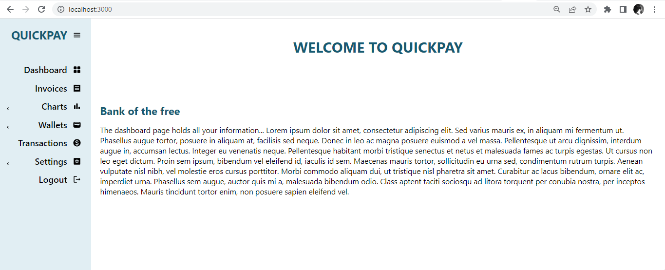
export default App;Here, we introduced the onClick() handler, which will call the collapseSidebar function. The sidebar collapses when the hamburger icon is clicked. It should look like this.
Great! Our sidebar looks good. We can collapse the sidebar with the click of the icon.
Revising the Sidebar Position
The sidebar is positioned on the left side of the screen by default. We can switch the position of the sidebar to the right side of the screen by changing the property of the flex-direction with CSS, as shown below.
const App = () => {
  return (
    <div
      style={{ display: "flex", height: "100vh", flexDirection: "row-reverse" }}
    >
      <Sidebar className="app"></Sidebar>
    </div>
  );
};
export default App;
It should look like this:
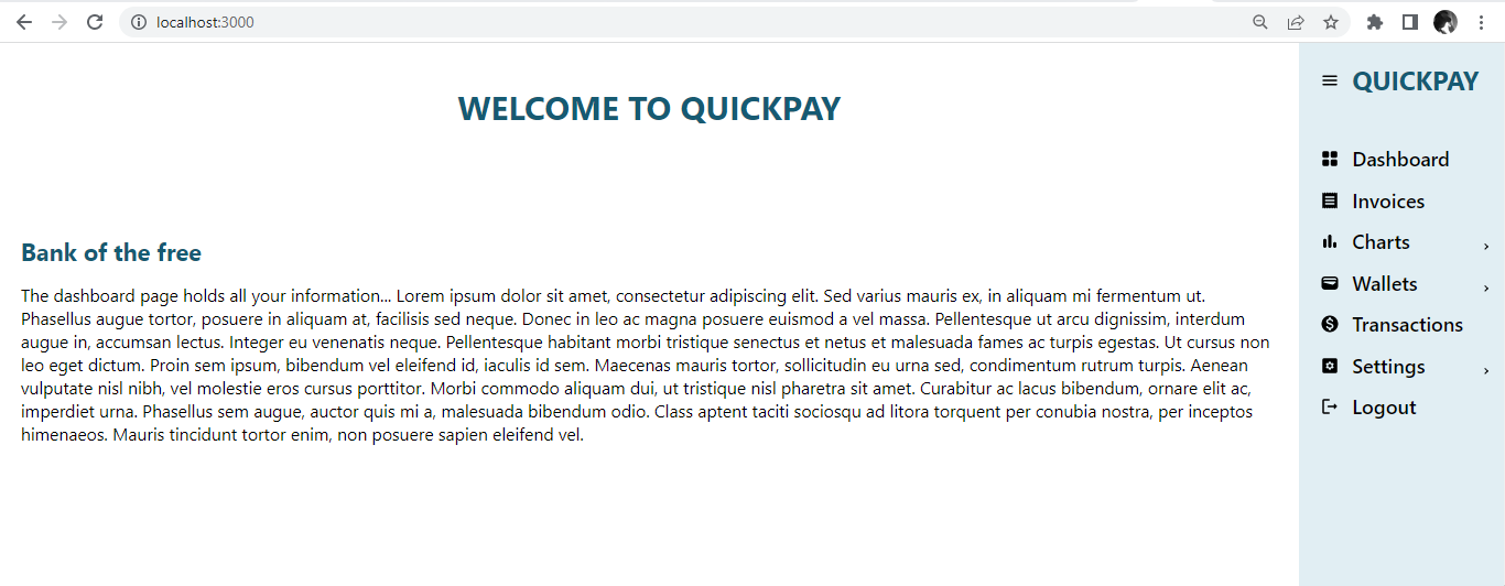
Now, the sidebar’s position has been switched to the right end of the screen with basic CSS styling.
Using Right to left prop(rtl)
The rtl prop is a function that comes from the useProSidebar hook. By default, texts and other elements are arranged from left to right, the rtl prop negates that. The rtl stands for “right-to-left” and refers to how texts and other elements are arranged on a webpage or application, with the text and elements starting from the right side.
To implement this, we will set rtl as true.
const App = () => {
  const { collapseSidebar, rtl } = useProSidebar();
  return (
    <div style={{ display: "flex", height: "100vh" }}>
      <Sidebar className="app" rtl={true}></Sidebar>
    </div>
  );
};
export default App;
Before executing the code, it looks like this:
After executing the code, the texts and elements in the sidebar follow the right-to-left direction, and it should look like this:
Here, we can see that the left-to-right default direction was changed and now renders from right to left. We know this by the menu icons and the text elements.
Conclusion
This tutorial discussed how to set up React Pro-Sidebar in our React application. We also discussed how to set up Material-UI icons and integrate the icons with the sidebar in our React app. React Pro-Sidebar has many advantages for building sidebars, such as great community, lightweight, documentation, customization properties, and consistency across the application.
Also, we discussed how to implement menu and submenu items in our sidebar. We also looked at how to integrate our sidebar with React-Router.
Furthermore, we looked at how to use the useProSidebar hook for extra functionalities like collapsing the sidebar and changing the texts and other elements in the sidebar to the right to left direction.
React Pro-Sidebar is a valuable tool for creating functional sidebars to aid easy navigation and ensure a positive user experience in a React application.
Gain Debugging Superpowers
Unleash the power of session replay to reproduce bugs and track user frustrations. Get complete visibility into your frontend with OpenReplay, the most advanced open-source session replay tool for developers.