
Vue.js is a widely adopted JavaScript framework known for its simplicity and flexibility in UI development. One essential aspect that makes Vue effective is its use of slots. If you’re getting into Vue development, grasping the idea of slots is vital for building dynamic and reusable components. This article will explore the fundamentals of slots in Vue.js, diving into their syntax and types and how they enable developers to build code that is modular and easy to maintain.

Discover how at OpenReplay.com.
A slot in Vue.js is a way or mechanism for a component to accept and render content(s) provided by its parent component. In other words, a slot is a placeholder in a component’s template where the parent component can inject and customize content. Slots enable dynamic composition as the parent can provide specific content to be rendered within the slots of the child component.
What roles do slots play in dynamic and flexible component composition?
- Dynamic Content Insertion: Slots allow the dynamic insertion of content into specific areas of a component, providing flexibility in how components can be composed.
- Default Content: Components can define default content within slots, providing fallbacks if the parent component does not supply content for a particular slot.
- Named Slots: Provide a way to designate specific insertion points within a component, allowing the parent component to insert content into these named slots.
- Scoped Slots: Facilitate communication between parent and child components by allowing the child component to expose data to the parent.
Slots vs. Props-based Communication
Let’s examine the comparisons below.
| Comparison Factor | Slots | Props |
|---|---|---|
| Content Insertion | Allow the parent component to insert content, including HTML and other components, into specific areas defined by the child component. | Involve passing data values to the child component without directly inserting content. |
| Communication | Facilitate bidirectional communication, enabling parent and child components to interact through slot content and scoped slots. | Typically involves a unidirectional flow of data from parent to child. |
| Reusability | Enhance component reusability by allowing dynamic composition and customization of content. | Can enhance reusability but may require more effort in creating versatile components. |
| Child Component Control | Provide more control to the child component over its structure and content. | The child component has less control, as it relies on the data passed down from the parent. |
| Default Content | Allow the definition of default content within the child component, providing fallbacks if the parent does not provide specific content. | Do not inherently support the concept of default content. |
Named Slots Vs Default Slots
In Vue.js, There are two types of slots: “default slots” (unnamed slots) and “named slots”. Let’s explore each of them individually and understand their use cases.
Default Slots
Default slots come into play when content needs to be inserted into a child component and the parent component doesn’t specify a slot name.
Suppose a slot in a child component is defined without a name. In that case, it functions as the default slot, and content provided by the parent component without indicating a slot name will be automatically placed into this default slot.
<!-- ChildComponent.vue -->
<template>
  <div>
    <!--default slot outlet -->
    <slot></slot>
  </div>
</template>
</code>
<!-- ParentComponent.vue -->
<template>
<ChildComponent>
<!--default slot content -->
<p>Custom content for the default slot</p>
</ChildComponent>
</template>Let me walk you through the provided code snippets:
In the ChildComponent.vue:
- The component has a template with a default slot
<slot></slot>, allowing any content from the parent to be inserted into it. - The
<div>element acts as a container for the slot content.
In the ParentComponent.vue:
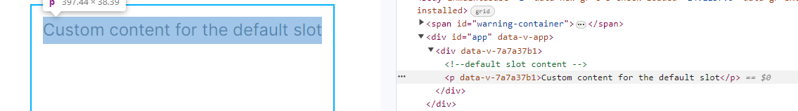
- The component utilizes ChildComponent, supplying custom content for the default slot.
- Inside the
<ChildComponent>tags, a<p>element with the text “Custom content for the default slot” will be automatically inserted into ChildComponent’s default slot, as shown in the screenshot below.
Named Slots
Named slots allow the parent component to insert content into specific named slots defined by the child component. A child component can have multiple named slots, each with a unique name.
The parent component specifies the slot name when providing content using the v-slot directive or the # shorthand.
<!-- ChildComponent.vue -->
<template>
  <div>
    <header>
      <!-- Named Slot for Header -->
      <slot name="header"></slot>
    </header>
    <main>
      <!-- Default Slot for Main Content -->
      <slot></slot>
    </main>
    <footer>
      <!-- Named Slot for Footer -->
      <slot name="footer"></slot>
    </footer>
  </div>
</template>
Allow me to guide you through the code snippets above.
In ChildComponent.vue:
- The template defines three slots within a div element: “header”, “the default slot (without a name)”, and “footer”.
- The
<header>and<footer>sections serve as named slots, allowing the parent component to insert specific content into these areas. - The
<main>section is the default slot where content will be inserted if the parent component doesn’t specify a slot name.
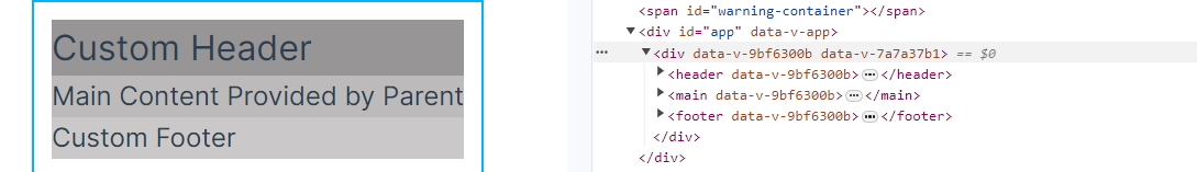
In ParentComponent.vue:
- The ChildComponent was wrapped around three templates and custom content is provided for the named slots by using the
v-slotdirective. - The content for the “header” slot is a
<h1>element with the text “Custom Header.” - The content for the default slot is a
<p>element with the text “Main Content Provided by Parent.” - The content for the “footer” slot is a
<p>element with the text “Custom Footer.”
All of these can be seen in the screenshot below:
Criteria for Choosing Between Named Slots and Default Slots
Named Slots are the preferred choice when specific areas within your component need customization by the parent. This is well-suited for components with clearly defined sections that accept distinct content.
On the other hand, Default Slots are recommended when dealing with generic or fallback content that can be centrally located. This is appropriate for components where customization is optional or less specific.
With all that being said, you’re now ready to work with slots. However, let’s delve deeper into another aspect of slots known as the scoped slot.
What are Scoped slots?
Scoped slots in Vue.js provide a powerful way or mechanism for passing data and methods from child to parent components, unlike regular slots, which mainly handle content insertion.
Scoped slots facilitate bidirectional communication between components, allowing child components to expose specific data and functionalities to their parent components.
Scoped slots offer many benefits, of which I’ll highlight a few:
- Data and Method Exposition
- Customizable Content
- Bidirectional Communication
- Enhanced Component Reusability
- Encapsulation of Logic
- Avoidance of Prop Drilling
Let’s explore a scenario that illustrates some of the benefits above.
We will start by creating the ChildComponent.
<!-- ChildComponent.vue -->
<script setup>
import { reactive } from "vue";

const post = reactive({
  title: "Introduction to Vue.js",
  content: "Vue.js is a progressive JavaScript framework...",
  likes: 0,
});

const likePost = () => {
  post.likes++;
};

const dislikePost = () => {
  post.likes--;
};
</script>

<template>
  <div class="blog-post">
    <h2>{{ post.title }}</h2>
    <p>{{ post.content }}</p>
    <slot :post="post" :like="likePost" :dislike="dislikePost"></slot>
  </div>
</template>

<style scoped>
.blog-post {
  border: 2px solid #ddd;
  padding: 10px;
  margin: 10px;
  border-radius: 8px;
}

h2 {
  color: #333;
}
</style>
Allow me to walk you through the provided code snippet.
We employ the Composition API within the <script setup> syntax in this illustration.
The reactive function from Vue is imported to create a reactive object named post. This object encompasses key details of the blog post, including the title, content, and the count of likes.
Two functions are defined:
- When invoked, the
likePostfunction increments thepost.likescount. - The
dislikePostfunction, when invoked, decrements thepost.likescount.
Within the <template> tag, the blog post’s title and content are rendered. The post, likePost, and dislikePost components are exposed through a scoped slot, enabling the parent component to tailor the rendering and behavior of the blog post to its specific needs.
Now, let us create the parent component:
<!-- ParentComponent -->
<script setup>
import ChildComponent from "./ChildComponent.vue";
</script>

<template>
  <div>
    <ChildComponent>
      <template v-slot="{ post, like, dislike }">
        <div class="custom-actions">
          <p>Do you like this post?</p>
          <div class="buttons">
            <button @click="like">Like</button>
            <button @click="dislike">Dislike</button>
          </div>
          <p>{{ post.likes }} likes</p>
        </div>
      </template>
    </ChildComponent>
  </div>
</template>
Let’s go through the code snippet above:
- Within the
<script setup>section, theChildComponentwas imported. - In the
<template>section, theChildComponentwas enveloped by the default slot template. It’s important to note that in the absence of a specified slot name in the child component, it is treated as the default slot. - Custom content, comprising two buttons and two paragraphs, was subsequently injected through the scoped slot.
- The scoped slot receives functionalities such as
post,like, anddislikefrom the child component. If it were anamed scoped slot, the syntax would resemble this::slotName="{post, like, dislike}"and notv-slot="{ post, like, dislike }". - Furthermore, The
likeanddislikebuttons are provided for user interaction. They trigger thelikeanddislikefunctions received from the child component via the scoped slot.
Below is the output of the code:
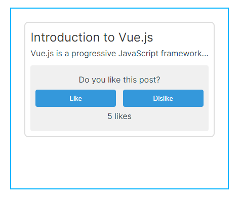
Now, let’s examine how the provided example aligns with the benefits mentioned earlier:
- Data and Method Exposition: The ChildComponent exposes three functionalities through a scoped slot: post (blog post data), like (function to increment likes), and dislike (function to decrement likes).
- Customizable Content: The parent component customizes the content within the scoped slot by creating a section called custom-actions. It includes a prompt, like and dislike buttons, and a paragraph to display the number of likes.
- Bidirectional Communication: The like and dislike buttons in the custom-actions section are connected to the like and dislike functions from the ChildComponent, enabling bidirectional communication.
- Encapsulation of Logic: The logic related to handling likes and dislikes is encapsulated within the ChildComponent. The parent component doesn’t need to know the implementation details; it simply interacts with the exposed functionalities.
What are Slot Fallback and Default Content?
As we conclude, let’s explore the concepts of Slot Fallbacks and Default Content.
When working with slots in Vue.js, there might be scenarios where the parent component doesn’t provide any content for a particular slot. You can include fallback content within the child component to handle this situation. This ensures that even if a slot is left unused, there will be default content to render.
<!-- ChildComponent.vue -->
<template>
  <div>
    <header>
      <slot name="header">Default Header</slot>
    </header>
    <main>
      <slot></slot>
      <!-- Fallback content if the default slot is not used -->
      <p>No main content provided.</p>
    </main>
    <footer>
      <slot name="footer">Default Footer</slot>
    </footer>
  </div>
</template>
In this example, if the parent component doesn’t provide content for the header or footer slots, the default content specified within the <slot> tags will be used as a fallback.
Furthermore, to enhance the reusability of your Vue components, you can make slots optional and provide default content. This means the component can function well even if the parent component doesn’t utilize certain slots.
<!-- ChildComponent.vue -->
<template>
  <div>
    <header v-if="$slots.header">
      <slot name="header"></slot>
    </header>
    <main>
      <slot></slot>
      <!-- Fallback content if the main slot is not used -->
      <p>No main content provided.</p>
    </main>
    <footer v-if="$slots.footer">
      <slot name="footer"></slot>
    </footer>
  </div>
</template>
In this modification, the <header> and <footer> sections are conditionally rendered only if the content is provided for the respective slots. If no content is provided, default content or fallbacks are displayed, ensuring the component remains usable and adaptable to different scenarios.
Finally, let’s explore some best practices to keep your codebase clean and well-organized while working with slots in Vue.js components.
- Documentation: Clearly explain the purpose of each slot and any default or fallback behavior.
- Consistent Slot Naming: Use consistent and meaningful names for your slots. This helps developers understand the purpose of each slot and promotes a standardized approach to slot usage.
- Default Content and Fallbacks: Include default content or fallbacks within your component for slots that may not be utilized by the parent.
- Conditional Rendering: Use conditional rendering to show or hide slot sections based on whether the parent provides content. This ensures the layout remains visually cohesive even when slots are not fully utilized.
- Avoid Overuse of Slots: Use slots judiciously. Overusing slots can lead to overly complex components that may be challenging to maintain. Consider the balance between flexibility and simplicity.
- Clear Slot Descriptions: Add comments or descriptions in your component to explain each slot’s purpose and expected content. This is particularly helpful for components that have multiple slots.
Conclusion
In conclusion, slots in Vue.js serve as a fundamental feature that enhances the flexibility and modularity of component-based development. They empower developers to create dynamic, customizable, and reusable components by allowing the injection of content from parent components.
Adhering to best practices, such as consistent slot naming and clear documentation, contributes to maintaining clean and organized code.
Refer to Vue’s documentation for in-depth insights. Moreover, practicing on your own is vital to grasp and master this concept effectively.
Gain Debugging Superpowers
Unleash the power of session replay to reproduce bugs, track slowdowns and uncover frustrations in your app. Get complete visibility into your frontend with OpenReplay — the most advanced open-source session replay tool for developers.
Star on GitHub12k