Squircles and Bevels with CSS corner-shape
Use CSS corner-shape to create squircles, bevels and scoops. Explore syntax, per-corner control, shadows, animation, and browser support with practical examples.

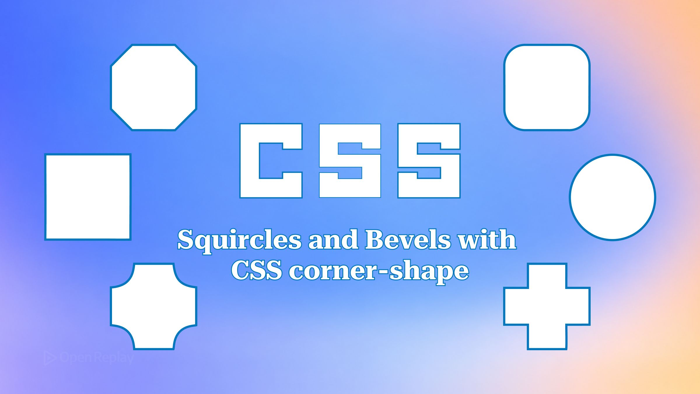
The CSS corner-shape property changes the curve of a corner without changing its size. border-radius still sets how far the corner reaches along each edge, and corner-shape picks the path the edge follows inside that area.
For years, a bevelled tag meant writing clip-path polygon coordinates by hand, and a smooth app-icon corner meant pulling in an SVG mask. Both workarounds tend to break in the same place: the box shadow, which gets cut off or has to be faked.
This article covers the syntax, what each keyword draws, how to set shapes per corner, why shadows behave better than they do with clip-path, how to animate between shapes, and when you need a fallback.
Key Takeaways
corner-shapeonly takes effect whenborder-radiusresolves to a non-zero value, and its initial value,round, draws the same cornerborder-radiusdraws by itself.- Each keyword is a named
superellipse()value:squareisinfinity,squircleis2,roundis1,bevelis0,scoopis-1, andnotchis-infinity. - Borders, outlines, box shadows and backgrounds follow the reshaped corner.
clip-pathbehaves differently and cuts the shadow off with everything else outside the clip region. - Chrome and Edge ship
corner-shapefrom version 139. Firefox and Safari have it only in Nightly, Technology Preview and beta builds, so the feature is not Baseline.
What CSS corner-shape Does
corner-shape reshapes the area that border-radius reserves at each corner. With no radius, there is nothing to reshape. MDN’s border-radius reference makes the same point with an example: a corner set to a border-radius of 0 gets no corner shape applied.
Think of border-radius and corner-shape as two separate controls. border-radius: 2rem reserves a 2rem region at the corner. corner-shape decides whether the edge crosses that region as a curve, a straight cut or an inward scoop. Per the MDN corner-shape reference, every corner longhand starts at round, so adding the property changes nothing until you set a value.
The Six Keywords and superellipse()
Every corner-shape keyword is shorthand for a superellipse() value. Positive arguments bulge outward and get squarer as the number rises. Zero draws a straight diagonal between the two ends of the radius. Negative arguments curve inward toward the centre of the box. The <corner-shape-value> page on MDN defines squircle as a convex curve between round and square, equal to superellipse(2), and bevel as a straight diagonal that is neither convex nor concave, equal to superellipse(0).
| Keyword | superellipse() equivalent | Corner looks like |
|---|---|---|
square | superellipse(infinity) | A sharp right angle |
squircle | superellipse(2) | A soft curve, squarer than round |
round | superellipse(1) | The standard elliptical arc |
bevel | superellipse(0) | A straight diagonal cut |
scoop | superellipse(-1) | A concave arc |
notch | superellipse(-infinity) | A square cut inward |
The grammar in the CSS Borders and Box Decorations Level 4 draft accepts a single argument: a number, infinity or -infinity, as the corner-start-start-shape reference on MDN also shows. To compare all six side by side, put them on six sibling cards:
.shapes { display: grid; grid-template-columns: repeat(3, 8rem); gap: 1rem; }
.shapes > * {
  aspect-ratio: 1;
  background: #4f46e5;
  border-radius: 2rem;
}
.shapes > :nth-child(1) { corner-shape: square; }
.shapes > :nth-child(2) { corner-shape: squircle; }
.shapes > :nth-child(3) { corner-shape: round; }
.shapes > :nth-child(4) { corner-shape: bevel; }
.shapes > :nth-child(5) { corner-shape: scoop; }
.shapes > :nth-child(6) { corner-shape: notch; }
Why border-radius Can’t Draw a Squircle
border-radius only draws elliptical arcs, so the curvature changes abruptly at the point where the corner meets the straight edge. corner-shape: squircle replaces that arc with a superellipse that leaves the edge more gradually. The result is the softer corner common in modern app icons.
.icon        { width: 6rem; aspect-ratio: 1; border-radius: 30%; background: #0ea5e9; }
.icon.smooth { corner-shape: squircle; } /* same as superellipse(2) */
At the same radius, a squircle looks less rounded than round, because a higher superellipse value sits closer to the square. If the corner looks too tight, increase the radius before you reach for a custom superellipse() value.
Per-Corner Shapes with Multi-Value Syntax and Longhands
corner-shape takes one to four values in the same corner order as border-radius. One value sets all four corners. With two values, the first sets top-left and bottom-right and the second sets top-right and bottom-left. With four values, the order runs clockwise from top-left. For finer control, MDN lists physical longhands such as corner-top-left-shape, logical longhands such as corner-start-start-shape, and side shorthands such as corner-top-shape and corner-inline-start-shape.
For a breadcrumb chip that points back toward the start of the line, use the logical side shorthand so the bevel flips in right-to-left text. corner-inline-start-shape sets both corners on the inline-start edge, which are corner-start-start-shape and corner-end-start-shape.
.crumb {
  border-radius: 0.75rem;
  corner-inline-start-shape: bevel; /* LTR: same as corner-shape: bevel round round bevel */
  padding-inline: 1.25rem 0.75rem;
}
The extra start padding on .crumb is there for a reason. corner-shape changes how the box is painted, not how its content is laid out. Text and child elements still sit in the rectangular box and can spill into a bevelled or scooped corner unless padding keeps them clear.
Borders and box-shadow Follow the Shape
corner-shape reshapes the box itself, so the shadow, border, outline and background all follow the new corner. clip-path, by contrast, cuts away everything outside the clip region, box-shadow included. Per MDN, the corner shape also applies to overflow clipping and backdrop-filter.
/* Before: clip-path removes the shadow along with the cut corners */
.ticket-clip {
  --cut: 1rem;
  box-shadow: 0 8px 24px rgb(0 0 0 / .25);
  clip-path: polygon(0 0, calc(100% - var(--cut)) 0, 100% var(--cut),
                     100% 100%, var(--cut) 100%, 0 calc(100% - var(--cut)));
}

/* After: shadow, border and outline trace the bevel */
.ticket {
  border-radius: 1rem;
  corner-shape: square bevel; /* TL+BR square, TR+BL bevelled */
  border: 2px solid #f59e0b;
  box-shadow: 0 8px 24px rgb(0 0 0 / .25);
}
The usual clip-path workaround is to wrap the element and put filter: drop-shadow() on the wrapper. corner-shape needs neither the wrapper nor the filter. clip-path is still the right tool for arbitrary outlines, as covered in getting creative with CSS shape functions and drawing layout-friendly shapes with xywh().
Animating Between Shapes on Hover
corner-shape is animatable, so a regular transition can morph one shape into another. MDN notes that animations interpolate through the superellipse() equivalents, which lets keywords animate smoothly into each other.
.btn {
  border-radius: 1rem;
  corner-shape: squircle;
  transition: corner-shape 250ms ease;
}
.btn:hover, .btn:focus-visible { corner-shape: bevel; }

@media (prefers-reduced-motion: reduce) {
  .btn { transition: none; }
}
Avoid designing around the exact in-between frames of a corner-shape transition. WebKit’s Technology Preview 252 notes mention a fix that brings outset-curve interpolation in line with the updated spec algorithm, which means intermediate frames can still differ between engines.
Fallback with @supports (corner-shape: squircle)
Browsers that don’t support corner-shape ignore the declaration and draw ordinary rounded corners from the existing border-radius. A squircle card or a soft bevel therefore falls back to a normal rounded rectangle, and most uses need no extra code.
Chrome added the property in Chrome 139, and Edge supports it from the same version. Firefox supports it only in Nightly builds, starting with 158, according to the Firefox Nightly release notes. Safari added support in Technology Preview 251, and the Safari 27.3 beta release notes list it too, but it isn’t in a stable Safari release yet. MDN lists the feature as Limited availability, so check its compat table before you ship.
The fallback stops being acceptable when the shape depends on corner-shape itself. A large radius combined with bevel makes a diamond in supporting browsers, but an unsupported browser renders the same radius as an ellipse. In that case, gate the large radius behind @supports:
.badge { border-radius: 0.5rem; }

@supports (corner-shape: bevel) {
  .badge { border-radius: 50%; corner-shape: bevel; }
}
A few cases where the property doesn’t do what you might expect:
- A
border-radiusthat resolves to 0 meanscorner-shapehas no effect. - Content stays rectangular. Pad it away from bevelled or scooped corners.
- When the shapes of opposite corners would overlap, MDN documents that the browser constrains them.
- Per MDN,
corner-shapehas no effect whenborder-shapeis set.
Conclusion
corner-shape turns border-radius into a two-part control: the radius sets the size of the corner and the keyword sets its curve. Because unsupported browsers fall back to plain rounded corners, squircles and soft bevels are safe to add to existing components now. Keep @supports for designs where the outline itself, such as a diamond or a notched badge, would turn into an ellipse without the property. A good first change is to add corner-shape: squircle to a card or icon that already uses border-radius, then compare it with the original.
FAQs
Can I use superellipse() values other than the six keyword equivalents?
Yes. superellipse() accepts any number, plus infinity and -infinity. superellipse(0.5) draws a curve between bevel and round, superellipse(1.5) sits between round and squircle, and values like -2 or -3 give deeper concave scoops. The same value can look different on two elements if their box size or border-radius differs, because the shape is drawn inside each element's own radius region.
Does corner-shape work with elliptical or percentage border-radius values?
Yes. corner-shape draws its curve inside whatever region border-radius computes for each corner, including percentage radii and elliptical radii set with the slash syntax, such as border-radius: 2rem / 1rem. A bevel on an elliptical radius becomes a longer, shallower diagonal cut. A squircle on an elliptical radius becomes a stretched superellipse, so changing the radius changes the proportions of the shape.
How do I clip an image or child element to a squircle or bevelled card?
Set overflow: hidden or overflow: clip on the card. MDN lists overflow clipping among the things that follow the corner shape, so child content gets clipped to the squircle or bevel instead of the rectangle. Without overflow clipping, children paint in the rectangular box and can show in the cut-away corners. corner-shape is not inherited, so children never pick up the parent's shape automatically.
Complete picture for complete understanding
Capture every clue your frontend is leaving so you can instantly get to the root cause of any issue with OpenReplay — the open-source session replay tool for developers. Self-host it in minutes, and have complete control over your customer data.
Star on GitHub12k

