
Styling Select Elements with Modern CSS

The <select> element has always been one of the most stubborn form controls to style. Unlike inputs or buttons, it historically rendered using OS-level UI components, meaning CSS could only touch the surface. That limitation pushed developers toward workarounds that are still common in production code today.
This article covers both approaches: the widely supported legacy technique using appearance: none, and the newer appearance: base-select model currently emerging in modern Chromium browsers.
Key Takeaways
- Native
<select>elements resist styling because browsers historically delegate their rendering to the operating system, producing inconsistent results across platforms. - The
appearance: nonetechnique, combined with a wrapper element and a custom arrow viaclip-path, is the most reliable cross-browser method for styling the closed state of a select. appearance: base-select(Chrome/Edge 135+) unlocks styling hooks for the dropdown panel, arrow icon, checkmarks, and selected content — but currently only in Chromium-based browsers.- Use
@supports (appearance: base-select)to layer the modern approach as a progressive enhancement on top of the legacy baseline.
Why Native <select> Elements Resist CSS Styling
Browsers traditionally handed <select> rendering off to the operating system. The result was inconsistent box sizing, font rendering, and dropdown arrow styles across Chrome, Firefox, Safari, and Edge, with no reliable way to unify them through CSS alone.
The open dropdown list (the options panel) remains largely unstylable in most browsers even today. That’s a hard constraint worth keeping in mind before choosing your approach.
The Legacy Approach: appearance: none with a Wrapper Element
The most widely supported CSS styling technique for select elements involves three steps:
- Strip the native appearance with
appearance: none. - Wrap the
<select>in a container element you can style freely. - Add a custom dropdown arrow using
clip-pathor a background SVG.
:root {
  --select-border: #777;
  --select-arrow: var(--select-border);
}

select {
  appearance: none;
  background-color: transparent;
  border: none;
  padding: 0 1em 0 0;
  width: 100%;
  font-family: inherit;
  font-size: inherit;
  cursor: inherit;
  line-height: inherit;
  outline: none;
}

.select {
  display: grid;
  grid-template-areas: "select";
  align-items: center;
  position: relative;
  border: 1px solid var(--select-border);
  border-radius: 0.25em;
  padding: 0.25em 0.5em;
  background-color: #fff;
}

select,
.select::after {
  grid-area: select;
}

.select::after {
  content: "";
  width: 0.8em;
  height: 0.5em;
  background-color: var(--select-arrow);
  clip-path: polygon(100% 0%, 0 0%, 50% 100%);
  justify-self: end;
  pointer-events: none;
}
The CSS grid overlap trick here is worth understanding: assigning both the <select> and the ::after pseudo-element to the same named grid area stacks them, letting the custom arrow sit visually on top without breaking the native control’s click behavior.
For focus states, since outline on the native select doesn’t behave reliably across browsers, a common fix is adding a <span class="focus"> sibling element and targeting it with select:focus + .focus using position: absolute to draw a visible focus ring.
This approach works across all modern browsers and preserves native accessibility — keyboard navigation, screen reader announcements, and form submission all behave as expected.

Discover how at OpenReplay.com.
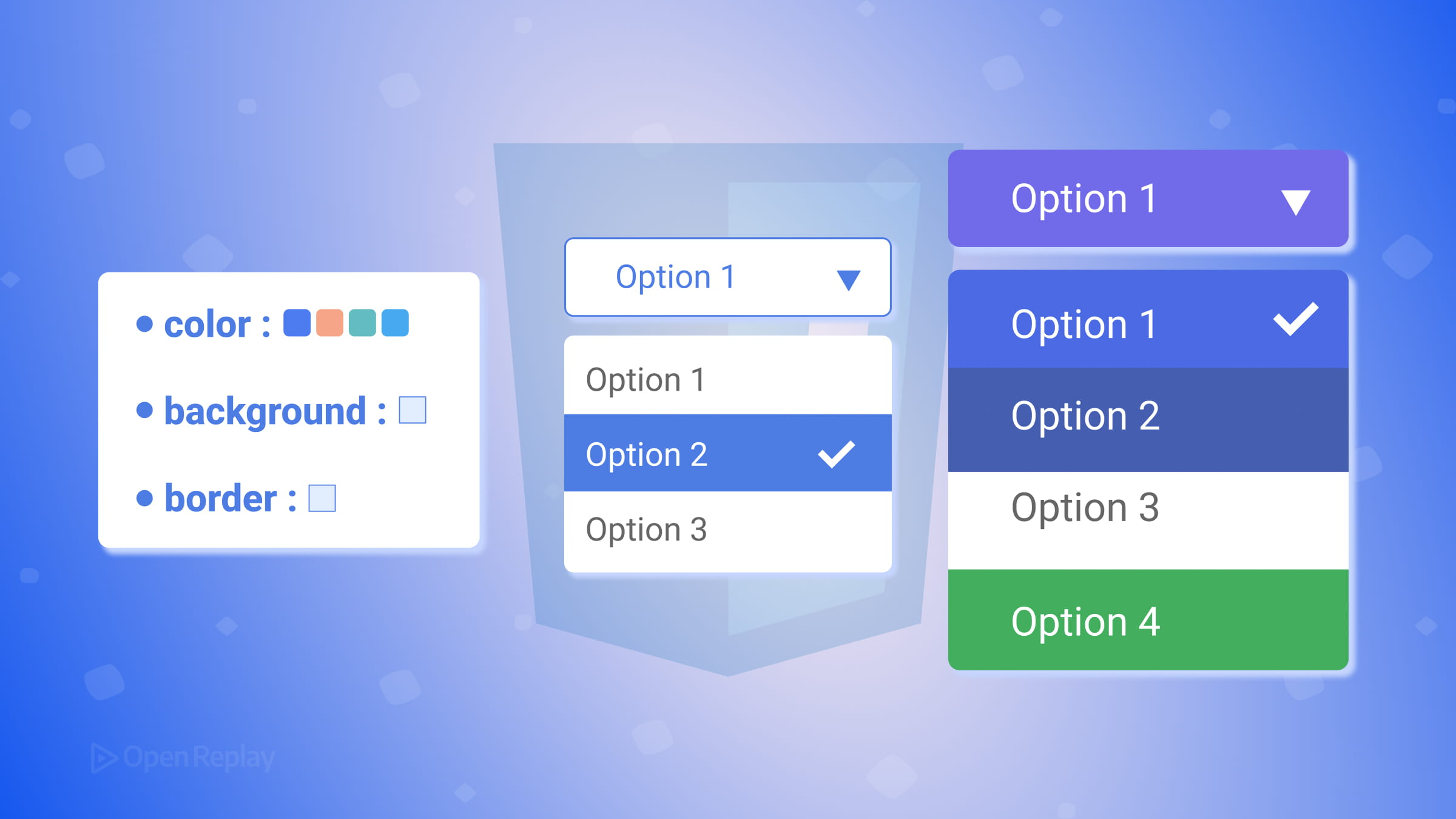
The Modern Approach: appearance: base-select
Chrome 135 and Edge 135 introduced a new opt-in model that exposes internal parts of <select> for direct CSS styling. You activate it like this:
select,
select::picker(select) {
  appearance: base-select;
}
This unlocks several new styling targets:
::picker(select)— the dropdown panel containing options::picker-icon— the dropdown arrow indicatoroption::checkmark— the checkmark shown next to the selected option:open— a pseudo-class active while the picker is openoption:checked— targets the currently selected option
With base-select, you can style the picker dropdown directly, animate it open and closed, and use the <selectedcontent> element to mirror the selected option’s content into the closed control. Supporting browsers also allow richer markup inside options when the customizable select model is enabled.
Browser support: currently limited primarily to Chromium-based browsers. Check the current status on Can I Use.
Use @supports to apply it as a progressive enhancement:
@supports (appearance: base-select) {
  select,
  select::picker(select) {
    appearance: base-select;
  }
}
Which Approach Should You Use?
appearance: none | appearance: base-select | |
|---|---|---|
| Browser support | 95%+ | Limited (see support table) |
| Styles the dropdown panel | No | Yes |
| Rich content in options | No | Yes |
| Accessibility | Native | Native |
Use the appearance: none wrapper technique as your baseline. It works everywhere, preserves accessibility, and gives you solid control over the closed state of the select. Layer appearance: base-select on top with @supports for browsers that support it.
Conclusion
Customizing HTML select dropdowns with CSS is no longer a choice between “full control with JavaScript” or “accept the browser defaults.” The appearance: none wrapper pattern remains the dependable cross-browser foundation, while appearance: base-select opens the door to styling the dropdown panel, embedding richer content in options, and animating the picker. The gap between those two extremes is closing, just not uniformly across all browsers yet. Start with the legacy technique, progressively layer the modern one, and you’ll cover the widest range of users with the least friction.
FAQs
No. Setting appearance none only strips the visual styling provided by the operating system. The underlying HTML select element retains all native keyboard behavior, including arrow key navigation, Enter and Space to open the dropdown, and Tab to move focus. Screen readers continue to announce options correctly because the DOM structure is unchanged.
Support for customizable select elements is still evolving and varies by browser. Chromium-based browsers have shipped the feature first, while other engines are still implementing it. Check the latest compatibility data on caniuse.com before relying on it in production, and wrap your base-select styles inside an @supports (appearance: base-select) block so unsupported browsers fall back gracefully to your legacy styles.
The select element ignores many CSS properties when rendered natively. A wrapper div gives you full control over borders, border-radius, background color, and the custom arrow via a pseudo-element. The grid overlap technique stacks the arrow on top of the select without interfering with click events, which you cannot achieve on the select alone.
Use a CSS pseudo-element on the wrapper with clip-path to draw a triangle shape purely in CSS. Set pointer-events to none on the pseudo-element so clicks pass through to the select underneath. Alternatively, you can use an inline SVG as a background-image on the wrapper, encoded as a data URI to avoid an extra network request.
Truly understand users experience
See every user interaction, feel every frustration and track all hesitations with OpenReplay — the open-source digital experience platform. It can be self-hosted in minutes, giving you complete control over your customer data. . Check our GitHub repo and join the thousands of developers in our community..
