Tailwind CSS is a popular utility-first CSS framework that greatly benefits developers when developing user interfaces. It allows developers to quickly and easily add styles to their applications without writing much CSS code. This article will teach you to take advantage of it to the fullest extent!
In this guide, we’ll go through how we can install and use Tailwind CSS with Astro, an all-in-one web framework that has been gaining popularity for its lightweight nature and blazing-fast, content-focused websites. It contains the right building blocks out of the box, such as helpful utility classes, JIT mode, scroll snap API, and more, enabling developers to get up and running in minutes. Additionally, we’ll learn how to make API requests in Astro by building a demo Astro application, whose styling will be done with Tailwind CSS.
Why use Tailwind CSS?
Tailwind CSS speeds up the creation and maintenance of your application’s code by employing utility classes to regulate your application’s padding, margin, color, font, shadow, and other features. It helps improve team efficiency by reducing the time they switch between files and writing custom CSS classes. Because it promotes a uniform approach, it also makes debugging our styles simpler.
It makes building complex responsive layouts easy; thanks to the help of utility classes, you can use any number of breakpoints to make your design come alive conditionally without the need for Global Styles.
Tailwind CSS is highly customizable. It has a built-in default configuration that can be simply customized by making adjustments to the tailwind.config.js file. Its configuration file allows developers access to everything (including color schemes and stylesheets). It also opens a world of opportunities for third parties by allowing developers to extend or add custom plugins.
Setup a new Astro project
To create an Astro application, run the command below on your terminal:
// NPM
npm create astro@latest

// YARN
yarn create astro
This command will guide you through each stage of creating your new Astro project. You can select from different official starter templates or create a new project from an existing Astro GitHub repository by running the command below:
// NPM
npm create astro@latest -- --template <github-username>/<github-repo>

// YARN
yarn create astro --template <github-username>/<github-repo>
Note: you can also browse their collection of themes and starters to find themes for landing pages, blogs, portfolios, and more!
If all goes well and you will be presented with the message “Ready for liftoff!”, move to the newly created project folder using the cd command to begin using Astro:
cd <project name>Next, to view your new website in action, run the following command in your terminal:
yarn run devIf no other application is running on port 3000, the command above starts a local development server.
Visit http://localhost:3000/ to see the app in action.
Integrating Tailwind CSS into our Astro app
Tailwind CSS works well with Astro, and it is also easy to integrate it into your application. To integrate it into our newly created Astro project, run the command below in the terminal:
yarn astro add tailwindThe installation is automated using the astro add command line tool. The command above creates a tailwind.config.cjs configuration file, and will automatically set up the appropriate package (@astrojs/tailwind) in your astro.config.mjs file. This will allow us to customize Tailwind CSS to standard.
import { defineConfig } from "astro/config";
import tailwind from "@astrojs/tailwind";
export default defineConfig({
// ...
integrations: [tailwind()],
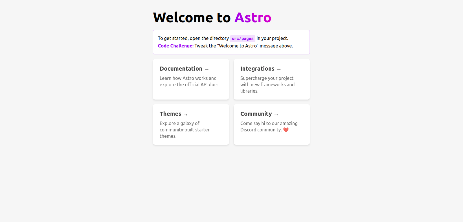
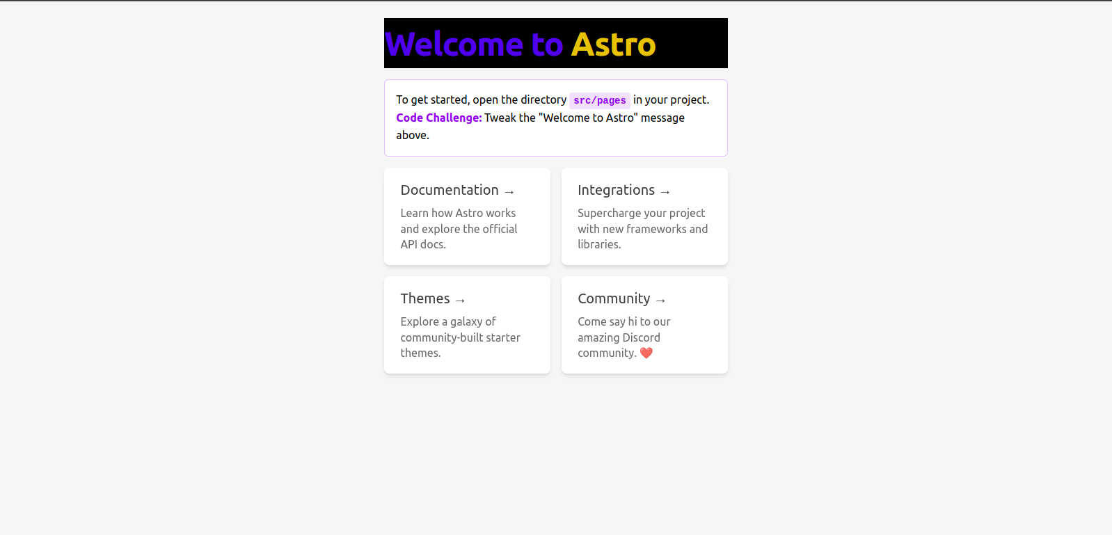
});With this, our .astro, React, Vue, Svelte, and other files can now use Tailwind CSS classes. Now let’s include the classes in the h1 and span tags of our pages/index.astro file to verify that our installation worked as expected:
<h1 class="text-blue-600 bg-black tracking-tight">
  Welcome to
  <span class="text-yellow-500">Astro</span>
</h1>
Now restart the development server to see the changes.
Alternatively, you can manually add Tailwind CSS to your Astro site or app by installing the following dependencies:
npm install @astrojs/tailwind tailwindcssThen integrate Tailwind CSS into your astro.config.* file using the integrations property:
import { defineConfig } from "astro/config";
import tailwind from "@astrojs/tailwind";

export default defineConfig({
  // ...
  integrations: [tailwind()],
});
Building and Styling our Astro application with Tailwind CSS
In this section, we’ll create and style a simple Astro application that makes an API call to the Consumet API and fetches a list of top-airing anime. We’ll style and display the results using Tailwind CSS.
Consumet is a search engine API for gaining access to data and links for numerous forms of entertainment, including movies, novels, anime, and other media.
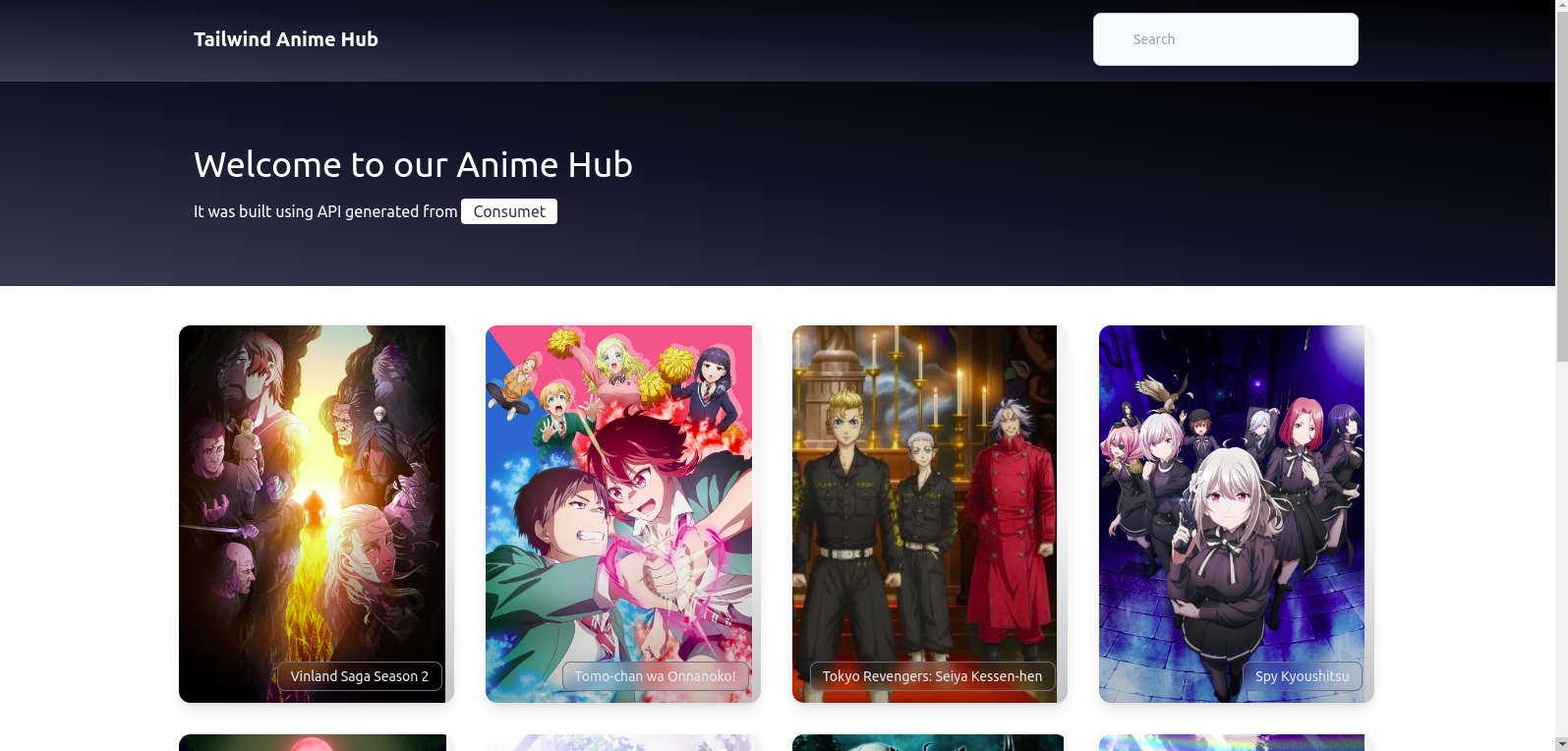
Our final application should appear as follows:
Creating a Layout
We’ll use the Layout component to create our navigation section. It will contain our app logo and search input for our application’s landing page. Inside your layouts/Layout.astro file, add the following code:
---
export interface Props {
  title: string;
}
const { title } = Astro.props;
---
The Astro.props object is a container that stores any values passed as attributes to a component.
<!DOCTYPE html>
<html lang="en">
  <head>
    <meta charset="UTF-8" />
    <meta name="viewport" content="width=device-width" />
    <link rel="icon" type="image/svg+xml" href="/favicon.svg"/>
    <meta name="generator" content="{Astro.generator}" />
    <title>{title}</title>
  </head>
  <body class="w-full">
    <nav
      class="py-4 px-[200px] border-gray-200 bg-gradient-to-tr from-gray-700 via-gray-900 to-black"
    >
      <div class= "flex flex-wrap items-center justify-between mx-auto">
        <a href="#" class="flex items-center">
          <span class= "self-center text-xl font-semibold whitespace-nowrap text-white"
            >Tailwind CSS Anime Hub</span
          >
        </a>
        <div class= "hidden w-full md:block md:w-auto">
          <input
            type= "search"
            id= "search"
            class="block w-full p-4 pl-10 text-sm text-gray-900 border border-gray-300 rounded-lg"
            placeholder= "Search"
          />
        </div>
      </div>
    </nav>
    <slot />
  </body>
</html>
The class name w-screen sets the body of our to 100vw. We added flex to set our logo and input field side by side.
Session Replay for Developers
Uncover frustrations, understand bugs and fix slowdowns like never before with OpenReplay — an open-source session replay tool for developers. Self-host it in minutes, and have complete control over your customer data. Check our GitHub repo and join the thousands of developers in our community.
Hero component
Now, let’s build our Hero component and add styles to it. In the components folder, create a file Hero.astro and the code below:
<header class="bg-gradient-to-tr from-gray-700 via-gray-900 to-black w-full">
  <div class="py-16 px-[200px] text-white">
    <h1 class="text-4xl mb-4">Welcome to our Anime Hub</h1>
    <p>
      It was built using API generated from
      <a
        href="https://docs.consumet.org/"
        class="py-1 px-3 text-gray-700 bg-white rounded"
      >
        Consumet
      </a>
    </p>
  </div>
</header>;
In the code above, we added a background color for our Hero section using the following class names bg-gradient-to-tr, from-gray-700, via-gray-900, to-black, and we also specified a large font text-4xl to our h1 tag and padding top and bottom of 4rem using py-16 and padding left and right of 200px using px-[200px] to our div. The text-4xl class increases the font size to 36px, text-white changes the text color to white, and py-16 adds a padding of 64px to the top and bottom of the text.
Building our Card component
Next, we’ll build a simple Card component that will house the cover image, title, and URL of the anime. The data rendering here will be fetched from the index page. Now in our components folder, create a file Card.astro and add the code below:
---
const { anime } = Astro.props;
---<a
href={anime.url}
class="group h-72 md:h-96 flex justify-end items-end bg-gray-100 overflow-hidden rounded-xl shadow-lg relative hover:shadow-xl"
>
<figure class="w-full h-full flex object-cover object-center absolute inset-0 group-hover:scale-110 transition duration-200 text-transparent">
<img src={anime.image} alt={`${anime.title} cover image`} />
</figure>
<div class="bg-gradient-to-t from-black via-transparent to-transparent opacity-20 absolute inset-0 pointer-events-none group-hover:opacity-0 transition duration-200" />
<span class="inline-block text-gray-200 text-xs md:text-sm border border-gray-500 rounded-lg backdrop-blur relative px-2 md:px-3 py-1 mr-3 mb-3 group-hover:opacity-0 transition duration-200">
{anime.title}
</span>
</a>;In the code block above, Astro allows us to write javascript and Typescript code within the --- block. It also allows us to use Astro.props to pass data throughout our Astro component. We then styled our app using Tailwind CSS classes. We used the object cover and object-center to make the cover image take the full width and height we specified on the a tag and position it at the center. We added a gradient background and used the backdrop-blur class to make the background at least partially transparent and blurring. The sm, md, lg, and xl prefixes are used to build components and layouts for different screen sizes.
Fetching and organizing our Data
Now, we’ll use our index page to fetch anime from Consumet, then create categories to organize them. First, let’s import our components and layout by adding the following code block to our pages/index.astro file:
---
import Layout from "../layouts/Layout.astro";
import Card from "../components/Card.astro";
import Hero from "../components/Hero.astro";

const response = await fetch(
  "https://api.consumet.org/anime/gogoanime/top-airing"
);
const data = await response.json();
const animes = data.results;
---
Based on the code above, we imported our components, and we then used the fetch() function to make an API request for the Consumet API. The fetch method is executed at build time, and the components will have access to the data to create dynamic HTML.
<Layout title= "Anime Hub.">
  <main>
    <Hero />
    <ul
      role= "list"
      class="grid grid-cols-2 sm:grid-cols-3 lg:grid-cols-4 gap-4 md:gap-6 xl:gap-8 max-w-screen-xl px-4 md:px-8 mx-auto"
    >
      {animes.length ? (
        animes.map((anime) => <Card anime="{anime}" />)
      ) : (
        <p>No anime at the moment</p>
      )}
    </ul>
  </main>
</Layout>;
Here we wrapped our site with the Layout component. We use the ul tags to iterate over the data from the API and display it between the Card components. The sm:grid-cols-3 sets the grid to 3 columns on a small screen size, while lg:grid-cols-4 sets the grid to 4 columns on a larger screen size. In the event that no anime is available from our API, we have also added a notice. Even though this is exceedingly unlikely, it is good practice.
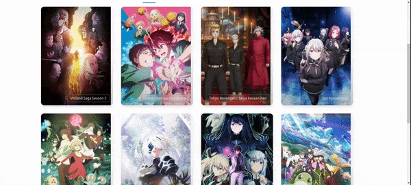
In the end, we have this nice-looking layout and animation of our site.
Although this application is quite simple, Tailwind CSS has a ton of different classes that can be utilized to make it much more complex. Visit the official documentation for further details on all of the Tailwind CSS classes that are offered and how to use them.
Conclusion
Overall, Tailwind CSS is a powerful and flexible tool that makes it easy to add styles to your Astro applications. By using the classes it provides, you can quickly and easily create a consistent and polished look for your app without having to write a lot of CSS yourself. Its utility-first approach, customization options, low specificity, and fast development make it a popular choice for building modern and responsive user interfaces.
Gain Debugging Superpowers
Unleash the power of session replay to reproduce bugs and track user frustrations. Get complete visibility into your frontend with OpenReplay, the most advanced open-source session replay tool for developers.