
Styling React components with Stitches


Stitches is a React framework for creating and styling reusable components with confidence. It has a feature that enables support for other frameworks like Vue, Svelte, and Vanilla HTML. It was developed to help developers avoid unnecessary prop interpolations at runtime, thus increasing the application’s performance.
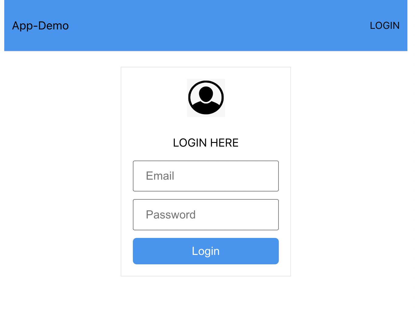
In this tutorial, you’ll learn how to create and style your React components using Stitches. For that, we’ll build a login UI as shown in the screenshot below.
Why use Stitches?
Let’s look at some of the reasons why developers prefer Stitches over other React libraries.
- Stitches performs better than other styling libraries, helping developers avoid unnecessary prop interpolations at runtime.
- Stitches has rich features such as CSS props, smart tokens, as props, and a fully-typed API.
- Stitches provides a fully typed API to reduce the learning curve and give the greatest developer experience.
- Stitches has
@stitches/coreallows it to work with other frameworks like Svelte, Vue, and Vanilla HTML.
Now let’s look at some of the features built into Stitches that simplify the styling of your components.
Variants
This is the key feature of Stitches that allows you to create typed, composable component APIs. For example, you can create a component and use variants to add multiple, compound, or default styles to the component. You’ll see all this in action later in this tutorial.
Themes
Stitches allow developers to easily add themes to a component using built-in tokens and theming CSS variables. Stitches allows you to define and use multiple themes across your application.
Smart Tokens
Another cool feature in Stitches is Smart Tokens. It allows developers to create or customize typed tokens, which are mapped automatically to the appropriate scale.
Utils
Stitches has another feature known as utils that allow developers to speed up your coding by creating custom CSS properties for their components. This is possible because this feature allows you to abbreviate CSS properties or use tricky styles in naming your CSS properties.
Creating Components with Stitches
Since you understand what Stitches is all about, let’s go ahead and create and style React components, to create the login UI.
You can also learn more about these features from the official documenation.
Create React App
You need to create a React project with the command below to get started.
npx create-react-app stitches-demoOnce the above command has created a new React project and installed the necessary dependencies required to run the project, install Stitches with the command below.
npm install @stitches/reactCreate Button component
With Stitches installed, let’s use it to create and style the components we’ll use in our application. We’ll start by creating a Button component. Create the component/Button.jsx file in the src folder and add the code snippet below.
import { styled } from "@stitches/react";

export const Button = styled("button", {
  // base styles
  display: "block",
  border: "none",
  borderRadius: "5px",
  color: "white",

  variants: {
    size: {
      sm: {
        fontSize: "13px",
        height: "25px",
        paddingRight: "10px",
        paddingLeft: "10px",
      },
      lg: {
        fontSize: "15px",
        height: "35px",
        paddingLeft: "15px",
        paddingRight: "15px",
      },
    },
    bg: {
      primary: {
        backgroundColor: "#2196f3",
        "&:hover": {
          backgroundColor: "#64b5f6",
        },
      },
      secondary: {
        backgroundColor: "#009688",
        "&:hover": {
          backgroundColor: "#4db6ac",
        },
      },
      danger: {
        backgroundColor: "#f44336",
        "&:hover": {
          backgroundColor: "#ef9a9a",
        },
      },
      success: {
        backgroundColor: "#4caf50",
        color: "white",
        "&:hover": {
          backgroundColor: "#a5d6a7",
        },
      },
    },
  },
});
In the above code snippet, we imported the styled function from Stitches, which will allow us to customize the component. Then we used the variants property to define the styling for the component’s background color (bg) and size (size).
Create Input Component
Now let’s create the Input to collect the user’s inputs. Create an Input.jsx file in the component folder and add the code snippet below.
import { styled } from "@stitches/react";

export const Input = styled("input", {
  display: "block",
  marginBottom: "10px",

  variants: {
    size: {
      sm: {
        fontSize: "13px",
        height: "25px",
        paddingRight: "10px",
        paddingLeft: "10px",
      },
      lg: {
        fontSize: "15px",
        height: "35px",
        paddingLeft: "15px",
        paddingRight: "15px",
      },
    },
  },
});
We want large and small inputs in the Input component, and we defined the styles using the variants property.
Create Avatar component
Let’s create an Avatar component to enable us to add images to the application. Create an Avatar.jsx file in the components folder and add the code snippet below.
import { styled } from "@stitches/react";

export const Avatar = styled("img", {
  display: "inline-block",
  marginBottom: "10px",
  // base styles
  variants: {
    size: {
      sm: {
        width: "25px",
        height: "25px",
      },
      lg: {
        width: "50px",
        height: "50px",
      },
    },
    align: {
      center: {
        margin: "0 auto",
        marginBottom: "10px",
      },
    },
  },
});
We also defined the styling to have a large and small avatar. We also defined the style to change the avatar alignment avatar.
Create Box Component
Here we’ll create a Box component to wrap and organize components together. Create a Box.jsx file in the components folder and add the code snippet below.
import { styled } from "@stitches/react";

export const Box = styled("div", {
  display: "flex",
  justifyContent: "center",
  flexDirection: "column",
  padding: "15px",

  variants: {
    align: {
      center: {
        alignItems: "center",
      },
      left: {
        alignItems: "flex-start",
      },
      right: {
        alignItems: "flex-end",
      },
    },
    border: {
        none: {
            border: "none"
        },
        solid: {
            border: "solid 1px #e6e6e6"
        }
    }
  },
});
In the above code snippet, we defined the styling to align and to add border to the contents.
Create Contanier Component
Now let’s create a container component to organize other components. Create a Container.jsx file in the component folder and add the code snippet below.
import { styled } from "@stitches/react";

export const Container = styled("div", {
  display: "flex",
  flexDirection: "column",
  justifyContent: "center",
  padding: "10px",
  backgroundColor: "white",

  variants: {
    size: {
      sm: {
        width: "100%",
        height: "50px",
      },
      lg: {
        width: "100%",
        height: "60px",
      },
    },
    align: {
      center: {
        alignItems: "center",
      },
      left: {
        alignItems: "flex-start",
      },
      right: {
        alignItems: "flex-end",
      },
    },
  },
});
In the Container component, we defined the styling to align and set the size of the container.
Create Navbar Component
Let’s create one more component to create a nav bar for the application. Create a Navbar.jsx file in the components folder and the code snippet below.
import { styled } from "@stitches/react";

export const Navbar = styled("nav", {
  display: "flex",
  flexDirection: "row",
  justifyContent: "space-between",
  alignItems: "center",
  padding: "10px",
  backgroundColor: "white",
  borderBottom: "1px solid #e6e6e6",
  // base styles
  variants: {
    size: {
      sm: {
        width: "100%",
        height: "50px",
      },
      lg: {
        width: "100%",
        height: "60px",
      },
    },
    bg: {
      primary: {
        backgroundColor: "#2196f3",
        "&:hover": {
          backgroundColor: "#64b5f6",
        },
      },
      secondary: {
        backgroundColor: "#009688",
        "&:hover": {
          backgroundColor: "#4db6ac",
        },
      },
      danger: {
        backgroundColor: "#f44336",
        "&:hover": {
          backgroundColor: "#ef9a9a",
        },
      },
      success: {
        backgroundColor: "#4caf50",
        "&:hover": {
          backgroundColor: "#a5d6a7",
        },
      },
    },
  },
});
In the Navbar component, we defined the styling to add a background color and set the size of the Navbar.
Open Source Session Replay
OpenReplay is an open-source, session replay suite that lets you see what users do on your web app, helping you troubleshoot issues faster. OpenReplay is self-hosted for full control over your data.

Start enjoying your debugging experience - start using OpenReplay for free.
Use the Components
Now let’s use the components we just created to create a login UI. We must import the components into the App.js file with the code snippet below.
import { Button } from "./Compponents/Button";
import { Input } from "./Compponents/Input";
import { Avatar } from "./Compponents/Avatar";
import { Navbar } from "./Compponents/Navbar";
import { Container } from "./Compponents/Container";
import { Paragraph } from "./Compponents/Paragraph";
import { Box } from "./Compponents/Box";
Then update the App component with the code snippet below to create the navbar.
function App() {
  return (
    <>
      <Container>
        <Navbar bg="primary">
          <Paragraph size="large">App-Demo</Paragraph>
          <Paragraph size="small">LOGIN</Paragraph>
        </Navbar>
      </Container>
   </>
  );
}
export default App;
In the above code snippet, we used the Container component to wrap the Navbar. Then in the Navbar component, we used the Paragraph component to add text to the Navbar.

Next, update the App component to create the login form with the code snippet below.
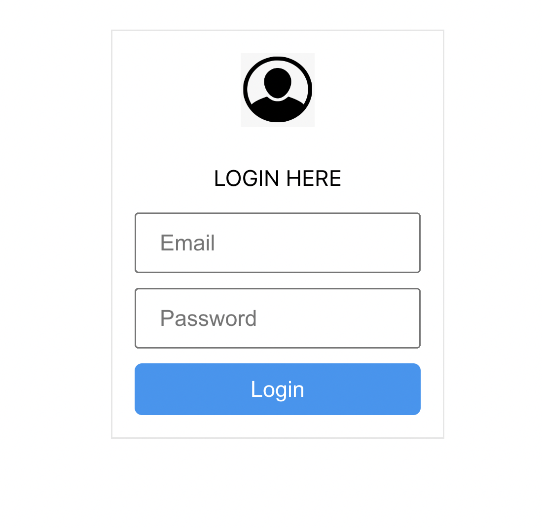
<Container align="center">
  <Box border="solid">
    <Avatar
      align="center"
      size="large"
      src="https://www.pngitem.com/pimgs/m/24-248235_user-profile-avatar-login-account-fa-user-circle.png"
    ></Avatar>
    <Paragraph size="large" align="center">
      LOGIN HERE
    </Paragraph>
    <Input size="large" placeholder="Email"/>
    <Input size="large" placeholder="Password"/>
    <Button size="large" bg="primary">
      Login
    </Button>
  </Box>
</Container>
We also used the Container component in the above code snippet to organize the components. Then we used the Avatar component to add an image, the Paragraph component to add a display text, the Input to add an input field, and the Button component to add a login button. Also, you see that the Input and Container components were used multiple times with different props.
Conclusion
Am happy you made it to this point. Throughout this tutorial, you’ve learned how to create, and style React components using Stitches. The tutorial started with the introduction of Stitches, then to why developers use Stitches. Finally, we created and styled several components using Stitches and used the components to create a login UI. Now that you have this knowledge, how do you intend to style your React projects? Perhaps, you can learn more about Stitches from the documentation.
A TIP FROM THE EDITOR: You can see more on Stitches with our Creating a theme in a Gatsby Application with Stitches article; check it out!