
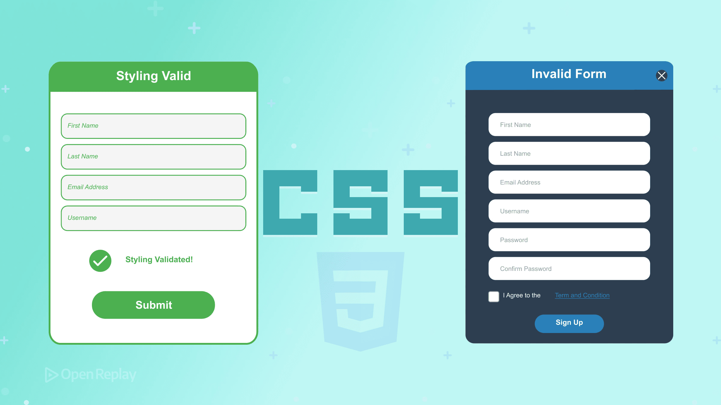
Styling Valid and Invalid Form States with CSS

Empty required fields glowing red before users type a single character. That’s the frustrating experience many forms deliver—and it’s entirely avoidable with modern CSS.
This guide covers CSS form validation states and the pseudo-classes that control them. You’ll learn when to use :valid and :invalid, why :user-valid and :user-invalid provide better UX, and how to style form errors with CSS using patterns like :has() for parent styling.
Key Takeaways
- HTML5 constraint validation works automatically with attributes like
required,type,min,max, andpattern - Avoid
:validand:invalidfor error styling as they trigger before user interaction - Use
:user-validand:user-invalidto show validation feedback only after users interact with fields - Combine
:has()with validation pseudo-classes to style parent elements and control error message visibility - Always pair visual validation with ARIA attributes for screen reader accessibility
How Constraint Validation Works
HTML5 constraint validation happens automatically. When you add attributes like required, type="email", min, max, minlength, maxlength, or pattern to form fields, browsers evaluate validity continuously.
The browser checks constraints whenever the input value changes. CSS pseudo-classes reflect this validity state in real-time, letting you style fields based on whether they pass or fail validation.
<input type="email" required minlength="5" />This field becomes invalid if empty, if the value isn’t email-formatted, or if it’s shorter than five characters.
Core CSS Form Pseudo-Classes
:valid and :invalid
These pseudo-classes match fields based on current validity:
input:valid {
  border-color: green;
}

input:invalid {
  border-color: red;
}
The problem: :invalid applies immediately on page load. A required field with no value is technically invalid before the user touches it. This creates a poor experience—users see errors before they’ve done anything wrong.
:required and :optional
These target fields based on the required attribute:
input:required {
  border-left: 3px solid blue;
}

input:optional {
  border-left: 3px solid gray;
}
Useful for visual indicators showing which fields must be completed.
:in-range and :out-of-range
For number and range inputs with min/max constraints:
input:in-range {
  background: white;
}

input:out-of-range {
  background: #ffe0e0;
}
Better UX with :user-valid and :user-invalid
The :user-valid and :user-invalid pseudo-classes solve the premature error problem. They only match after the user has interacted with the field—typically after editing and blurring.
input:user-invalid {
  border-color: red;
}

input:user-valid {
  border-color: green;
}
Now required fields don’t show errors on page load. Validation styling appears only after users have had a chance to enter data. This matches user expectations and reduces frustration.
These pseudo-classes have broad browser support and should be your default choice for styling form errors with CSS.

Discover how at OpenReplay.com.
Parent Styling with :has()
The :has() selector enables styling parent elements based on child validation states—something previously impossible without JavaScript.
<div class="field">
  <label for="email">Email</label>
  <input type="email" id="email" required />
  <span class="error">Please enter a valid email</span>
</div>
.error {
display: none;
color: red;
}
.field:has(input:user-invalid) .error {
display: block;
}
.field:has(input:user-invalid) input {
border-color: red;
}This pattern shows error messages only when the contained input fails validation after user interaction. The parent container controls visibility of sibling error elements.
Accessibility Considerations
Visual styling alone isn’t sufficient for accessible forms. Screen reader users need programmatic error associations.
Pair CSS validation states with proper ARIA attributes:
<div class="field">
  <label for="email">Email</label>
  <input
    type="email"
    id="email"
    required
    aria-describedby="email-error"
    aria-invalid="false"
  />
  <span id="email-error" class="error" aria-live="polite">
    Please enter a valid email
  </span>
</div>
Key accessibility requirements:
aria-describedbylinks the input to its error messagearia-live="polite"announces error changes to screen readersaria-invalidshould update via JavaScript when validation fails- Color contrast must meet WCAG requirements (4.5:1 for text)
- Don’t rely on color alone—use icons or text alongside color changes
Practical Pattern: Complete Field Validation
Here’s a production-ready pattern combining these techniques:
/* Base field styles */
.field input {
  border: 2px solid #ccc;
  transition: border-color 0.2s;
}

/* Valid state after interaction */
.field:has(input:user-valid) input {
  border-color: #2e7d32;
}

/* Invalid state after interaction */
.field:has(input:user-invalid) input {
  border-color: #c62828;
}

.field:has(input:user-invalid) .error {
  display: block;
}

/* Error message hidden by default */
.error {
  display: none;
  color: #c62828;
  font-size: 0.875rem;
  margin-top: 0.25rem;
}
This approach keeps error messages hidden until users interact with fields, then reveals them only when validation fails.
Conclusion
Modern CSS form pseudo-classes provide powerful validation styling without JavaScript. Use :user-valid and :user-invalid as your primary tools—they prevent premature error display and match user expectations. Combine them with :has() for parent-level styling that controls error message visibility.
Remember that visual styling supplements but doesn’t replace accessible error handling. Always pair CSS validation states with appropriate ARIA attributes for screen reader users.
FAQs
The :invalid pseudo-class matches any field that fails validation, including on page load before user interaction. The :user-invalid pseudo-class only matches after the user has interacted with and left the field. This prevents showing error styles on empty required fields before users have a chance to fill them in.
These pseudo-classes have broad support in modern browsers including Chrome, Firefox, Safari, and Edge. For older browser support, consider using the :focus and :not(:placeholder-shown) pseudo-classes as a fallback pattern, though this approach is less precise.
CSS validation pseudo-classes reflect the browser's constraint validation API state. If you prevent default form submission or use JavaScript to handle forms, ensure you call checkValidity() on form elements. The CSS states update based on the validity property, not submission attempts.
Use the :has() selector on a parent container to detect child input validation states. For example, .field:has(input:user-invalid) .error-message lets you show or hide sibling error elements based on whether the input inside that container fails validation after user interaction.
Truly understand users experience
See every user interaction, feel every frustration and track all hesitations with OpenReplay — the open-source digital experience platform. It can be self-hosted in minutes, giving you complete control over your customer data. . Check our GitHub repo and join the thousands of developers in our community..
