

Attention all frontend enthusiasts and curious minds! Are you tired of struggling to create React tables that look good and perform better? Well, have no fear because Tanstack Table is here, and this article will teach you all about it!
A Tanstack table is a workhorse built to filter, sort, group, aggregate, paginate, materialize, and display massive datasets. It offers many improved features, such as performance, server-side rendering (SSR) support, new hooks, and a more modern, flexible API. Its headless design doesn’t ship with components and markup styles, giving us full control over markup and styles. In this article, we will focus on how to start adding and styling our ReactJS tables using Tanstack Table. So, let’s dive in and see what Tanstack Table offers!
Preview of The Table API
The Table API is a collection of functions and objects used to build and render tables. Below are the library adapters to choose from.
Here are some of the key features of the Tanstack React Table API:
-
columns: This is an array of objects that define the table’s columns. Each object should contain at least a Header property, which is the label for the column, and an accessor property, which is a function that returns the value for a column based on the data. -
data: The data property is an array of objects representing the table’s rows. Each object should have properties corresponding to the accessor functions defined in the columns array. -
useReactTable: This hook creates a new table instance and returns the necessary functions and objects to render it. The functions include getTableProps, getTableBodyProps, headerGroups, and rows. -
getTableProps: The getTableProps function is a function that returns a set of props that should be applied to the<table>element. -
getTableBodyProps: The getTableBodyProps function is a function that returns a set of props that should be applied to the<tbody>element. -
headerGroups: The headerGroups property is an array of objects that represent the header groups of the table. Each object contains a headers property, an array of the columns in that group. -
rows: The rows property is an array of objects representing the table’s rows. Each object contains a cells property, an array of objects representing the cells in that row. -
prepareRow: This function prepares a row object for rendering by applying any necessary styles or props.
Installing and Importing Tanstack Table
Before we dig into the API, it’s important to note that we will be using Typescript with React, so when initializing your project, choose Typescript as the preferred language. This can easily be done using NextJS or ViteJS.
Let’s get set up! With our terminal pointing to our project folder, we can run the following command to install the Tanstack adapter for ReactJS.
npm install @tanstack/react-table
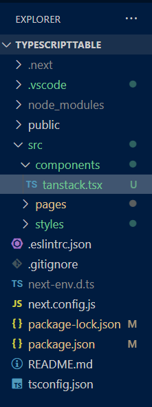
Next, we have to import it to use it. Quick, in our project working directory, navigate to our source folder, create a new folder, and name it components. In that folder, create a file, name it tanstack.tsx, and then add the following code.
import {
  createColumnHelper,
  flexRender,
  getCoreRowModel,
  useReactTable,
} from "@tanstack/react-table";
The code imports two of the most important functions from the library: createColumnHelper and useReactTable.
-. createColumnHelper is a helper function used to create column definitions for our table.
-. useReactTable is the main hook function that we’ll use to generate a table instance based on our data and column definitions.
Here’s the structure for our working directory.
Preparing the Data
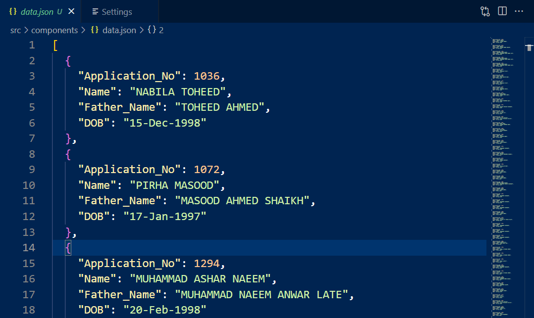
We will save our data in JSON format, so if you don’t already have it, we have a copy available. To use it in the application, navigate to the components folder, create a new file named data.json, and paste the data as an array of objects.
We must import the file into our React component tanstack.tsx.
tanstack.tsx
import {
  createColumnHelper,
  flexRender,
  getCoreRowModel,
  useReactTable,
} from '@tanstack/react-table'

import { defaultData } from './data.json';
Now that we have everything we need, we can define our table schema and create the table.
Setting Up Tables with Tanstack Table
In this section, we will use most of the functions available in the Table API. Let’s jump in and start defining our table. The first step is to create an object with the properties we need from our data. In TypeScript, we can do this by defining a TypeScript type object. In our case, let’s call it Student. This will later indicate that it holds an array defined as Student.
tanstack.tsx
type Student = {
  Application_No: number;
  Name: string;
  Father_Name: string;
  DOB: string;
};
We defined a TypeScript type Student that represents an object with properties such as Application No, Name, Father Name, and DOB.
Next, we’ll create a new instance of the createColumnHelper function, which we’ll use to define the table columns.
tanstack.tsx
const columnHelper = createColumnHelper<Student>();We will use the createColumnHelper() function to create a columnHelper object that we’ll use to define a columns object.
We must create the columns object to complete our table schema. It should contain an array of objects, each representing a column in the table. We create each object using the columnHelper.accessor() function, which returns an object with configuration options for the corresponding column.
tanstack.tsx
const columns = [
  columnHelper.accessor("Application_No", {
    header: "Registration No",
    cell: (info) => info.getValue(),
  }),
  columnHelper.accessor("Name", {
    header: "Name",
    cell: (info) => info.getValue(),
  }),
  columnHelper.accessor("Father_Name", {
    header: "Father Name",
    cell: (info) => info.getValue(),
  }),
  columnHelper.accessor("DOB", {
    header: "Date of Birth",
    cell: (info) => info.getValue(),
  }),
];
The accessor() function of the columnHelper specifies the data accessor for each column, which extracts the value of a property from the row of data in the data.json file.
We have successfully defined our table columns; our code should be like the one below.
tanstack.tsx
import {
  createColumnHelper,
  flexRender,
  getCoreRowModel,
  useReactTable,
} from "@tanstack/react-table";

import defaultData from "./data.json";

type Student = {
  Application_No: number;
  Name: string;
  Father_Name: string;
  DOB: string;
};

const columnHelper = createColumnHelper<Student>();

const columns = [
  columnHelper.accessor("Application_No", {
    header: "Registration No",
    cell: (info) => info.getValue(),
  }),
  columnHelper.accessor("Name", {
    header: "Name",
    cell: (info) => info.getValue(),
  }),
  columnHelper.accessor("Father_Name", {
    header: "Father Name",
    cell: (info) => info.getValue(),
  }),
  columnHelper.accessor("DOB", {
    header: "Date of Birth",
    cell: (info) => info.getValue(),
  }),
];
The next section will determine the final table output. In our tanstack.tsx file, below thecolumns object, we will define a React functional component named Table. This function will render a table using the useReactTable hook we imported earlier.
tanstack.tsx
function Table() {
  const [data, setData] = useState<Student[]>(defaultData);

  const table = useReactTable({
    data,
    columns,
    getCoreRowModel: getCoreRowModel(),
  });

  return <></>;
}
The Table function starts by initializing the data state to an array of Student objects using the useState hook, where each Student object will represent a table row.
Next, our useReactTable hook is called to create a table object. The hook takes an object with three properties:
data: An array of data representing the table’s rows.columns: An array of objects representing the table’s columns.getCoreRowModel: A function that returns a row model that specifies how the rows should be displayed.
The table object will render our table in the return statement of the Table function.
Before rendering our table, it’s key that we know what the <th>, <td>, and <tr> elements represent in tables.
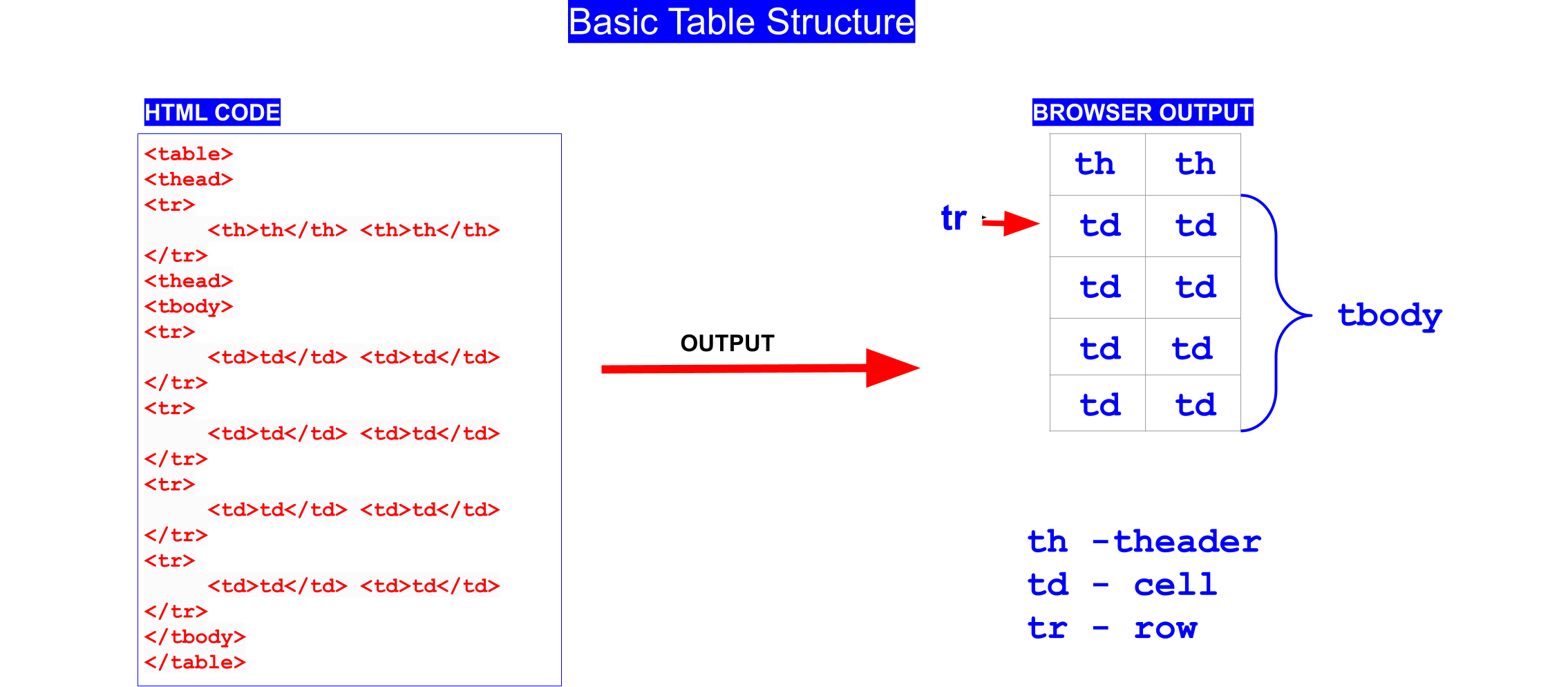
<th>: This element defines a header cell in a table. A header cell is typically used to label the columns or rows of the table and is displayed in bold to differentiate it from the other cells.
<td>: This element defines a standard cell in a table. Standard cells contain the main content of the table and are usually displayed with normal text formatting.
<tr>: This element defines a row in a table. A row comprises one or more cells; each cell is defined using either a <th> or <td> element.
By combining these elements, we can create tables that display information in a structured and organized way.
Return to our Table component and add the following code to our return statement.
tanstack.tsx
return (
  <div>
    <table>
      <thead>
        {table.getHeaderGroups().map((headerGroup) => (
          <tr key={headerGroup.id}>
            {headerGroup.headers.map((header) => (
              <th key={header.id}>
                {header.isPlaceholder
                  ? null
                  : flexRender(
                      header.column.columnDef.header,
                      header.getContext()
                    )}
              </th>
            ))}
          </tr>
        ))}
      </thead>
      <tbody>
        {table.getRowModel().rows.map((row) => (
          <tr key={row.id}>
            {row.getVisibleCells().map((cell) => (
              <td key={cell.id}>
                {flexRender(cell.column.columnDef.cell, cell.getContext())}
              </td>
            ))}
          </tr>
        ))}
      </tbody>
    </table>
  </div>
);
In the return section, we render the table using the data and columns defined earlier. We start by creating a <div> element that contains a <table> element. Inside the <table> is an <thead> element containing rows with table headers.
For each header group returned by the table.getHeaderGroups(), we used the map method to iterate over the headers and created a <th> element for each one. If the header in place is a placeholder, null is returned; if not, the flexRender function is used to render the header element.
The next section is the <tbody> element, which contains rows with table cells. For each row in the table, we used the map method to iterate over the cells and created a <td> element for each one. Inside each <td>, the flexRender function is used to render the cell element.
Let’s not forget to import our Table component to our root component.
import Table from "@/components/tanstack";
export default function Home() {
return (
<>
<Table />
</>
);
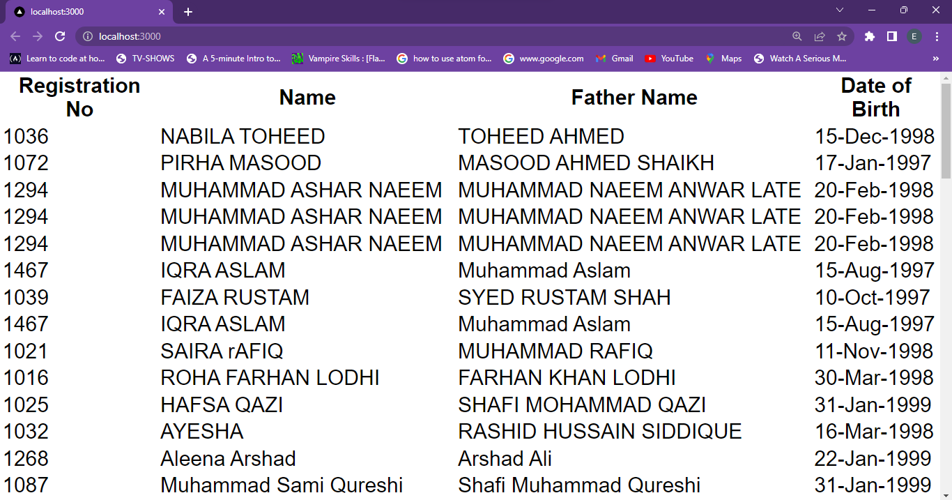
}Let’s run our project and check the rendered table in our browser.
Session Replay for Developers
Uncover frustrations, understand bugs and fix slowdowns like never before with OpenReplay — an open-source session replay tool for developers. Self-host it in minutes, and have complete control over your customer data. Check our GitHub repo and join the thousands of developers in our community.
Styling the Tanstack Table
Our table is now functional, but lacks visual appeal. To style it, we’ll use Styled-Components, which offers a CSS-in-JS approach that enables us to write structured and readable CSS code
We recommend checking their documentation if you have not been using Styled Components. We only need two styled components, TableContainer and StyledTable. TableContainer defines a div element with CSS styles applied as our table container.
Since Styled Components use regular CSS syntax to define styles, our StyledTable component will use th and td CSS selectors to target the <th> and <td> elements, respectively.
In the styles folder, let’s create a new tableStyles.ts file; here we will create all our required table styles.
/styles/tableStyle.ts
import styled from "styled-components";

export const TableContainer = styled.div`
  position: relative;
  left: 10%;
  display: flex;
  justify-content: center;
  align-items: center;
  font-size: 14px;
  max-width: 800px;
`;

export const StyledTable = styled.table`
  width: 100%;
  border-collapse: collapse;
  margin-top: 20px;
  font-size: 0.9em;

  th {
    background-color: slategray;
    color: white;
    padding: 5px;
    border: 1px solid #ddd;
    text-align: left;
  }

  td {
    background-color: hsl(240, 50%, 90%);
    padding: 5px;
    border: 1px solid #ddd;
    text-align: left;
  }

  tr:nth-child(even) td {
    background-color: hsl(240, 50%, 85%);
  }

  tr:hover td {
    background-color: #ddd;
  }
`;
The tr:nth-child(even) td selector applies a background color to every row of <td> elements, creating a striped effect. When a user hovers over a row, the tr:hover td selector applies a background color to the <td> element.
Next, we need to update our Table component with these styled-components. We will import and replace them with the respective tsx elements.
import {
createColumnHelper,
flexRender,
getCoreRowModel,
useReactTable,
} from "@tanstack/react-table";
import defaultData from "./data.json";
import { useState } from "react";
import { StyledTable, TableContainer } from "@/styles/tableStyle";
type Student = {
Application_No: number;
Name: string;
Father_Name: string;
DOB: string;
};
const columnHelper = createColumnHelper<Student>();
const columns = [
columnHelper.accessor("Application_No", {
header: "Registration No",
cell: (info) => info.getValue(),
}),
columnHelper.accessor("Name", {
header: "Name",
cell: (info) => info.getValue(),
}),
columnHelper.accessor("Father_Name", {
header: "Father Name",
cell: (info) => info.getValue(),
}),
columnHelper.accessor("DOB", {
header: "Date of Birth",
cell: (info) => info.getValue(),
}),
];
function Table() {
const [data, setData] = useState<Student[]>(defaultData);
const table = useReactTable({
data,
columns,
getCoreRowModel: getCoreRowModel(),
});
return (
<TableContainer>
<StyledTable>
<thead>
{table.getHeaderGroups().map((headerGroup) => (
<tr key={headerGroup.id}>
{headerGroup.headers.map((header) => (
<th key={header.id}>
{header.isPlaceholder
? null
: flexRender(
header.column.columnDef.header,
header.getContext()
)}
</th>
))}
</tr>
))}
</thead>
<tbody>
{table.getRowModel().rows.map((row) => (
<tr key={row.id}>
{row.getVisibleCells().map((cell) => (
<td key={cell.id}>
{flexRender(cell.column.columnDef.cell, cell.getContext())}
</td>
))}
</tr>
))}
</tbody>
</StyledTable>
</TableContainer>
);
}
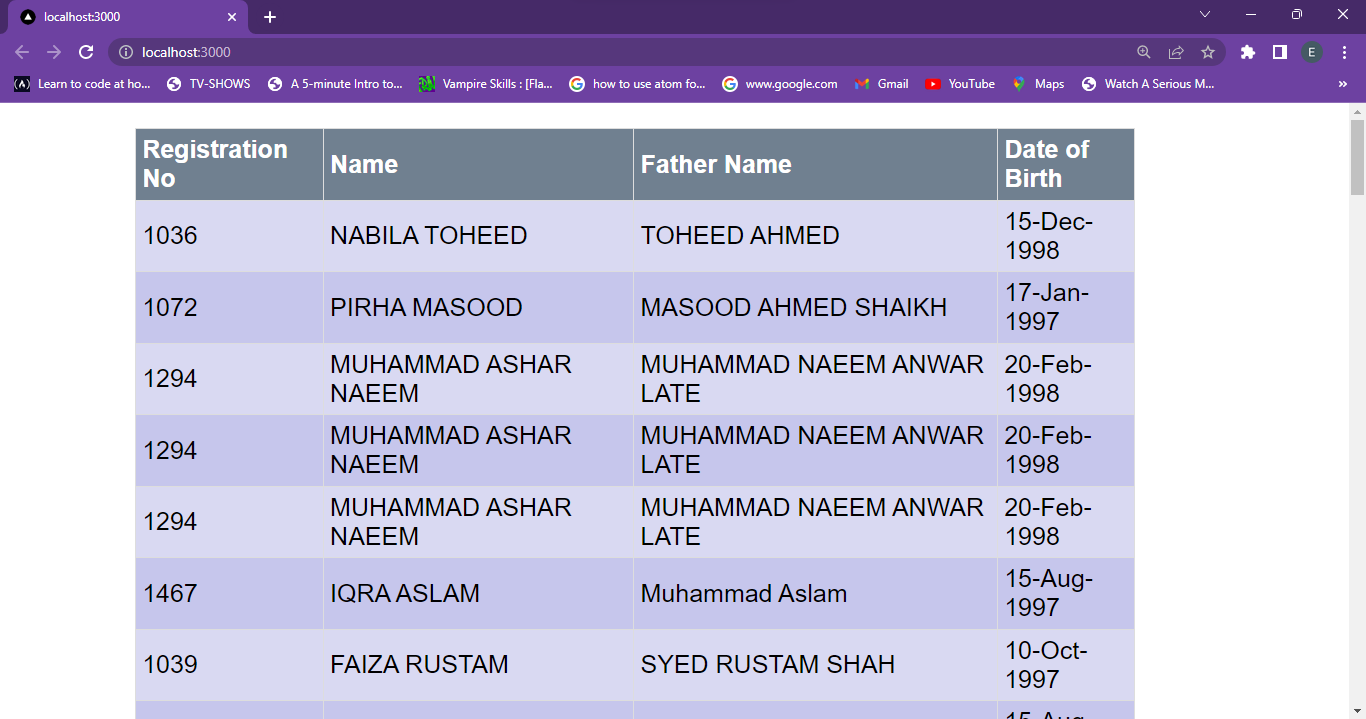
export default Table;Congratulations! For making it this far, our final Table version is now styled.
Now that the table looks great, you may want to check Tanstack’s documentation for other features such as adding pagination and sorting to improve the table’s usability further. They can help users navigate large data sets and make finding the information they need easier.
Conclusion
The process presented here exemplifies a well-structured Tanstack React table. By using type annotations and following best practices for React development, the code ensures that the table is easily maintainable and extensible in the future.
It is essential to note that this is just one way to create a table in React. We may use alternative approaches depending on the application’s specific requirements. By adopting the principles showcased, we can craft clean, maintainable code that effectively fulfills our needs.
References
Gain Debugging Superpowers
Unleash the power of session replay to reproduce bugs and track user frustrations. Get complete visibility into your frontend with OpenReplay, the most advanced open-source session replay tool for developers.