
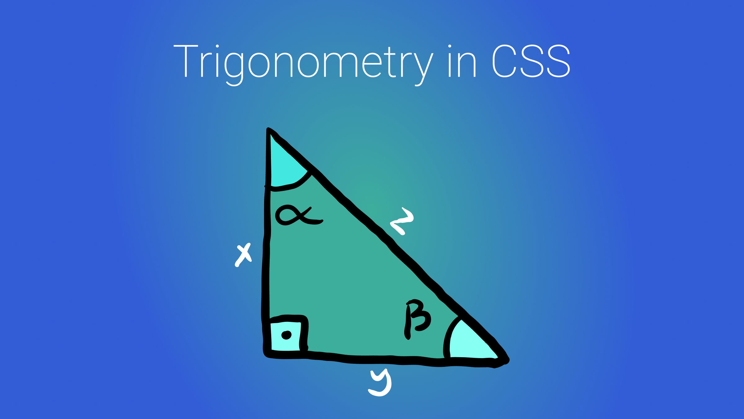
Whether or not you excelled in high school math, this article offers valuable insights to all readers on using trigonometry for your web designs, covering the theoretical aspects of trigonometric functions and how we can derive practical applications for creating appealing web designs.

Discover how at OpenReplay.com.
Many individuals debate whether CSS qualifies as a programming language. While I won’t contribute to that discussion, I urge you to pay more attention to CSS. Over time, this language—or technology—has become increasingly significant, especially with the integration of high-order functions like the focus of today’s discussion: trigonometric functions.
Trigonometric functions are crucial in precisely aligning components on a webpage, involving the specification of distances and degrees.
While there are various approaches to achieving this, we’ll explore a simpler and more direct method—CSS trigonometric functions—that contributes to the seamless rendering of webpage designs.
Take a moment to join me as we delve into the enhancements this new feature brings to web design.
Let’s jump right in.
Goals
CSS trigonometric functions excel in certain design scenarios, particularly those involving radial layouts, wavy lines, non-linear layouts with arcs, and animations. If you’re keen on creating these kinds of designs, this article is tailor-made for you.
By the end of this reading, you’ll acquire the following insights:
- Gain a clear comprehension of the fundamental concepts behind trigonometry.
- Learn how trigonometry influences and enhances various aspects of web design.
- Develop an understanding of leveraging trigonometric functions to create circular or wave-like elements in your designs.
Brushing Up on Trigonometry
Trigonometry, a branch of mathematics, delves into the intricate relationship between angles and the side lengths of triangles.
Trigonometric functions, in turn, enable the calculation of unknown values within a right-angled triangle based on known parameters. In this context, the unknown values encompass the triangles’ angles and side lengths.
Once these unknown values are determined, they play a pivotal role in calculating coordinates, which are essential for accurately positioning elements in various contexts.
Here’s the rationale behind trigonometry: Imagine standing and gazing at a house, attempting to measure the distance from your head to the top of the house, which is hypothetically taller than you. This task would prove challenging.
However, if you know the distance from yourself to the house and the height of the house, the process becomes more manageable. To clarify, these different distances have distinct names:
- The distance from your head to the house’s roof is termed the HYPOTENUSE.
- The distance from yourself to the house is called the ADJACENT.
- The height of the house is labeled the OPPOSITE.
Refer to Michelle Barker’s illustrative depiction below for a clearer visual representation.
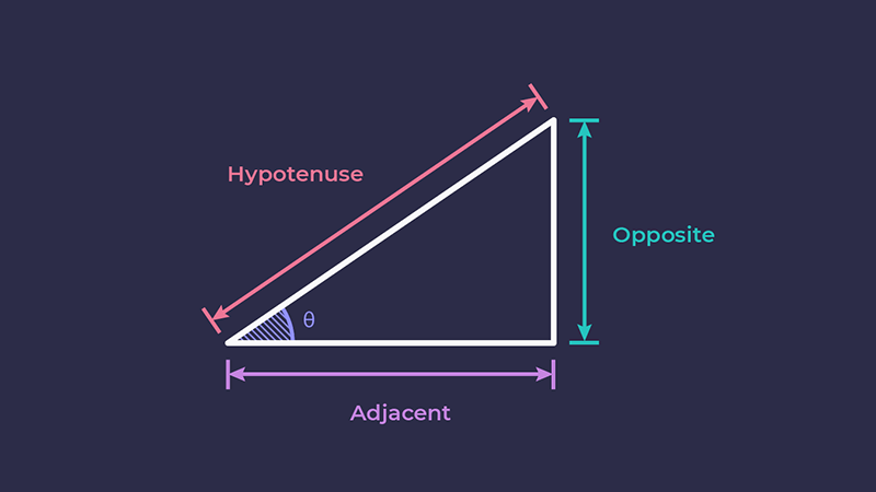
Trigonometric functions play a crucial role in angle calculations. In the depicted right-angled triangle, where the hypotenuse, adjacent, and opposite sides provide angles, specific functions are used to calculate these angles. These functions are commonly known as sine(sin), cosine(cos), and tangent (tan). The respective equations for obtaining these functions are as follows:
The angle between the opposite and hypothenuse is called the sine, and it is calculated with the equation below:
sine = opposite/hypothenuseThe angle between the adjacent and hypothenuse is called the cos, and it is calculated with the equation below:
cos = adjacent/hypothenuseThe angle between the opposite and adjacent is called the tan, and it is calculated with the equation below:
tan = opposite/adjacentNow, the significant question is: how is this useful in real life? A right-angled triangle represents the simplest application of trigonometry, as illustrated in the house example.
However, we can determine the coordinates of more complex shapes, webpages, navigation, and more by breaking them down into right-angled triangles and acquiring their lengths and angles.
It’s important to note that we are not manually performing these calculations; instead, mathematical algorithms running within browsers and on the web handle this task.
Also, these mathematical algorithms go beyond web design. They utilize angles to obtain coordinates, which are then employed in various real-life applications, including engineering, architecture, physics, and navigation.
Here are some key real-life applications of trigonometry:
- Navigation: Trigonometry is crucial for determining positions, plotting courses over long distances, and accurately setting directions.
- Architecture: Architects use trigonometry to calculate structural loads, angles, and material lengths and ensure the safety and aesthetics of buildings.
- Engineering: In engineering, trigonometry is utilized to design mechanical components, analyze forces, solve wave-related problems, and more.
- Astronomy: Astronomers use trigonometry to calculate the distances to stars and planets, understand orbits, and map the universe.
In the upcoming sections, you will better understand the relationship between trigonometry and our work as developers.
Trigonometry and Web Design
One of the ways CSS directs the browser to accurately place components on a webpage is with trigonometry.
Even though we do not directly use trigonometry to position elements, CSS uses it to calculate coordinates relative to another element, creating a relative positioning system.
Webpages adhere to a cartesian coordinate system beneath the surface, where elements are situated at specific (x, y) coordinates.
Trigonometric functions utilize the relationships between angles and sides in right-angled triangles or employ polar coordinates for circular or curved paths. This involves applying trigonometric ratios—such as sine, cosine, and tangent—to determine the lengths of sides and angles in triangles. Subsequently, this information is used to find coordinates within a coordinate system.
Therefore, when you want to direct the placement of your components, CSS uses complex trigonometric algorithms to enhance accuracy.
Trigonometry Use Cases in Web Design
Trigonometry holds significance in web development through its application in the coordinate system, ensuring accurate mapping of positions, distances, and angles for elements on web pages. The following examples illustrate the relevance of trigonometry in the web’s coordinate system:
- Transformation and Rotation: If you want to rotate an element by a specific angle, you can use trigonometry to calculate the new coordinates of the element after the rotation. This is particularly useful for creating dynamic and visually appealing animations.
- Responsive Design: Trigonometry helps calculate the appropriate positions and sizes appropriate for different screen sizes. For instance, you might use trigonometric functions to ensure an element remains centered or aligned at a specific angle regardless of the screen dimensions.
- Parallax Scrolling: Although parallax scrolling effects are not solely dependent on trigonometry but also involve three-dimensional design manipulation, trigonometric functions are used under the hood by CSS algorithms to calculate the angles and distances between different layers of content, ensuring that they move at the correct speeds to create the desired effect. For example, the parallax angle can be calculated using the tangent function, a fundamental trigonometry concept.
- Animating Paths: Using trigonometric functions, you can calculate the coordinates at different points along the path to create smooth animations along circular or curved paths.
Simple Use Case
Understanding these concepts is significant because it allows us to directly implement trigonometry by invoking trigonometric functions in CSS. Let’s explore how to achieve this starting now.
The initial demonstration is straightforward, showcasing a circular layout of shapes around the center. Without trigonometric functions, determining the coordinates for aligning these shapes would involve a seemingly arbitrary process. However, by utilizing trigonometric functions, you can precisely specify the angles at which you want the shapes to align, and they will do so seamlessly. Let’s delve into how this works:
- Considering you have these HTML elements, which are child
div’s of a.parentdiv:
<div class="parent">
  <div class="circle"></div>
  <div class="circle"></div>
  <div class="circle"></div>
  <div class="circle"></div>
  <div class="circle"></div>
  <div class="circle"></div>
  <div class="circle"></div>
  <div class="circle"></div>
  <div class="circle"></div>
  <div class="circle"></div>
  <div class="circle"></div>
  <div class="circle"></div>
</div>- To target the page’s
.parentdiv, employ the following CSS. This step is crucial as it sets the foundation for obtaining the angles required to strategically position elements around it:
body {
  min-height: 100vh;
  display: grid;
  place-items: center;
}

.parent {
  width: 50px;
  aspect-ratio: 1;
  background: black;
  border-radius: 50%;
  position: relative;
}- This gives styling to the
.parentdivand centers it, as shown in the image below:
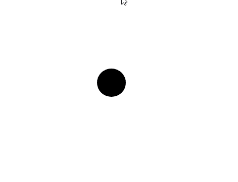
Take note that from this point, we will need to position the elements that will revolve around it.
Manual Positioning
Note:This is a continuation of the demo and code above
If we were to proceed directly with trigonometric positioning, I believe you might not fully appreciate the impact of trigonometry in this particular scenario. Therefore, let’s attempt to manually position these elements first.
- To manually position these elements, we can achieve this by implementing the following changes to the CSS:
.circle {
  --size: 25px;
  width: var(--size);
  aspect-ratio: 1;
  background-color: red;
  position: absolute;
  top: calc(var(--size/2));
  left: calc(var(--size/2));
  border-radius: 50%;
}

.circle:nth-of-type(1) {
  transform: translate(75px, 75px);
}

.circle:nth-of-type(2) {
  transform: translate(0px, 100px);
}- First and foremost, the
.circleclass imparts styling to all elements bearing that class. - We aim to position the child
.circleelements around the central.parentelement. However, my current approach involves a rather ineffective method, attempting to guess the coordinates for perfect alignment of the.circleelements around the central circle. - Take note of the image below, illustrating how dispersed the child elements are, with even the first child residing within the central black element:
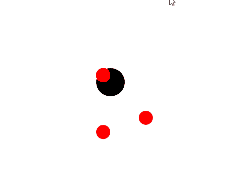
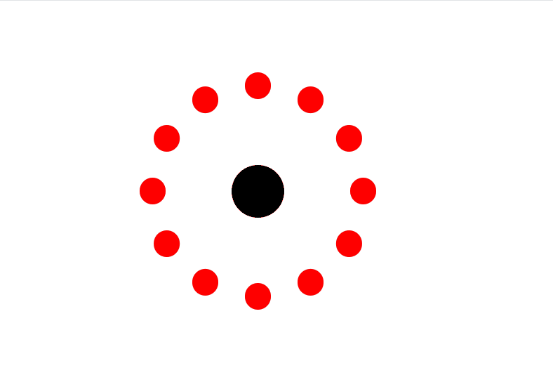
Imagine having to guess the coordinates for all twelve child elements to achieve a flawless revolution of circles around the black circle. Come on! We’re programmers, not magicians.
Trigonometric Positioning
In a scenario where you are developing a frontend component like this, just envision the time you would spend trying to guess these coordinates—time that could be better spent watching Manchester United beat Chelsea or cuddling your puppy. With trigonometric functions, a task like this becomes a breeze in CSS.
By employing the CSS sin and cos trigonometric functions, we can obtain accurate coordinates for alignment. The choice of these functions is grounded in orthogonality; the cosine and sine ratios are orthogonal, signifying their perpendicular relationship.
Utilizing cosine for the x-axis and sine for the y-axis ensures that the resulting vectors are perpendicular, adhering to geometric conventions in Cartesian coordinate systems. This system underlies the positioning of elements on a webpage.
Note:This is a continuation of the demo and code above
- To position the red child circles around the central black circle, let’s make modifications to the preceding CSS snippet:
.circle {
  --size: 25px;
  --offset: 100px;
  width: var(--size);
  aspect-ratio: 1;
  border-radius: 50%;
  background-color: red;
  position: absolute;
  left: calc(var(--size) / 2);
  top: calc(var(--size) / 2);

  /* Change in this class */
  transform: translate(
    calc(cos(var(--degrees)) * var(--offset)),
    calc(sin(var(--degrees)) * var(--offset))
  );
}

/* Change from below here */
.circle:nth-of-type(1) {
  --degrees: 0deg;
}

.circle:nth-of-type(2) {
  --degrees: 30deg;
}

.circle:nth-of-type(3) {
  --degrees: 60deg;
}

.circle:nth-of-type(4) {
  --degrees: 90deg;
}

.circle:nth-of-type(5) {
  --degrees: 120deg;
}

.circle:nth-of-type(6) {
  --degrees: 150deg;
}

.circle:nth-of-type(7) {
  --degrees: 180deg;
}

.circle:nth-of-type(8) {
  --degrees: 210deg;
}

.circle:nth-of-type(9) {
  --degrees: 240deg;
}

.circle:nth-of-type(10) {
  --degrees: 270deg;
}

.circle:nth-of-type(11) {
  --degrees: 300deg;
}

.circle:nth-of-type(12) {
  --degrees: 330deg;
}- Despite appearing as a substantial amount of new code, this approach yields optimal results in a significantly shorter timeframe.
- The initial step involves placing the
transformproperty within the.circleclass. Subsequently, thetransformproperty incorporates placeholders for computing the horizontal and vertical coordinates, utilizing the--degreevariable for each degree multiplied by the--offsetvariable, which determines the distance from the central circle to the outer circles. - For each
divwith the.circleclass, we simply specify the degree, and behind the scenes, this works seamlessly to generate precise coordinates. - Voila! We now have a perfectly coordinated set of elements revolving around our central element. Observe in the image below how they align at the same distance from each other:
Advanced Use Case: Accurate Animations
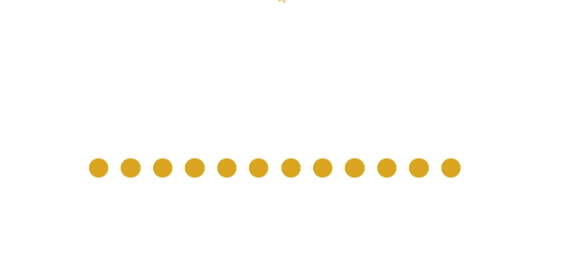
Now, let’s leverage trigonometric functions to not only attain precise positions but also determine movements based on the positions of relative elements. In this more advanced demonstration, we will utilize trigonometric functions to smoothly animate elements.
While using the same HTML elements, there will be notable adjustments to the CSS styling to accomplish a wave-like animation effect:
- Introduce new styling to the CSS:
body {
  min-height: 100vh;
  display: grid;
  place-items: center;
}

.parent {
  display: flex;
  gap: 1rem;
  border-radius: 50%;
  position: relative;
}

.circle {
  --size: 25px;
  width: var(--size);
  aspect-ratio: 1;
  border-radius: 50%;
  background-color: goldenrod;
  animation: rise 5s ease-in-out alternate infinite;
}

@keyframes rise {
  to {
    transform: translateY(-500%);
  }
}- The
.parentelement has been removed, and all.circlechild elements are styled withflexto create a linear arrangement. The.circleclass now incorporates a slight animation, with movement specified using the@keyframesproperty. - Observe in the image below the upward and downward movement of the golden balls:
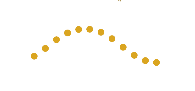
- The concept for the next step is to precisely animate these balls in a wave-like pattern. To achieve this, we need to employ trigonometric functions. As the first ball is animated, the second ball and subsequent ones will be animated at specific coordinates. To implement this, we simply utilize the
sinfunction to obtain the relative Y coordinates at different times:
.circle:nth-of-type(1) {
  animation-delay: calc(sin(50deg) * 1s);
}

.circle:nth-of-type(2) {
  animation-delay: calc(sin(50deg) * 2s);
}

.circle:nth-of-type(3) {
  animation-delay: calc(sin(50deg) * 3s);
}

.circle:nth-of-type(4) {
  animation-delay: calc(sin(50deg) * 4s);
}

.circle:nth-of-type(5) {
  animation-delay: calc(sin(50deg) * 5s);
}

.circle:nth-of-type(6) {
  animation-delay: calc(sin(50deg) * 6s);
}

.circle:nth-of-type(7) {
  animation-delay: calc(sin(50deg) * 7s);
}

.circle:nth-of-type(8) {
  animation-delay: calc(sin(50deg) * 8s);
}

.circle:nth-of-type(9) {
  animation-delay: calc(sin(50deg) * 9s);
}

.circle:nth-of-type(10) {
  animation-delay: calc(sin(50deg) * 10s);
}

.circle:nth-of-type(11) {
  animation-delay: calc(sin(50deg) * 11s);
}

.circle:nth-of-type(12) {
  animation-delay: calc(sin(50deg) * 12s);
}- In this scenario, each
.circleis positioned at the same coordinate relative to each other, but at different times, thanks to the functionanimation-delay: calc(sin(50deg) * 8s);. - Achieving this wavy-like effect wouldn’t have been as straightforward without trigonometric functions to determine the coordinates for placing the balls.
- Consequently, we attain our visually appealing wavy effect, as illustrated in the image below:
Conclusion
CSS trigonometry is supported by all major browsers as of this writing.
Trigonometry has always been a powerful tool in web development, but it can now be directly manipulated through CSS, providing developers with a systematic approach to creating complex web components.
Through practical applications in the Cartesian coordinate system, trigonometric functions enable precise positioning of elements, responsive designs, and dynamic animations.
By embracing trigonometry, developers unlock a creative force that goes beyond guesswork, offering efficiency and innovation in design.
It becomes a reliable companion, propelling designs to new heights and turning mathematical concepts into dynamic design solutions for the web. Stay curious!
Truly understand users experience
See every user interaction, feel every frustration and track all hesitations with OpenReplay — the open-source digital experience platform. It can be self-hosted in minutes, giving you complete control over your customer data.
Star on GitHub12k