The Power of Custom Properties in CSS
How to use CSS custom properties (variables) for more flexible styling


CSS custom properties, commonly known as variables, are powerful features that allow developers to define reusable values within their stylesheets. By utilizing custom properties, developers can significantly enhance code reusability and maintainability, and create dynamic styles for their web projects. This article aims to comprehensively explain CSS custom properties and their application using the var function.

Discover how at OpenReplay.com.
CSS custom properties, denoted by their names starting with two hyphens, (--), act as containers for holding values that can be reused throughout the stylesheet. These custom properties can store various data types, including colors, measurements, and even strings. The primary purpose of CSS custom properties is to make it easier to manage and update repetitive values across the entire CSS document. A good way to use CSS variables is when it comes to the colors of your design. Instead of copying and pasting the same colors over and over again, you can place them in variables.
With traditional CSS, repetitive values must be manually replaced whenever changes are required. This process can be time-consuming and prone to errors, especially in large projects. Custom properties solve this problem by allowing developers to store values in a centralized manner, making it simple to modify them globally.
The Traditional CSS
The following example shows the traditional way of defining some colors in a style sheet (by defining the colors to use for each specific element):
<!DOCTYPE html>
<html lang="en">

<head>
  <meta charset="UTF-8">
  <meta name="viewport" content="width=device-width, initial-scale=1.0">
  <title>Document</title>
</head>
<style>
  body {
    background-color: #738fab;
  }

  h2 {
    border-bottom: 2px solid #1e90ff;
  }

  .container {
    color: #1e90ff;
    background-color: #ffffff;
    padding: 15px;
  }

  button {
    background-color: #ffffff;
    color: #1e90ff;
    border: 1px solid #1e90ff;
    padding: 5px;
  }
</style>

<body>
  <h1>The Traditional Way</h1>
  <div class="container">
    <h2>My header</h2>
    <p>This is a sample paragraph using the primary colour defined by the CSS variable.</p>
    <p>This is another paragraph within the container.</p>
    <button>Yes</button>
    <button>No</button>
  </div>
</body>

</html>
The output is as follows:
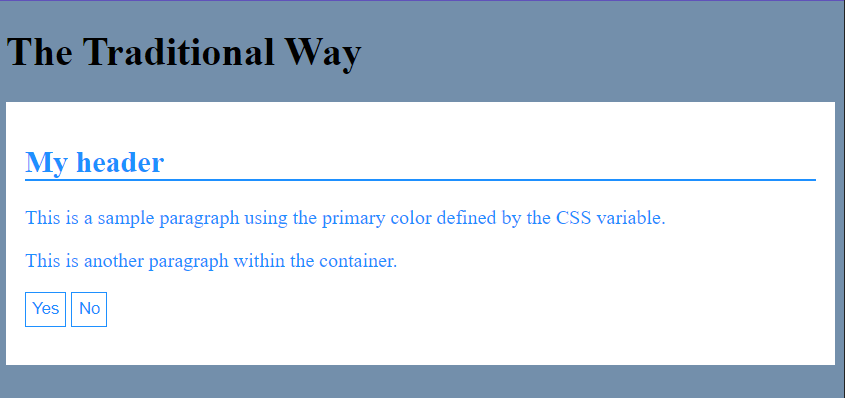
This code creates a simple HTML document with CSS styles for a blue-themed page. The page’s background color is a shade of blue, the headings have blue underlines, and there is a container with a white background, blue text, and padding around its contents. Additionally, two buttons are styled with blue text, white background, and blue borders. In this traditional way, you noticed that the class .container and the button selector button in the CSS style have the same color and background-color values.
However, the code could be improved for larger projects. In the CSS styles, both the .container class and the button selector have the same color and background-color values set to blue and white, respectively. It would be cumbersome if you need to adjust the colors for the entire project because you have to change each value separately.
To make things easier to manage in larger projects, using the variables var function is recommended. Using variables, you can define color values in one place and reuse them throughout the stylesheets. This way, if you want to change the colors later on, you only need to modify the variable values, and it will update the colors across the entire project.
Importance of Using var functions in CSS
The var function is the key to unlocking the potential of CSS custom properties. It enables the usage of the stored custom property values throughout the stylesheet. Using the var function, developers can reference the custom property value wherever needed, making it easier to maintain consistency and update values across the project.
The benefits of using the var function, as it will be demonstrated in detail in this article, include:
- Code Reusability: With var, developers can reuse the same custom property value at multiple locations within the stylesheet, reducing redundancy and improving maintainability.
- Global Changes: Since custom properties are defined globally, modifying their values can instantly apply changes to all elements that utilize the specific variable.
- Dynamic Styling: By combining var with other CSS functions and expressions, developers can create dynamic and adaptive styles that adjust based on user interactions, viewport sizes, or other conditions.
Exploring CSS Custom Properties
Let’s get into CSS custom properties now.
Definition and Syntax of CSS Custom Properties
Defining a CSS custom property involves using the -- prefix followed by a unique name and assigning it a value. The syntax is as follows:
:root {
  --custom-property-name: value;
}
In the above syntax, :root refers to the highest-level element (usually the html tag) and ensures that the custom property is available globally. However, custom properties can also be defined within specific elements to create local scope, which we’ll explore later.
How to use CSS variables
Defining CSS Variables: To define a CSS variable, you declare it within a selector block or the :root pseudo-class, which makes it global and accessible throughout the stylesheet. Here’s an example of defining CSS variables:
:root {
  --primary-color: #1e90ff;
  --background-color: #738fab;
  --button-padding: 5px;
}
In this example, we’ve defined three variables with their respective values: -primary-color, --background-color, and --button-padding.
Using CSS Variables: You can use the defined CSS variables by referencing them with the var() function. Here’s how you can use the variables in your styles:
body {
  background-color: var(--background-color);
}

h2 {
  border-bottom: 2px solid var(--primary-color);
}

.container {
  color: var(--primary-color);
  background-color: #ffffff;
  padding: var(--button-padding);
}

button {
  background-color: #ffffff;
  color: var(--primary-color);
  border: 1px solid var(--primary-color);
  padding: var(--button-padding);
}
In this example, we’ve used the CSS variables --background-color, --primary-color, and --button-padding in the appropriate styles, making it easy to apply consistent values across the entire stylesheet.
Full code
<!DOCTYPE html>
<html lang="en">
<head>
<meta charset="UTF-8">
<meta name="viewport" content="width=device-width, initial-scale=1.0">
<title>Example Page</title>
<style>
:root {
--background-color: #e910cc;
--primary-color: #000000;
--button-padding: 5px;
}
body {
background-color: var(--background-color);
}
h2 {
border-bottom: 2px solid var(--primary-color);
}
.container {
color: var(--primary-color);
background-color: #ffffff;
padding: var(--button-padding);
}
button {
background-color: #ffffff;
color: var(--primary-color);
border: 1px solid var(--primary-color);
padding: var(--button-padding);
}
</style>
</head>
<body>
<h1>Example of using var function</h1>
<div class="container">
<h2>Lorem Ipsum</h2>
<p>This is a sample paragraph using the primary color defined by the CSS variable.</p>
<p>This is another paragraph within the container.</p>
<p>
<button>Click Me</button>
<button>Submit</button>
</p>
</div>
</body>
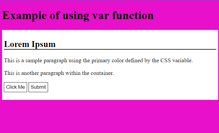
</html>We’ve created a simple HTML page with the provided CSS styles in this example. The :root level CSS variables are set for --background-color, --primary-color, and --button-padding. Then, the CSS styles use these variables to style the elements accordingly.
The<body> background color is set using var(--background-color), the <h2> element’s bottom border color is set using var(--primary-color), and the .container’s text color, background color, and padding are set using var(--primary-color) and var(--button-padding) respectively. Similarly, the <button> elements use the defined CSS variables for their text color, background color, border color, and padding.
Adjusting the color scheme becomes much easier by using these variables throughout the styles. Changing the value of --background-color or --primary-color in the :root will instantly apply the new colors to the entire page, including the background, headings, containers, and buttons. This approach offers a convenient way to maintain and update the color theme for the entire project from a central location.
The output is as follows:
Browser Support and Compatibility Consideration
CSS custom properties, including the var function, enjoy widespread browser support, with compatibility extending to modern versions of major browsers, including Chrome, Firefox, Safari, Edge, and Opera. However, verifying the specific versions supported to ensure compatibility with older browsers is essential, especially if you need to support Internet Explorer.
As of writing this article, most modern browsers provide excellent support for CSS custom properties and the var function, making it a reliable feature for contemporary web development.
Managing Global and Local Scope
CSS custom properties have either a global or local scope. When defined within :root, the custom property is accessible globally and can be used anywhere in the stylesheet. On the other hand, defining a custom property within a specific selector limits its scope to that selector and its descendants.
Global Scope Variable
Global variables are ideal for values that must be consistent throughout the project. For instance, theme colors, spacing values, or typography scales can be defined as global variables to maintain consistency.
Example code
:root {
  /* Global variables for theme colors */
  --primary-color: #007bff;
  --secondary-color: #6c757d;
  --accent-color: #ffc107;
  --text-color: #333333;
  --background-color: #f8f8f8;

  /* Global variables for spacing values */
  --spacing-small: 8px;
  --spacing-medium: 16px;
  --spacing-large: 24px;

  /* Global variables for typography */
  --font-family: 'Arial', sans-serif;
  --font-size-small: 14px;
  --font-size-medium: 18px;
  --font-size-large: 24px;
}

/* Example of using the global variables for theme colors */
.theme-element {
  color: var(--text-color);
  background-color: var(--background-color);
}

/* Example of using the global variables for spacing values */
.spacer {
  margin: var(--spacing-medium);
}

/* Example of using the global variables for typography */
.custom-text {
  font-family: var(--font-family);
  font-size: var(--font-size-large);
}
Here’s an explanation of the code:
- The
:rootselector is a special selector that represents the document’s root, in this case, the HTML document. This block sets several global variables for theme colors, spacing values, and typography. These variables are prefixed with--to indicate they are custom properties. - The
--primary-color,--secondary-color,--accent-color,--text-color, and--background-colorare custom properties for theme colors. They are assigned specific color values. For example,--primary-coloris set to#007bff(a shade of blue). - The
--spacing-small,--spacing-medium, and--spacing-largeare custom properties for spacing values. They are assigned different numeric values representing pixel units. For example,--spacing-mediumis set to16px. - The
--font-family,--font-size-small,--font-size-medium, and--font-size-largeare custom properties for typography. They set the font family and font size for different elements. - The
.theme-elementclass uses the custom properties for theme colors. It sets the color property tovar(--text-color), which resolves to--text-colorvalue. Similarly, it sets thebackground-colorproperty tovar(--background-color). - The
.spacerclass uses the custom properties for spacing. It sets the margin property tovar(--spacing-medium), which resolves to--spacing-mediumvalue. - The
.custom-textclass uses the custom properties for typography. It sets the font-family property tovar(--font-family), which resolves to--font-familyvalue. It also sets the font-size property tovar(--font-size-large), which resolves to--font-size-largevalue.
Here’s a full HTML file with an internal CSS style to demonstrate the usage of this global scope:
<!DOCTYPE html>
<html>
<head>
<style>
:root {
/* Global variables for theme colors */
--primary-color: #007bff;
--secondary-color: #6c757d;
--accent-color: #ffc107;
--text-color: #333333;
--background-color: #f8f8f8;
/* Global variables for spacing values */
--spacing-small: 8px;
--spacing-medium: 16px;
--spacing-large: 24px;
/* Global variables for typography */
--font-family: 'Arial', sans-serif;
--font-size-small: 14px;
--font-size-medium: 18px;
--font-size-large: 24px;
}
/* Example of using the global variables for container border */
.container {
border: 2px solid var(--text-color);
}
/* Example of using the global variables for theme colors */
.theme-element {
color: var(--text-color);
background-color: var(--background-color);
padding: var(--spacing-medium);
}
/* Example of using the global variables for spacing values */
.spacer {
margin: var(--spacing-medium);
}
/* Example of using the global variables for typography */
.custom-text {
font-family: var(--font-family);
font-size: var(--font-size-large);
}
</style>
</head>
<body class="container">
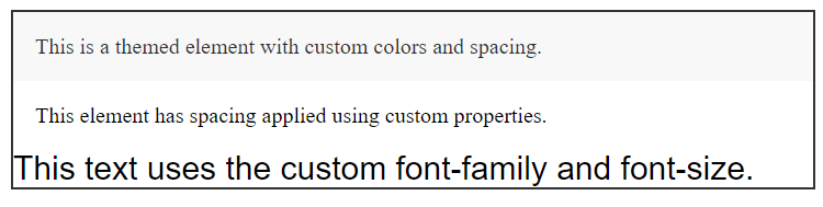
<div class="theme-element">
This is a themed element with custom colors and spacing.
</div>
<div class="spacer">
This element has spacing applied using custom properties.
</div>
<div class="custom-text">
This text uses the custom font-family and font-size.
</div>
</body>
</html>In this example, you’ll see four different classes: .container, .theme-element, .spacer, and .custom-text, each demonstrating the use of custom properties for theme colors, spacing, and typography, respectively. The custom properties defined in the :root block are applied to these elements, providing consistent and reusable styles throughout the document.
The output is as follows:
Local Scope Variable
Local variables, on the other hand, are useful for specific component styles or cases where you need different values in different parts of the project. This can prevent unintended side effects when modifying global variables.
Example code
/* Local component styles using local variables */
.component-container {
  /* Local variables for this component */
  --button-background-color: #ffc107;
  --button-text-color: #ffffff;
  display: flex;
  flex-direction: column;
  align-items: center;
  margin: 24px;
}

.component-button {
  /* Using local variables for button styles */
  background-color: var(--button-background-color);
  color: var(--button-text-color);
  font-size: 16px;
}
We use local variables for specific components by defining CSS custom properties inside the .component-container class. Each component can have its local variables to customize its appearance.
The .component-button class inside the .component-container uses these local variables for background color and text color, which are unique to each component. This way, modifying the local variables only affects the respective component’s styles and does not interfere with other components or global styles. This approach prevents unintended side effects when modifying global variables.
Here’s an example to illustrate the code:
<!DOCTYPE html>
<html>

<head>
  <style>
    /* Local component styles using local variables */
    .component-container {
      /* Local variables for this component */
      --button-background-color: #ffc107;
      --button-text-color: #ffffff;
      display: flex;
      flex-direction: column;
      align-items: center;
      margin: 24px;
    }

    .component-button {
      /* Using local variables for button styles */
      background-color: var(--button-background-color);
      color: var(--button-text-color);
      font-size: 16px;
      padding: 8px 16px;
      border: none;
      border-radius: 4px;
      cursor: pointer;
    }
  </style>
</head>

<body>
  <div class="component-container">
    <button class="component-button">Click me!</button>
  </div>
</body>

</html>
In this example, we have a simple HTML document with a component container that contains a button with the class component-button. The .component-container class defines local variables --button-background-color and --button-text-color, which are specific to this component.
The .component-button class uses these local variables to style the background-color and color buttons. Instead of hardcoding colors directly in the .component-button class, we use var(--button-background-color) and var(--button-text-color) to reference the values defined in the .component-container class.
This way, the button will always have the background and text color defined by the local variables in its parent .component-container. If you use the .component-container class in multiple places on your website, you can easily modify the button’s appearance by changing the values of the local variables in that particular container.
This approach promotes the reusability and maintainability of component styles by encapsulating them within their respective containers, making it easier to manage and update styles across your website.
The output is as follows:

Avoiding Naming Conflicts and Maintaining a Clean Stylesheet
Use descriptive names for custom properties to avoid naming conflicts with existing or future CSS properties. Additionally, it’s good practice to document the purpose of each custom property to ensure clarity for anyone working with the stylesheet.
Maintaining a clean and organized stylesheet involves grouping related custom properties and adopting a consistent naming convention.
Example Code
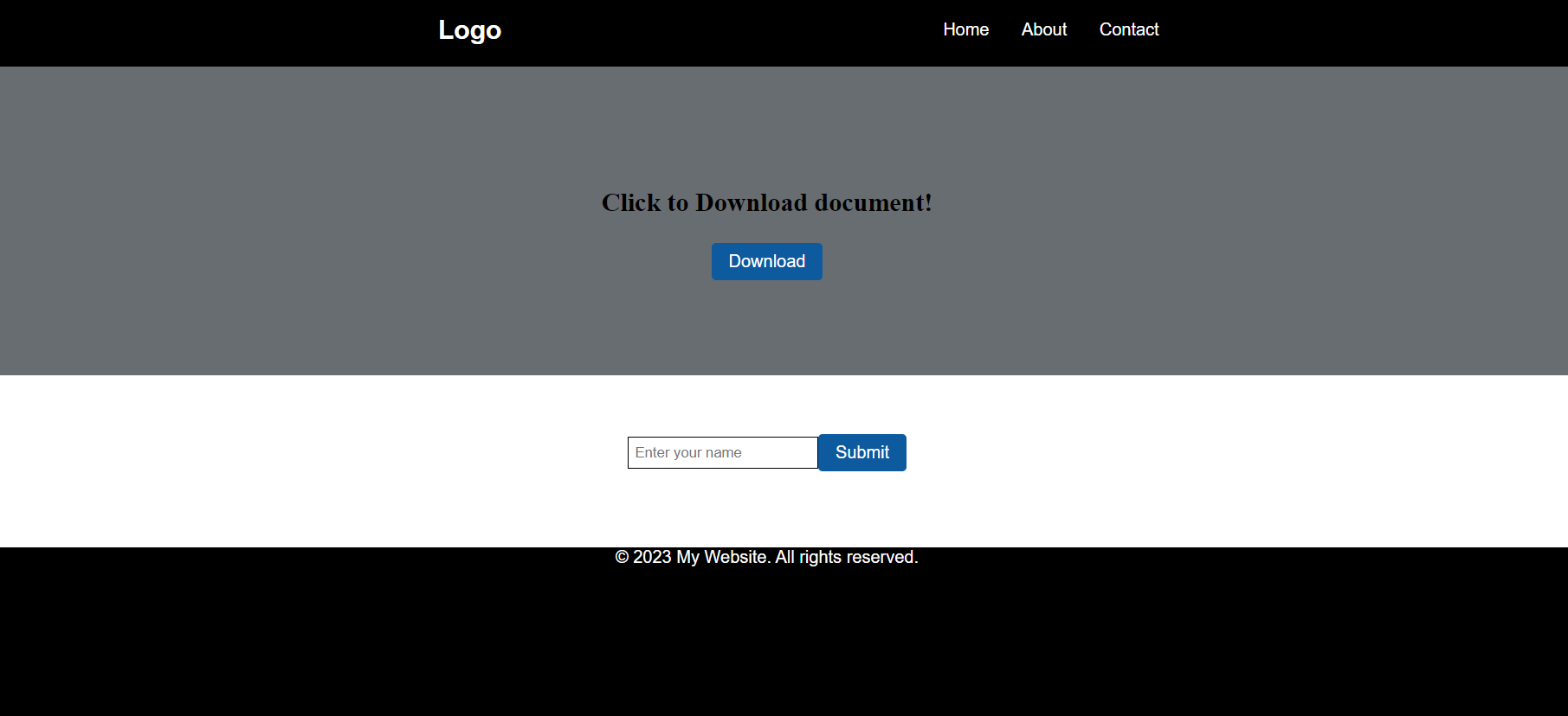
<!DOCTYPE html>
<html lang="en">
<head>
<meta charset="UTF-8">
<meta name="viewport" content="width=device-width, initial-scale=1.0">
<title>Clean Stylesheet Example</title>
<style>
/* Define a CSS custom property for primary color */
:root {
--main-background-primary-color: #000000;
--main-button-background-primary-color: #0d5a9e;
--main-primary-font-size: 16px;
--main-primary-text-color-one: #ffffff;
--main-primary-text-color-two: rgb(46, 46, 128);
}
/* Define a CSS custom property for secondary color */
:root {
--main-button-secondary-color: #0d5a9e;
--main-background-secondary-color: #686d71;
--main-secondary-font-size: 18px;
}
/* Define a CSS custom property for font family */
:root {
--main-font-family: 'Arial', sans-serif;
}
/* Navigation Styles */
.navigation {
display: flex;
align-items: center;
background-color: var(--main-background-primary-color);
color: var(--main-primary-text-color-one);
font-family: var(--main-font-family);
padding-left: 30%;
}
.logo {
margin-right: 20px;
flex-grow: 0.5; /* Add space between logo and ul items */
}
ul {
list-style: none;
display: flex;
margin: 0;
padding: 0;
gap: 20px; /* Add 20px gap between li items */
}
/* Individual LI styles */
li {
margin-right: 10px; /* Add space between the li items */
}
.hero-section {
display: flex;
justify-content: center; /* Horizontally center content */
align-items: center; /* Vertically center content */
height: 40vh; /* Adjust the height as needed */
background-color: var(--main-background-secondary-color);
}
/* Styles for the content within the hero section */
.container {
text-align: center;
}
.container h3 {
font-size: 24px;
}
/* Button Styles */
.button {
background-color: var(--main-button-background-primary-color);
color: var(--main-primary-text-color-one);
font-family: var(--main-font-family);
padding: 8px 16px;
font-size: var(--main-primary-font-size);
border: none;
border-radius: 4px;
cursor: pointer;
}
/* Input Styles */
.input {
border: 1px solid var(--main-background-primary-color);
padding: 6px;
font-family: var(--main-font-family);
}
main {
display: flex;
justify-content: center; /* Adjust the height as needed */
align-items: center; /* Center content horizontally */
height: 20vh; /* Adjust the height as needed */
}
/* Footer Styles */
.footer {
background-color: var(--main-background-primary-color);
color: var(--main-primary-text-color-one);
font-family: var(--main-font-family);
font-size: var(--main-primary-font-size);
text-align: center;
height: 25vh;
}
</style>
</head>
<body>
<header>
<nav class="navigation">
<h2 class="logo">Logo</h2>
<ul>
<li>Home</li>
<li>About</li>
<li>Contact</li>
</ul>
</nav>
</header>
<section>
<div class="hero-section">
<div class="container">
<h3>Click to Download document!</h3>
<button class="button">Download</button>
</div>
</div>
</section>
<main>
<input type="text" class="input t" placeholder="Enter your name">
<button class="button">Submit</button>
</main>
<footer class="footer">
<p>© 2023 My Website. All rights reserved.</p>
</footer>
</body>
</html>In this code snippet, we created descriptive names for the CSS custom properties, such as --main-background-primary-color, --main-button-background-primary-color,--main-primary-font-size, --main-primary-text-color-one, --main-primary-text-color-two, --main-button-secondary-color, --main-background-secondary-color, --main-secondary-font-size and --main-font-family. Each custom property represents a specific aspect of the style.
We group related styles using comments to separate the navigation, section, main, button, input, and footer styles. This helps maintain a clean and organized stylesheet.
Furthermore, we adopt a consistent naming convention by using the “main-” prefix for all custom properties related to the main theme. This naming convention helps avoid naming conflicts with existing or future CSS properties, making it easier for other developers to understand the purpose of each custom property.
By following these practices, we ensure clarity and prevent conflicts, resulting in a cleaner and more maintainable stylesheet.
The output is as follows:
Conclusion
CSS custom properties and the var function offer web developers a powerful tool to enhance code reusability and maintainability. By defining custom properties, you can easily centralize repetitive values and apply changes globally. The var function allows you to reference these custom properties, enabling dynamic styles and simplifying the management of values throughout your project.
As you delve deeper into web development, mastering custom properties and var will undoubtedly contribute to more efficient and organized stylesheets, making your codebase easier to manage and maintain.
Gain control over your UX
See how users are using your site as if you were sitting next to them, learn and iterate faster with OpenReplay — the open-source session replay tool for developers. Self-host it in minutes, and have complete control over your customer data.
Star on GitHub12k