

Styling is paramount for creating visually appealing and organized websites. Although native CSS lacks a built-in nesting feature, developers can employ various techniques to achieve a nested structure. This article explores techniques and best practices that empower developers to achieve a nested structure without relying on preprocessors like Sass or Less. By grasping the fundamentals of CSS selectors and adopting these practices, developers can craft maintainable and efficient stylesheets, opening new avenues for elegant and organized web application styles.

Discover how at OpenReplay.com.
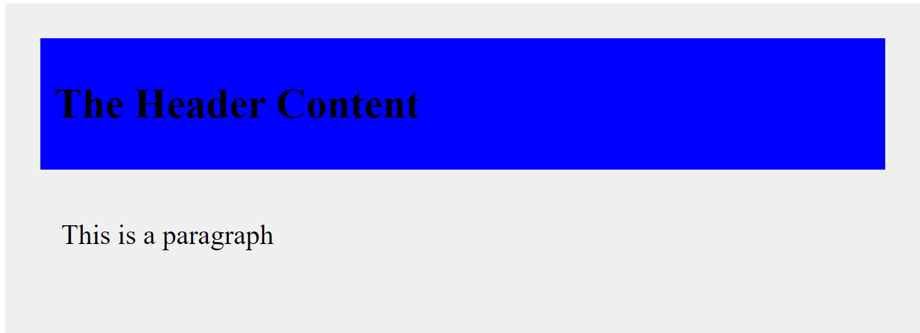
CSS nesting refers to the ability to nest one style rule inside another. This feature allows for a more organized and readable way of writing CSS, especially when dealing with complex and deeply nested HTML structures. Before the advent of CSS nesting, you would have to repeat the parent selectors for each nested rule, which could lead to redundancy and decreased code readability. With CSS nesting, you can write nested rules more intuitively. It’s like creating a blueprint for styling where each rule is precisely placed within its corresponding HTML container. Example of nested CSS:
.container {
  width: 90%;
  background-color: #eeee;
  padding: 50px;
  font-size: 28px;

  .header {
    background-color: blue;
    color: black;
    padding: 20px;
    font-size: 25px;
  }

  .content {
    padding: 30px;
    font-size: 28px;
  }
}
This example uses nesting to define styles for a header and content section exclusively within a container element. The .header and .content rules are “nested” inside the .container rule, ensuring their styles only apply to elements inside the container, keeping them separate and organized. This promotes cleaner and more targeted styling.
A well-organized and maintainable stylesheet in web development promotes collaboration and efficient debugging by enhancing code clarity and readability. It facilitates seamless scalability, allowing the integration of new styles or features without compromising code quality. Additionally, it encourages modularity, fostering reusability and ensuring a consistent design across various application parts. This structured approach streamlines tasks, updates, bug fixes, and feature additions straightforward and confident.
Challenges of Flat CSS
Flat CSS generally refers to a style of writing CSS without nesting. In flat CSS, selectors are written on a single level without nested blocks. Also, you won’t structure your CSS rules to reflect the hierarchical structure of your HTML document. Flat CSS, or non-nested CSS, poses several challenges, mainly when dealing with large and complex projects. Example of flat CSS:
.container {
  width: 90%;
  background-color: #eeee;
  padding: 50px;
  font-size: 28px;
}

.header {
  background-color: blue;
  color: black;
  padding: 20px;
  font-size: 25px;
}

.content {
  padding: 30px;
  font-size: 28px;
}
In this example, each selector and its corresponding rules are presented on the same level without any nesting or indentation, reflecting a flat structure without nested selectors. This can be contrasted with the previously explained nested structure where styles for child elements would be indented within the rules of their parent elements, like in the previous example about css nesting. Although the two approaches produce the same outcome:
In the coming sections, we will look at the limitations of flat CSS and why a nested approach is better.
Limitations of Flat CSS
Here are some common limitations of maintaining flat CSS files:
-
Global scope issues: In flat CSS, styles often have a global scope, affecting all instances of a particular element type. This lack of specificity can result in unintentional style conflicts and difficulty managing and isolating styles for different project parts.
-
Repetition of code: Flat CSS often involves the repetition of code without the ability to use variables. There may be duplication of styles that need to be reused or consistent across the project, leading to increased maintenance overhead. Without the ability to nest selectors, you may repeat parent selectors multiple times, leading to redundant and verbose code. This redundancy can make the stylesheet harder to maintain and update.
-
Difficult theming: Flat CSS can be cumbersome when implementing themes or variations. Applying different color schemes or styles may require manually updating styles throughout the codebase, making it error-prone.
-
No Variables or constants: The absence of variables or constants makes maintaining consistency across the project challenging. If a color, font, or spacing value needs to be changed, it must be updated manually in every instance.
-
Vendor prefixing challenges: Flat CSS requires manual handling of vendor prefixes for browser compatibility. This can be error-prone and time-consuming, especially when introducing new features or changing browser requirements.
-
Limited Tooling: Flat CSS lacks the advanced tooling and features of preprocessors or modern frameworks. You must manage features such as automatic minification, auto prefixing, and code splitting separately.
-
Responsive design complexity: Implementing responsive design in flat CSS can be more complex. Media queries and breakpoints need to be managed without the assistance of features provided by preprocessors, potentially leading to less maintainable code.
The Need for CSS Nesting
CSS nesting plays a significant role in structuring stylesheets by providing a more organized and maintainable way to write styles, especially for complex and deeply nested HTML structures. Here are some key aspects of the role of CSS nesting in structuring stylesheets:
-
Hierarchy: CSS nesting allows you to represent the hierarchical structure of your HTML directly in your stylesheet. This means styling child elements within their respective parent elements, creating a clear visual representation of the document’s structure. This can improve code readability by clarifying which styles are intended for specific elements and their descendants.
-
Logical organization: Nesting promotes logical organization by keeping related styles together. This makes understanding the relationship between different elements and their corresponding styles easier.
-
Avoid Redundancy: Nesting helps to reduce redundancy by avoiding the repetition of parent selectors. Without nesting, you might have to repeat the parent selector for each rule, leading to longer and potentially error-prone stylesheets. It simplifies the process of targeting specific elements within a particular context.
-
Component Styling: CSS nesting is particularly beneficial when styling components or modules within your application. Each component can have its section, making it easy to locate and manage styles for that specific component. With nested rules, you can write styles more contextually.
-
Scalability and Maintenance: Structuring your styles with nesting can make maintaining and updating your code more accessible. When changes are needed, developers can more quickly identify and modify styles for specific sections without affecting unrelated parts of the stylesheet. Changes to the HTML structure are naturally reflected in the stylesheet, making maintenance more straightforward.
-
Readability and developer experience: Nesting enhances readability and improves developer experience. It creates a more intuitive and visually organized representation of your styles, making it easier for developers to navigate and understand the codebase.
Here is an example with and without CSS nesting:
/* Without nesting */
.header {
  background-color: blue;
}

.header h1 {
  color: black;
}

.header p {
  font-size: 14px;
}

/* With nesting */
.header {
  background-color: blue;

  h1 {
    color: black;
  }

  p {
    font-size: 144px;
  }
}
In the above example, the first without nesting, each rule is written separately, and the selectors are explicitly defined for each element with no implicit indication of the hierarchical relationship between these elements. This can result in more verbose and potentially less readable code, significantly as the complexity of the HTML structure increases.
However, the second shows the nesting approach representing the hierarchical structure of the HTML more directly within the stylesheet. The styles for the nested elements (h1 and p) are encapsulated within the .header rule, making it more evident that these styles are related to elements inside the .header container. This can enhance code organization, readability, and maintainability, especially in more extensive and complex stylesheets.
Native CSS Nesting Techniques
Native CSS nesting allows you to nest one style rule inside another, reflecting the HTML structure and improving code readability and maintainability. It leverages features directly available in CSS without relying on additional tools. CSS selectors play a vital role in web development by applying styles to HTML elements. They target specific elements within the HTML document, allowing developers to define how to style them. Understanding CSS selectors is essential in CSS nesting. There are several ways to nest selectors in CSS.
Here’s a breakdown of the most common methods:
Nested Selectors with the Ampersand (&)
The nested selector with the ampersand is the most popular method supported by most modern browsers. This method allows referencing the parent selector within the nested rule, simplifying code structure. It involves prepending the & symbol to the selector you want to nest inside the parent rule.
Example:
<!DOCTYPE html>
<html lang="en">
<head>
  <meta charset="UTF-8">
  <meta name="viewport" content="width=device-width, initial-scale=1.0">
  <title>Native CSS Nesting with &</title>
</head>
<body>
  <div class="parent">
    <h1>This is a heading within the .parent element</h1>
    <p>This is a paragraph within the .parent element.</p>
  </div>
</body>
</html>.parent {
color: blue;
font-size: 25px;
background-color: #eee;
padding: 70px;
& h1 {
font-size: 28px;
margin-top: 15px;
border: 5px solid black;
padding: 50px;
}
}Outcome:
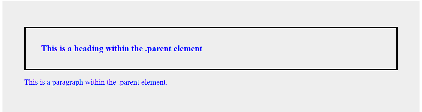
In the example above:
-
The
.parentclass defines the base styles for the container, including color (blue) and font size (25px). -
Within the
.parentrule, the&h1selector utilizes native CSS nesting. The&nested rule allows you to explicitly target theh1element within the.parent. -
The nested rule for
h1inherits the 25px font size from its parent but overrides it with a larger size of 28px. -
The
pelement inherits the blue color from the.parentclass due to the cascading nature of CSS inheritance. However, it does not inherit theh1’s styles, like the border and padding, because they are defined within the specific nested rule targetingh1.
@ Rule
CSS at-rules are special instructions preceded by the ”@” symbol. They provide a way to apply styles to different document parts, define metadata, or include external resources. This method explicitly defines a nested block of styles using the @ rule. It can be helpful for organization and clarity, especially in complex stylesheets. It is tailored for complex nesting as it can provide better organization and clarity. Additionally, it allows you to nest various at-rules within other rules, creating a more organized and maintainable CSS structure. It is currently in experimental stages, with evolving browser support, and is available in Chrome and Edge behind flags.
The at-rules currently supporting CSS nesting are @media, @support, and @layer. Although @scope and @container can be used for nesting, they may not be widely used, as @scope is deprecated, and @container is still experimental. For current nesting needs, you can focus on @media and @supports, which have broader support.
@mediaNesting Rule: You can nest media queries within other rules for conditional styling based on screen size or other media features. You can use the@medianesting rule alone or with the&nesting selector to achieve nesting. Here is an example of using@meadianesting alone:
<!DOCTYPE html>
<html lang="en">
<head>
<meta charset="UTF-8">
<meta name="viewport" content="width=device-width, initial-scale=1.0">
<title>@media Rule Nesting Alone</title>
<style>
.container {
background-color: brown;
font-size: 40px;
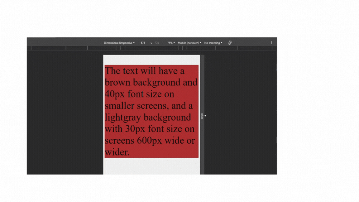
@media (min-width: 600px) {
background-color: lightgray;
}
}
</style>
</head>
<body>
<div class="container">
<p>The text will have a brown background and a 40px font size on smaller screens and a light gray background with a 30px font size on screens 600px wide or wider.</p>
</div>
</body>
</html>Here is an example of using @media nesting with &:
<!DOCTYPE html>
<html lang="en">
  <head>
    <meta charset="UTF-8">
    <meta name="viewport" content="width=device-width, initial-scale=1.0">
    <title>@media Rule Nesting with &</title>
    <style>
      .container {
        background-color: brown;
        font-size: 40px;

        @media (min-width: 600px) {
          & {
            background-color: lightgray;
          }
        }
      }
    </style>
  </head>
  <body>
    <div class="container">
      <p>The text will have a brown background and a 40px font size on smaller screens and a light gray background with a 30px font size on screens 600px wide or wider.</p>
    </div>
  </body>
</html>
The two examples above produce the same output:
In the first example above, the @media (min-width: 600px) rule is nested within the .container rule. The .container class applies a brown background color by default. The @media (min-width: 600px) rule overrides the background color to light gray and 40px font size on smaller screens when the viewport width is 600px or wider.
In the second example above, within the nested @media rule, the & selector references the parent selector (.container). This makes the nested styles apply specifically to elements with the .container class within the media query context.
Nesting can affect specificity; here, the nested media query has slightly higher specificity than the base .container styles. This is because it’s more specific, so it targets elements with the .container class and applies only when the viewport width is at least 600px.
@supportsNesting Rules: You can nest@supportsrules to apply styles only if the browser supports a specific CSS feature. If nested, the feature check applies only within the context of the parent selector, and if the feature is supported, the nested styles are applied. Nested@supportsstyles typically have higher specificity, overriding base styles if applicable. Example:
<!DOCTYPE html>
<html lang="en">
<head>
  <meta charset="UTF-8">
  <meta name="viewport" content="width=device-width, initial-scale=1.0">
  <title>@supports Rule Nesting</title>
</head>
<body>
  <button class="button">
    <span>Button Content 1</span>
    <span>Button Content 2</span>
    <span>Button Content 3</span>
    <span>Button Content 4</span>
    <span>Button Content 5</span>
    <span>Button Content 6</span>
  </button>
</body>
</html>.button {
background-color: brown;
@supports (display: grid) {
display: grid;
grid-template-columns: repeat(3, 1fr);
grid-template-rows: repeat(2, 70px);
gap: 20px;
padding: 100px;
}
.button span {
padding: 20px;
border: 3px solid #fff;
background-color: #5c5c5c;
color: #fff;
text-align: center;
font-size: 30px;
}
}The outcome:
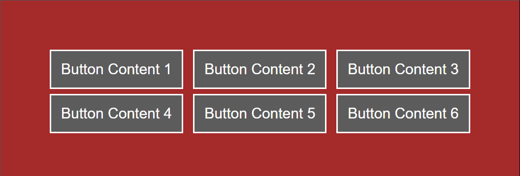
In the above example, the @supports (display: grid) rule is nested within the .button rule. This means its styles only apply to elements with the .button class if the browser supports grid layout. Within the nested @supports rule, styles are applied to span elements—but only to span elements within the .button element.
Child Combinator (>)
The > in CSS is used to select elements that are a direct child of a specified parent. This means it targets elements immediately nested within another element without intervening elements. The child combinator is particularly useful for styling specific elements within a structured hierarchy. When applied in nesting, it allows you to select and style child elements directly within a parent element. This method targets direct children of the parent selector using >. It is simple to understand but can become less readable with deep nesting. You can use > with & nesting selector or without it. Whether or not you use it with & depends on your specific goal and the desired nesting level.
Let’s look at an example of using a child combinator with or without &.
Using the child combinator without the ampersand:
<!DOCTYPE html>
<html lang="en">
  <head>
    <meta charset="UTF-8">
    <meta name="viewport" content="width=device-width, initial-scale=1.0">
    <title>CSS Nesting with Child Combinator (>) Alone</title>
  </head>
  <body>
    <div class="container">
      <div class="article">
        <h1>Article Heading</h1>
        <p>This is the article content.</p>
        <blockquote>
          <h2>Quoted Text</h2>
          <p>This is a quote within the article.</p>
        </blockquote>
      </div>
    </div>
  </body>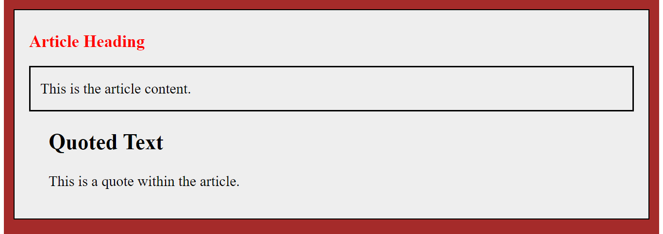
</html>.container {
background-color: brown;
padding: 20px;
}
.container > .article {
background-color: #eee;
border: 2px solid black;
margin-bottom: 10px;
padding: 30px;
font-size: 30px;
}
.container > .article > h1 {
font-size: 35px;
margin-top: 15px;
color: red;
}
.container > .article > p {
line-height: 1.6;
border: 3px solid black;
font-size: 30px;
padding: 20px;
}In the above example, the child combinator (>) creates a hierarchical relationship, allowing styles to be explicitly applied to direct children of certain parent elements. Each subsequent rule builds on the specificity of the preceding rule, creating a sense of nested structure in the styling. The code is organized to reflect the HTML structure, making it clear which styles are applied to which elements based on their parent-child relationships.
Using the child combinator with the ampersand:
<!DOCTYPE html>
<html lang="en">
  <head>
    <meta charset="UTF-8">
    <meta name="viewport" content="width=device-width, initial-scale=1.0">
    <title>CSS Nesting with Child Combinator (>) and &</title>
  </head>
  <body>
    <div class="container">
      <div class="article">
        <h1>Article Heading</h1>
        <p>This is the article content.</p>
        <blockquote>
          <h2>Quoted Text</h2>
          <p>This is a quote within the article.</p>
        </blockquote>
      </div>
    </div>
  </body>
</html>.container {
background-color: brown;
padding: 20px;
& > .article {
background-color: #eee;
border: 2px solid black;
margin-bottom: 10px;
padding: 30px;
font-size: 30px;
& > h1 {
font-size: 35px;
margin-top: 15px;
color: red;
}
& > p {
line-height: 1.6;
border: 3px solid black;
font-size: 30px;
padding: 20px;
}
}
}The two examples above produce the same output:
This code achieves the same result as the previous example but utilizes the ampersand to avoid repeating the .container selector. This can improve code clarity and readability, especially in scenarios with deeper nesting. In addition, the ampersand inherits the specificity of the parent selector, while the standalone child combinator has one less level of specificity. This is because nested styles have higher specificity, overriding broader rules. This helps ensure that styles apply as intended within their specific contexts.
Choosing between the two methods:
-
Using the child combinator without the ampersand is sufficient and concise for directly targeting child elements. The ampersand can significantly improve code readability and avoid repetition when nesting multiple levels deep.
-
Using the ampersand requires extra care, as it can increase the overall specificity of your selectors. Also, browser support for the ampersand is still under development, while the child combinator has wider compatibility.
:is() Pseudo-class
The :is() pseudo-class is a powerful tool for applying styles to multiple selectors within a nested rule. This is useful when applying the same styles to different elements within the parent selector. It prevents repeating the same styles for other elements and improves code conciseness and maintainability.
Let us look at an example with and without :is() pseudo-class:
/* Without :is() pseudo-class */
<!DOCTYPE html>
<html lang="en">
<head>
  <meta charset="UTF-8">
  <meta name="viewport" content="width=device-width, initial-scale=1.0">
  <title>Without :is() Pseudo-class Example</title>
</head>
<style>
  .parent p {
    font-size: 40px;
    background-color: brown;
    border: 3px solid black;
  }

  .parent h1 {
    font-size: 40px;
    background-color: brown;
    border: 3px solid black;
  }

  .parent h2 {
    font-size: 40px;
    background-color: brown;
    border: 3px solid black;
  }
</style>
<body>
  <div class="parent">
    <p>This is a paragraph.</p>
    <h1>This is a heading 1.</h1>
    <h2>This is a heading 2.</h2>
  </div>
</body>
</html>
/* With :is() pseudo-class */
<!DOCTYPE html>
<html lang="en">
<head>
<meta charset="UTF-8">
<meta name="viewport" content="width=device-width, initial-scale=1.0">
<title>:is() Pseudo-class Example</title>
</head>
<style>
.parent {
:is(p, h1, h2) {
font-size: 40px;
background-color: brown;
border: 3px solid black;
}
}
</style>
<body>
<div class="parent">
<p>This is a paragraph.</p>
<h1>This is a heading 1.</h1>
<h2>This is a heading 2.</h2>
</div>
</body>
</html>The examples above produce the same output:
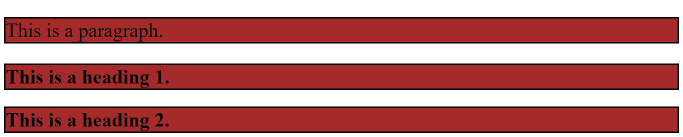
In the approach without the :is() pseudo-class, each selector (p, h1, and h2) is styled individually with the same set of styles. This approach can be repetitive, especially if you have more selectors to style, and may result in longer and less maintainable code.
In the example with the :is() pseudo-class, the .parent utilizes the :is() pseudo-class to target multiple child selectors simultaneously. In this case, it targets all p, h1, and h2 elements directly inside the .parent element and apply styles to them. Using the :is() pseudo-class allows you to group multiple selectors, reducing redundancy and improving code conciseness. This can be helpful when you want to use the same style for various elements within a specific section of your web page.
Adjacent Sibling Selector (+)
The adjacent sibling combinator (+) targets the first element placed immediately after the former element, and both elements must share the same parent. When applied in nesting, the adjacent sibling selector can help style elements with a specific relationship with their preceding siblings. It plays a valuable role in native CSS nesting by allowing precise targeting of elements within nested structures. You can use the + selector with or without the& nest rule.
Here’s how you can leverage the (+) selector:
/* with & */
<!DOCTYPE html>
<html lang="en">
<head>
  <meta charset="UTF-8">
  <meta name="viewport" content="width=device-width, initial-scale=1.0">
  <title>Adjacent Sibling Selector Nesting</title>
</head>
<style>
  h1 {
    color: black;
    background-color: blue;
    font-size: 30px;
    & + h2 {
      color: white;
      background-color: brown;
      padding: 10px;
    }
  }
</style>
<body>
    <h1>Heading</h1>
    <h2>This is the first h2 heading.</h2>
    <h2>Another heading2.</h2>
    <h2>The first h2 Element is targeted</h2>
</body>
</html>
Targeting Direct Siblings in Nested Structures with only the + selector:
<!DOCTYPE html>
<html lang="en">
<head>
  <meta charset="UTF-8">
  <meta name="viewport" content="width=device-width, initial-scale=1.0">
  <title>Adjacent Sibling Selector Nesting</title>
</head>
<style>
  h1 {
    color: black;
    background-color: blue;
    font-size: 30px;
  + h2 {
    color: white;
    background-color: brown;
    padding: 10px;
  }
}
</style>
<body>
    <h1>Heading</h1>
    <h2>This is the first h2 heading.</h2>
    <h2>Another heading2</h2>
    <h2>The first h2 Element is targeted</h2>
</body>
</html>
The two examples above produce the same output:
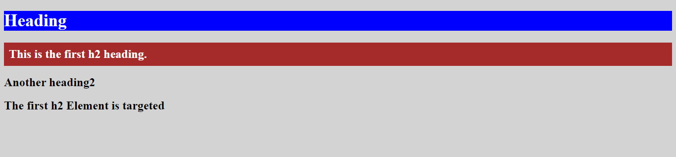
This example targets only the h2 element directly following an h1 element within a .parent element using only the + selector. It applies styles to the background, font, and padding of the specific h2 element, ensuring no unintended styling applies to other elements.
Appending Nesting Selectors
Appending nesting selectors to a nested rule can be a powerful tool for achieving specific stylistic effects within your CSS code. This approach allows you to reverse the context of the nested rule. This means styles defined within the nested rule will apply to the parent element instead of the element directly targeted by the nested rule. It helps apply different styles to child elements based on their parent’s class or state.
The technique of appending the nesting selector and simply using & for nesting are two different things. Using & for nesting refers to using the & selector within a nested rule, and it targets the current element within the context of the nested rule. While appending a nesting selector involves attaching the & selector to a nested selector and explicitly targets child elements within the context of the nested selector. This context can be another class, pseudo-class, or even a combination.
Essentially, appending nesting selectors adds a contextual layer to the targeting while simply using & for nesting focuses on the current element within that context.
Here’s an example of using appending nesting with & to achieve different styles:
<!DOCTYPE html>
<html lang="en">
<head>
  <meta charset="UTF-8">
  <title>Appending Nesting Selector</title>
</head>
<body>
  <div class="category-container">
    <article class="category featured">
      <h2>Futuristic Tech</h2>
      <p>Explore the cutting edge of technology, discovering the latest trends, gadgets, and breakthroughs.</p>
      <p>Stay ahead of the curve and shape the future.</p>
    </article>
    <article class="category">
      <h2>Nature</h2>
      <p>Explore stunning landscapes, vibrant wildlife, and breathtaking scenery.</p>
    </article>
    <article class="category featured">
      <h2>Culinary Adventures</h2>
      <p>Embark on a journey of delicious recipes, traditional dishes, and culinary wonders.</p>
      <p>Discover hidden gems and secret ingredients.</p>
    </article>
    <article class="category">
      <h2>Innovation</h2>
      <p>Unleash your creativity with inspiration for your art, music, writing, and more.</p>
    </article>
  </div>
</body>
</html>.category-container {
display: flex;
flex-direction: row;
margin: 20px;
}
.category {
padding: 20px;
margin: 10px;
border: 3px solid black;
font-size: 20px;
width: 500px;
background-color: #eee;
h2 {
.featured & {
color: blue;
border-bottom: 4px solid red;
font-size: 30px;
}
}
}Outcome:
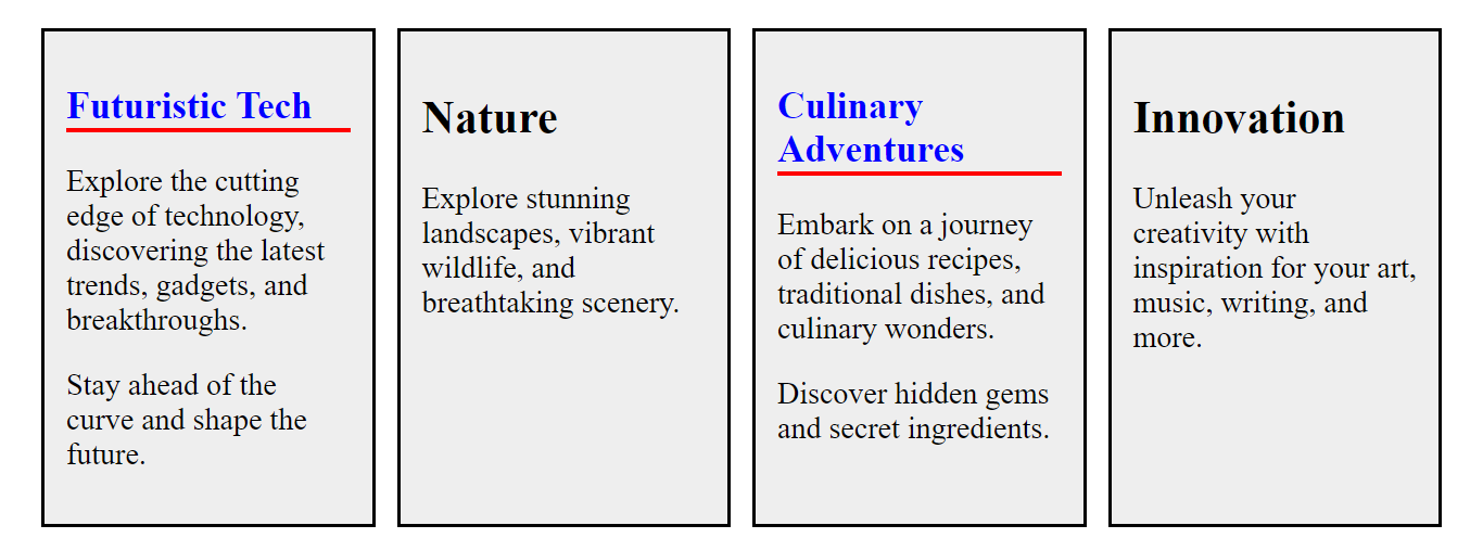
In the example above, the .category h2 .featured & selector targets h2 elements within any .category element:
.categoryselects the parent element.h2selects the childh2elements.
The & symbol within the nested .featured class is a placeholder for the current element (h2). It explicitly targets h2 elements within any .category element with the featured class. The nested rule ensures that only h2 elements within featured categories receive the specific blue color, red border, and larger font size.
Native CSS Considerations and Best Practices
When writing native CSS without using preprocessors like Sass or Less, several considerations and best practices can contribute to cleaner, more maintainable, and more efficient stylesheets. Here are some essential tips:
-
Keep selectors specific but simple: Use specific selectors when needed, but avoid overly complex selectors. Overly complex selectors can lead to increased specificity, making it harder to manage and override styles.
-
Avoid overusing
!important: While!importantcan be helpful in certain situations, you should use it sparingly. Overusing it can make your styles less predictable and more challenging to debug. -
Use shorthand properties: When possible, use shorthand properties for properties like margin, padding, font, etc. This reduces code size and improves readability.
-
Indentation and formatting: Consistently indent your CSS rules for improved readability. Consistently use a formatting style throughout your stylesheet.
-
Avoid overusing the universal selector (
*): Minimize the use of*. It can have performance implications, as it selects all elements. -
Specificity considerations: Understand the concept of specificity to avoid unexpected results. Nested selectors inherit the specificity of their parent. Be mindful of this to avoid unintended consequences, especially with high-specificity selectors. Therefore, keep specificity as low as necessary to achieve your styling goals.
-
Responsive design: Design with responsiveness in mind. Use relative units like percentages and ems, and consider media queries for responsive layouts.
-
Avoid global styles: Minimize global styles to reduce the chance of unintentional style conflicts. Use
classesandIDsto encapsulate styles within specific components.
Browser Support
Native CSS nesting is still under development and has not yet been fully implemented across all browsers. However, it’s gaining traction and becoming increasingly supported. It has good Chrome, Firefox, and Edge support. If you’re concerned about browser compatibility, you can use polyfills to provide fallback support for older browsers that don’t natively support the chosen nesting technique. This can help ensure your styles are rendered correctly across different platforms.
Conclusion
Native CSS nesting offers a powerful and flexible approach to structuring and targeting styles. By nesting selectors, we can achieve greater specificity, reduce code repetition, and create modular, maintainable CSS. Native CSS nesting holds immense promise for the future of web development. As browser support matures and developer understanding grows, we expect to see more creative and efficient CSS code emerge, leading to cleaner, more maintainable websites and applications.
Complete picture for complete understanding
Capture every clue your frontend is leaving so you can instantly get to the root cause of any issue with OpenReplay — the open-source session replay tool for developers. Self-host it in minutes, and have complete control over your customer data.
Star on GitHub12k