The Top 7 Component Libraries for React
The comparison you need to select the best component library for your project


React is one of the finest JavaScript libraries for building intuitive and responsive user interfaces. You can build anything with this flexible and easy-to-use framework, from simple web apps to powerful, feature-rich websites. In fact, React powers nearly 10 million websites across the globe. One of the key reasons for the immense popularity of React is its multiple component libraries that contain several design elements to build React web apps.
If you are on the hunt for the best React UI library for your current web development project, we have created a list of top React UI component libraries to help you achieve your development goals. Each has its pros and cons, which we will discuss below, but overall, using any component library can offer many benefits and support your React project. So, let’s jump right in to know more about the React UI libraries.
Ant Design UI
Created by Alibaba, the Chinese tech giant, Ant Design is one of the most popular React UI libraries and design systems for creating custom enterprise-grade web application interfaces. The framework offers a set of over 50 high-quality, customizable components that can be used for creating appealing apps. Ant Design’s components are carefully examined and focus on four design values: certain, natural, growing, and meaningful.
Being a great React UI component library, Ant Design offers comprehensive documentation, including many demos, examples, guidelines, and variants. Furthermore, Ant Design also works wonders when it comes to customizing themes and components intricately. It uses Less.js as its style language that keeps the code organized, lean, and easy to maintain.
What’s even more, Ant Design offers seamless compatibility with many third-party libraries as well as their products, such as Ant Design Mobile, Ant Design Charts and AntV Data Visualization. These tools help in expanding the scope of your project.
Features
- Offers premium quality React components right out-of-the-box
- It has vast support
- Enterprise-level UI components
- Offers a vast package of development tools and design resources
Pros of Ant Design UI
- Internationalization enables the use of multiple languages
- Powerful theme customization
- Written in TypeScript and uses static, predictable types
Cons of Ant Design UI
- Large bundle size
- Insufficient accessibility support
Components
- Buttons - Clickable options for an event
- Icon - Vector-like images
- Steps- Display completion of steps
- Datepicker - To select any date
- AutoComplete - Show available text after user input
Find more Ant Design Components at https://ant.design/components/overview/
Installation Process
https://ant.design/docs/react/introduce
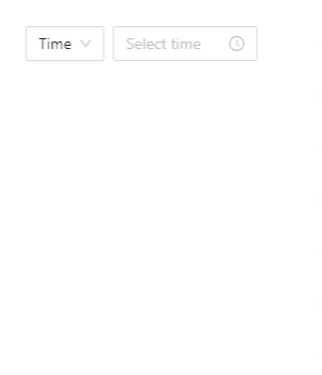
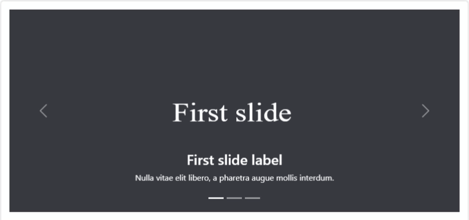
Example
With the help of DatePicker Ant Design UI Component
Material UI
Material UI is one of the best React component libraries, widely known for making web development more efficient and faster. It has many pre-built components and templates, including dropdown menus, navigational tools, and pre-built sliders, so you don’t need to waste time developing your own. Moreover, each component is fully customizable and meets current accessibility standards.
In addition, Material UI comes with advanced features for themes. Based on Google’s Material Design, MUI allows you to customize the code using CSS utilities. With these tools, developers can control component usage and styling from a single location.
Since Material UI is based on Google’s Material Design, it also uses Google’s platform. That means your MUI components give you a distinct look and feel like Google. What makes Material UI stand out from the competition is the number of free resources that can help you get started with your app development. Be it blog design mockups, landing page templates, or portfolio styles; there is something suitable for every type of development project.
Features
- Easy theme customization across global components
- A large set of free, accessible, and ready-to-use components
- A huge number of inbuilt templates
- Appealing UI designs
- Highly responsive
Pros of Material UI
- Great community support
- Well-organized documentation
- Frequent updates on the latest features
Cons of Material UI
- Documentation is not regularly updated
- Not recommended to beginners
Components
- Floating Action Button - To show action buttons in a floated way
- ToolTip - Shows more information once hovered
- Divider - To add a divisive line between contents
- Typography - To show your content in a typographical way
- Skeleton - Display your about-to-load content
- Snackbar - To give brief notifications
Find more Material UI components here https://mui.com/material-ui/getting-started/supported-components/
Installation Process
https://mui.com/material-ui/getting-started/overview/
Example
With the help of SpeedDial Components

Onsen UI
Onsen UI is one of the best mobile application development tools for creating stunning application UIs for Android and iOS platforms. Developers who struggle with operating system or device compatibility issues will find Onsen UI an excellent platform to build hybrid apps.
Onsen UI utilizes JavaScript and HTML and integrates with React, Angular, and Vue.js. All the components in Onsen UI are auto-styled according to the platform, which means the same source code can be used for both platforms. Moreover, the library is absolutely CSS-based, and there is no JavaScript functionality.
Onsen UI is ideal for making stunning hybrid and native-looking apps, making the components highly accessible and arranging them flawlessly according to the platform. Moreover, tons of valuable assets and interactive tutorials are available to educate you on effectively utilizing the component.
Features
- Plenty of ready-to-use UI components
- Offers several sample apps for different needs
- Responsive layout
Pros of Onsen UI
- Comes with helpful tutorials
- Easy to learn and work
- Enables rapid prototyping
Cons of Onsen UI
- Smaller community
- High price
- Performance is sometimes slower in Android
Components
- Action Sheet - To show clickable actions for users
- List - To display a list of available items
- Progress Circle - To show the ongoing process
- Switch - A clickable switch to give on/off like feel
- Notification - To display an alert notification
Find more OneSen UI components here https://onsen.io/theme-roller/
Installation Process
https://onsen.io/v2/guide/#getting-started
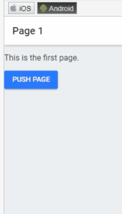
Example
With the help of Navigator Component
Open Source Session Replay
OpenReplay is an open-source, session replay suite that lets you see what users do on your web app, helping you troubleshoot issues faster. OpenReplay is self-hosted for full control over your data.

Start enjoying your debugging experience - start using OpenReplay for free.
React Bootstrap
React Bootstrap is a front-end UI framework based on the Bootstrap library. In other words, React Bootstrap combines React and Bootstrap, containing the set of React components that implement the Bootstrap framework. This makes React Bootstrap the fastest tool to develop React and Bootstrap interfaces for mobile and web applications.
React Bootstrap is one of the original React libraries that deliver a pure React experience without any dependencies on jQuery. Moreover, the elements in React Bootstrap are readily accessible and fully responsive. That means it requires little or no effort to adjust them while making your plugin, theme, or app accessible to users.
React Bootstrap is extensively used for website UI and designing applications. It is built on JavaScript and TypeScript, and its latest version is compatible with the latest Bootstrap version 5.1. It enables you to design your project on the back end and preview it on the front end. Hence, this makes React Bootstrap an excellent choice for developers working on different application modules.
Features
- Offers a wide range of components
- Comes with package manager for easy installation
- No dependencies required
- Plenty of resources available
Pros of Bootstrap
- Easily build React app without worrying about underlying HTML and CSS
- Easy to work with
- Build any web or mobile application
- Accessible Bootstrap themes
Cons of Bootstrap
- It can be challenging to customize the components
- You need to write some CSS and JavaScript codes to change the behavior of an element
Components
- Alerts - Display text messages before or after an event
- Breadcrumb - Shows the current location of your website page
- Dropdowns - Display a List of options available after clicking
- NavBars - Header navigation menus to display
- Pagination - Shows paginated pages.
Find more React Bootstrap Components at https://react-bootstrap.github.io/components/alerts
Installation Process
https://react-bootstrap.github.io/getting-started/introduction
Example
With the help of Carousel React Bootstrap Component.
Reactstrap
Reactstrap is a component library for React.js that contains self-contained and reusable components that can be used in React applications. Reactstrap is similar to Bootstrap but uses different JavaScript functions and CSS classes. Its UI components are simple in design, responsive, and can be used to create various web applications.
Reactstrap is a newer component library than others on this list, so it currently has fewer components available. This can benefit you if you plan for a simple design and don’t wish to be overwhelmed by too many choices.
Reactstrap can either be used for the entire UI development or some components. It comes with predefined validation and offers greater flexibility, which assists in developing attractive forms quickly that engage more users.
Reactstrap offers thorough documentation, but it majorly includes code and lesser explanations. Being a straightforward component library, Reactstrap is still easy to work with, even for beginners. Moreover, you can expect enough support from the Reactstrap community to assist you in your project.
Features
- Prebuilt Bootstrap components
- Components are compatible with react-router
Pros of Reactstrap
- Easy to learn and use
- It offers many free and premium themes to get started
Cons of Reactstrap
- The syntax may be confusing for some developers
- Lesser features than other libraries
Components
- Accordion - It is a vertical collapsible text box
- Carousel - To give a slider-like look
- Table - To add table data
- Forms - For user input forms
- Badge - To add a label
Find more Reactstrap Components at https://reactstrap.github.io/?path=/docs/components-accordion—accordion
Installation Process
https://reactstrap.github.io/?path=/docs/home-installation—page
Example
With the help of PopOver ReactStrap component

React Toolbox
React Toolbox is another great React UI component library that allows you to implement Google Material Design principles. React Toolbox is based on the most cutting-edge technologies, such as Webpack, ES6 and CSS modules (written in SASS). It comes with a vast set of components, such as cards, discourses, catches, cards, and many more, which enable developers to build exceptional web applications.
React Toolbox comes with comprehensive documentation, meaning any level of developer can learn and implement React Toolbox. In addition, React Toolbox offers an in-browser editor where developers can try the components and preview the interface in real-time.
When working with React Toolbox, developers can import components in bundles or raw components. When components are imported in bundles, they come with all the required dependencies and themes, so each dependency will have its CSS available automatically. On the other hand, no CSS is included with raw components, and that means you will have to offer a theme through properties to the component to style it properly.
Features
- Implements Google Material Design specification
- Offers React components
- Library seamlessly integrates with Webpack workflow
- Comprehensive documentation
Pros of React Toolbox
- It is good and easy to implement
- The components are extremely customizable
- Easy to work with Redux
Cons of React Toolbox
- Lesser components than other libraries
Components
- Avatar - To use as a people image
- Checkbox - To use as a consent
- Dialog - To alert the user to do a specific task
- Radio Buttons - To select one option from various
- Drawer - To display navigation text
Find more React ToolBox Components here http://react-toolbox.io/#/components
Installation Process
http://react-toolbox.io/#/install
Example
With the help of Autocomplete Component
Semantic UI
Semantic UI is a jQuery-based UI library that uses a set of specifications based on natural language principles. Semantic UI became a popular component library in a very short period, offering over 3,000 themes for the framework and over 50 components to create beautiful and responsive user interfaces.
Semantic UI offers many UI components that help you write semantically sound code. Since Semantic UI is based on natural language principles, it is pretty easy to use. If you want five columns, then type “five columns”. If you want to add a dropdown, type “dropdown”. Moreover, you can name Semantic UI classes with meaningful names, making them easier to understand and helping develop faster.
Another great thing about Semantic UI is the large variety of themes available. That means you will most likely find a theme that suits your project. If you are building a React app and want to ensure that your code is semantic-friendly, then Semantic UI is a way to go.
Features
- Offers a huge amount of customization
- Assists in building responsive layouts easily
- Loads only the components you need
- Self-contained and portable
Pros of Semantic UI
- Easy to use
- A large set of components and themes
- Well documented
- Supports third-party applications
Cons of Semantic UI
- Large file size
- Smaller community
- Fewer updates
Components
- Flag - To display the flag code of countries
- Loader - To give an idea about ongoing activity
- Rating - User can input their rating
- Reveal - To show content after hover
- Segment - To display a grouping of content
Find more Semantic UI Components here https://semantic-ui.com/elements/button.html
Installation Process
https://semantic-ui.com/introduction/getting-started.html
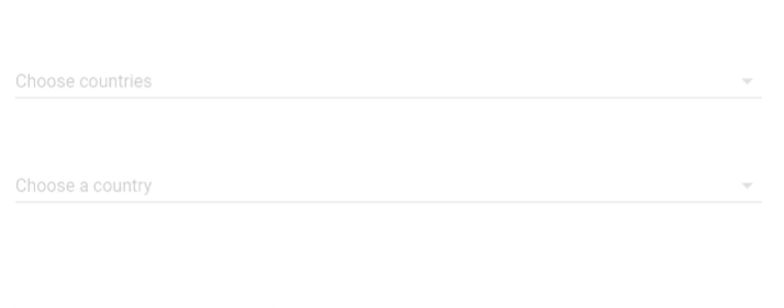
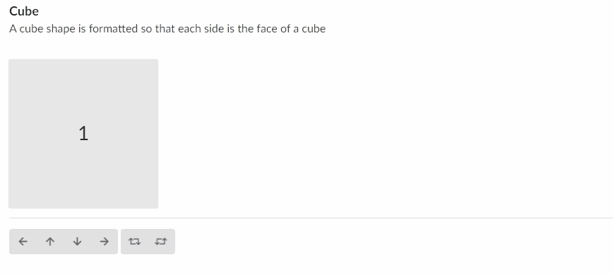
Example
With the help of Shape Component
Choosing the Best React UI Component
Choosing the right React UI framework is the most crucial step in your app development journey. Apps with responsive and structured user interfaces never fail to delight users. The list of React UI frameworks doesn’t end here, and many more frameworks are available in the market. However, the frameworks listed here are some of the most popular ones. Each React UI library discussed in this article has unique features with pros and cons. Hence, don’t just go with the hype created by marketing gimmicks. Evaluate your app’s project requirements and objectives before choosing a React UI component library.
A TIP FROM THE EDITOR: For valuable tips to consider when building your own components library, don’t miss Tips for creating a component library.