Theme Management in Vue with Styled Components

In the evolving landscape of Vue.js development, the demand for dynamic theming has grown significantly. Traditional styling approaches often fall short of providing a seamless user experience. However, with the introduction of styled-components in Vue 3, a revolutionary shift in styling paradigms is underway, as this article shows.

Discover how at OpenReplay.com.
The progress of web development tools and capabilities has been reflected in the styling of web development frameworks. The transition from inline styles to CSS-in-JS solutions has improved consistency throughout development.
Developers can use the styled-components library to style HTML inside JavaScript or JavaScript frameworks rather than having to create separate CSS files as is customary. It is now available for Vue projects and has shown tremendous success in React.
Benefits of styled-components in Vue 3
The adoption of styled-components in Vue 3 brings forth many benefits, transforming how we approach styling in Vue.js applications. Let’s explore the advantages that make this package stand out.
Cleaner Code
One of the main benefits is the cleaner, more readable code structure. Traditional Vue.js styling involves separate CSS files or style blocks, leading to a cluttered structure where styles are managed independently from the component logic.
Styled-components allow developers to write CSS directly in JavaScript, encapsulated within the component. This integrates styles with the component’s logic and template, providing a single source of truth.
This approach reduces the need for separate CSS files, eliminates global style conflicts, and results in a more organized and maintainable codebase.
Scoped Styles
Styled-components offer a more advanced approach to scoping styles than traditional Vue scoped styles. Vue’s scoped styles apply CSS rules only to the component where they are defined, which can be limiting in complex scenarios.
Styled-components automatically generate unique class names for each component, encapsulating styles and preventing conflicts. This is especially useful in large applications with many components, where managing styles can become complex.
Enhanced Maintainability
The modularity of styled-components makes them easier to maintain. Components become self-contained with encapsulated styles, simplifying style management and updates without affecting the rest of the program.
This self-contained approach means the component’s logic, template, and styles are all in one place. As a result, developers can easily access and modify styles without navigating through different files or worrying about global style changes affecting other parts of the application.
Dynamic Theming
Styled-components seamlessly integrate with Vue 3’s reactivity system, enabling dynamic theming. Themes can be switched on-the-fly, offering users a personalized and dynamic visual experience without compromising performance.
For example, implementing dark or light mode is easy with styled-components. By defining theme objects and passing them through a ThemeProvider, you can switch themes dynamically based on user preferences or application settings. This capability allows for responsive, user-friendly interfaces that adapt to visual requirements.
Using Styled-Component with Vue.js
To get started, create a new Vue 3 project using the command below:
npm create vue@latestNow, let’s install styled-components:
npm i vue3-styled-componentsAnd we’re set! To try things out, create a new styled-component directory in the default src/ folder; next, create a new Button.js file inside the new directory and paste the following code into it:
import styled from "vue3-styled-components";

export const StyledButton = styled.button`
 font-size: 18px;
 text-align: center;
 color: #000;
 padding: 10px;
 border-radius: 10px;
 background-color: #ffcc00;
`;
The code above creates and exports a new StyledButton and applies our defined CSS style to this component.
Now, let’s use this StyledButton in a vue component. Open the default src/components/HelloWorld.vue file and replace its content with the code below.
<template>
   <div class="hello">
      <h1>Welcome to OpenReplay</h1>
      <StyledButton as="button" on-click="">Click This Styled Button</StyledButton>
   </div>
</template>

<script>
import { StyledButton } from "../styled-components/Button"
export default {
   name: 'HelloWorld',
   components: {
      StyledButton
 },
}
</script>
With these changes, we’ve updated the HelloWorld component to import our StyledButton and render it with some additional custom messages.
Run the following command to start the app:
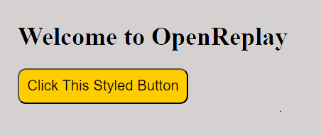
npm run devAfter starting the app, you should see an output like the one displayed below in your browser:

The image above shows the output of the HelloWorld component displaying the styled button.
Applying Global Styles
Styled components in Vue.js allow you to define global styles used across your application. This is especially handy for creating defaults for typeface, colors, and other common design components to ensure uniformity throughout your project.
To define global styles with styled-components, you can create a separate styled component specifically for global styles and include it in your main Vue component.
Here’s an example of how you can define global styles:
// GlobalStyles.js
import { createGlobalStyle } from 'vue3-styled-components';

export const GlobalStyles = createGlobalStyle`
 body {
 font-family: Arial, sans-serif;
 margin: 0;
 padding: 0;
 background-color: #f8f8f8;
 color: #333;
 }

 // Add more global styles as needed
`;
In the above code, we’ve defined global styles using createGlobalStyle from styled-components. We’ve set defaults for the body element’s font-family, margin, padding, background-color, and color properties. You can add more global styles as needed for your application.
To use these global styles in your Vue.js application, import the GlobalStyles component and include it in your main Vue component:
// App.vue
<template>
  <div id="app">
    <GlobalStyles />
    <router-view />
  </div>
</template>

<script>
import { GlobalStyles } from './GlobalStyles';

export default {
  components: {
    GlobalStyles
 }
};
</script>
In this example, we’ve imported the GlobalStyles component and included it in the main App.vue component. This ensures that the global styles are applied to the entire application.
Dynamic styling with props
One of the powerful features of using styled-components in Vue.js is the ability to dynamically style components based on props. This allows for greater flexibility and reusability of components throughout your application.
Let’s consider a scenario where we want to create a customizable button component that can change its background color based on a prop passed to it.
First, let’s modify our Button.js file to accept a prop for the background color:
import styled from "vue3-styled-components";

export const StyledButton = styled.button`
 font-size: 18px;
 text-align: center;
 color: #000;
 padding: 10px;
 border-radius: 10px;
 background-color: ${(props) => props.bgColor || "#ffcc00"};
`;
In the code above, we’re using the styled-components syntax to interpolate the value of the bgColor prop passed to our component. If no bgColor prop is provided, it defaults to #ffcc00.
Now, let’s update our HelloWorld.vue component to demonstrate how we can dynamically style our button:
<template>
  <div class="hello">
    <h1>Welcome to OpenReplay</h1>
    <StyledButton as="button" :bgColor="buttonColor" @click="toggleColor">
      Click Me To Switch Color
    </StyledButton>
  </div>
</template>

<script>
import { StyledButton } from "../styled-components/Button";
export default {
  name: 'HelloWorld',
  components: {
    StyledButton
 },
  data() {
 return {
 buttonColor: "#ffcc00"
 };
 },
  methods: {
    toggleColor() {
      this.buttonColor = this.buttonColor === "#ffcc00" ? "#00ff00" : "#ffcc00";
 }
 }
};
</script>
In this example, we’ve added a buttonColor data property to our component and bound it to the bgColor prop of our StyledButton. We’ve also implemented a toggleColor method that changes the buttonColor property when clicked.
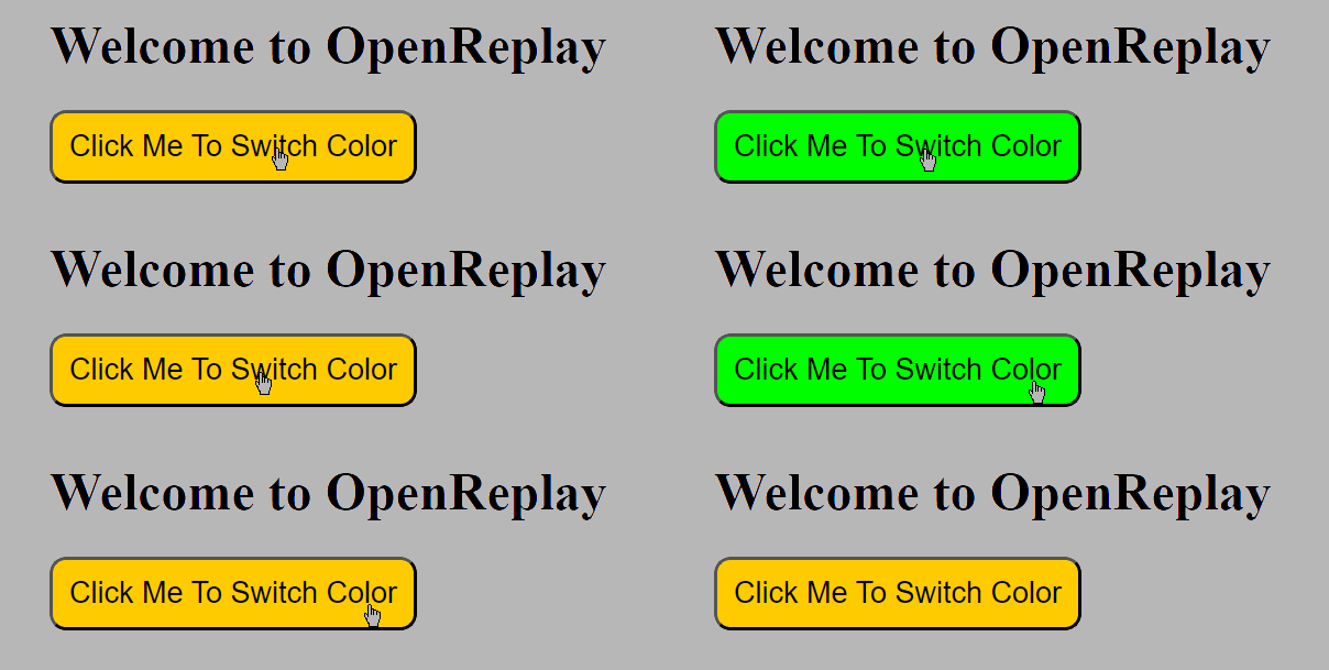
When the button is clicked, it toggles between two different background colors, demonstrating how we can dynamically style components using props.
An image showing the dynamically styled button in action:
 The image above shows the button dynamically changing its color when clicked.
Pseudo Selectors in styled-components
Styled components in Vue.js support pseudo selectors, which enable you to apply styles to items based on their state or position in the document.
Let’s explore how we can use pseudo-selectors to enhance the styling of our components.
To begin, create a new Vue file inside the styled-components directory; let’s name it Box.js. Now, let’s add the following code to Box.js to create a styled box element:
// src/styled-components/Box.js
import styled from "vue3-styled-components";

export const StyledBox = styled.div`
 width: 200px;
 height: 200px;
 background-color: ${(props) => props.bgColor || "#f0f0f0"};

 &:hover {
 transform: scale(1.1);
 }
`;
In the code above, we’ve defined a StyledBox component using styled-components. It sets the width and height of the box and allows for a customizable background color through the bgColor prop. Additionally, we’ve included a hover effect that scales the box when hovered over.
To import and use the StyledBox component in the HelloWorld.vue component, open the HelloWorld.vue file and import the StyledBox component at the top of the file:
import { StyledBox } from "../styled-components/Box";Now, you can use the StyledBox component within the template section of HelloWorld.vue. Replace the existing content or add the StyledBox component as needed. For example:
<template>
  <div class="hello">
    <h1>Welcome to OpenReplay</h1>
    <StyledBox bgColor="#ffcc00">This is a styled box</StyledBox>
  </div>
</template>
We use the StyledBox component with a custom background color (#ffcc00) in this example. You can customize the background color by passing different values to the bgColor prop.
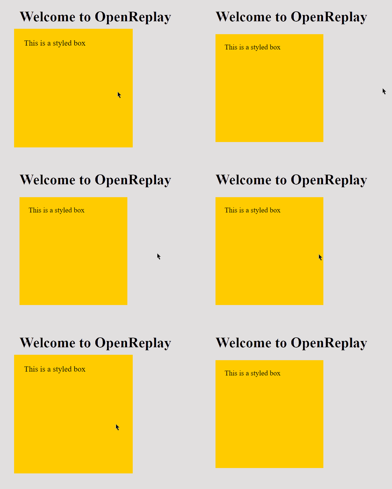
Now, save the file, and when you run your application, you should see the StyledBox component rendered with the specified background color. Additionally, when you hover over the box, it should scale up according to the hover effect defined in the styled component, as shown below.
 The image above shows the styled box with a hover effect that scales the box when hovered over.
Conclusion
In conclusion, utilizing Vue.js’s styled-components for theme management provides an efficient and flexible approach to crafting cohesive and customizable user interfaces. This integration streamlines development, maintains code clarity, and facilitates easy theme updates, leading to dynamic and adaptable user experiences.
Gain Debugging Superpowers
Unleash the power of session replay to reproduce bugs, track slowdowns and uncover frustrations in your app. Get complete visibility into your frontend with OpenReplay — the most advanced open-source session replay tool for developers. Check our GitHub repo and join the thousands of developers in our community.


