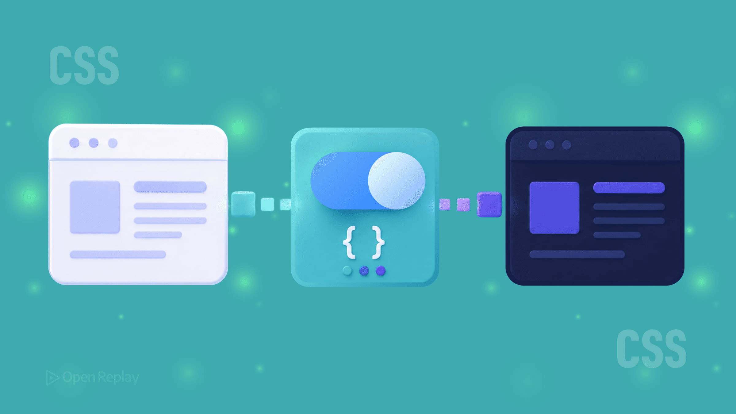
Creating a Theme Switcher with CSS Variables
Build a theme switcher with CSS variables, data-theme, prefers-color-scheme, localStorage, and no flash of wrong theme on load.

Hardcoded color values scattered across a stylesheet make theme switching painful. Change one color and you’re hunting through dozens of declarations. CSS variables solve this cleanly — define your design tokens once, then switch themes by changing a single attribute on the root element.
This article walks through building a maintainable theme switcher: one that respects system preferences automatically, responds to manual user choice, and persists that choice across sessions.
Key Takeaways
- CSS custom properties are dynamic and update at runtime, making them ideal design tokens for theming.
- A
data-themeattribute on the root element provides a clean, scalable way to switch between any number of themes. - The
prefers-color-schememedia query handles system defaults, while JavaScript andlocalStoragepreserve manual user choices. - A small inline script in the
<head>prevents the flash of incorrect theme on page load. - Including the
color-schemeproperty ensures native browser UI adapts to match your active theme.
Why CSS Variables Are the Right Foundation for Theming
CSS custom properties are dynamic. Unlike Sass variables that compile to static values, CSS variables live in the browser and can be updated at runtime — by media queries, by JavaScript, or by a parent element changing state.
That makes them ideal design tokens. Define your surface colors, text colors, and accent colors as variables on :root, then reference those variables throughout your stylesheet. Switching themes becomes a single DOM change rather than a stylesheet swap.
Setting Up Your Theme Tokens
Start by defining your light theme as the default, then declare a dark variant using a data-theme attribute selector:
:root {
  color-scheme: light;
  --color-bg: #ffffff;
  --color-text: #1a1a1a;
  --color-primary: #302ae6;
  --color-surface: #f4f4f4;
}

[data-theme="dark"] {
  color-scheme: dark;
  --color-bg: #161625;
  --color-text: #e1e1ff;
  --color-primary: #9a97f3;
  --color-surface: #1e1e30;
}
The color-scheme property is worth including. It tells the browser which mode is active, so native UI elements — scrollbars, form inputs, focus rings — adapt to match your theme automatically.
Now use those tokens throughout your stylesheet:
body {
  background-color: var(--color-bg);
  color: var(--color-text);
}
Respecting System Preferences with prefers-color-scheme
System preferences and manual theme switching solve different problems. prefers-color-scheme handles the automatic case — users who’ve set their OS to dark mode and expect websites to follow:
@media (prefers-color-scheme: dark) {
  :root:not([data-theme="light"]) {
    color-scheme: dark;
    --color-bg: #161625;
    --color-text: #e1e1ff;
    --color-primary: #9a97f3;
    --color-surface: #1e1e30;
  }
}
The :not([data-theme="light"]) guard ensures a user’s explicit choice overrides the system default. Without it, the media query would override manual selection.
A Note on light-dark()
The light-dark() CSS function lets you declare both theme values inline:
:root {
  color-scheme: light dark;
  --color-bg: light-dark(#ffffff, #161625);
}
It’s elegant for simpler token sets and works well when you only need two themes. For systems with more than two themes or tokens that vary beyond color, the attribute-selector approach gives you more control.
Note that light-dark() requires color-scheme to be set with both values for the function to resolve correctly. Support in modern browsers is strong, but still relatively recent (Chrome 123+, Safari 17.5+, Firefox 120+), so confirm your audience compatibility before relying on it.

Discover how at OpenReplay.com.
Adding JavaScript for Persistent Manual Control
System preference detection is CSS-only, but remembering a user’s manual choice requires JavaScript. Here’s a minimal, production-ready implementation:
const STORAGE_KEY = 'theme-preference';
const root = document.documentElement;

function getSystemTheme() {
  return window.matchMedia('(prefers-color-scheme: dark)').matches ? 'dark' : 'light';
}

function getSavedTheme() {
  try {
    return localStorage.getItem(STORAGE_KEY);
  } catch {
    return null;
  }
}

function applyTheme(theme) {
  root.setAttribute('data-theme', theme);

  try {
    localStorage.setItem(STORAGE_KEY, theme);
  } catch {
    // Storage unavailable — theme still applies for this session
  }
}

// On load: respect saved preference, fall back to system
applyTheme(getSavedTheme() || getSystemTheme());

// Wire up your toggle button
document.getElementById('theme-toggle').addEventListener('click', () => {
  const current = root.getAttribute('data-theme');
  applyTheme(current === 'dark' ? 'light' : 'dark');
});

// Sync with OS changes when no manual preference is set
window.matchMedia('(prefers-color-scheme: dark)').addEventListener('change', (e) => {
  if (!getSavedTheme()) {
    root.setAttribute('data-theme', e.matches ? 'dark' : 'light');
  }
});
The try/catch blocks around localStorage handle private browsing modes and storage quota errors gracefully — the theme still applies for the current session even if it can’t be saved.
Preventing Flash of the Wrong Theme
If your JavaScript loads after the page renders, users briefly see the default theme before the correct one applies. Fix this with a small blocking inline script in <head>:
<script>
  try {
    const saved = localStorage.getItem('theme-preference');

    if (saved) {
      document.documentElement.setAttribute('data-theme', saved);
    } else if (window.matchMedia('(prefers-color-scheme: dark)').matches) {
      document.documentElement.setAttribute('data-theme', 'dark');
    }
  } catch {
    if (window.matchMedia('(prefers-color-scheme: dark)').matches) {
      document.documentElement.setAttribute('data-theme', 'dark');
    }
  }
</script>
This runs synchronously before any content renders, eliminating the flash. Place it as early as possible in <head>, before any stylesheets, so the attribute exists when CSS is first applied.
The Pattern That Scales
CSS variables give you a clean separation between your design tokens and your component styles. Components reference variables; themes define variables. Adding a third theme — high contrast, a brand variant, a seasonal palette — means adding one new attribute selector block in CSS and one new option in your switcher logic. Nothing else changes.
Conclusion
The real value here isn’t just dark mode — it’s a theming architecture that stays maintainable as your design system grows. By treating CSS variables as design tokens, respecting both system and user preferences, and handling the edge cases (storage failures, render flashes, OS-level changes), you build a switcher that feels native to the platform and trivial to extend. The pattern is small, the payoff compounds with every new theme or component you add.
FAQs
Should I use a data-theme attribute or a class to toggle themes?
Both work, but a data-theme attribute is generally cleaner because it expresses a single value rather than a list of modifiers. Classes are better suited to compositional state where multiple flags coexist. With themes, you typically have one active value at a time, which matches the semantics of an attribute selector more naturally.
Why does my theme briefly flash the wrong colors on page load?
That flash happens when your JavaScript runs after the browser has already painted the page using default styles. The fix is a small synchronous inline script in the head that reads the saved preference from localStorage and sets the data-theme attribute before any rendering occurs. For first-time visitors, you can also check prefers-color-scheme so the initial render matches the system theme immediately.
Can I use CSS variables for more than just colors in my themes?
Yes. CSS variables can hold any valid CSS value, including spacing scales, border radii, shadows, font stacks, and animation durations. This makes them useful for theming density (compact versus comfortable layouts), motion preferences, or even typography variants. Treat variables as design tokens broadly, not just as color references.
Is light-dark() ready for production use?
It works well in modern browsers (Chrome 123+, Safari 17.5+, Firefox 120+) but lacks support in older versions. For projects with a modern audience, it's a clean choice. For wider compatibility, the data-theme attribute approach remains safer and also scales to more than two themes, which light-dark() cannot do by itself.
Truly understand users experience
See every user interaction, feel every frustration and track all hesitations with OpenReplay — the open-source digital experience platform. It can be self-hosted in minutes, giving you complete control over your customer data.
Star on GitHub12k