
Theming With Tailwind CSS


As accessibility becomes increasingly important, having at least an extra theme (mostly dark) on a web page has become necessary. In this article, I will show how to create multiple themes in a Tailwind CSS application and create switches to toggle them.
Tailwind CSS is a popular, utility-first CSS framework that provides pre-designed CSS classes to quickly and easily style your web pages. Additionally, it provides customization options, allowing developers to easily tweak and adjust the styles to their specific needs.
Installation and Overview
In your terminal, enter the commands
git clone https://github.com/Complexlity/tailwind-theming.git
cd tailwind-theming
npm install
npm run watch
On Completion, you should have a similar folder structure.
For this tutorial, we would work with four files
- index.html
- input.css
- tailwind.config.js
- main.js
Creating Call To Action Component
- Update
index.htmlwith the code below
<!-- index.html -->

<!DOCTYPE html>
<html lang="en">
  <head>
    <meta charset="UTF-8" />
    <meta http-equiv="X-UA-Compatible" content="IE=edge" />
    <meta name="viewport" content="width=device-width, initial-scale=1.0" />
    <title>Tailwind Theming</title>
    <link rel="stylesheet" href="output.css" />
    <script src="main.js" defer></script>
  </head>
  <body class="bg-gray-400">
    <div class="wrapper mt-16 px-8">
      <div class="theme-container mx-auto max-w-[50rem] rounded-xl shadow-md bg-white">
        <div
          class="lg:py-16 lg:px-8 z-20 mx-auto w-full py-12 px-4 text-center sm:px-6"
        >
          <h2 class="theme-header text-3xl font-extrabold text-black sm:text-4xl">
            <span class="block"> Hey There 👋 </span>
            <span class="block text-indigo-500">
              Happy Learning!!
            </span>
          </h2>
          <p class="mx-auto mt-4 max-w-md text-xl text-gray-400">
            Lorem ipsum dolor sit amet, consectetur adipisicing elit. Quaerat
            necessitatibus eos consequuntur?
          </p>
          <div class="lg:mt-0 lg:flex-shrink-0">
            <div class="mt-12 inline-flex rounded-md shadow">
              <button
                type="button"
                class="w-full rounded-lg bg-indigo-600 py-4 px-6 text-center text-base font-semibold text-white shadow-md transition duration-200 ease-in hover:bg-indigo-700 focus:outline-none focus:ring-2 focus:ring-indigo-500 focus:ring-offset-2 focus:ring-offset-indigo-200"
              >
                Get started
              </button>
            </div>
          </div>
        </div>
      </div>
    </div>
  </body>
</html>
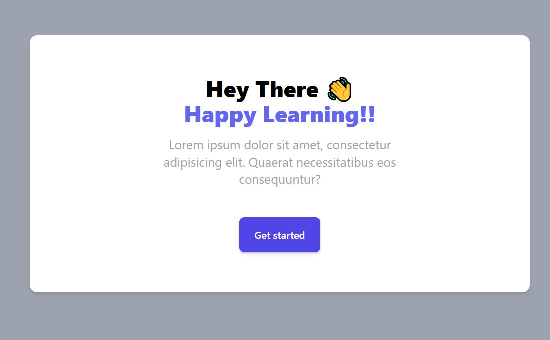
Open index.html in your browser to see the output below.
Creating dark theme using inline class
The easiest mode of using a dark theme in Tailwind is with the dark class. Update the code in tailwind.config.js.
// tailwind.config.js
module.exports = {
  content: ["./*.html"],
  darkMode: "class",
  theme: {
    extend: {},
  },
  plugins: [],
};
darkMode:class enables the dark state to be used with Tailwind classes to set different properties between normal and dark modes.
Update index.html in the following ways:
- Add
darkclass to thebody(Line 13) - Add
dark:bg-gray-800class todiv.theme-container(Line 15) - Add
dark:text-whiteclass toh2.theme-header(Line 19)
See the code below for an illustration
....
<body class="dark ....">
....
    <div class="theme-container dark:bg-gray-800 ....">
....
        <h2 class="theme-header dark:text-white .... ">
....
NOTE: .... represents unchanged code
To enable this, we added the dark to the body tag, and removing it would reset it back to normal mode.
Create Toggle
Now in the current state, we have to manually add or remove the dark class from the body, but this is usually now what we want. We would want a switch to toggle between these modes.
<!-- Replace index.html -->

<!DOCTYPE html>
<html lang="en">
  <head>
    <meta charset="UTF-8" />
    <meta http-equiv="X-UA-Compatible" content="IE=edge" />
    <meta name="viewport" content="width=device-width, initial-scale=1.0" />
    <title>Tailwind Theming</title>
    <link rel="stylesheet" href="output.css" />
    <script src="main.js" defer></script>
  </head>
  <body class="bg-gray-400">
    <div class="wrapper mt-16 px-8">
      <div
        class="theme-container mx-auto max-w-[50rem] rounded-xl bg-white shadow-md dark:bg-gray-800"
      >
        <div class="mx-8 pt-4 text-end">

            <!-- Checkbox start -->
          <div
            class="relative mr-2 inline-block w-10 select-none align-middle transition duration-200 ease-in"
          >
            <input
              type="checkbox"
          name="theme-toggle"    id="theme-toggle"
              class="peer absolute block h-6 w-6 cursor-pointer appearance-none rounded-full border-4 bg-white checked:right-0 checked:border-green-400"
            />
            <label
              for="theme-toggle"
              class="block h-6 cursor-pointer overflow-hidden rounded-full bg-gray-300 peer-checked:bg-green-400"
            ></label>
          </div>
          <label
            for="toggle"
            class="theme-text text-bold text- font- font-bold tracking-wider text-gray-700 dark:text-white"
            >LIGHT</label
          >
        </div>
          <!-- Checkbox End -->

          <div
          class="lg:py-16 lg:px-8 z-20 mx-auto w-full py-12 px-4 text-center sm:px-6"
        >
          <h2
            class="theme-header text-3xl font-extrabold text-black dark:text-white sm:text-4xl"
          >
            <span class="block"> Hey There 👋 </span>
            <span class="block text-indigo-500">
              Happy Learning!!
            </span>
          </h2>
          <p class="mx-auto mt-4 max-w-md text-xl text-gray-400">
            Lorem ipsum dolor sit amet, consectetur adipisicing elit. Quaerat
            necessitatibus eos consequuntur?
          </p>
          <div class="lg:mt-0 lg:flex-shrink-0">
            <div class="mt-12 inline-flex rounded-md shadow">
              <button
                type="button"
                class="w-full rounded-lg bg-indigo-600 py-4 px-6 text-center text-base font-semibold text-white shadow-md transition duration-200 ease-in hover:bg-indigo-700 focus:outline-none focus:ring-2 focus:ring-indigo-500 focus:ring-offset-2 focus:ring-offset-indigo-200"
              >
                Get started
              </button>
            </div>
          </div>
        </div>
      </div>
    </div>
  </body>
</html>
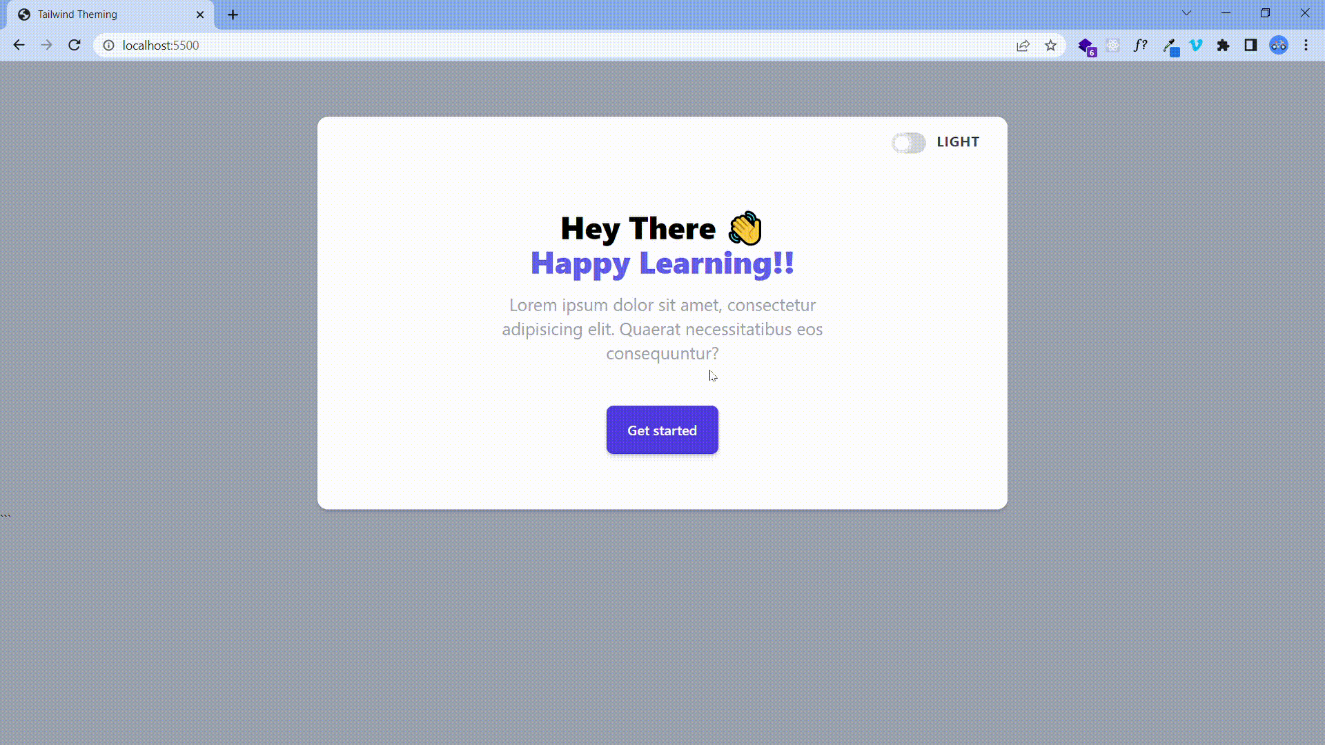
The Output
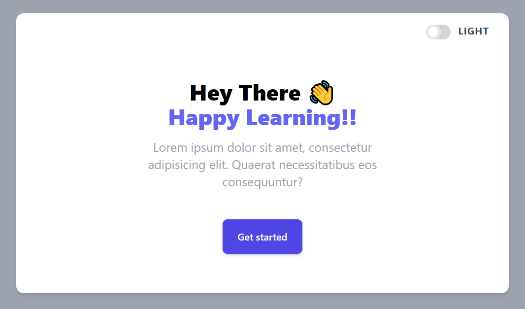
We added a checkbox to enable the toggle.
We need to use some Javascript to make the switch work as expected.
Update main.js with the code below.
// main.js
const body = document.querySelector("body");
const themeToggle = document.querySelector("#theme-toggle");
const themeText = document.querySelector(".theme-text");
let darkTheme = false;

themeToggle.addEventListener("click", () => {
  body.classList.toggle("dark");
  darkTheme = !darkTheme;
  themeText.textContent = darkTheme ? "DARK" : "LIGHT";
});
Here, we get the toggle and the body element and create the toggle function to change the state. We also change the toggle text when clicked.
Session Replay for Developers
Uncover frustrations, understand bugs and fix slowdowns like never before with OpenReplay — an open-source session replay tool for developers. Self-host it in minutes, and have complete control over your customer data. Check our GitHub repo and join the thousands of developers in our community.
Theming with CSS Variables
Consider a scenario where you need more than just light and dark themes. Using the tailwind dark class would not be able to handle that. With the help of CSS Variables, you can create a custom design system that handles as many themes as you want.
- Start a new project folder
- Open the folder on your terminal and run the following:
git clone https://github.com/Complexlity/tailwind-theming.git
cd tailwind-theming
npm install
npm run watch
Having the same folder structure and files as in the previous project, we create a different component to handle multiple themes.
Creating Call To Action Component
Copy the code below into index.html
<!DOCTYPE html>
<html lang="en">
  <head>
    <meta charset="UTF-8" />
    <meta http-equiv="X-UA-Compatible" content="IE=edge" />
    <meta name="viewport" content="width=device-width, initial-scale=1.0" />
    <title>Tailwind Theming</title>
    <link rel="stylesheet" href="output.css" />
    <script src="main.js" defer></script>
  </head>
  <body class="bg-gray-500">
    <div>
      <div class="wrapper mt-16 px-8">
        <div
          class="themed-background bg-gray-200 mx-auto max-w-[50rem] rounded-xl  shadow-md"
        >
          <div class="px-4 pt-4">
            <label
              for="themes"
              class="themed-label text-indigo-600 mb-2 block text-center text-sm font-medium "
              >CHOOSE A THEME</label
            >
            <select
              id="themes"
              class="block w-full cursor-pointer rounded-lg border p-2.5 text-sm outline-transparent"
            >
              <option value="" selected>Default (Light)</option>
              <option value="blue">Blue</option>
              <option value="red">Red</option>
              <option value="purple">Purple</option>
            </select>
          </div>
          <div
            class="relative mx-auto max-w-4xl overflow-hidden sm:rounded-2xl"
          >
            <div
              class="relative mx-auto max-w-2xl py-16 px-4 text-center sm:py-20 sm:px-6 lg:px-8"
            >
              <h2
                class="themed-header text-indigo-600 text-3xl font-extrabold sm:text-4xl"
              >
                <span class="block">Consistency matters.</span>
                <span class="block">Practice makes perfect.</span>
              </h2>
              <p class="themed-subheader text-gray-800 mt-4 text-lg leading-6">
                Ac euismod vel sit maecenas id pellentesque eu sed consectetur.
                Malesuada adipiscing sagittis vel nulla nec.
              </p>
              <div
                class="mx-auto mt-10 max-w-sm sm:flex sm:max-w-none sm:justify-center"
              >
                <a
                  href="#"
                  class="themed-button bg-indigo-600 text-gray-200 flex items-center justify-center rounded-md border border-transparent px-4 py-3 text-base font-medium  shadow-sm sm:px-8"
                >
                  Get started
                </a>
              </div>
            </div>
          </div>
        </div>
      </div>
    </div>
  </body>
</html>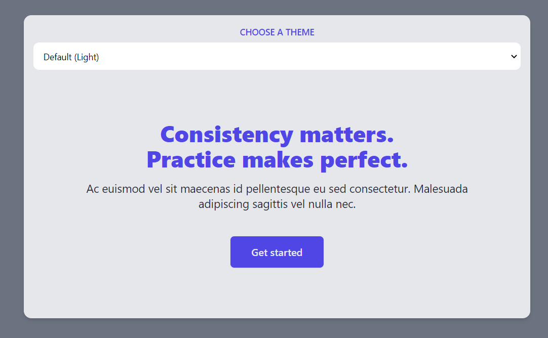
We have a similar call to action component with a select button which we would use to toggle themes.
Create CSS Variables for the colors of themed-* elements.
Replace input.css with the code below
/* input.css */
@tailwind base;
@tailwind components;
@tailwind utilities;

@layer base {
  :root {
    --color-text-base: #4f46e5; /* bg-indigo-600 */
    --color-text-muted: #1f2937; /* bg-gray-800 */
    --color-fill: #e5e7eb;  /* bg-gray-200 */
    --color-text-inverted: #e5e7eb; /* bg-gray-200 */
    --color-button-base: #4f46e5; /*bg-indigo-600 */
  }
}
Here, we create variables from the tailwind colors using their hex code equivalent.
Add Custom Color Configuration
Update tailwind.config.js with the code below
module.exports = {
  content: ["./*.html"],
  theme: {
    extend: {
      textColor: {
        skin: {
          base: "var(--color-text-base)",
          muted: "var(--color-text-muted)",
          inverted: "var(--color-text-inverted)",
        },
      },
      backgroundColor: {
        skin: {
          fill: "var(--color-fill)",
          button: "var(--color-button-base)",
        },
      },
    },
  },
  plugins: [],
};
Here, we use the CSS variables to make custom tailwind colors. These colors can be accessed in HTML elements. For example, the base color could be accessed by text-skin-base, and the fill color could be accessed by bg-skin-fill.
Replace hard-coded colors with the created colors
Update the following elements in index.html:
- div.themed-background (Line 15 ): Replace
bg-gray-200withbg-skin-fill - label.themed-label (Line 20 ): Replace
text-indigo-600withtext-skin-base - h2.themed-header (Line 40 ): Replace
text-indigo-600withtext-skin-base - p.themed-subheader (Line 45): Replace
text-gray-800withtext-skin-muted - a.themed-button (Line 54): Replace
bg-indigo-600withbg-skin-buttonandtext-gray-200withtext-skin-inverted
Note: Depending on the text editor and code formatting, the line number may vary
....
<div class="themed-background bg-skin-fill mx-auto ....">
<!-- bg-gray-200 now bg-skin-fill -->
....
<label for="themes" class="themed-label text-skin-base mb-2 ....">CHOOSE A THEME</label>
<!-- text-indigo-600 now text-skin-base -->
....
<h2 class="themed-header text-skin-base text-3xl .... ">
<!-- text-indigo-600 now text-skin-base -->
....
<p class="themed-subheader text-skin-muted mt-4 .... ">
<!-- text-gray-800 now text-skin-muted -->
....
<a href="#" class="themed-button bg-skin-button text-skin-inverted flex ....">
<!-- bg-indigo-600 now bg-skin-button , text-gray-200 now text-skin-inverted -->
Note: .... represents unchanged code
The component should still look the same without hardcoded colors on the elements.
Create Multiple Themes
Now you can create as many themes as you need using the CSS variables. We will create three more: Blue, Red, and Purple.
Replace input.css with the code below
/* input.css */
@tailwind base;
@tailwind components;
@tailwind utilities;

@layer base {
  :root {
    --color-text-base: #4f46e5;
    --color-text-muted: #1f2937;
    --color-fill: #e5e7eb;
    --color-text-inverted: #e5e7eb;
    --color-button-base: #4f46e5;
  }

  .blue {
    --color-text-base: #fff;
    --color-text-muted: #bfdbfe;
    --color-fill: #1e40af;
    --color-text-inverted: #1d4ed8;
    --color-button-base: #fff;
  }
  .red {
    --color-text-base: #fff;
    --color-text-muted: #fecaca;
    --color-fill: #991b1b;
    --color-text-inverted: #b91c1c;
    --color-button-base: #fff;
  }
  .purple {
    --color-text-base: #fff;
    --color-text-muted: #e9d5ff;
    --color-fill: #6b21a8;
    --color-text-inverted: #7e22ce;
    --color-button-base: #fff;
  }
}
Now we created more themes. We used scoping of CSS variables to achieve it. These colors would only apply under the specific class while the :root one remains the default.
Implement Theme Toggling
We already created the select to toggle these themes, so we need to use Javascript to make it work as expected.
Insert the code below into main.js.
// Insert code into main.js
const themedContainer = document.querySelector("body > div");
const selectOptions = document.querySelector("#themes");
selectOptions.addEventListener("input", (e) => {
themedContainer.className = e.target.value;
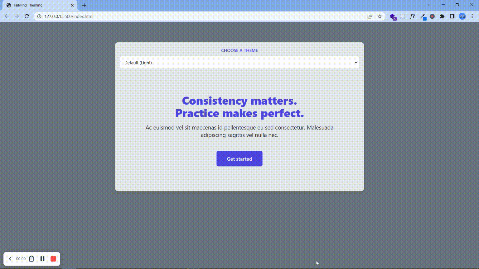
});In the code above, we change the parent element’s class depending on the selected option’s value. Now the code works the same as the image below.
Conclusion
In this article, we looked at how to create a dark theme and multiple themes using Tailwind CSS. You can see both methods in action here. With the ease of implementation here and for accessibility reasons, you should always create at least a dark theme for your websites and applications
Gain Debugging Superpowers
Unleash the power of session replay to reproduce bugs and track user frustrations. Get complete visibility into your frontend with OpenReplay, the most advanced open-source session replay tool for developers.
