
The navigation bar (navbar) is a critical component influencing user experiences. Traditional navbar layouts can cause issues with their static nature, potentially leading to navigation problems, especially on dynamic websites. Users expect websites to be clear, easy, and fun to use, and designers have revamped the traditional navigation bar. This article showcases three trendy navbar layout styles and explains why they’re better options.

Discover how at OpenReplay.com.
Navbars are those menus at the top of websites, but they’re much more than just decoration. They’re like helpful guides, making it easy for visitors to find what they’re looking for and get around your site. Here’s why they’re important:
- User Guidance: A navbar helps users navigate the site, especially on complex sites.
- Usability: It’s easy for users to interact with, no matter their device, with clear labels and an intuitive layout.
- Brand Cohesion: It consistently reinforces the brand by featuring logos and branding elements.
- Efficiency: Users can quickly find what they’re looking for, reducing frustration and keeping them on the site.
- SEO Benefits: It can improve search engine rankings by helping search engines understand the site’s structure and content.
- Accessibility: It’s designed with accessibility in mind, making it usable for everyone.
- Aesthetic Appeal: A well-designed navbar enhances the site’s overall appearance, making it more appealing to users.
Types of Website Navigation
Here are three main types of navigation bars commonly seen in web design:
Sticky Navigation Bar

These types of navigation bars remain fixed at the top or bottom of the webpage as users scroll. They always ensure easy access to navigation links, enhancing user experience by providing constant visibility of navigation options.
Hamburger Menu
This type of navigation bar features a compact icon, often represented by three horizontal lines (the “hamburger” icon), which, when clicked or tapped, reveals a dropdown menu containing navigation links. It’s commonly used in mobile or minimalist designs to save space and streamline navigation.
Tab Navigation Bar
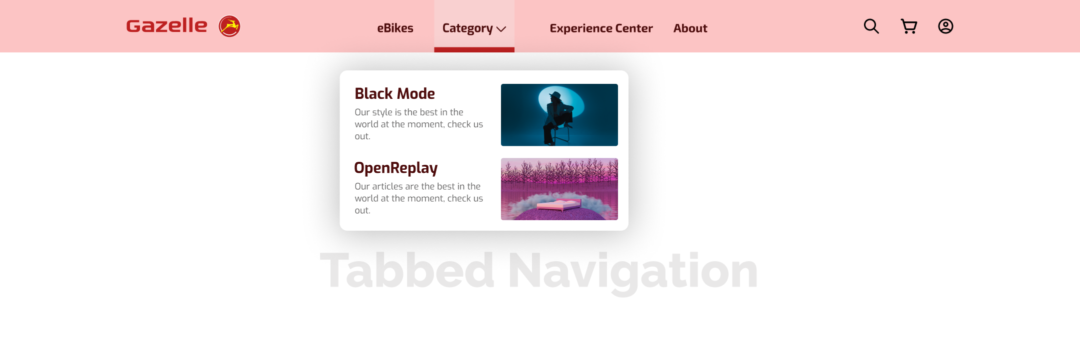
Tabbed navigation bars display tabs horizontally at the top of the webpage, each representing a different section or category of the website. Users can click on the tabs to navigate between different sections, providing a clear and organized way to access content.
Evolution of Navigation in Web Design
Alright, let’s take a stroll down web memory lane! Back in the early days, websites were —basic and text-heavy. Navigation was just a bunch of hyperlinks pointing you where to go—simple but not very exciting.
Fast-forward to the late ’90s—enter CSS, the superhero for web designers. We got dropdown menus, image tricks, and cool hover effects with it. Navigation became more interactive and stylish. Websites were no longer just places to get info; they were experiences.
Today, users want more than just functionality; they want a smooth, good-looking ride. It’s like the web grew up and got a whole new bag of tricks and styles. In this article, we are going to cover some of them.
Key Considerations for Modern Navbar Design
When designing a modern navbar, three key aspects must be considered: usability, aesthetics, and performance.
- Usability: Focus on making the navbar easy to navigate, with clear labels and logical organization. Ensure accessibility features are in place for all users.
- Aesthetics: Design the navbar to seamlessly integrate with the website’s overall look and feel, paying attention to color, typography, and visual hierarchy.
- Performance: Prioritize fast loading times and responsiveness across different devices. Optimize assets to minimize loading delays and ensure smooth interaction.
In the next sections, I will showcase these three modernized navbar layout and why you should consider using them.
Minimalist Menu
For a practical demonstration of a minimalist menu, you can explore this CodePen example. This example showcases how clean lines, limited elements, and strategic use of negative space combine to create a minimalist and user-friendly navigation experience.
Features
Some of the features of a minimalistic menu include:
- Clean lines and simple design elements.
- Limited number of navigation items.
- Emphasis on negative space for clarity.
Benefits
Below are reasons why a minimalistic menu is better.
- Faster loading times due to reduced elements.
- Enhanced focus on content for improved readability.
- Contemporary design aesthetic for a modern look.
Drawbacks
Minimalistic menus face several challenges. They may struggle to handle complex navigation structures, particularly on websites with extensive content hierarchies. Additionally, they may not match some websites’ branding preferences, leading to design inconsistencies.
Horizontal Hamburger Hero
Explore korty.tv to experience the horizontal hamburger hero menu. This website effectively demonstrates how the hamburger menu can be implemented seamlessly, providing users with intuitive navigation while maintaining a sleek and modern design aesthetic.
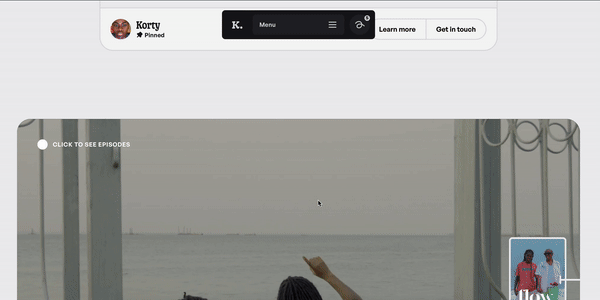
The horizontal hamburger hero menu employs the iconic hamburger icon, typically displayed horizontally at the top of the webpage. An animated menu slides out underneath it after clicking or tapping the hamburger icon, revealing navigation options.
Advantages
The horizontal hamburger hero menu offers the following benefits:
- Flexible layouts adaptable to various screen sizes.
- Device compatibility, particularly suited for mobile devices.
- Offers a sleek and minimalist appearance, reducing clutter.
Challenges
Challenges with the horizontal hamburger hero menu include a user learning curve, where some users may not immediately recognize the hamburger icon as a navigation menu. Also, options are limited in visibility as all navigation items are hidden behind the hamburger icon, potentially leading to discoverability issues.
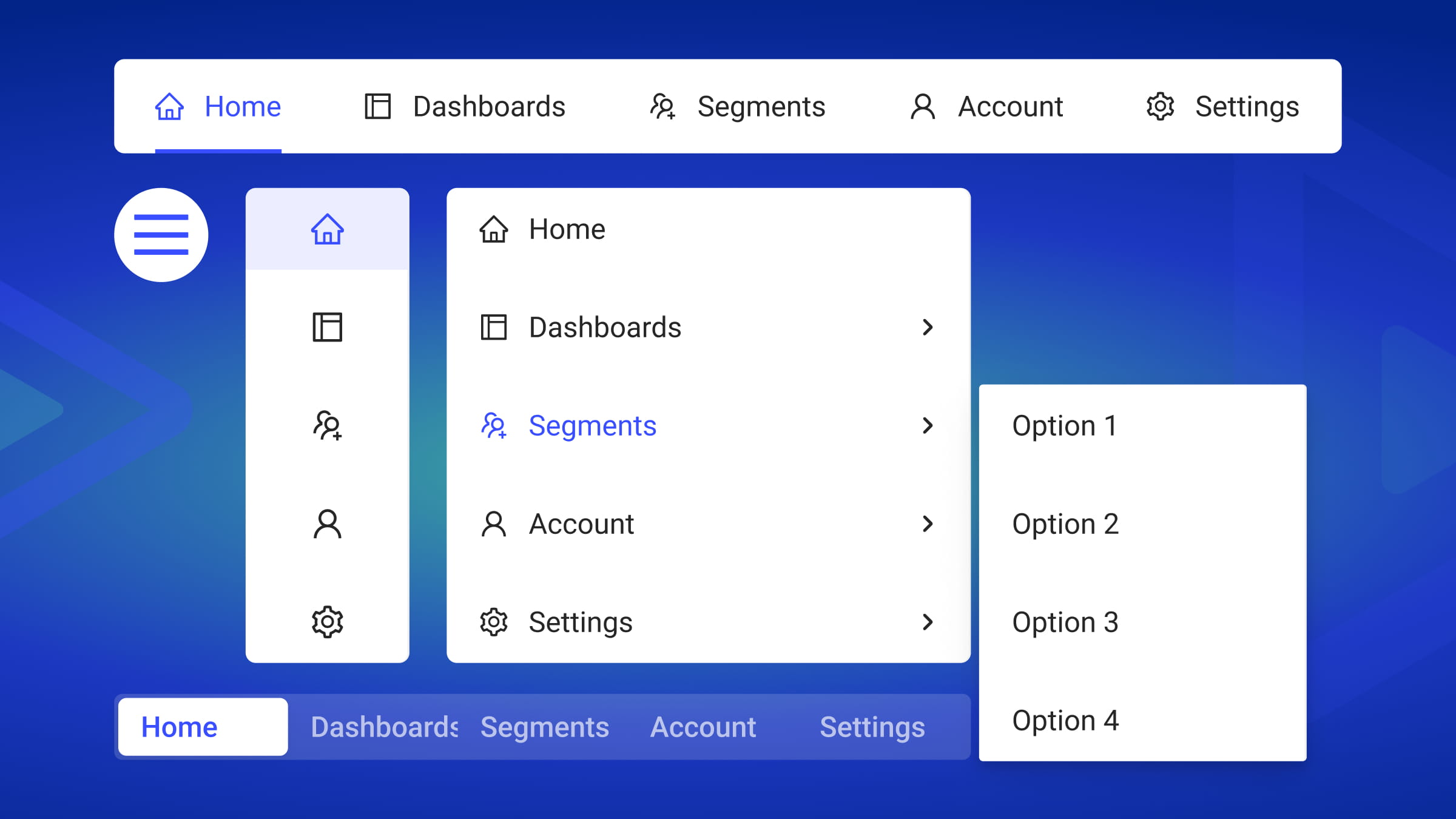
Vertical Mega Menu
Visit Material Design 3 to experience a vertical mega menu. This example demonstrates how structured submenus and extensive dropdown capabilities can provide users with comprehensive navigation and improved information discovery within a sleek and intuitive menu interface.

How do they work?
The vertical mega menu functions by expanding from a single menu item, offering extensive dropdown capabilities that reveal multiple submenus filled with information. Each submenu is organized neatly, resembling a well-organized library, with clear categories and labels for easy navigation.
What are the benefits?
The vertical mega menu offers several advantages, including:
- Comprehensive navigation: Vertical mega menus present all website sections clearly, simplifying navigation even on complex websites.
- Improved information discovery: Users can explore related topics effortlessly, delving deeper into subjects of interest.
- User convenience: With everything easily accessible, users save time and frustration, akin to having neatly organized tools on a desk.
Are there any drawbacks?
Some of the disadvantages of vertical mega menus include:
- Design complexity: Crafting a well-designed vertical mega menu requires careful planning and execution, akin to building a functional treehouse.
- Information overload: Overloading menus with too much content can overwhelm users. It’s essential to organize content effectively, like packing for a hike—bring only what’s necessary.
- Slower loading: Complex menus may slow down website loading times, impacting performance in today’s fast-paced digital landscape.
Modern vs. Traditional
Choosing between modern and traditional navigation is a balancing act in web design. Traditional offers familiarity, while modern brings innovation. Finding the right balance ensures effective navigation that aligns with the website’s essence.
Choosing the Right Fit
Before selecting a navigation layout, it’s crucial to consider various factors. Start by evaluating the type and amount of content your website hosts. Next, consider what your users prefer—whether they prioritize familiarity or engagement. Finally, ensure that the chosen layout aligns seamlessly with your website’s branding and design goals to maintain a cohesive and user-friendly experience.
When to Modernize
Not every website requires a complete navigation overhaul. Determining whether your website’s navigation needs an update requires careful consideration. One indication might be if users frequently express frustration or confusion when navigating your site, as revealed through usability testing. By incorporating modern features, you can address these pain points and enhance the overall user experience. Moreover, staying attuned to industry trends ensures your website remains contemporary and appealing to visitors. Analyzing user data obtained through analytics offers valuable insights into areas where navigation improvements are needed, allowing you to make informed decisions. Ultimately, prioritizing a seamless and enjoyable user journey should guide any decisions regarding navigation updates, ensuring that visitors can easily find what they need on your site.
Conclusion
So, there you have it! We’ve explored the exciting world of modern website navigation, diving into different styles like minimalist and vertical mega menus. Each type of navigation layout offers distinct advantages and considerations.
Remember, the perfect navigation for your website depends on your unique content, audience, and brand identity. Instead of guessing, gather feedback from real users. Use tools like OpenReplay, Hotjar, or Crazy Egg to track how people navigate your site and find areas for improvement.
Resources
Explore navigation bar design further with additional resources:
- Everything you need to know on the navigation bar
- Want to explore more awesome navbars?
- How to know user navigation usage for your site.
Truly understand users experience
See every user interaction, feel every frustration and track all hesitations with OpenReplay — the open-source digital experience platform. It can be self-hosted in minutes, giving you complete control over your customer data.
Star on GitHub12k