3 things you never thought were possible with only CSS
Three interesting applications of CSS.


CSS (Cascading Style Sheets) is like aesthetics to the HTML used to structure a web document. Whether you’re a front-end developer, a full stack developer, or someone starting in web design, how to use a CSS style sheet is something you should definitely know how to do!
I’ll be expanding your horizon on the limitless things you could do with just CSS, things you thought you would only do with code.
To go along with some of these tricks, you should have a good knowledge of HTML tags. You should also know CSS, flexbox, and CSS Grid (especially border, margin, and padding).
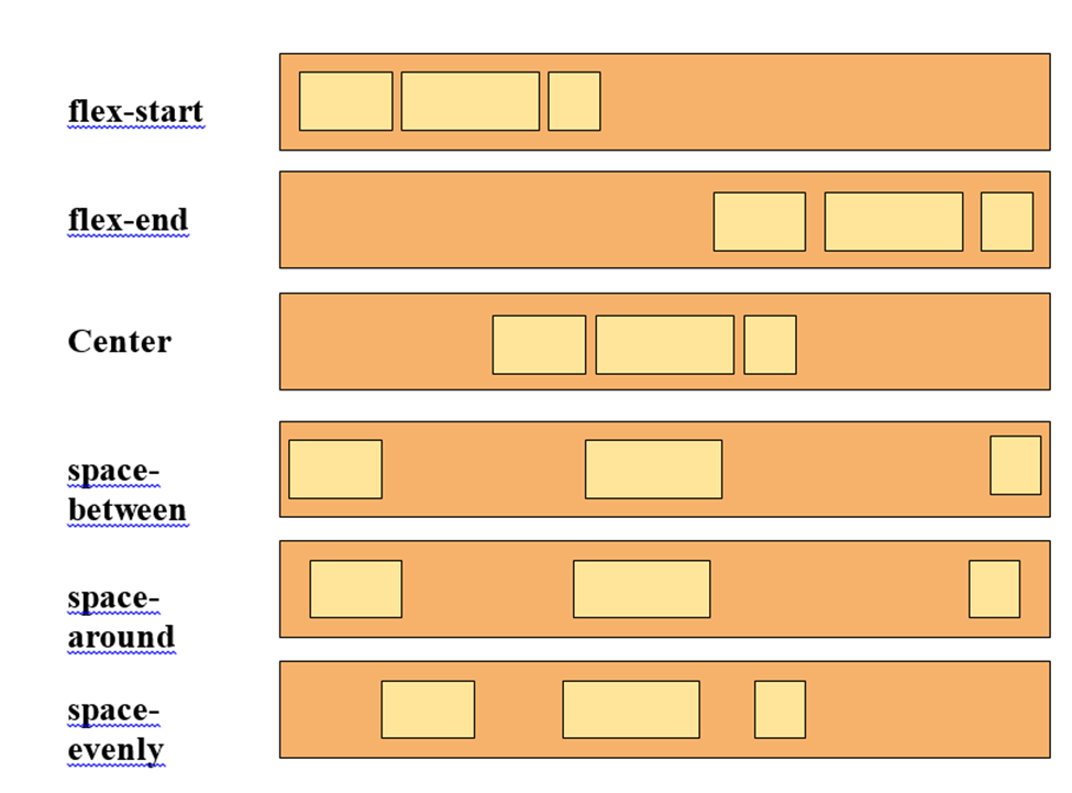
The Flexible Box Layout Model (flexbox) is designed for one-dimensional content, and it excels at taking a bunch of items of different sizes and returning the best layout.
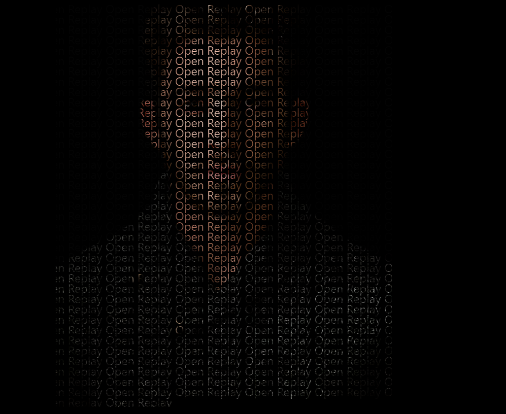
Creating a text portrait with an Image:
Text portrait is one of the various designs and image manipulations that can be performed using CSS. CSS has a lot of functionalities, and I’ll outline how you could create a text portrait with an image blended in.
- Step 1: Create an HTML document. We could use a generated ‘Lorem’ text, but to not cluster our HTML document, I embedded a javascript code that repeats my text 500 times.
<!DOCTYPE html>
<html lang="en">
  <head>
    <meta charset="UTF-8" />
    <meta http-equiv="X-UA-Compatible" content="IE=edge" />
    <meta name="viewport" content="width=device-width, initial-scale=1.0" />
    <link rel="stylesheet" href="form.css" />
    <title>Document</title>
  </head>
  <body>
    <div id="text">
</div>
    </div>
    <script>
      let str = "Open Replay ";
      document.getElementById("text").innerHTML = str.repeat(500);
    </script>
  </body>
</html>- Step 2: Edited the background image in the CSS document. We gave it a darker color. Set the overflow hidden and the font family to a sans-serif font.
body {
  background: rgb(0, 0, 0);
  overflow: hidden;
  font-family: "Segoe UI", sans-serif;
}- Step 3: First, select the id “text”. Set background image using CSS URL
()function. We are using this image from unsplash.com. Set the background-size to 80vh.

Add background-repeat to no-repeat to avoid repetition of the image. Reduce the space between lines for better visuals. background-attachment to fixed.
- Step 4: To clip text over an image and we use
-WebKit-text-fill-colorproperty and theWebKit-text-fill-color. We will be setting the background of the to -webkit-text-fill-color: rgba(255, 255, 255, 0);
body {
  background: rgb(0, 0, 0);
  overflow: hidden;
  font-family: "Segoe UI", sans-serif;
}
#text {
  line-height: 14px;
  background: url("https://images.unsplash.com/photo-1506794778202-cad84cf45f1d?ixlib=rb-4.0.3&ixid=MnwxMjA3fDB8MHxzZWFyY2h8M3x8cG9ydHJhaXR8ZW58MHx8MHx8&auto=format&fit=crop&w=600&q=60");
  -webkit-background-clip: text;
  background-attachment: fixed;
  background-repeat: no-repeat;
  -webkit-text-fill-color: rgba(255, 255, 255, 0);
  background-size: 80vh;
}
The output:
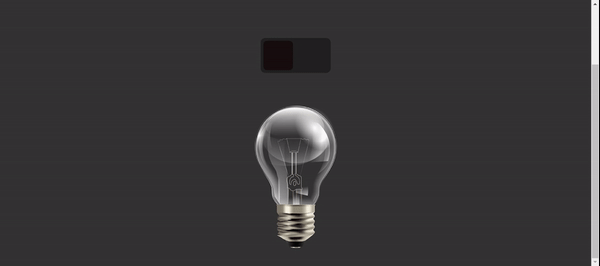
The making of a light bulb
It’s unimaginable that CSS could be used to turn on/off a light bulb. You might expect a button that will require an “onClick” function to run a function that turns it off or on. For this trick, we will use a checkbox tag to boycott the javascript code. What we do is switch between two different pictures (the light bulb on and the light bulb image when it’s off) For the bulb images, download the images from this link.
The :checked attribute indicates whether the checkbox is currently checked. This is used in applying or removing styles to the HTML element.
The HTML section linked to the bulb.css
<!DOCTYPE html>
<html lang="en">
  <head>
    <meta charset="UTF-8" />
    <meta http-equiv="X-UA-Compatible" content="IE=edge" />
    <meta name="viewport" content="width=device-width, initial-scale=1.0" />
    <title>Light bulb</title>
    <link rel="stylesheet" href="bulb.css" />
  </head>
  <body>
    <label for="switch">
      <input type="checkbox" id="switch" />
      <span id="bulb-button"></span>
      <div class="bulb"></div>
    </label>
  </body>
</html>
The sign in CSS: It is a general sibling combinator that selects all elements that the former selector precedes. It selects all the <p> tags below the first selector, which is the <div> tag.
The CSS section:
* {
  margin: 0;
  padding: 0;
  box-sizing: border-box;
}
body {
  display: flex;
  justify-content: center;
  align-items: center;
  background: #333333;
  min-height: 100vh;
}
#switch {
  appearance: none;
}
label {
  position: relative;
  width: 150px;
  height: 75px;
  background: #212121;
  border-radius: 10px;
}
#bulb-button {
  position: absolute;
  top: 0;
  left: 0;
  width: 75px;
  height: 75px;
  background: rgb(23, 14, 14);
  border: 6px solid #212121;
  border-radius: 14px;
  cursor: pointer;
  transition: 0.5s;
  color: aliceblue;
}
#switch:checked ~ span {
  left: 75px;
  background-color: #ffffff;
}
.bulb {
  position: absolute;
  left: 50%;
  top: 80px;
  width: 348px;
  height: 408px;
  transform: translate(-50%);
  background: url(light-bulb-0ff.jpg);
  pointer-events: none;
  transition: 0.5s;
}
/* Use the lighted bulb in this section */
#switch:checked ~ .bulb {
  background: url(light-bulb-on.jpg);
}
Here’s your output:
Session Replay for Developers
Uncover frustrations, understand bugs and fix slowdowns like never before with OpenReplay — an open-source session replay tool for developers. Self-host it in minutes, and have complete control over your customer data. Check our GitHub repo and join the thousands of developers in our community.
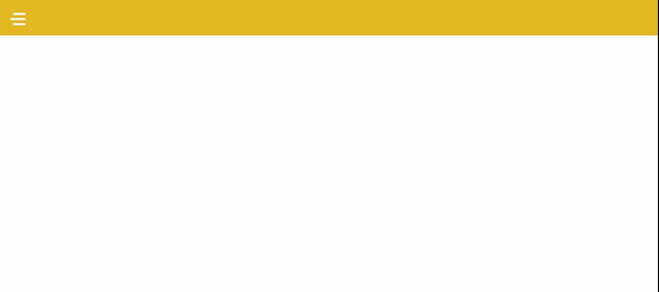
Hamburger menu
The hamburger menu is one of the most popular UI elements. Virtually all web designers have heard of or used it in designing websites. An overwhelming majority of the websites we see online use the Hamburger menu. It could be used for mobile responsiveness.
Creating a hamburger requires a good Knowledge of Html, CSS, and Javascript (functions). This post will enlighten you on how to create a hamburger menu without having any knowledge of JavaScript. This could also be like a project for aspiring developers.
The HTML section for the hamburger menu that’s linked to the CSS.
<!DOCTYPE html>
<html lang="en">
  <head>
    <meta charset="UTF-8" />
    <meta http-equiv="X-UA-Compatible" content="IE=edge" />
    <meta name="viewport" content="width=device-width, initial-scale=1.0" />
    <link rel="stylesheet" href="harmburger.css" />
    <title>Document</title>
  </head>
  <body>
    <header class="header">
      <div class="navigation">
        <input type="checkbox" class="toggle" />
        <div class="hamburger"></div>
        <ul class="menu">
          <li><a href="#">Home</a></li>
          <li><a href="#">About</a></li>
          <li><a href="#">Services</a></li>
          <li><a href="#">Contact us</a></li>
        </ul>
      </div>
    </header>
  </body>
</html>
The CSS section for the hamburger menu
* {
  font-family: sans-serif;
  margin: 0;
  padding: 0;
  box-sizing: border-box;
}
.header {
  position: relative;
  width: 100%;
  display: flex;
  justify-content: space-between;
  align-items: center;
  background-color: rgb(232, 181, 29);
  padding: 0 25px;
  transition: 0.3s;
}
.menu li {
  list-style-type: none;
}
.menu li a {
  color: aliceblue;
  text-decoration: none;
  display: block;
  padding: 40px 25px;
  font-size: 18px;
  line-height: 1;
  transition: 0.3s;
}
.hamburger {
  position: relative;
  width: 30px;
  margin-top: 25px;
  margin-bottom: 20px;
  height: 4px;
  background: aliceblue;
  cursor: pointer;
  border-radius: 10px;
  z-index: 2;
}
.hamburger:before,
.hamburger:after {
  background: aliceblue;
  content: "";
  position: absolute;
  height: 4px;
  right: 0;
  border-radius: 10px;
  transition: 0.3s;
}
.hamburger:before {
  top: -10px;
  width: 25px;
}
.hamburger:after {
  top: 10px;
  width: 25px;
}
.toggle {
  position: absolute;
  width: 30px;
  height: 100%;
  z-index: 3;
  cursor: pointer;
  opacity: 0;
}
.navigation input:checked ~ .menu {
  right: 0;
}
.hamburger,
.toggle {
  display: block;
}
.header {
  padding: 10px 20px;
}
.menu {
  justify-content: start;
  flex-direction: column;
  align-items: center;
  position: fixed;
  top: 0;
  right: -300px;
  background: rgb(232, 181, 29);
  width: 300px;
  height: 100%;
  padding-top: 65px;
}
.menu li {
  width: 100%;
}
.menu li a,
.menu li a:hover {
  padding: 30px;
  font-size: 24px;
  box-shadow: 0 1px 0 rgba(255, 255, 255, 0.1) inset;
}
Here’s the result you get.
CSS has endless possibilities and is very flexible to create anything based on your imagination.
Gain Debugging Superpowers
Unleash the power of session replay to reproduce bugs and track user frustrations. Get complete visibility into your frontend with OpenReplay, the most advanced open-source session replay tool for developers.