Angular is one of the most prominent frameworks allowing you to build front-end web applications much faster and more efficiently. Developed by Google and based on TypeScript, a popular programming language developed and maintained by Microsoft, Angular is the first choice of many professional developers for building web applications. In a very short time, this open-source web application framework won the hearts of many web developers and customers across the globe. In fact, according to BuiltWith, over 300,000 websites are built on the Angular framework. The vast range of reusable and accessible component libraries that can help speed up the web development process makes Angular a preferred choice.
Let’s look at some popular Angular component libraries that can help you create robust web apps and systems.
Angular Material
Angular Material is an official component library from Angular that works on Google’s Material Design. Created with the help of Angular and TypeScript, this library features a set of components that can be used to build buttons, dialogs, bottom sheets, and so on. It comes with about 40 components that can be used to create fully customizable themes and build feature-rich applications.
Features of Angular Material:
- User-friendly
- Responsive apps
- Intuitive UI components
- Cross-platform compatibility
Angular Material Components:
- Form controls, such as autocomplete, checkbox, radio button, input, etc.
- Buttons, icons, progress bar
- Data table format
- Navigation bar, side navigation, and a toolbar menu
- Different types of pop-ups
Want to check some more Angular material components and their usage? You can go to https://material.angular.io/components/categories
Installation Process
https://material.angular.io/guide/getting-started
What’s good about Angular Material
- Easy to use
- Comes with excellent documentation
- Simple to maintain a consistent design
What’s bad about Angular Material
- Some components are not responsive enough
- Overuse or misuse of ARIA in some components
- It is not easily customizable to add accessibility to components
- Absence of a component that imports all the components
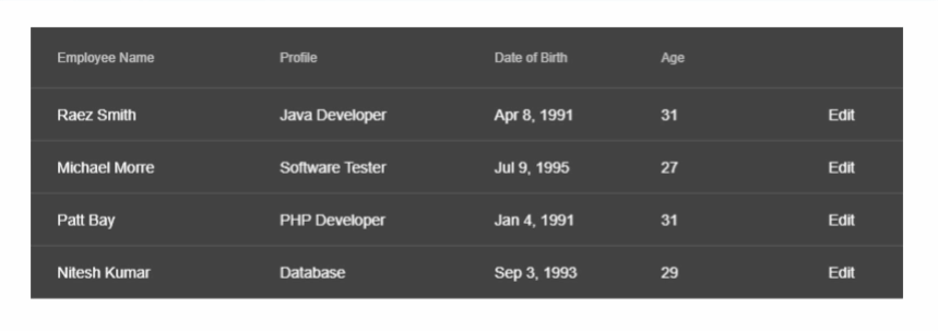
Example
With the help of different types of Table components -
NG Bootstrap
NG-Bootstrap is the most popular UI library that is entirely built using TypeScript. This component library is extensively used to build Angular-specific widgets from the top down. These widgets are easy to use and require no extra knowledge besides Bootstrap and Angular.
Unlike its previous version, NG-Bootstrap has dropped its dependency on jQuery, making Bootstrap 4 CSS its only other dependency. Implementing most JavaScript components makes an ideal solution for using Angular with Bootstrap.
Features
- Gives a professional look and feel to the app
- Easily accessible for integration with Angular 4 and above
- Adds responsiveness to your front-end
- It is lightweight
NG Bootstrap Components
- Buttons - To change the looks of the buttons
- Alert - To display alert messages with different UI
- Carousel - For sliding effects with different UI options
- DatePicker - The user can select a date with different UI options
- Collapse - One-click collapse option
- Dropdown - Select more options from dropdown menus
- Typehead - Different selection according to user input
- Modal - To get a pop-up-like feel after user input
Want to check some more NG Bootstrap components and their usage? You can go to https://ng-bootstrap.github.io/#/components
Installation Process
https://ng-bootstrap.github.io/#/getting-started
What’s good about NG Bootstrap
- Large community of developers
- an extensive range of widgets to use in Angular
- Make fantastic-looking websites that run seamlessly on mobile
What’s bad NG Bootstrap
- Requires working experience of Bootstrap to get started with NG-Bootstrap
- Often, it gets difficult to locate an issue in the code
- No frequent updates
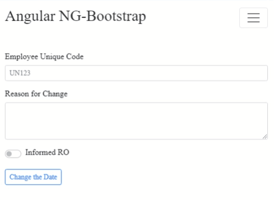
Example
With the help of the Form and Datepicker component -
NGX-Bootstrap
NGX-Bootstrap is another popular Angular UI component library that contains all the core Bootstrap components powered by Angular. That means you don’t need to include JS components, but it uses CSS and markup offered by Bootstrap. The modular components in NGX-Bootstrap can be adjusted and styled by scripts and manipulated through Accessible Rich Internet Applications(ARIA) roles.
It is a well-designed framework that extends Bootstrap component capabilities, allowing developers to use them in Angular applications. Since Bootstrap components are developed with Angular, it delivers excellent performance on all devices. NGX Bootstrap components are more extensible, modular, and adaptable than native Bootstrap.
Features
- Helpful and easy-to-understand documentation
- Fuss-free code
- Each component is tested and supports the latest Angular versions
NGX-Bootstrap Components
- Pagination - To display paginated website pages
- Accordion - To display hidden text after a click
- Popover - Different pop-up options after user input
- Progressbar - To display the completion
- Collapse - One click collapsing content
- Carousel - To add slider like UI
Get more detailed information and their usage here https://valor-software.com/ngx-bootstrap/#/components
Installation Process
https://www.npmjs.com/package/ngx-bootstrap/v/5.1.0
What’s good about NGX Bootstrap
- There are numerous components accessible right out-of-the-box
- It helps create responsive UI
- Can run on both mobile and desktop platforms with the same level of performance
What’s bad NGX Bootstrap
- Some components miss accessibility feature
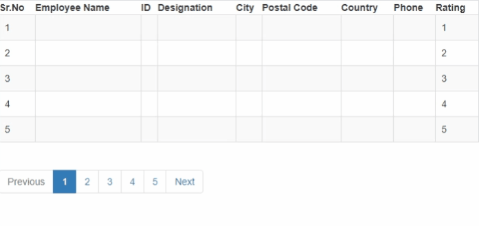
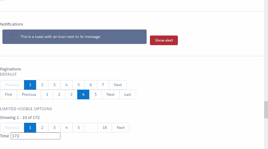
Example
With the help of Pagination Component -
Onsen UI
Onsen UI is a great Angular component library mainly used for creating high-quality hybrid web and mobile apps for Android and iOS using JavaScript. This component library provides flat and material designs that can be combined with the Angular framework.
Onsen UI provides developers with powerful CLI and development tools to build highly responsive Progressive Web Apps(PWAs) and mobile apps. Incredible Angular directives enable automatic styling based on the platform you choose for the project.
Features
- Onsen UI works well with Monaca which is a great platform for building hybrid apps
- Mobile-optimized CSS, JavaScript, and Components
- Provide support for Material and Flat Design
- Compatible with both AngularJS and Angular 2+
Onsen UI Components
- Tab bar - To display tab, select options with different UIs
- CheckBox - To get user input with a checkbox with different UIs
- Notification - Same as alert-like features
- Card - To give a card-like feel to UI
To get more information about the components, you can go to https://onsen.io/v2/api/css.html.
Installation Process
https://onsen.io/v2/guide/installation.html
What’s good about Onsen UI
- Built on open-source code
- Easy to learn
- Responsive layout
- Compiles JavaScript and HTML5 code without requiring developers to write it in a specific way
What’s bad about Onsen UI
- Free debugger not available
- Small community
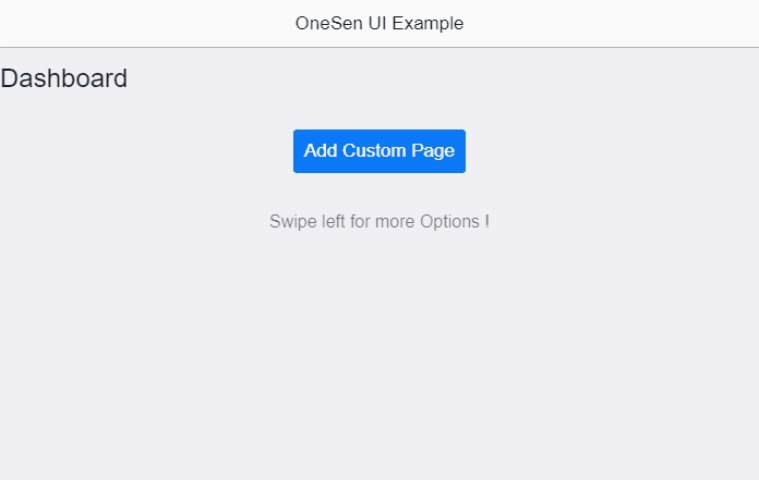
Example
With the help of Gesture along with some other components -
PrimeNG
PrimeNG is a complete UI suite for Angular. It offers a rich collection of over 80 UI components that are not only open-source and free to use, but are extremely easy to implement. PrimeNG allows you to choose from a range of professionally designed material and flat themes that are highly responsive and touch-optimized, and deliver extraordinary performance on numerous mobile devices.
The main benefit of PrimeNG over other components is that PrimeNG offers several customization options and allows developers to make it accessible the way they want easily. You can get started in no time with highly customizable native Angular CLI application templates.
Features
- Has 80+ components to choose from
- All widgets are available free and open-source
- A range of themes for the professional look and feel of the application
PrimeNG Components
- Buttons and SplitButtons
- File upload component
- Charts - pie, bar, line, and doughnut
- Alert messages with Growl and Messages
- Data components - DataTable, DataList, and DataGrid
- Overlay components – Dialog, Lightbox, and Overlay Panel
Get more information about PrimeNg’s different components under the installation process URL.
Installation Process
https://primefaces.org/primeng/setup
What’s good about PrimeNG
- Single library for all components
- PrimeNG components support templating
- A range of themes to choose from
- Frequent maintenance updates
What’s bad about PrimeNG
- Documentation is not consistent
- It accepts open source contributions for only bug fixes, but not for features
- Few components misuse or overuse Accessible Rich Internet Applications
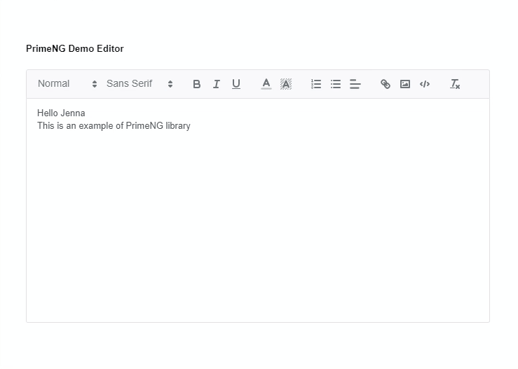
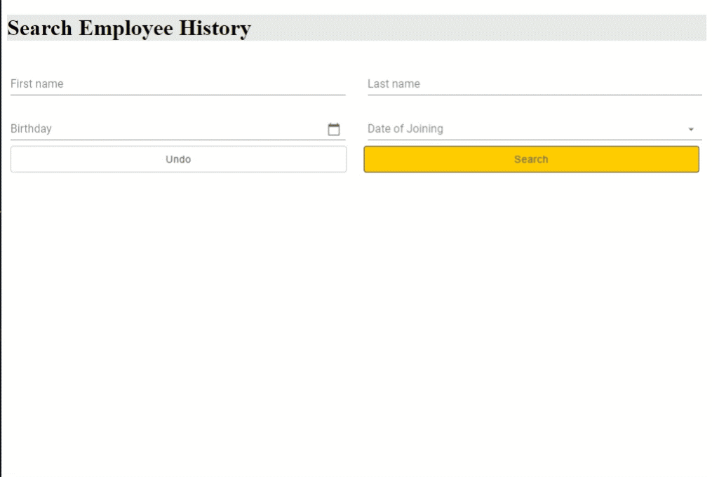
Example
With the help of the Form editor component -
Open Source Session Replay
OpenReplay is an open-source, session replay suite that lets you see what users do on your web app, helping you troubleshoot issues faster. OpenReplay is self-hosted for full control over your data.

Start enjoying your debugging experience - start using OpenReplay for free.
NG Lightning
NG-Lightning is another top Angular component library written in TypeScript and built upon the Angular and Salesforce’s Lightning design system. The primary purpose of this library component is to offer native Angular directives and components to the Lightning Design System.
NG-Lightning works on stateless functional components that rely on its input properties for delivering enhanced performance, flexibility, and seamless integration based on your application requirements.
Features
- It has a huge set of native Angular components
- It can be used to create an Angular app with Lightning design that interacts with Salesforce REST services
NG Lightning Components
- Breadcrumbs - To display next and previous pages
- Spinners - Work in progress display in the form of circle spin
- Badges - To display different types of badges with different UIs
- Icons - Different icons display in different shapes and sizes
- Datatables - Similar to Table components with different UI options
- DatePickers - For date selection with different UIs
- Forms - From editors for user input
- Ratings - To display different types of user ratings with different UIs
- Lookups - Search lookup after user input
et more information about different PrimeNG components here https://ng-lightning.github.io/ng-lightning/#/components/
Installation Process
https://www.npmjs.com/package/ng-lightning
What’s good about NG Lightning
- Developers can transpile TypeScript code and upload the JavaScript code
- It enables creating a web page and surfacing it within a Canvas app
What’s bad about NG Lightning
- Lightning LockService prevents adding of third-party libraries
Example
With the help of Notification, Pagination components
Vaadin
Vaadin offers enterprise-grade components that are great for building mobile and desktop apps. With accessible and themable components, developers can build apps faster and more efficiently. Vaadin also comes with Figma – a high-quality library that makes it easy to create prototypes of Vaadin-based UIs.
Vaadin is based on the open W3C web components standard, which means it works seamlessly on all the latest browsers and can be used with any front-end framework.
Features
- Figma library, which is a high-quality library for creating prototypes
- A good design system
- It offers more than 45 components
- It is entirely object-oriented
Vaadin Components
- Charts of 29 different types
- DataGrid with sorting, filtering, drop & down, and more
- A filterable dropdown field
- Date Picker to select a date with different UIs
- Upload - To upload files
- Map - To add a map with zoom in and zoom out options for users
- Log-in - To get user login credentials with different UI options
More information about Vaadin components is here https://vaadin.com/docs/latest/components
Installation Process
https://vaadin.com/docs/latest/guide/quick-start
What’s good about Vaadin
- Speed up the development process
- Mobile-friendly
- Easy to learn and navigate
- Comprehensive documentation
- Active community
What’s bad about Vaadin
- The size of dynamic JavaScript files can increase, which may demand a larger server
- Since Vaadin is focused on business, you may not be able to create funky websites
Example
With the help of Form, Datepitcker, and combobox components.
Angular Google Maps
Angular Google Maps is a set of directives and services that enable developers to use Google Maps services in their Angular applications. Earlier, it was a stressful task to use Google Maps in Angular because the library is loaded using a script tag, so the type definitions were not readily available. This resulted in compilation errors.
But, with Angular Google Maps directives, creating maps, markers, shapes, lines, windows, etc., is easily possible. The library also offers an async function that enables you to know whether the Google Maps library is loaded on the web page.
Features
- Display selected Latitude and Longitude
- Add and place marker
- Display the current position on a map
- Set direction in google map
Angular Google Maps Components
- GoogleMap - To Add google map
- Markers - To set the marker to set the directions
- MapTrafficLayer - To Display traffic with some customizations
- Zooming - For zoom in and zoom out
Find more information about google maps components here https://github.com/angular/components/tree/main/src/google-maps.
Installation Process
https://angular-ui.github.io/angular-google-maps/#!/quickstart
What’s good about Angular Google Maps
- Enables smooth integration of Google Maps in Angular applications
- Great for apps that need Google Maps
What’s bad about Angular Google Maps
- Angular Google Maps module sometimes fails to render in production
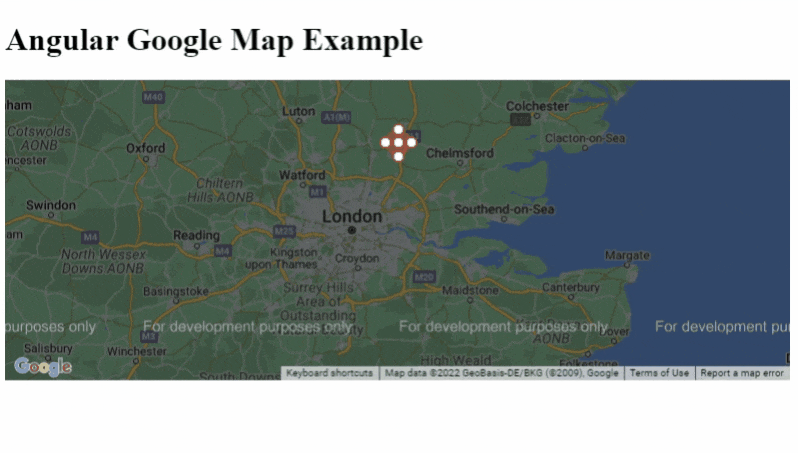
Example
With the help of google map, markers components -
Nebular
Nebular is an open-source and free Angular UI library based on Eva Design System specifications. This library contains more than 40 customizable UI components, Auth and Security modules, and four visual themes, allowing brands to incorporate beautiful designs.
Nebular has no third-party dependencies, meaning you can implement Angular UI components faster and more easily to create responsive and visually appealing UI for apps.
Features
- Its source code is available free under the MIT license
- Highly customizable components
- Highly modular design
Nebular Components
- Card - For normal content boxes with different UIs
- Layout - To display different forms and sections in the layout
- Flip Card - One click flip the content option
- Accordion - Hidden text different options and UIs
- Reveal Card - One-click content display
- Stepper - To display step by step process
- Infinite List - Infinite scroll
Get more information about Nubular components here https://akveo.github.io/nebular/docs/components/components-overview
Installation Process
https://akveo.github.io/nebular/docs/auth/installation#installation
What’s good about Nebular
- Offers great support
- Compatible with a range of devices
- It is secure and easy to use
What’s bad about Nebular
- Has no apparent cons
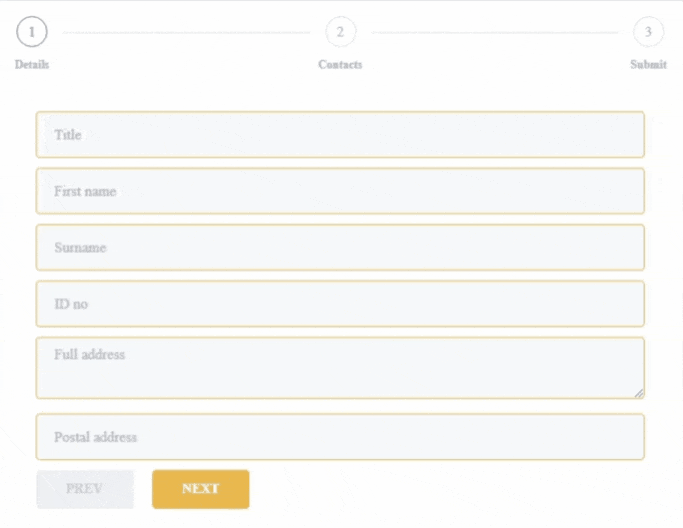
Example
With the help of forms, Stepper components -
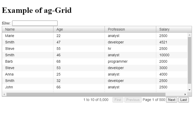
ag Grid
AG-Grid is Angular’s most feature-rich, robust, and fastest JavaScript-based data grid specifically designed to deliver exceptional performance right out of the box. It offers a full-fledged solution with features to meet most requirements without requiring third-party dependencies.
AG-Grid also has outstanding documentation to ensure every customization and feature option is included and described. AG-Grid UI interactions are familiar to Excel table creation functionality, making it easy for developers to get started with the Angular grid.
Features
- Easy to configure
- Server-side data integration
- Export to CSV and Excel
- Integrated charting
- Data-driven Component
Some ag Grid Components
- Cell Renderer - To render the data inside the table cell
- Date Component - To render the date inside the table cell
- Filter Component - To filter the cell data inside a table
- Floating Filter - Same as filter functions but with floated
- Status Bar Component - To add other filter options to the Table status bar
Find more information about ag Grid components here https://ag-grid.com/angular-data-grid/component-types/
Installation Process
https://www.ag-grid.com/javascript-data-grid/npm/
What’s good about ag Grid
- Comprehensive documentation
- Well-maintained
- Ease of customization
- Intuitive API
- Capable of handling large data sets
What’s bad about ag Grid
- Very few prebuilt UI themes
Example
With the help of the Filtering component -
All Libraries in Tabular Form
| Library | GitHub Stars | Weekly Downloads | Latest Version |
|---|---|---|---|
| Angular Material | 8.6K | 36K | 14.0.4 |
| NG Bootstrap | 7.9K | 407K | 13.0.0-beta.1 |
| NGX Bootstrap | 5.4K | 274K | 8.0.0 |
| Onsen UI | 8.6K | 36.8K | 2.12.1 |
| PrimeNG | 7.6K | 274K | 14.0.0 |
| NG Lightning | 904 | 1.3K | 8.0.0 |
| Vaadin | 495 | 11K | 23.1.4 |
| Angular Google Maps | 22.8K | 96.2K | 14.0.5 |
| Nebular | 6 | 74 | 0.0.1 |
| ag Grid | 8.9K | 123K | 28.0.0 |
Conclusion
These are some of the best Angular component libraries you should consider if you plan to build robust and future-ready Angular applications in 2022. Often developers avoid using external libraries, which may be acceptable in some cases, but external libraries can significantly reduce development time and help you deliver customized solutions. However, the first task is to find the right library that matches your application requirements and fulfills your end purpose.
A TIP FROM THE EDITOR: Do check our Getting started with Angular Material UI article, to get a thorough description about using Material UI in Angular.