
Transform your Website: Create 3D Magic with CSS Grid


3D effects in web design create a user experience that transcends traditional web design. They introduce a dimension and depth that is captivating to the site’s visitors and create an engaging and interactive experience for users. 3D also aids in storytelling through visuals that give the users an illusion of a real experience by bringing the objects or elements of the story to life, and this article will show you how to do this.

Discover how at OpenReplay.com.
CSS Grid is a layout system in CSS used to create two-dimensional grid-based layouts along both the horizontal and vertical axes on web pages. It provides a way to create responsive and more complex design layouts. While CSS grid is originally for creating two-dimensional layouts, it can be combined with CSS transforms to create a 3D layout effect.
A 3D layout is an arrangement of elements in a way that emulates a three-dimensional space, attempting to replicate the physical world. CSS provides styling features like 3D transforms, perspective, and other properties to create 3D layouts. These techniques enable developers to elevate their projects with dynamic interactivity.
Important properties for making grid layouts
Let’s review a quick overview of the CSS grid to understand its properties and concepts.
-
Grid container: An element becomes a grid container by applying the
displayproperty with the value of the grid to it, i.e.,display: grid. -
Rows and columns: You determine the number of rows and columns you want, then specify them using the
grid-template-rowsorgrid-template-columnsproperty. -
Grid item: This refers to the child element of the grid container.
-
Grid gaps:
Grid-gapsets the spacing between rows and columns. -
Fractional unit:
fris used to distribute the available spacing among the grid items proportionally.
Here’s a code snippet demonstrating how CSS Grid works.
<div class="container">
  <div class="item">Item 1</div>
  <div class="item">Item 2</div>
  <div class="item">Item 3</div>
  <div class="item">Item 4</div>
</div>
.container {
display: grid;
grid-template-columns: repeat(4, 1fr);
gap: 10px;
}
.item {
background: yellowgreen;
font-size: 3rem;
padding: 20px;
text-align: center;
}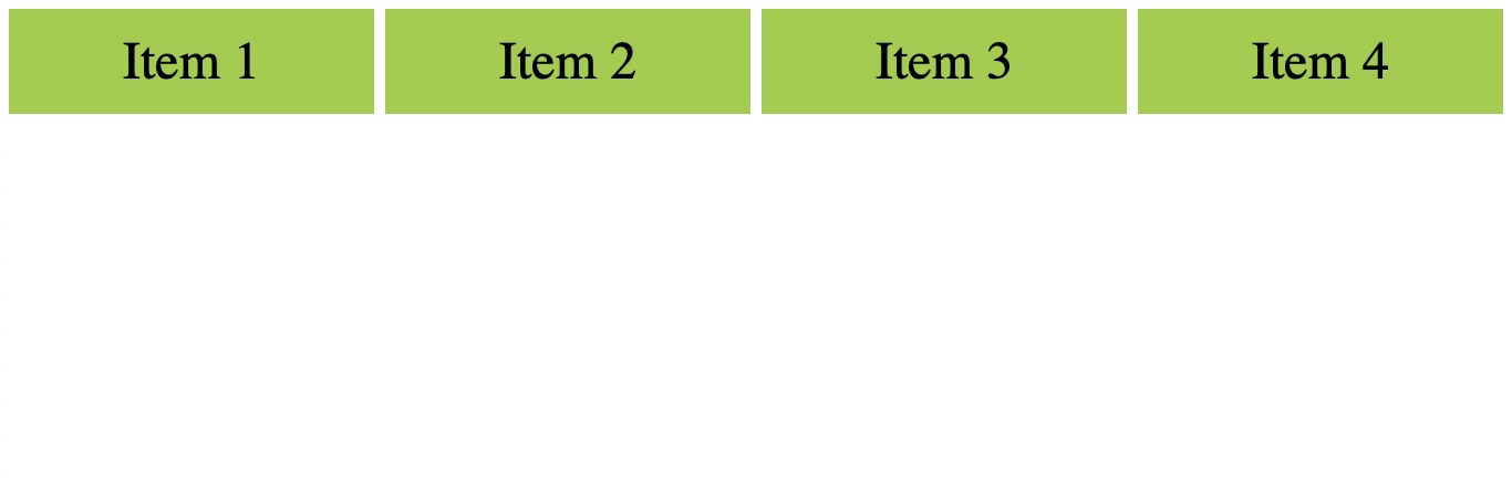
display: grid is applied to the container class, making it a grid container with four grid items.
The repeat(4, 1fr) is used to set up the grid columns by creating four columns, each taking up an equal fraction of the available space (1fr). The equal spacing can be seen in the image above.
Some other important properties for making layouts.
-
grid-columnandgrid-roware shorthand properties used to represent the start and end positions of a grid item along the row or column. -
grid-template-areas: These are named areas where grid items are assigned in the layout. -
justify-contentandalign-content: This aligns or justifies the entire grid within its container. -
grid-auto-columnsandgrid-auto-rows: This is used to specify the size of columns and rows that were implicitly created.
Code snippet demonstrating some other grid properties for making layouts.
<div class="container">
  <div class="grid-item item1">Item 1</div>
  <div class="grid-item item2">Item 2</div>
  <div class="grid-item item3">Item 3</div>
</div>
.container {
display: grid;
grid-template-columns: repeat(3, 1fr);
gap: 10px;
}
.grid-item {
background-color: yellowgreen;
color: rgb(15, 3, 3);
font-size: 3rem;
padding: 30px;
text-align: center;
}
.item1 {
grid-column: 1 / 3;
}
.item2 {
grid-column: 2 / 4;
}
.item3 {
grid-column: 1 / 2;
}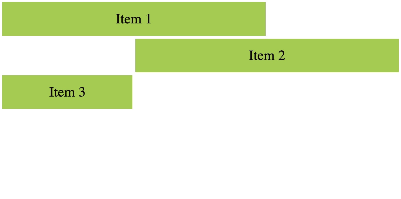
The class container is a grid-container with grid items.
The grid-item selector defines the styling common to each item.
The grid-column property on each item specifies the number of columns each item should span across. item1 class specifies that the item should span from column 1 and end at column 3. item2 spans from column 2 and ends at column 4. Similarly, item3 spans from column 1 and ends at column 2. This is all demonstrated in the image.
A demonstration of grid-template-areas.
<div class="container">
  <div class="grid-item item1">Header</div>
  <div class="grid-item item2">Main</div>
  <div class="grid-item item3">Sidebar</div>
  <div class="grid-item item4">Footer</div>
</div>
.container {
display: grid;
grid-template-columns: repeat(3, 1fr);
gap: 10px;
grid-template-areas:
"header header header"
"main main sidebar"
"footer footer footer";
}
.grid-item {
background-color: yellowgreen;
font-size: 3rem;
color: #000000;
padding: 30px;
text-align: center;
}
.item1 {
grid-area: header;
}
.item2 {
grid-area: main;
}
.item3 {
grid-area: sidebar;
}
.item4 {
grid-area: footer;
}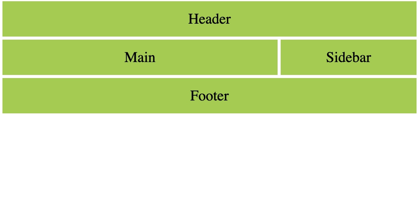
Here, the grid layout is established by defining named areas using the grid-template-areas property. Then, each grid item is assigned to a specific named area using the grid-area property. This ensures that each item is placed within its specified named area on the grid. In the image, the header and footer spans across the entire column as defined by the grid-template-areas. The main occupies the first two columns in its grid-template-area while the sidebar occupies the last column.
Overlays in web design
An overlay is a property in CSS used to add visual elements to an existing element. It can be colors, text, or gradients. Overlays enhance visual appeal.
Here’s a code snippet on creating overlays and a subsequent pictorial representation.
<div class="grid-container">
  <div class="grid-item">
    <div class="overlay"></div>
    1
  </div>
  <div class="grid-item">
    <div class="overlay"></div>
    2
  </div>
  <div class="grid-item">
    <div class="overlay"></div>
    3
  </div>
  <div class="grid-item">
    <div class="overlay"></div>
    4
  </div>
  <div class="grid-item">
    <div class="overlay"></div>
    5
  </div>
  <div class="grid-item">
    <div class="overlay"></div>
    6
  </div>
  <div class="grid-item">
    <div class="overlay"></div>
    7
  </div>
  <div class="grid-item">
    <div class="overlay"></div>
    8
  </div>
  <div class="grid-item">
    <div class="overlay"></div>
    9
  </div>
  <div class="grid-item">
    <div class="overlay"></div>
    10
  </div>
  <div class="grid-item">
    <div class="overlay"></div>
    11
  </div>
  <div class="grid-item">
    <div class="overlay"></div>
    12
  </div>
  <div class="grid-item">
    <div class="overlay"></div>
    13
  </div>
  <div class="grid-item">
    <div class="overlay"></div>
    14
  </div>
  <div class="grid-item">
    <div class="overlay"></div>
    15
  </div>
  <div class="grid-item">
    <div class="overlay"></div>
    16
  </div>
</div>
body {
margin: 0;
height: 100vh;
display: flex;
align-items: center;
justify-content: center;
}
.grid-container {
display: grid;
grid-template-columns: repeat(4, 1fr);
gap: 20px;
}
.grid-item {
position: relative;
background-color: #3498db;
color: #fff;
display: flex;
align-items: center;
justify-content: center;
font-size: 1.5rem;
font-weight: bold;
height: 100px;
width: 100px;
transition: transform 0.5s ease;
}
.overlay {
position: absolute;
top: 0;
left: 0;
width: 100%;
height: 100%;
background-color: rgba(6, 24, 64, 0.7);
opacity: 0;
transition: opacity 0.3s ease;
cursor: pointer;
}
.grid-item:hover .overlay {
opacity: 1;
}The grid-container has 16 grid items placed in a grid layout of 4 columns of equal width and a 20px gap. On hover, an overlay appears with a smooth transition. The overlay class is styled with an absolute top and left properly of 0 and a width and height of 100%, so it is completely on top of the grid item.
The grid-item:hover .overlay changes the overlay’s opacity to 1 (fully visible) on hover.
Note: Adjust the browser size of the code result with the size options provided to see the result completely.
3D layer grid hover effect
This section will cover how to make a 3D layer hover effect using a grid and 3D transformation.
.grid-container {
  position: relative;
  display: grid;
  grid-template-columns: repeat(4, 1fr);
  transform: rotate(-30deg) skew(25deg);
}
.grid-item {
  position: absolute;
  right: 13px;
  background-color: #3498db;
  opacity: 0;
  color: #fff;
  display: flex;
  align-items: center;
  justify-content: center;
  font-size: 1.5rem;
  font-weight: bold;
  height: 100px;
  width: 100px;
  transition: 0.5s;
}
.grid-container:hover .grid-item:nth-child(4) {
  transform: translate(120px, -120px);
  opacity: 1;
}
.grid-container:hover .grid-item:nth-child(3) {
  transform: translate(90px, -90px);
  opacity: 0.8;
}
.grid-container:hover .grid-item:nth-child(2) {
  transform: translate(60px, -60px);
  opacity: 0.6;
}
.grid-container:hover .grid-item:nth-child(1) {
  transform: translate(30px, -30px);
  opacity: 0.4;
}
.grid-container .grid-item:nth-child(16) {
  opacity: 1;
}
.grid-container:hover .grid-item:nth-child(16) {
  opacity: 0;
}The transform property in the grid-container is a 3D-like transformation applied using rotate and skew. The rotate property rotates the grid-items by -30deg and skews it by 25deg, creating a skewed grid.
The grid-item class absolutely positions each item, allowing them to stack on top of each other. On hover, different translate and opacity values are applied to each grid-item, bringing about a difference in transparency.
The nth-child selector targets specific grid items, which are given different translate and opacity values, creating the layered hover effect. The 16th grid item is given an initial opacity of 1 and an opacity of 0 on hover. This is what makes it present initially and disappears when hovered on.
Introduction to perspective in CSS
Perspective in CSS defines the depth at which an element is seen. It defines how close or far an object is from the viewer. The perspective property is used with 3D transformation to give the transformed elements some perspective.
Adding 3D appearance to grid items
This section will demonstrate how to add a 3D appearance to grid items.
body {
  margin: 0;
  height: 100vh;
  display: flex;
  align-items: center;
  justify-content: center;
  perspective: 500px;
}

.grid-container {
  display: grid;
  grid-template-columns: repeat(4, 1fr);
  grid-template-rows: repeat(3, 100px);
  gap: 20px;
  transform-style: preserve-3d;
}

.grid-item {
  position: relative;
  background-color: #3498db;
  color: #fff;
  display: flex;
  align-items: center;
  justify-content: center;
  font-size: 1.5rem;
  font-weight: bold;
  height: 100px;
  width: 100px;
  transform: rotateX(10deg) rotateY(-18deg) rotateZ(13deg);
  transition: transform 0.3s ease-in-out;
}

.grid-item:hover {
  transform: rotateY(180deg) translateZ(50px);
}In this effect, 3D transformation made the grid items flip sides on hover.
The perspective property transforms the screen into a 3D space. It specifies a value of 500px, which sets the viewer’s distance to the elements to 500 pixels. In simpler terms, it defines how far or close elements appear in the 3D space. The larger the perspective value, the less pronounced the 3D effect will be, and vice versa.
You can try increasing or decreasing the perspective values to see how the view changes.
3D transformation allows you to manipulate elements in a three-dimensional space instead of the default two-dimensional space. It allows for the creation of visual effects on a two-dimensional screen.
The transform-style: preserve-3d; applied to the .grid-container class ensures that its child elements with 3D transformations maintain their 3D positioning relative to the container.
transform: rotateX(10deg) rotateY(-18deg) rotateZ(13deg) applies a 3D rotation to each grid item making them flip.
The overlay will transition its opacity over 0.3 seconds (transition: opacity 0.3s ease-in-out).
When a grid item is hovered on(.grid-item:hover), it triggers two transitions:
The overlay becomes visible (opacity: 1).
The grid item itself flips by 180 degrees around the Y-axis and moves 50 pixels along the Z-axis (transform: rotateY(180deg) translateZ(50px)).
Creating a 3D rotating cube
This section will go into the tutorial of a basic example of a rotating cube using CSS perspective and CSS transforms.
<div class="container">
  <div class="cube">
    <div class="front side"></div>
    <div class="back side"></div>
    <div class="left side"></div>
    <div class="right side"></div>
    <div class="top side"></div>
    <div class="bottom side"></div>
  </div>
</div>
.container {
width: 400px;
height: 400px;
display: flex;
align-items: center;
justify-content: center;
perspective: 800px;
}
.cube {
position: relative;
width: 200px;
height: 200px;
transform-style: preserve-3d;
transform: translateZ(-100px);
transition: transform 1s;
animation: cubeRotate 10s linear infinite;
}
.cube > div {
position: absolute;
width: 200px;
height: 200px;
opacity: 0.8;
}
@keyframes cubeRotate {
0% {
transform: rotateX(0deg) rotateY(360deg) rotateZ(90deg);
}
25% {
transform: rotateX(90deg) rotateY(270deg) rotateZ(180deg);
}
50% {
transform: rotateX(180deg) rotateY(180deg) rotateZ(0deg);
}
75% {
transform: rotateX(270deg) rotateY(90deg) rotateZ(360deg);
}
100% {
transform: rotateX(360deg) rotateY(0deg) rotateZ(270deg);
}
}
.cube .front-view {
transform: translateZ(-100px);
}
.cube .back-view {
transform: translateZ(100px);
}
.cube .left-view {
transform: translateZ(-100px) rotateY(-90deg);
}
.cube .right-view {
transform: translateZ(-100px) rotateY(90deg);
}
.cube .top-view {
transform: rotateX(90deg) translateY(100px);
}
.cube .bottom-view {
transform: rotateX(-90deg) translateY(100px);
}.side {
position: absolute;
width: 500px;
height: 500px;
}
.front.side {
background-color: pink;
transform: translateZ(100px);
}
.back.side {
background-color: blue;
transform: translateZ(-100px);
}
.left.side {
background-color: yellow;
transform: rotateY(90deg) translateZ(100px);
}
.right.side {
background-color: aqua;
transform: rotateY(-90deg) translateZ(100px);
}
.top.side {
background-color: green;
transform: translateY(-100px) rotateX(-90deg);
}
.bottom.side {
transform: translateY(-100px) rotateX(90deg);
}This code creates a cube that rotates, showing all its six faces at intervals. The .container class sets the perspective property to create a 3D space with a value of 800px.
The .cube class sets the transform-style to preserve-3d to maintain 3D transformations. It also sets a translation along the z-axis to position the cube in 3D space. The transition property adds a smooth transformation to the cube and keeps it rotating.
The @keyframes at-rule in CSS defines animations on elements over a duration. Here, it defines the keyframe animation cubeRotate that specifies different rotation angles at different points of the cube’s rotation.
The .front.side and the other sides of the cube apply the transform property to position each side to different angles in 3D space.
How 3D improves user experience
-
Improved product displays: E-commerce websites use 3D elements to display products from different angles, which provides users with a more interactive view.
-
Interactive Infographics: Infographics can also employ the use of 3D elements to present data in a more visually compelling manner.
-
Engaging Narrative: Websites like news or storytelling planets can use 3D effects to create a more immersive and engaging narrative.
-
Architectural Visualization: Websites involved in architecture or real estate can use 3D to showcase buildings and interiors. This gives the users a chance to explore spaces virtually.
-
Portfolio Showcase: Developers and designers can showcase their work in a 3D portfolio, allowing users to explore projects in a dynamic and interesting way.
Quick tips for common 3D challenges
-
When using 3D effects, ensure that it does not compromise usability; prioritize clarity and ease of navigation.
-
Test your design across different devices and screen sizes to ensure optimal usability.
-
Ensure that 3D elements are accessible to users with disabilities. Provide alternative content or descriptions for 3D visuals.
-
Design with responsiveness in mind. 3D elements should be made to adapt to different screen sizes and device capabilities.
-
Ensure that the 3D effects used do not affect performance. Use lightweight 3D models to ensure fast loading times.
-
Align the 3D elements to fit with the overall style. Also, opt for subtle animations to avoid overwhelming users.
Conclusion
In this article, we went over the significance of 3D effects in CSS. It covers fundamental CSS grid concepts alongside the key properties used in creating layouts. Additionally, we also went through overlays and layering techniques for a 3D look demonstrated by code snippets. Further down, we explored perspective transformation followed by a tutorial on a rotating cube box.
3D effects, when used judiciously, can enhance user experiences by adding depth and immersion to web design.
Techniques such as the ones covered in this article: Overlays, perspective transformations, and depth cues can be used in creating visually engaging interfaces. Keep in mind to balance 3D effects with usability considerations to ensure an intuitive user experience.
Here are resources on 3D effects in CSS to further explore and see its vast capabilities.
- https://www.w3.org/TR/2009/WD-css3-3d-transforms-20090320/
- https://developer.mozilla.org/en-US/docs/Web/CSS/CSS_transforms/Using_CSS_transforms
- https://3dtransforms.desandro.com/
- https://www.w3schools.com/css/css3_3dtransforms.asp
Gain control over your UX
See how users are using your site as if you were sitting next to them, learn and iterate faster with OpenReplay. — the open-source session replay tool for developers. Self-host it in minutes, and have complete control over your customer data. Check our GitHub repo and join the thousands of developers in our community.
