Twelve Rarely Utilized CSS Media Query Features
A round dozen of features you should know

CSS media queries stand as a familiar concept among developers. However, a considerable number of its features remain underutilized. This offers an untapped potential for enhancing responsive and accessible design strategies in web applications. This article will explore the concepts of media queries and 12 rarely utilized media features.

Discover how at OpenReplay.com.
CSS media queries are tools that allow developers to style web applications to adapt based on the characteristics of the user’s device or viewport.
Media queries are declared using the @media rule, accompanied by one of the following media types:
screen: The query applies only to screen devices.print: The query applies only to documents viewed in print preview mode.all: The query applies to all devices
The media types are followed by the and keyword and one or more expressions defining conditions.
@media screen and (expression) {
  /* styles */
}
If a media query does not specify a media type, it defaults to all. This indicates that the enclosed styles will apply to all devices, regardless of type. Here’s an example:
@media (min-width: 768px) {
  /* styles for all devices with a minimum width of 768 pixels */
}
Most modern browsers support media queries, making them a reliable tool for responsive web design.
Media Features
@media features check for device specifics, such as width, display type, or user preference.
Developers can apply different styles based on whether a device supports certain features.
There are a few commonly used media features, such as the min-width, orientation, max-width etc. However, a lot of other media features aren’t fully utilized by developers. Let’s explore 12 of these features in the following sections.
1. dynamic-range
The dynamic-range media feature detects a device’s combination of contrast ratio, max brightness, and color depth capabilities.
This feature allows two possible values:
standard: Matches the styles with any visually capable device.
@media (dynamic-range: standard) {
  /* styles to apply if the device doesn't support HDR */
}high: Matches styles only to devices with HDR(High Dynamic Range) capabilities.
@media (dynamic-range: high) {
  /* styles to apply if the device supports HDR */
}
A device matching high would also match standard.
The dynamic-range feature promotes an improved user experience by leveraging the capabilities of a device’s display.
Here’s an example:
@media (dynamic-range: high) {
  body {
    background-color: green;
  }
}
The green background color will only be applied to the body element selector if the device’s dynamic range is classified as high.
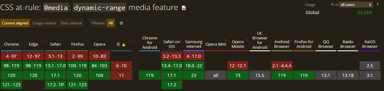
The dynamic-range is currently a stable feature supported in recent versions of all major browsers as shown below.
2. forced-colors
The forced-colors media feature is used to check whether the browser is currently in forced colors mode. It is used to ensure the readability of text for users with visual accessibility needs by providing a high-contrast design.
This feature allows for two possible values:
none: The colors on the page are not forced into a limited palette by the browser.
@media (forced-colors: none){
  /* styles to apply when colors are displayed normally */
}active: The browser has forced colors mode enabled. In this mode, the only colors available to the application are a limited palette of system colors, which is applied automatically by the browser.
@media (forced-colors: active) {
  /* styles to apply when the browser has forced colors enabled */
}
The forced colors mode affects most color-related css properties including color, background-color, and box-shadow. It overrides their initial values with the browser-specified values selected from a limited palette of system colors.
Here is an example:
/*preferred styling*/
p {
  background-color: white;
  color: cyan;
  text-shadow: 1px 1px 1px yellow;
}

/* Apply styles when forced colors are active */
@media (forced-colors: active) {
  p {
    /* default value for text-shadow in forced colors mode is 'none'. */
    /* specify a better contrasting color to the white  background */
    color: black;
  }
}
The main use of this feature is simply to tweak a given portion of a page when the default enforcement of forced colors does not go well with the kind of design implemented on the page and not to create separate styling for users with an active forced colors mode.
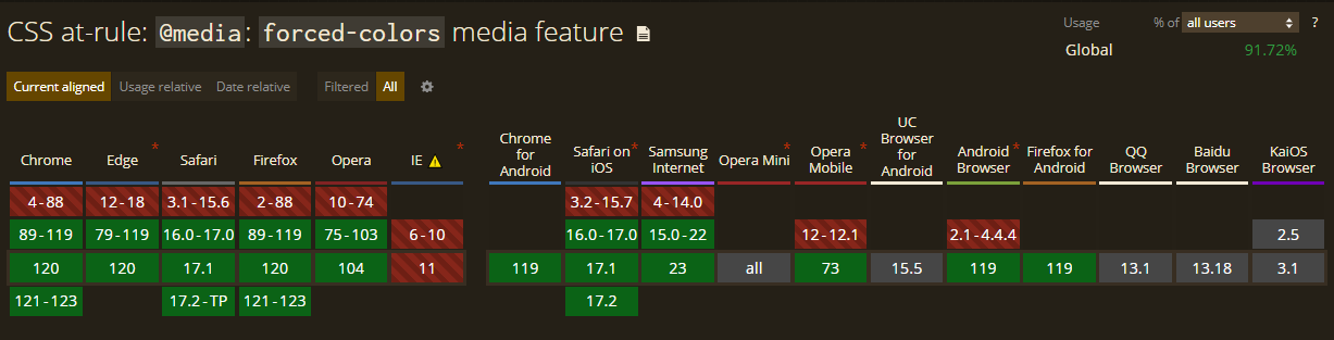
The forced-colors feature is currently supported in recent versions of all major browsers, as shown below.
3. display-mode
The display-mode media feature is used to customize styles based on the browser’s current display mode to create an optimal user experience in various display modes.
This feature allows four possible values:
fullscreen: Detects when the browser is in fullscreen mode, which results in all browser UI elements being hidden and the application taking up the entire screen space.
@media (display-mode: fullscreen) {
  /* styles for when the browser is in fullscreen mode */
}minimal-ui: Specifies when the browser is almost at fullscreen mode but still provides a limited set of UI elements for navigation, such as reload, back, and forward buttons.
@media (display-mode: minimal-ui) {
  /* styles for when the browser displays a limited set of UI elements*/
}standalone: Detects when the web application is treated as a standalone native application by the browser, excluding certain features such as URL display and most UI elements and providing the application with its own separate window and app icon.
@media (display-mode: standalone) {
  /* styles for when the browser treats the application as native */
}browser: Detects when the application opens in a new browser window or tab.
@media (display-mode: browser) {
  /*styles for when the application opens in a new browser window */
}
This feature improves the user interface based on the way and manner in which the content is presented. Here’s an example:
body {
border: 2px solid black;
margin: 5px;
}
@media (display-mode: fullscreen) {
/* removes the border and margin in fullscreen mode */
body {
border: none;
margin: none;
}
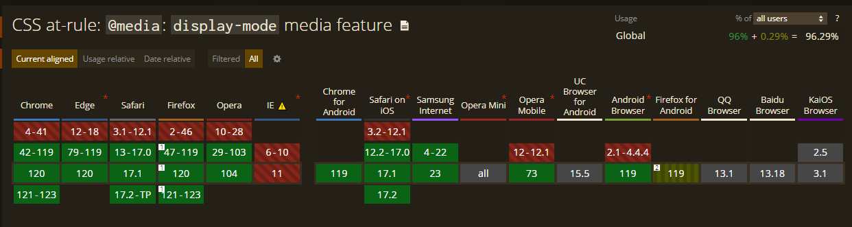
}The display-mode feature is currently supported in recent versions of all major browsers, as shown below.
4. scripting
The scripting media feature detects browser support for scripting(such as JavaScript) in a document. This allows for optimization of content display for browsers with or without scripting.
Only three possible values can be specified with the scripting feature:
enabled: Detects when scripting is fully available throughout the current document.
@media (scripting: enabled) {
  /* styles for when scripting is fully enabled*/
}initial-only: Detects when scripting is only partially available to the document at the initial page load but not afterward.
@media (scripting: initial-only) {
  /* styles for when scripting is only enabled at the initial page load */
}none: Detects when scripting isn’t available for the current document.
@media (scripting: none) {
  /* styles to only be applied when scripting isn't supported */
}
This feature can indicate the specific browser scripting support of the document to the user. Here’s an example:
<p class="no-scripting">Sorry your browser does not allow scripting for this document.</p>.no-scripting{
display: none;
}
@media (scripting: none) {
.no-scripting {
display: block;
}
}The code above only displays the no-scripting element when the browser does not support scripting for the document.
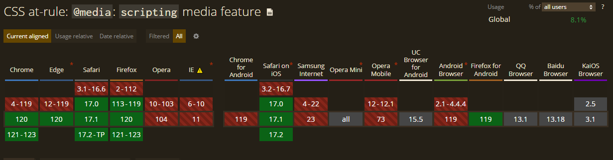
The scripting media feature is supported by only a few major browsers, as shown below. A fallback mechanism should be implemented for browsers not supporting this feature.
5. video-dynamic-range
The video-dynamic-range media feature is used to adjust styles based on the color depth, max-brightness, and contrast ratio supported by the video plane (a component responsible for handling and displaying video content) of the output device.
This feature supports the same two values as that of the dynamic-range feature:
standard: Indicates that the video plane renders the videos on a standard visually capable device.
@media (video-dynamic-range: standard) {
  /* styles to apply when video is rendered on a non-HDR device */
}high: Indicates the video plane renders the videos on HDR-capable devices. An output device that matches thehighvalue will also match thestandardvalue.
@media (video-dynamic-range: high) {
  /* styles to apply when the videos are rendered on HDR devices */
}
This feature promotes enhanced visual quality for video content on devices with varying video-dynamic ranges.
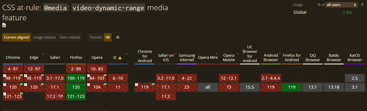
The video-dynamic-range feature is currently not supported by most major browsers, as shown below. Adequate testing and fallback mechanisms should be implemented when using.
6. inverted-colors
The inverted-colors media feature styles content for devices with inverted color schemes, allowing for better content visibility and readability.
This feature accepts two valid values:
inverted: The output device inverts each pixel color in the display area.
@media (inverted-colors: inverted) {
  /* styles to apply if colors are inverted */
}none: Indicates that the output device displays colors normally.
@media (inverted-color: none) {
  /* styles to be applied when colors are displayed normally */
}
This feature improves accessibility by ensuring content remains readable on devices with inverted colors enabled and creates more inclusive designs for users with specific visual preferences.
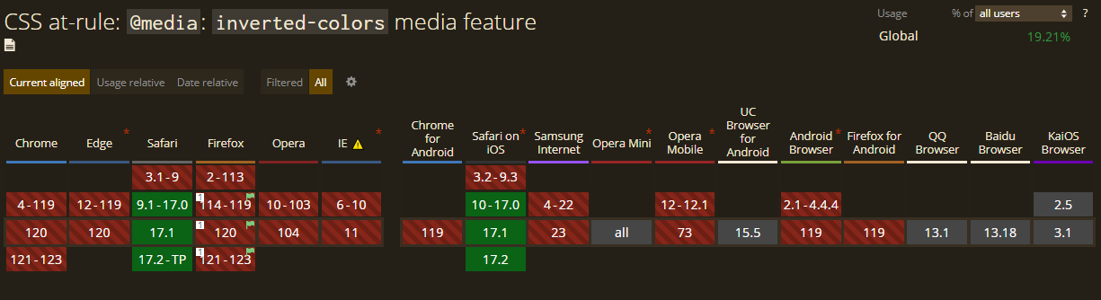
The inverted-colors feature is currently not supported by most browsers, as shown in the browser support table below. Consider implementing a fallback mechanism when using it.
7. overflow-block
The overflow-block media feature detects device behavior for overflowing content in the displayed document.
This feature has three valid values:
none: Detects when the output device entirely crops out any overflowing content.
@media (overflow-block: none){
  /* styles to apply when the overflow contents are completely cropped out */
}scroll: Detects when the output device allows overflown contents to be scrollable within the content block.
@media (overflow-block: scroll) {
  /* styles to be applied when overflowing contents are allowed to be scrolled */
}paged: Detects when overflowing contents are broken into pages by the output device, e.g., a printer.
@media (overflow-block: paged) {
  /* styles to be applied if the content is broken up into pages */
}
The none or scroll media are also known as continuous media, while those that match paged are referred to as paged media.
This feature enhances responsiveness by managing and organizing overflowing content within the document according to the output device.
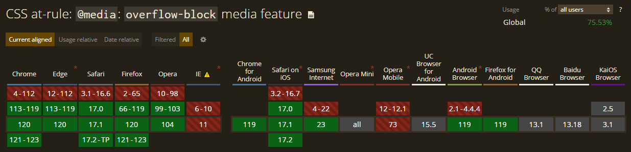
The overflow-block feature is currently supported by most major browsers, as shown below.
8. resolution
The resolution media feature is a range feature used to adjust styles based on the output device’s resolution (number of pixels within a display area).
This feature allows for a varying number of CSS dpi(dots per inch) or dppx(dots per pixel) to be set as its value. When specified, a higher value indicates a higher resolution and vice versa.
/* indicating high-resolution devices */
@media (resolution >= 5dppx) {
  /* styles to apply in high-resolution devices */
}
Alternatively, the min or max prefix can specify a minimum or maximum resolution. For example:
@media (max-resolution: 600dpi) {
  /* styles to apply when the device resolution is lower than 600 CSS dpi*/
}
This feature helps enhance styles for different resolution contexts, promoting sharper visuals and improved device presentation.
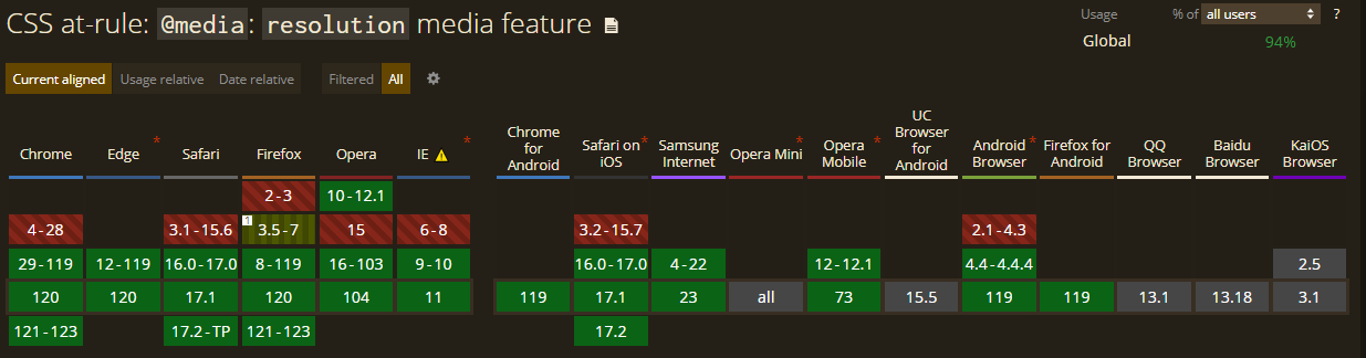
The resolution feature is currently supported by all major browsers, as shown below.
9. color-index
The color-index media feature adapts styles based on the number of entries a device has in the color lookup table.
This feature only allows an integer value. If the device does not use a color lookup table, the value is set to 0.
No value specified means it applies to all color-indexed devices:
@media (color-index) {
  /* styles to apply to all color index devices
Alternatively, styles could be applied to devices with a specified number of entries:
@media (color-index >= 256) {
  /* styles to apply when the device has a color index entry of 256 or greater */
}
This feature promotes the optimization of visuals for devices with limited color support, improving performance.
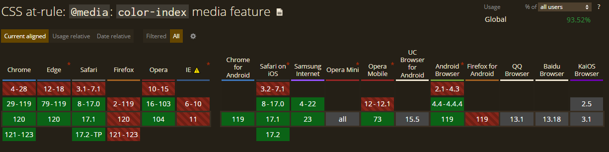
The color-index feature is still not supported by a few browsers, as shown below. Consider setting a fallback mechanism when using it.
10. prefers-reduced-motion
The prefers-reduced-motion media feature adapts styles based on user preference for reduced motion, creating a more comfortable experience for users sensitive to motion effects.
This feature allows for two valid values:
reduce: The user has enabled a setting to limit motion effects in the accessibility preference on their device.
@media (prefers-reduced-motion: reduce) {
  /* styles to reduce or eliminate harsh motion movements when the user has set a preference for reduced motion */
}no-preference: The system does not recognize any reduced motion preference and displays all motion contents normally.
@media (prefers-reduced-motion: no-preference) {
  /* styles to apply if the user has no preference set for reduced motion */
}
This feature promotes enhanced accessibility and improved comfort for users with vestibular motion disorders during browsing.
A major consideration when using this feature is that it poses security concerns for exploitation, as the information about the user can be used as an active fingerprinting vector.
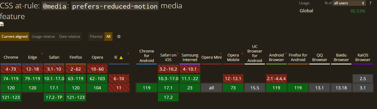
The prefers-reduced-motion feature is currently supported in recent versions of all major browsers, as shown below.
11. update
The update media feature is used to detect the update speed of the output device.
This feature allows for three valid values:
slow: The document’s contents are updated, but in a manner perceived as janky. This typically occurs when the document is viewed with low-quality devices.
@media (update: slow) {
  /* apply styles to adjust the content update to devices with slow update speed */
}fast: Document updates are rendered fast by the output device, creating smooth transitions and animations.
@media (update: fast) {
  /* styles to apply when the updates are rendered swiftly */
}none: Doesn’t allow for any update once the document has been rendered. This is typically common with printed documents.
@media (update: none) {
  /* styles to apply if the document does not allow dynamic updates */
}
This feature is used to customize styles based on whether the page is actively being updated or stable. Here’s an example:
.spinner {
width: 50px;
height: 50px;
border: 2px solid black;
animation: .5s spin linear infinite;
}
@keyframes spin {
100% {
transform: rotate(360deg);
}
}
@media (update: slow) {
/* reduce the spin animation speed to adjust to devices with a slow update speed */
.spinner {
animation: 3s spin infinite;
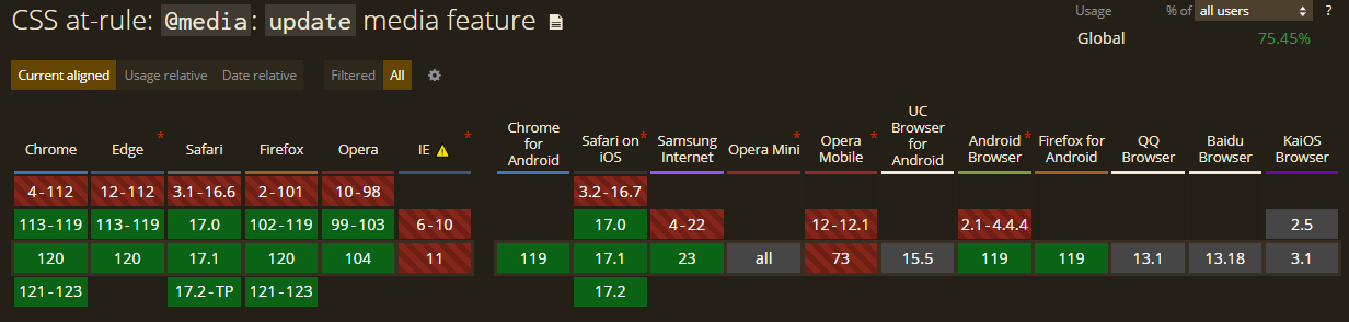
}The update media feature is currently supported by most major browsers, as shown below.
12. grid
The grid media feature is used to detect if the output device is grid-based(e.g., terminals, phones with a single font style) or bitmap (graphics displayable) based(e.g., modern computer and smartphone screens).
The value for this feature is an <mq-boolean> type, which would be 1(true) if the device is grid-based, and 0(false) if otherwise.
@media (grid) {
  /* styles to apply if the output device is grid-based */
}
This feature allows your content to be styled effectively for grid-based devices.
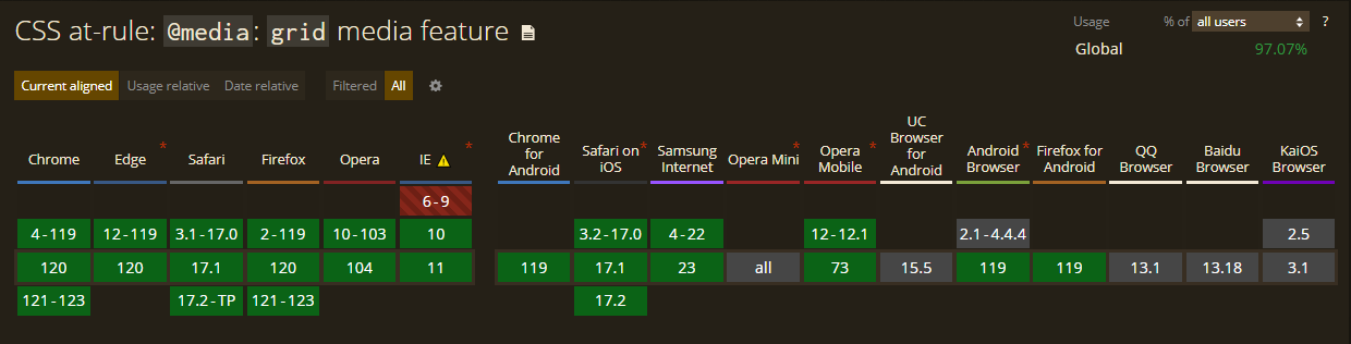
The grid feature is supported by all major browsers, as shown below.
Conclusion
In conclusion, these rarely utilized CSS media query features provide a robust toolkit for developers seeking to enhance their web design accessibility. While some features may pose challenges regarding browser compatibility, their potential benefits in terms of accessibility, visual appeal, and responsive design make them valuable assets for crafting modern and user-friendly websites. As the web development landscape evolves, exploring and understanding these features can empower developers to create more adaptable and engaging user experiences.
References
- Media Queries Level 5 - W3C working draft
- Using Media Queries - MDN web docs_
Truly understand users experience
See every user interaction, feel every frustration and track all hesitations with OpenReplay — the open-source digital experience platform. It can be self-hosted in minutes, giving you complete control over your customer data.
Star on GitHub12k