Even if typewriters aren’t used that much today, they provide an interesting text animation. This article will fully show you how to add that to your own pages.
Typewriter animation is a popular effect that simulates text typing on a screen. It is an excellent way of adding a touch of nostalgia to your website or application. The typewriter animation recreates the appearance and sensation of an old-fashioned typewriter as it types out texts on the screen. It can be a powerful tool for adding visual interest and engagement to a website or application, and it draws the user’s attention and makes content more dynamic and interactive.
This tutorial will guide readers on a step-by-step procedure to create a typewriter animation in your web application using CSS.
What is typewriter animation?
Typewriter animation is a text animation effect that simulates the process of someone typing text on a typewriter. This effect mimics the appearance of a mechanical typewriter. It is often used to grab the attention of the audience, reveal important information, or give a sense of drama to the text being displayed. The animation typically includes the visual of each letter appearing one at a time, as if being typed by an invisible hand.
The typewriter animation can be achieved in more ways than one. For this tutorial, we will be using just CSS for animation.
When can it be used?
Typewriter animation can be used in various scenarios where a text-typing effect is desired to add emphasis, create a sense of nostalgia, or simply make a text appear more dynamic. Some common uses include:
- Website or application landing pages to draw attention to specific features or benefits.
- Marketing or promotional videos to highlight key messages or products.
- Presentations to add visual interest and engage the audience.
- Animated graphics or logos to create an eye-catching intro or outro.
- Gaming or interactive interfaces to simulate in-game text entry.
- To draw attention to specific text, such as headlines, captions, or quotes in a presentation or video.
Creating the text in the document
Let’s start with creating the text we intend to animate. We don’t need much; we will create a paragraph or text element to manipulate. This can be any text you want. We will create an index.html file which indicates that this is the default webpage for this directory of our website. We will also create an app.css file to house our styling properties. In our index.html file, we will put in the code as shown below.
<!DOCTYPE html>
<html lang="en">
<head>
<meta charset="UTF-8" />
<meta http-equiv="X-UA-Compatible" content="IE=edge" />
<meta name="viewport" content="width=device-width, initial-scale=1.0" />
<link rel="stylesheet" href="app.css" />
<title>Document</title>
</head>
<body>
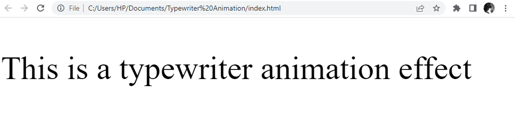
<p class="typewriter">This is a typewriter animation effect</p>
</body>
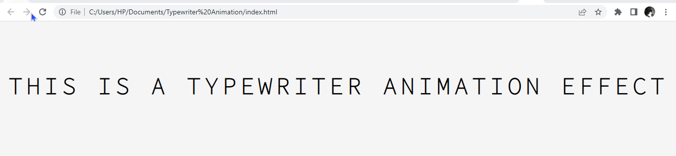
</html>We will assign a class selector to the paragraph tag containing the text we want to animate. This will allow us to manipulate and add styling to the paragraph tag. The text, without any animation, is as follows:
Great! We are done with the HTML content and will move ahead with styling the webpage and animating the text.
Styling the webpage
We will apply all our styling in our project folder’s app.css file. We will start by importing font styles. We will also apply styling to the webpage and the typewriter text container. Great! Let’s get started.
Importing and choosing a font
We will start by importing font styles suitable for the typewriter animation to give it the typewriter feel in our app.css file. Choosing a font that recreates the feeling of seeing a typewriter in action is important. We will import the monospace font from the Source Code Pro font family. This is because letters and characters from the monospace font occupy the same horizontal space, essential in creating a typewriter animation.
@import url('https://fonts.googleapis.com/css2?family=Source+Code+Pro:wght@200&display=swap');Applying Basic Styling
Here, we will apply basic styling to our webpage by adjusting the margin, padding, height, and width. We can also set the background to a preferred color.
body {
  margin: 0;
  padding: 0;
  height: 100%;
  width: 100%;
  background: whitesmoke;
}
Styling the Container for the Typewriter Text
Now, we will manipulate the text to give it the typewriter feel, using the monospace font from the Source Code Pro font family and other basic CSS styling properties to achieve this.
@import url("https://fonts.googleapis.com/css2?family=Source+Code+Pro:wght@200&display=swap");
body {
margin: 0;
padding: 0;
height: 100%;
width: 100%;
background: whitesmoke;
}
.typewriter {
font-size: 3rem;
font-weight: 800;
font-family: "Source Code Pro", monospace;
text-align: center;
margin: 100px auto;
letter-spacing: 0.15em; /* Add spacing between the characters */
white-space: nowrap; /* keeps text in one line */
text-transform: uppercase; /* transforms text to uppercase*/
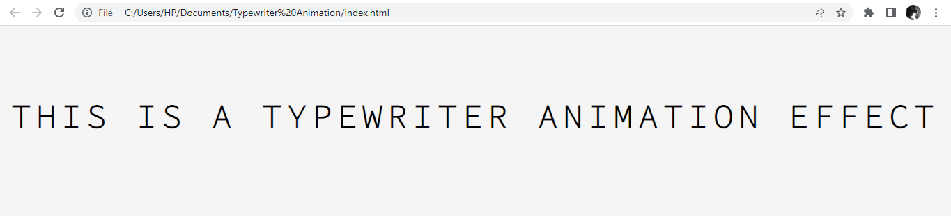
}Awesome! Now the webpage looks good — though there is no animation yet!
Session Replay for Developers
Uncover frustrations, understand bugs and fix slowdowns like never before with OpenReplay — an open-source session replay tool for developers. Self-host it in minutes, and have complete control over your customer data. Check our GitHub repo and join the thousands of developers in our community.
What are Animation Property and @Keyframes rules?
Animation property and @keyframes rules are CSS properties for creating animations in HTML elements.
Animation property is a CSS property that allows you to animate the styles of an HTML element over time, giving it a smooth transition between styles. Keyframes specify what styles the animated element should have at specific points in the animation.
The animation property and the keyframe rules are invaluable in the manipulation of text behavioral patterns, as they can be used to create animations that could aid visual interest, improve navigation, explain concepts, and enhance user experience.
Typewriter Effect with Animation Property and @keyframes rule
As shown below, we will use the CSS animation property and the keyframe rules to manipulate the text element to achieve the typewriter effect.
.typewriter {
  font-size: 3rem;
  font-weight: 800;
  font-family: "Source Code Pro", monospace;
  overflow: hidden; /* Hide the text until the animation starts */
  width: max-content;
  text-align: center;
  margin: 100px auto; /* Centers the text */
  letter-spacing: 0.15em; /* Add spacing between the characters */
  white-space: nowrap; /* keeps text in one line */
  text-transform: uppercase; /* transforms text to uppercase*/
  animation: typing 10s steps(36, end);
}

/* The typewriter animation */
@keyframes typing {
  from {
    width: 0;
  }
  to {
    width: 100%;
  }
}
Here, we set the CSS property overflow as hidden to prevent it from being visible before the animation. The white-space property must be set to the value nowrap, which specifies that the text will not wrap to the following line, and will instead be displayed on one line, regardless of the size of the container.
We also set the animation to run for 10 seconds with the step value, allowing us to break an animation or transition into segments rather than one continuous transition.
Lastly, we also introduced the keyframe rules, which we will use to define the start or end point of a change in the animated content. It will look like this.
Creating and Styling the Animated Blinking Cursor
The blinking cursor is an outstanding feature of a typewriter animation. To create the blinking cursor animation, we will introduce the CSS property border-right and pass values to the property to make it solid and give it a color.
We will create a keyframe property for the blinking cursor, pass theborder-color as transparent, and at 50% pass a dark color, preferably black. We will now pass the time and infinite value to the animation property to make the cursor blink at the specified time interval and blink infinitely at the end of the text.
.typewriter {
  border-right: 0.15em solid #000; /* Add a border to the right of the text */
  animation: typing 10s steps(36, end), blink-cursor 0.5s step-end infinite;
}

/* The blinking cursor animation */
@keyframes blink-cursor {
  from,
  to {
    border-color: transparent;
  }
  50% {
    border-color: #000;
  }
}
After applying this styling, it should look like this.
Great work! Now, characters are displayed one by one on a screen as if they were being typed out on a typewriter in real time.
JavaScript as an Alternative
While CSS can be used to create typewriter animations, JavaScript can also achieve similar results, and in most cases, offers more flexibility and customization options.
The idea behind a JavaScript-based typewriter animation is to manipulate the text on a page by updating it dynamically, either by adding or removing characters one by one, changing the text being displayed, or manipulating the typing speed.
Pros of Using CSS over JavaScript
Here are some benefits of using CSS over JavaScript for creating a typewriter animation:
- Performance: CSS animations are generally faster than JavaScript animations, as they leverage the power of the graphics processing unit (GPU) rather than relying on the CPU.
- Accessibility: CSS animations are easier to access, as they do not require any JavaScript code to be executed.
- Simplicity: CSS animations are simpler to create and maintain, as they can be defined in a single stylesheet and don’t require writing complex JavaScript code, and reduce page load time.
Cons of Using CSS over JavaScript
Here are a few drawbacks to using CSS over JavaScript for typewriter animations:
- Limited Customization: CSS-based typewriter animations are limited in customization options and cannot be easily modified to fit specific needs, unlike JavaScript.
- Control: CSS has lesser control over the animation. JavaScript, on the other hand, provides greater control over the animation.
- Lack of Interactivity: CSS animations are not interactive, so you cannot pause or stop them easily. On the other hand, JavaScript-based animations can be interactive, allowing you to control the animations.
While JavaScript may be a better fit for more complex animations, CSS animations are a good choice for simple, fast, and accessible typewriter animations.
Ultimately, deciding between using CSS or JavaScript for typewriter animations will depend on your needs.
Conclusion
The typewriter animation is a great way to add some visual interest to your website or page and is easy to create using HTML and CSS without using any JavaScript code. Whether you’re looking to create a nostalgic feel or just want to add a unique touch to your website, this effect is a fun and easy way to do so.
Gain Debugging Superpowers
Unleash the power of session replay to reproduce bugs and track user frustrations. Get complete visibility into your frontend with OpenReplay, the most advanced open-source session replay tool for developers.