Understanding CSS Logical Properties
Use CSS logical properties to control your layouts

CSS logical properties are an effective way to control the layout of your web pages. Over time, CSS has evolved to meet the demands of modern web design, and one significant advancement in recent years has been the introduction of CSS logical properties. This article will enter the world of CSS logical properties, showing what they are, how they differ from traditional (physical )properties, and why they are important for creating flexible and responsive layouts.
In this article this is what we’ll cover:
- Physical (Traditional) CSS Properties
- Introduction to css logical properties
- Advantages of css logical properties
- Logical Properties vs. Physical Properties
- Implementing CSS Logical Properties
Let’s get started!
Physical (Traditional) CSS Properties
Traditional CSS properties (also called physical properties) have long served as the foundation for defining the appearance and layout of elements. These properties operate by manipulating elements based on their physical dimensions. For example, the margin-top property controls the spacing between the top of an element and the top of its containing element, allowing developers to precisely position elements within the page layout.
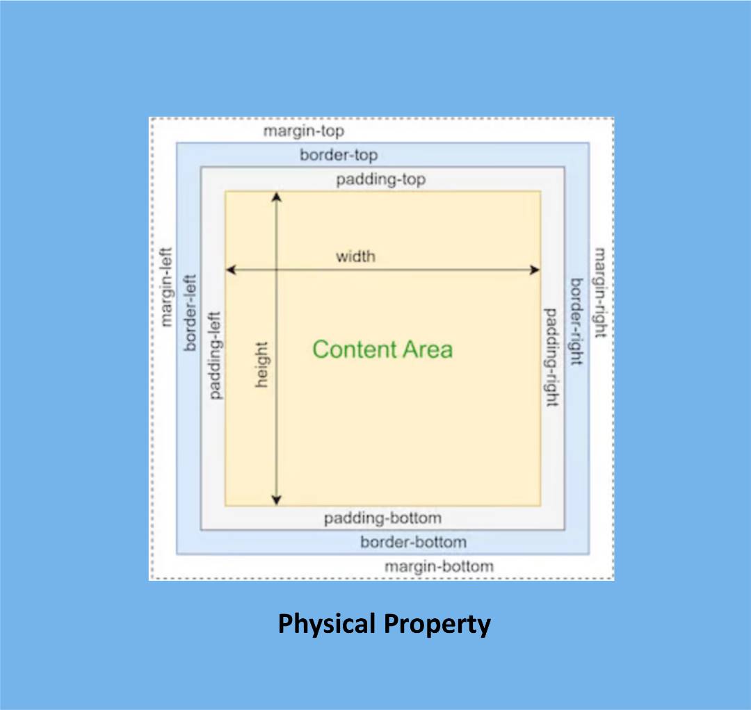
While traditional CSS properties offer a straightforward and widely adopted approach, they can sometimes present limitations, particularly in scenarios involving multilingual websites. One such limitation arises when accommodating different languages with varying text lengths. In these cases, relying solely on traditional properties, such as margin-top, may not suffice. Each language may require different margin values to ensure consistent spacing and visual alignment across the content.
CSS logical properties come into play to overcome these limitations and provide a more adaptable solution.
Introducing CSS Logical Properties
CSS logical properties are a set of properties that allow web developers to specify the layout and styling of webpage elements based on their directional or logical values. These properties provide greater flexibility and adaptability in handling different writing modes, such as left-to-right (LTR), right-to-left (RTL), and multiple languages.
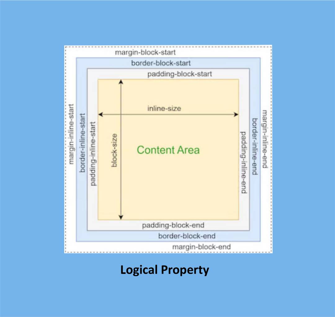
Unlike traditional physical properties, which are based on the physical dimensions of an element, CSS logical properties are rooted in the flow of text. This means they are independent of the text’s language and the document’s writing mode, making them more versatile in accommodating various linguistic and cultural contexts.
Some key CSS logical properties include:
-
margin-inline-start and margin-inline-end: These properties control the margins on an element’s inline-start and inline-end sides, depending on the text direction.
-
padding-inline-start and padding-inline-end: These properties control the padding on an element’s inline-start and inline-end sides.
-
border-inline-start and border-inline-end: These properties control the borders on an element’s inline-start and inline-end sides.
-
inline-size and block-size: These properties specify the width and height of an element regardless of the text direction.
CSS logical properties offer a more intuitive and flexible approach to layout and styling, especially in scenarios where text direction and multilingual support are crucial. They enable web developers to create consistent and adaptive designs that seamlessly adjust to different writing modes and languages, providing a better user experience across diverse contexts.
Advantages of CSS logical properties
CSS logical properties offer a myriad of advantages that empower web developers to create more versatile and adaptable designs. Let’s delve into these advantages in detail:
-
Multilingual and Language Independent: One of the key strengths of CSS logical properties lies in their ability to support multilingual websites seamlessly. These properties are language-independent, meaning they can adapt to different languages without requiring manual adjustments. By leveraging logical properties, web developers can ensure consistent layouts and styles across various languages, eliminating the need for language-specific modifications.
-
Enhanced Flexibility in Responsive Design: CSS logical properties shine in responsive design, enabling web layouts to be more fluid and adaptive across different screen sizes and devices. Developers can create responsive designs that automatically adjust to available space and screen dimensions by utilizing logical properties. This flexibility simplifies the development process, as logical properties adapt the layout dynamically, reducing the reliance on media queries and complex calculations.
-
Easy Adaptation to Different Writing Modes: CSS logical properties excel in accommodating different writing modes, such as left-to-right (LTR) and right-to-left (RTL). These properties seamlessly adapt to the writing mode of the document, ensuring consistent positioning and styling of elements. By utilizing logical properties, web developers can create layouts that fluidly adjust to diverse writing modes, supporting a more inclusive and accessible user experience.
Logical Properties vs. Physical Properties
Understanding the difference between logical and physical properties is pivotal in harnessing the full potential of CSS. Let’s delve into this distinction and explore its implications for layout and design:
-
Based on the Flow of Text: The fundamental dissimilarity lies in the foundation upon which logical and physical properties are built. Logical properties are rooted in the text flow, allowing developers to position and style elements based on their relationship to the text. On the other hand, physical properties rely on the physical dimensions of an element, focusing on its size, position, and visual properties.
-
Independence from Language and Writing Mode: A significant advantage of logical properties is their language independence and writing mode adaptability. Regardless of the text’s language or the document’s writing mode, logical properties remain consistent in their behavior. This independence ensures a seamless experience in multilingual websites, as the layout and styling of elements dynamically adjust to different languages without requiring language-specific modifications.
-
Flexibility and Responsiveness: Logical properties offer enhanced flexibility and responsiveness in web layouts. They allow elements to fluidly adapt to various screen sizes, devices, and orientations. By leveraging logical properties, developers can create layouts that automatically adjust and flow according to available space, eliminating the need for complex calculations and media queries.
-
Handling Complex Text Direction Scenarios: Complex text direction scenarios, such as bidirectional or mixed language content, pose challenges for traditional physical properties. Logical properties provide a solution by enabling developers to easily handle such scenarios. These properties ensure proper alignment, flow, and positioning of elements, resulting in visually cohesive and accessible designs.
Let’s look at a practical example highlighting the effectiveness of CSS logical properties.
Session Replay for Developers
Uncover frustrations, understand bugs and fix slowdowns like never before with OpenReplay — an open-source session replay tool for developers. Self-host it in minutes, and have complete control over your customer data. Check our GitHub repo and join the thousands of developers in our community.
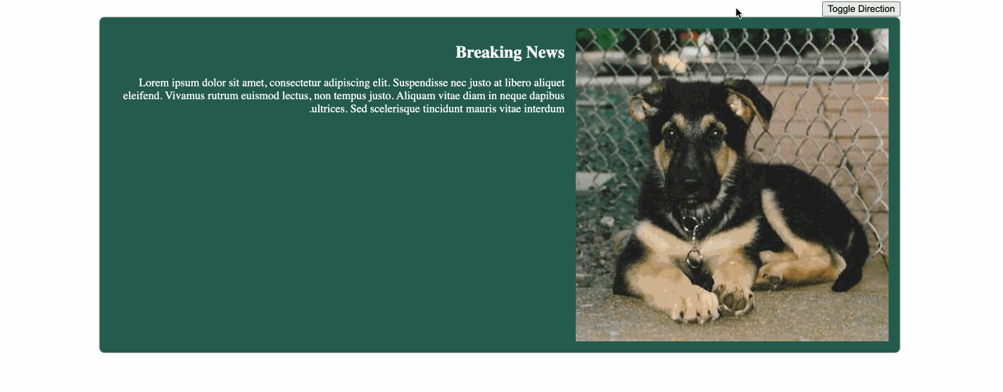
Implementing CSS Logical Properties: Handling text direction scenarios
Logical properties can be used to handle complex text direction scenarios. An instance is where a blog is displayed in Arabic or Spanish. It is read from left to right. Let’s create an example that changes the direction of a text from right to left when toggled by just modifying the value of a CSS property.
Our HTML will look like this:
<div class="container">
 <button id="toggleBtn">Toggle Direction</button>
 <div class="news-article">
   <img id="dogImage" src="" alt="News Image">
   <div class="article-content">
     <h2>Breaking News</h2>
     <p>Lorem ipsum dolor sit amet, consectetur adipiscing elit. Suspendisse nec justo at libero aliquet eleifend. Vivamus rutrum euismod lectus, non tempus justo. Aliquam vitae diam in neque dapibus ultrices. Sed scelerisque tincidunt mauris vitae interdum.</p>
   </div>
 </div>
</div>
For our CSS:
:root {
   --direction: ltr; /* Initial direction */
 }

 .container {
   direction: var(--direction); /* Set direction based on --direction variable */
   width: 80%; /* Adjust the width as desired */
   margin: 0 auto; /* Centers the container horizontally */
 }

 .news-article {
   display: flex;
   align-items: flex-start; /* Aligns items at the top of the container */
   padding: 1em;
   border: 1px solid #ccc;
   border-radius: 8px;
   background-color: #235c4e;
   color:white
 }

 .news-article img {
   margin-inline-end: 1em; /* Adds spacing between the image and text */
   width: 100%; /* Adjusts the image width to fill the container */
   height: auto; /* Automatically adjusts the image height while maintaining aspect ratio */
   object-fit: cover; /* Ensures the image fills the container and maintains its aspect ratio */
   margin-inline-end: 1em; /
 }

 .news-article[dir="rtl"] img {
   margin-inline-end: 0; /* Resets the margin when toggled to the right */
   margin-inline-start: 1em; /* Adds spacing between the image and text when toggled to the right */
 }

 /* Optional: Set a fixed aspect ratio for the image container */
 .news-article .image-container {
   width: 120px; /* Adjust the width as desired */
   height: 120px; /* Adjust the height as desired */
 }
The CSS logical properties will play a crucial role by enabling dynamic control over the direction of content (direction: var(—direction)), allowing the layout to adapt to different writing modes. The margin-inline-start CSS property will be used to adjust the spacing between the image and text based on the text direction, providing a more consistent and visually appealing design when toggling between left-to-right and right-to-left layouts.
Adding a little bit of JavaScript as our icing. Create a file called script.js:
const toggleBtn = document.getElementById('toggleBtn');
const root = document.documentElement;
const dogImage = document.getElementById('dogImage');

toggleBtn.addEventListener('click', () => {
 root.style.setProperty('--direction', root.style.getPropertyValue('--direction') === 'ltr' ? 'rtl' : 'ltr');
});

fetch('https://dog.ceo/api/breeds/image/random')
 .then(response => response.json())
 .then(data => {
   dogImage.src = data.message;
 })
 .catch(error => {
   console.error('Error fetching dog image:', error);
 });
Our result:
Conclusion
CSS logical properties are a powerful new feature that can create more flexible, responsive, and multilingual layouts. If you are looking for a way to improve the design and functionality of your websites, I encourage you to learn more about CSS logical properties.
Gain Debugging Superpowers
Unleash the power of session replay to reproduce bugs and track user frustrations. Get complete visibility into your frontend with OpenReplay, the most advanced open-source session replay tool for developers.