In this article, we’ll cover a crucial concept of CSS: CSS positioning. When working on complex layouts on a webpage, you’ll need to alter the natural document flow to change how elements are positioned on a webpage. For example, you may want to have elements overlap each other, display side by side, or in a certain way. We will see the different CSS position types and how they apply.
At the end of this article, we’ll fully understand the CSS position property and the different position types, with clear code samples on each position type and how they apply.
What is the CSS position property?
The CSS position property is used to modify how elements are placed on a webpage. With the CSS position property, you can adjust the position of an element on your webpage. The CSS position property allows us to move our elements around the webpage using the top, left, right, and bottom properties.
| top | sets the top margin for a positioned element |
|---|---|
| bottom | sets the bottom margin for a positioned element |
| left | sets the left margin for a positioned element |
| right | sets the right margin for a positioned element |
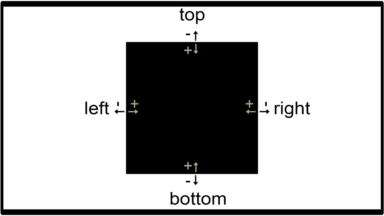
Positive values move inwards, while negative values move outwards.
Note: Without setting a position type, the top, left, right, and bottom properties will have no effect.
Types of CSS Positions
The following are the five different types of CSS positions:
- static
- relative
- absolute
- fixed
- sticky
Now let’s look into each position type in detail.
Static position
position: static is the default CSS position. All elements, by default, have a static position. With the static position, you cannot adjust the placement of elements on a webpage.
Let’s look at an example: here’s a webpage with a single div element on it. By default, it already has position: static, but we’ll be adding it to confirm.
<!DOCTYPE html>
<html>
<head>
  <title>CSS Position</title>
  <style>
    body{
      background: yellow;
}
    .box{
      width: 80%;
      height: 30vh;
      background: red;
    }
  </style>
</head>
<body>
  <div class="box">
  </div>
</body>
</html>
Here’s the result of the initial code:
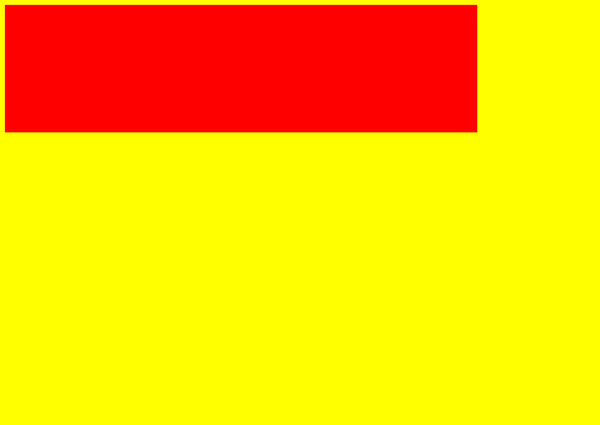
Now let’s try to move it around with the left and top properties.
.box{
  width: 80%;
  height: 30vh;
  background: red;
  position: static;
  left: 100px;
  top: 80px;
}
Here’s the result:

Notice you can’t see any difference? An element with the position: static cannot be moved around with the top, left, right, and bottom properties.
Relative position
In position: relative, the element is positioned according to its original position. If we position a box with position: relative, the box remains in its original position.
Let’s look at an example to understand better.
<!DOCTYPE html>
<html>
<head>
<title>CSS Position</title>
<style>
body{
margin: 0;
}
.parent{
background: yellow;
display: flex;
align-items: center;
justify-content: center;
height: 100vh;
}
.box{
width: 50%;
height: 40vh;
background: red;
}
</style>
</head>
<body>
<div class="parent">
<div class="box">
</div>
</div>
</body>
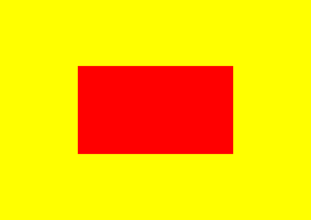
</html>The code on the parent element is me trying to center-align the sub-element horizontally and vertically. So don’t worry about that. Centering the element will help you understand the movement of what we’ll be doing easier.
Here’s the output of the initial code:

Now let’s add position: relative to the box and try to move it around.
.box{
  width: 50%;
  height: 40vh;
  background: red;
  position: relative;
}
Here’s our output after adding position: relative

Yes, the output stays the same after adding position: relative. As we mentioned earlier, in position: relative, the element is positioned according to its original position. Also, if we are to try to move our element with a value of 0, it remains at the same position. Because it maintains its original position, moving with a 0 value takes no effect.
Here’s an example:
.box{
  width: 50%;
  height: 40vh;
  background: red;
  position: relative;
  left: 0;
  top: 0;
}
Here’s the output:
The output stays the same.
Let’s look at another example of moving the box around with actual values.
.box{
  width: 50%;
  height: 40vh;
  background: red;
  position: relative;
  left: 120px;
  top: 120px;
}
Here’s the output:
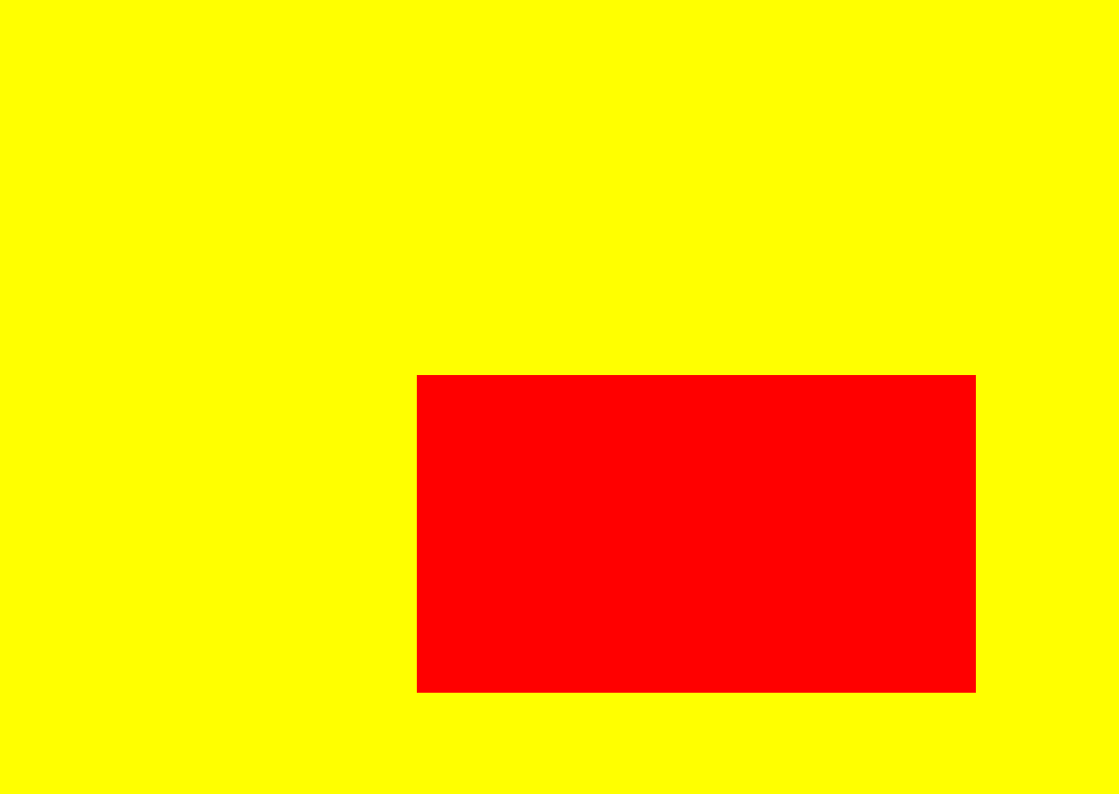
We can see that the box moved away, 120px from the left of its original position and 120px from the top of its original position.
Open Source Session Replay
OpenReplay is an open-source, session replay suite that lets you see what users do on your web app, helping you troubleshoot issues faster. OpenReplay is self-hosted for full control over your data.

Start enjoying your debugging experience - start using OpenReplay for free.
Absolute position
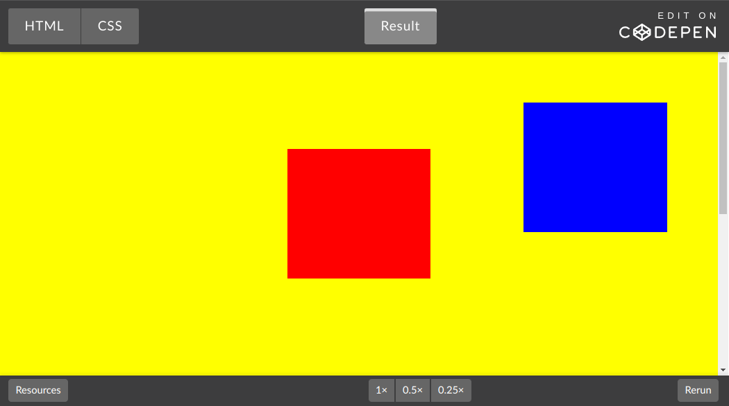
In position: absolute elements are positioned according to the nearest containing(parent) element. Also, the parent element has to be positioned using position: relative.
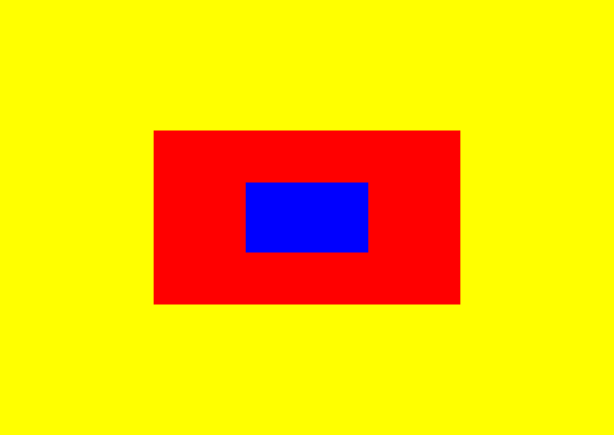
Let’s look at an example with two boxes, setting the red box to position: relative and the blue box position: absolute.
.box1{
  display: flex;
  justify-content: center;
  align-items: center;
  width: 50%;
  height: 40vh;
  background: red;
  position: relative;
}

.box2{
  background: blue;
  width: 40%;
  height: 40%;
  position: absolute;
}
Here’s the output:
Now let’s try to move the blue box with the position: absolute. Like we said, in position: absolute the element is positioned according to its parent element, which is the red box in this case.
.box2{
  background: blue;
  width: 40%;
  height: 40%;
  position: absolute;
  top: 0;
}
Here’s the output:
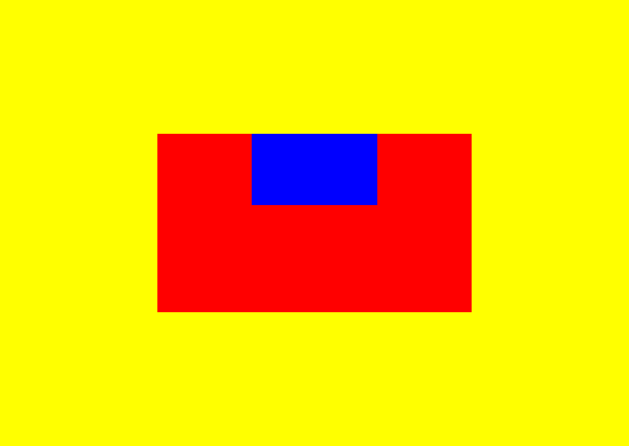
Notice that the box moved to the top of the parent element? Like we said, in absolute positioning, the element is positioned according to its parent element, so having a top with a value of 0, moves it to a top margin of 0 relative to its parent element.
let’s look at one more example:
.box2{
  background: blue;
  width: 40%;
  height: 40%;
  position: absolute;
  bottom: 50px;
  right: 50px;
}
Here’s what the output looks like:
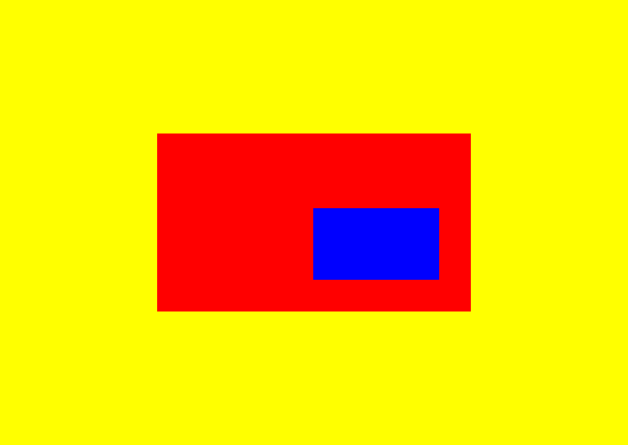
The box moves 50px from the bottom of the parent element and 50px from the right of the parent element.
Fixed position
In position: fixed, the element is positioned according to the viewport, which is the browser window itself.
According to the viewport, the element will always stay fixed at the positioned spot.
Let’s look at a similar example to the previous one. Let’s make the blue box position: fixed. Also, add a third box to see the effect of the fixed position while scrolling.
body{
  margin: 0;
}
.parent1, .parent2{
  background: yellow;
  display: flex;
  align-items: center;
  justify-content: center;
  height: 100vh;
}

.box1{
  width: 50%;
  height: 40vh;
  background: red;
  position: relative;
}

.box2{
  background: blue;
  width: 20%;
  height: 20%;
  position: fixed;
  top: 50px;
  right: 50px;
}

.box3{
  width: 50%;
  height: 40vh;
  background: green;
  position: relative;
}
Here’s a look at the output: The blue box remains fixed while we scroll through the page.
Here’s a different example, with a header fixed at the top.
Sticky position
The option position: sticky acts like a hybrid between relative and fixed. The element is positioned relative until a specified offset position is met while scrolling, then it sticks at a spot just like the fixed position.
Let’s see an example: we’ll be using the previous example of the fixed header, moving the header downwards for clarity.
.stick{
  background: #000;
  height: 20vh;
  width: 100%;
  position: sticky;
  top: 0;
  color: #fff;
  padding-left: 60px;
}
Here’s the output: It acts as relative until the element meets the specified scroll position of top:0. Then, it acts as fixed, and sticks at the specified spot.
Z-index
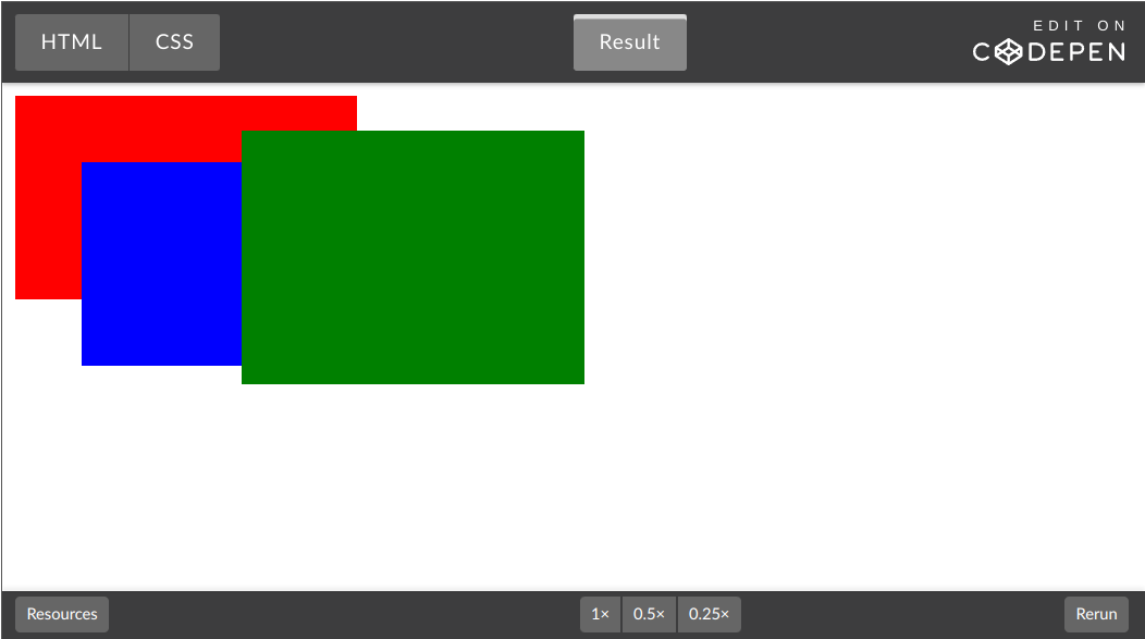
The z-index property specifies the stacking order of elements. In a case where multiple elements are stacked, the z-index property helps control how these elements stack on each other. Elements with a higher z-index stay on top of elements with a lower z-index. Let’s look at an example of three boxes stacked on each other:
.red{
  width: 30%;
  height: 40vh;
  background: red;
  position: absolute;
    }

.blue{
  background: blue;
  width: 30%;
  height: 40vh;
  position: absolute;
  top: 50px;
  left:50px;
}

.green{
  width: 30%;
  height: 50vh;
  background: green;
  position: absolute;
  left: 150px;
  top: 30px;
}
Here’s the output:
In a case where we want the blue box to display in front of both the green and red box, all we have to do is give the blue box a z-index with a higher value.
Let’s do that:
.red{
  width: 30%;
  height: 40vh;
  background: red;
  position: absolute;
  z-index:1;
    }

.blue{
  background: blue;
  width: 30%;
  height: 40vh;
  position: absolute;
  top: 50px;
  left:50px;
  z-index:3;
}

.green{
  width: 30%;
  height: 50vh;
  background: green;
  position: absolute;
  left: 150px;
  top: 30px;
  z-index: 2;
}
Here’s the output:
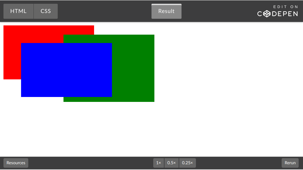
The blue box has the highest z-index, it displays over both boxes. The green box has the next highest z-index, it displays over the red box.
Resources
Conclusion
Hopefully, we now understand the CSS position property, the different types of CSS positions, and how they apply. Now we can go on to position our elements around web pages properly.
A TIP FROM THE EDITOR: For an interesting way to include CSS in your pages, look at our Incorporating CSS to a Page via HTTP Headers article.