The key to a successful website lies in prioritizing the user experience. User-centered web design involves comprehending user behaviors, developing responsive and accessible interfaces, and utilizing data-driven insights. This approach is all about placing the user’s needs at the forefront. By actively seeking and incorporating user feedback and navigating the implementation challenges, web developers and designers can create websites that not only impress but also genuinely serve their audiences. This article will show the significance of making users the focal point of web design through real-world case studies and best practices.

Discover how at OpenReplay.com.
The goal of user-centered web design is to create websites that not only appear appealing but also consider the wants, expectancies, and needs of end users to make them highly efficient, easy to use, and enjoyable. It is an iterative process that involves reviewing user feedback, testing, and researching to target the user’s expectations.
User-centered design is crucial for putting first the experiences, needs, and expectations of end users throughout the design process, ensuring that every decision aligns with user-centric principles. To accomplish this, designers need to consider the context, goals, and preferences of users. Additionally, they should guarantee that the content and functionality of the website are accessible, readable, and usable on various devices and platforms.
User-First Approach Design
A user-first approach to design aims to create projects that are functional and resonate with the target audience, resulting in increased user satisfaction and engagement. In user-first approach design, here are some key principles you should consider:
- Enhanced User Satisfaction: A user-first approach prioritizes user needs and preferences, leading to a more satisfying and enjoyable experience for website visitors.
- Improved Usability: By considering the user’s context and behaviors, designers can create more intuitive and easy-to-navigate websites, enhancing overall usability.
- Increased Engagement: Designing with the user in mind increases the likelihood of capturing and maintaining user attention, resulting in higher levels of engagement with the website.
- Better Conversion Rates: Understanding user goals allows for optimizing key conversion points, improving the likelihood that visitors will take desired actions on the site.
- Reduced Bounce Rates: A user-centric design decreases the likelihood of users leaving the site quickly (bounce) as the content and functionality align more closely with their expectations.
- Effective Communication: A user-first approach ensures the website communicates information clearly and efficiently, reducing user confusion and frustration.
- Brand Loyalty: Positive user experiences contribute to the development of brand loyalty, as users are more likely to return to a website that consistently meets their needs.
User Design Thinking and Journey Maps
User design thinking and journey maps are concepts of user-centered projects, playing pivotal roles in shaping a web design that revolves around user needs. Let’s take a look at some of these concepts:
User Design Thinking
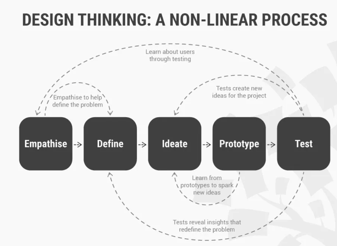
User-design thinking is a human-centered approach to solving problems. Its main focus is to understand user needs, behaviors and wants. User design can be divided into five categories:
- Empathy: Empathy involves developing a deep understanding of users by putting yourself in their shoes and recognizing their perspectives, wants, needs, and challenges.
- Define: Define the problem or challenge based on user insights, ensuring a precise understanding of what needs to be addressed.
- Ideate: Encourage creative thinking to generate a wide range of potential solutions. The quantity of ideas is encouraged during this phase.
- Prototype: Create tangible representations of design solutions, allowing for quick testing and iteration.
- Test: In testing, gather user feedback by testing prototypes, refining designs based on insights, and repeating the process iteratively.
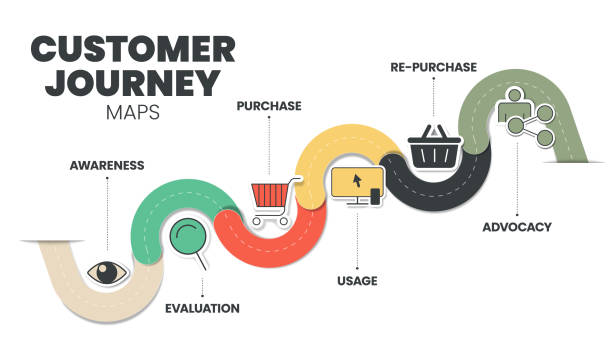
Journey Maps
Journey maps are visual representations of the user experience that focus on the end-to-end experience of a user as they interact with a product or service. Journey maps can be used to:
- Identify user pain points: Journey maps can help designers identify areas where the user is having a negative experience.
- Prioritize improvements: Journey maps help designers prioritize improvements to the product or service.
- Communicate with stakeholders: Journey maps can be used to communicate with stakeholders about the user experience.
User Research And Personas
User research and personas are two essential components used in user-centered design, playing key roles in addressing the target audience’s preferences. User research is gathering and analyzing user information to inform the design and development of products and services. Personas are fictional characters that are created based on the insights gathered from user research.
Surveys, interviews, and usability testing are three essential approaches for collecting user feedback to help in the design process.
Surveys
A survey aims to collect data on opinions, behaviors, preferences, or other characteristics from a sample of individuals through a set of questions.
Some practical methods for conducting surveys are:
- Online Surveys: Use online survey platforms like SurveyMonkey or Google Forms for convenient data collection to design concise and clear questions to encourage participant engagement.
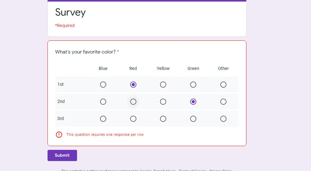
- Email Surveys: surveys can be distributed via email to targeted audiences.
- Website Embedded Surveys: Integrate surveys directly into your website for real-time user feedback. Make sure the appearance is timed strategically to avoid disruption.
- Social Media Surveys: Leverage social media channels to reach a broader audience by crafting visually appealing surveys with straightforward questions.
Interviews
Conducting interviews is a great way to get in-depth qualitative data from fewer users. User interviews involve delving into the essence of a user’s objectives and understanding their challenges. Let’s take a look at some practical methods of conducting interviews:
- One-on-One Interviews: This method involves conducting individual interviews for in-depth insights to develop a structured interview guide with a mix of open-ended and specific questions.
- Remote Video Interviews: Use video conferencing tools for remote interviews.
- Focus Group Interviews: Gather a small group for interactive discussions. Facilitate conversation, encouraging participants to share diverse perspectives.
- Contextual Inquiry: Conduct interviews in the user’s natural environment for context-specific insights, observe behaviors, and gather feedback in real-world scenarios.
Usability Testing
Usability testing involves assessing a product or service by having representative users test it; the users are observed interacting with these products or prototypes. This aids in the identification of usability issues and helps improve the design or prototypes.
Some Practical tips for conducting usability testing:
- Recruit a representative group of users: Ensure that your testing involves individuals who accurately reflect your intended audience.
- Moderated Usability Testing: Facilitate usability sessions with a moderator guiding participants through tasks and capture real-time feedback and observations.
- Task Scenarios: Determine participants’ ability to accomplish designated tasks and ascertain the time required for task completion.
- A/B Testing: A/B tests are implemented to compare different design versions and performance metrics and measure user preferences.
- Accessibility Testing: Ensure your product is accessible to users with disabilities.
- Choose a realistic testing environment: Products or prototypes should be tested in an environment similar to how users will be using it in the real world.
- Take notes: Take notes on user behavior, comments, and pain points.
- Analyze the testing data: Look for patterns and trends in the data and identify areas for improvement.
Always prioritize ethical considerations, secure informed consent, and customize your methods according to the specific objectives of your research.
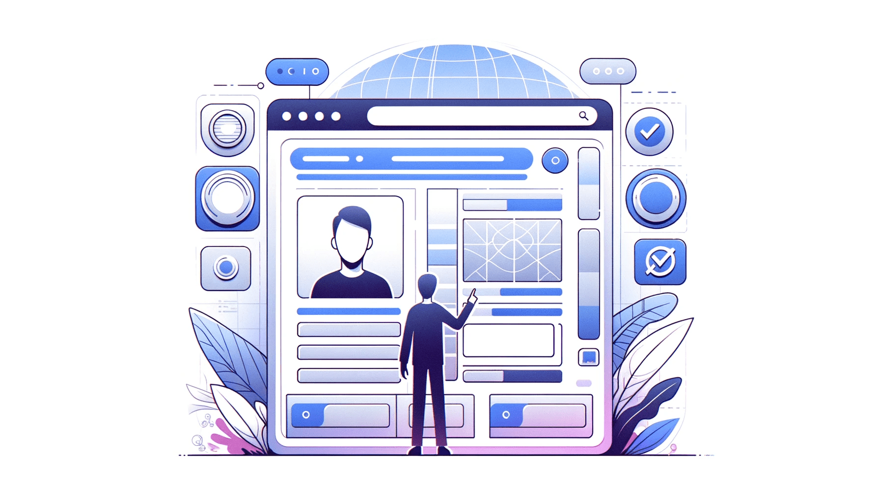
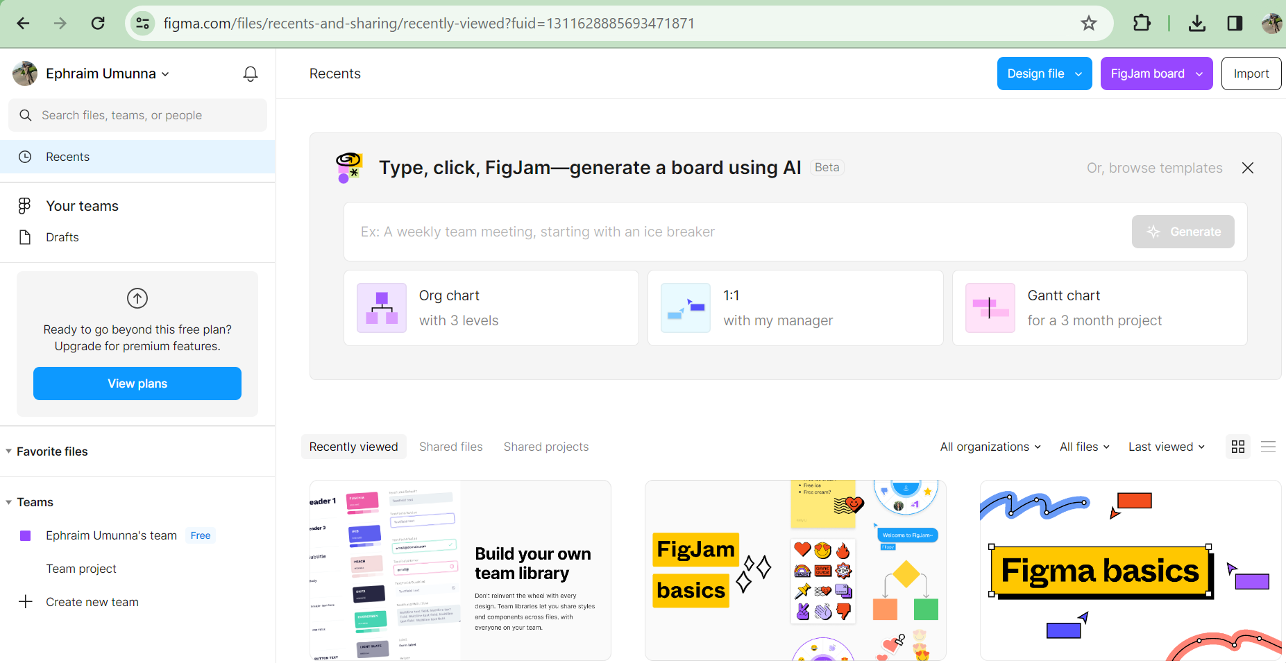
How to Create Personas
Personas are fictional characters used to represent a user or group of users with similar characteristics and behaviors. By creating user personas, designers can better understand their target audience. Xtensio and Hubspot are popular tools used for creating personas, as they both offer great features that can help you develop insightful personas to guide your product design and marketing efforts.

The above persona was created using the Xtensio tool. Creating personas using Xtensio makes it easy, as the platform has a user-friendly interface and persona template.
Here’s a step-by-step guide to take when creating personas using Xtensio:
- Go to the Xtensio website and either log in to your existing account or sign up for a new one.
- Once you’ve successfully logged in, click on the Create New Folio displayed on the dashboard and click on Use Template.
- In the template library, locate the User Persona template
- Xtensio provides a pre-designed persona template with various sections for information. Click on each section to edit the details, including the persona’s name, bio, photo, background, goals, frustrations, etc.
- Xtensio allows you to customize the persona template by adding or removing sections or modules based on your needs. You can also explore additional modules such as the “User Interview Insights” or “User Quotes” to enhance the persona.
- Collaborate in Real-Time: One exciting feature of Xtensio is that it is designed for collaborative work. You can invite team members to collaborate on the persona creation in real time. Team members can also discuss changes, provide feedback, make edits, and contribute to the persona-building process.
- Save and Share: Once you’ve filled in all relevant information and are satisfied with the persona, save your work. Xtensio also allows you to share the persona with others through a unique link or by exporting it as a PDF or PNG file.
- Iterate and update: Personas are dynamic and may need updates as your understanding of your user target evolves; Xtensio makes it easy to iterate on your personas over time; you can revisit the persona template to add new insights, change details, or adjust based on evolving user understanding.
- Export the persona document for presentations, reports, or sharing with stakeholders. You can also Integrate your personas into your design and marketing processes to ensure alignment with user needs.
Remember that crafting impactful personas relies on grounding them in authentic data and insights derived from thorough user research. Xtensio offers a well-organized and visually engaging platform to structure this information, facilitating easy comprehension and seamless sharing within your team.
UX Design
User Experience (UX) is an approach that enhances users’ overall experience when interacting with a system or product; the main goal of User Experience is to make products and services very easy to use, efficient, and enjoyable. User Experience design plays a very crucial role in enhancing usability; tools like Figma and Adobe XD play a significant and efficient role in shaping the usability of digital products. Figma, a design platform in the cloud, has transformed collaboration and user interface creation for designers and product teams. Its robust features and user-friendly interface make it an ideal tool for crafting accessible and user-friendly products.
In this section, we will explore how Figma’s comprehensive set of features can significantly enhance usability:
- Accessibility: Figma incorporates various features that enhance product usability for individuals with disabilities. These features encompass tools such as color contrast checkers and text-to-speech readers.
- Aids Collaboration and Communication: Figma is a cloud-based design tool that supports live collaborations. Designers, developers, and stakeholders can collaborate, discuss and view changes instantly, and provide feedback, developing effective communication.
- Prototyping, Wireframing, and Interaction Design: Figma is known for its robust prototyping capabilities, which allow designers to create interactive prototypes with animations and transitions, enabling a more realistic representation of the final product. Figma’s wireframes and prototyping allow users to create low-fidelity and high-fidelity designs, empowering them to test and refine their designs before implementation. This facilitates the early detection and resolution of usability issues in the design process.
- Flexible Design and Device Testing: Figma excels in supporting responsive design. Designers can create layouts that adapt to different screen sizes, and the “Auto Layout” feature simplifies the creation of flexible designs. Figma also provides a device preview mode for testing designs on various devices.
Usability And Accessibility
Usability and accessibility are two key components of the user experience (UX), which ensures that digital products are efficient, inclusive, and effective. They are used interchangeably but have distinct goals and meanings. Usability focuses on the overall ease of use and user satisfaction, enhancing the general user experience. Accessibility ensures that digital products are inclusive, providing equal access and usability for all, regardless of abilities or disabilities. In web development, usability and accessibility are closely intertwined, ensuring that websites and applications are not just user-friendly but also designed to be inclusive. Axe Usability Checker is an open-source accessibility testing tool developed by Deque Systems. It is available as a browser extension for Chrome and Firefox and is used to Identify issues related to accessibility in web applications following the Web Content Accessibility Guidelines (WCAG). Axe operates by scanning the website’s HTML code and reporting any violations of accessibility best practices. While its main goal is to address accessibility issues, it indirectly enhances usability. Let’s take a look at some of the ways it enhances usability:
- Axe Usability Checker provides a prioritized list of accessibility issues, highlighting those with the most significant impact.
- Its efficiency in testing allows designers and developers to focus on resolving issues quickly, leading to a more usable and accessible product.
- Axe Accessibility Checker often provides real-time feedback as users interact with web pages for quick iteration and improvement, contributing to a more usable and accessible design.
Web Content Accessibility Guidelines (WCAG)
You might be curious about what WCAG entails, seeing that Axe usability checker follows the rules defined in Web Content Accessibility Guidelines (WCAG). The Web Content Accessibility Guidelines (WCAG) are a set of internationally recognized standards that ensure digital content and applications are accessible to people with disabilities. WCAG provides a comprehensive framework for ensuring that websites and web applications are designed and developed to accommodate a diverse range of users. By following WCAG guidelines, designers can create inclusive digital experiences that cater to a wider audience and enhance the overall usability of their products. Here’s a discussion on the key aspects of designing with WCAG:
WCAG is organized around four fundamental principles, often referred to as POUR:
- Perceivable: Information and user interface components must be presented in ways that users with visual, auditory, or other sensory impairments can perceive.
- Operable: User interface components and navigation must be operable and functional to enable users to navigate the content using various input methods, including keyboards, touchscreens, and assistive technologies.
- Understandable: The information and operation of the user interface must be clear and easy to understand.
- Robust: Content must be robust enough to be reliably interpreted by various user agents, including assistive technologies and operating systems.
Each principle is further divided into success criteria that specify the minimum requirements for conformance. WCAG is divided into three levels of conformance: A (basic), AA (intermediate), and AAA (advanced). Designers must align their design decisions with these guidelines and success criteria to ensure a universally accessible experience. By embracing WCAG principles and integrating them into the design process, designers contribute to creating a digital landscape that is aesthetically pleasing and functional and accessible to all users, regardless of their abilities or disabilities. Designing with WCAG offers numerous benefits, including:
- Increased User Reach: WCAG-compliant websites and applications are accessible to a wider audience, including individuals with disabilities, increasing user engagement and satisfaction.
- Reduced Legal Risks: Adherence to WCAG can help organizations avoid legal claims related to accessibility barriers, protecting their reputation and brand image.
- Improved Usability: WCAG guidelines promote usability principles, enhancing the overall user experience for all users, regardless of their abilities or limitations.
- Enhanced Brand Reputation: Demonstrating a commitment to accessibility showcases an organization’s inclusivity and social responsibility, fostering a positive brand perception.
Intersection of Usability and Accessibility for an Inclusive Design
The intersection of usability and accessibility forms the cornerstone of inclusive design. When an application or website is usable, it is easier for everyone to use, regardless of their abilities and limitations. By considering both usability and accessibility in a design process, this intersection fosters a design philosophy that prioritizes user needs and ensures that technology is a tool for empowerment for all users.
UI Design
Beyond user experience (UX) design, there is user interface (UI) design. User interface (UI) design skillfully combines interaction design, information architecture, and visual design to anticipate user actions and provide a simple and user-friendly experience. It encompasses all aspects of the user’s engagement with a product or service, from the initial discovery to the continued use and maintenance. The primary objective of user interface design (UI) is to make products and services simple, efficient, and enjoyable for users, enabling them to accomplish their activities with ease, giving them a positive experience using the products and services. User interface plays a significant role in shaping user interactions, with tools like Adobe Creative Cloud, a software application influencing overall productivity and experience, widely used for web development and other creative tasks.
The impact of UI design on user interactions can be observed in multiple important areas:
- User Experience (UX): UI design significantly influences the overall user experience by making it easier for users to navigate the various applications and features within the Creative Cloud suite.
- The UI design of Adobe Creative Cloud establishes the platform’s navigation structure and information architecture, intuitive navigation menus, clear organization of features, and a visually coherent layout, which contribute to a positive user experience and efficient exploration of tools.
- Consistency Across Applications: Adobe Creative Cloud encompasses multiple applications, and consistent UI design across these applications ensures a smooth transition for users moving between different tools. Consistency enhances user familiarity, making it easier for individuals to utilize their skills across various Adobe applications.
- Interactive Elements and Controls: Well-designed sliders, menus, buttons, and other interactive elements contribute to the ease with which users can manipulate and control the creative tools.
- Responsive Design: Adobe Creative Cloud UI design accounts for responsive design, ensuring a consistent and optimized experience between desktop and mobile environments.
- Personalisation and customization: A thoughtful UI design allows for personalization and customization, enabling users to customize the interface according to their preferences. Features like customizable workspaces and user preferences create a more personalized and efficient workflow.
- Prototyping and Design Tools: Adobe XD, a part of Creative Cloud, is not just a UI/UX design but also a prototyping tool. Its UI design directly impacts how designers create and interact with prototypes, facilitating efficient design iteration.
Any product or service’s ability to succeed depends heavily on its user interface (UI). By following UI design principles and using the UI design process, designers can create successful products and services that are user-centered, effective, and successful. Ensuring usability, along with functionality, is a crucial component in keeping users.
Responsive and Mobile-Friendly Design
Responsive and mobile-friendly designs aim to create the best possible user experiences on various devices, including smartphones, tablets, and PCs. Although they share the goal of improving accessibility and usability across a range of screen sizes, their methods and approaches vary. Responsive design aims to create flexible and dynamic layouts capable of adjusting to various screen sizes and resolutions. Fluid grids are a great feature of responsive design that allows website elements to resize proportionately to the size of page elements based on the user’s screen. With responsive design, the layout adjusts dynamically based on the device’s screen size, using a single codebase for all platforms.
The mobile-friendly design focuses specifically on giving users top-notch experiences when accessing a website on mobile devices. It involves reformatting websites to meet the requirements of each mobile device and mobile browser rather than just making a smaller or simplified version of your desktop site. It could be larger touch targets and streamlined content for ease of use on smaller screens to enable users to find information quickly.
We live in a mobile-first world, and making sure that websites are mobile-first in the world today is crucial for a smooth user experience. Testing tools that offer detailed testing capabilities across diverse screen sizes and devices, such as BrowserStack and Responsinator, are essential to achieving mobile friendliness. In this section, we will take a look at how to ensure and test mobile-friendliness using the BrowserStack tool.
The BrowserStack tool is a web-based tool that gives a quick insight into how your website will perform and appear on different screen sizes. It ensures the mobile-friendliness of websites and applications on a range of simulated devices.
Using BrowserStack:
- Visit the BrowserStack website and sign up for an account.
- Log in to your newly created account.
- Select a plan based on your testing needs. BrowserStack offers various plans tailored to different testing needs. Select a plan that aligns with your requirements.
- Familiarize yourself with the BrowserStack dashboard. It serves as the central hub for accessing different testing environments.
- Copy and paste the URL of your app into the input field.
- Choose the browsers and devices you want to test on. BrowserStack provides an extensive list, allowing you to simulate your application or website across diverse environments.
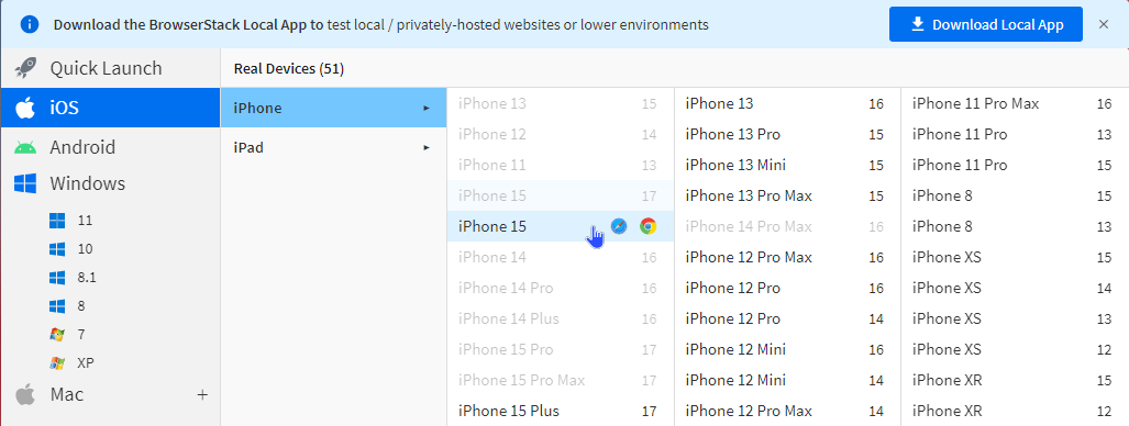
Remember that Responsive design adapts to different devices, while mobile-friendly design is tailored for optimal use on mobile devices. Both improve user experiences and support diverse web access methods. BrowserStack can be a very powerful tool for testing and ensuring the mobile-friendliness of applications and websites.
Mobile view screen
Desktop screen view
Best Practices to Consider When Optimizing Websites Across Diverse Devices
The following are some of the best practices to consider when you are optimizing websites across diverse devices:
- Adopting a Mobile-First Approach in Design and Development: In your design and development process, prioritize mobile-first, taking into account the limitations and capabilities of mobile devices.
- Implementing Responsive Design with CSS Media Queries and Frameworks: CSS media queries are ways to apply various styles according to the device’s specifications, including screen size and orientation. Use responsive CSS frameworks like Bootstrap or Tailwind to simplify the implementation of responsive design.
- To keep a consistent layout across various devices, use flexible images that can scale proportionally and fluid grids.
- Make sure people with disabilities can access the website. This is done by following the guidelines set by the WCAG (Web Content Accessibility Guidelines).
- Choose clear fonts and maintain readable font sizes to ensure readable content on small and large screens.
- Maintain a consistent user experience across mobile devices to provide ease and familiarity for users transitioning between platforms.
- To guarantee that the functionality of your website or application is accurate, test on a variety of real devices and also ensure cross-browser compatibility to make sure your website works well on different web browsers used by diverse audiences.
- Use analytical tools to monitor user patterns in device usage and learn how visitors use the website across a range of devices.
- The process of optimizing a website is never-ending. Review and improve the website’s performance, content, and design regularly to stay current with changing user demands and device capabilities.
By putting these strategies into practice, a website can look good and work well while serving a wide range of users, making it welcoming and easy to use.
Testing and Feedback
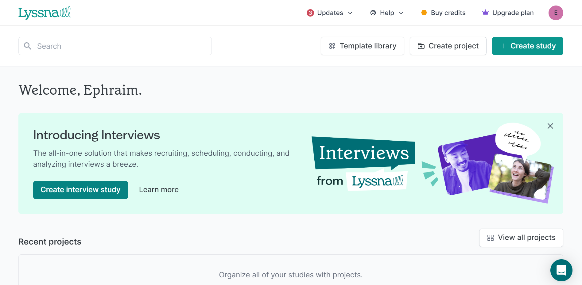
User testing involves using real people to gather feedback when they access a product or service. Also, decisions about new product development can be influenced by the insights obtained from user testing, which show you what customers think and feel about your offering. UsabilityHub now Lyssna is a platform that provides users with various tools to improve digital product usability by offering diverse tools for feedback and user testing. The general process of conducting user testing using software such as Lyssna is as follows:
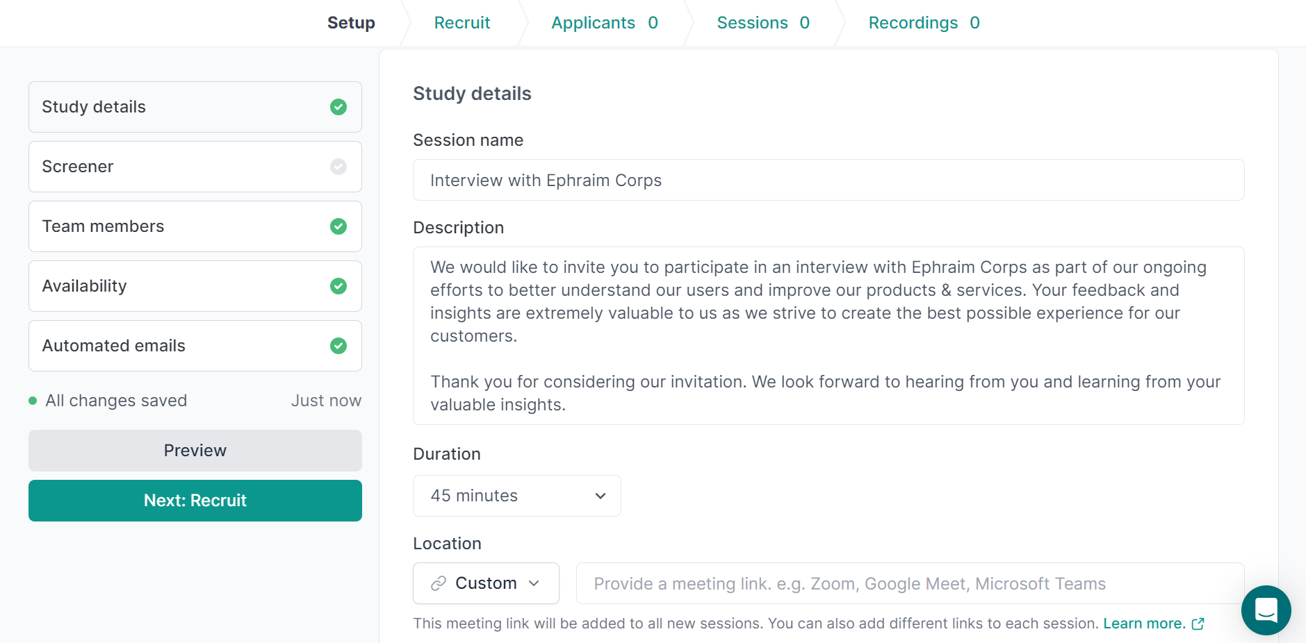
- Recruiting Participants for User Research: The first step is to utilize Lyssna’s extensive participant pool to match users similar to the product being tested.
- Creating Test Plans: After getting individuals who match the intended user base, create customized test plans that specify the tasks participants will perform and the questions they will be asked to complete to ensure a structured and focused testing experience.
- Record Sessions with Users: Observe participants as they engage with the product or service; screen records and audio capture can be used to gain valuable insights into their thought processes and behavior.
- Collect their Feedback: After you have finished the test, gather feedback from participants through post-test surveys, inviting them to share their thoughts, what they recommend, and their frustrations to aid improvement.
- Examine your Findings: To get a comprehensive picture of the user experience, use Lyssna’s data analysis tools to spot patterns, trends, and typical usability problems.

Some benefits of using Lyssna for User-Testing
Using Lyssna for user testing has several benefits:
- Test Flexibility Remotely: Hold user testing sessions virtually; this eliminates the need for participants to be physically present in a lab, expanding the pool of potential testers and increasing testing efficiency.
- Cost-Effectiveness: Thanks to Lyssna’s subscription-based pricing model, user testing tools are accessible at lower expenses than traditional lab-based testing.
- Simple-to-use Interface: Lyssna’s user-friendly interface makes the process of creating test plans, analyzing results, and recording sessions easier, making it accessible to designers of all skill levels.
- Actionable Insights: Gaining information from user testing helps enable designers to prioritize design improvements and make decisions based on actual user feedback.
- Continuous Improvement: Integrate user testing into the design process, allowing for continuous improvement and refinement of the product or service throughout its development cycle.
Lyssna and related tools are crucial to user-centered design because they facilitate informed decision-making and iteratively improve digital products. I hope that this talk gives a thorough rundown of using Lyssna for user testing.
Content Strategy
When we talk about content strategy, in today’s digital world, businesses need to apply content strategy. Now, you might be wondering what content strategy is all about. Content strategy simply means creating, planning, and managing content to meet business objectives. Content strategy tools are essential for business management.
Let’s take a look at some content strategy tools and how they help in effective content management:
- GatherContent: Gathercontent is a content planning and collaboration tool that helps teams brainstorm, organize, and manage content ideas.
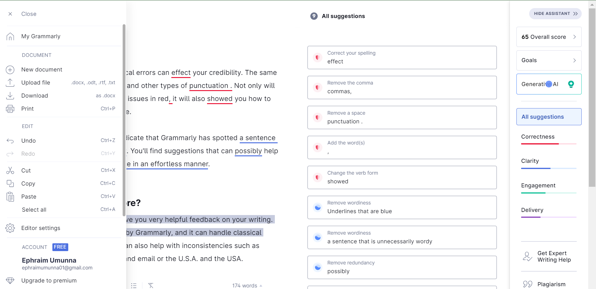
- Optimization and Content Analysis Tool: Grammarly, and Hemingway Editor are two examples of tools, their function is to optimize content for search engines, enhance the readability of content, and ensure error-free content.
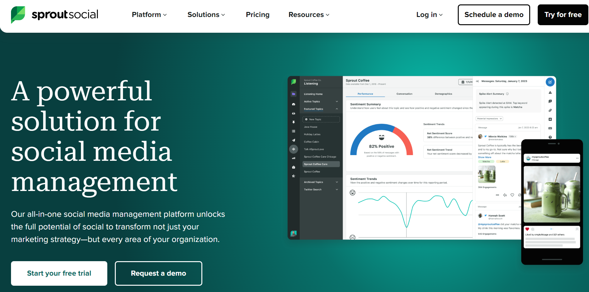
- SproutSocial: SproutSocial is a social media content strategy tool that plans and schedules social media content. It also helps monitor social media performance, trends, comments, and engagements.
Choosing content strategy tools depends on the requirements of the business; some things to consider when choosing content strategy tools are:
- The size of the team and collaboration demands: select tools that make collaboration easier and match the size of the content team.
- Easy to use: use tools that are simple to use and contain easily with the current systems.
- Use of adaptable tools: The use of tools will evolve with the company as both quantity and complexity increase.
- The Cost: Always take into consideration the different prices, subscriptions, and plans of tools.
Putting these content strategy tools into a comprehensive business can enhance collaboration, optimize content marketing, and achieve desired results.
Role of Content in User Engagement and Satisfaction.
The goal of user engagement and satisfaction is to see that the expectations of users are met when they interact with a website. Content plays a role in user engagement and satisfaction; the use of well-crafted content contributes significantly to a positive user experience.
Content helps users in diverse areas; let us take a look at some ways content aids in user engagement and satisfaction:
- It Promotes Exploration: Engaging and interactive content awakens users’ interest and keeps them engaged by allowing them to check out various aspects of the goods or products.
- Content Fulfills Users’ Needs: Users are satisfied whenever they get the answers and information they need from related and educational content.
- Content builds trust and accountability: Accurate content allows a user to trust a product or service and acknowledge it as a source of confidential information.
- Importance of Clear Contents: Clear and accessible content helps a user find the information they want quickly and without stress.
Some Techniques for Using Content Efficiently:
- Creating high-quality content: Engaging well-written content attracts users because it is easy to consume.
- Understanding user needs: Research to ensure that your content aligns with users` interests, pain points, and expectations.
- Promoting User Interaction: Encourage the use of feedback, user comments, and discussions to encourage an interaction that is two ways.
- Updating User Content: Users are thrilled when content is up-to-date and current as it encourages them to check in from time to time, which also displays the company’s dedication to being relevant.
Content serves as an essential link between digital platforms and consumers. It is crucial for user consumption and satisfaction on digital platforms. Producing relevant content and putting the users in mind are tactics that can be used to produce relevant content. By implementing these strategies, businesses can leverage content to engage, hold the attention of, and please their users. This will ultimately lead to growth and success.
Data-Driven Decision-Making
Data-driven decision-making is crucial in user-centered design, and it is the process of using the insights obtained from user data to direct design decisions. This method is centered on the qualitative and quantitative results obtained from user interactions and behaviors with digital products. The introduction of analytical tools like Google Analytics is crucial for tracking user behavior; they help collect and analyze user data. Some benefits of Google Analytics in user-centered design include:
- Tracks User Goals: Google Analytics identifies and monitors particular goals, which include the purchase of products, signing up for newsletters, and submission of forms.
- Conducting A/B Testing: Conduct different versions of designs and compare which ones perform better while improving users’ experience.
- Real-Time Statistics: Track user activities in actual time to track the rise in traffic, possible pain points, and trending content. This allows for quick updates and corrections.
- User Categorization: To target interaction with marketing and content adverts, group users into categories of their behaviors and demographic reasons.
- Use of Metrics for User Engagement: Review data like the time on site, page bounces, and conversion rate to measure user satisfaction with the site and identify areas needing development.
Practical implementation of analytics in UX improvements
By adding analytics into user experience, designers can make informed decisions based on actual user data, this is helpful as it improves the process effectiveness, usability, and general satisfaction of users. Here’s a helpful manual for applying analytics to use in web design to enhance user experience:
- Defining Goals and Metrics: Clearly state the goals of your website or application (e.g., to increase user engagement and improve conversion rate). Determine the essential metrics, such as the time spent on a page, the rate of clicks, and the conversion rates that correspond with these goals.
- User Journey Inspection: Review the behavior of users to find out where users tend to depart more from the path most frequently. Use data analysis to find out how users normally get around your website or application.
- Continual Monitoring: Put in place a system that keeps an eye constantly on analytical data. Stay mindful of any changes in the behavior of users and adapt to their experience appropriately.
- Use of User Feedback Integration: Bring together analysis with user feedback instruments like questionnaires or user feedback forms. Use statistical analysis to gain an in-depth understanding of user needs.
- Report Regularly: Create reports regularly that point out essential UX metrics and improvements. Send reports to all parties involved and stakeholders on how they affect the user experience.
Organizations may provide a continual improvement culture and guarantee that design decisions are based on data-driven information that integrates analytics into UX improvement. Over time, this user-centric and iterative approach helps to create a more effective and satisfying user experience.
Challenges and Solutions
The user-centered design strongly emphasizes understanding end-users behaviors, needs, and preferences to create products that are very effective, simple to use, and enjoyable. While user-centered design can have great benefits, it poses several difficulties that companies and designers must overcome to produce positive results.
Key Challenges
- Global Aspects to Take Into Account: Designing for people from various cultures, languages, and regional backgrounds can be challenging.
- Designing Accessible Solutions for People with Disabilities and Diverse Demographics: Creating designs that can be accessible to people with disabilities and demographics can be a major challenge.
- Evolvement of Technology: The evolvement of technology can be a challenge to designers as technology advances so quickly that it sometimes surpasses the design process.
- Time and money can be a great hindrance to how much testing and user research can be done.
Actionable solutions
- Carry out global research and create designs that adjust to differences in cultures. Take translation into account.
- Comply with accessibility guidelines by involving users of different skill levels for testing and conducting thorough access reviews.
- Adopt methods that are agile to keep up with new technologies and give adaptable design solutions of the greatest importance.
- Use affordable research techniques, place activities according to their impact, and strain the value of early involvement of users.
Conclusion
In this guide, we explored the importance of user-centered web design; understanding their role, we looked at some tools that enhance user-centered web design.
As the expectations of users continue to evolve, User-centered web design is still an essential approach for companies looking to succeed online and create websites that not only work effectively but deeply interact with their target users, building lasting relationships and promoting long-term success by users at the center of the design process.
In conclusion, User-centered web design empowers designers to create more websites that meet the needs and expectations of end users, ensuring a more dependable and simple online experience.
Truly understand users experience
See every user interaction, feel every frustration and track all hesitations with OpenReplay — the open-source digital experience platform. It can be self-hosted in minutes, giving you complete control over your customer data.
Star on GitHub12k