How-to Use Mantine with React and Next.js
Mantine is a feature-rich React component framework, and in this article you'll learn how to to enhance your Next.js apps by using it.


When you’re building any piece of software , you should always keep in mind that re-inventing the wheel is possibly a bad idea. When it comes to building React + Next.js application that translates to not building the components you’re using from scratch. There is most likely someone out there who’s built the perfect component library for you.
And in this article, we’re going to be covering one such library: Mantine, and why it’s going to become your favorite component library from now on.
What is Mantine?
Mantine is a feature-rich React component framework that lets you quickly create fully functional and accessible online applications. It has several custom components and hooks that you can dynamically add to your projects. Some of the features of Mantine include theming, reusable components, and some unique hooks for managing the state and UI, which can be used to create your own custom components.
So let’s now answer the second question everyone asks after hearing about Mantine.
Why would you use Mantine?
It’s a very valid question, with so many alternatives out there, why go with yet another component library instead of sticking with what you already know?
This library offers so many exciting features that it’s hard to pick a single reason! Let’s take a look at some of its major pros:
- Theming: Mantine theme is an object that you can subscribe to via context in any application area and use it to create custom components.
- Reusable Components: Some components include typography, modals, inputs, buttons, etc. And they all can be re-used and extended.
- Hooks: More than 30 hooks are included with Mantine to assist you to manage state and UI while creating custom components.
- Dark Theme: another interesting feature of this component library is its Dark theme. With Mantine, you can add a dark theme to your application with just a few lines of code.
- Notification System: Mantine has a fully-featured notifications system that integrates effortlessly with your theme.
What we are Building?
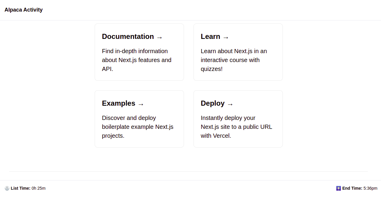
For this article, I want to recreate the interface of Llamalife, a task manager website, using Mantine. However, we will be naming our Demo project “Alpaca activity”. The interface of Llamalife looks like this:
And we will be building something a bit similar to it. Are you ready?!
What we are Covering
Before we talk about what we are covering, let’s quickly head over to the get started page on Mantine, which looks like this:
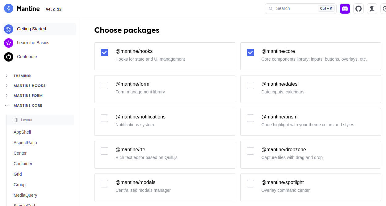
For this article, we are going to be focusing on quite a few of Mantine’s core:
- AppShell: Mantine’s Appshell gives you a responsive shell for your applications. It allows you to build a frame that you can use on every page of your website or application.
- Group: Group is essentially flex in a container, we will use it throughout this article.
- ActionIcon: the ActionIcon allows you to create a button from an Icon or a form of text.
- Button: in the button section, we will use an “unstyled button”. The unstyled button ultimately allows us to create completely custom buttons.
Creating our Next app
Scaffolding a Next app is pretty straightforward. All you have to do is go to your terminal and run the command:
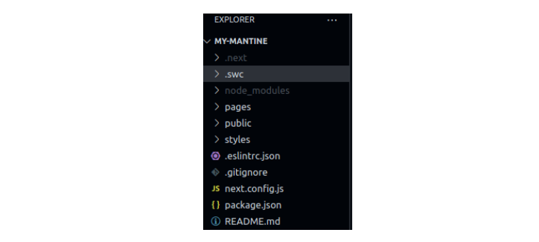
npx create-next-app@latestYou will then be prompted to give your project a name. Once your Next app is done installing, open the file up in your code editor. The directory should look like this.
And that’s it! We are done creating our Next project.
How to add Mantine to the Next.js app
To add Mantine to our application, we need to run the following command to install all the necessary dependencies.
#yarn
yarn add @mantine/hooks @mantine/core @mantine/next

#npm
npm install @mantine/hooks @mantine/core @mantine/next
Once you run the command successfully, Mantine will be added.
Easy, right?
Setting up Mantine
The first thing we want to do is to create a folder in our directory named “component”.
Now inside the component folder is where we want to store our appshell, so we will create a file in our component folder
named ApplicationContainer.js.
But before we start writing any code in our ApplicationContainer.js file, let’s head straight to our “Pages” folder and create a file named _document.js, where we will first include
the following code:
import Document from "next/document";
import { createGetInitialProps } from "@mantine/next";

const getInitialProps = createGetInitialProps();
export default class _Document extends Document {
    static getInitialProps = getInitialProps;
}
The code above holds all our initial props that need to be loaded from Mantine. The next thing is to go into our _app.js file and type in the following code:
import '../styles/globals.css'
import {MantineProvider} from "@mantine/core"

function MyApp({ Component, pageProps }) {
  return(
    <MantineProvider
      withGlobalStyles
      withNormalizeCSS
      theme={{colorScheme: "light"}}
      >
        <Component {...pageProps}/>
      </MantineProvider>
  )
}
export default MyApp
In the code, we first imported MantineProvider from @mantine/core, then wrapped our component in Mantine. Then we set some global styles, normalized our CSS, and even set the
theme to our preference.
Creating our Application Container
Our application container is the top and bottom sections, then the children go inside.
To build out our top and bottom section, we have to go into our ApplicationContainer.js file, and modify the code:
import {
AppShell,
Footer,
Group,
Header,
Text
} from "@mantine/core"
export const ApplicationContainer = ({children}) => {
return(
<AppShell
styles={{
main: {
background: '#FFFFFF',
width: "100vw",
height: "100vh",
paddingLeft: '0px',
}
}}
fixed
footer={
<Footer height={60} p="md">
<Group position="apart" spacing="xl">
<Text size="sm"><span style={{fontWeight: "bolder"}}
>🕛 List Time: </span>0h 25m</Text>
<Text size="sm"><span style={{fontWeight: "bolder"}}
>🎆 End Time: </span>5:36pm</Text>
</Group>
</Footer>
}
header={
<Header height={70} p="md">
<div style={{display: "flex", alignItems: 'center', height: "100%"}}>
<Text size="lg" weight="bolder">Alpaca Activity</Text>
</div>
</Header>
}
>
{children}
</AppShell>
)
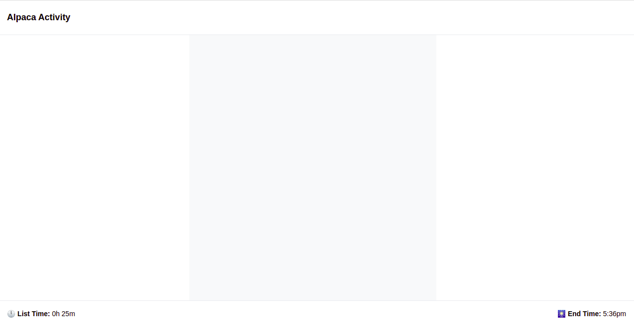
}The first thing we did with our AppShell was adding some styles. Then, we set a boolean of fixed, which allows us to have our UI on every page.
Then we created a footer that contains our “List time” and “End time”. We also added emojis to our “List time” and “End time” to make our UI a little bit more fun to look at.
When we run the code using the npm run dev command on our terminal, we will see this:
As you can see, we have our “Alpaca activity” at the top, and at the footer, we have our “List time” and “End time”.
Open Source Session Replay
OpenReplay is an open-source, session replay suite that lets you see what users do on your web app, helping you troubleshoot issues faster. OpenReplay is self-hosted for full control over your data.

Start enjoying your debugging experience - start using OpenReplay for free.
Modifying the Rest of our Project
To get started, the first thing we need to do is to go into our index.js file and edit it:
import { ActionIcon, Box, Group, Text, Title, UnstyledButton, useMantineTheme } from "@mantine/core"
import { PlayerPlay, Settings, PlaylistAdd, Plus } from "tabler-icons-react";


export default function Home() {
  const theme = useMantineTheme();
  return (
    <Group direction="column" mt="-20px">
      <Group style={{backgroundColor: theme.colors.gray[0], width:"500px", height:"100vh"}} mx="auto" direction="column">

      </Group>
    </Group>
  )
}
If you’re paying attention, you’ll notice that I used a package I haven’t mentioned yet: tabler-icon-react.
So let’s first install the Tabler Icon React package:
# npm
npm install tabler-icons-react

# yarn
yarn add tabler-icons-react
Tabler Icon React is an open-source icon library that gives users high-quality SVGs. In our code above, we imported our icons from tabler-icons-react; then we returned Group, which contains some styling for our UI.
If you rerun the code, you will get this:
Notice how in the previous file we started using one of the many custom hooks, in this case we’re using useMantineTheme which provides us direct access to the colors of our selected theme.
That way, if we change the theme, the reference to this color will still be valid, but with a different value. We’ll be using this throughout the rest of the app’s code.
For the rest of our project, we added the following code to our index.js file (of course, if you were to be making this part completely dynamic, you’d probably want to split the code into several different components):
export default function Home() {
  const theme = useMantineTheme();
  return (
    <Group direction="column" mt="-20px">
      <Group style={{backgroundColor: theme.colors.gray[0], width:"500px", height:"100vh"}} mx="auto" direction="column">
        <Group position="apart" style={{width: "100%"}}>
          <ActionIcon color="gray" size="xl" m="sm" variant="transparent">
            <Settings/>
          </ActionIcon>
          <ActionIcon color="gray" size="xl" m="sm" variant="transparent">
            <PlaylistAdd/>
          </ActionIcon>
        </Group>
        <Group spacing="none" mt="sm" position="center" mx="auto" direction="column" height="175px">
          <Title order={1} style={{fontWeight: "900", fontSize: "4rem"}}>11:00</Title>
          <Text>Read Mantine turotial</Text>
        </Group>
        <Group mt="sm" position="center" mx="auto" direction="row" height="200px" mb="md">
          <ActionIcon color="dark" size="xl" variant="transparent">
            -5
          </ActionIcon>
          <ActionIcon radius="xl" color="dark" size="xl" variant="filled">
            <PlayerPlay/>
          </ActionIcon>
          <ActionIcon color="dark" size="xl" variant="transparent">
            +5
          </ActionIcon>
        </Group>
        <Group mt="sm" mb="sm" position="center" mx="auto" direction="column" height="90px">
          <UnstyledButton style={{height:"100%", width: "250px"}}>
            <Group spacing="none" p="lg" direction="column" mt="sm" mx="auto" position="center" style={{background:"rgb(238,238,238)", border: "1px dashed rgb(189,189,189)"}}>
              <Box size="md" radius="xs">
                <Plus style={{color: "gray"}}/>
              </Box>
              <Text variant="light" size="xs" color="gray">Add Task</Text>
            </Group>
          </UnstyledButton>
        </Group>
        <Group mx="auto" style={{width: "260px", justifyContent: "space-between"}} position="right">
          <Text size="xs">⬇️Hide completely</Text>
          <Text size="xs">🎊Clear completely</Text>
          <Text size="xs">🧹Clear all</Text>
        </Group>
      </Group>
    </Group>
  )
}
Here, we use ActionIcon to create our top buttons. ActionIcon is essentially just buttons that are presented in a way that makes them look like icons. We also used ActionIcon to
create our +5, -5, and Play buttons.
For our Add Task button, we used the UnstyledButton, a cool feature in Mantine that wraps whatever you put inside it as a button.
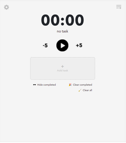
This is what our final project looks like:
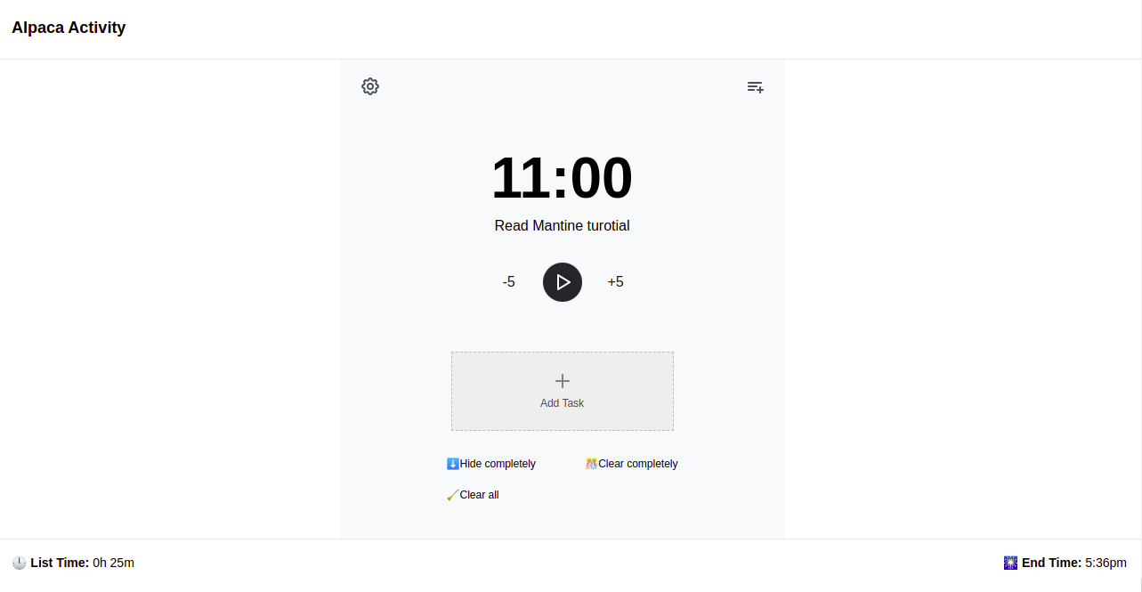
We are now done building our replica task manager UI using Mantine features.
Conclusion
And that’s it for this introduction to Mantine. Hopefully, with this article, you got to know Mantine and managed to understand how to add it to your projects.
With the unique hooks and components on Mantine, building out a beautiful interface for a project becomes a lot easier for developers.