Using Switch Selectors in React Native


Switches are one of the most interactive ways of selecting or toggling on mobile because of how easy users can implement changes/select from a tab or settings. How to use Switch Selectors and ways to utilize it in React Native applications will be the focus of this article. I will be taking you through setting up Switch Selectors for React Native and some ways you can use them.
To follow this tutorial, basic knowledge of React Native is essential, and you should have React Native set up on your computer. An Android and an iOS simulator should also be set up for testing the application. You will find how to set up React Native and the Android and iOS emulators here.
Initiating the React Native Project
In this tutorial, I will demonstrate using a simple React Native app; therefore, we will need to initialize the React Native Project. For this Switch Selector tutorial, we will be calling it switchselectorapp. Open your code editor and run the command below to create your react native app in your terminal.
npx react-native init switchselectorappThis command will install and set up your app. After it is completed, you should navigate to your ios folder switchselectorapp/ios and run this command to install necessary dependencies for your ios app.
#To Navigate to the ios folder
cd ios

#To Install ios dependencies
pod install
After this process is complete, before you run your app on your emulators, you should install the React Native package we will use to achieve this Switch Selector.
Setting up Switch Selector
We will use the React Native Switch Selector package. This package helps make the integration of switches in React Native apps much easier and how it works is not difficult to understand. It also has several props you can use to customize and have the switch selector show up just the way you want it, and I will be going over a number of them.
To install this package/library, navigate to your root folder and run the below command.
#To navigate to root folder from ios folder
cd ..

#Install package
npm i react-native-switch-selector
After this is installed, you must navigate to your ios directory/folder and run pod install as directed above. Once it’s completed, you should now run the apps in your emulators. Note that you can find details on how to set up your Android and iOS emulators on your PC here.
Moving on, you should ensure you are in the app’s root folder. Then, run the command below in your terminal to start the app in your emulators.
#To run the app on your Android Emulator
npx react-native run-android
#To run the app on iOS Emulator
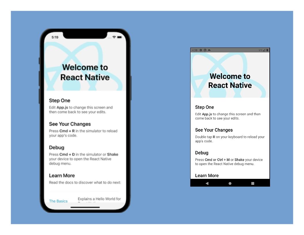
npx react-native run-iosThis might take some depending on the build of your PC. When it loads up successfully, you should have it show up like this:
Now, I will remove the demo content on my app.js and set up the Switch Selector. The first thing to do is to import the package into App.js. To do this, add this code line just below the react-native imports.
import SwitchSelector from "react-native-switch-selector";After this import statement, I will directly declare switchoptions and assign the items for the Switch Selector to it. The code is:
const switchoptions = [
    { label: "Tall", value: "tall" },
    { label: "Average", value: "average" },
    { label: "Short", value: "short" }
];
Each option comes with a label and a value. The label is what will display to the users, while the value is what will be saved or stored when selected.
Next, I will create a class component. The code to set the Switch Selector will be input inside the class component. Then, the switchoptions which was just declared will be added as the options for the Switch Selector.
class App extends React.Component {
  render() {
    return (
      <View>
        <SafeAreaView>
          <View>
            <Text style={styles.sectionTitle}>
              {""}
              Switch Selector in {"\n"} React Native
            </Text>
          </View>
        </SafeAreaView>
        <View>
          <SwitchSelector
            options={switchoptions}
            initial={0}
            onPress={(value) => console.log(value)}
          />
        </View>
      </View>
    );
  }
}

export default App;
After adding this block of code, just before the export statement at the end, you should add some style that I added to enhance the header text.
const styles = StyleSheet.create({
  sectionTitle: {
    fontSize: 24,
    fontWeight: "900",
    textAlign: "center",
    padding: 20,
  },
});
After adding all of this, save, and you should have your emulators show up like this:
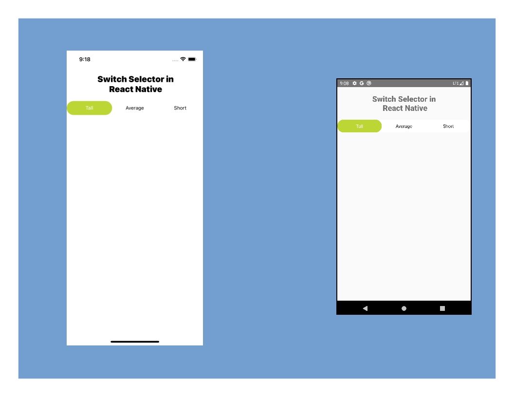

Note that you do not have to re-run/re-build your apps; you only do that after installing or uninstalling a package.
Open Source Session Replay
OpenReplay is an open-source, session replay suite that lets you see what users do on your web app, helping you troubleshoot issues faster. OpenReplay is self-hosted for full control over your data.

Start enjoying your debugging experience - start using OpenReplay for free.
Working with the Switch Selector
I have demonstrated the setup of this Switch Selector in a React Native application. Now, I will customize the switch selector using some props available in the React Native Switch Selector library. The whole list here is on their homepage.
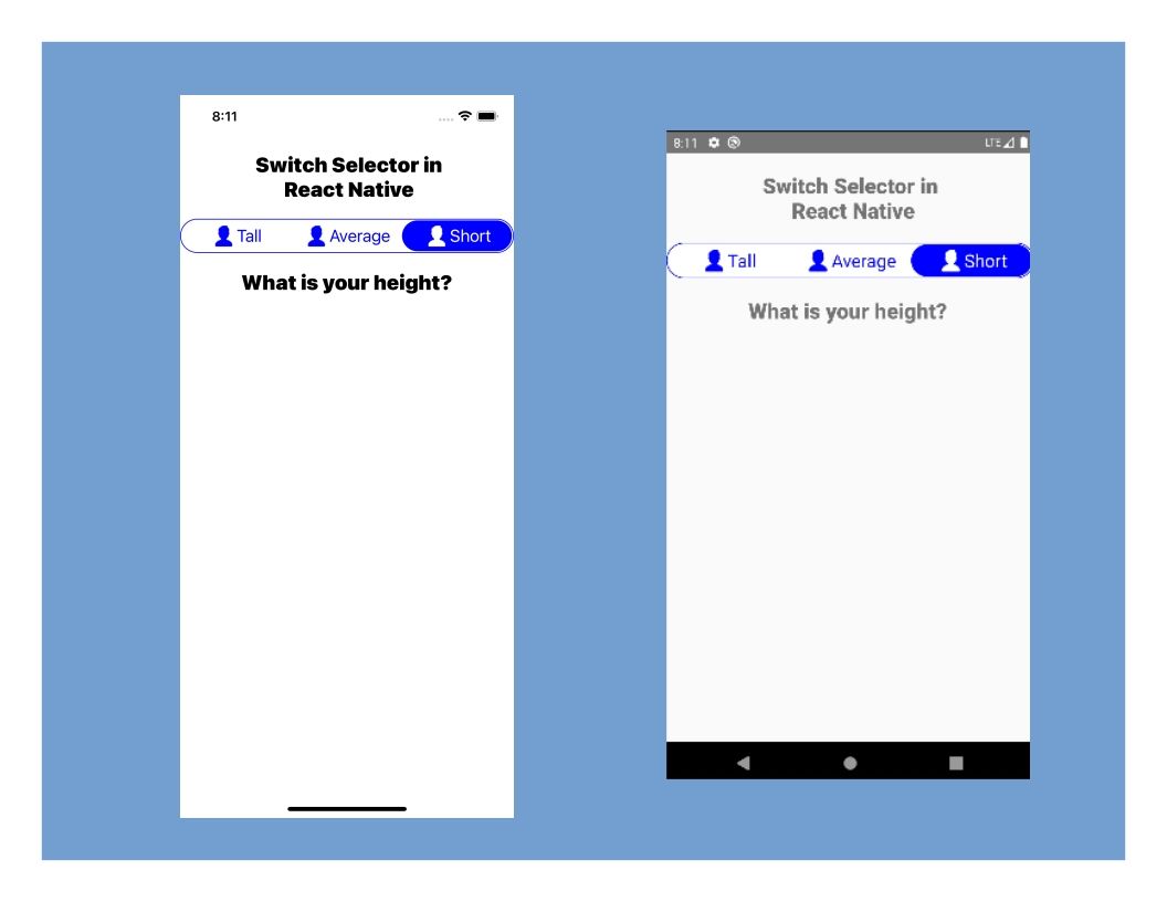
I will add a border and set its color to blue, set the active button color to blue, the active text to white, the background color will remain white, the inactive text will be set to blue, and the font size will be set to 20px.
buttonColor="blue"
selectedColor="white"
borderColor="blue"
textColor="blue"
fontSize={20}
hasPadding
Note that your border color might not show up until you add padding hence the presence of the hasPadding prop. After adding this, your app should show up like this:
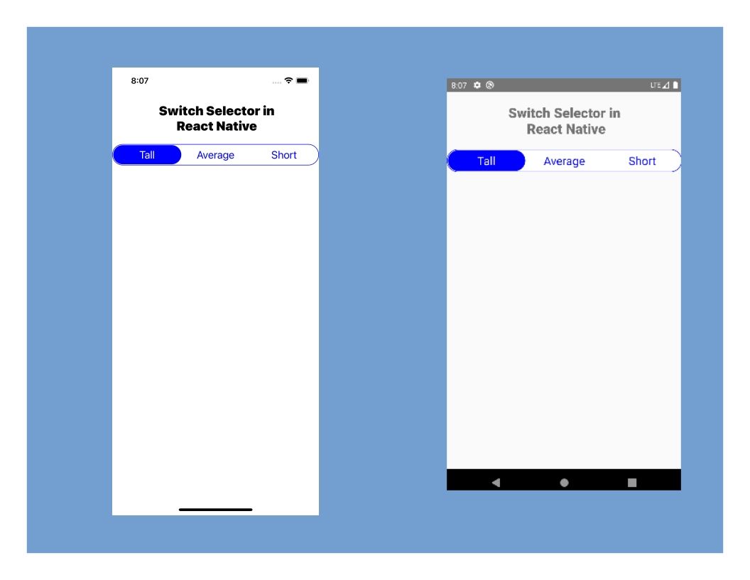
Notice that the selected option is always the first option. This is set with the initial props. For this three (3) option example, the first, second, and third options are recognized as 0, 1, and 2 accordingly; therefore, you can modify the value of the initial prop to 1 or 2, and the selected option will be on the second or third option on the load of the app.
Adding Icons to Options
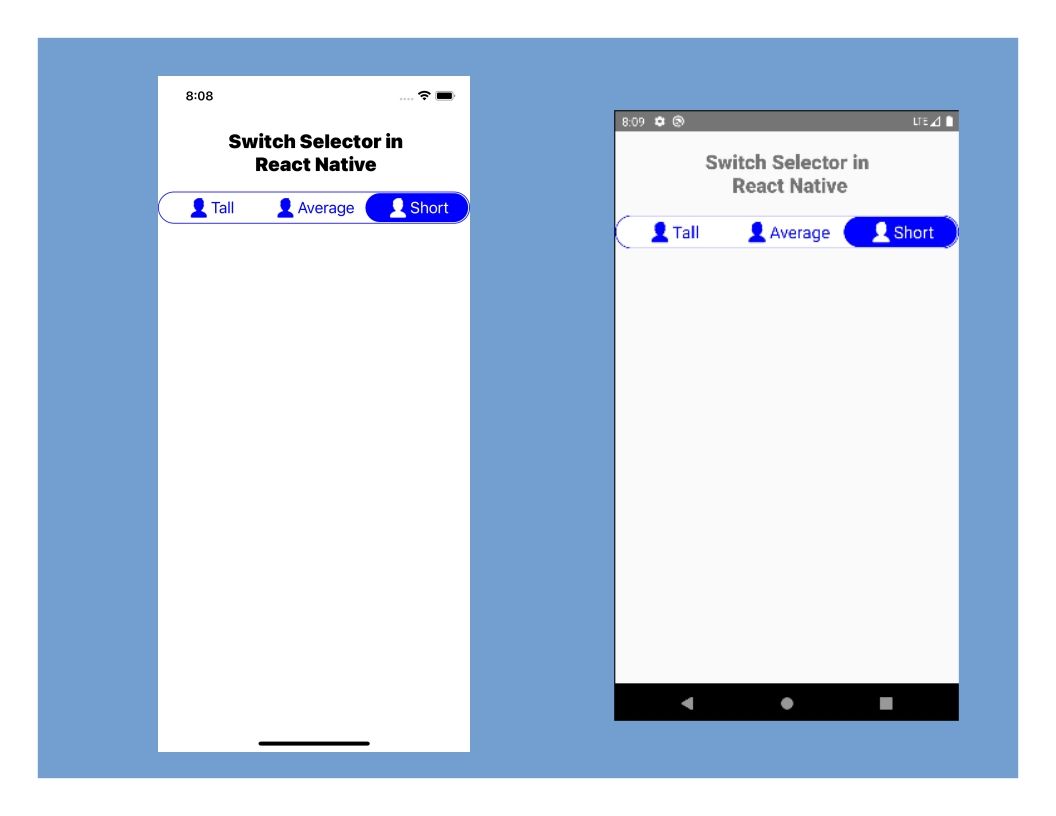
The React Native Switch Selector also allows icons to be associated with the options. To add icons, you should create a folder in the root directory of your project and insert the image you want to have as part of the options. After that, you will need to update the options with the imageIcon prop; then, pass the path to the image.
const switchoptions = [
  {
    label: "Tall",
    value: "Tall",
    imageIcon: require("./images/person-icon.png"),
  },
  {
    label: "Average",
    value: "Average",
    imageIcon: require("./images/person-icon.png"),
  },
  {
    label: "Short",
    value: "Short",
    imageIcon: require("./images/person-icon.png"),
  },
];
I am using one image for the options. You could use different images, and following this process, you will have the same result.

Dynamically Displaying Values from the Switch Selector
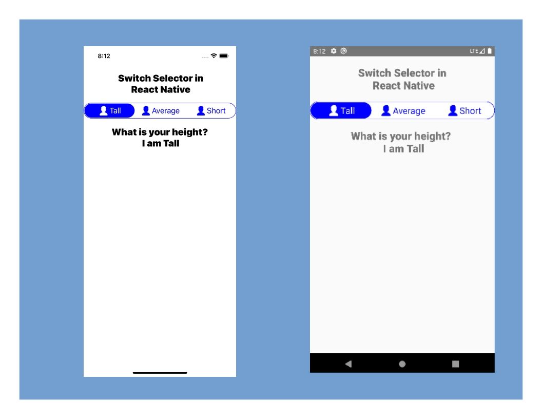
In the first execution of the switch selector, the value was logged in the console now. I will be demonstrating how you can have your value saved to the state in the app and update a text component when you click on any of the options in the switch selector. This will be done using the onPress prop.
First thing, I will create a state to hold the height. I will also create a function that will set the height from the switch selector and update the text component with the height’s value, which will keep updating as you select any option.
constructor() {
  super();
  this.state = {
    height: "",
  };
}
You should insert this code before the render function. This will hold the state.
setHeight(height){
  this.setState({height: 'I am ' + height});
}
This setHeight function will be triggered when any option is selected. I concatenated the state with a string as I want it to display in a sentence when it’s called.
Now, you should update the onPress prop and assign the setHeight function as the operation to be triggered on selecting any option from the switch selector.
onPress={value => this.setHeight(value)}Next, for this to show up in the app, I will add a Text Component that will display the height value gotten from the state.
<Text style={styles.sectionTitle}>What is your height? {'\n'} {this.state.height}</Text>This will get the height value and show it in the text component on selecting any of the options in the switch selector. You should have your app display like this:
This is how you can use switch selectors in React Native. Note that there are some other props you can use to customize your switch selector, and with the knowledge from this tutorial, you will be able to use them.
Conclusion
The React Native Switch Selector package has made switch selectors relatively straightforward and flexible. I hope you found this educating enough. If you have any questions from this tutorial, I would like you to share them in the comments.
You will find the complete source code from this tutorial here on Github.
A TIP FROM THE EDITOR: For considerations on styling components, look at our Theming React Native Applications with Styled Components article.