

To meet a specific effect or rendering, web developers always need to enhance the appearance, quality, and color of web pages’ images, backgrounds, or borders. The CSS filter property provides these graphical and visual effects and modifies the appearance of webpage elements.
This article will guide the audience through using the CSS filter properties to set the visual effect of HTML elements, especially image elements, using the diverse CSS filter properties values such as brightness, blur, and contrast.
CSS Filter Property and how it works
CSS Filter Property is a potent tool used by web authors to attain diverse visual effects of web elements, such as color shifting and blur, primarily used for images and backgrounds.
The syntax of the CSS filter property is filter: effect (parameter) where
- effect refers to any of the eleven (11) CSS filter functions: blur(), brightness(), contrast(), drop-shadow(), grayscale(), hue-rotate(), invert(), opacity(), saturate(), sepia(), or none. In this article, we will detail each of these filter effects.
- parameter refers to the value(s) applied to the chosen filter effect. The parameter differs for various filter effects, given in percentage, decimal, or pixels. Web developers may use numbers/decimal equivalents instead of percentages (for instance, 27% or 0.27). The filter function applies “none” if an invalid value is specified.
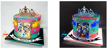
The example below shows how the visual effect of an image is changed with just one CSS Filter Property - filter: contrast(140%)
    <!DOCTYPE html>
    <html lang="en">
    <head>
        <meta charset="UTF-8">
        <title>CSS_Filter_Property</title>
        <style>
            img{
                width: 200px;
                margin: 0 25px;
                float: left;
            }
            .filterapplied{
                filter: contrast(140%)
            }
        </style>
    </head>
    <body>
        <img src="Mickey_Mouse.jpg" alt="Mickey_Mouse_Cake" class="filterapplied">
    </body>
    </html>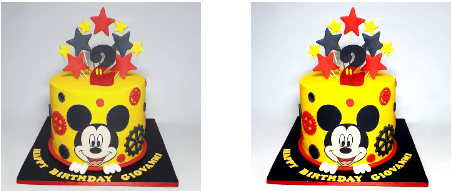
Photo credit: All the beautiful cake pictures used in this article, courtesy of redberyl_cakes. Click this link to visit.
Multiple filters
By separating them with space, you may apply multiple filter effects in the same line of code.
The example below shows the use of multiple (three) filter properties in one line of code.
    <!DOCTYPE html>
    <html lang="en">
    <head>
        <meta charset="UTF-8">
        <title>Multiple_Filters</title>
        <style>
            img{
                width: 200px;
                margin: 0 25px;
                float: left;
            }
            .filterapplied{
                filter: grayscale(100) sepia(0.5) blur(1px)
            }
        </style>
    </head>
    <body>
        <img src="Mickey_Mouse.jpg" alt="Mickey_Mouse_Cake" class="filterapplied">
    </body>
    </html>
Importance of CSS Filter Property
CSS allows you to achieve powerful visual effects on graphic webpage elements with just a few lines of code.
With CSS Filter Property, you no longer rely solely on graphic packages such as Adobe Photoshop to create website production assets.
Session Replay for Developers
Uncover frustrations, understand bugs and fix slowdowns like never before with OpenReplay — an open-source session replay tool for developers. Self-host it in minutes, and have complete control over your customer data. Check our GitHub repo and join the thousands of developers in our community.
CSS Filter Property Effects and Values/Functions:
none
None is the default value; it returns the original image as is, with no filter effect applied.
blur()
The blur() filter effect makes a webpage element indistinct, drawing more attention to another within the webpage. The blur effect is measured in pixels(px), from 0px to 100px, with 0px as no blur effect. The higher the value, the more blur.
    .filterapplied{
        filter: blur(2px)
     }
brightness()
The brightness() filter effect sets the brightness of the image element. Measured in percentage or decimal, the default value of 100% or 1 leaves the image as is, and 0% creates an entirely dark/black image. One can set the brightness above 100% or 1, resulting in a brighter image, while brightness below 100% renders a darker image.
    .filterapplied{
        filter: brightness(120%)
    }
contrast()
Contrast uses two colors with varying shades and tints to render a perfect aesthetic balance for the viewer/user. The contrast() effect of the CSS Filter property enables web developers to achieve this, creating images that are more pleasing to the eyes than the original image. It uses the percentage parameter with 100%returning the original image with no contrast applied. 0% gives an entirely black graphic. Filter contrast value above 100% or 1 up to 1000% or 10 exists. With experience, a contrast value of 1.5 is often perfect, depending on what one aims to achieve.
    .filterapplied{
        filter: contrast(150%)
    }
drop-shadow()
As its name implies, this effect applies a drop shadow to the image. It has five possible parameter values, with the first two values compulsory and the other three values optional thus:
- H-shadow (horizontal shadow) in pixel(px): A positive value places the shadow on the image’s right, while a negative value will set the shadow on the image’s left.
- V-shadow (vertical shadow) in pixel(px): This accepts a positive or negative parameter value. The shadow appears under the image for a positive value. And on top of the image for a negative value.
- Blur in pixels(px) applies a blur effect to the drop-shadow. The higher the blur value, the larger and lighter the shadow. This value is optional, and when omitted, it applies the default value of 0.
- Spread in pixel(px): This is optional and defines how large or small the drop-shadow appears. When you need a larger drop-shadow, use positive values here; if you aim at getting a smaller drop-shadow, use a negative value. When the spread is not specified, the default value 0 is used, which means the drop-shadow and the image will have the same size.
- Colour: This is also optional. It renders the drop-shadow in the specified color. It applies the default color (black) when the color is not defined.
    .filterapplied{
        filter: drop-shadow(10px 10px 5px orange)
    }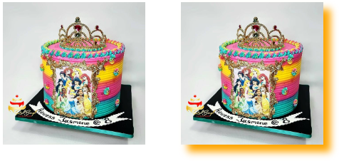
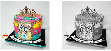
Photo credit: All the beautiful cake pictures used in this article are courtesy of redberyl_cakes. Click this link to visit.
grayscale()
The grayscale CSS Filter effect renders the image in grayscale (monochrome/black & white). Its parameter, measured in percentage(%), defines the conversion amount. For example, 100% returns an entirely grayscale image, and 0% returns the original image. One may choose parameter values between 0% to 100%, and negative values are unacceptable. It applies 100% if the parameter value is missing.
    .filterapplied{
        filter: grayscale(100%)
    }
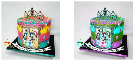
hue-rotate()
Simply put, hue refers to color. CSS hue-rotate() filter effect, measured in degrees(deg), moves and applies color on that angle/position on the color wheel, with the original image color as the offset value. The default parameter value is 0deg, which returns the original image as is. Not stating the parameter value, applies the default value 0deg. 360deg is the maximum value.
Below is an example showing the CSS Filter hue-rotate effect:
    .filterapplied{
        filter: hue-rotate(120deg)
    }
invert()
This CSS Filter effect inverts the image’s color using the parameter value, defined in percentage or number, as the conversion amount. For example, 0% returns the original image with no invert applied, 50% returns an entirely grey appearance, and 100% renders a wholly inverted image. Negative values are not valid. Try your hands at different invert() values to experience the outcome.
    .filterapplied{
        filter: invert(100%)
    }
opacity()
The Opacity CSS Filter effect defines the transparency of the image element. The parameter value is in percentage or number. For example, 0% renders a transparent image, while 100% returns the original image. Opacity values between 0% and 100% help to achieve varying degrees of transparency; negative values are invalid.
    .filterapplied{
        filter: opacity(15%)
} 
saturate()
Color saturation refers to the intensity and purity of the image’s color. A higher saturation results in a more intense and vivid color, while lower saturation defines a shade closer to grayscale. CSS saturation function is used alongside the filter property to set the saturation level of webpage elements.
Its parameter, measured in percentage or number, defines the saturation level, where 100% returns the original image, and 0% returns an unsaturated image. A parameter value of less than 1 or 100% leads to lower saturation, while a value above 100% leads to supersaturation.
filter: saturate(150%)
sepia()
Sepia is a light brown tint color, as seen in old photos, gotten initially from the ink-like pigment of cuttlefishes, which they secrete as a defense mechanism to set predators off their track. Artists drew/painted with this pigment in times past.
Note: old photos do not turn this color due to the passage of time but are originally made in that color by the artist or photographer. Sepia preserves the image, enables it to stand the test of time, prevents aging, and increases its archival value. See this for more details.
As a web developer, there may be a need to get an image in sepia color to serve a specific purpose. The CSS Filter sepia() function enables you to achieve this effortlessly. Its parameter value stated in number or percentage, defines the conversion factor. The valid value is between 0 and 100. 0 renders the original image, while 1 gives a completely sepia appearance. Negative numbers are not acceptable.
filter: sepia(80%)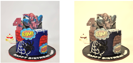
Conclusion
This article covered the use of CSS Filter property to enhance webpage content visually. So, when next you need to edit your image and graphics, go ahead and use the CSS Filter property and enjoy its convenience and ease.
Gain Debugging Superpowers
Unleash the power of session replay to reproduce bugs and track user frustrations. Get complete visibility into your frontend with OpenReplay, the most advanced open-source session replay tool for developers.