Which is easier to customize: Tailwind CSS or Material UI?
A comparison between these two common and powerful CSS frameworks.

Tailwind CSS and Material UI are well-known, widely used CSS frameworks. This article will compare them both, so you can decide which one better suits your needs in terms of allowing all kinds of customization.

Discover how at OpenReplay.com.
In this tutorial, we will walk through which is easier to customize, Tailwind CSS or Material-UI. We will focus on some key outline to guide while working on both styling frameworks. By the end of the article, we will know which one is easier to work with and adapt to our needs.
Tailwind CSS
Tailwind CSS is an open-source CSS framework. The main feature of this library is that, unlike other CSS frameworks like Bootstrap, it does not provide a series of predefined classes for elements such as buttons or tables. Instead, it creates a list of utility CSS classes that can be used to customize every design aspect.
The easiest way to use Tailwind CSS from scratch is with the Tailwind CLI tool. The CLI is also available as a standalone executable if you want to use it without installing Node.js. Although there are various methods through which you can install Tailwind CSS, including PostCSS, Framework Guides, and Play CDN.
To install and configure Tailwind CSS in your application using Tailwind CLI, follow the steps below:
- Open your terminal and navigate to the directory where the web application folder is, then run the command below to install Tailwind CSS. Run the command below on your terminal in the same directory as the application folder.
npm install -D tailwindcss
npx tailwindcss init- after the installation, in the project root directory, create the
tailwind.config.jsfile and add the following configuration.
/** @type {import('tailwindcss').Config} */
module.exports = {
 content: ["./src/**/*.{html,js}"],
 theme: {
   extend: {},
 },
 plugins: [],
}- Add the Tailwind directives to your CSS
Add the
@tailwinddirectives for each of Tailwind’s layers to your main CSS file.
@tailwind base;
@tailwind components;
@tailwind utilities;
Next, start the Tailwind CLI build process by running the CLI tool to scan your template files for classes and build your CSS.
npx tailwindcss -i ./src/input.css -o ./dist/output.css --watchFinally, start using Tailwind in your HTML by adding your compiled CSS file to the <head> and start using Tailwind’s utility classes to style your contents
<link href="/dist/output.css" rel="stylesheet">Note: you can skip this process if your system already has Tailwind CSS.
Material UI
Material UI is a library of React UI components that implement Google’s Material Design to provide a high-quality digital experience while developing front-end graphics. It allows users to import and use different components to create a user interface in our React applications. It is an open-source, front-end UI framework for React components.
Installing Material UI
You can skip this process if you already have React project set up. Otherwise, follow this process:
First, create a new React app with the create-react-app command and give it a name, e.g., my_app:
npx create-react-app my_appAfter creating the react application, you can install material UI by running the command below on your terminal.
npm install @material -ui/coreIf you prefer using yarn, you can install Material UI by running the following command in your terminal:
yarn add @material-ui/coreNow, you are all set to start developing in Material UI!
Comparing Tailwind CSS and Material UI for customization
We will compare both Tailwind CSS and Material UI for customization
Customization approach
Tailwind CSS provides a utility-first approach to customization. It offers a vast array of utility classes that you can combine and extend to create unique designs. This allows for quick and flexible customization without the need to write custom CSS rules.
Material UI follows a theming design system and utilizes a CSS-IN-JS approach for customization. It offers a set of pre-designed components that you can customize using the provided theme and style override mechanisms.
Colors
Tailwind CSS allows you to fully customize the default color palette for your project. You can easily modify the colors in the theme configuration file (tailwind.config.js), making it convenient to adapt the design to your brand colors.
Material UI provides a set of predefined color palettes based on Google’s Material Design principles. You can create a custom color palette for your UI and ensure accessibility with color contrast measurement.
Typography
Tailwind CSS provides utility classes for typography, enabling you to customize font families, sizes, weights, and line heights according to your design requirements.
Material UI offers a coherent set of type sizes that work harmoniously with its layout grid. You can customize typography to some extent within the confines of the Material Design guidelines.
Design style
Tailwind CSS does not impose any specific design style, leaving the creative decisions entirely up to the developers. It serves as a foundation for building custom designs from scratch.
Material UI is built around Google’s Material Design principles, emphasizing clean, modern design elements with depth animations. It provides a visually appealing and consistent design language out of the box.
Customization options for Tailwind CSS and Material UI
In this section, we will look at the customization options for both Tailwind CSS and Material UI.
Tailwind CSS:
- Tailwind provides a configuration file,
tailwind.config.js,in which various framework aspects can be customized. Themes, colors, fonts, breakpoints, spacing, and many more can be modified. It allows you to modify the utility classes to match your desired design. - you can also write your own custom CSS to override or extend Tailwind CSS styles. New utility classes can be added, existing ones can be modified, or new styles can be created entirely using the library’s low-level utility classes.
- Tailwind CSS has a plugin system that allows you to extend its functionality. various plugins can be installed and configured to add new utilities, components, or features. These plugins can be created by the community or yourself, enabling further customization and expanding the library’s capabilities.
Material UI:
- A theming system based on the
muiThemeProviderUI component is used by Material UI. Custom themes can be created by overriding the default values of the theme variables. This allows modification of colors, typography, spacing, breakpoints, and other design-related properties. - This custom theme can be applied globally to your application or selectively to specific components when needed in your development, called the Reusable component.
To customize the theme, you must use the
ThemeProvidercomponent to inject a theme into your application. However, this is optional; Material UI components have a default theme.
ThemeProvider relies on the context feature of React to pass the theme down to the components, so you need to make sure that ThemeProvider is a parent of the components you are trying to customize. You can learn more about this in the API section.
Ease of customization between Tailwind CSS and Material UI
We will build a navigation bar using each framework to expound on the ease of customization between Tailwind CSS and Material UI.
Building a navigation bar using Tailwind CSS
Create a navigation Bar using Tailwind CSS. Create an index.html file and add the following code to it.
Note: the
playCDNwas used in this tutorial.
<!doctype html>
<html lang="en">
<head>
<meta charset="UTF-8" />
<meta name="viewport" content="width=device-width, initial-scale=1.0" />
<title>Simple Navbar with Dropdown Menu using Tailwind CSS</title>
<link
href="https://cdn.jsdelivr.net/npm/tailwindcss@2.2.19/dist/tailwind.min.css"
rel="stylesheet"
/>
</head>
<body>
<nav class="bg-gray-800 p-4">
<div class="container mx-auto">
<div class="flex justify-between items-center">
<!-- Logo or Branding -->
<a href="#" class="text-white font-bold text-xl">Your Logo</a>
<!-- Navigation Links -->
<ul class="flex space-x-4">
<li><a href="#" class="text-white hover:text-gray-300">Home</a></li>
<li>
<a href="#" class="text-white hover:text-gray-300">About</a>
</li>
<li class="relative group">
<a href="#" class="text-white hover:text-gray-300">Services</a>
<!-- Dropdown Content -->
<ul
class="absolute top-full left-0 hidden group-hover:block bg-gray-800 p-2 space-y-1"
>
<li>
<a href="#" class="text-white hover:text-gray-300"
>Service 1</a
>
</li>
<li>
<a href="#" class="text-white hover:text-gray-300"
>Service 2</a
>
</li>
<li>
<a href="#" class="text-white hover:text-gray-300"
>Service 3</a
>
</li>
</ul>
</li>
<li>
<a href="#" class="text-white hover:text-gray-300">Contact</a>
</li>
</ul>
</div>
</div>
</nav>
<!-- Your page content goes here -->
</body>
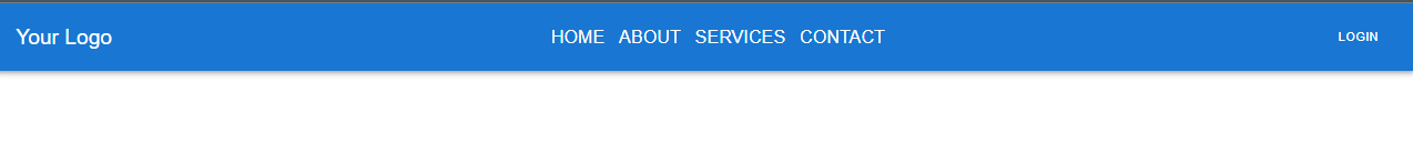
</html>The code above should produce the following output, as shown in the image below.
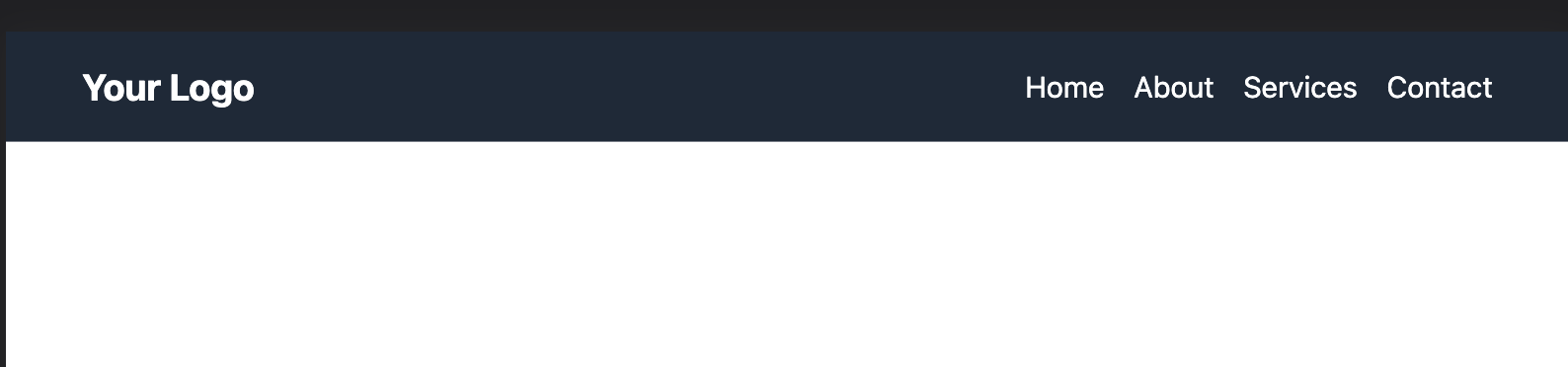
That’s how a navigation bar using Tailwind CSS is built.
Building a navigation bar using material UI
Follow these steps to build a navigation bar using Material UI;
Create a js file inside your React development folder, let’s call it app.js, and link the required CSS and JavaScript files
Note:
index.htmlis only needed for trial.
import * as React from 'react';
import AppBar from '@mui/material/AppBar';
import Box from '@mui/material/Box';
import Toolbar from '@mui/material/Toolbar';
import Typography from '@mui/material/Typography';
import Button from '@mui/material/Button';
import IconButton from '@mui/material/IconButton';
import MenuIcon from '@mui/icons-material/Menu';
The code above is to import all the necessary components into your application.
const pages = ['Home', 'About', 'Services', 'Contact'];The code above creates the necessary pages for your application.
export default function ButtonAppBar() {
 return (
   <Box sx={{ flexGrow: 1 }}>
     <AppBar position="static">
       <Toolbar>
         <Typography variant="h5" component="div" sx={{ flexGrow: 1 }}>
           Your Logo
         </Typography>
         <Box sx={{ flexGrow: 1, display: { xs: 'none', md: 'flex' } }}>
           {pages.map((page) => (
             <Button
               key={page}
               sx={{ my: 2, color: 'white', display: 'block' }}
             >
               <Typography variant='h6'>
               {page}
               </Typography>
             </Button>
           ))}
         </Box>
         <Button color="inherit">Login</Button>
       </Toolbar>
     </AppBar>
   </Box>
 );
}
The code above should produce the following output, as shown in the image below.
That’s how a navigation bar using Material UI is built.
Comparing the ease of customization of Tailwind CSS and Material UI, the choice between them depends on your preference and the level of control you require for your project. The above codes show the breakdown and complexity of building a navbar in both frameworks.
Tailwind CSS allows for more granular and direct customization through utility classes and configuration, While Material UI’s customization is more focused on theming and component-level styling.
Cases of use in Tailwind CSS and Material UI
Cases of use refer to predefined styles or components created to address typical use cases or web or UI development scenarios. By offering pre-made answers to particular design patterns or functional needs, they spare developers the time and effort to create those components or styles from scratch.
For Tailwind CSS
- Cases of use in Tailwind CSS are referred to as utility classes. With Tailwind CSS, you apply pre-defined utility classes to your HTML elements to style them. This is known as the utility-first method.
- These utility classes have intuitive descriptive names explaining what they do, like
p-4for padding andbg-red-500for applying a red background color.
You may rapidly create the desired styles for each utility class by combining and assembling them without creating unique CSS and several use cases.
For instance, you can use utility classes like bg-blue-500, text-white, px-4, and py-2 to construct a button with certain designs. You can create buttons with consistent and simple-to-customize styles by using these classes above, which offer predefined styles for background-color, text-color, padding, and other elements. e.g.:
<body>
 <div class="container grid justify-items-center">
   <h1 class="justify-items-center text-2xl">The button Element</h1>

   <button type="button" class="bg-blue-500 px-4 py-2 text-white">
     Click Me!
   </button>
 </div>

 <!-- Your page content goes here -->
</body>
Here we have a simple button code. Running the code will produce the following result:

For Material UI
- Cases of usage are referred to in Material UI as components. A wide range of pre-built components from Material UI complies with the Material Design standards, a design language created by Google. These components include input fields, dialog boxes, buttons, navigation bars, and more.
- Developers may quickly incorporate frequently used UI elements and interactions in their projects by leveraging Material-UI components. These parts are made to be flexible and adaptable, enabling developers to alter their look, behavior, and functionality to meet specific needs.
For instance, you can use the ButtonComponent offered by Material-UI if you wish to include a button in your Material UI application:
import { Typography, Button } from "@mui/material";import helps to connect the ButtonComponent from the Material UI folder.
It makes developing uniform and responsive buttons simple because it has pre-defined styles, hover effects, and accessibility capabilities. You can customize the button by changing the button's properties, such as its color, variant, icon, or onClick event.
import "./App.css";
import { Typography, Button } from "@mui/material";
function App() {
 return (
   <div className="App">
     <Typography variant="h3">This is a Button Element</Typography>
     <Button
       variant="contained"
       color="primary"
       size="large"
       sx={{ padding: "20px 40px" }}
     >
       This is a button
     </Button>
   </div>
 );
}

export default App;
Here is a simple button that can be used anywhere in your web app. Running the code will produce the following result:

Therefore, use cases are related to preconfigured styles or components that cover typical use cases in web development in both Tailwind CSS and Material UI.
Material UI offers pre-built components that follow the Material Design standards. In contrast, Tailwind CSS gives utility classes that can be easily added to HTML elements to build custom components.
Conclusion
In conclusion, personal preference and project requirements determine which is easier to adjust. Tailwind CSS or Material UI, through its utility classes and setup, Tailwind CSS provides a simple and practical approach, making it perfect for quick and explicit customization. While having a slightly steeper learning curve, Material UI has a systematic theming system and component style, allowing for a greater degree of customization and flexibility which can be used anywhere in your development.
Gain Debugging Superpowers
Unleash the power of session replay to reproduce bugs, track slowdowns and uncover frustrations in your app. Get complete visibility into your frontend with OpenReplay — the most advanced open-source session replay tool for developers.
Star on GitHub12k