Working with multiple columns in CSS


The CSS multi-column layout lets you specify the number of columns you want an element to be divided into quickly and efficiently. This article will guide you on creating column-to-column, gap sizes between columns, and column dividing lines, along with their appearance.
A CSS multi-column layout is a style in which content divides into multiple columns, similar to a newspaper or magazine layout. This occurs by creating a print-inspired layout with the web’s flexibility, enabling content flow, as seen in magazines and newspapers, without floating boxes.
There are several benefits to using a CSS multi-column layout. Here are some benefits of using it:
- It creates a more visually exciting and engaging design for a webpage.
- You can create a multi-column layout with just a few lines of code, and it is easy to customize the number of columns, the
gapbetween columns, and the width of the columns. - It is
responsive, meaning it can adjust to the screen size and device viewed, creating layouts that look good on desktop and mobile devices. - It improves better readability of a webpage by breaking up the content into smaller, more manageable chunks, making it easier for users to scan and read the content.
- Better use of space, that is, you can use the available space on the screen, especially on smaller screens where a single-column layout may take up too much space.
- It helps to balance a page’s layout and create a more pleasing design.
- It reduces the amount of scrolling required to view the content, improving the overall user experience.
- It creates magazine-style or newspaper-style layouts.
- It is useful for presenting text-heavy content, such as news or long-form articles.
Understanding Multi-column Properties and their uses
In CSS, a multi-column layout is a feature that allows you to divide a web page into multiple columns, similar to a newspaper or magazine layout. It helps create a more visually exciting and easy-to-read format for text-heavy pages. The properties used to control multi-column layout are column count, column width, column gap, column rule style, column rule width, column-rule-color, column rule, and column-span.
Note: To use the multi-column layout, specify the number of columns or the width for the element you want to divide into multiple columns and then set the appropriate values for the other properties as needed. Here are the multi-column properties and their uses:
Column-count
Column-countis a CSS property used to set the number of columns a component should be divided into. It is used for splitting block-level elements content into columns, similar to how the text in a newspaper divides into columns. Therefore, it sets the number of columns using the column-count property.
For example:
<!DOCTYPE html>
<html>
  <head>
    <style>
      body {
        border: 1px solid blue;
      }
      h1 {
        text-align: center;
      }
      .paper {
        column-count: 4;
        text-align: justify;
        font-weight: bold;
        font-size: 24px;
      }
    </style>
  </head>
  <body>
    <h1>Multiple Columns</h1>
    <div class="paper">
      Lorem ipsum dolor sit amet, consectetur adipiscing elit. Ut pharetra dui et tortor maximus, quis feugiat nulla lobortis.
      Mauris vestibulum blandit pretium. Sed dolor dui, molestie rhoncus felis nec, porta posuere orci. Donec efficitur orci
      et auctor volutpat. Aenean pulvinar libero et quam rutrum, eget faucibus augue scelerisque. Nulla sollicitudin ornare
      ipsum eu interdum. Nunc vitae consequat tortor. Proin at pulvinar mi. Nunc venenatis quam justo, in gravida ex cursus eu.
      Mauris aliquet in elit vel sagittis. Cras a dapibus turpis. Morbi malesuada at turpis et imperdiet. Aliquam lacinia,
      velit vel volutpat scelerisque, ex diam laoreet justo, sed lobortis turpis enim nec erat. Nulla vulputate vitae quam
      nec aliquam. Integer egestas posuere eros, ac bibendum neque suscipit quis. Cras mattis nisl porta congue mollis. Quisque
      facilisis suscipit lectus, ac tristique metus. Iaculis sit amet. Nam varius arcu a nibh tincidunt aliquam feugiat in
      felis. Phasellus a massa elit. Vivamus dapibus vestibulum vehicula.
    </div>
  </body>
</html>
Here is the outcome:
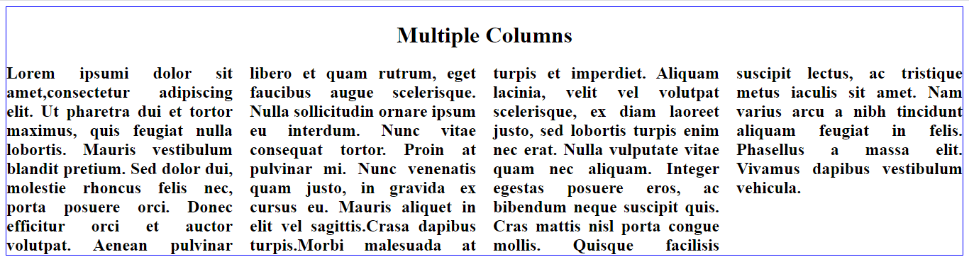
Notice that the CSS sets an element with the class “paper” to have four columns.
Column-gap
The column gap is a CSS property that sets the size of the gap between columns in a multi-column layout. Therefore, you can set it using a length value, such as px, em, rem, or the keyword normal, which sets the gap to the default value. In addition, you can use it simultaneously with column-count or column-width properties.
Examples:
<style>
  body {
    border: 1px solid blue;
  }
  h1 {
    text-align: center;
  }
  .paper {
    column-count: 4;
    column-gap: 100px;
    text-align: justify;
    font-weight: bold;
    font-size: 24px;
  }
</style>
Here is the result:
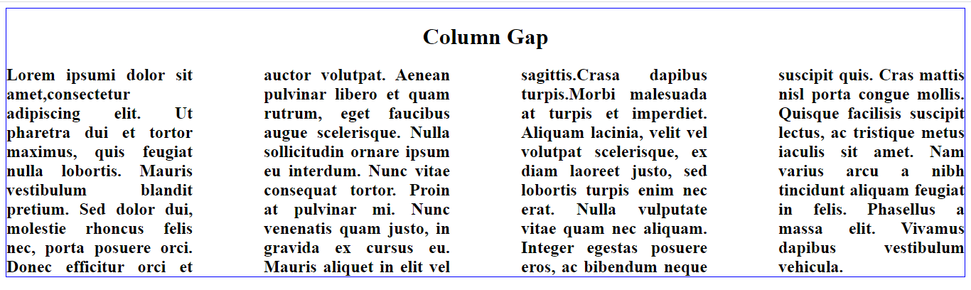
Notice that the CSS creates a gap of 100 pixels between the columns.
Column-rule-style
Column-rule-style is a CSS property that sets the style of the line that separates columns in a multi-column layout. Therefore, you can set it to one of the following values:
Solid: A solid line between columns.Dotted: A line made of dots between columns.Dashed: A line made of short dashes between columns.Double: A double line between columns.
Examples of how to set the column rule style:
A solid rule between the columns
You can set a solid rule between the columns.
For example:
<style>
  body {
    border: 1px solid blue;
  }
  h1 {
    text-align: center;
  }
  .paper {
    column-count: 4;
    column-rule-style: solid;
    text-align: justify;
    font-weight: bold;
    font-size: 24px;
  }
</style>
Here is the outcome:
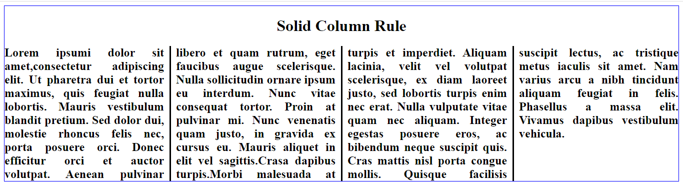
Notice a solid line between the columns.
A dotted rule between columns
You can set a dotted rule between the columns.
For example:
<style>
body {
  border: 1px solid blue;
}

h1 {
  text-align: center;
}

.paper {
  column-count: 4;
  column-rule-style: dotted;
  text-align: justify;
  font-weight: bold;
  font-size: 24px;
}
</style>
Here is the result:
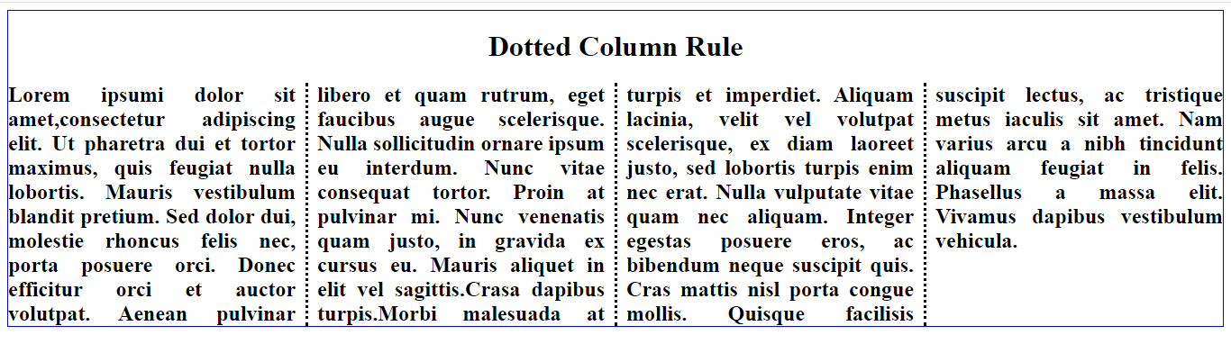
Notice a dotted line between the columns.
A dashed rule between the column
You can also use the column-rule-style property to set a dashed rule between the columns.
For example:
<style>
  body {
    border: 1px solid blue;
  }
  h1 {
    text-align: center;
  }
  .paper {
    column-count: 4;
    column-rule-style: dashed;
    text-align: justify;
    font-weight: bold;
    font-size: 24px;
  }
</style>
Here is the outcome:
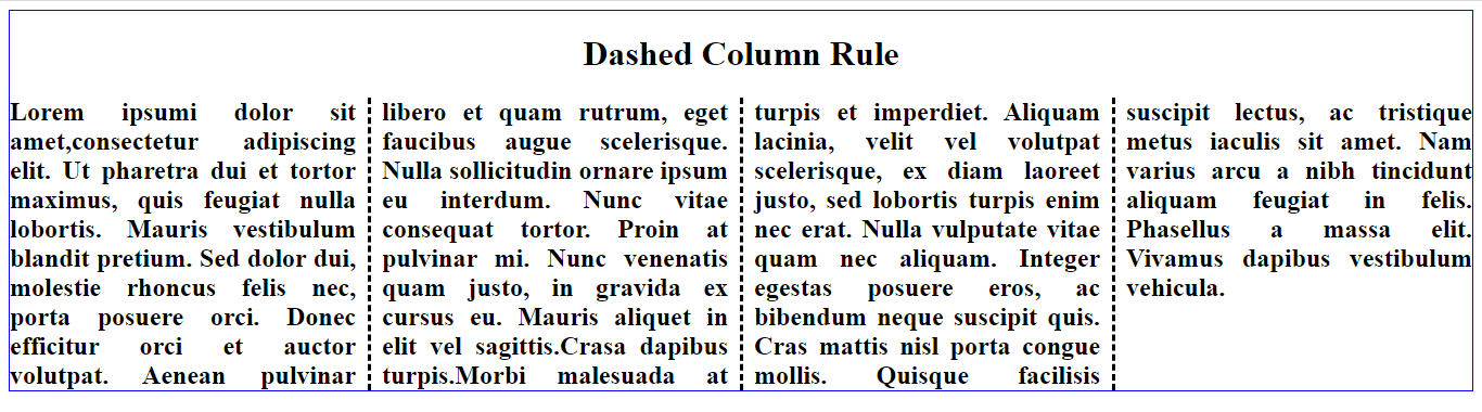
Notice a dashed rule between columns.
A double rule between the columns
You can set a double rule between the columns.
For example:
<style>
  body {
    border: 1px solid blue;
  }

  h1 {
    text-align: center;
  }

  .paper {
    column-count: 4;
    column-rule-width: 10px;
    column-rule-style: double;
    text-align: justify;
    font-weight: bold;
    font-size: 24px;
  }
</style>
Here is the result:
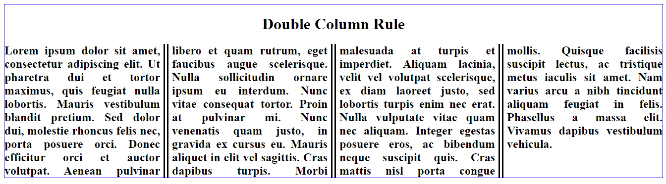
Notice a double rule between columns.
Session Replay for Developers
Uncover frustrations, understand bugs and fix slowdowns like never before with OpenReplay — an open-source session replay tool for developers. Self-host it in minutes, and have complete control over your customer data. Check our GitHub repo and join the thousands of developers in our community.
Column-rule-width
Column rule width is a CSS property that specifies the width of the rule or line between the columns in a multi-column layout. Therefore, you can set the width in a length value (e.g., px, em, rem). The default value for column rule width is medium, equivalent to a width of 3px. In addition, you can use this property with the column-rule-style and column-rule-color properties to control the appearance of the column rule.
For example:
<style>
  body {
    border: 1px solid blue;
  }
  h1 {
    text-align: center;
  }
  .paper {
    column-count: 4;
    column-rule-style: solid;
    column-rule-width: 10px;
    text-align: justify;
    font-weight: bold;
    font-size: 24px;
  }
</style>
Here is the outcome:
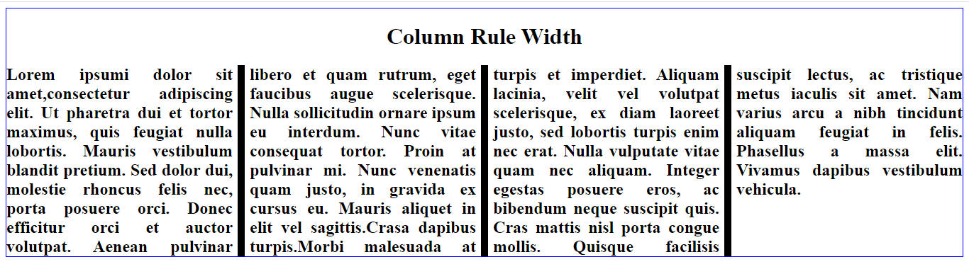
Notice that the column rule width between the columns was set to 10 pixels; the outcome is what you saw in the picture.
Column-rule-color
The column rule color is a CSS property that sets the color of the rule (line) marked between columns in a multi-column layout. Therefore, you can style the rule between the columns with a width, style, and color.
Example:
<style>
body {
  border: 1px solid blue;
}

h1 {
  text-align: center;
}

.paper {
  column-count: 4;
  column-rule-style: solid;
  column-rule-width: 5px;
  column-rule-color: red;
  text-align: justify;
  font-weight: bold;
  font-size: 24px;
}
</style>
Here is the result:
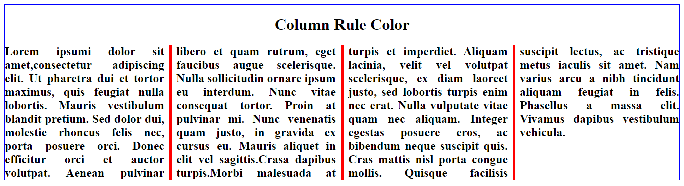
Notice that the column rule color was set between the columns as red.
Column-rule
The column rule is a CSS property specifying a line separating columns in a multi-column layout. The property is a shorthand for the column-rule-width, column-rule-style, and column-rule-color properties. There you can use the column rule property to control the appearance of the width, style, and color of the rule or line that separates columns in a multi-column layout.
For example:
<style>
  body {
    border: 1px solid blue;
  }
  h1 {
    text-align: center;
  }
  .paper {
    column-count: 4;
    column-rule: 13px solid green;
    text-align: justify;
    font-weight: bold;
    font-size: 24px;
  }
</style
Here is the result:
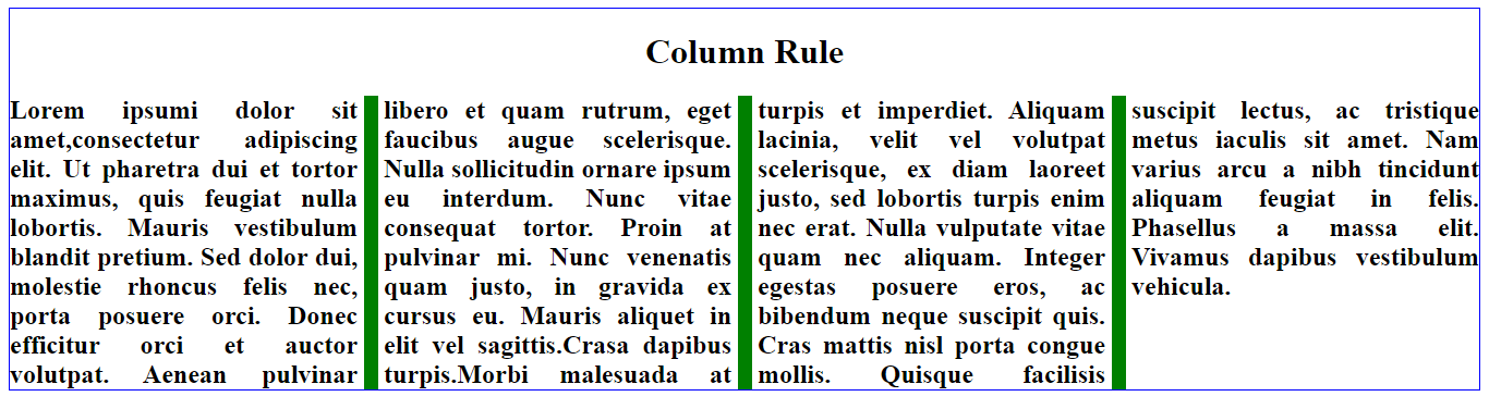
The above CSS rule would create a 13px wide solid green line between columns.
Column-span
The CSS column-span property specifies how many columns an element should span across in a multi-column layout. This property can be set to a positive integer value, indicating the number of columns the part should span. You can also set it to the keyword all, which suggests that the element should span across all columns in the container. It is essential to note that the column span only works if the element is positioned within a block formatting context. Therefore, the element must be a block-level element and a child of a multi-column container.
Example:
<!DOCTYPE html>
<html>
  <head>
    <style>
      body {
        border: 1px solid blue;
      }
      .paper {
        column-count: 4;
        column-rule: 1px solid green;
        text-align: justify;
        font-weight: bold;
        font-size: 24px;
      }
      h1 {
        column-span: all;
      }
    </style>
  </head>
  <body>
    <div class="paper">
      <h1>Column Span</h1>
      Lorem ipsum dolor sit amet, consectetur adipiscing elit. Ut pharetra dui et tortor maximus, quis feugiat nulla lobortis. Mauris vestibulum blandit pretium. Sed dolor dui, molestie rhoncus felis nec, porta posuere orci. Donec efficitur orci et auctor volutpat. Aenean pulvinar libero et quam rutrum, eget faucibus augue scelerisque. Nulla sollicitudin ornare ipsum eu interdum. Nunc vitae consequat tortor. Proin at pulvinar mi. Nunc venenatis quam justo, in gravida ex cursus eu. Mauris aliquet in elit vel sagittis. Crasa dapibus turpis. Morbi malesuada at turpis et imperdiet. Aliquam lacinia, velit vel volutpat scelerisque, ex diam laoreet justo, sed lobortis turpis enim nec erat. Nulla vulputate vitae quam nec aliquam. Integer egestas posuere eros, ac bibendum neque suscipit quis. Cras mattis nisl porta congue mollis. Quisque facilisis suscipit lectus, ac tristique metus iaculis sit amet. Nam varius arcu a nibh tincidunt aliquam feugiat in felis. Phasellus a massa elit. Vivamus dapibus vestibulum vehicula.
    </div>
  </body>
</html>
Here is the result:
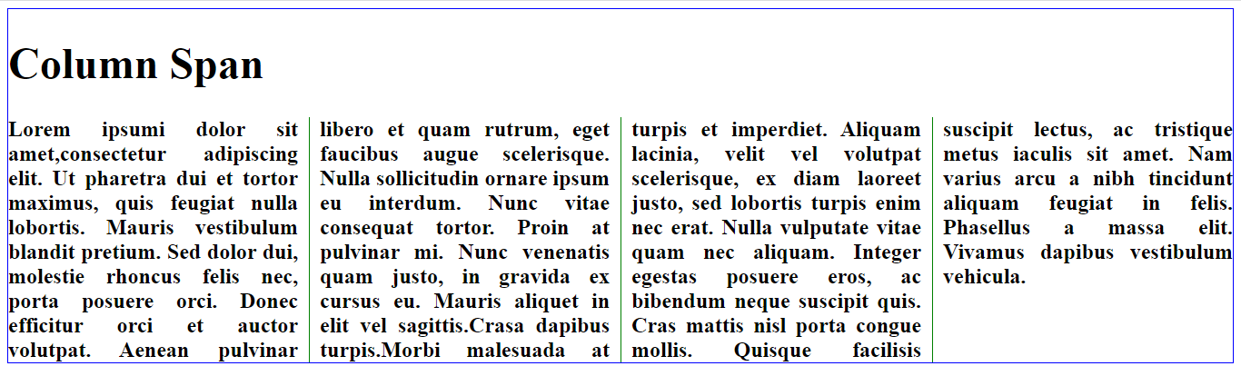
Notice that it spans all four columns as it is set to all.
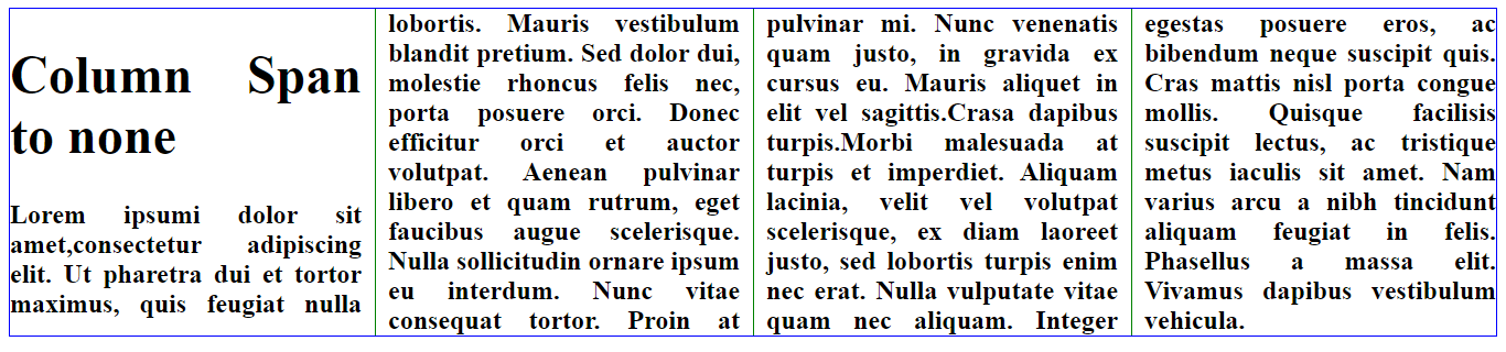
Setting a column ‘span’ to none
Example:
<style>
body {
  border: 1px solid blue;
}
.paper {
  column-count: 4;
  column-rule: 1px solid green;
  text-align: justify;
  font-weight: bold;
  font-size: 24px;
}
h1 {
  column-span: none;
}
</style>
Here is the result:
Column-width
The column width property in CSS specifies the minimum or optimal width for a multi-column layout. Therefore, you can use it with the column-count property, which determines the maximum number of columns, to create a flexible multi-column layout. If the column width is not set, the columns will be sized based on their content. You can set the column width using a length value (such as pixels) or the auto keyword, which will cause the columns to be sized based on the container’s width.
For example:
<style>
  body {
    border: 1px solid blue;
  }

  h1 {
    text-align: center;
  }

  .paper {
    column-width: 100px;
    font-weight: bold;
  }
</style>
Here is the result:
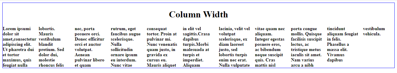
The above example determines that the suggested optimal width for the columns should be 100px.
Setting multiple responsive columns.
In CSS, you can use the column-count property to create multiple columns for responsive design.
Example:
<style>
  body {
    border: 1px solid blue;
  }
  h1 {
    text-align: center;
  }
  .paper {
    -webkit-column-count: 4;
    -moz-column-count: 4;
    column-count: 4;
    -webkit-column-gap: 40px;
    -moz-column-gap: 40px;
    column-gap: 40px;
    font-weight: bold;
    font-size: 18px;
    text-align: justify;
  }

  @media (max-width: 600px) {
    .paper {
      -webkit-column-count: 3;
      -moz-column-count: 3;
      column-count: 3;
    }
  }
</style>
Here is the result:
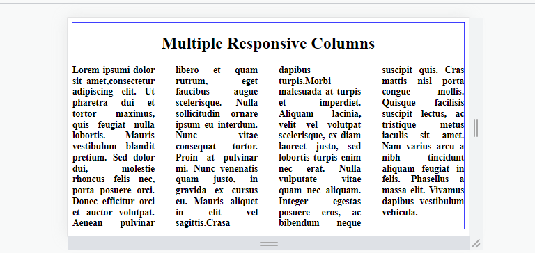
On large screens more than 600px:
On screens smaller than 600px:
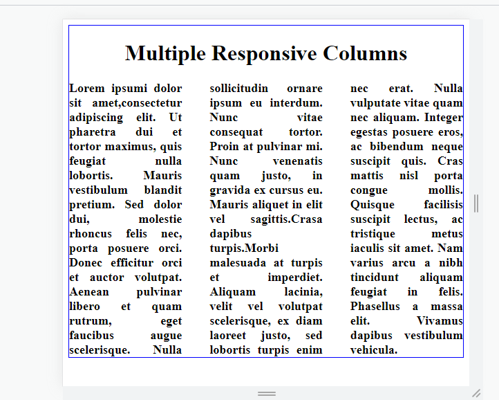
The above will create four columns on large screens and three on screens smaller than 600px.
Browser support
The CSS3 multi-column layout module is supported by most modern web browsers, such as:
- Google Chrome
- Mozilla Firefox
- Apple Safari
- Microsoft Edge
Conclusion
CSS multi-column layouts are beneficial in our web pages as they can improve the readability of a web page by breaking up the content into smaller parts and enabling users to scan and read the content easily. You can use these directions to create a multi-column layout with merely a few lines of code, and it is effortless to customize the number of columns, the gap between columns, and the width of the columns in your web development tasks.
Gain Debugging Superpowers
Unleash the power of session replay to reproduce bugs and track user frustrations. Get complete visibility into your frontend with OpenReplay, the most advanced open-source session replay tool for developers.