Working with the CSS Box Model
Everything about the important Box Model concept in CSS.


We can describe the placement of HTML elements within their borders using the CSS box model. The CSS box model is essential to understand when working with CSS as it helps us create our web page designs and layout with several properties like margins, paddings, and borders. So this article will explain the CSS box model and why we use it. In addition, we will explain the different properties of the box model and how we can use them on our web pages effortlessly.
What is the CSS box model?
The CSS box model defines the structure of an HTML element on a webpage. It is a box or container that wraps around all HTML elements. According to the CSS box model, all elements are rectangular boxes, and the web browser renders them as such. In addition, it defines the dimensions of an element and the space around it, including margins, borders, and padding.
We use the CSS box model for the following reasons:
- It helps to create web page design and layout.
- It helps customize the layout of different elements of our web pages.
- It determines the size of HTML elements on the page.
- It helps ensure consistency in the design of a website, as it enables the creation of standard rules for how elements should be positioned and sized.
- It helps to separate an element from other elements on a web page.
- It helps set the width and height properties of an element.
- It allows developers to position HTML elements on a web page as desired.
- It is essential for responsive web design, enabling you to create flexible layouts that work on different devices.
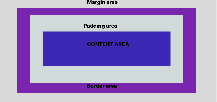
Parts of the box model
The parts of the box model include:
-
Content area: This is the box model’s innermost layer which shows the box’s content. Texts, images, and other elements appear here.
-
Padding area: This area empties an area around the content, creating space around the content and between the content and the border. The padding-box width and the height set the dimensions of this area.
-
Border area: This area covers the content and padding. The border width and height set the dimension of this area. You can also set the border’s color, width, and style.
-
Margin area: This is the box model’s outermost layer, and the area empties an area outside the border. The margin-box width and height set the dimensions of this area.
Here is an illustration of the different parts of the CSS box model:
How does the box model work?
An HTML element can be considered a rectangular box, with the element’s content contained within the box. The CSS box model defines the dimensions of the rectangular box and the space around it. In addition, the width and height properties in CSS define the dimensions of the box. So when we use CSS to set an element’s width and height properties, only the content area’s width and height are set.
To understand how the CSS box model works, you can use these two approaches for the CSS box model: The Standard CSS box model or the alternative CSS box model.
Standard CSS box model: The standard CSS box model approach defines an element’s height and width. Using height and width gives you the size of the content area. But to get the total size of an element, we have to add padding, borders, and margins properties. So when you specify the border and padding properties, you need to add them to the width and height to get the total size of the element. Let us see how these properties work together to define the dimensions of a box:
<!DOCTYPE html>
<html>
<head>
  <style>
  div {
    width: 500px;
    height: 100px;
    margin: 100px;
    border: 50px solid purple;
    padding: 30px;
    background-color: blue;
    font-size: 26px;
    color: white;
    font-weight: bold;
  }
</style>
</head>
<body>
  <h1>The Box Model</h1>
  <h1>Standard CSS Box Model Dimension </h1>
  <h1> The box's width is 500px, the height is 100px, the border is 50px, and the padding is 30px.</h1>
  <div>
    Content area: This area shows the content of the box. Texts, images, and other elements appear here. The content-box width and height set the dimensions of this area.
  </div>
</body>
</html>
The result:
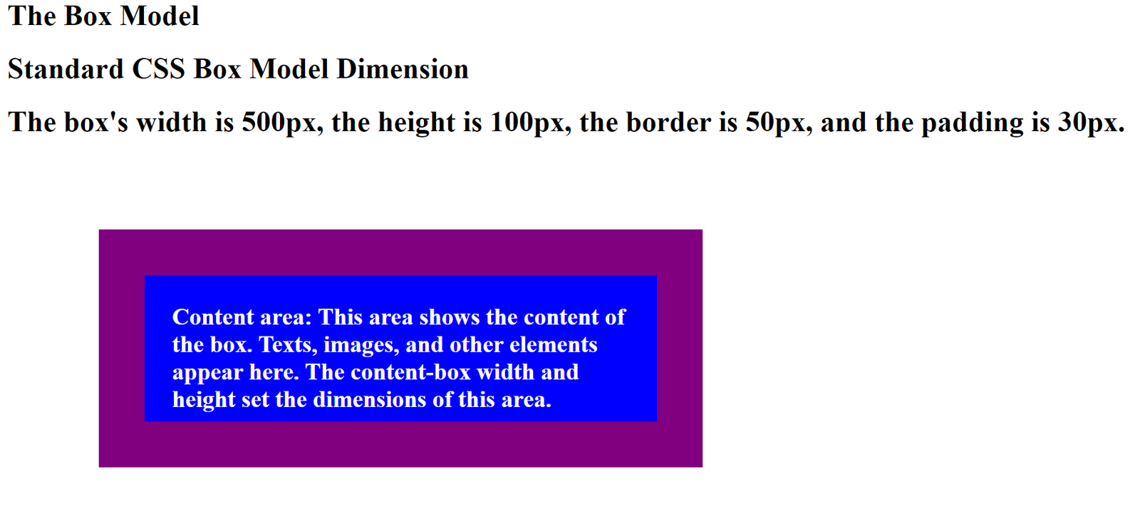
In this example, the box’s width is 500 pixels, the height is 100 pixels, the border is 50 pixels, and the padding is 30 pixels. Therefore, the total width of the box will be: 500px (width)
- 60px (left + right padding)
- 100px (left + right border) = 660px The total height of the box will be: 100px (height) +60px (top + bottom padding) +100px (top + bottom border) =260px
Note: The margin is not added to get the total size of the element because the element’s area stops at the border and does not extend into the margin.
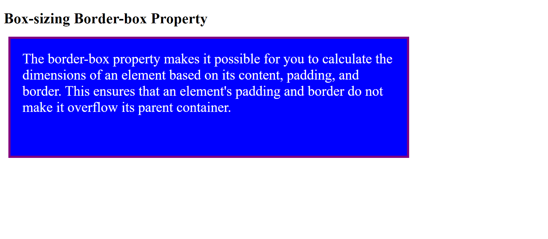
Alternative CSS box model: It can be exhausting doing the height, width, padding, margins, and border calculations for the standard CSS box model. Hence, the reason you can use the alternative CSS model approach. In this approach, the width and height determine not just the element’s size but also the border and padding. You set the box-sizing property to use the alternative model for an element. For example, the box-sizing property can be set to border-box or content-box. The syntax: box-sizing: content-box|border-box;
The content-box is the default value of the box-sizing property, meaning that elements will take the size of their contents. The width and height properties determine the element’s size, excluding the border and padding. The border-box property makes it possible for you to calculate the dimensions of an element based on its content, padding, and border. This ensures that an element’s padding and border do not make it overflow its parent container.
Example:
<!DOCTYPE html>
<html>
<head>
        <style>
  div {
  width: 800px;
  height: 200px;
  margin: 10px;
  padding: 25px;
  border: 5px solid purple;
  background-color: blue;
  color: white;
  font-size: 30px;
}
.border-box {
  box-sizing: border-box;
}
        </style>
</head>
<body>
        <h1>Box-sizing Border-box Property</h1>
        <div class="content-box">The border-box property makes it possible for you to calculate the dimensions of an element based on its content, padding, and border. This ensures that an element's padding and border do not make it overflow its parent container.</div>
</body>
</html>
The result:
The Box model properties
The properties of the CSS box model include the following:
Content
This property helps to display text, images, and other elements. The content-box width and height set this area’s dimensions and are measured from the content box to the outermost edge of its border, padding, and margin.
For example, you can put text inside a box using a <div> element. By so doing, you will specify the height and width you want it to have.
<!DOCTYPE html>
<html>
<head>
<style>
div {
  height: 200px;
  width: 800px;
  background-color: blue;
  font-size: 30px;
  color: white;
}
</style>
</head>
<body>
  <h1>Content Property</h1>
  <h1>The box has a 200px height and 800px width</h1>
  <div>This property helps to display text, images, and other elements. The content-box width and height set this area's dimensions and are measured from the content box to the outermost edge of its border, padding, and margin.</div>
</body>
</html>
The result:
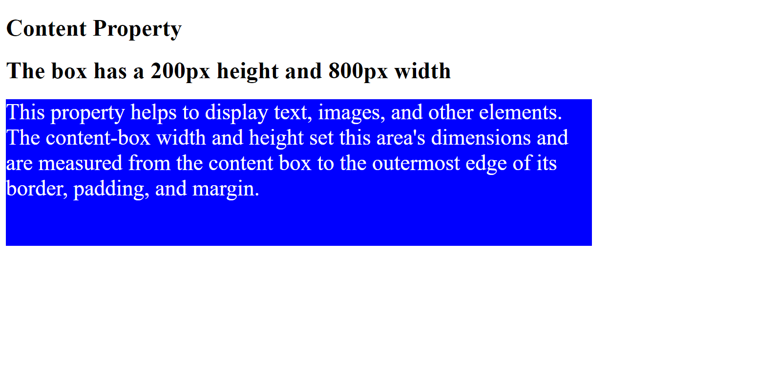
Here you see a text element with 200px height and 800px width.
Padding and the properties
CSS padding is a property that adds space inside an element, and it is between the element’s content and its border. It prevents the content from overlapping with the border. You can combine the padding property with the border property to create a visually appealing and structured layout for your web page.
Properties of the padding The padding properties apply to an element’s sides (top, right, bottom, left) or all sides using the keyword “padding.” The padding values can be specified using length units (px, em, etc.), percentages, or the keyword “auto.” Let us see how the padding properties work:
<!DOCTYPE html>
<html>
<head>
<style>
div {
border: 10px solid purple;
background: blue;
padding-top: 80px;
padding-right: 50px;
padding-bottom: 60px;
padding-left: 70px;
font-size: 35px;
color: white;
}
</style>
</head>
<body>
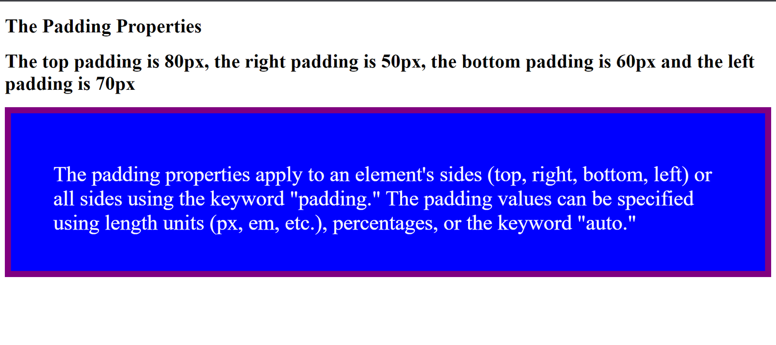
<h1>The Padding Properties</h1>
<h1>The top padding is 80px, the right padding is 50px, the bottom padding is 60px and the left padding is 70px</h1>
<div>The padding properties apply to an element's sides (top, right, bottom, left) or all sides using the keyword "padding." The padding values can be specified using length units (px, em, etc.), percentages, or the keyword "auto."</div>
</body>
</html>The result:
Notice the different paddings for the element. Padding shorthand properties If the padding has four values, then this is what it means in the example below: Padding: 30px 40px 50px 60px;
<!DOCTYPE html>
<html>
<head>
<style>
div {
  border: 10px solid purple;
  background: blue;
  Padding: 30px 40px 50px 60px;
  font-size: 35px;
  color:white;
}
</style>
</head>
<body>
  <h1>The Padding Properties with four values</h1>
  <h1>The padding has the following values: 30px, 40px, 50px and 60px</h1>
  <div>The padding properties apply to an element's sides (top, right, bottom, left) or all sides using the keyword "padding." The padding values can be specified using length units (px, em, etc.), percentages, or the keyword "auto."</div>
</body>
</html>
The result:
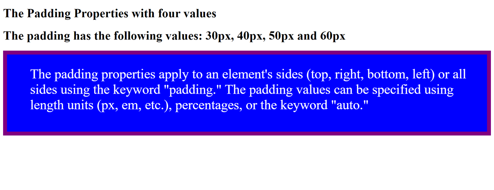
This means the top padding is 30px, the right padding is 40px, the bottom padding is 50px, and the left padding is 60px.
If the padding property has three values, then this is what it means in the example below: Padding: 30px 40px 50px;
<!DOCTYPE html>
<html>
<head>
<style>
div {
  border: 10px solid purple;
  background: blue;
  Padding: 30px 40px 50px;
  font-size: 35px;
  color: white;
}
</style>
</head>
<body>
  <h1>The Padding Properties with three values</h1>
  <h1>The padding has the following properties:30px, 40px, and 50px.</h1>
  <div>The padding properties apply to an element's sides (top, right, bottom, left) or all sides using the keyword "padding." The padding values can be specified using length units (px, em, etc.), percentages, or the keyword "auto."</div>
</body>
</html>
The result:
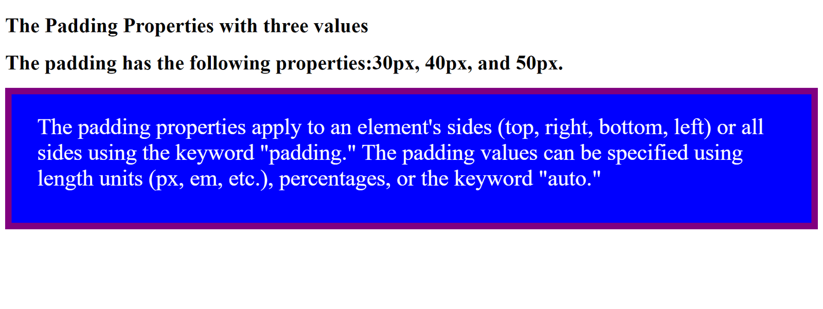
This means the top padding is 30px, the right and left padding are 40px, and the bottom padding is 50px.
Border and the properties
The CSS border property helps to add a border around an HTML element. It allows you to specify the border’s style, width, and color. In addition, you can apply it to any HTML element, including text, images, and other elements.
Properties of the border
The syntax of the border property is as follows:
border:<border-width> <border-style> <border-color>;
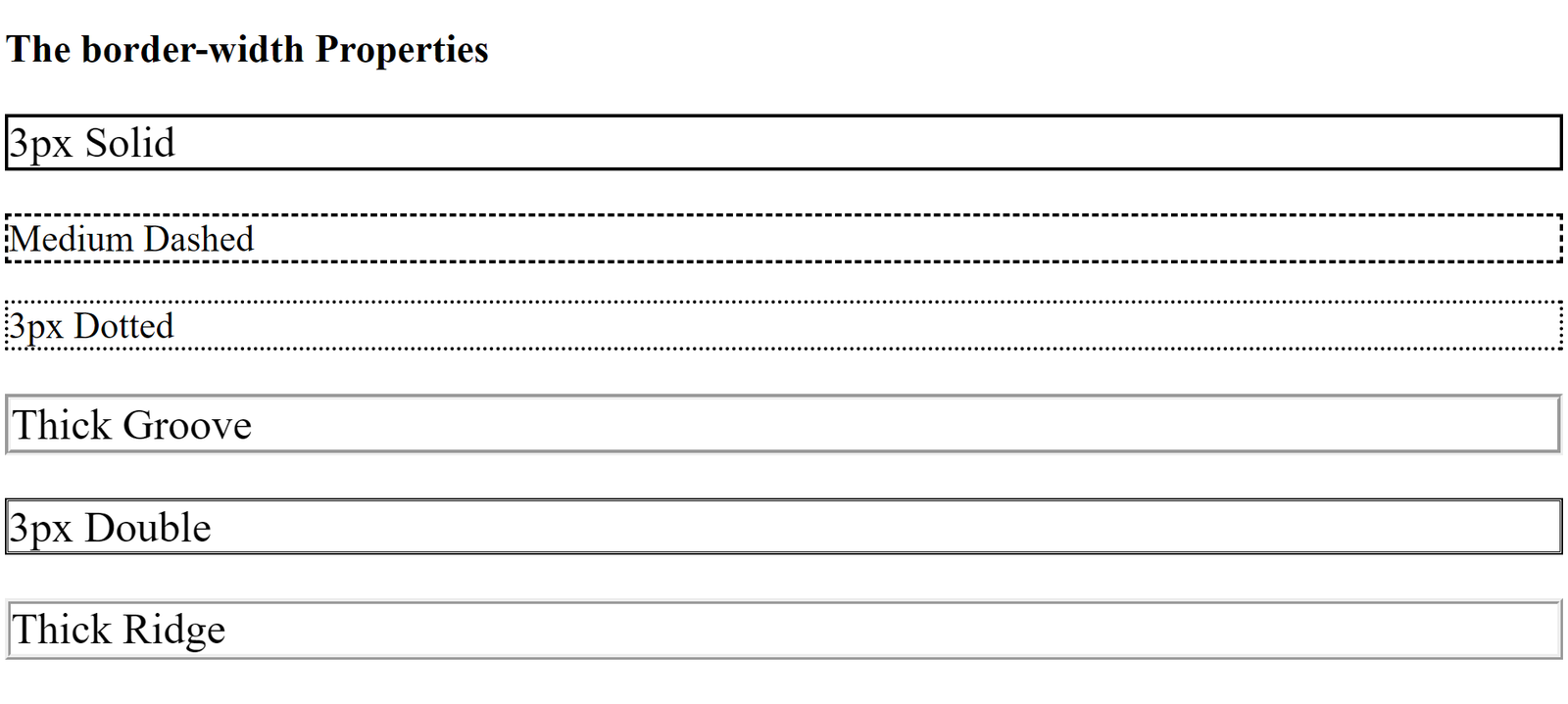
Border-width: Specifies the width of the border. You can specify the border width in pixels, ems, or other units of measurement. You can also set it with thin, medium, or thick.
Let us see how this works:
<!DOCTYPE html>
<html>
<head>
<style>
p.one {
  border-style: solid;
  border-width: 3px;
  font-size: 35px;
}
p.two {
  border-style: dashed;
  border-width: medium;
  font-size: 35px;
}
p.three {
  border-style: dotted;
  border-width: 3px;
  font-size: 35px;
}
p.four {
  border-style: groove;
  border-width: thick;
  font-size: 35px;
}
p.five {
  border-style: double;
  border-width: 3px;
  font-size: 35px;
}
p.six {
  border-style: ridge;
  border-width: thick;
  font-size: 35px;
}
</style>
</head>

<body>
  <h1>The border-width Properties</h1>
  <p class="one">3px Solid</p>
  <p class="two">Medium Dashed</p>
  <p class="three">3px Dotted</p>
  <p class="four">Thick Groove</p>
  <p class="five">3px Double</p>
  <p class="six">Thick Ridge</p>
</body>
</html>
The result:
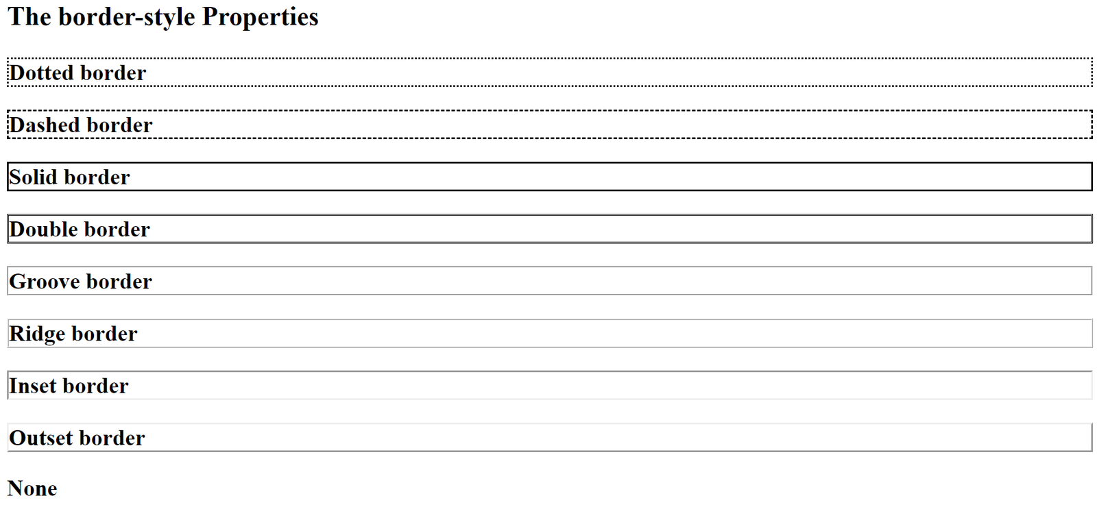
Border-style: Specifies the style of the border. The border-style property has four values (for the top, right, bottom, and left border). The following values are possible with the border-style property:
- Dotted: Shows a dotted border.
- Dashed: Shows a dashed border.
- Solid: Shows a solid border.
- Double: Shows a double border.
- Groove: This shows a border with a 3D groove; the effect depends on the border-color value.
- Ridge: Shows a border with a 3D ridge; the effect also depends on the border-color value.
- Inset: This shows a border with a 3D inset; the effect also depends on the border-color value.
- Outset: This shows a 3D outset border; the effect also depends on the border-color value.
- None: It defines no border.
Let us see how the border-style properties work:
<!DOCTYPE html>
<html>
<head>
<style>
body{
  font-size: 26px;
  font-weight: bolder;
}
p.dotted {border-style: dotted;}
p.dashed {border-style: dashed;}
p.solid {border-style: solid;}
p.double {border-style: double;}
p.groove {border-style: groove;}
p.ridge {border-style: ridge;}
p.inset {border-style: inset;}
p.outset {border-style: outset;}
p.none {border-style: none;}
</style>
</head>
<body>
  <h3>The border-style Properties</h3>
  <p class="dotted">Dotted border</p>
  <p class="dashed">Dashed border</p>
  <p class="solid">Solid border</p>
  <p class="double">Double border</p>
  <p class="groove">Groove border</p>
  <p class="ridge">Ridge border</p>
  <p class="inset">Inset border</p>
  <p class="outset">Outset border</p>
  <p class="none">None</p>
</body>
</html>
The result:
Note: The border-style property is necessary for the other border properties to function.
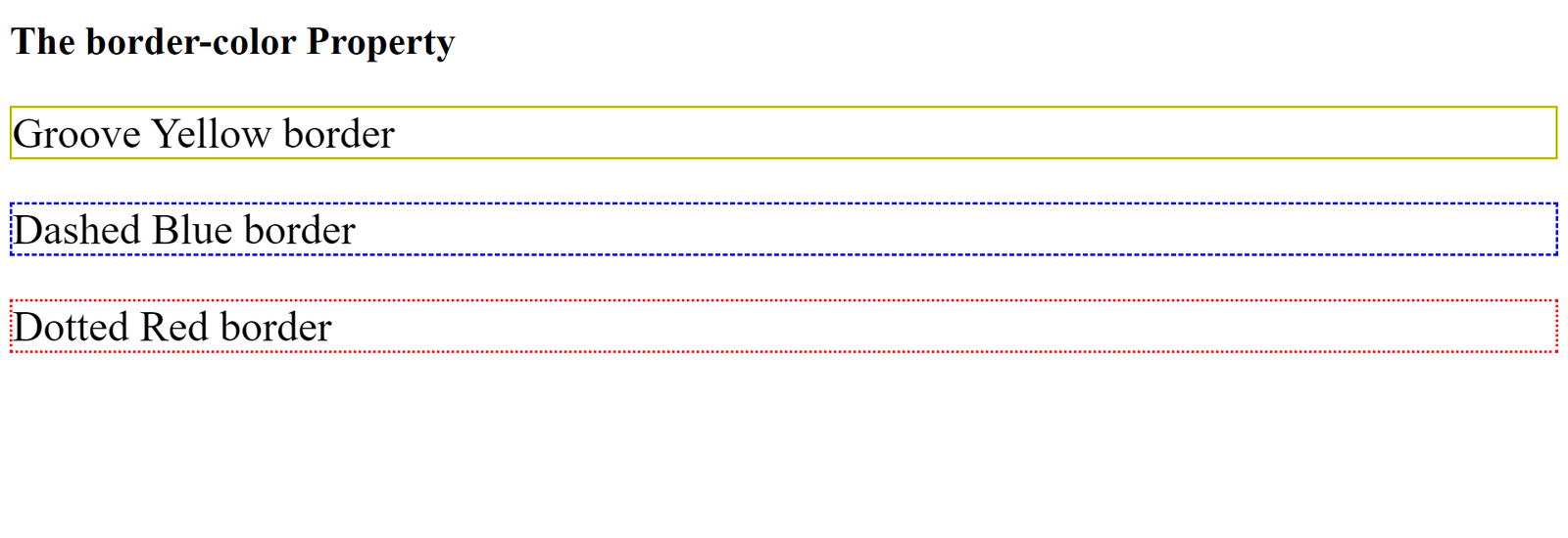
Border-color: Specifies the color of the border. You can specify the border color using a hexadecimal code, RGB value, or named color. When a border color is not set, it inherits the element’s color. Let us see some of the ways we can use this property:
<!DOCTYPE html>
<html>
<head>
<style>
p.one {
  border-style: groove;
  border-color: yellow;
  font-size: 35px;
}
p.two {
  border-style: dashed;
  border-color: blue;
  font-size: 35px;
}
p.three {
  border-style: dotted;
  border-color: red;
  font-size: 35px;
}
</style>
</head>
<body>
  <h1>The border-color Property</h1>
  <p class="one">Groove Yellow border</p>
  <p class="two">Dashed Blue border</p>
  <p class="three">Dotted Red border</p>
</body>
</html>
The result:
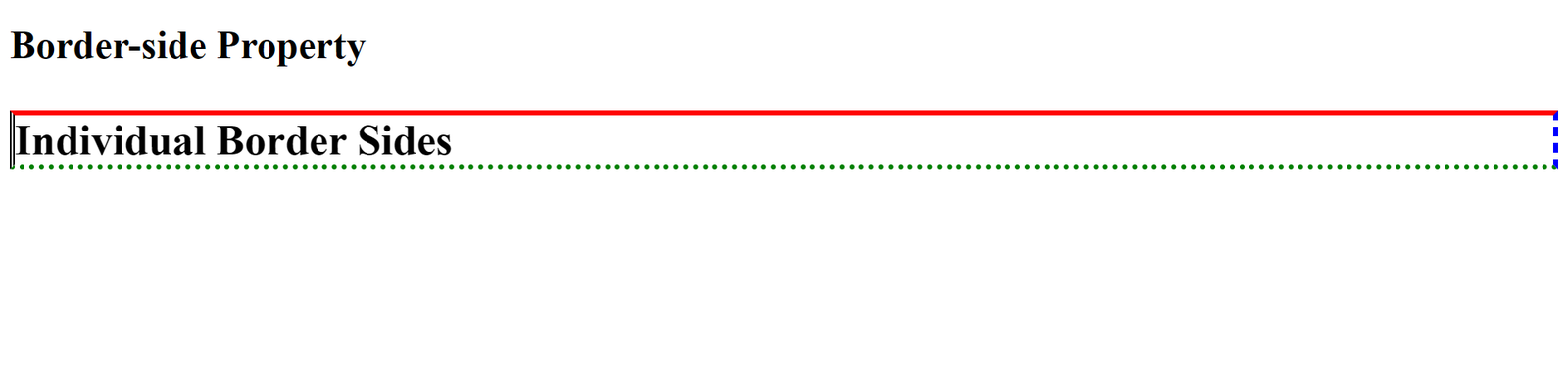
Border-side: This specifies the style, width, and color of an element’s border on a particular side. The respective sides it applies to are the top, right, bottom, and left of an element or to all sides. Let us see how to use this property:
<!DOCTYPE html>
<html>
<head>
<style>
p {
  border-top: 4px solid red;
  border-right: 4px dashed blue;
  border-bottom: 4px dotted green;
  border-left: 4px double black;
  font-size: 35px;
  font-weight: bold;
}
</style>
</head>
<body>
  <h1>Border-side Property</h1>
  <p>Individual Border Sides</p>
</body>
</html>
The result:
Margin and the properties
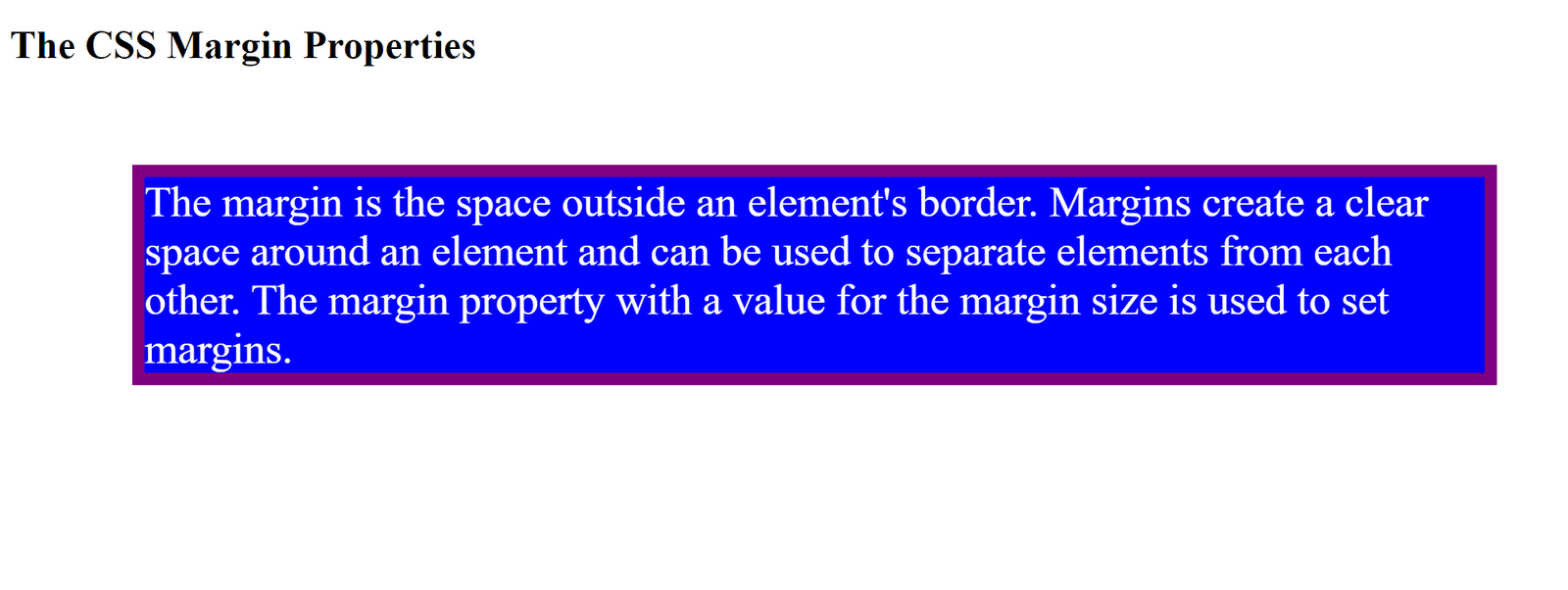
The margin is the space outside an element’s border. Margins create a clear space around an element and can be used to separate elements from each other. The margin property with a value for the margin size is used to set margins. The syntax is as follows: margin: size;
Properties of the margin The margin-top, margin-right, margin-bottom, and margin-left properties are used to set specific margins for each side of the element. You can set the values using pixel, percentage, or CSS length units. Let us see how the margin properties work:
<!DOCTYPE html>
<html>
<head>
<style>
div {
  border: 10px solid purple;
  background-color: blue;
  margin-top: 80px;
  margin-right: 50px;
  margin-bottom: 90px;
  margin-left: 100px;
  font-size: 35px;
  color: white;
}
</style>
</head>
<body>
  <h1>The CSS Margin Properties</h1>
  <div>The margin is the space outside an element's border. Margins create a clear space around an element and can be used to separate elements from each other. The margin property with a value for the margin size is used to set margins.</div>
</body>
</html>
The result:
Conclusion
We have seen several ways to use the CSS box model on our web pages by knowing how to set the content, padding, border, and margin properties. These properties help us to customize our page layouts adequately.
Gain Debugging Superpowers
Unleash the power of session replay to reproduce bugs and track user frustrations. Get complete visibility into your frontend with OpenReplay, the most advanced open-source session replay tool for developers.