5 Things You Don't Need React For
Five native browser APIs replace common React components: dialog, Popover, Custom Elements, container queries, and View Transitions.

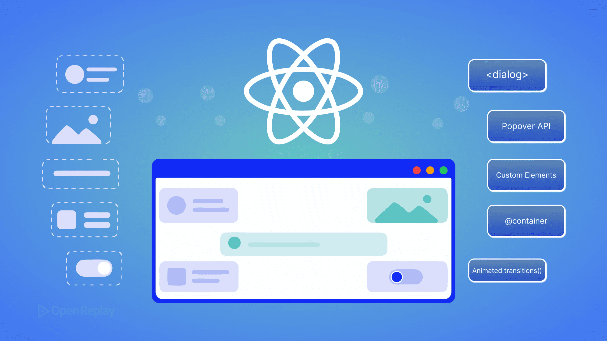
The browser platform has shipped native, baseline-available replacements for several UI primitives that used to require React components or third-party libraries: modal dialogs, popovers and tooltips, framework-agnostic reusable widgets, container-aware responsive layouts, and animated view transitions. This article is not an argument against React — it remains the right tool for complex shared state, large form workflows, and ecosystems like Next.js and Remix. It is a maintainer’s audit checklist: five categories of component you may already have in a React codebase that the browser can now handle natively, with zero added JavaScript bundle weight.
The audience here is the working React developer whose mental model of “what the browser can do” stopped updating somewhere around 2020. React 19 is the current stable release, and several of the patterns its ecosystem solved are now part of the platform. Each section below names the React reflex, the native API that replaces it, and the specific accessibility caveat you need to know before deleting code.
Key Takeaways
- The HTML
<dialog>element withshowModal()provides native focus trapping, Escape-key dismissal, and a::backdroppseudo-element — eliminating most reasons to depend on a React modal library. - The Popover API renders elements in the browser’s top layer, which removes the entire class of z-index and
overflow: hiddenclipping bugs that plague hand-rolled React tooltips and dropdowns. - Custom Elements with Shadow DOM let you ship one widget that works in any framework or plain HTML, without re-implementing it per stack.
- CSS Container Queries (
@container) let a component respond to its parent’s width, replacingResizeObserverhooks and React state used purely for layout decisions. - The View Transitions API (
document.startViewTransition()) animates DOM state changes natively, covering many use cases previously handled by Framer Motion orreact-transition-group.
Modals: use the <dialog> element instead of a modal library
For modal dialogs, the native HTML <dialog> element called via showModal() gives you focus trapping, inert background content, Escape-key dismissal, and backdrop styling — behaviors a custom React modal must implement manually and frequently gets wrong. The <dialog> element is part of Baseline; verify the exact availability date on MDN before publishing internal docs.
The React pattern. Teams typically reach for react-modal, Radix Dialog, or a custom useModal hook backed by a portal. The hook pattern usually combines createPortal, a useEffect that toggles document.body.style.overflow, and a hand-written focus trap. Production session replays of these implementations frequently surface users tabbing out of the modal into background content — a symptom of incomplete focus-trap logic.
The native API.
<dialog id="confirm" aria-labelledby="confirm-title">
  <h2 id="confirm-title">Delete project?</h2>
  <p>This action cannot be undone.</p>
  <form method="dialog">
    <button value="cancel">Cancel</button>
    <button value="confirm">Delete</button>
  </form>
</dialog>

<script>
  document.getElementById('confirm').showModal();
</script>
showModal() puts the dialog in the top layer, traps focus inside it, makes the rest of the document inert, and renders the ::backdrop pseudo-element you can style with CSS. A <form method="dialog"> closes the dialog and returns the clicked button’s value via dialog.returnValue — no event listener required.
Caveats. The accessibility gotcha is that <dialog> does not announce a label automatically. You need aria-labelledby pointing to a visible heading (or aria-label) for screen readers to identify it. If the dialog is non-modal — opened with show() instead of showModal() — it does not trap focus, and you may want the Popover API instead. React or a library remains the better choice when you need declarative state-bound open/close logic tightly coupled to other components, or animation that runs before the dialog unmounts.
Popovers, tooltips, and dropdowns: use the Popover API
The Popover API renders elements in the browser’s top layer, which means a popover always appears above other content regardless of stacking context or overflow: hidden on an ancestor. This eliminates the entire category of z-index wars and clipping bugs that hand-rolled tooltip and dropdown implementations produce.
The React pattern. Floating UI, Radix Popover, and React-Aria’s overlay primitives are common dependencies. They handle positioning, click-outside dismissal, and portal rendering. For a simple tooltip, this is a lot of code to import.
The native API.
<button popovertarget="menu">Open menu</button>

<div id="menu" popover>
  <a href="/account">Account</a>
  <a href="/logout">Log out</a>
</div>
The popover attribute alone — with no JavaScript — gives you an element that toggles via a popovertarget button, dismisses on outside click and Escape, and renders in the top layer. The default value popover="auto" enables light-dismiss; popover="manual" disables it for cases where you want explicit control. The Popover API is Baseline Newly Available; check the MDN compatibility table for the current status.
Caveats. The accessibility gotcha is that, unlike <dialog>’s showModal(), the Popover API does not automatically manage focus. If your popover is functionally a menu, you still need to apply role="menu", manage roving tabindex, and move focus into the popover when it opens. For positioning relative to the trigger, you also need CSS Anchor Positioning, whose Baseline status is more limited — verify on MDN before relying on it cross-browser. For complex menus with submenus, keyboard navigation patterns, and typeahead, a library like Radix or React-Aria still saves real work.

Discover how at OpenReplay.com.
Reusable widgets: use Custom Elements and Shadow DOM
A Custom Element registered with customElements.define() works in any HTML context — React, Vue, Angular, Svelte, or a plain HTML file — without re-implementation. Combined with Shadow DOM, it provides style encapsulation without CSS Modules, CSS-in-JS, or a build step. Custom Elements and Shadow DOM are Baseline Widely Available; verify the year on MDN.
Web Components have not replaced React in mainstream application development. What they have replaced is the need to ship the same widget five times — once per framework — when you maintain a design system or distribute a third-party embed.
The React pattern. A reusable button, badge, or chart wrapped in a React component, published to npm, and re-implemented (or re-wrapped) for any team using a different framework.
The native API.
class CopyButton extends HTMLElement {
  connectedCallback() {
    this.attachShadow({ mode: 'open' }).innerHTML = `
      <style>button { padding: 6px 12px; }</style>
      <button><slot>Copy</slot></button>
    `;
    this.shadowRoot.querySelector('button')
      .addEventListener('click', () => {
        navigator.clipboard.writeText(this.dataset.value ?? '');
      });
  }
}
customElements.define('copy-button', CopyButton);
Used as <copy-button data-value="hello">Copy</copy-button> in any HTML, including inside JSX. React 19 supports custom elements directly, including passing object props and listening to custom events.
Caveats. The accessibility gotcha is that the accessibility tree does not pierce shadow boundaries by default — aria-labelledby and aria-describedby references in light DOM cannot target IDs inside a shadow root, and vice versa. The ARIA in HTML spec and the in-progress reference target proposal address this, but practical patterns today require either explicit ARIA attributes on the host element or attachInternals() with ElementInternals. React is still the better choice when a widget needs to integrate tightly with application state, share React Context, or use Suspense.
Component-level responsive layout: use CSS Container Queries
CSS Container Queries (@container) let a component adapt its layout based on the width of its own parent rather than the viewport. This eliminates the useResizeObserver hook pattern where React state tracks container dimensions purely to drive a className. Container Queries are Baseline Widely Available — verify the year on MDN.
The React pattern. A useResizeObserver hook (often from @react-hook/resize-observer or hand-rolled) wired to component state that swaps a layout="compact" prop or className. Every resize triggers a React render, even though the only consumer is CSS.
The native API.
.card-container {
  container-type: inline-size;
}

.card {
  display: grid;
  grid-template-columns: 1fr;
}

@container (min-width: 400px) {
  .card {
    grid-template-columns: 120px 1fr;
  }
}
Declare container-type: inline-size on the parent, then write @container rules against the child. The browser handles the resize observation natively. No JavaScript, no re-renders, no hydration mismatch.
The :has() selector complements this for state-aware styling. A rule like form:has(input:invalid) button[type="submit"] { opacity: 0.5 } expresses what previously required useState and a controlled-input pattern. :has() is Baseline Widely Available — check MDN.
Caveats. The accessibility consideration is subtle but real: container queries can change layout dramatically without changing DOM order, which is good for screen readers but means you should still verify reading order matches visual order at each breakpoint. Container queries also introduce containment behavior that can affect how descendant elements are laid out and positioned, so test components that rely on viewport-relative positioning or other layout assumptions. React state is still warranted when the layout decision drives more than styling — for example, when you need to render a different component tree, not just restyle one.
Animated transitions: use the View Transitions API
The View Transitions API wraps a DOM update in a cross-fade animation by default, with full CSS control over the transition via ::view-transition-* pseudo-elements. For same-document transitions it covers the majority of route- and state-transition animations that previously required animation libraries.
The React pattern. Framer Motion, react-transition-group, or AnimatePresence wrappers around route components. These work, but they require the animation to be expressible in React’s render model, which is awkward for transitions that span unmounting one tree and mounting another.
The native API.
function navigate(url) {
  if (!document.startViewTransition) {
    updateDOM(url);
    return;
  }
  document.startViewTransition(() => updateDOM(url));
}
document.startViewTransition() takes a callback that performs the DOM update. The browser captures the before state, runs the callback, captures the after state, and cross-fades between them. To animate a specific element across the transition — for example, a thumbnail expanding into a detail view — give matched elements the same view-transition-name in CSS. Same-document View Transitions are Baseline Newly Available; cross-document View Transitions (for MPA navigations) have more limited support — check the MDN compatibility table and the WebKit blog for current Safari status before relying on cross-document mode.
Caveats. The accessibility gotcha is motion: respect prefers-reduced-motion by wrapping the transition in a media query or skipping the call entirely for users who opt out. The default cross-fade is brief but still animation. React libraries remain the better choice when you need spring physics, gesture-driven transitions, or animations that interrupt and reverse mid-flight — view transitions are atomic and not designed for that.
Where React still wins
The five swaps above target specific component categories. For everything below, React is still the right tool, and replacing it with platform features would cost more than it saves.
- Complex shared state across distant components. When multiple unrelated parts of the UI subscribe to the same evolving state with derived selectors, libraries like Zustand, Jotai, or Redux Toolkit do work the platform does not. Custom events on Web Components can carry data but do not model derived state.
- Large form workflows with cross-field validation and dynamic rendering. Native
<form>, the Constraint Validation API, andFormDatahandle single-form submission cleanly. Multi-step wizards, conditional fields that depend on values elsewhere in the form, server-driven validation merged with client validation, and field arrays still benefit from React Hook Form or TanStack Form. - Server-driven rendering and data fetching. React Server Components, the
use()hook for async data, and the streaming SSR model in Next.js and Remix solve hydration, code-splitting, and data-fetching coordination problems that the platform does not address directly. - Ecosystem maturity for routing and data layers. TanStack Router, TanStack Query, and the established React Router ecosystem provide cache invalidation, optimistic updates, and route-loader patterns that would take significant work to replicate against native APIs.
- Team conventions and existing investment. A codebase, hiring pipeline, design system, and CI built around React is itself an asset. The audit posture here is to remove specific components where the platform now suffices — not to migrate stacks.
The practical action: open your largest React component directory, search for Modal, Popover, Tooltip, Dropdown, and any useResizeObserver import. Each is a candidate for the native replacement above. Verify the Baseline status of the API against MDN for your supported browser range, ship the swap behind a feature flag, and measure the bundle delta. The browser caught up — the remaining work is auditing which dependencies you no longer need.
FAQs
Can I use the native dialog element with React's state model?
Yes. Attach a ref to the dialog element and call ref.current.showModal() or ref.current.close() from effects driven by React state. The dialog stays in the React tree and accepts JSX children normally, but you bypass useState-driven open props on the rendered output. The main friction is that React does not re-run effects for the dialog's internal cancel event, so attach a native close listener via useEffect to sync state back.
How do Custom Elements pass complex data to React, and vice versa?
React 19 passes non-string props directly to custom element properties rather than serializing them to attributes, so objects and arrays work without JSON encoding. Custom elements emit data back via CustomEvent, which React 19 listens for using standard on-prefixed handler props (for example, onMyEvent). In React 18 and earlier, you must attach event listeners imperatively via a ref because synthetic events do not handle custom event names.
Do container queries and the :has() selector hurt rendering performance?
Both have measurable cost but are generally cheaper than the JavaScript alternatives they replace. Container queries require the browser to maintain a containment context and re-evaluate matching rules on size changes, which is still faster than a ResizeObserver callback triggering a React render. The :has() selector can be expensive when used with broad subject selectors across large DOM trees; scope it to specific parents rather than applying it to body or root-level elements.
Does the View Transitions API work with client-side routers like React Router?
Yes, for same-document transitions. Wrap your router's navigation callback in document.startViewTransition() so the DOM update React performs during route change runs inside the transition. React Router v6 and TanStack Router both support this pattern through navigation interception. Cross-document view transitions, which animate full page loads, require additional opt-in via the @view-transition CSS rule and have narrower browser support — verify on MDN before relying on them.