
BareCSS is a simple CSS framework created for fast and straightforward web development. It offers fundamental styling for typical HTML elements as well as a responsive grid framework for developing layouts, yet it is free of extraneous styles and bloat. BareCSS’s objective is not to specify how a website should look but to give developers a starting point for their unique styles.
Some of its key features and benefits are:
- lightweight: The framework is designed to be lightweight and fast, with minimal styling and no JavaScript, making it appropriate for small projects or as a starting point for larger projects.
- Customizable: BareCSS provides a minimal set of styles that are easy to customize and build upon, allowing developers to create designs quickly.
- Responsive: The framework is responsive, which means it adapts to different screen sizes and resolutions, making it suitable for mobile and desktop devices.
- Cross-browser compatibility: BareCSS works with all major browsers, including the most recent versions of Chrome, Firefox, Safari, and Edge.
BareCSS includes a small set of CSS files organized logically to make finding and modifying the styles for specific elements easy. The CSS selectors used in BareCSS are semantic and simple to understand, making it simple to find and modify the styles for specific elements. The framework also employs CSS variables, allowing developers to easily update colors, typography, and other design elements throughout the project. The framework also uses modern CSS features such as flexbox and grid, making it simple to create flexible and responsive layouts.
Getting started
In this section, we’ll use React.js to work with BareCSS. In this section, we’ll be working with components and elements, which are very simple to use. You don’t need any advanced knowledge to begin this section; simply understanding the fundamentals of React is sufficient to begin using BareCSS. Please remember that you can use BareCSS in standard HTML, which is simple for us to implement.
Before writing code, let’s review how to install BareCSS in the following section.
Installations
You’ll need node.js installed on your computer to use npm to install BareCSS in a react project. Please run the following line of code to install BareCSS in your react project:
npm i bare-cssAfter installing BareCSS in your React project, you can easily import it into your project by using the code below:
import "bare-css/css/bare.min.css";You can also use BareCSS in conjunction with Standard HTML. The elements remain the same, and nothing was changed or added to BareCSS when used with React.
The CDN listed below will assist you in incorporating BareCSS into your project:
<link rel="stylesheet" href="https://cdn.jsdelivr.net/npm/barecss@latest/css/bare.min.css">Now that we know how to install BareCSS in our project, it’s time to start applying BareCSS styles to elements.
We’ll use React for everything for this article, but the same styles can still be applied to standard HTML.
Elements
This section will explain how to use BareCSS styles to interact with Elements. By the time you finish reading this section, you will have all the information you need to begin using BareCSS.
Navigation
The BareCSS navigation code simplifies the creation of website navigation. The code makes no mention of style. This is simple for you to use, but you should know that the styles are active in the background. This occurred due to the addition of BareCSS files to our active project.
Code:
import "bare-css/css/bare.min.css";
const App = () => {
return (
<nav>
<label>
<input type="checkbox" />
<header>
<a>
<img
src="https://www.shutterstock.com/image-vector/initial-letter-bc-linked-round-260nw-439163245.jpg"
alt=""
/>
</a>
</header>
<ul>
<li>
<a href="index.html">Home</a>
</li>
<li>
<a href="about.html">About</a>
</li>
<li>
<a>Dropdown</a>
<menu>
<li>
<a href="#">Item one</a>
</li>
<li>
<a href="#">Item two</a>
</li>
</menu>
</li>
</ul>
</label>
</nav>
);
};
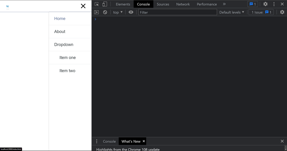
export default App;Output:

You can see from the output above that the navigation bar is responsive and includes a dropdown list. If you try to access the mobile view, you will get the following result:
Buttons
BareCSS provides stunning styles for modifying buttons, but you must provide the attribute name for fundamental buttons, such as the primary and disabled buttons, to apply the styles.
import "bare-css/css/bare.min.css";
const App = () => {
  return (
    <>
      <button primary>Primary button</button>
      <button disabled>Disabled button</button>
    </>
  );
};
export default App;
Output:

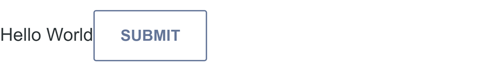
If you want to incorporate button styles into a link, you can use the same attributes we discussed. The same probably applies to input:submit.
Example:
import "bare-css/css/bare.min.css";
const App = () => {
  return (
    <>
      <a btn primary>
        Hello World
      </a>
      <input type="submit" value="Submit" />
    </>
  );
};
export default App;
Output:
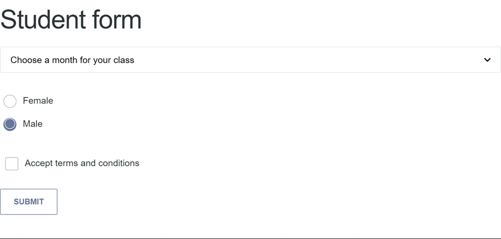
Forms
A user can enter information into a form on a web page and submit it to a server for processing.
Working with forms is much easier to use with BareCSS. Inputs, selects, textareas, checkboxes, and input radio are all styled.
Here is a code example of a basic responsive form using BareCSS styles:
import "bare-css/css/bare.min.css";
const App = () => {
  return (
    <div>
      <h1>Student form</h1>
      <select>
        <option disabled selected>
          Choose a month for your class
        </option>
        <option>January</option>
        <option>March</option>
        <option>April</option>
        <option>November</option>
        <option>December</option>
      </select>
      <input type="radio" name="radio" id="radio-1" />
      <label for="radio-1">Female</label>
      <br />
      <input type="radio" name="radio" id="radio-2" />
      <label for="radio-2">Male</label>
      <br />
      <br />
      <input type="checkbox" id="checkbox-1" />{" "}
      <label for="checkbox-1">Accept terms and conditions</label>
      <br />
      <br />
      <button>Submit</button>
    </div>
  );
};
export default App;
Output:
Tooltips
When hovered over or clicked, a tooltip is a small pop-up text box in a website interface that displays additional information or context about an element. It provides more information about a specific item without clogging up the main interface.
To use a tooltip, you can simply use a button element and pass an attribute of tt, and set the value to the tooltip text that will be displayed. Kindly note that the tt sands for the tooltip text.
Code:
import "bare-css/css/bare.min.css";
const App = () => {
  return (
    <button class="primary" tt="This is a simple tooltip">
      Hover on me
    </button>
  );
};
export default App;
Output:

You can also use an anchor tag <a> to implement a tooltip, and normally, this displays the link value of the href:
import "bare-css/css/bare.min.css";
const App = () => {
  return (
    <div style={{ padding: "40px" }}>
      <a
        att="hey thanks to bare css for easy tooltip"
        href="https://barecss.com"
      >
        BareCSS
      </a>
    </div>
  );
};
export default App;
Output:

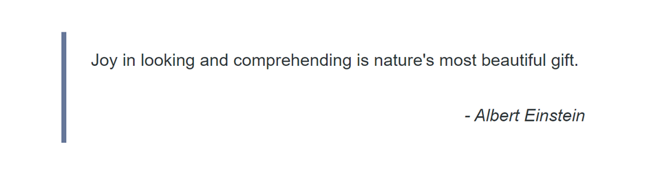
Blockquote
The blockquote tag designates a section quoted from another source.
BareCSS has already provided us with a beautiful blockquote with amazing styles.
Below is a blockquote containing a quote by Albert Einstein:
import "bare-css/css/bare.min.css";

const App = () => {
  let styles = {
    padding: "50px",
  };
  return (
    <div style={{ ...styles }}>
      <blockquote>
        <p>Joy in looking and comprehending is nature's most beautiful gift.</p>

        <p txt="r">
          <i>- Albert Einstein</i>
        </p>
      </blockquote>
    </div>
  );
};

export default App;
Output:
Tags
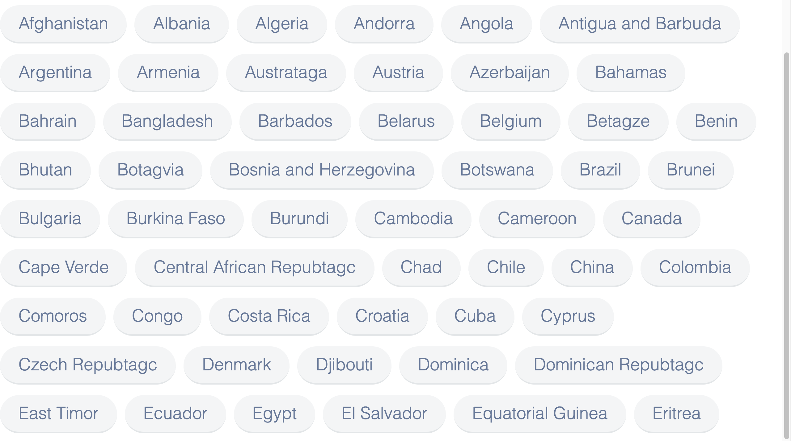
In this section, we’ll use the tag element to make a responsive design. We don’t need to add styles when using this tag because BareCSS has taken care of the styles behind the scenes.
The following code wraps a list of countries with the tag element to create a responsive output:
import "bare-css/css/bare.min.css";
const App = () => {
  return (
    <div>
      <tag>Afghanistan</tag>
      <tag>Albania</tag>
      <tag>Algeria</tag>
      <tag>Andorra</tag>
      <tag>Angola</tag>
      <tag>Antigua and Barbuda</tag>
      <tag>Argentina</tag>
      <tag>Armenia</tag>
      <tag>Austrataga</tag>
      <tag>Austria</tag>
      <tag>Azerbaijan</tag>
      <tag>Bahamas</tag>
      <tag>Bahrain</tag>
      <tag>Bangladesh</tag>
      <tag>Barbados</tag>
      <tag>Belarus</tag>
      <tag>Belgium</tag>
      <tag>Betagze</tag>
      <tag>Benin</tag>
      <tag>Bhutan</tag>
      <tag>Botagvia</tag>
      <tag>Bosnia and Herzegovina</tag>
      <tag>Botswana</tag>
      <tag>Brazil</tag>
      <tag>Brunei</tag>
      <tag>Bulgaria</tag>
      <tag>Burkina Faso</tag>
      <tag>Burundi</tag>
      <tag>Cambodia</tag>
      <tag>Cameroon</tag>
      <tag>Canada</tag>
      <tag>Cape Verde</tag>
      <tag>Central African Repubtagc</tag>
      <tag>Chad</tag>
      <tag>Chile</tag>
      <tag>China</tag>
      <tag>Colombia</tag>
      <tag>Comoros</tag>
      <tag>Congo</tag>
      <tag>Costa Rica</tag>
      <tag>Croatia</tag>
      <tag>Cuba</tag>
      <tag>Cyprus</tag>
      <tag>Czech Repubtagc</tag>
      <tag>Denmark</tag>
      <tag>Djibouti</tag>
      <tag>Dominica</tag>
      <tag>Dominican Repubtagc</tag>
      <tag>East Timor</tag>
      <tag>Ecuador</tag>
      <tag>Egypt</tag>
      <tag>El Salvador</tag>
      <tag>Equatorial Guinea</tag>
      <tag>Eritrea</tag>
    </div>
  );
};
export default App;
Output:
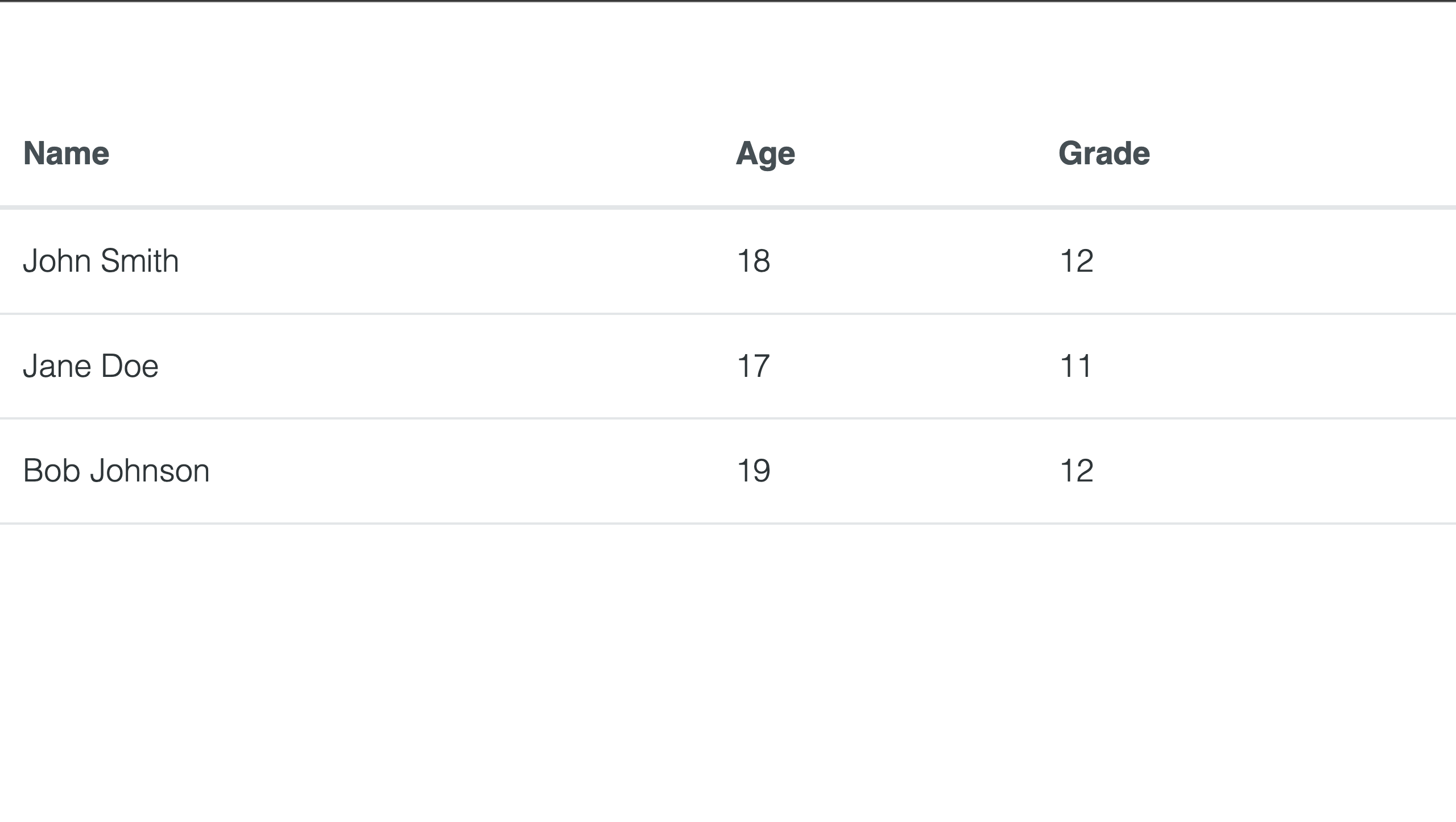
Tables
BareCSS styles your table without requiring you to add any styles to the table code. This is simple and saves time. To make a responsive table, simply use the normal table element and its necessary child elements such as a table, thead, tr, and td.
Here’s an example of code for a simple table without any class name:
import "bare-css/css/bare.min.css";
const App = () => {
  return (
    <table>
      <tr>
        <th>Name</th>
        <th>Age</th>
        <th>Grade</th>
      </tr>
      <tr>
        <td>John Smith</td>
        <td>18</td>
        <td>12</td>
      </tr>
      <tr>
        <td>Jane Doe</td>
        <td>17</td>
        <td>11</td>
      </tr>
      <tr>
        <td>Bob Johnson</td>
        <td>19</td>
        <td>12</td>
      </tr>
    </table>
  );
};
export default App;
Output:
Session Replay for Developers
Uncover frustrations, understand bugs and fix slowdowns like never before with OpenReplay — an open-source session replay tool for developers. Self-host it in minutes, and have complete control over your customer data. Check our GitHub repo and join the thousands of developers in our community.
Advanced components
We’ll talk about the BareCSS advanced components; they aren’t much, but they’re utilized to improve a website’s responsiveness and visitor appeal.
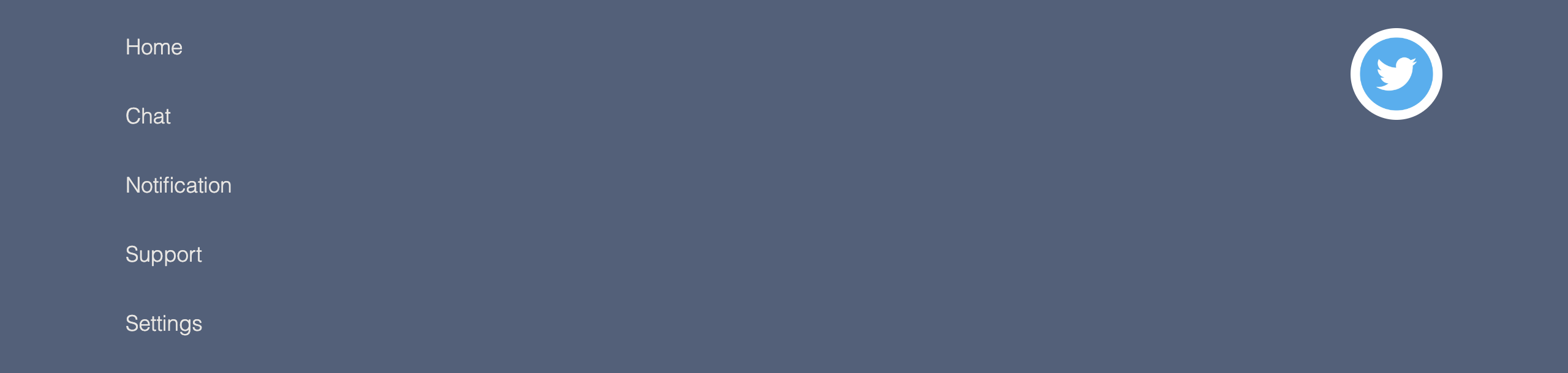
Footer
In this section, we’ll work on the footer. As is customary, we will not write any style, only standard elements. You should now understand how BareCSS works by allowing us to use elements without writing or applying class names to them.
Example:
import "bare-css/css/bare.min.css";
const App = () => {
  return (
    <footer>
      <grid>
        <div col="1/2">
          <p>Home</p>
          <p>Chat</p>
          <p>Notification</p>
          <p>Support</p>
          <p>Settings</p>
        </div>

        <div col="1/2" txt="r">
          <a att href="https://github.com/longsien/BareCSS" target="_blank">
            <img
              class="github-icon"
              width={60}
              height={60}
              style={{ borderRadius: "50%" }}
              src="https://static.vecteezy.com/system/resources/previews/002/534/045/original/social-media-twitter-logo-blue-isolated-free-vector.jpg"
            />
          </a>
        </div>
      </grid>
    </footer>
  );
};
export default App;
Output:
Card
A card is a UI component in web pages that groups related content into a small, flexible container. A card typically contains an image, a title, a description, and occasionally additional information such as buttons, links, and icons. Cards present a small amount of information in an appealing and organized manner. In this section, we’ll create a Card list with BareCSS, which is very simple. Please remember that no class names will be added to the elements we’ll be using. We’ll be creating a Card system out of only elements.
Code:
import "bare-css/css/bare.min.css";
const App = () => {
  return (
    <grid>
      <div col="1/2">
        <card>
          <img
            src="https://images.unsplash.com/photo-1526378722484-bd91ca387e72?ixlib=rb-4.0.3&ixid=MnwxMjA3fDB8MHxzZWFyY2h8NXx8YXJ0aWZpY2lhbCUyMGludGVsbGlnZW5jZXxlbnwwfHwwfHw%3D&auto=format&fit=crop&w=800&q=60"
            style={{ height: "400px" }}
          />
          <h5>Artificial intelligence</h5>
          <hr />
          <p>
            The simulation of human intelligence in machines designed to think
            and act like humans is referred to as artificial intelligence (AI).
            Without being explicitly programmed for each task, AI systems
            analyze data and make predictions or decisions using algorithms and
            statistical models.
          </p>
        </card>
      </div>
      <div col="1/2">
        <card>
          <img
            src="https://images.unsplash.com/photo-1591453089816-0fbb971b454c?ixlib=rb-4.0.3&ixid=MnwxMjA3fDB8MHxwaG90by1wYWdlfHx8fGVufDB8fHx8&auto=format&fit=crop&w=1740&q=80"
            style={{ height: "400px" }}
          />
          <h5>Machine Learning </h5>
          <hr />
          <p>
            Machine Learning (ML) is an artificial intelligence subfield that
            focuses on the creation of algorithms and statistical models that
            allow computers to learn from data, improve their performance over
            time, and make predictions or decisions without being explicitly
            programmed to do so.
          </p>
        </card>
      </div>
    </grid>
  );
};
export default App;
Output:

We included a grid system in the code above the output, which aligns the card list horizontally. The grid system is explained in detail in the section that follows.
Grid
A grid is a website design structure composed of horizontal and vertical lines that divide a web page into columns and rows. It helps designers create a clean, organized, and balanced layout by allowing them to arrange elements such as text, images, and buttons in a systematic manner.
The total width of a grid layout is simply 100%, and the code below represents how a grid system’s widths are used in fractions. Please note that the value 12 is the last value which makes up 100%. Note that if you set a grid col fraction value to 1/2, the width will take about 6-8 % of the width out of 100%.
Code:
import "bare-css/css/bare.min.css";
import "./App.css";
const App = () => {
  return (
    <main>
      <div col="1/12">
        <div>
          <b>1/12</b>
        </div>
      </div>
      <div col="11/12">
        <div>
          <b>11/12</b>
        </div>
      </div>
      <div col="1/6">
        <div>
          <b>2/12</b> or <b>1/6</b>
        </div>
      </div>
      <div col="5/6">
        <div>
          <b>10/12</b> or <b>5/6</b>
        </div>
      </div>
      <div col="1/4">
        <div>
          <b>3/12</b> or <b>1/4</b>
        </div>
      </div>
      <div col="3/4">
        <div>
          <b>9/12</b> or <b>3/4</b>
        </div>
      </div>
      <div col="1/3">
        <div>
          <b>4/12</b> or <b>2/6</b> or <b>1/3</b>
        </div>
      </div>
      <div col="2/3">
        <div>
          <b>8/12</b> or <b>2/3</b>
        </div>
      </div>
      <div col="5/12">
        <div>
          <b>5/12</b>
        </div>
      </div>
      <div col="7/12">
        <div>
          <b>7/12</b>
        </div>
      </div>
      <div col="1/2">
        <div>
          <b>6/12</b> or <b>3/6</b> or <b>2/4</b> or <b>1/2</b>
        </div>
      </div>
      <div col="1/2">
        <div>
          <b>6/12</b> or <b>3/6</b> or <b>2/4</b> or <b>1/2</b>
        </div>
      </div>
      <div col="1/1">
        <div>
          <b>1/1</b>
        </div>
      </div>
    </main>
  );
};
export default App;
App.css:
main div {
  border: 3px solid red;
}
Output:
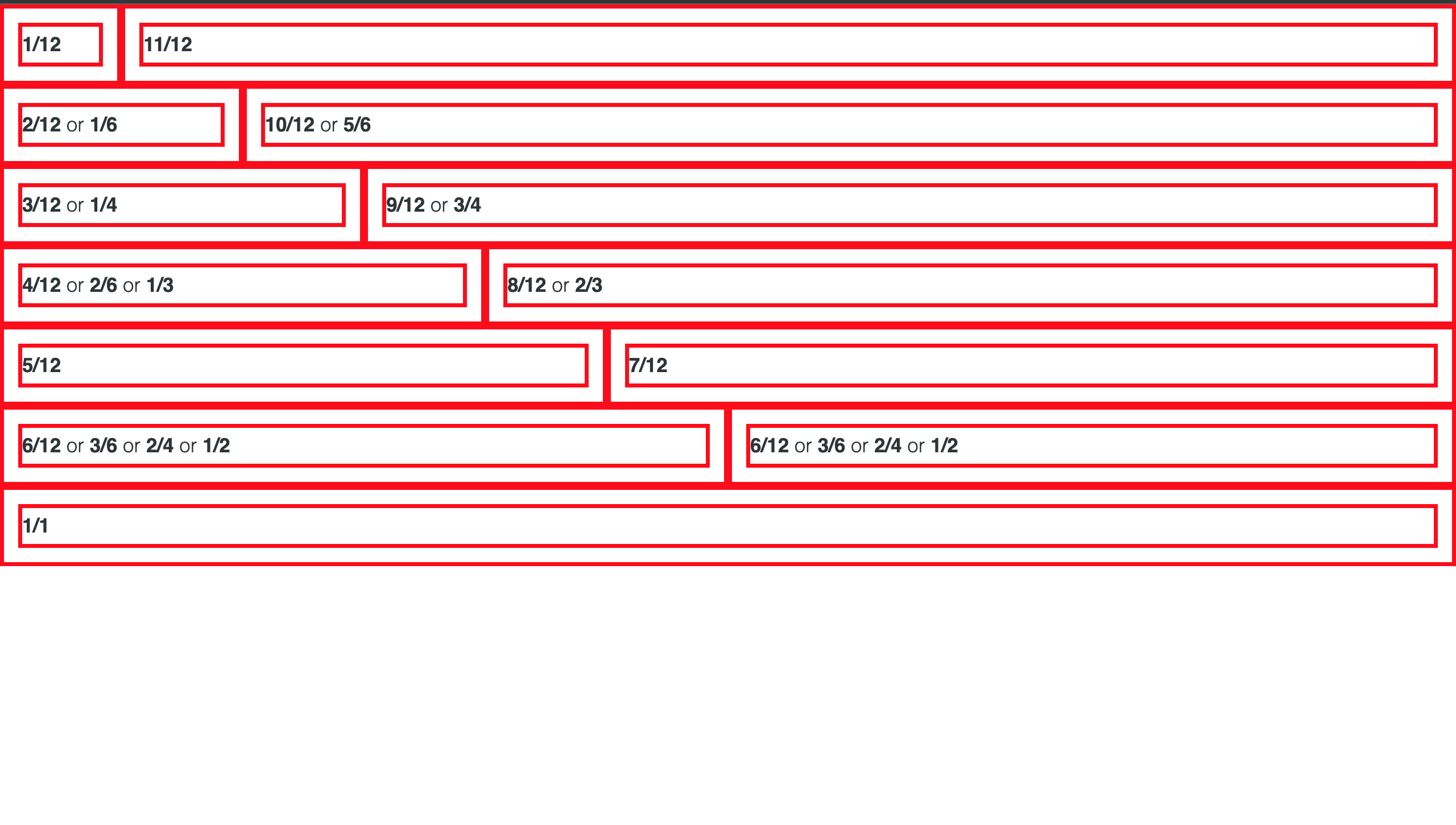
Using a grid system is very simple with BareCSS, as mentioned earlier in this section. You can practice what we’ve covered in this section or click here to learn more.
Building a React website with BareCSS
In this section, we’ll be building a beautiful portfolio website with BareCSS and utilizing all the components we’ve covered earlier in this article.
Below is an output of a finished portfolio website we’ll be building with BareCSS:
Please remember that the website is quite simple to integrate and that all you need to do is use BareCSS without writing any styles, which we’ll do in this article before building it.
The navigation bar must first be built; no additional styles or class names are required during this step. You can create fully customized components by using just the elements specified by BareCSS. Here’s an example of the navigation we made use of:
import "bare-css/css/bare.min.css";
const App = () => {
  return (
    <main>
      <header>
        <nav>
          <label>
            <header>
              <a>
                <img src="https://assets.codepen.io/4722128/internal/avatars/users/default.png?fit=crop&format=auto&height=512&version=1594276253&width=512" />{" "}
                HIRE ME!
              </a>
            </header>
            <ul>
              <li>
                <a href="index.html">Home</a>
              </li>
              <li>
                <a href="about.html">About</a>
              </li>
              <li>
                <a>Dropdown</a>
                <menu>
                  <div>
                    <a href="#">Item one</a>
                  </div>
                  <div>
                    <a href="#">Item two</a>
                  </div>
                </menu>
              </li>
            </ul>
          </label>
        </nav>
      </header>

      {/* Code section 1 */}
      {/* Code section 2 */}
      {/* footer */}
    </main>
  );
};
export default App;
Output:

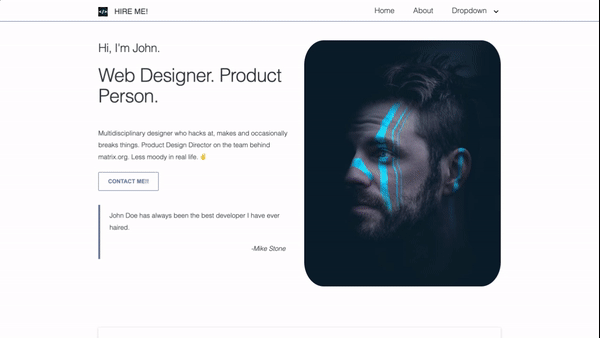
Now that we have the navigation set, let’s concentrate on building the most integrative component of the portfolio website. We’ll be using the BareCSS grid system to set the two-column layout of the website that contains the website owner details and the owner image. This section is cool since it concentrates and highlights the beauty of the web page to explain more about what the website does.
Example:
Code:
<section>
  <grid>
    <div fx="" col="6/12">
      <h3>Hi, I'm John.</h3>
      <h1>Web Designer. Product Person.</h1>
      <br />
      <p>
        Multidisciplinary designer who hacks at, makes and occasionally breaks
        things. Product Design Director on the team behind matrix.org. Less
        moody in real life. ✌️
      </p>
      <div>
        <button tt="i will respond immediately">Contact me!!</button>
      </div>
      <blockquote>
        <p>John Doe has always been the best developer I have ever haired.</p>
        <p txt="r">
          <i>-Mike Stone</i>
        </p>
      </blockquote>
    </div>
    <div fx="" col="6/12">
      <img
      src="https://images.unsplash.com/photo-1555952517-2e8e729e0b44?ixlib=rb-4.0.3&ixid=MnwxMjA3fDB8MHxwaG90by1wYWdlfHx8fGVufDB8fHx8&auto=format&fit=crop&w=764&q=80"
      style={{ borderRadius: "10%" }} />
    </div>
  </grid>
</section>
As you can see from the code above, no specific styles are being applied to it; to add this to our code, please paste it below the navigation header.
It’s time to develop something more distinctive and attractive by making a card list to explain more about what the owner of the portfolio does now that our website is beginning to take shape.
Example:
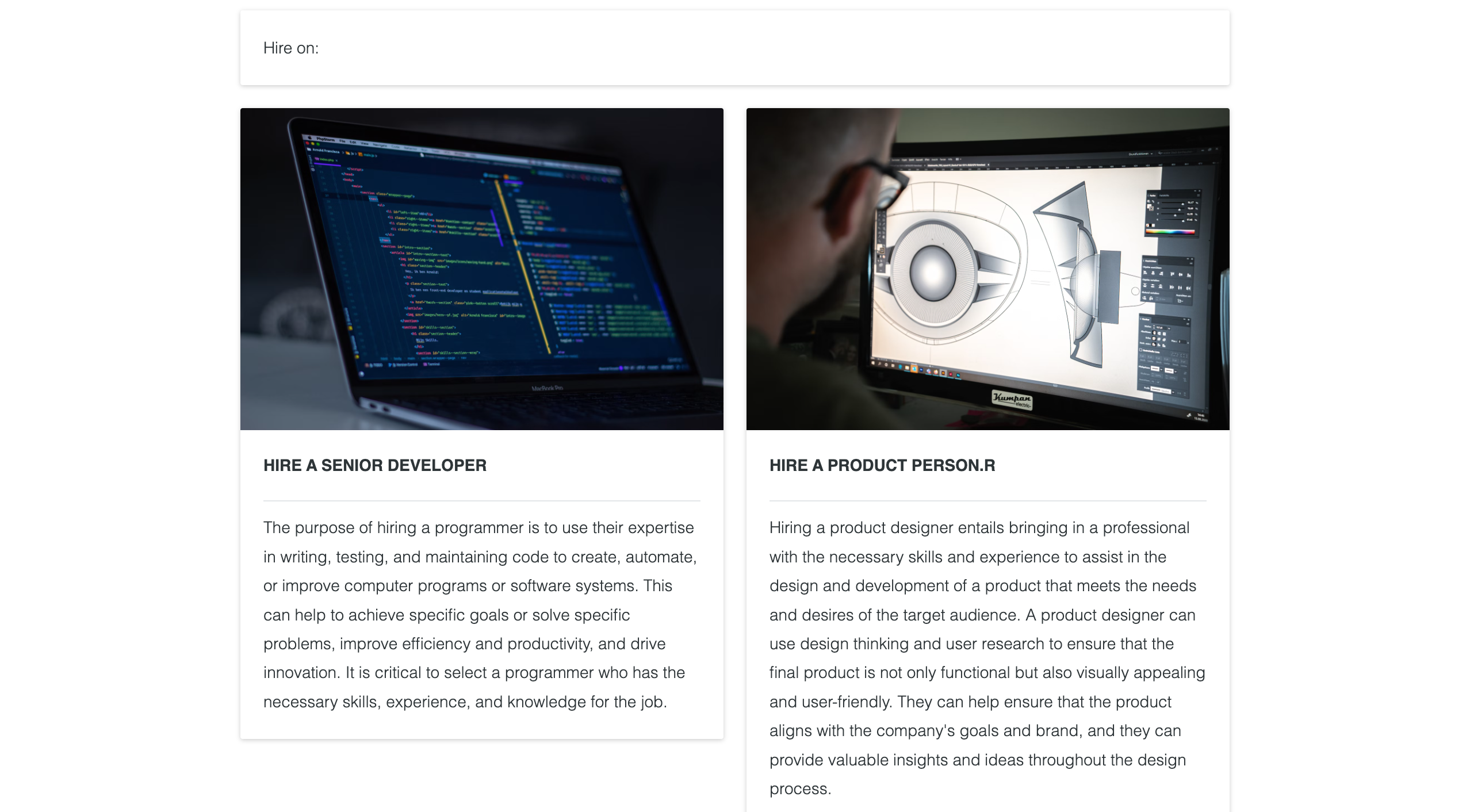
Code:
<section>
  <card>
    <p>Hire on:</p>
  </card>
  <grid>
    <div col="1/2">
      <card>
        <img
          src="https://images.unsplash.com/photo-1555066931-4365d14bab8c?ixlib=rb-4.0.3&ixid=MnwxMjA3fDB8MHxwaG90by1wYWdlfHx8fGVufDB8fHx8&auto=format&fit=crop&w=1740&q=80"
        />
        <h5>Hire a Senior Developer</h5>
        <hr />
        <p>
          The purpose of hiring a programmer is to use their expertise in
          writing, testing, and maintaining code to create, automate, or improve
          computer programs or software systems. This can help to achieve
          specific goals or solve specific problems, improve efficiency and
          productivity, and drive innovation. It is critical to select a
          programmer who has the necessary skills, experience, and knowledge for
          the job.
        </p>
      </card>
    </div>
    <div col="1/2">
      <card>
        <img
          src="https://images.unsplash.com/photo-1600869009498-8d429f88d4f5?ixlib=rb-4.0.3&ixid=MnwxMjA3fDB8MHxwaG90by1wYWdlfHx8fGVufDB8fHx8&auto=format&fit=crop&w=1740&q=80"
        />
        <h5>Hire a Product Person.r</h5>
        <hr />
        <p>
          Hiring a product designer entails bringing in a professional with the
          necessary skills and experience to assist in the design and
          development of a product that meets the needs and desires of the
          target audience. A product designer can use design thinking and user
          research to ensure that the final product is not only functional but
          also visually appealing and user-friendly. They can help ensure that
          the product aligns with the company's goals and brand, and they can
          provide valuable insights and ideas throughout the design process.
        </p>
      </card>
    </div>
  </grid>
</section>
The layouts for the card list are formed using a grid system, as seen from the code above. You may have also noted that we did not use styles or class names to build the cards; instead, BareCSS handles everything.
Now that Card is being used on our website, it’s time to use a table to create a calendar. This is just a basic calendar created with the help of table elements. We will not add any new external styles; BareCSS will handle the styling.
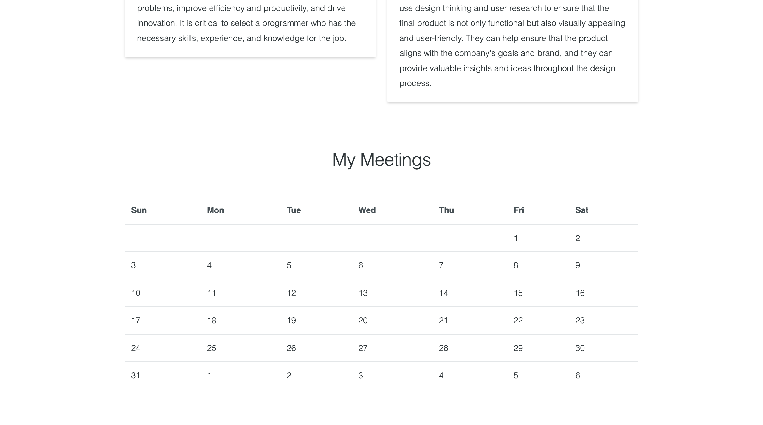
The code for the calendar can be found below:
<section>
  <h2 align="center">My Meetings</h2>
  <br />
  <table>
    <caption align="top"></caption>
    <thead>
      <tr>
        <th>Sun</th>
        <th>Mon</th>
        <th>Tue</th>
        <th>Wed</th>
        <th>Thu</th>
        <th>Fri</th>
        <th>Sat</th>
      </tr>
    </thead>
    <tbody>
      <tr>
        <td></td>
        <td></td>
        <td></td>
        <td></td>
        <td></td>
        <td>1</td>
        <td>2</td>
      </tr>
      <tr></tr>
      <tr>
        <td>3</td>
        <td>4</td>
        <td>5</td>
        <td>6</td>
        <td>7</td>
        <td>8</td>
        <td>9</td>
      </tr>
      <tr>
        <td>10</td>
        <td>11</td>
        <td>12</td>
        <td>13</td>
        <td>14</td>
        <td>15</td>
        <td>16</td>
      </tr>
      <tr>
        <td>17</td>
        <td>18</td>
        <td>19</td>
        <td>20</td>
        <td>21</td>
        <td>22</td>
        <td>23</td>
      </tr>
      <tr>
        <td>24</td>
        <td>25</td>
        <td>26</td>
        <td>27</td>
        <td>28</td>
        <td>29</td>
        <td>30</td>
      </tr>
      <tr>
        <td>31</td>
        <td>1</td>
        <td>2</td>
        <td>3</td>
        <td>4</td>
        <td>5</td>
        <td>6</td>
      </tr>
    </tbody>
  </table>
</section>
Finally, let’s design the footer. The footer is very simple to create and uses the grid system behind the scenes. Let’s get started:
<footer>
  <grid>
    <div col="1/2">
      <p>
        This site was made with ❤️{" "}
        <a att href="http://www.longsien.com" target="_blank"> by John Doe </a>
      </p>
    </div>
    <div col="1/2" txt="r">
      <a att href="https://github.com/longsien/BareCSS" target="_blank">
        <img style={{ width: "30px" }}
        src="https://assets.codepen.io/4722128/internal/avatars/users/default.png?fit=crop&format=auto&height=512&version=1594276253&width=512"
        />
      </a>
    </div>
  </grid>
</footer>
Output:

Conclusion
I hope you found this article to be interesting. In this article, we discussed BareCSS’s foundations and how to set it up and use it with React.js. Additionally, we use BareCSS to quickly construct a stunning Portfolio website without having to write a ton of CSS codes. I will encourage you to take another advanced project and integrate it with BareCSS if you want to advance further with it. What you’ve covered in BareCSS and other front-end frameworks can be easily integrated. kindly click on this link to understand more about BareCSS.
Gain Debugging Superpowers
Unleash the power of session replay to reproduce bugs and track user frustrations. Get complete visibility into your frontend with OpenReplay, the most advanced open-source session replay tool for developers.