When we talk about CSS, it feels really hard and too much of a hassle to learn. Some people even think CSS is not a programming language, so learning and understanding concepts will be easy. But ultimately, it’s not that easy to master; there are a lot of CSS fundamentals that you should know about.
I am going to explore some of the important parts of CSS that we use daily.
CSS syntax
CSS’s three essential parts are selectors, properties, and values.
- Selectors - the elements are being selected
- Properties - the elements that are being styled
- Values - the styles that are used
Example:
  selector {
     properties:value;
  }
CSS Selector
Here are the most important types of selectors:
- Universal Selector: it selects all the elements.
- Type Selector: it targets a particular elements by using HTML Tag.
- Class selector, Attribute Selector: you can target a particular elements by using class or attributes.
- ID selector: it lets you target element by using ID.
 * {
  /* Universal selector */
}

tag {
  /* Type selector of the HTML tag */
}

tag::before {
  /* Type selector */
}

.class {
  /* Class selector */
}

.class:hover {
  /* Class selector */
}

[attr] {
  /* Attribute selector */
}

#id {
  /* ID selector */
}
CSS Properties
Here is a list of all the CSS attributes that, in my opinion, are a must-know.
padding, margin, border
background
color, font-family, font-weight, font-size, line-height
width, height, max-width, max-height
Layouts
position, z-index, top, right, bottom, left
display, flex, align-items, justify-content
@media
Box Model
CSS displays everything as a box. So, one of the fundamental building blocks of CSS is understanding how the CSS Box Model functions.
Boxes behave differently based on their display value, predetermined size, and inside content. Additional boxes created by child components or simple text content might make up this content. In any case, the box size will be impacted by this content by default.
Use extrinsic sizing to control this, or use intrinsic sizing to continue letting the browser decide, depending on the size of the content.
Boxes are composed of separate box model sections, each performing a specialized function.
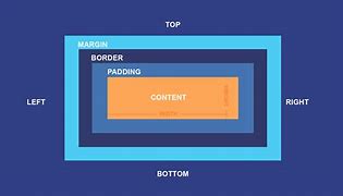
Here is the explanation for the box model.
- Content - The content of the box, where text and images appear
- Padding - Clears an area around the content. The padding is transparent
- Border - A border that goes around the padding and content
- Margin - Clears an area outside the border. The margin is transparent.
Flexbox
Flexbox is a layout tool created for arranging collections of things in a single dimension. Use this module to learn how to use it.
A sidebar positioned in line with certain content is a design element that might be challenging in responsive design. This pattern works well when there is room in the viewport, but when there is little room, the inflexible design can cause issues.
The Flexible Box Layout Model (flexbox) is a layout model for one-dimensional content. It excels at returning the optimal arrangement for a collection of things with varying sizes.
What is a flex layout good for?
- They can show up as either a row or a column.
- They respect the document’s style of writing.
- By default, they are single lines, but you can request that they wrap onto more than one line.
- The layout’s elements can have their visual order changed such that it differs from the DOM’s order.
- The space distribution allows the objects to change in size in accordance with the volume of their parent.
- Using the Box Alignment settings, space can be added around the elements and flex lines in a wrapped layout.
- On the cross-axis, the elements themselves can be oriented.
Flex Container Reference:
| Property | Values |
|---|---|
| flex-direction | row, column, row-reverse, column-reverse |
| flex-wrap | wrap, nowrap |
| align-items | flex-start, flex-end, center, stretch, baseline |
| justify-content | start, center, end, space-between, space-around, space-evenly |
Creating a Flex Container
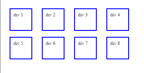
We already know that a bunch of default block elements will stack each other:
<section>
  <div>div 1</div>
  <div>div 2</div>
  <div>div 3</div>
  <div>div 4</div>
</section>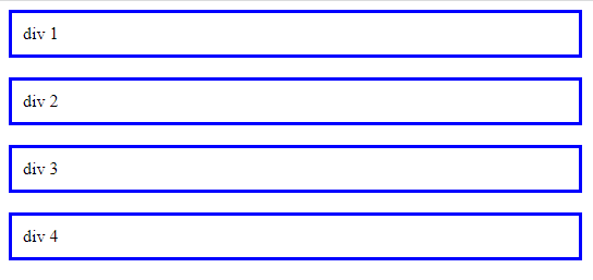
How can we make elements side-by-side? This can happen using a flex container.
<section class="flex-container">
  <div>div 1</div>
  <div>div 2</div>
  <div>div 3</div>
  <div>div 4</div>
</section>
.flex-container {
display: flex;
}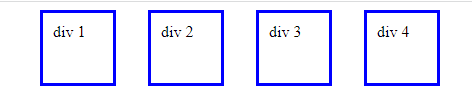
Here, you can see that the inner elements are aligned horizontally. A flex container is by default set to flex-direction:row. You can also update the inner elements in a column using flex-direction: column.
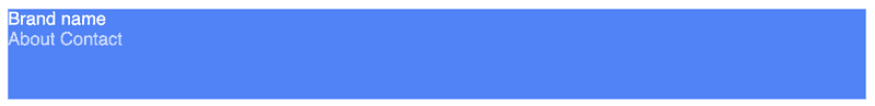
Let’s make an example to demonstrate flex. We are going to create a navigation bar.
Here is what the navigation bar will look like:
- Logo name to the left-hand side
- nav links to the right-hand side
- all items centered vertically
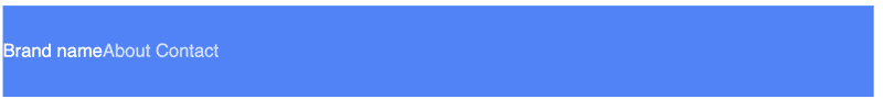
<nav>
  <div>Brand name</div>
  <div>
    <a href="#!">About</a>
    <a href="#!">Contact</a>
  </div>
</nav>
nav {
background: blue;
height: 80px;
}Here, is how the layout will look.
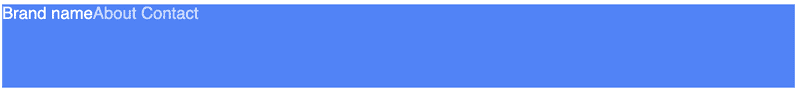
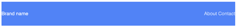
We’ll make the navbar flex, so the brand name and nav links will be horizontal.
nav {
  display: flex;
}
Now we want everything to be vertically aligned. With align-items: center, we can vertically align items within a flex container.
nav {
  display: flex;
  align-items: center;
}
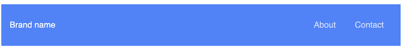
Now we want the brand and links to be on opposite ends of the navbar. With justify-content: space-between, we can tell the items in the flex container to be spaced apart as far as possible.
nav {
  display: flex;
  align-items: center;
  justify-content: space-between;
}
After that, just little padding and having a proper navbar with good spacing.
Session Replay for Developers
Uncover frustrations, understand bugs and fix slowdowns like never before with OpenReplay — an open-source session replay tool for developers. Self-host it in minutes, and have complete control over your customer data. Check our GitHub repo and join the thousands of developers in our community.
Grid
CSS Grid Layout provides a two-dimensional layout system, controlling the layout in rows and columns.
It’s crucial to comprehend the vocabulary before delving into the principles of Grid. Suppose you don’t initially memorize the definitions provided by the Grid specification for the terminology used in this context. In that case, it’s easy to confuse them with one another because they are all conceptually quite similar. But fear not—they are few.
-
Grid Container: The element on which
display: gridis applied. It’s the direct parent of all the grid items. In this example container is the grid container. -
Grid Item: The grid container’s children (i.e., direct descendants). Here the item elements are grid items, but sub-item isn’t.
-
Grid Line: The dividing lines that make up the structure of the grid. They can be either vertical (“column grid lines”) or horizontal (“row grid lines”) and reside on either side of a row or column. Here the yellow line is an example of a column grid line.
-
Grid Cell: The space between two adjacent rows and two adjacent column grid lines. It’s a single “unit” of the grid.
Creating Grid
A gallery frequently contains several cards or images that ought to be arranged in a repeating grid. The horizontal items in a flex container will always be horizontal by default.
<section class="flex-container">
  <div>div 1</div>
  <div>div 2</div>
  ...
</section>.flex-container {
display: flex;
}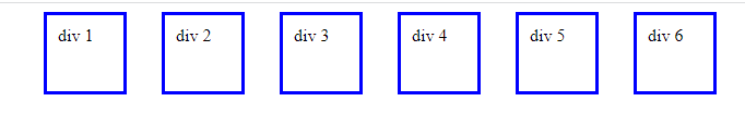
We can make the grid repeat onto as many lines as necessary with flex-wrap.
.flex-container {
  display: flex;
  flex-wrap: wrap;
}
Responsive: Media Queries
If you want to make your websites responsive, use media queries. It helps to adapt your websites to multiple screen sizes. With the help of media queries, you let CSS handle your screen size below a certain width or above certain width.
@media screen and (min-width: 800px) {
  /*  styles to any device screen sizes above 800px wide */
}

@media screen and (max-width: 800px) {
  /* styles to any device screen sizes below 800px wide */
}
If you’ve ever heard of the phrase “mobile-first,” it means constructing a website first for mobile devices and adding min-width media queries as needed as screen sizes increase.
@media screen and (min-width: 800px) {
  /*  styles go here */
}
Note: @media queries can be nested inside a selector. In this example, an h1 has a font size of 38px by default, but 22px on larger screen sizes.
h1 {
  font-size: 38px;

  @media screen and (min-width: 800px) {
    font-size: 22px;
  }
}
Example:
Media inquiries can help to include a breakpoint where specific design components will act differently on either side.
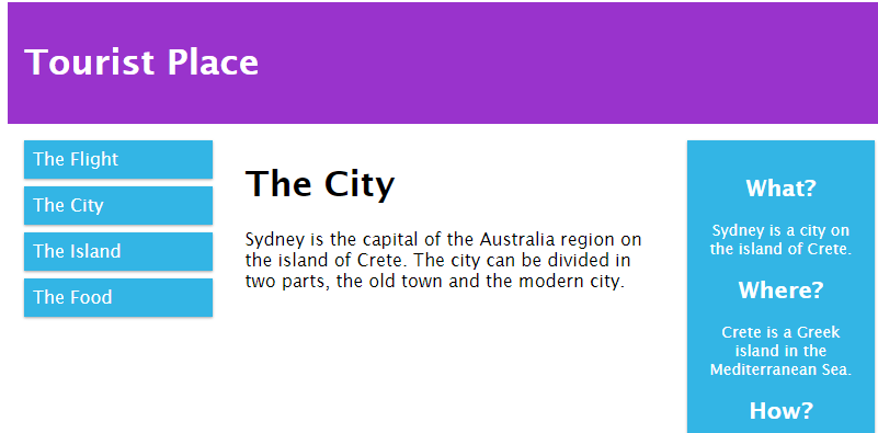
<!DOCTYPE html>
<html>
<head>
<meta name="viewport" content="width=device-width, initial-scale=1.0">
<style>
* {
box-sizing: border-box;
}
.row::after {
content:" ";
clear: both;
display: block;
}
[class*= "col-"] {
float: left;
padding: 15px;
}
html {
font-family: "Lucida Sans", sans-serif;
}
.header {
background-color: #9933cc;
color: #ffffff;
padding: 15px;
}
.menu ul {
list-style-type: none;
margin: 0;
padding: 0;
}
.menu li {
padding: 8px;
margin-bottom: 7px;
background-color: #33b5e5;
color: #ffffff;
box-shadow: 0 1px 3px rgba(0,0,0,0.12), 0 1px 2px rgba(0,0,0,0.24);
}
.menu li:hover {
background-color: #0099cc;
}
.aside {
background-color: #33b5e5;
padding: 15px;
color: #ffffff;
text-align: center;
font-size: 14px;
box-shadow: 0 1px 3px rgba(0,0,0,0.12), 0 1px 2px rgba(0,0,0,0.24);
}
.footer {
background-color: #0099cc;
color: #ffffff;
text-align: center;
font-size: 12px;
padding: 15px;
}
/* For desktop: */
.col-1 {width: 8.33%;}
.col-2 {width: 16.66%;}
.col-3 {width: 25%;}
.col-4 {width: 33.33%;}
.col-5 {width: 41.66%;}
.col-6 {width: 50%;}
.col-7 {width: 58.33%;}
.col-8 {width: 66.66%;}
.col-9 {width: 75%;}
.col-10 {width: 83.33%;}
.col-11 {width: 91.66%;}
.col-12 {width: 100%;}
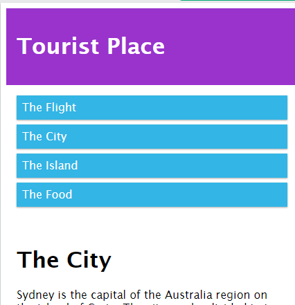
@media only screen and (max-width: 768px) {
/* For mobile phones: */
[class*= "col-"] {
width: 100%;
}
}
</style>
</head>
<body>
<div class="header">
<h1>Tourist Place</h1>
</div>
<div class="row">
<div class="col-3 menu">
<ul>
<li>The Flight</li>
<li>The City</li>
<li>The Island</li>
<li>The Food</li>
</ul>
</div>
<div class="col-6">
<h1>The City</h1>
<p>Sydney is the capital of the Australia region on the island of Crete. The city can be divided in two parts, the old town and the modern city.</p>
</div>
<div class="col-3 right">
<div class="aside">
<h2>What?</h2>
<p>Sydney is a city on the island of Crete.</p>
<h2>Where?</h2>
<p>Crete is a Greek island in the Mediterranean Sea.</p>
<h2>How?</h2>
<p>You can reach Sydney airport from all over Europe.</p>
</div>
</div>
</div>
<div class="footer">
<p>Resize the browser window to see how the content respond to the resizing.</p>
</div>
</body>
</html>-
Desktop Mode
-
Mobile Mode
Conclusion
Read the theory of CSS first to understand what it is, how it functions in browsers, and the fundamental syntax and usage. Getting a fundamental understanding will lead you to understand any library easily. I have attempted to keep this in mind to understand CSS foundations better. I think this will be very helpful to you.
A TIP FROM THE EDITOR: Consider using A Top Collection Of CSS Code Generators for quick, simple coding!
Gain Debugging Superpowers
Unleash the power of session replay to reproduce bugs and track user frustrations. Get complete visibility into your frontend with OpenReplay, the most advanced open-source session replay tool for developers.