

Discover how at OpenReplay.com.
CSS (Cascading Style Sheets) is a powerful tool that allows web developers to enhance their websites’ visual appeal and interactivity. One of the most exciting features of CSS is its capacity to transform elements in both two-dimensional (2D) and three-dimensional (3D) space, bringing life and interactivity to web applications. This article will explain how to use those transforms to enhance your website.
2D and 3D transforms enable developers to alter the elements’ position, size, rotation, and perspective, creating engaging user experiences. In this guide, we will explore the basics of 2D and 3D CSS transforms and provide examples to help you understand how to use them effectively.
What is a 2D CSS Transform?
CSS transforms in 2D space enable you to modify the position and shape of an element within the two-dimensional plane.
To apply a 2D CSS transform to an element, you must use the transform property in your CSS code. The transform property receives a variety of transformation functions that can be merged to achieve different effects.
Some of the most commonly used 2D transformation functions are:
translate(), rotate(), scale(), skew().
translate()
The translate() CSS function allows you to move an element in horizontal (X) and vertical (Y) directions without affecting the layout of other elements on the page. It allows you to change an element’s position relative to its original position.
You can use a single-axis translation like translate(X) or a combined-axis translation like translate(X, Y).
Here’s an example that moves an element 70 pixels to the right and 30 pixels down:
.element {
 transform: translate(70px, 30px);
}
Negative values can also be used in the translate() method to move the element in the opposite direction. For example, to move an element 70 pixels to the left and 30 pixels up, you can use the following CSS:
.element {
 transform: translate(-70px, -30px);
}
Negative translations are useful when you want to offset an element in a specific direction or align it precisely within a layout.
translate() is particularly useful for creating a 2D animation, sliding elements into view, or implementing drag-and-drop functionality. The values can be specified in pixels (px), percentages (%), or other CSS length units.
This function can also be written as translateX() for horizontal translation and translateY() for vertical translation.
Note: translate(10px) is equivalent to translateX(10px) and translate(10px, 0)
Practical Example
Here’s a practical example to demonstrate its use:
HTML
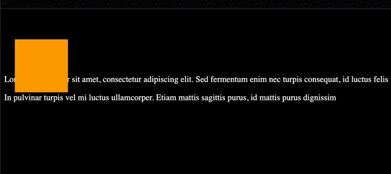
<div class="box"></div>
<p>Lorem ipsum dolor sit amet, consectetur adipiscing elit. Sed fermentum enim nec turpis consequat, id luctus felis vestibulum. Nullam ultricies metus in fermentum scelerisque.</>

<p>In pulvinar turpis vel mi luctus ullamcorper. Etiam mattis sagittis purus, id mattis purus dignissim </>
CSS
.box {
 height: 100px;
 width: 100px;
 background-color: orange;
 animation: shimmy 3s infinite;
 animation-direction: alternate;
}
body {
 background-color: black;
 color: white;
}
@keyframes shimmy {
 0% {
   transform: translate(0, 0);
 }
 100% {
   transform: translate(20px, 50px);
 }
}
We make use of Keyframes to animate the translation.
Output:
rotate()
The rotate()method allows you to revolve an element around a fixed point on the 2D plane without deforming it. It takes a single parameter representing the rotation angle in degrees. Positive values rotate the element clockwise, while negative values rotate it counterclockwise.
Example:
.element {
 transform: rotate(45deg);
}
Practical Example
HTML
<div class="featured">
</div>
<div class="featured">
</div>
<div class="featured">
</div>
CSS
.featured {
 display: inline-block;
 background-color: red;
 height: 100px;
 width: 100px;
 margin-right: 5px;
 margin-left: 5px;
 animation: roll 3s infinite;
 transform: rotate(30deg);
 opacity: 0.7;
}
@keyframes roll {
 0% {
   transform: rotate(0);
 }
 100% {
   transform: rotate(360deg);
 }
}
body,
html {
 height: 100%;
}
body {
 display: flex;
 background-color: black;
 align-items: center;
 justify-content: center;
}
Output:

scale()
scale() resizes an element on the 2D plane. It takes two values: scale(x, y), where x represents the horizontal scaling factor, and y represents the vertical scaling factor.
You can opt to Scale both the X and Y dimensions together using transform: scale(0.1), which is also the same as scaleX(0.1) scaleY(0.1).
Therefore you can choose to Scale X and Y dimensions separately while translating the origin:
For example:
HTML
<div>Normal div</div>
<div class="scaled">Scaled div</div>
CSS
div {
 width: 50px;
 height: 50px;
 background-color: blue;
}
.scaled {
 transform: scale(0.7); /* Equal to scaleX(0.7) scaleY(0.7) */
 background-color: red;
}
Output:

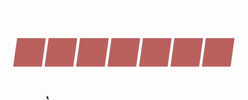
skew()
This property changes the size of an element along the X and Y axes on a 2D plane. It takes two values, representing the angles of skew in degrees. A positive angle skews the element to the right, while a negative angle skews it to the left.
For example, transform: skew(10deg, -5deg) will skew the element by 10 degrees to the right and 5 degrees to the left.
skewX() and skewY() tilt an element to the left and right, respectively. This is just like turning a rectangle into a parallelogram.
Note: skew() is a shorthand which combines skewX() and skewY() by accepting both values.
HTML
<div class="box">
</div>
<div class="box">
</div>
<div class="ebox">
</div>
<div class="box">
</div>
<div class="box">
</div>
<div class="box">
</div>
<div class="box">
</div>
CSS
.box {
 display: inline-block;
 background-color: brown;
 height: 100px;
 width: 100px;
 font-size: 1px;
 padding: 1px;
 color: white;
 margin-right: 5px;
 margin-left: 5px;
 animation: skew 3s infinite;
 transform: skew(20deg);
 animation-direction: alternate;
 opacity: .7;
}

@keyframes skew {
 0% {
   transform: skewX(20deg);
 }
 100% {
   transform: skewX(-20deg);
 }
}
body, html {
 height: 100%;
}
body {
 display: flex;
 align-items: center;
 justify-content: center;
}
Output:
What is a 3D CSS Transform?
CSS transforms in 3D space take the capabilities of 2D transforms further, allowing you to manipulate elements in three-dimensional space.
Just like in the case of 2D transforms, we also need to make use of the transform() property.
Some CSS properties used for 3D transformations:
perspective: Specifies the perspective from which 3D elements are viewed. transform-origin: Enables the adjustment of the position of transformed elements. perspective-origin: Determines the bottom position of 3D elements. transform-style: defines the rendering style of nested elements in 3D space.
Here are some methods used for 3D CSS transformations:
translate3d(): allows you to move an element along the x, y, and z axes. It takes three values: translate3d(x, y, z), where x, y, and z represent the translations along the respective axes.
Example:
transform: translate3d(100px, -20px, 50px);rotateX()
The rotateX() method spins a 3D object around the x-axis (Horizontal) by the specified angle without deforming it.
The angle parameter represents the amount of rotation in radians (or degrees).
Positive angles rotate the object clockwise when viewed from the positive y-axis.
Negative angles rotate the object in an anti-clockwise direction when viewed from the positive y-axis.
rotateY()
The rotateY() method spins an object around the y-axis by the specified angle.
Similar to rotateX(), the angle parameter represents the amount of rotation in radians or degrees.
Positive angles rotate the object clockwise when viewed from the positive x-axis.
Negative angles rotate the object anti-clockwise when viewed from the positive x-axis.
Both rotateX() and rotateY() are often used in combination with other 2D transform methods, such as translation (translate()), scaling (scale()), etc., to achieve complex transformations and animations in 3D transformations.
Examples:
transform: rotateX((10px, 50px));
transform: rotateY((15px, 60px));
rotate3d()
It enables you to rotate an element in three-dimensional space. It takes four values: rotate3d(x, y, z, angle), where x, y, and z represent the rotation axis, and angle represents the 3D rotation angle in degrees.
Example:
transform: rotate3d(1, 0, 0, 45deg);scale3d()
It allows you to resize an element in three dimensions. It takes three values: scale3d(x, y, z), where x, y, and z represent the scaling factors along the respective axes.
Example:
transform: scale3d(1.2, 1, 0.5);perspective()
Defines the perspective from which an element is viewed in 3D space. It takes a length value that determines the distance between the viewer and the element.
Example:
transform: perspective(500px);Combining 2D and 3D Transforms
Fusing 2D and 3D transforms can be done by applying both transformations to an object or element in a specific order. The order of the transformations is important because it affects the final result.
To combine these transformations, you can use the CSS transform property.
Here’s an example of how to combine 2D and 3D transforms:
HTML
<div class="container">
   <div class="child"></div>
</div>
CSS
.container {
 perspective: 1000px;
}

.child {
 transform: translateX(100px) rotateY(45deg) translateZ(200px);
}
In the above example, we first translate the element along the X-axis by 100 pixels (translateX(100px)). Then, we apply a 2D rotation around the Y-axis by 45 degrees (rotateY(45deg)). Finally, we translate the element along the Z-axis in 3D space by 200 pixels (translateZ(200px)).
For 3D transforms to work, you need to enable the perspective by using the perspective property on a parent element. This sets the perspective for the 3D transformations within the container element.
You can combine multiple transforms by separating them with spaces within the transform property. The transformations will be applied in the order specified.
Check browser compatibility for specific transform functions and features, as support may vary across browsers and versions.
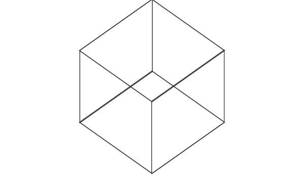
Practical example of 3D Transform
HTML
 <div class="cube">
   <div class="body left"></div>
   <div class="body right"></div>
   <div class="body top"></div>
   <div class="body bottom"></div>
  </div>
CSS
.cube{
width: 200px;
height: 200px;
margin-left: 300px;
margin-top: 120px;
position: relative;
transform-style: preserve-3d;
transition-property: all;
transition-duration: 2s;
transition-timing-function: linear;
}
.cube:hover{
translate: 50px 25px 75px;
transform-style: preserve-3d;
transform: rotate(360deg);
}
.body {
position: absolute;
width: 200px;
height: 200px;
border: 2px solid #333;
display: flex;
justify-content: center;
align-items: center;
font-size: 20px;
}
.front {
transform: translateZ(100px);
}
.back {
transform: translateZ(-100px) rotateY(180deg);
}
.left {
transform: translateX(-100px) rotateY(-90deg);
}
.right {
transform: translateX(100px) rotateY(90deg);
}
.top {
transform: translateY(-100px) rotateX(90deg);
}
.bottom {
transform: translateY(100px) rotateX(-90deg);
}
Result
Comparing 2D & 3D transforms
- 2D is less dynamic as it tends to display objects only on two axes.
- 2D presently has reduced demand because of the increased demand for 3D.
- 2D is time-consuming because it’s challenging to animate plane frame projections to create a full animation.
- 2D is faster and easier to produce due to the advancement of the software used in production.
- 3D gives more flexibility because it can view objects in X, Y, and Z axes.
- 3D gives a more photo-realistic view because of advanced technology.
- Due to the rise in demand for 3D animations, it has become popular in the industry and across many platforms.
- 3D production involves more elements than
2D, which makes it more complicated.
Advantage of using 2D & 3D in CSS
- 2D & 3D helps increase user experience and easy navigation of the website.
- 2D & 3D helps in the detailed modeling of digital products and visualization of all external properties.
- 3D transformations are universally supported across modern browsers, allowing you to create compactable 3D effects across different platforms.
- Merging 2D and 3D transforms in web development can create visually stunning and interactive websites that provide an appealing user experience.
In conclusion, 2D & 3D transforms in CSS have transformed how we design and interact with web content. These powerful tools allow developers to manipulate and animate elements in seemingly impossible ways. The introduction of transforms has opened up a new world for creating engaging user experiences, enhancing visually appealing content, and improving website performance.
Gain control over your UX
See how users are using your site as if you were sitting next to them, learn and iterate faster with OpenReplay — the open-source session replay tool for developers. Self-host it in minutes, and have complete control over your customer data.
Star on GitHub12k