A switcher or toggler is a user interface element that can be included in a website to enable users to choose from options. For example, in an application, a user can toggle between a dark or light theme or enable or disable a feature. In this article, you’ll learn how to create an animated switcher using Angular, how it works, and how to use it in your application.

Discover how at OpenReplay.com.
Let’s look briefly at the importance of having a switcher or toggler in your application.
- Modifications: With switchers, we can customize how we want certain features in our application to play out. For example, with switchers, we can select or toggle between languages, change background or color schemes like dark or light themes, and so much more.
- Live Updates: Like the word live updates, switchers allow users to see the changes they make when using switchers or togglers in real time. For example, in an application that implements dark and light mode features, users can see in real time what happens to the application when they toggle between the dark and light mode features.
- Accessibility: Using switchers in an application can give users with diverse needs smooth interactions with some features. For example, a user with high sensitivity to bright colors can use a switcher to select a darker color instead. Another example will be a user switching to their preferred language instead of the default application’s language. This makes a diverse range of options accessible to users.
Getting Started
We’ll go through a practical example of using a switcher in an application. This will be how you can use a switcher to customize an element’s colors or display in an application.
But before we start with the project, let’s start with setting up our project, which is very important as it helps us install all the necessary packages we need for the project and build a good project structure.
If you don’t already have Angular CLI installed on your system, use the code below:
# do this
npm install -g @angular/cli

# then this
Set-ExecutionPolicy -Scope CurrentUser -ExecutionPolicy RemoteSigned
This installs the latest version of Angular, which we currently use for this project.
Next, we create a new Angular app using the code below in your terminal:
ng new switcherThen, we create a switcher component in a switcher folder with the code below:
ng g c switcher/switcher Now that we have set up our project structure let’s go ahead and create our color-themed animated switcher.
Creating our Switcher Structure
In this section, we’ll go through practical steps in creating our color-themed animated switcher.
In your switcher.component.html file, enter the following code:
<div class="">
  <section class="p-4 switcher-container" (click)="toggleSwitcherState()">
    <article
      class="switcher-circle-Container"
      [style.border]="switcherState ? '1px solid red' : '1px solid black'"
    >
      <div
        class="switcher-circle"
        [style.left]="switcherState ? 'calc(100px / 1.3)' : '1px'"
        [style.backgroundColor]="switcherState ? 'red' : 'black'"
      ></div>
    </article>

    <section class="text-center text-capitalise mt-2">
      <p>Switch Status: {{ switcherState }}</p>
    </section>
  </section>
</div>
The code above contains the structure of our switcher, has conditional styling, and shows the status of our switcher.
In your switcher.component.ts file, add the following code:
import { Component } from "@angular/core";
import { CommonModule } from "@angular/common";

@Component({
  selector: "app-switcher",
  standalone: true,
  imports: [CommonModule],
  templateUrl: "./switcher.component.html",
  styleUrl: "./switcher.component.css",
})
export class SwitcherComponent {
  switcherState: boolean = false;

  toggleSwitcherState() {
    this.switcherState = !this.switcherState;
    console.log(this.switcherState);
  }
}
Code breakdown:
- We initialized
switcherState, which represents the state of our switcher, giving it a boolean data type and assigning a false value to it as its default value. - We defined a
toggleSwitcherStatefunction that changes the state ofswitcherStatewhenever it’s called. - When the
toggleSwitcherStateis called, the switcher component’s background color, position, and border styles are changed based on the state of theSwitcherStatevariable.
In your switcher.component.css, add the following code:
*,
::after,
::before {
  box-sizing: border-box;
}
.switcher-container {
  background-color: whitesmoke;
  margin: 50px auto;
  width: fit-content;
  height: 100px;
  text-align: center;
  box-shadow:
    inset 0 0 -2em 2em rgba(0, 0, 0, 0.2),
    0 0 0 1px rgb(255, 258, 260),
    0.4em 0.4em 2em rgba(0, 0, 0.1, 0.4);
}
.switcher-circle-Container {
  border: 1px solid black;
  position: relative;
  border-radius: 12px;
  color: black;
  left: 12px;
  height: calc(100px / 4);
  width: 100px;
  cursor: pointer;
}

.switcher-circle-Container .switcher-circle {
  background-color: black;
  border-radius: 50%;
  position: absolute;
  --size: calc(100px / 4 - 4px);
  width: var(--size);
  height: var(--size);
  top: 1px;
  left: 1px;
}
This is what our output looks like on the browser:
Animating our Switcher
To add a smooth experience to our switcher when it’s toggled, let’s animate it. We’ll use CSS transition animation to add animation to the switcher.
Update your switcher.component.css file with the code below.
.switcher-circle-Container .switcher-circle {
  /* add this code */
  transition: all 700ms cubic-bezier(0.175, 0.89, 0.35, 1.27);
}
Here is what our animated switcher looks like on the browser:
Using our Animated Switcher in an Application
In this section, we’ll look at how we will use the animated switcher we created in an existing application.
Here is what the existing application looks like without a switcher:
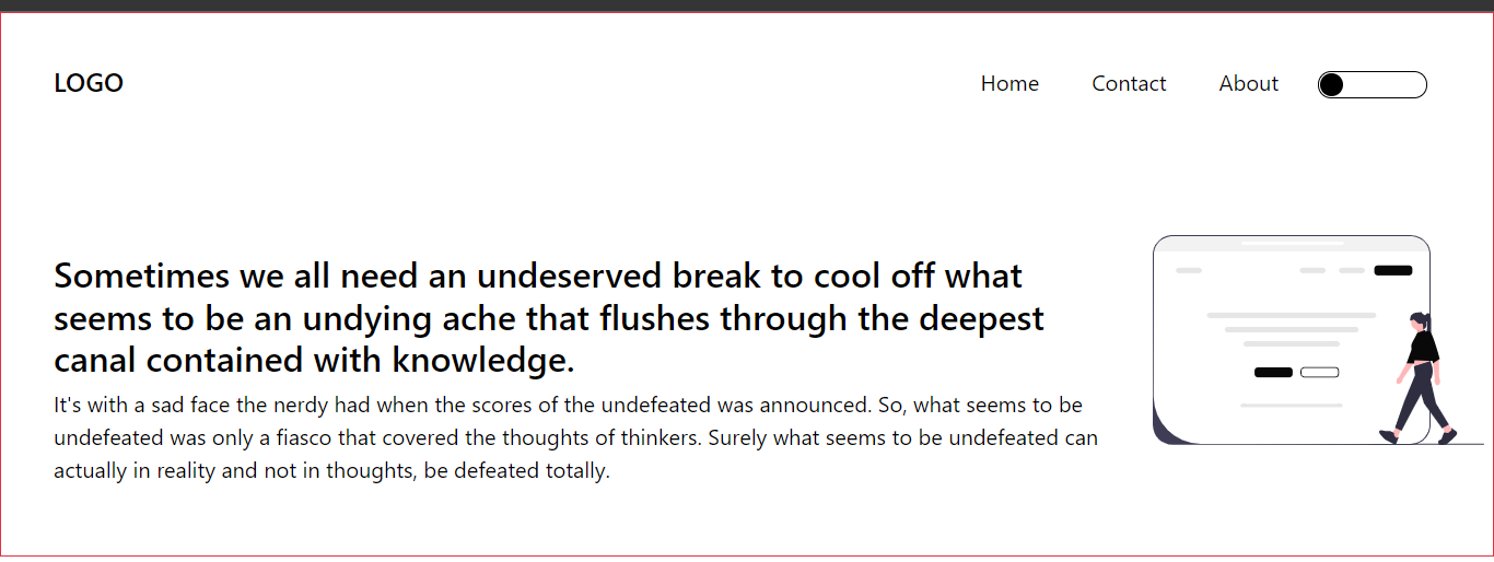
You’ll notice how the background color is just white. We’ll add our animated switcher component to this home page so that when users toggle, it affects the display of the image and background color.
Update your switcher.component.ts with the following code:
import { Component, Output, EventEmitter } from "@angular/core"; // imported Output and EventEmitter decorators
import { CommonModule } from "@angular/common";

@Component({
  selector: "app-switcher",
  standalone: true,
  imports: [CommonModule],
  templateUrl: "./switcher.component.html",
  styleUrl: "./switcher.component.css",
})
export class SwitcherComponent {
  switcherState: boolean = false;
  @Output() sendSwitcherState = new EventEmitter<boolean>(); // added this

  toggleSwitcherState() {
    this.switcherState = !this.switcherState;
    console.log(this.switcherState);
    this.sendSwitcherState.emit(this.switcherState); // added this
  }
}
We made use of the Output() decorator to send or emit the value contained in sendSwitcherState to AppComponent, which is the parent component of SwitcherComponent.
In your app.component.html, add this code below:
<section class="p-5 border border-danger fs-5">
  <header class="d-flex justify-content-between">
    <div>
      <h4>LOGO</h4>
    </div>
    <div class="d-flex nav justify-content-between g-4">
      <p>Home</p>
      <p>Contact</p>

      <p>About</p>
      <div class="switcher">
        <app-switcher
          (sendSwitcherState)="handleSwitcherChange($event)"
        ></app-switcher>
      </div>
    </div>
  </header>
  <main class="mt-4 d-flex justify-content-between">
    <div class="mt-3">
      <h2>
        Sometimes, we all need an undeserved break to cool off what seems to be
        an undying ache that flushes through the deepest canal contained with
        knowledge.
      </h2>
      <p>
        It's with a sad face the nerdy had when the scores of the undefeated was
        announced. So, what seems to be undefeated was only a fiasco that
        covered the thoughts of thinkers. Surely what seems to be undefeated can
        actually in reality and not in thoughts, be defeated totally.
      </p>
    </div>
    <div class="illustration">
      <img class="w-100" src="../assets/undraw1.svg" alt="" />
    </div>
  </main>
</section>
The above code represents the structure of our home page. When sendSwitcherState gets emitted by the app-switcher selector, it calls the handleSwitcherChange method in AppComponent and emits switcherState from SwitcherComponent to $event.
Now, in your app.component.ts, add this code below:
import { Component } from "@angular/core";
import { CommonModule } from "@angular/common";
import { RouterOutlet } from "@angular/router";
import { SwitcherComponent } from "./switcher/switcher/switcher.component";

@Component({
  selector: "app-root",
  standalone: true,
  imports: [CommonModule, RouterOutlet, SwitcherComponent],
  templateUrl: "./app.component.html",
  styleUrl: "./app.component.css",
})
export class AppComponent {
  receivedSwitcherState: boolean = false;

  handleSwitcherChange(state: boolean) {
    this.receivedSwitcherState = state;
  }
}
We declared the receivedSwitcherState variable as a boolean and defined the handleSwitcherChange method, in which we assigned the value in the state parameter to receivedSwitcherState.
So, this now means that the value contained in the receivedSwitcherState variable equals the value contained in the switcherState variable from SwitcherComponent.
Now that we have succeeded in getting the SwitcherComponent and the value of switcherState from SwitcherComponent in AppComponent, we’ll go ahead and use the switcher to change the background color, text color, and image on the home page depending on the state of receivedSwitcherState.
Update your app.component.html with the following code:
<section
  class="p-5 border border-danger fs-5"
  [style.backgroundColor]="receivedSwitcherState ? 'rgb(63, 61, 86)' : 'white'"
  [style.color]="receivedSwitcherState ? 'white' : 'black'"
>
  <header class="d-flex justify-content-between">
    <div>
      <h4>LOGO</h4>
    </div>
    <div class="d-flex nav justify-content-between g-4">
      <p>Home</p>
      <p>Contact</p>

      <p>About</p>
      <div class="switcher">
        <app-switcher
          (sendSwitcherState)="handleSwitcherChange($event)"
        ></app-switcher>
      </div>
    </div>
  </header>
  <main class="mt-4 d-flex justify-content-between">
    <div class="mt-3">
      <h2>
        Sometimes we all need an undeserved break to cool off what seems to be
        an undying ache that flushes through the deepest canal contained with
        knowledge.
      </h2>
      <p>
        It's with a sad face the nerdy had when the scores of the undefeated was
        announced. So, what seems to be undefeated was only a fiasco that
        covered the thoughts of thinkers. Surely what seems to be undefeated can
        actually in reality and not in thoughts, be defeated totally.
      </p>
    </div>
    <div class="illustration">
      @if (receivedSwitcherState) {
      <img class="w-100" src="../assets/undraw.svg" alt="" />
      } @if (!receivedSwitcherState) {
      <img class="w-100" src="../assets/undraw1.svg" alt="" />
      }
    </div>
  </main>
</section>
In the code above, we use conditional styling to display a particular background color, text color, or image depending on the value of receivedSwitcherState.
The illustration below shows how our home page now looks and works:
Conclusion
We’ve been able to successfully show how a switcher or toggler can be created, make it more visually appealing by adding CSS transitions to make it animated, and then show how we can use it in an application to change its text color, background color, and image depending on its state.
I’ll implore you to explore other ways a switcher can be used in an application, as its uses are endless.
Truly understand users experience
See every user interaction, feel every frustration and track all hesitations with OpenReplay — the open-source digital experience platform. It can be self-hosted in minutes, giving you complete control over your customer data.
Star on GitHub12k