

Adding animations and transitions to websites has been a lot of work, but this article will show you how to easily achieve those tasks with Tailwind CSS.
Creating animations and transitions in Vanilla CSS has always been fun, but what’s even more fun is creating animations and transitions in the Tailwind CSS framework. Developers have reacted positively to its creation as a Front end tool, making it a very sought-after tool in modern web development. Similarly, you would agree there’s very little chance of avoiding animations in your project, especially with the trend of complex visual designs by UI/UX designers. This makes it important for Front End developers to get acquainted with these tools and use them with the best practices. The major catch of Tailwind CSS is that you can make animations right from your inline styling without creating a separate style file as you would in Vanilla CSS. Isn’t that amazing?
Adding Tailwind CSS to Your Project
Tailwind CSS supports a very wide range of Front End frameworks and build tools like React, Next.js, Vue, GatsbyJS, Nuxt.js, Remix, and many others. Let’s see how we would add it using the popular frameworks.
In the course of this tutorial, we will not be using any framework, so provided you have Node js installed in your computer, you add it following these steps :
- Open your terminal and run the install command
npm install -D tailwindcss postcss autoprefixer
npx tailwindcss init- Open your
tailwind.config.jsfile and configure your template paths, this is to show what files we want our Tailwind CSS plugin to have an effect on. In this, we are includinghtmlandjs, if we you are using a framework like React JS, you would include thejsxpath orvuepath for a framework like Vue.js
module.exports = {
 content: ["./src/**/*.{html,js}"],
 theme: {
   extend: {},
 },
 plugins: [],
}- Next, add the Tailwind directives to your CSS file
@tailwind base;
@tailwind components;
@tailwind utilities;- Finally, run the build command for Tailwind CSS
npx tailwindcss -i ./src/input.css -o ./dist/output.css --watchAnd we’re all set! We can now include the link in the <head> tag in our index.html file and start using it.
If you’re using React or Next.js as a framework, the major difference in the setup is configuring our template paths. For React, we configure our template path like this :
module.exports = {
 content: [
   "./app/**/*.{js,ts,jsx,tsx,mdx}",
   "./pages/**/*.{js,ts,jsx,tsx,mdx}",
   "./components/**/*.{js,ts,jsx,tsx,mdx}",

   // Or if using `src` directory:
   "./src/**/*.{js,ts,jsx,tsx,mdx}",
 ],
 theme: {
   extend: {},
 },
 plugins: [],
}
For Vue.js and Nuxt.js, we configure our template path like this :
module.exports = {
 content: [
   "./components/**/*.{js,vue,ts}",
   "./layouts/**/*.vue",
   "./pages/**/*.vue",
   "./plugins/**/*.{js,ts}",
   "./nuxt.config.{js,ts}",
 ],
 theme: {
   extend: {},
 },
plugins: []NB: I recommend you use build tools like Vite, Parcel, Next or Remix in scaffolding a React Application because the Create React App build directive does not support PostCSS configuration and other PostCSS commands.
In the Tailwind CSS documentation, you can check out how to install it in other frameworks not mentioned here.
Overview of Animation and Transition in CSS
In creating a basic animation sequence, we go to our CSS file and put in all the properties we want to apply while using the @keyframes rule. For example, if we want to animate a color change, we do this:
div {
 width: 75px;
 height: 75px;
 background-color: red;
 animation-name: colorChange;
 animation-duration: 4s;
}

@keyframes example {
 from {
   background-color: blue;
 }
 to {
   background-color: green;
 }
}
Here, we specify the name of our CSS animation using the animation-name property and the duration using the animation-duration property, and we specify the sequence using the @keyframes rule. The above code snippet changes our div background color from blue to green, and the process takes 4 seconds.
Likewise, for CSS transitions, suppose we want to create a basic transition of a div element to expand by 200px on hover; we do this:
div {
 width: 200px;
 height: 200px;
 background: green;
 transition:
   width 3s,
   height 5s;
}

div:hover {
 width: 400px;
 height: 400px;
}
In this code snippet, our div increases in width and height from 200px to 400px when hovered upon.
Now that we have had a brief overview of how we would add animations and transitions to our CSS file, let’s get started using Tailwind CSS!
Animations in Tailwind CSS
Unlike CSS, Tailwind CSS has some built-in animation classes that would save you the stress of explicitly defining the values of a particular animation property. It follows the syntax of animate-{property}, where the property specifies how we want our element to be animated. Compared to Vanilla CSS, that’s quite straightforward, isn’t it?
The logic behind its utility classes is that all that lengthy CSS code has been written for you. For example, suppose we add a property like animate-spin to our element. This is what we would have written with vanilla CSS.
animation: spin 1s linear infinite;

@keyframes spin {
 from {
   transform: rotate(0deg);
 }
 to {
   transform: rotate(360deg);
 }
}
Doing all this with a single line of code is the major benefit of using Tailwind CSS.
The animate utility class
All built-in animation classes in Tailwind CSS use the animate class. Tailwind provides a bulk of animation sequences to choose from, some of which we will discuss in this section.
The animate-none property
The animate-none property adds no animation to an element. You might ask, “Isn’t this the default state?” that’s a valid question. This property becomes useful when we do not want the animation from a parent element to apply to the child element. Consider the block of code below:
<div class="animate-bounce">
   <div>
     <h3>Animation here</h3>
   </div>

   <div class="animation-none">
     <h3>No Animation here</h3>
   </div>
 </div>
In this code snippet, the animation-spin property applies to the first div but not the second div with the animation-none property.
Here’s how the output looks:
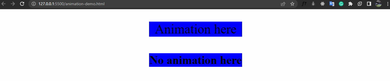
The top div named “Animation here” title has a soft bounce effect to it, while the bottom div named “No Animation here” does not move, even though they belong to the same parent. We do this using the animate-none property.
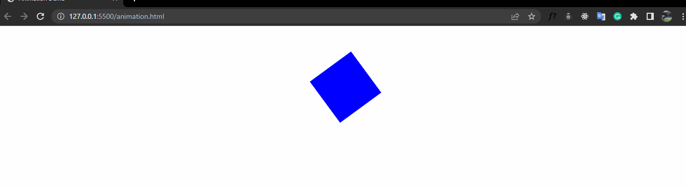
The animate-spin property
The animate-spin provides a spin effect on an element. It can be used in place of or alongside the “loading…” text which indicates a particular action on the web is still loading. The code snippet is shown below:
<div class="bg-blue">
 <svg class="animate-spin h-10 h-10 m-auto" viewBox="0 0 24 24">
   <!-- ... -->
 </svg>
</div>
Here’s the output of the above code snippet:
Just to show how much time we’re saving by using Tailwind CSS, this would be the output if it is written with Vanilla CSS :
  svg {
       display: block;
       background-color: blue;
       animation: spin 1s linear infinite;
       margin: 70px auto;
       width: 40px;
       height: 40px;
     }
     @keyframes spin {
       from {
         transform: rotate(0deg);
       }
       to {
         transform: rotate(360deg);
       }
     }
Quite lengthy, isn’t it? Creating animations with Tailwind CSS is faster and more efficient than Vanilla CSS. Let’s see the other animation CSS properties.
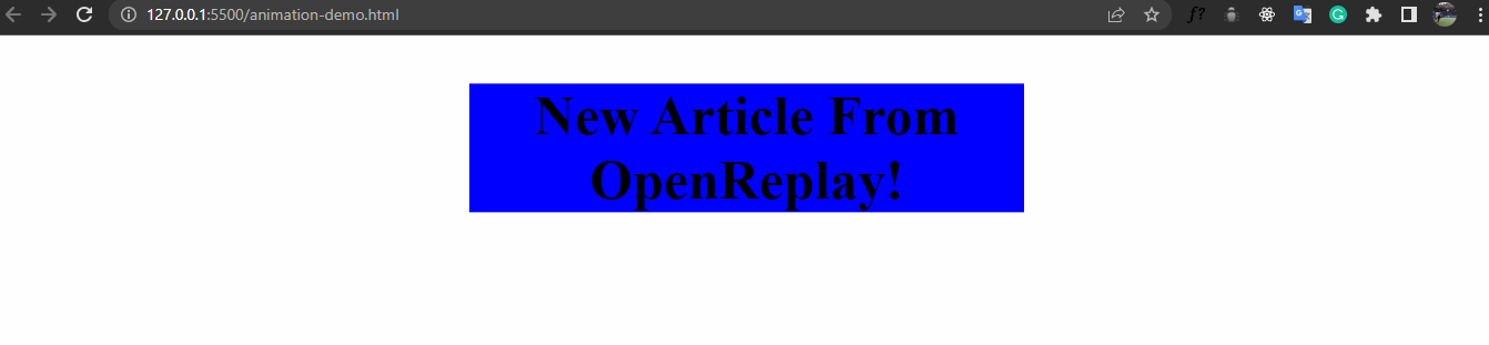
The animate-ping property
The animate-ping property creates a blinking effect element, often used as a notification badge. It gives a “ping” effect as if to say you have a new message notification. Here’s how it’s used :
 <h3 class="animate-ping m-auto bg-blue text-center">
   New Article From OpenReplay
 </h3>
The output looks like this :
Here’s the CSS equivalent :
.ping {
margin: 50px auto;
background-color: blue;
width: 300px;
font-size: 25px;
animation: ping 2s cubic-bezier(0, 0, 0.2, 1) infinite;
text-align: center;
}
@keyframes ping {
90%,
100% {
transform: scale(2);
opacity: 0;
}
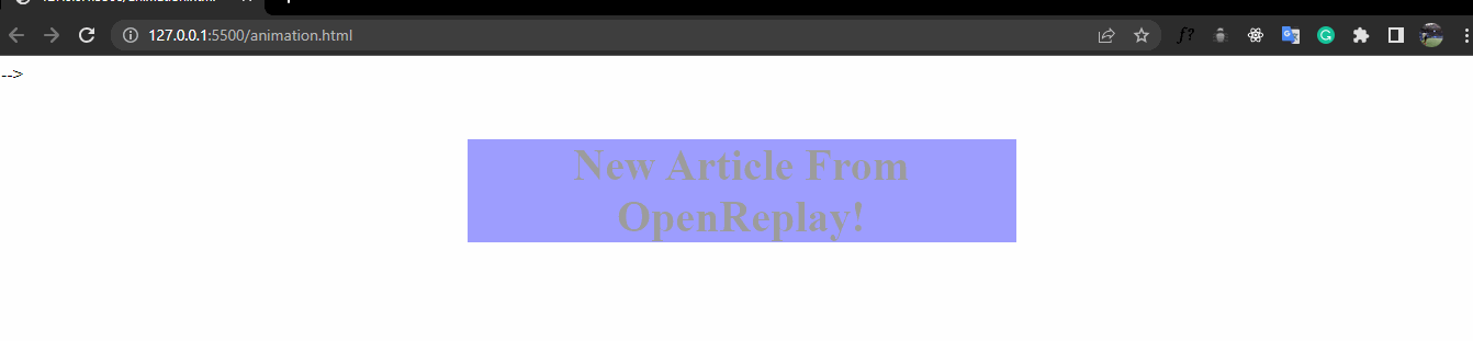
}The animate-pulse property
The animate-pulse property is used in creating a fade-in fade-out effect. Let’s see how this is used. Compared to the animate-ping property, this gives a more gentle effect.
 <h3 class="animate-pulse m-auto bg-blue text-center">
     New Article From OpenReplay
   </h3>
Here’s how the output looks :
The CSS equivalent is shown below:
 .pulse {
       margin: 50px auto;
       background-color: blue;
       width: 300px;
       font-size: 25px;
       animation: pulse 2s cubic-bezier(0.4, 0, 0.6, 1) infinite;
       text-align: center;
     }
     @keyframes pulse {
       0%,
       100% {
         opacity: 1;
       }
       50% {
         opacity: 0.5;
       }
     }
The animate-bounce property
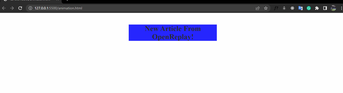
The animate-bounce property gives an up-and-down movement. It is often used in calling the user’s attention to a particular part of the webpage or in giving directions.
 <h3 class="animate-bounce m-auto bg-blue text-center">
   New Article From OpenReplay
 </h3>
The output looks like this:
The CSS equivalent is shown below :
.bounce {
       margin: 50px auto;
       background-color: blue;
       width: 300px;
       font-size: 50px;
       animation: bounce 1s infinite;
       text-align: center;
     }
     @keyframes bounce {
       0%,
       100% {
         transform: translateY(-25%);
         animation-timing-function: cubic-bezier(0.8, 0, 1, 1);
       }
       50% {
         transform: translateY(0);
         animation-timing-function: cubic-bezier(0, 0, 0.2, 1);
       }
     }
We have discussed how we would create animations in Tailwind CSS using the animate-spin, animate-ping, animate-pulse, and animate-bounce utility classes. In a bit, we will discuss how to create our custom CSS classes, but before then, let’s see how we would create transitions in Tailwind CSS.
Session Replay for Developers
Uncover frustrations, understand bugs and fix slowdowns like never before with OpenReplay — an open-source session replay tool for developers. Self-host it in minutes, and have complete control over your customer data. Check our GitHub repo and join the thousands of developers in our community.
Transitions in Tailwind CSS
Like animation, transitions follow the transition-{property} syntax for implementation in Tailwind CSS, where the property represents the transition sequence we want the element to follow. The logic behind this is also similar to the animation property, and Tailwind CSS allows us to convert lines of CSS code into a single line of code.
The transition property
All built-in transitions are done using the transition property, and all the CSS transition values that might be explicitly defined in Vanilla CSS are written using the transition property. It is often used with the :hover pseudo-class.
To efficiently use transitions in Tailwind CSS, three properties must be well understood; the transition duration, the transition timing function, and the transition delay. Let’s see what this is all about:
-
The Transition Duration specifies the total time we want a particular transition class to use. Tailwind CSS uses the
duration-{value}syntax, wherevaluerepresents the amount of time in milliseconds. Suppose a transition class has a value ofduration-100; it means that a particular transition class will run for 100 milliseconds. -
The Transition Timing Function specifies how our elements undergo their transition. Does our transition move at the same pace all through the duration? Does it start slow and then finish in a fast manner? Or does it start fast and finishes slowly? All these are determined using the transition timing function. Suppose an element has a timing function of
ease-in; it means it starts slow and finishes fast. Similarly,ease-outmeans it starts fast but finishes slowly. -
The Transition Delay specifies the start time of our transitions. We can decide not to start our transition sequence immediately, or we can wait a while before the effect kicks in, which is done using the transition delay. It follows the
delay-{value}syntax, where the value specifies the delay time in milliseconds. Suppose a transition class has a value ofdelay-100; it means the transition effect is delayed for 100 milliseconds.
Utilizing Pseudo-classes Variants for Transitions
The use of pseudo-classes is an integral part of implementing transitions. For instance, we might want our transition to take effect when we hover over an element or focus on an input bar. We use the pseudo-class:{value} syntax in Tailwind CSS. For example, to show a background color of red when an element is hovered on, we use the hover:bg-red line of code.
Enough talking! Let’s see a practical example showing all the transition properties and the use of pseudo-classes, as discussed.
 <h3
   class="transition ease-in delay-1000 duration-1000 bg-blue w-[300px] hover:bg-green hover:text-white hover:w-[500px] "
 >
   Hover on me!
 </h3>
In this code snippet, we have a transition timing function of ease-in, a duration of 1s, and a delay of 1s. When it is hovered upon, we have our width set to 500px, text to white, and background color to green.
The output gives this:
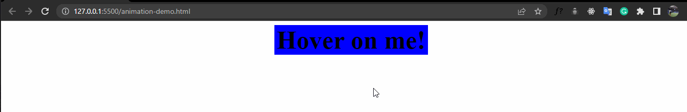
We see that when we hover over it, the transition delays by 1s before it begins and also delays by 1s before returning to its normal state. We notice the transition process is a bit slower, and this is because we set the duration to 1s(the default transition duration value is 0s). Also, our element increases from 200px to 500px, the background color changes from blue to green, and the text color changes from black to white in the transition process.
Creating Custom Animations and Transitions
There’s always a chance you may not want to use Tailwind CSS utility classes; that’s no problem because you can create your custom class using your defined values! How do we do this? Before we get into that, let’s define two key components :
-
The
@keyframesdirective : This is used to specify the animation code. We use it to explicitly define how we want our element to behave. It is often measured in percent, where 0% represents the start of the animation and 100% represents the end. At 0%, we specify the events we want to happen on our element; at 100%, we also specify the events we want. A basic understanding of the@keyframesdirective is important in making custom animations in Tailwind CSS. We’ll see how that works in a bit! -
The
@applydirective : The@applydirective is used to write custom CSS code in our Tailwind CSS. It is also useful to avoid inline repetition in our code. So, when you want to use your own CSS values to add events to your animation, the@applydirective comes in handy. Let’s see how this works.
Creating Custom Animations
To make custom animations,
- Head to your
tailwind.config.jsfile and add your custom animation. Suppose we want to add a utility class that moves sideways; we proceed like this:
module.exports = {
 theme: {
   extend: {
     animation: {
       sideways: "sideways 3s linear infinite",
     },
   },
 },
};- Configure your
@keyframesvalue.
module.exports = {
 theme: {
   extend: {
     keyframes: {
       sideways: {
         "0%, 100%": { left: "0", top: "0" },
         "50%": { left: "100px", top: "0" },
       },
     },
   },
 },
};
- Finally, reference the custom
@keyframesvalue you have created.
module.exports = {
 theme: {
   extend: {
     animation: {
       sideways: "sideways 1s linear infinite",
     },
   },
 },
};
And that’s set! In any instance in your code where you use the animate-sideways property in your code, the element moves sideways.
Creating Custom Transitions
Tailwind CSS only provides a few transition utility classes for adding transitions. However, it gives the flexibility of adding your properties. Suppose we want to add height and spacing; we can do this by extending the values of the transitionProperty in our tailwind.config.file as shown below.
module.exports = {
 theme: {
   extend: {
     animation: {
       sideways: "sideways 1s linear infinite",
     },
   },
 },
}
And we’re set. We can now use the transition-height and transition-spacing property that isn’t among the Tailwind CSS utility classes.
Aiming for Performance and Optimization
As much fun using animations can be, it is important to use them in a very moderate manner to get the best out of them. Here are some tips to help you create high performant animations and transitions:
- Ensure cross-browser compatibility of the properties you are using.
- One animation per element is enough; too many animation classes slow down the browser.
- In instances where you want to use more than one animation, create a custom animation.
- Ensure every instance of animations is necessary; this helps in the satisfaction of users of your site.
Best Practices
To have the best experience in using animation and transitions in Tailwind CSS, consider these practices:
- Arrange your classes according to their functions; for example,
widthandheightshould come after each other. This practice helps in debugging. - Use the
@applydirective when you notice a repetition of utility classes across many elements. - Remove unused utility classes; this contributes to the build size of the file.
Conclusion
In this article, you have learned how to create basic animations and transitions in Tailwind CSS, how to create custom animations and transitions, utilizing pseudo-classes in transitions and the use of @keyframes and @apply directives, but it doesn’t end here. There are still loads of fun things to do. You can check out Tailwind’s documentation here for more cool stuff! Thanks for reading.
Gain Debugging Superpowers
Unleash the power of session replay to reproduce bugs and track user frustrations. Get complete visibility into your frontend with OpenReplay, the most advanced open-source session replay tool for developers.