Better Form Validation in React with Formik
Add the flexibility of Formik for easier form validation in your React app


Forms are integral to how users interact with our websites and web applications. Validating the data the user passes into the form is essential to our jobs as web developers. Formik is a free and open-source, lightweight form library for React. Formik is created for Scalability and High Performance: a form tool with minimal API that allows developers to build form fields with less code.
Formik is a flexible form library. It allows you to decide when and how much you want to use it. We can control how much functionality of the Formik library we use. Sure it can be used with HTML input fields and custom validations with yup. It was developed by Jared Palmer while working on a form field for his project, searching to standardize the input components and flow of form submission. The idea was to keep things organized and in a single place. Formik addresses three key points:
- Getting values in and out of form state
- Validation and error messages
- Handling form submission
We will consider all these points while building a sample React application — and as a bonus we’ll see an example of validations done with the Yup library.
Introduction
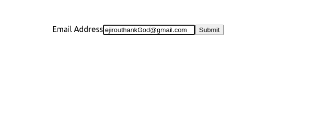
Before we learn how to use Formik, let’s have a little introduction and see how Formik works with a simple newsletter form. Imagine we want to add a newsletter sign-up form for a blog. To start with, our form will have just one field named email. With Formik, this is just a few lines of code.
import React from 'react';
import { useFormik } from 'formik';

const SignupForm = () => {
  // Pass the useFormik() hook initial form values and a submit function that will
  // be called when the form is submitted
  const formik = useFormik({
    initialValues: {
      email: '',
    },
    onSubmit: values => {
      alert(JSON.stringify(values, null, 2));
    },
  });
  return (
    <form onSubmit={formik.handleSubmit}>
      <label htmlFor="email">Email Address</label>
      <input
        id="email"
        name="email"
        type="email"
        onChange={formik.handleChange}
        value={formik.values.email}
      />

      <button type="submit">Submit</button>
    </form>
  );
};
We pass our form’s initialValues and a submission function (onSubmit) to the useFormik() hook. The hook returns to us a goodie bag of form state and helper methods in a variable we call formik. For now, the only helper methods we care about are as follows:
handleSubmit: A submission handlerhandleChange: A change handler to pass to each<input>,<select>, or<textarea>values: Our form’s current values
As you can see above, we pass each of these to their respective props… and that’s it! We can now have a working form powered by Formik. Instead of managing our form’s values on our own and writing our custom event handlers for every single input, we can just useFormik().
Advantages of Formik
What are the advantages of using Formik?
- Scalability: Formik is a good fit for a complete solution, including validation and handling form submission; we can also keep form state localized and managed by Formik, which is suitable for building multi-step forms.
- Size: Size has been one of the most significant advantages of Formik; with its minified gzipped size of 12.7kB, Formik still has the capacity of archiving form state with minimal APIs.
- Complementary Packages: Formik extends its capabilities by allowing complementary packages to come into play. One can integrate Yup with Formik for validation, or while using Redux State Management, you can also implement Formik for your form state (which is not possible when it comes to Redux form).
Also, let’s compare Formik with other top-rated form tools in React concerning their Performance, Development Experience, Components, Boilerplate, Popularity Contest, and more.
- Integrations: A form library like Redux Form doesn’t allow integrations, unlike Formik/React Hook Form. Formik and React Hook Form can integrate with any 3rd party app (especially Yup and Redux) for validations, and you can also use HTML5 inputs with Formik for the form field.
- Boilerplate: Boilerplate is something developers don’t want to get caught up with. Form tool libraries such as Redux Form/Final Form are faced with these issues, imagine you have to use a form tool like Final Form, and the whole place is covered with boilerplate; I guess that’s not an excellent way to start a form. On the other hand, Formik and React Hook Form constitute less boilerplate on your codes.
- Popularity Contest: For the popularity contest, we will draw up a table with all the above form libraries and compare them according to their Github stars/Forks/Weekly Download/Size.
| Name | Github Stars | Fork | Weekly Downloads | Size |
|---|---|---|---|---|
| Formik | 30.4k | 2.5k | 2,043,080 | 580 kB |
| React Hook Form | 28.3k | 1.4k | 1,983,501 | 783 kB |
| Redux Form | 12.6k | 1.7k | 404,429 | 1.45 MB |
| Final Form | 2.8k | 210 | 478,508 | 191 kB |
With the data we have above, it seems Formik is leading the race with over 30k Github stars and, most importantly, 2M+ weekly downloads, a massive win for Formik. Formik is an excellent tool to work with, although the rest of the libraries also have good features.
Build Sign Up Page With Formik And Yup Validation
To fully understand this tutorial, please ensure that you’re familiar with React and have the latest version of Node and npm installed.
Let’s start by creating our project. Head to your terminal and run the following command;
npx create-react-app formik-form Also, for us to be able to use Formik as our form tool, we need to install its dependencies with the following command;
cd formik-form
npm install formik --save
npm install yup --save
npm start
We will build sign-in and sign-up forms to show how to use Formik, and add Yup for validations.
Creating a sign-up component
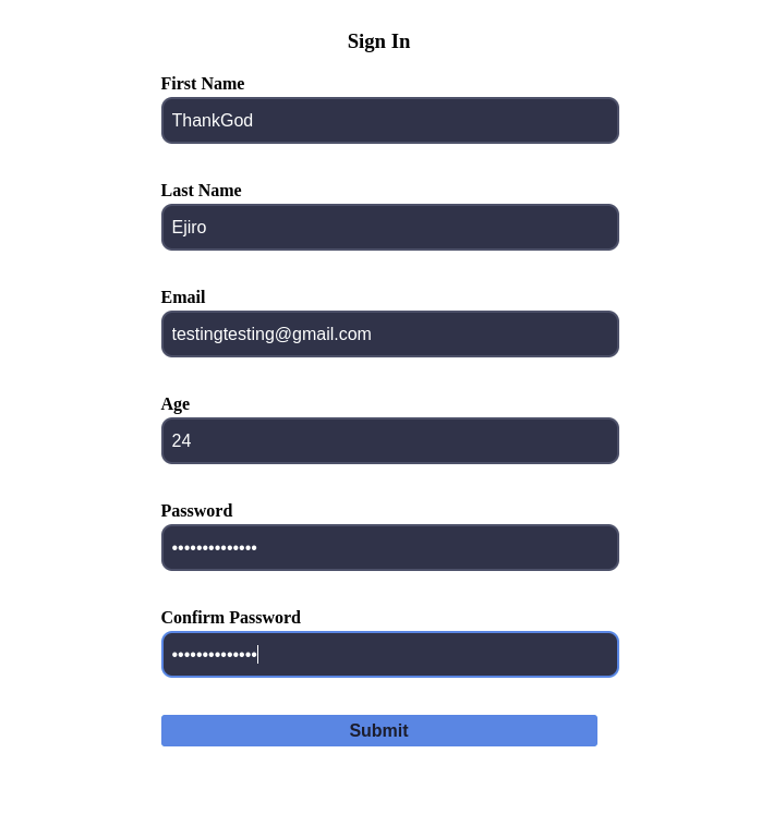
We will build a Signup component to accept Firstname, Email, and Password.
import { useFormik } from "formik";
import { basicSchema } from "../schema";
const onSubmit = async (values, actions) => {
  console.log(values);
  console.log(actions);
  await new Promise((resolve) => setTimeout(resolve, 1000));
  actions.resetForm();
};
const SignUp = () => {
  const {
    values,
    errors,
    touched,
    isSubmitting,
    handleBlur,
    handleChange,
    handleSubmit,
  } = useFormik({
    initialValues: {
      firstname: "",
      lastname: "",
      email: "",
      age: "",
      password: "",
      confirmPassword: "",
    },
    validationSchema: basicSchema,
    onSubmit,
  });
  console.log(errors);
  return (
    <form onSubmit={handleSubmit} autoComplete="off">
        <label htmlFor="firstname">First Name</label>
      <input
        value={values.firstname}
        onChange={handleChange}
        id="firstname"
        type="firstname"
        placeholder="Enter First Name"
        onBlur={handleBlur}
        className={errors.firstname && touched.firstname ? "input-error" : ""}
      />
      {errors.firstname && touched.firstname && <p className="error">{errors.firstname}</p>}
      <label htmlFor="lastname">Last Name</label>
      <input
        value={values.lastname}
        onChange={handleChange}
        id="lastname"
        type="lastname"
        placeholder="Enter Last Name"
        onBlur={handleBlur}
        // className={errors.email && touched.email ? "input-error" : ""}
      />
      {errors.lastname && touched.lastname && <p className="error">{errors.lastname}</p>}
      <label htmlFor="email">Email</label>
      <input
        value={values.email}
        onChange={handleChange}
        id="email"
        type="email"
        placeholder="Enter your email"
        onBlur={handleBlur}
        className={errors.email && touched.email ? "input-error" : ""}
      />
      {errors.email && touched.email && <p className="error">{errors.email}</p>}
      <label htmlFor="age">Age</label>
      <input
        id="age"
        type="number"
        placeholder="Enter your age"
        value={values.age}
        onChange={handleChange}
        onBlur={handleBlur}
        className={errors.age && touched.age ? "input-error" : ""}
      />
      {errors.age && touched.age && <p className="error">{errors.age}</p>}
      <label htmlFor="password">Password</label>
      <input
        id="password"
        type="password"
        placeholder="Enter your password"
        value={values.password}
        onChange={handleChange}
        onBlur={handleBlur}
        className={errors.password && touched.password ? "input-error" : ""}
      />
      {errors.password && touched.password && (
        <p className="error">{errors.password}</p>
      )}
      <label htmlFor="confirmPassword">Confirm Password</label>
      <input
        id="confirmPassword"
        type="password"
        placeholder="Confirm password"
        value={values.confirmPassword}
        onChange={handleChange}
        onBlur={handleBlur}
        className={
          errors.confirmPassword && touched.confirmPassword ? "input-error" : ""
        }
      />
      {errors.confirmPassword && touched.confirmPassword && (
        <p className="error">{errors.confirmPassword}</p>
      )}
      <button disabled={isSubmitting} type="submit">
        Submit
      </button>
    </form>
  );
};
export default SignUp;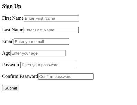
This form includes first and last name, email, age, password, and password confirmation fields.
Custom Input component
In CustomInput, we’ll use useField, a custom React hook that will enable one to hook up with inputs to formik.
import { useField } from "formik";
const CustomInput = ({ label, ...props }) => {
  const [field, meta] = useField(props);
  return (
    <>
      <label>{label}</label>
      <input
        {...field}
        {...props}
        className={meta.touched && meta.error ? "input-error" : ""}
      />
      {meta.touched && meta.error && <div className="error">{meta.error}</div>}
    </>
  );
};
export default CustomInput;
In CustomInput, useField() returns [formik.getFieldProps(), formik.getFieldMeta()] which we can spread on <input>. We can use field meta to show an error message if the field is invalid and it has been touched (i.e. visited). We also created such components for our CustomCheckbox and CustomSelect. The purpose is to make the component reusable in other parts of our code.
Sign-in component
Create a Sign In Component to accept Emails and Passwords and a Checkbox for confirmation.
import { Form, Formik } from "formik";
import { advancedSchema } from "../schema";
import CustomCheckbox from "./CustomCheckbox";
import CustomInput from "./CustomInput";
const onSubmit = async (values, actions) => {
  await new Promise((resolve) => setTimeout(resolve, 1000));
  actions.resetForm();
};
const SignIn = () => {
  return (
    <Formik
      initialValues={{ username: "", password: "", jobType: "", acceptedTos: false }}
      validationSchema={advancedSchema}
      onSubmit={onSubmit}
    >
      {({ isSubmitting }) => (
        <Form>
          <CustomInput
            label="Username"
            name="username"
            type="text"
            placeholder="Enter Username"
          />
            <CustomInput
            label="Password"
            name="password"
            type="text"
            placeholder="Enter Password "
          />
          <CustomCheckbox type="checkbox" name="acceptedTos" />
          <button disabled={isSubmitting} type="submit">
            Submit
          </button>
        </Form>
      )}
    </Formik>
  );
};
export default SignIn;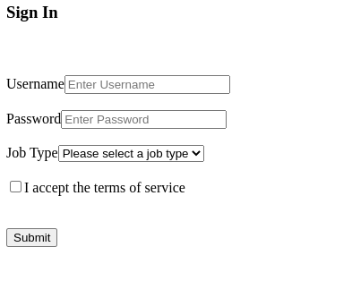
Open Source Session Replay
OpenReplay is an open-source, session replay suite that lets you see what users do on your web app, helping you troubleshoot issues faster. OpenReplay is self-hosted for full control over your data.

Start enjoying your debugging experience - start using OpenReplay for free.
Implementing Layout
Although we can use any UI libraries such as Bootstrap, Material UI, or Chakra UI here, we’ll create a CSS file to make things a little bit easier.
.App {
  text-align: center;
  padding: 5rem 1rem;
}
.error {
  color: #fc8181;
  font-size: 0.75rem;
  text-align: left;
  margin-top: 0.25rem;

nav {
  display: flex;
  justify-content: center;
  align-items: center;
  margin-bottom: 2rem;
}
nav h3 {
  margin: 1rem;
  cursor: pointer;
  color: #718096;
}
nav h3:hover {
  color: white;
}
form {
  width: 95%;
  max-width: 400px;
  margin: 0 auto;
}
form label {
  font-size: 1rem;
  font-weight: bold;
  display: block;
  text-align: left;
  margin: 1rem 0 0.2rem;
}
input,
select {
  width: 100%;
  padding: 0.65rem 0.5rem;
  font-size: 1rem;
  color: white;
  border: 2px solid #4a5568;
  background-color: #2d3748;
  border-radius: 10px;
  outline: none;
}
input:focus,
select:focus {
  border-color: #4299e1;
}
input::placeholder,
select::placeholder {
  color: #a0aec0;
}
input[type="checkbox"] {
  width: fit-content;
  margin-right: 0.5rem;
  transform: scale(1.25);
}
button {
  display: block;
  margin: 1rem 0;
  padding: 0.35rem 0.5rem;
  background-color: #4299e1;
  color: #1a202c;
  border: none;
  border-radius: 3px;
  width: 100%;
  font-size: 1rem;
  font-weight: bold;
  cursor: pointer;
}
input.input-error,
select.input-error {
  border-color: #fc8181;
}
button:disabled {
  opacity: 0.35;
}

* {
  box-sizing: border-box;
  margin: 0;
  padding: 0;
}
body {
  background: #29736e;
  color: #f3f3f3;
  font-family: 'Figtree', -apple-system, BlinkMacSystemFont, "Segoe UI", "Roboto", "Oxygen",
    "Ubuntu", "Cantarell", "Fira Sans", "Droid Sans", "Helvetica Neue",
    sans-serif;
  -webkit-font-smoothing: antialiased;
  -moz-osx-font-smoothing: grayscale;
}
code {
  font-family: source-code-pro, Menlo, Monaco, Consolas, "Courier New",
    monospace;
}
This is how our sign-up forms ends up looking.
The SignUp and SignIn forms accept input for your name, age, password, email, and a checkbox. Next, we’re going to create Validations for our forms using Yup.
Enable Form Validation Using Yup
Validations are like rules that must be adhered to when filling a form to ensure the correct details are input, and we’re going to use a 3rd party app called Yup for our form validation.
import * as yup from "yup";
const passwordRules = /^(?=.*\d)(?=.*[a-z])(?=.*[A-Z]).{5,}$/;
// min 5 characters, 1 upper case letter, 1 lower case letter, 1 numeric digit.
export const basicSchema = yup.object().shape({
    firstname: yup.string()
    .max(15, 'Must be 15 characters or less')
    .required('Required'),
  lastname: yup.string()
    .max(20, 'Must be 20 characters or less')
    .required('Required'),
  email: yup.string().email("Please enter a valid email").required("Required"),
  age: yup.number().positive().integer().required("Required"),
  password: yup
    .string()
    .min(5)
    .matches(passwordRules, { message: "Please create a stronger password" })
    .required("Required"),
  confirmPassword: yup
    .string()
    .oneOf([yup.ref("password"), null], "Passwords must match")
    .required("Required"),
});
export const advancedSchema = yup.object().shape({
  username: yup
    .string()
    .min(3, "Username must be at least 3 characters long")
    .required("Required"),
  jobType: yup
    .string()
    .oneOf(["designer", "developer", "manager", "other"], "Invalid Job Type")
    .required("Required"),
  acceptedTos: yup
    .boolean()
    .oneOf([true], "Please accept the terms of service"),
});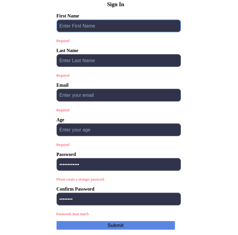
If you look at the above picture, you will notice a red warning sign indicating Required; with our Yup Validation we can set the inputs as required, and if those places are not filled in, the user won’t be able to submit the form.
Our form is now fully functional in the sense that integrating Formik with Yup validation users/clients will have error pop-up text to fill the required data.
Wrap Up
With Formik creating lightweight, less code, scalable forms have been made easier. In this article, we covered the importance of having a form library like Formik, which tends to make form creation a lot easier for developers, who will also be able to implement the step-by-step process of making a Form with Formik and using Yup as our validation. For the live app click here, also for the source code on GitHub.