
Beyond Media Queries: Best Practices for Responsive Web Design

Responsive web design is important in web development today, ensuring websites are accessible and user-friendly. While most people are familiar with its fundamentals, more advanced strategies can enhance the usefulness and quality of responsive designs. A few of these advanced techniques will be covered in this article, focusing on dynamic typography, fluid media handling, retina-ready graphics, responsive navigation, conditional asset loading, and accessibility in responsive design.

Discover how at OpenReplay.com.
Responsive web design plays an important role in web development today, it is used to ensure websites created are accessible and user-friendly.
While most people are familiar with the fundamentals of responsive web design,understanding more advanced strategies can enhance their usefulness and quality.
This article will cover a few of these advanced techniques, focusing on dynamic typography, fluid media handling, retina-ready graphics, responsive navigation, conditional asset loading, and accessibility in responsive design.
Dynamic Typography
In web design, typography plays an important role by influencing a website’s legibility and user experience. With the increase of different devices and screen sizes, the typography across various devices must remain legible and visually appealing to users.
Dynamic typography simply refers to the ability of text on a website to adjust according to the screen dimensions and resolution of the device. This adjustment ensures that text remains clear and visually appealing, whether the user is viewing the website from a desktop computer, tablet, or smartphone.
This technique uses units such as viewport width (vw) and root em (rem) to create a responsive and scalable typography system that ensures readability across devices.
We can implement dynamic typography using CSS techniques to create responsive text styles that adjust to diverse screen sizes and user preferences. This can be achieved through the following methods:
Viewport Units: This involves using viewport units such as vw (viewport width) and vh (viewport height) to adjust font sizes to the size of the viewport. For example, setting font-size: 3vw; will adjust the font size to 3% of the viewport’s width.
<!doctype html>
<html lang="en">
 <head>
 <meta charset="UTF-8" />
 <meta name="viewport" content="width=device-width, initial-scale=1.0" />
 <title>Viewport Units</title>
 <style>
 body {
 font-size: 3vw;
 background-color: black;
 }
 h1 {
 color: white;
 text-align: center;
 }
 p {
 color: white;
 font-family: verdana;
 font-size: 20px;
 </style>
 </head>
 <body>
 <h1>Responsive Font Size</h1>
 <p>This text will adjust its size based on the width of the viewport.</p>
 </body>
</html>
In the code above, the <meta name="viewport" content="width=device-width, initial-scale=1.0" /> tag is added in the head section of the HTML. The tag instructs the browser to match the viewport’s width to the device’s width and to scale the page to 1:1, ensuring it appears well on the device.
In the CSS section of the code, the font size of the body element is set to 3vw, meaning it adjusts to 3% of the viewport’s width, making it responsive to the viewport’s width.
The font size adjusts accordingly as the width of the viewport changes when resizing the browser window or on different devices.
The HTML content of the code includes a h1 heading with the text “Responsive Font Size” and a p tag with the text “This text will adjust its size based on the width of the viewport.”
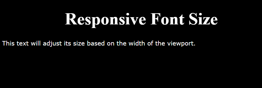
The image above displays the standard code output size when viewed in a browser.
As the viewport width changes, the font size of the text in the p and h1 tags adjusts to match the viewport’s width, as illustrated in the image below.
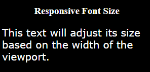
This scaling ensures readability across various screen sizes and devices, enhancing user experience.
Media Queries: Media queries can be used to set various styles depending on the size of the screen. i.e., you can specify varying font sizes for mobile devices, tablets, and desktop screens.
In the example below, we will show how media queries can be implemented in a simple project.
Here is the HTML;
<!doctype html>
<html lang="en">
 <head>
 <meta charset="UTF-8" />
 <meta http-equiv="X-UA-Compatible" content="IE=edge" />
 <meta name="viewport" content="width=device-width, initial-scale=1.0" />
 <link rel="stylesheet" href="style.css" />
 <title>Login Form</title>
 </head>
 <body>
 <div class="container">
 <h2>Login</h2>
 <form>
 <input type="text" placeholder="Username" required />
 <input type="password" placeholder="Password" required />
 <button type="submit">Login</button>
 </form>
 </div>
 </body>
</html>
Here is the CSS;
body {
 font-family: Arial, sans-serif;
 background-color: #000000;
 margin: 0;
 padding: 0;
}

.container {
 max-width: 400px;
 margin: 100px auto;
 background-color: #fff;
 padding: 20px;
 border-radius: 5px;
 box-shadow: 0 2px 5px rgba(0, 0, 0, 0.1);
}

h2 {
 text-align: center;
 margin-bottom: 20px;
}

form {
 display: flex;
 flex-direction: column;
}

input[type="text"],
input[type="password"],
button {
 padding: 10px;
 margin-bottom: 10px;
 border: 1px solid #ccc;
 border-radius: 3px;
 box-sizing: border-box;
}

button {
 background-color: #007bff;
 color: #fff;
 cursor: pointer;
}

/* Media queries for responsive design */

@media (max-width: 767px) {
 .container {
 max-width: 300px;
 margin-top: 50px;
 }
}
@media (min-width: 768px) and (max-width: 1023px) {
 .container {
 max-width: 400px;
 }
}
@media (min-width: 1024px) {
 .container {
 max-width: 600px;
 }
}
The code above uses CSS media queries to target the .container class, applying specific styles based on the width of the viewport.
Mobile view;
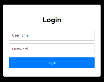
- The
max-width767px media query targets screens with a maximum width of 767 pixels. It adjusts.containerto 300px width and sets amargin-topof 50px for smaller screens like mobile devices.
Tablet view;

- The
min-width768px andmax-width1023px media query targets screens with a width between 768 pixels and 1023 pixels and sets.containerwidth back to 400px for bigger screens, such as tablets.
Desktop view;
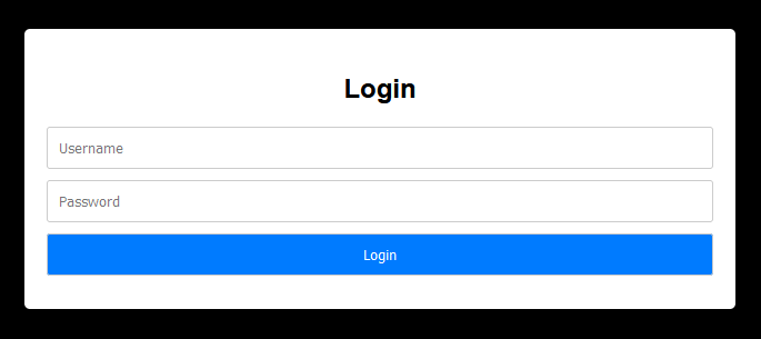
- The
min-width1024px media query targets screens with a minimum width of 1024 pixels and expands.containerto 600px for desktop and laptop screens.
Using these media queries, the login form’s container adjusts its width and layout according to the user’s screen size, ensuring a responsive and user-friendly design that works well on different devices and screen resolutions.
Fluid Typography: Fluid typography techniques can be used to create scalable text that adjusts smoothly across various screen sizes. This can be achieved by combining viewport units, media queries, and the CSS calc() function.
body {
 font-size: calc(16px + 0.5vw);
}
Example;
<!doctype html>
<html lang="en">
 <head>
 <meta charset="UTF-8" />
 <meta name="viewport" content="width=device-width, initial-scale=1.0" />
 <title>Fluid Typography Example</title>
 <style>
 body {
 font-size: calc(16px + 0.5vw);
 background-color: black;
 color: white;
 }
 </style>
 </head>
 <body>
 <h1>Fluid Typography Example</h1>
 <p>This is an example of fluid typography.</p>
 </body>
</html>
Output;

In the example above, the font-size property within the body selector uses the calc() function to set the font size relative to the viewport width (vw). It begins at 16 pixels (16px) and increases by half of the viewport width (0.5vw).
When you open this HTML file in a web browser and resize the window, you’ll observe the text size adapting dynamically, ensuring it remains legible across different screen sizes.
Line Height: This is done by modifying the line height according to the font size to ensure readability and visual appeal across various devices.
body {
 line-height: 1.5;
}
Let’s use it in an example;
<!doctype html>
<html lang="en">
 <head>
 <meta charset="UTF-8" />
 <meta name="viewport" content="width=device-width, initial-scale=1.0" />
 <title>Line Height Example</title>
 <style>
 body {
 background-color: black;
 font-family: "Roboto", sans-serif;
 color: white;
 font-size: 16px;
 line-height: 1.5;
 }
 </style>
 </head>
 <body>
 <h1>Line Height Example</h1>
 <p>This is an example of text with adjusted line height.</p>
 </body>
</html>
Output;
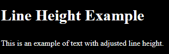
In the example above, line-height: 1.5; in the body selector sets the line height of the text within the body element to 1.5 times the font size. This increases the spacing between lines, enhancing readability.
Fallback Fonts: To achieve consistent typography across platforms, you can use fallback font families as backups in case the primary font isn’t available on the user’s device.
body {
 font-family: "Roboto", sans-serif;
}
The code sets the font family for the text in the body element to “Roboto” as the preferred font, with a fallback to a sans-serif font in case “Roboto” is unavailable.
Combining these methods above, you can create a responsive typography system that effectively adjusts to different screen sizes and enhances the user experience.
Fluid Images and Videos
It is very important in web design to ensure that images and videos retain quality across various devices and screen sizes. A major challenge in responsive design is maintaining the aspect ratio of images and videos.
When a website is viewed on different devices with different screen sizes, the content needs to scale proportionally to use the available space effectively without reducing the quality or causing distortion. We can accomplish this by using the powerful properties of CSS to achieve fluidity.
In a fluid layout, elements can adapt to different viewport dimensions without changing their appearance or functionality.
An important tip for images is to use the CSS property max-width: 100%; in combination with height: auto;. This ensures that images resize proportionally based on the dimension of their container.
This property restricts the width of the image to fit within the available space without exceeding it, while height: auto; automatically adjusts the height of the image to preserve its aspect ratio.
This ensures that images scale smoothly across various screen sizes to prevent overflow or pixelation on smaller screens.
img {
 max-width: 100%;
 height: auto;
}
The code above makes images on the webpage responsive by setting their maximum width to 100% of the container’s width, allowing it resize proportionally. The height: auto; property maintains the image’s aspect ratio, preventing distortion when resized.
You can make videos responsive by using the aspect-ratio property in CSS. This is done by specifying the required aspect ratio. For example, using 16:9 for widescreen videos makes the video element adjust its dimensions to maintain the correct aspect ratio regardless of the viewport size.
This makes the videos consistent and not stretched on devices with different screen dimensions.
.video-container {
 aspect-ratio: 16/9; /* Or any other desired aspect ratio */
}
The code above creates a class called .video-container with a 16:9 aspect ratio. It adjusts the container’s height relative to its width, preserving the aspect ratio and ensuring a distortion-free display of videos or content inside.
Retina-Ready Graphics
Ensuring your website has high-quality graphics is extremely important nowadays. Techniques such as the srcset attribute in HTML allow us to produce different image resolutions based on the device’s pixel density, thus creating sharp visuals.
Retina-ready graphics are images designed to maintain sharpness on devices with high pixel density.
To achieve clear graphics on such screens, we can use the following methods:
- Select the right file formats that support high-quality visuals. For pictures, it is recommended to use JPEG formats with high compression settings to reduce the size of the file without reducing the quality.
- Use PNG or SVG formats for graphics to maintain the quality.
- Use vector graphics like SVG for your icons, logos, and illustrations to maintain quality.
- Use high-resolution images with double the resolution required for standard displays allows the image to retain its sharpness.
- Use CSS media queries to detect Retina displays and also serve higher-resolution graphics accordingly. You can achieve this by specifying different image URLs based on the device’s pixel density.
By using these methods, we can ensure that graphics are of high quality on Retina displays, thus enhancing the overall quality of the website.
Conditional Asset Loading
We can optimize the performance of responsive designs via lazy loading and conditional asset loading. Lazy loading refers to the loading of non-critical resources that are loaded only when they are needed. Lazy loading is mainly used in some user interactions such as scrolling and navigation.
You can implement lazy loading by using the loading attribute:
<img loading="lazy" src="image.jpg" alt="..." />
<iframe loading="lazy" src="video-player.html" title="..."></iframe>
In the code above, the HTML elements use lazy loading for improved performance:
The img tag uses loading="lazy" to load the image only when it’s about to enter the viewport, reducing initial load times and saving bandwidth.
The iframe tag uses loading="lazy" to lazy load the content. This can be helpful for large videos, which can be loaded only when needed, enhancing the overall page loading speed and user experience.
Accessibility in Responsive Design
In creating accessible websites, people with disabilities or different browsing methods should also be considered.
There are guidelines published by the Web Accessibility Initiative (WAI) of the World Wide Web Consortium (W3C) that helps people with:
- Attention or anxiety disorders.
- Short-term memory, or people who multitask.
- Lower technological literacy.
- Poor wireless reception.
- Motor control issues.
To create responsive websites that are inclusive to meet the needs of the people mentioned above, we can use the following methods:
-
Creation of content that can be presented in different ways without losing information or structure. For example, provide responsive layouts, with a single-column mobile design.
-
Creation of content that does not distract people with attention deficit disorders. This provides access to people with cognitive disabilities by enabling them to focus on the main purpose of the content.
-
Create user-friendly website navigation by incorporating title tags for quick understanding, using descriptive labels to identify specific components, and clear headings to organize content into chapters, sections, and subsections. This enhances navigation and improves comprehension for users.
Conclusion
The article talked about the importance of Responsive Web Design (RWD) in creating accessible and user-friendly websites. It explored advanced techniques such as dynamic typography, fluid media handling, retina-ready graphics, responsive navigation, conditional asset loading, and accessibility methods that can enhance the quality and functionality of responsive designs. Through the mastery and combination of the techniques mentioned above, developers can create visually appealing and responsible websites.
Truly understand users experience
See every user interaction, feel every frustration and track all hesitations with OpenReplay — the open-source digital experience platform. It can be self-hosted in minutes, giving you complete control over your customer data. . Check our GitHub repo and join the thousands of developers in our community..
