Implementing fluid typography means creating text that adapts to various screen sizes. As technology continues to improve, devices of different shapes and sizes keep coming out. As a front-end developer, you must build applications that adapt well to various screen sizes. Fluid typography design will improve user experience and accessibility; this article will show you how to do it.

Discover how at OpenReplay.com.
The old approach: media queries
The old-school way of making text responsive is to use media queries. This is when you set different breakpoints for different screen sizes. For each breakpoint, you assign a specific font size value.
In the code below is one h1 header and a paragraph.
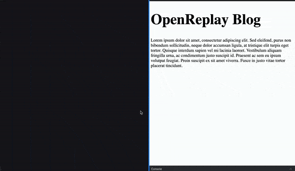
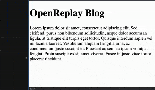
<h1>Open Replay Blogger</h1>

<p>
  Lorem ipsum dolor sit amet, consectetur adipiscing elit. Sed eleifend, purus
  non bibendum sollicitudin. Neque dolor accumsan ligula, at tristique elit
  turpis eget tortor. Quisque interdum sapien vel mi lacinia laoreet. Vestibulum
  aliquam fringilla urna, ac condimentum justo suscipit id. Praesent ac sem eu
  ipsum volutpat feugiat. Proin suscipit ex sit amet viverra. Fusce in justo
  vitae tortor placerat tincidunt.
</p>
The CSS code example below shows media queries for three breakpoints.
/* Default styles */
h1 {
  text-align: center;
  width: 500px;
  margin: 20px auto;
}

p {
  text-align: justify;
  width: 350px;
  margin: 20px auto;
}

/* Media queries to create responsive text */
@media screen and (max-width: 600px) {
  h1 {
    font-size: 22px;
  }

  p {
    font-size: 14px;
  }
}

@media screen and (min-width: 601px) and (max-width: 1024px) {
  h1 {
    font-size: 36px;
  }

  p {
    font-size: 20px;
  }
}

@media screen and (min-width: 1025px) {
  h1 {
    font-size: 72px;
  }

  p {
    font-size: 36px;
  }
}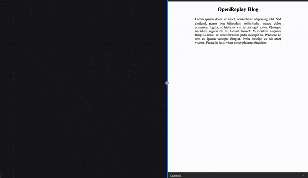
In the image above, you see the different font sizes for different screen sizes.
- Screens less than 600px: 22px for the header and 14px for the paragraph.
- Screen between 600px and 1024px: 36px for the header and 20px for the paragraph.
- Screen bigger than 1025px: 72px for the header and 36px for the paragraph.
Limitations of using media queries
Using media queries will make your text responsive to some extent. But it’s still got some limitations.
-
It’s hard to account for all screen sizes: These days, users access applications from devices that vary in size, from the smallest smartphones to ultra-wide screens and everything in between.
For example, what if you wanted devices with a screen size of 400px or less to have a smaller font size for the header, say 18px? And also a different size, say 28px for a screen size of 800px. You will have to add two more media queries.
-
It’s difficult to maintain code for multiple queries: The more media queries you write, the more difficult it is to maintain your stylesheets. As you increase the number of breakpoints, your code increasingly becomes complex. It becomes a challenge when updating or troubleshooting issues.
The new approach: fluid typography
Frontend developers today have new methods to create fluid texts. Two methods are using the viewports units (vw and vh) and the CSS clamp() function.
You will learn about how to use both methods. And also why one is a better approach than the other. But before that, let’s first consider some of the advantages of making type fluid.
Here are some reasons why implementing fluid typography benefits not only end users but also developers.
-
Improved user experience: Fluid typography makes texts legible and visually appealing on screens of different sizes. This means users will have a more consistent and enjoyable experience with your app.
-
Enhance accessibility: You avoid scenarios where texts appear too small or too big. And there will be little or no need for manual adjustment of the texts. And this can contribute to making your app more accessible, especially for people with vision difficulties.
-
Greater design freedom and flexibility: When you implement fluid typography, you are free from the restrictions of dealing with predefined breakpoints. You have the creative freedom to adjust font sizes based on design intent, not rigid breakpoints.
Using viewport units to make texts fluid
Viewport units (vw for viewport width and vh for viewport height) are a straightforward way to implement fluid typography. When you use the viewport units, you set the font size relative to the browser’s viewport. A browser’s viewport is the screen area the browser covers on the user’s device.
Here is a demo of using the viewport widths. Let’s use the same h1 header and paragraph from the first example.
The CSS code below shows adding font size values using the viewport widths.
h1 {
  font-size: 10vw;
}

p {
  font-size: 3vw;
}
As demonstrated in the image, with viewport width, you can create text that scales smoothly as the width changes. And you do that with only a few lines of code.
This seems like an ideal solution you should always use, right? Well, not exactly. And here’s why.
Since the vw unit is based on the viewport width, it can lead to very small or large texts. Text can become too small to read comfortably on very small or narrow screens. On the other hand, the text can get too large for users with ultra-wide screens. This can also cause layout problems.
There is a better way of dealing with these potential issues. And that is to use the CSS Clamp() function.
How to use the CSS clamp() function
The CSS clamp() function lets you set font size values that adapt to various screen sizes. It also allows you to set minimum and maximum font size values.
This means when you use the clamp() function, you can prevent text from becoming too small or too large. This helps you to strike a balance between responsiveness and readability. And creates a better user experience.
The clamp() function takes three values.
.text {
  font-size: clamp(min-value, pref-value, max-value);
}min-valueis the minimum font-size value.pref-valueis the preferred font-size value.max-valueis the maximum font-size value.
Let’s see an example of using the clamp() function to set font size.
p {
  font-size: clamp(26px, 5vw, 52px);
}
The preferred value here is 5vw (5% of the viewport width).
But consider a scenario where the viewport is 400px. This means 5vw (5% of 400px) is 20px. The preferred font size of 5vw would be 20px in this case. But the browser will instead set a font size value of 26px, the minimum value.
The minimum and maximum values you set act as boundaries. And make sure the font size values are not less than the specified minimum value. Or more than the specified maximum value.
The example above provides the minimum and maximum values in pixels. But it’s generally considered best practice to use relative units like rem instead.
Relative units like rem respond to the user’s preferences. If users change their browser’s default font size, the text changes to match.
Let’s see an example below.
h1 {
  font-size: clamp(3rem, 7vw + 1rem, 5rem);
}

p {
  font-size: clamp(0.5rem, 2vw + 1rem, 4rem);
}
Note: Adding a rem value to the preferred value ensures it responds to the user’s preference.
Tools for implementing fluid typography
Sometimes, it’s a challenge to come up with the preferred value and minimum and maximum font sizes for various type levels. You can spend time on trial and error. Or you can take advantage of any of these tools to create a fluid scale for your type.
Some best practices to consider
The following are some of the best practices to consider when you are implementing fluid typography in your application.
-
Thorough testing to prevent unexpected behavior: Before you deploy, do well to perform thorough testing. Test your application on various screens and browsers. This will help you catch and fix any potential issues. And ensure your fluid type works as expected.
-
Adding fallbacks for non-supportive browsers: Most browsers these days support the CSS
clamp()function. At the time of this writing, browser support for clamp is 94%. But you can still include fallback values for browsers that may not support clamp. This can help make your application more accessible.
Conclusion
In this article, you’ve learned various ways to adapt text to different screen sizes. Implementing fluid typography in your application will make it more accessible. The CSS clamp() function gives you freedom from rigid media queries. This not only improves user experience but also makes it easy for you as a developer to maintain your code.
Truly understand users experience
See every user interaction, feel every frustration and track all hesitations with OpenReplay — the open-source digital experience platform. It can be self-hosted in minutes, giving you complete control over your customer data.
Star on GitHub12k