Creating easy custom modals with React
Build modals from zero, with HTML, CSS, and React

Think about being on a website or using an application when suddenly a small window appears in the center of the screen, or you click a button and a box that covers the main content appears, catching your eye. It is known as a modal window. Modal elements are parts of an application that show up as an overlay on a web page and display extra information, request user input, or carry out particular actions. After reading this article, you will know how to use React to make a customizable, reusable component that you could add to your component library.
Understanding Custom Modals
Similar to the word “custom,” a custom modal allows you to tailor your simple modal so that its design and general aesthetics match those of your application. In essence, it allows designers and developers to customize their modals to suit their tastes.
Sure, you can use components such as those provided by Material UI and other frameworks. Still, with custom modals, you can specify the transition effects, control how the modal opens and closes, and add interactive elements like texts, images, buttons, forms, or media.
Modal Use Cases
Modals can be tailored to the following use cases depending on an application and its users’ requirements:
- Additional Information: You can use modals to show more details about a specific object. For instance, a modal window may appear when you click a text on an application’s home page, giving the user more details about that text.
- User Inputs and Forms: This use case is very common because login or sign-up forms can show up as a modal to collect user information. In this use case, a modal dialog can be used to get user reviews of a product or service.
- Confirming Actions: Modals are used to decrease errors by verifying a user’s action in this use case. For instance, a modal dialog box window may appear when a user wants to delete a file so that they can confirm their choice.
Examples of Standard Modal Layouts
These are some typical modal layouts found in web applications.
1. Centered Modal
Most web applications use this modal layout. The modal window covers the main content when it first appears in the middle of the screen. To draw attention to the modal content, it typically has a fixed width and height and is surrounded by an almost transparent background overlay. This article will use a modal layout that looks like the illustration below:
2. Side Drawer Modal
This kind of modal slides into the main content from the side, as opposed to the centered modal. The user can see the application menu or other content when the side drawer modal is open and partially covers the main content.
Planning the Modal
You must consider a few things when designing a modal for your application to make it user-friendly and attractive and ensure that it blends in with the user interface. Some factors to consider when developing a modal component are listed below.
- User Experience: Consider yourself the user and how you will interact with the modal. Considerations should be made for aspects like modal behavior, visual appeal, and the effect on overall user flow.
- Modal Design and Styling: To make the modal aesthetically pleasing and user-friendly, you should pay attention to details like button styles, typography, spacing, and visual hierarchy. Consistency in layout and color schemes will help create a more seamless user experience.
Basic Features of a Custom Modal
For your custom modal to serve its purpose effectively, a few features and functionality must be considered during the design and implementation process. As you define the features and functionality of your modal, there are a few important factors to take into account. Let’s look at some of them.
- Title: A modal should have a thoughtful, simple, and descriptive title. The title helps in the user’s understanding of the modal’s content.
- Content: Your modal’s content can include both text-based information and media components like images or videos. Your modal’s content should be straightforward and clearly state its goal.
- Customization: You can choose how to change your modal’s position, font, or background styles to suit your preferences. Customization helps ensure that your modal’s design matches your application’s design.
Setting up the Custom Modal environment
We’ll use Vite to create our React app instead of the usual create-react-app. I’ve written an article on creating a React app with Vite; check it out here.
In this tutorial, we will also make use of react icons. Copy the command below and paste it into your terminal to install react-icons in your app.
npm install react-icons --saveNow, let’s create our modal component, as it will be the only component we’ll create.
In your src folder, create a folder and name it components. In that folder, create a file named Modal.tsx.
Let’s also create two JSON files, as we’ll need them in the modal component to dynamically display data based on the modal that is being selected.
Create two files in your src folder: buy.json and receive.json.
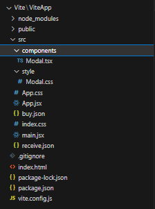
Your project folder should look like the image below:
Creating the Custom Modal Component
In this section, we’ll walk through the practical steps of creating our custom modal component. The modal component we develop will be reusable, making it simple to integrate and use across various application components.
Add the following default code to the Modal.tsx file we created earlier.
import React from "react";

const Modal = () => {
 return <section>Modal</section>;
};

export default Modal;
The JSON files we created earlier need to have data added to them. Depending on the modal that is being selected, this data will be used to dynamically display the modal contents.
In your buy.json file, add the following code:
{
 "title": "Buy",
 "image": "https://res.cloudinary.com/sohmmie/image/upload/v1687376677/buy-icon_ybpo3h.png",
 "content": "We appreciate your selection of this item! The 'Buy Now' button will take you only one step closer to receiving all of the wonderful features and advantages it has to offer. Enjoy your shopping!",
 "buttonText": "Buy Now"
}
In your receive.json file, add the following code:
{
 "title": "Receive",
 "image": "https://res.cloudinary.com/sohmmie/image/upload/v1687377147/receive_foedgf.png",
 "content": "Congratulations, your item will soon be delivered! We're thrilled to count you among our happy clients. You've made an exciting step toward taking advantage of our product's advantages and features by completing this transaction. We appreciate you choosing our brand.",
 "buttonText": "Receive item"
}
This lets us know what the contents of our custom modal will be: title, image, content, and button. Let’s now talk about managing modal state and interactivity.
Session Replay for Developers
Uncover frustrations, understand bugs and fix slowdowns like never before with OpenReplay — an open-source session replay tool for developers. Self-host it in minutes, and have complete control over your customer data. Check our GitHub repo and join the thousands of developers in our community.
Managing Modal State and Interactions
Controlling the visibility and behavior of the modal component requires managing the modal state and interactions. We can create an easy and intuitive user experience by carefully managing the modal’s opening, closing, and other interactions.
The App.jsx file in the src folder will serve as the parent component to the modal component.
Add the following code to your App.jsx file:
import React from "react";

function App() {
 return (
   <div>
     <main>
       <header>
         <h4>Custom Modal</h4>
       </header>
       <article>
         <p>Buy</p>
         <p>Receive</p>
       </article>
     </main>
   </div>
 );
}

export default App;
The code above will result in the image below
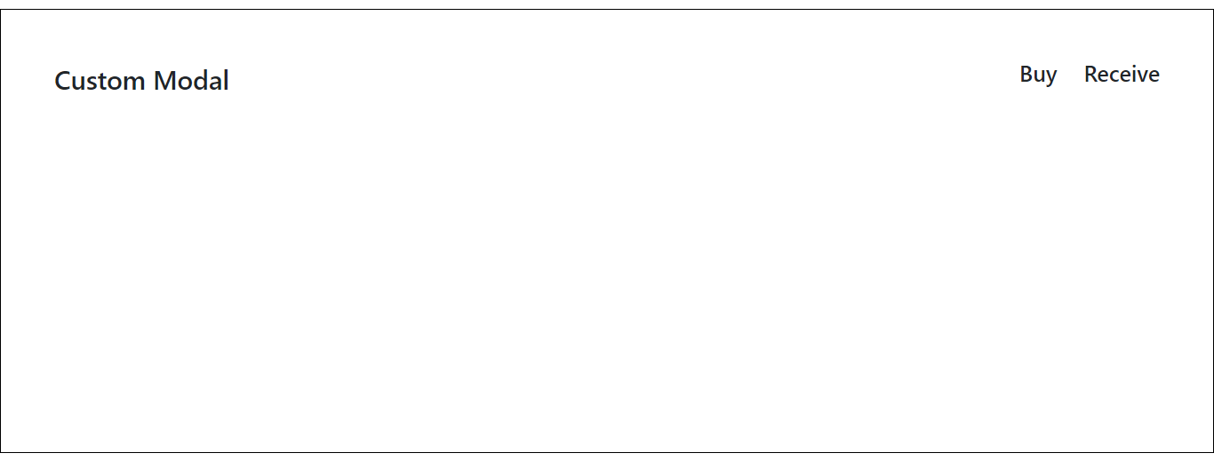
From the image above, a modal pops up when the ‘Buy’ or ‘Receive’ texts are clicked.
Custom Modal state
Let’s create a state using the useState hook to implement the opening and closing of the modal.
In your App.jsx file, import the useState hook to access its function.
import React, { useState } from 'react'Still in App.jsx file, the first line of code below sets the variable isModalOpen to false. The second line of code sets the variable modalContent to an empty string.
const [isModalOpen, setIsModalOpen] = useState(false)
const [modalContent, setModalContent] = useState('')
Let’s create two functions that will control the visibility and interactivity of the modal.
Add the following function to your App.jsx file:
const openModal = (content) => {
 setIsModalOpen(true);
 setModalContent(content);
};
The openModal function above sets the IsModalOpen variable to true when it’s been called. The setModalContent(content) function updates the value of the modalContent state variable.
The content argument passed to the openModal function allows you to dynamically set the modal’s content based on the argument passed.
We’ll add a close modal function to the App.jsx file, as follows:
const closeModal = () => {
 setIsModalOpen(false);
};
The closeModal function above sets IsModalOpen state variable to false. When this function is called, it closes the modal.
Custom Modal Interactivity
In this section, we’ll interact with the modal using the two functions and states we created.
To use the data in the JSON files we created for the modal content, first import them into your App.jsx file.
import buy from './buy.json'
import receive from './receive.json'
Update your App.jsx file with the code below:
<article>
 <p onClick={() => openModal(buy)}>Buy</p>
 <p onClick={() => openModal(receive)}>Receive</p>
</article>;
An onClick event listener is added to both the ‘Buy’ and ‘Receive’ elements so that when either of them is clicked, it calls the openModal function, which opens the modal and displays the specific content related to the element.
Rendering and Integrating the Custom Modal
Finally, Let’s integrate the custom modal in its parent component, the App.jsx file.
To integrate the modal component, let’s import it first.
import Modal from './components/Modal'Including the above line of code makes the modal component accessible for use.
Update your App.jsx file with the following line of code:
<section>
 <Modal
   isModalOpen={isModalOpen}
   modalContent={modalContent}
   onClose={closeModal}
 />
</section>;
From the code above, we pass the isModalOpen and modalContent props to the modal component. By passing these props to the modal component, you provide the necessary values and function to control its visibility, display appropriate content, handle the close event, and customize its behavior based on the buy and receive data.
Let’s use the props we passed in the modal component, shall we?
In your Modal.tsx component, add the code below:
import React from "react";
import { IoMdClose } from "react-icons/io";

const Modal = ({ isModalOpen, modalContent, onClose }) => {
 if (isModalOpen !== true) {
   return null;
 }
 return (
   <section className="modal">
     <article className="modal-content p-lg-4">
       <div className="exit-icon text-end">
         <IoMdClose onClick={onClose} />
       </div>
       <main className="modal-mainContents">
         <h5 className="modal-title">{modalContent.title}</h5>
         <hr />
         <div className="modal-image text-center mt-lg-2">
           <img src={modalContent.image} alt="image" />
         </div>
         <p className="mt-lg-3 modalText">{modalContent.content}</p>
         <div className="modal-button text-end">
           <button>{modalContent.buttonText}</button>
         </div>
       </main>
     </article>
   </section>
 );
};

export default Modal;
From the code snippet above:
- The line of code
{ isModalOpen, modalContent, onClose }represents the props we passed from theApp.jsxfile. - The code snippet below is a condition that renders nothing if the value of
isModalOpenis not true.
if (isModalOpen !== true) {
 return null;
}-
The line of code
<IoMdClose onClick={onClose} />is an icon imported fromreact-iconfor closing the modal. -
The lines of code
{modalContent.title},{modalContent.image},{modalContent.content}, and{modalContent.buttonText}displays the title, image, content, and button text which is accessed from themodalContentobject.
Styling Custom Modal
To truly define our custom modal, let’s apply the necessary styling to give it the distinct appearance and behavior that defines a modal.
Add the code snippet below to style your custom modal component. In your Modal.css file, copy and paste the code below:
.body {
 font-size: 25px;
 color: black;
 background: #f5f5f5;
}
.header-content {
 border: 1px solid black;
 justify-content: space-between;
}
.header-text {
 font-weight: 500;
 font-size: 20px;
 line-height: 18px;
 cursor: pointer;
}
.modal {
 position: fixed;
 left: 0;
 top: 0;
 right: 0;
 bottom: 0;
 background-color: rgba(0, 0, 0, 0.5);
 display: flex;
 align-items: center;
 justify-content: center;
}
.modal-content {
 border: 1px solid #fff;
 width: 500px;
 background-color: #fff;
 border-radius: 15px;
}
.exit-icon {
 cursor: pointer;
 font-size: 20px;
}
.modal-title {
 color: #6821c3;
 font-weight: 700;
 font-size: 30px;
 line-height: 28px;
}
.modal-image img {
 width: 8rem;
}
.modalText {
 text-align: justify;
}
.modal-button button {
 border: 1px solid #6821c3;
 padding: 6px;
 width: 8rem;
 background-color: #6821c3;
 color: white;
 border-radius: 7px;
}
The custom modal’s final appearance:
Conclusion
You have undoubtedly learned a lot if you have reached this point. We briefly covered how to create an easy custom modal in this article. Defining the modal’s layout, styling it to match the application’s design, including functionality for opening and closing the modal, and modifying its content were all steps in the process.
It’s incredible how we can design a custom modal to reduce component repetition. We only made one modal component from the article, but it dynamically displayed two different modal contents.
Gain Debugging Superpowers
Unleash the power of session replay to reproduce bugs and track user frustrations. Get complete visibility into your frontend with OpenReplay, the most advanced open-source session replay tool for developers.