
Building sliders, as complex as it is, gets more complicated when you factor in mobile compatibility due to the vast difference in the touch mechanics of mobile devices compared to keyboard and mouse click styles on desktops. This is why the SwiperJs package is often the go-to for all and any sliders.
Swiper is the most modern free mobile touch slider with hardware-accelerated transitions and amazing native behavior. It is intended to be used in mobile websites, mobile web apps, and mobile native/hybrid apps*. - SwiperJs Official
It focuses on bridging the gap and making them feel as native as possible on mobile as it is on desktops. It also has so many out-of-the-box features, which would be handy to use rather than building them from scratch.
In this article, we will explore some of those features by building a card slider. In your application, you could decide to build anything with it (cards, images, buttons, etc.).
Framework Compatibility
At the time of writing, the SwiperJs package is only available for the following:
- Vanilla Javascript: It could be deployed in plain Javascript applications. For this tutorial, we will use this method.
- React: Having its own JSX components, it could be easily integrated into the React Framework.
- Vue: Comes with custom Vue components that support all core functionalities.
- Web Components: Perhaps the most uncommon, it could be used as native HTML components.
Pre-requisite
To follow this tutorial, you need to understand the basics of the following:
- HTML
- CSS
- Javascript
Building A Simple Card Slider
To get started, run the following commands on your terminal.
git clone https://github.com/Complexlity/slider-starter.git
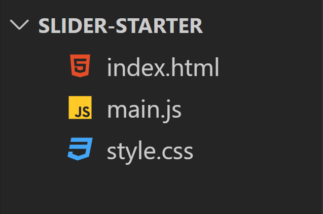
cd slider-starterOpen the folder in a text editor. You should see the structure below.
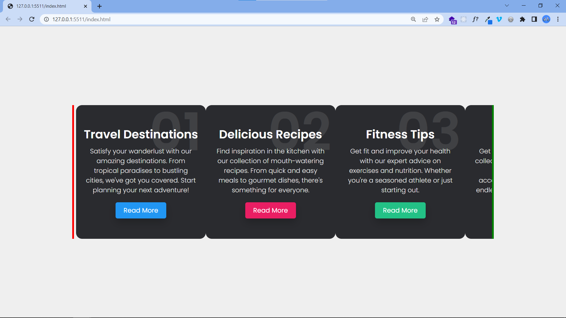
The Output:
Install SwiperJs
There are a few ways to get started. We would use the CDN method here, but you could as well install via npm or download the source code from jsdelivr and add it to your project files.
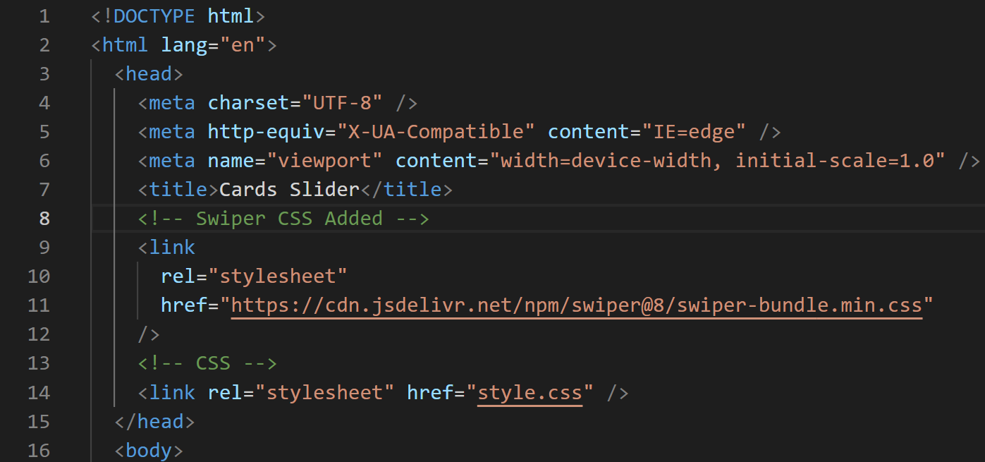
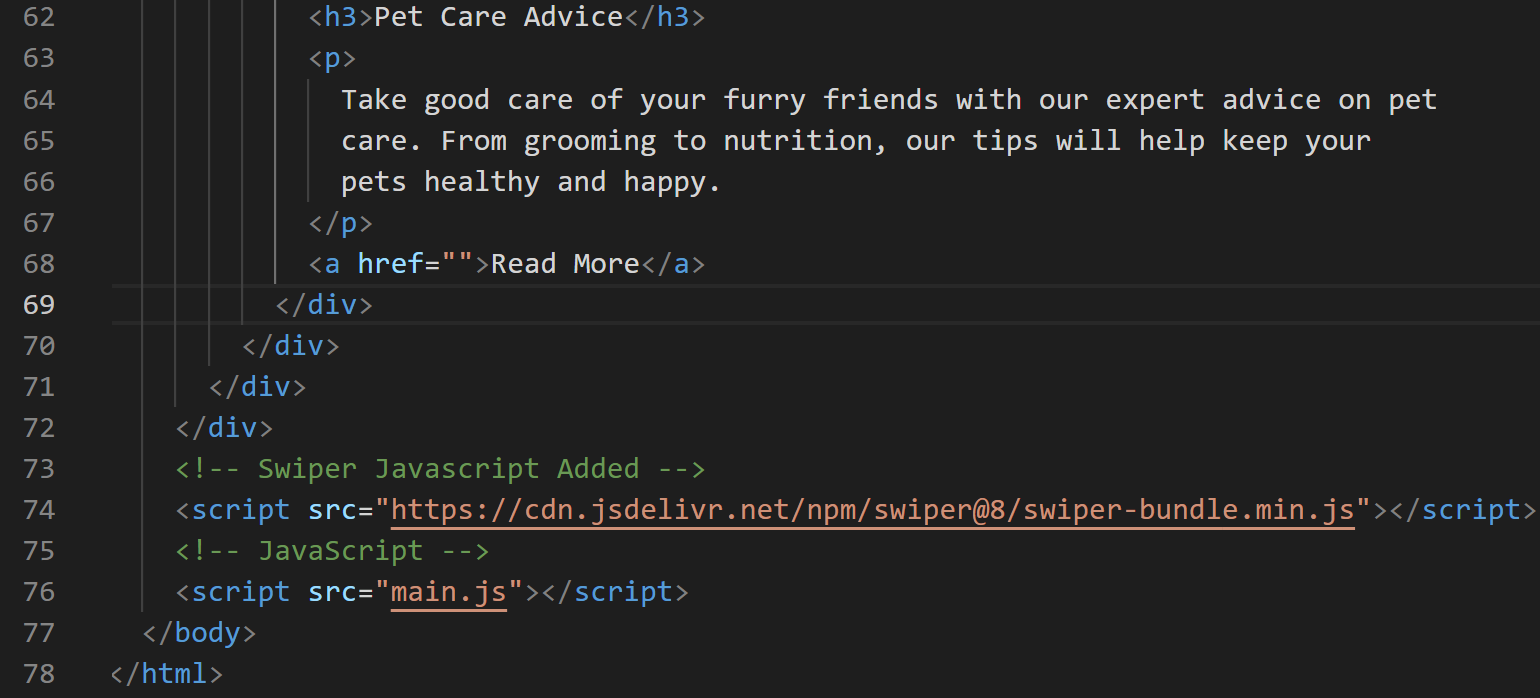
Add the Swiper CSS to the head (below the title tag ) of index.html and Swiper Javascript to the body.
<!-- Swiper CSS -->
<link rel="stylesheet" href="https://cdn.jsdelivr.net/npm/swiper@8/swiper-bundle.min.css"/>
<!-- Swiper Javascript -->
<script src="https://cdn.jsdelivr.net/npm/swiper@8/swiper-bundle.min.js"></script>Note: Ensure Swiper CSS comes before CSS and Swiper Javascript comes before Javascript. This is needed for some functions and styling to work properly.
Refer to the image below to see what it looks like.
 Swiper CSS Added to head
 Swiper Javascript Added body
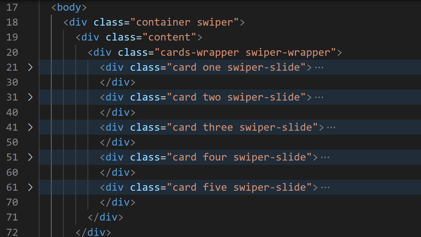
We need to add their pre-defined classes into our HTML elements to use these styles and functions. Update the body of index.html in the following ways:
- Add the
swiperclass todiv.container. - Add the
swiper-wrapperclass todiv.cards-wrapper. - Add the
swiper-slideclass to all.cardelements.
Refer to the image below.
And finally, we create a new Swiper object. Update main.js with the code below.
var swiper = new Swiper(".content", {
  slidesPerView: 3,
  spaceBetween: 20,
  grabCursor: "true",
});
We used the .content element to create the slider.
slidesPerView determines how many are shown each time.
spaceBetween determines the gap in the cards in pixels(px).
grabCursor shows the hand-grabbing cursor when you hover over the cards.
Session Replay for Developers
Uncover frustrations, understand bugs and fix slowdowns like never before with OpenReplay — an open-source session replay tool for developers. Self-host it in minutes, and have complete control over your customer data. Check our GitHub repo and join the thousands of developers in our community.
Add More SwiperJs Features
Right now, the slider works, but we could add more features supported by the package to improve the user experience.
Navigation
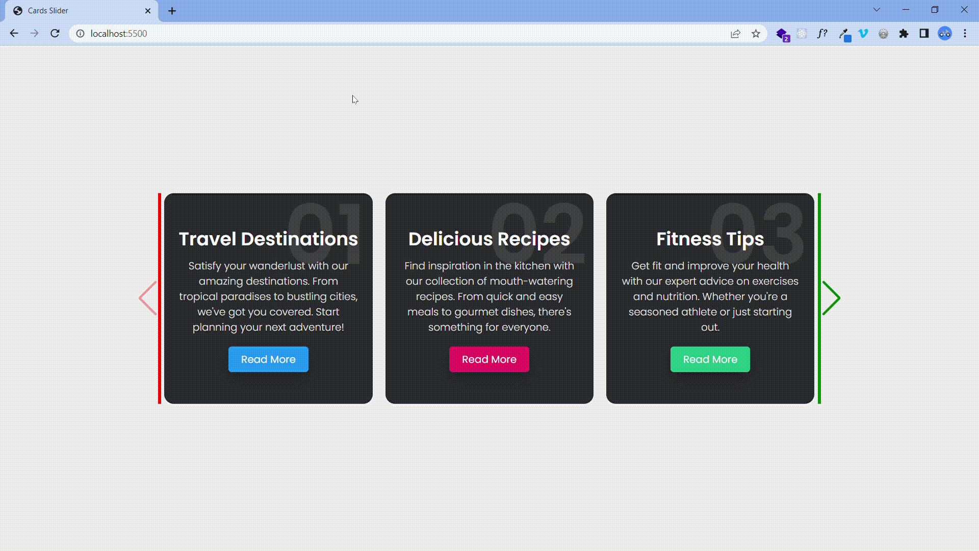
Navigation buttons provide a clear and intuitive way for users to control the content in the slider, enabling them to easily move forwards and backwards through the slides.
To create Navigation buttons, add the elements below to the bottom of the div.swiper element.
<div class="swiper-button-next swiper-navBtn"></div>
<div class="swiper-button-prev swiper-navBtn"></div>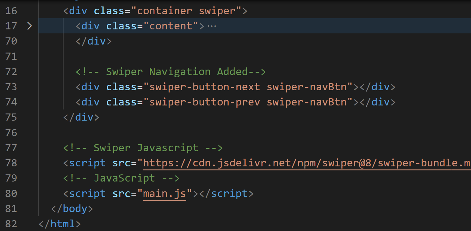
Note: div.content in the image above is not empty but has been collapsed.
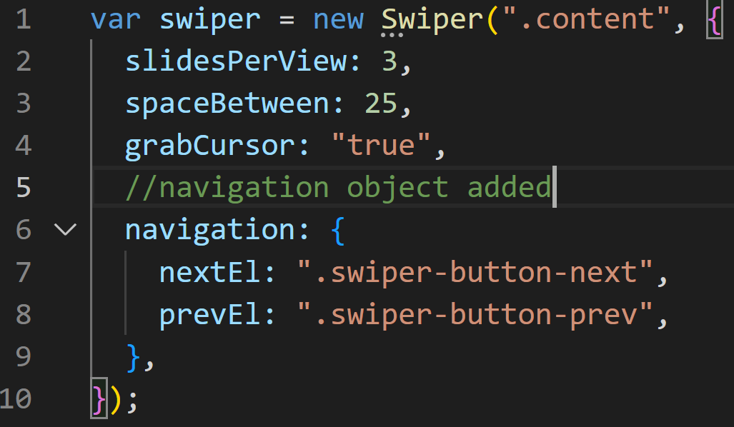
Update main.js by adding the following to the swiper object.
navigation: {
    nextEl: ".swiper-button-next",
    prevEl: ".swiper-button-prev",
  }
Refer to the image below.
Also, we could style the navigation button differently. Add the following code to the bottom of style.css.
/* Swiper Navigation Styles */
.swiper-navBtn::before,
.swiper-navBtn::after {
  font-size: 55px;
}
.swiper-button-prev {
  color:red
}
.swiper-button-next {
  color:green;
}

/* Remove navigation button on smaller screens*/
@media screen and (max-width: 800px) {
  .content {
    margin: 0 10px;
  }
  .swiper-navBtn {
    display: none;
  }
}
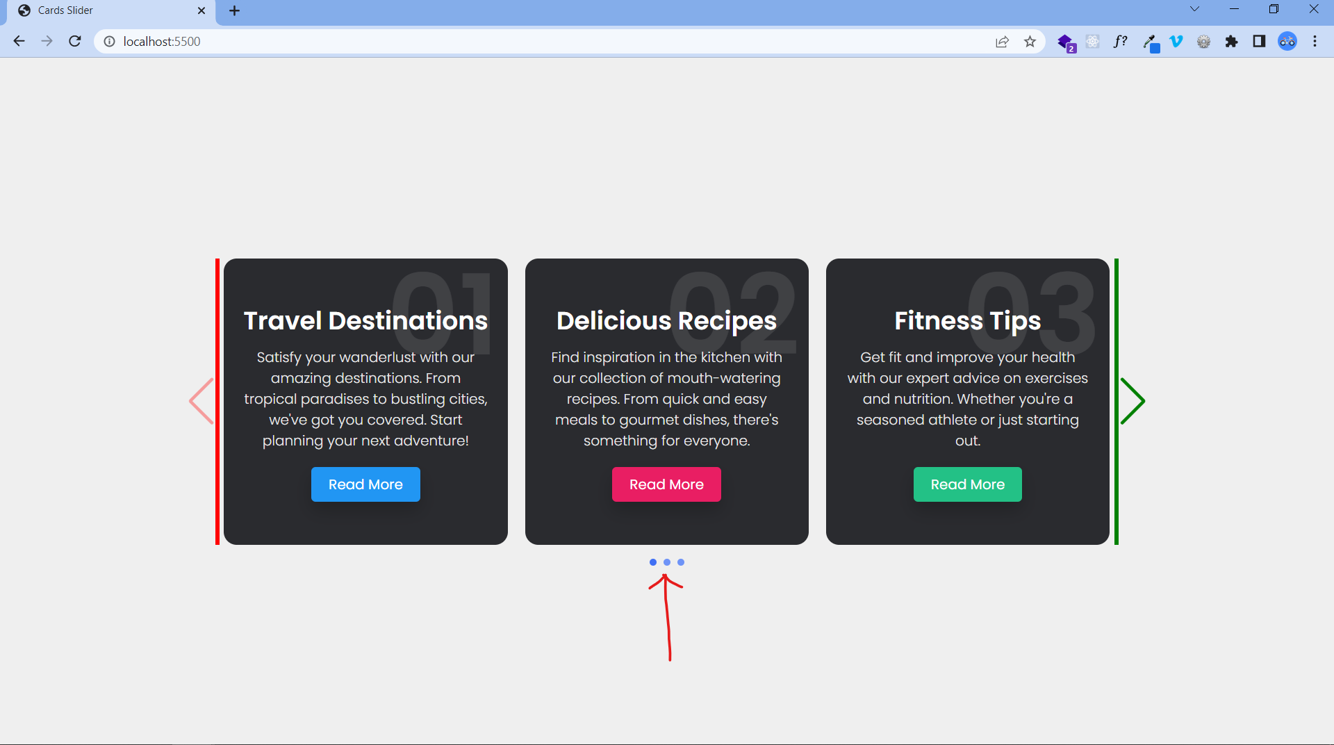
Pagination
Pagination is a useful feature in sliders as it offers a clear visual representation of the user’s position within the slide sequence, as well as the total number of slides. This enhances the user’s ability to navigate through the slider.
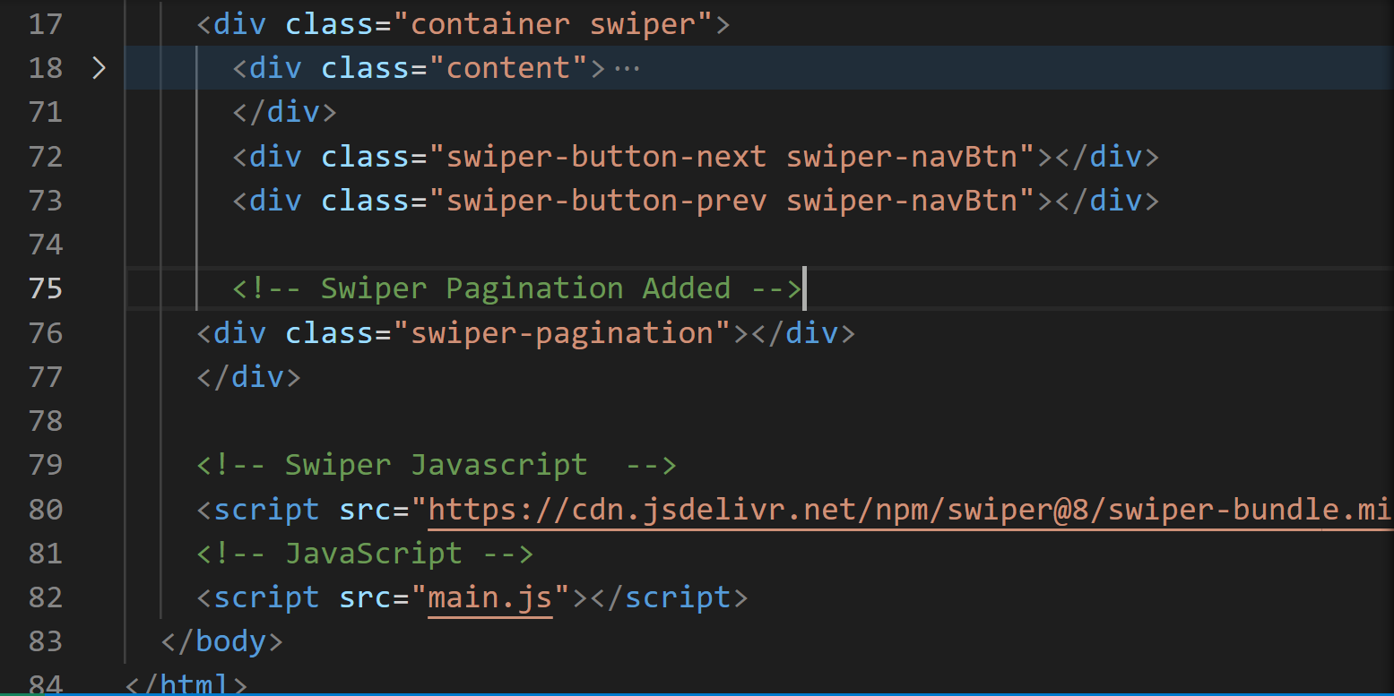
Add the code below just under the navigation markup in index.html.
<div class="swiper-pagination"></div>Refer to the image below for where to add it.
Add the code below to the bottom of style.css to style the pagination bullets.
/* Swiper Pagination Styles */
.swiper-pagination-bullet {
background-color: #6e93f7;
opacity: 1;
}
.swiper-pagination-bullet-active {
background-color: #4070f4;
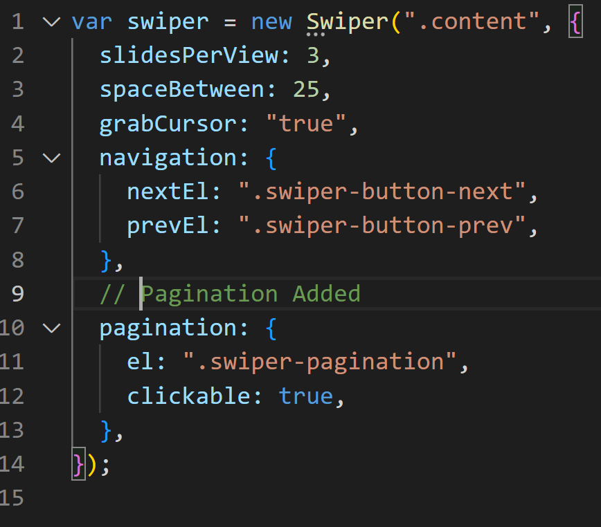
}Finally, we add the pagination property to the Swiper object in main.js.
pagination: {
    el: ".swiper-pagination",
    clickable: true,
  },
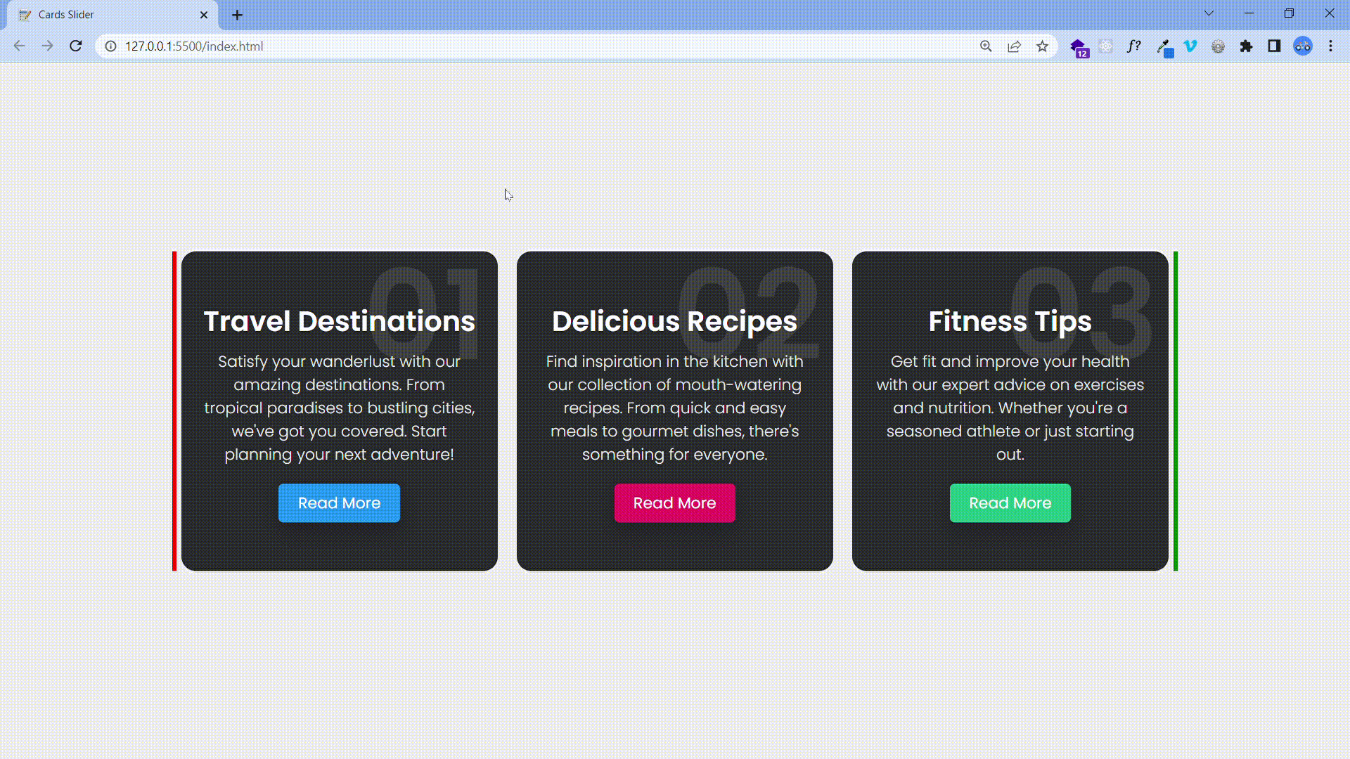
The Output:
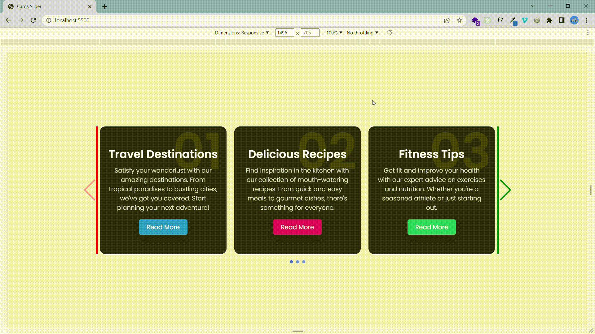
Responsive Breakpoints
To improve the responsiveness of our sliders, we could make a different number of items be displayed on each slider page depending on screen size. For this, we use the breakpoints property.
Update the Swiper object in main.js by adding the breakpoints property and giving it our desired values.
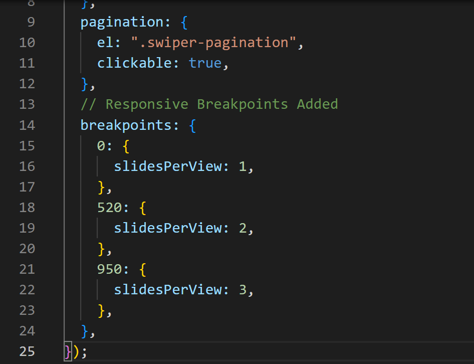
breakpoints: {
    0: {
      slidesPerView: 1,
    },
    520: {
      slidesPerView: 2,
    },
    950: {
      slidesPerView: 3,
    },
  },
The breakpoints property accepts any screen size (in pixels) and applies the styles defined under them. The style is not limited to slidesPerView but could also support slidesPerGroup, spaceBetween, and grid.rows, a feature of the Swiper object.
Refer to the image below to see where to update the code.
The Output:
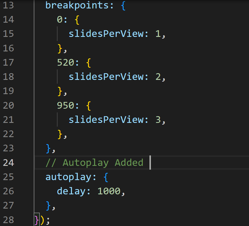
Autoplay
This is a feature where the slider page changes without any interaction with it.
Add the autoplay property to the swiper object in main.js to enable this feature.
autoplay: {
    delay: 1000,
  },
The delay property takes a number in milliseconds.
The autoplay objects also take more values: disableOnInteraction, pauseOnMouseEnter, stopOnLastSlide, waitOnTransition, and reverseDirection. All of which take boolean values (true or false).
The Output.
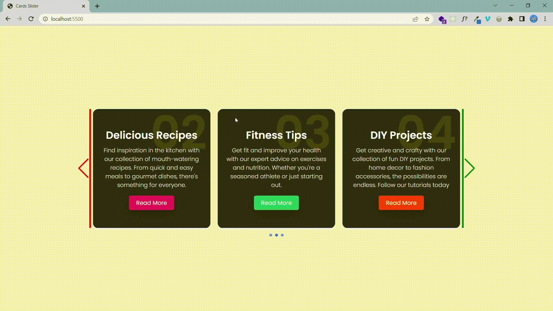 The slider moves automatically.
Infinite Loop
One handy feature is making the slider loop continuously, smoothly transitioning from the last to the first item.
Update main.js by adding the loop property to the Swiper object.
loop:true,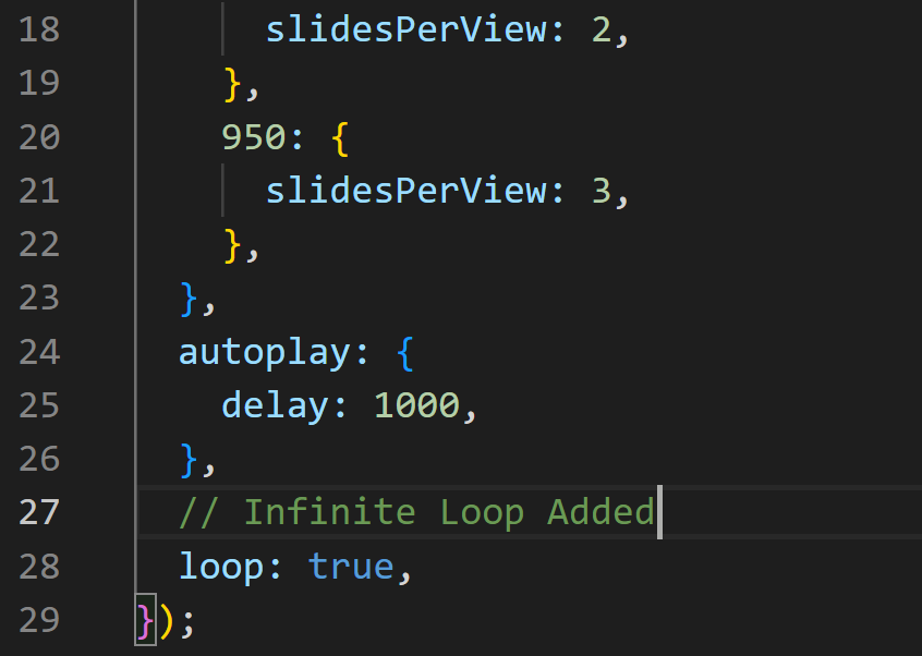
The Output.
 Autoplay now runs smoothly without rounding back to the first card.
There are still so many features the Swiper object supports. The comprehensive API documentation can be viewed on the Swiperjs website.
See the project working LIVE.
Usage On Frameworks and Web Components
As stated above, the SwiperJs package works on React and Vue frameworks and web components. To get started on either of them. Head over to the documentation below.
Conclusion
Building sliders from scratch can be very tasking, and in this article, we learned how to make it easier, as well as add some core features using the SwiperJs package. The SwiperJS package provides a flexible and user-friendly tool for designing sliders and carousels that may be customized. Web developers choose it because of the variety of features it offers. Its adaptability and usability make it appropriate for various applications, from straightforward picture sliders to intricate, interactive displays. SwiperJS delivers a dependable and uncomplicated solution for your slider needs, regardless of whether you are an experienced developer or just getting started.
Gain Debugging Superpowers
Unleash the power of session replay to reproduce bugs and track user frustrations. Get complete visibility into your frontend with OpenReplay, the most advanced open-source session replay tool for developers.