Building a Video Player with React and Material UI
Create and customize your own video player
Video assets are quickly taking over as the preferred method of product promotion on websites. Thus, developers need to understand how to create and modify video players to meet the requirements of their websites.
In this article, I’ll demonstrate how to develop a video player using the react-player package and style it with Material UI, so you can make a video player that perfectly suits the requirements of your next web build.
This article’s primary purpose is to assist readers in creating and customizing their video players in accordance with their preferences. However, if you prefer a program that you can simply install to gain access to a fully developed and personalized video player, take a look at the Mui player. Also, be aware that this service has drawbacks, including the inability to adjust the video player to your preferences.
What is React Player?
React player is a component used in rendering various video assets, including YouTube, Facebook, Twitch, SoundCloud, Streamable, Vimeo, Wistia, Mixcloud, DailyMotion, and so on. React player is a package used to create video players that supports various video sources and types.
The first thing to do is to bootstrap a new React project using the Create React App (CRA) bundler. Inside the project folder, install the needed dependencies.
First, we have to install the react-player by typing the code below into your project terminal:
npm i react-playerNext, we have to install Material UI for styling the video player:
npm install @mui/material @emotion/react @emotion/styledStill on Material UI, we have to install the SVG icons. Icons are the major thing we want to import from Material UI. Use the code below to import and have access to the material UI icons:
npm install @mui/icons-materialAnd lastly, we will install screenfull, the package for bringing our video player into full-screen mode.
npm i screenfullYou have to clean up the default folder structure for the build by deleting the logo file and removing everything in the return block inside the App.js file.
Your App.js file should look like this:
import * as React from 'react';
import './App.css';

function App() {
  return (
     <>

     </>
   );
}

export default App;
Next, import the react-player and screenfull in your App.js file.
import ReactPlayer from 'react-player';
import screenfull from 'screenfull';
Let’s create a simple header for the web app by updating our App.js file with this:
import './App.css';
import ReactPlayer from 'react-player';
import screenfull from 'screenfull';

function App() {
  return (
    <>
      <header className='header__section'>
        <p className='header__text'>Build a Video Player - Tutorial</p>
      </header>
    </>
  );
}

export default App;
Navigate to your App.css file and add the code below to style the header:
* {
  margin: 0;
  box-sizing: border-box;
}

.header__section {
  text-align: center;
  justify-content: center;
  align-items: center;
  height: 40px;
  background-color: rgb(70, 70, 172);
}

.header__text {
  color: white;
  font-size: 28px;
  font-weight: 800;
  font-family: Georgia, 'Times New Roman', Times, serif;
  padding-top: 5px;
  padding-bottom: 5px;
}
Note, clean up the App.css file before adding the code above.
We want to get our video URL and preview the video using the react-player package.
Here is the link to the video sample we will use in this article, and we get the link from this github gist sample for free video URLs.
In the App.js file, import the container wrapper from the Material UI, where we’ll include our React player and Controls.
import * as React from 'react';
import './App.css';
import ReactPlayer from 'react-player';
import screenfull from 'screenfull';
import Container from '@mui/material/Container';

function App() {
  return (
    <>
      <header className='header__section'>
        <p className='header__text'>Build a Video Player - Tutorial</p>
      </header>
      <Container maxWidth="md">
        <div className='playerDiv'>
          <ReactPlayer width={'100%'} height='100%' url="http://commondatastorage.googleapis.com/gtv-videos-bucket/sample/TearsOfSteel.mp4"/>
        </div>
      </Container>
    </>
  );
}

export default App;
In the code snippet above, we have a Container wrapper, where we embedded our react-player component. We also passed the video sample link as the value for the url prop. For the player to cover the whole Container wrapper, we also gave it a fixed width and height of 100%.
Navigate to your App.css file and style the Player Div using the code below:
.playerDiv {
  width:100%;
  position: relative;
}
If you run npm start to preview the video player on the browser, you will see this:
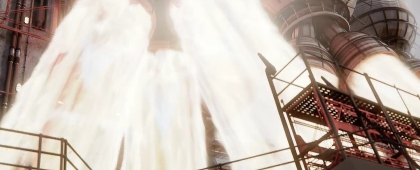
In the snapshot above, the react-player renders our sample video. Still, there seems not to be any video displayed because we’ve not added the needed props for that functionality.
To fix that, add a playing prop and a muted prop to the ReactPlayer component, and set the props to true, as shown in the code below:
<ReactPlayer width={'100%'} height='100%'
url="http://commondatastorage.googleapis.com/gtv-videos-bucket/sample/TearsOfSteel.mp4"
playing={true}
muted={true}
/>
In the code above, we included the playing and muted props to enable our sample video to play. In place of the props’ default values of false, we set a value of true. The code above produces the playing video seen in the illustration below:
Since there are no controls present, the video player is not interactive. Controls, a prop in the react-player package, has the value false by default. The video player’s controls are automatically added when the value is updated to true.

The controls prop adds the controls in the image above to your video player. But some controls we want our video player to have are not part of the controls react-player provides. For example, we don’t have the fast forward and rewind features, hence the reason for customizing ours.
The Controls
The picture below is a visual representation of the functionalities of our Video Player.
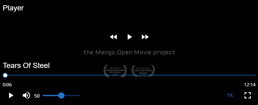
From the image above, we can see that this video player has the following features:
- Movie title
- Pause and Play
- Fast Forward and Rewind
- Muting
- Volume increase and decrease
- Playback Speed
- Fullscreen Mode
Importing and Styling the Controls
Create a new folder called Components in the src folder. Inside the newly created folder, create two new files-ControlIcons.jsx and ControlIcons.css.
The controls are divided into the top, middle, and bottom.
Let’s get into the code:
First, import the ControlIcons component into the App.js file by updating your App.js file with the following code:
import * as React from 'react';
import './App.css';
import ReactPlayer from 'react-player';
import screenfull from 'screenfull';
import Container from '@mui/material/Container';
import ControlIcons from './Components/ControlIcons';

function App() {
  return (
    <>
      <header className='header__section'>
        <p className='header__text'>Build a Video Player - Tutorial</p>
      </header>
      <Container maxWidth="md">
        <div className='playerDiv'>
          <ReactPlayer width={'100%'} height='100%'
          url="http://commondatastorage.googleapis.com/gtv-videos-bucket/sample/TearsOfSteel.mp4"
          playing={true}
          muted={true}
          controls={true}
          />
          <ControlIcons/>
        </div>
      </Container>
    </>
  );
}

export default App;
Next, navigate to ControlIcons.jsx file, and let’s get right into importing the controls segment by segment. Update its contents as follows:
import React from 'react';
import './ControlIcons.css';

const ControlIcons = () => {
    return (
        <div className="controls__div">

        </div>
    )
}

export default ControlIcons;
We must apply some styles, such as the position of absolute, to the div with a className of controls__div to allow our controls to overlap the video.
Inside the ControlsIcons.css file, add this:
.controls__div {
    position:absolute;
    top: 0;
    bottom: 0;
    left: 0;
    right: 0;
    display: flex;
    flex-direction: column;
    justify-content: space-between;
    z-index: 2;
    background: rgba(0,0,0,0.6);
}
In the code above, we set the position of the div with the className of controls__div as position: absolute for it to position properly inside the div with the className of playerDiv in our App.js file.
Our style will use the Grid wrapper from Material UI. We now begin with the top section, where we only want the word “Player” to be visible.
For this, we first have to import Grid and Typography (where the text to be displayed is written; this is the way to display a text when using material UI for styling).
import React from 'react';
import './ControlIcons.css';
import Grid from '@mui/material/Grid';
import Typography from '@mui/material/Typography';

const ControlIcons = () => {
    return (
        <div className="controls__div">

        </div>
    )
}

export default ControlIcons;
The following code should be added to your ControlIcons.jsx file to display the top section text (which is “Player” ):
import React from 'react';
import './ControlIcons.css';
import Grid from '@mui/material/Grid';
import Typography from '@mui/material/Typography';

const ControlIcons = () => {
    return (
        <div className="controls__div">
            {/* Top Segment */}
           <Grid container direction='row' alignItems='center' justifyContent='start' style={{padding: 16 }}>
              <Grid item>
                <Typography variant='h5' style={{color:'white'}}>Player</Typography>
              </Grid>
           </Grid>
        </div>
    )
}

export default ControlIcons;
In the code snippet above, we employ a Grid wrapper that acts as a container to hold the text “Player”. This Grid was given some positional parameters, and we then added the inline style padding: 16px to it. The item to be placed inside the container was then represented by another Grid wrapper, and the text was then displayed using the Typography wrapper.
Let’s move on to the middle section. Here we have three buttons: rewind, play, and fast-forward.
As usual, the first step is to import the needed icons. Add the following imports to your ControlIcons.jsx file.
import { IconButton } from '@mui/material';
import { FastRewind } from '@mui/icons-material';
import { FastForwardSharp } from '@mui/icons-material';
import { PlayArrowSharp } from '@mui/icons-material';
Next, let’s make use of the icons that we imported. Do this:
<Grid container direction='row' alignItems='center' justifyContent='center'>
        <IconButton className='controls__icons' aria-label='reqind'>
           <FastRewind fontSize='large' style={{color:'white'}}/>
        </IconButton>

        <IconButton className='controls__icons' aria-label='reqind'>
             <PlayArrowSharp fontSize='large' style={{color:'white'}}/>
        </IconButton>

        <IconButton className='controls__icons' aria-label='reqind'>
             <FastForwardSharp fontSize='large' style={{color:'white'}}/>
        </IconButton>
 </Grid>
In the code above, we simply created a Grid (Container) where all three icons live; we applied some value to this Grid which determines how the icons are positioned. And lastly, we displayed all three icons using the IconButton wrapper Material UI provides. For each of the IconButton wrappers, we added a className called controls__icons.
In the code above, all three icons are contained in a Grid (Container), and a value is applied to this Grid to determine how the icons are positioned. And lastly, we displayed all three icons using the IconButton wrapper Material UI provides. For each of the IconButton wrappers, we added a className called controls__icons.
Here is the style for the div with className of controls__icons:
.controls__icons {
    color: white;
    font-size: 50;
    transform:scale(0.9);
}

.controls__icons:hover {
    color: #fff;
    transform:scale(1);
}
And lastly, we move to the third section. This section has sub-sections: the video’s title, the player slider, and the last group of controls.
First, import the icons using the following code:
import Button from '@mui/material/Button';
import Slider from '@mui/material/Slider';
import { styled } from '@mui/material/styles';
import { VolumeUp } from '@mui/icons-material';
import { Fullscreen } from '@mui/icons-material';
We then add the code for the first category (the video title) in this section and create the Grid (container) that houses the entire bottom segment. Here is the code to execute the previous statement:
{/* Bottom Section */}
<Grid container direction='row' alignItems='center' justifyContent='space-between' style={{padding: 16}}>
      <Grid item>
            <Typography variant='h5' style={{color:'white'}}>Tears Of Steel</Typography>
       </Grid>
</Grid>
From the code above, it can be derived that this bottom section is embedded inside a container given a direction of row and justifyContent of space-between, which renders the bottom component with equal space between all the categories.
Let’s go on to the next category (the video player slider). We’ll use the ‘PrettoSlider’ pre-built slider from the material UI. There is a function needed to use the slider. We will use the PrettoSlider as a component wherever we want to display it after adding the function from the code snippet below to your “ControlIcons.jsx” file.
PrettoSlider Function:
const PrettoSlider = styled(Slider)({
  height: 5,
  "& .MuiSlider-track": {
    border: "none",
  },
  "& .MuiSlider-thumb": {
    height: 16,
    width: 16,
    backgroundColor: "#fff",
    border: "2px solid currentColor",
    "&:focus, &:hover, &.Mui-active, &.Mui-focusVisible": {
      boxShadow: "inherit",
    },
    "&:before": {
      display: "none",
    },
  },
  "& .MuiSlider-valueLabel": {
    lineHeight: 1.2,
    fontSize: 12,
    background: "unset",
    padding: 0,
    width: 32,
    height: 32,
    borderRadius: "50% 50% 50% 0",
    backgroundColor: "#52af77",
    transformOrigin: "bottom left",
    transform: "translate(50%, -100%) rotate(-45deg) scale(0)",
    "&:before": { display: "none" },
    "&.MuiSlider-valueLabelOpen": {
      transform: "translate(50%, -100%) rotate(-45deg) scale(1)",
    },
    "& > *": {
      transform: "rotate(45deg)",
    },
  },
});
Now use the PrettoSlider as a component:
{/* Bottom Section */}
<Grid
  container
  direction="row"
  alignItems="center"
  justifyContent="space-between"
  style={{ padding: 16 }}
>
  <Grid item>
    <Typography variant="h5" style={{ color: "white" }}>
      Tears Of Steel
    </Typography>
  </Grid>

  <Grid item xs={12}>
    <PrettoSlider min={0} max={100} defaultValue={20} />
    <Grid container direction="row" justifyContent="space-between">
      <Typography variant="h7" style={{ color: "white" }}>
        00:26
      </Typography>
      <Typography variant="h7" style={{ color: "white" }}>
        12:30
      </Typography>
    </Grid>
  </Grid>
</Grid>
We provided the PrettoSlider with specific props, including a default value, the terms “min” for minimum value and “max” for maximum value. Next, we added some digits to show the video’s duration and total watch time.
The play button, volume up, volume slider, playback speed, and full screen are the icons found in the last category.
We will use the “IconButton wrapper” to display the icons and render the volume slider by giving it the className “volume slider” and some parameters with default values.
<Grid item>
  <Grid container alignItems="center" direction="row">
    <IconButton className="controls__icons" aria-label="reqind">
      <PlayArrowSharp fontSize="large" style={{ color: "white" }} />
    </IconButton>

    <IconButton className="controls__icons" aria-label="reqind">
      <VolumeUp fontSize="large" style={{ color: "white" }} />
    </IconButton>

    <Typography style={{ color: "#fff", paddingTop: "5px" }}>40</Typography>
    <Slider min={0} max={100} defaultValue={100} className="volume__slider" />
  </Grid>
</Grid>
Here is the code to style the Volume Slider:
.volume__slider {
    width: 100;
    margin-top: -50px;
    margin-left: 130px;
}
Now let’s add the playback speed rate and the full-screen icon. Using the code below, display the text and icon in your video player.
<Grid item>
  <Button variant="text" className="bottom__icons">
    <Typography>1X</Typography>
  </Button>

  <IconButton className="bottom__icons">
    <Fullscreen fontSize="large" />
  </IconButton>
</Grid>
The code snippet above should be added to the ControlIcons.jsx file inside the grid container for the bottom section, and the styles should be in the ControlIcons.css file.
Here is the style for the className of bottom__icons:
.bottom__icons {
color:#999;
}
.bottom__icons:hover {
color: white;
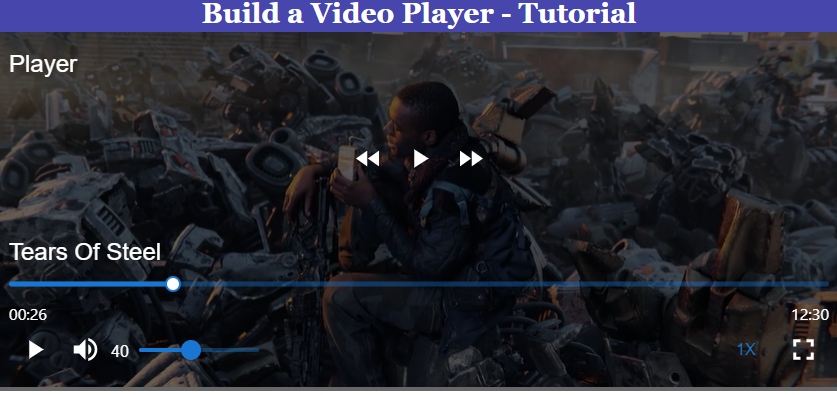
}When you preview the app, you should see a video player rendered with all the imported and styled buttons and icons.
In case you are running into errors at this point, simply crosscheck your code with the one below:
import React from "react";
import "./ControlIcons.css";
import Grid from "@mui/material/Grid";
import Typography from "@mui/material/Typography";
import { IconButton } from "@mui/material";
import { FastRewind } from "@mui/icons-material";
import { FastForwardSharp } from "@mui/icons-material";
import { PlayArrowSharp } from "@mui/icons-material";
import Button from "@mui/material/Button";
import Slider from "@mui/material/Slider";
import { styled } from "@mui/material/styles";
import { VolumeUp } from "@mui/icons-material";
import { Fullscreen } from "@mui/icons-material";

const ControlIcons = () => {
  const PrettoSlider = styled(Slider)({
    height: 5,
    "& .MuiSlider-track": {
      border: "none",
    },
    "& .MuiSlider-thumb": {
      height: 16,
      width: 16,
      backgroundColor: "#fff",
      border: "2px solid currentColor",
      "&:focus, &:hover, &.Mui-active, &.Mui-focusVisible": {
        boxShadow: "inherit",
      },
      "&:before": {
        display: "none",
      },
    },
    "& .MuiSlider-valueLabel": {
      lineHeight: 1.2,
      fontSize: 12,
      background: "unset",
      padding: 0,
      width: 32,
      height: 32,
      borderRadius: "50% 50% 50% 0",
      backgroundColor: "#52af77",
      transformOrigin: "bottom left",
      transform: "translate(50%, -100%) rotate(-45deg) scale(0)",
      "&:before": { display: "none" },
      "&.MuiSlider-valueLabelOpen": {
        transform: "translate(50%, -100%) rotate(-45deg) scale(1)",
      },
      "& > *": {
        transform: "rotate(45deg)",
      },
    },
  });
  return (
    <div className="controls__div">
      {/* Top Segment */}
      <Grid
        container
        direction="row"
        alignItems="center"
        justifyContent="start"
        style={{ padding: 16 }}
      >
        <Grid item>
          <Typography variant="h5" style={{ color: "white" }}>
            Player
          </Typography>
        </Grid>
      </Grid>

      {/* Middle Segment */}
      <Grid
        container
        direction="row"
        alignItems="center"
        justifyContent="center"
      >
        <IconButton className="controls__icons" aria-label="reqind">
          <FastRewind fontSize="large" style={{ color: "white" }} />
        </IconButton>

        <IconButton className="controls__icons" aria-label="reqind">
          <PlayArrowSharp fontSize="large" style={{ color: "white" }} />
        </IconButton>

        <IconButton className="controls__icons" aria-label="reqind">
          <FastForwardSharp fontSize="large" style={{ color: "white" }} />
        </IconButton>
      </Grid>

      {/* Bottom Segment */}
      <Grid
        container
        direction="row"
        alignItems="center"
        justifyContent="space-between"
        style={{ padding: 16 }}
      >
        <Grid item>
          <Typography variant="h5" style={{ color: "white" }}>
            Tears Of Steel
          </Typography>
        </Grid>

        <Grid item xs={12}>
          <PrettoSlider min={0} max={100} defaultValue={20} />
          <Grid container direction="row" justifyContent="space-between">
            <Typography variant="h7" style={{ color: "white" }}>
              00:26
            </Typography>
            <Typography variant="h7" style={{ color: "white" }}>
              12:30
            </Typography>
          </Grid>
        </Grid>

        <Grid item>
          <Grid container alignItems="center" direction="row">
            <IconButton className="controls__icons" aria-label="reqind">
              <PlayArrowSharp fontSize="large" style={{ color: "white" }} />
            </IconButton>

            <IconButton className="controls__icons" aria-label="reqind">
              <VolumeUp fontSize="large" style={{ color: "white" }} />
            </IconButton>

            <Typography style={{ color: "#fff", paddingTop: "5px" }}>
              40
            </Typography>
            <Slider
              min={0}
              max={100}
              defaultValue={100}
              className="volume__slider"
            />
          </Grid>
        </Grid>

        <Grid item>
          <Button variant="text" className="bottom__icons">
            <Typography>1X</Typography>
          </Button>

          <IconButton className="bottom__icons">
            <Fullscreen fontSize="large" />
          </IconButton>
        </Grid>
      </Grid>
    </div>
  );
};

export default ControlIcons;
When you preview, you should have a replica of the image below:
You’ll see that the buttons are not interactive and must be activated if you try clicking on them. This brings us to the article’s final section, Activating the Controls.
Session Replay for Developers
Uncover frustrations, understand bugs and fix slowdowns like never before with OpenReplay — an open-source session replay tool for developers. Self-host it in minutes, and have complete control over your customer data. Check our GitHub repo and join the thousands of developers in our community.
Activating the Controls
We will proceed in this part in a logical order, beginning at the top. This means we’ll start by activating the controls for the middle part.
Navigate into the App.js file, and we’ll start by creating a state called playerState. This state is an object with six properties: playing, mute, playerbackRate, played, volume, and seeking.
const [playerstate, setPlayerState] = useState({
    playing: true,
    mute: true,
    volume: 0.5,
    playerbackRate:1.0,
    played:0,
    seeking: false,
})
Note, in other for you to be able to use the useState hook, you need to import it at the top like this:
import { useState } from 'react';Next, destructure the state to access its properties.
//Destructure State in other to get the values in it
  const { playing, mute, volume, playerbackRate, played, seeking} = playerstate;
Update the React Player component by replacing the values for playing and muted props from true to playing and mute, respectively.
<ReactPlayer width={'100%'}
height='100%'  url="http://commondatastorage.googleapis.com/gtv-videos-bucket/sample/TearsOfSteel.mp4"
playing={playing}
muted={mute}
 />
We now develop a feature that determines whether our video is playing or paused. For this, we’ll use the spread operator to store the values of our current playerState, and anytime this function is called, we’ll update the playing property in the state to return the inverse of its current value.
Here is the function:
const handlePlayAndPause = () => {
    setPlayerState({
      ...playerstate,
      playing: !playerstate.playing
    })
}
We have to send the function as a prop to the ControlIcons component so that the play button may access this feature. Just like this, pass the function as a prop:
<ControlIcons playandpause={handlePlayAndPause} />Destructure the prop in the ControlIcons Component. We are now left with making use of the prop gotten.
Update the IconButton Wrapper where the play button icon is embedded, with onClick={playandpause}:
<IconButton className='controls__icons' aria-label='reqind' onClick={playandpause}>
     <PlayArrowSharp fontSize='large' style={{color:'white'}}/>
 </IconButton>
Use the code above to update the icon’s two instances.
Let’s include the capability to switch between play and pause. The playing attribute from our “playerState” will be used to conditionally render the icons and import the pause button.
Import the Pause Icon.
import { PauseSharp } from '@mui/icons-material';Pass the playing prop to the ControlIcons component
<ControlIcons playandpause={handlePlayAndPause} playing={playing}/>Destructure the prop
const ControlIcons = ({ playandpause, playing }) => { }Replace the two instances of the play icon wrapper with this:
<IconButton
  className="controls__icons"
  aria-label="reqind"
  onClick={playandpause}
>
  {playing ? (
    <PauseSharp fontSize="large" style={{ color: "white" }} />
  ) : (
    <PlayArrowSharp fontSize="large" style={{ color: "white" }} />
  )}
</IconButton>
In the code above, we used the ternary operator to conditionally render the icon based on the value of the playing attribute contained within the playerState. According to the rationale, the play icon should be rendered when the video is paused, and the pause icon should be rendered when the video is playing.
You should be able to play and pause the video now.
We must now construct a new set of functions to manage the rewind and fast-forward features. Just like the Windows Media Player on Windows PCs, we want to fast-forward the video by 30 seconds and rewind it by 10 seconds.
To do this, we must first establish a reference to the React player component to determine the video’s current time.
First, import the useRef hook and create the reference for the react-player component.
import { useState, useRef } from 'react';

//refer to the react-player component
 const playerRef = useRef(null);

//And lastly, add the reference to the react-player component by updating it with this code
<ReactPlayer width={'100%'} height='100%'
url="http://commondatastorage.googleapis.com/gtv-videos-bucket/sample/TearsOfSteel.mp4"
ref={playerRef} //here is the reference
playing={playing}
muted={mute}
/>
Let’s make the rewinding function, which we’ll call handleRewind(). Note that we have access to several instance methods through the react-player library, and we utilize the ‘playerRef’ to call instance methods on the player. We will utilize the two instance methods “seekTo(amount, type)” and “getCurrentTime()” for the rewind and fast-forward operations.
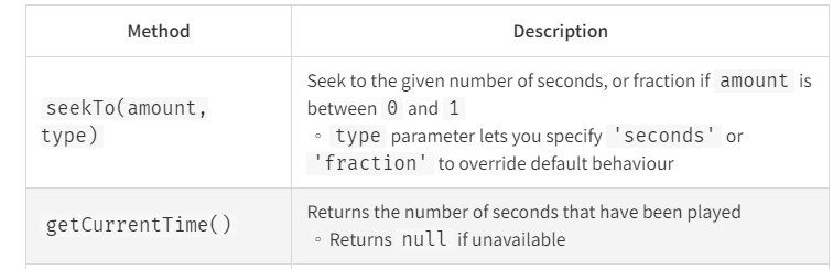
//function to handle rewinding
 const handleRewind = () => {
    playerRef.current.seekTo(playerRef.current.getCurrentTime() - 10, ‘seconds’)
 }
//function to handle fast-forward
//The major difference between this function and that of rewinding is the addition of 30 seconds to the video's current time.
const handleFastForward = () => {
playerRef.current.seekTo(playerRef.current.getCurrentTime() + 30, 'seconds')
}The “ControlIcons component will then get the functions as a prop, which will be destructured inside the component before the icons are activated.
For that, do this:
//Pass the functions as props
<ControlIcons
 playandpause={handlePlayAndPause}
 playing={playing}
 rewind={handleRewind}
 fastForward={handleFastForward}
 />
//Destructure the props inside the ControlIcons.jsx file
const ControlIcons = ({ playandpause, playing, rewind, fastForward }) => { }Next, call the onClick event on the rewind and fast-forward icons passing the rewind and fastForward props to the event.
//The rewind icon
<IconButton className='controls__icons' aria-label='reqind' onClick={rewind}>
     <FastRewind fontSize='large' style={{color:'white'}}/>
</IconButton>

//The fast-forward icon
<IconButton className='controls__icons' aria-label='reqind' onClick={fastForward}>
     <FastForwardSharp fontSize='large' style={{color:'white'}}/>
</IconButton>
With the code above, we can now rewind and fast-forward the video. You’ll note that the video player slider doesn’t move to the current time when we rewind or fast-forward the video, and let’s change that as we enter the third section of the controls.
The seek bar on the video player is our next goal (the slider). In addition to implementing the ability to click (seek) a specific time on the seek bar and view the video from that moment, we also want it to move as we fast-forward or rewind.
For that, we have to use a callback prop react-player provides - onProgress.
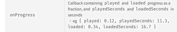
Add the value handlePlayerProgress (a function we will later write) to the callback props for the react-player component list. Use the following code to update your React player component:
<ReactPlayer width={'100%'} height='100%'
url="http://commondatastorage.googleapis.com/gtv-videos-bucket/sample/TearsOfSteel.mp4"
ref={playerRef}
playing={playing}
muted={mute}
onProgress={handlePlayerProgress}
 />
The function handlePlayerProgress accepts a state argument. This state argument represents an object with other states embedded. Some sets of states are changed, and new values are returned whenever the video player seek bar (the player’s timing) changes. In this function, we retain the values of the previously altered States and our playerstate attributes. We want this to happen only when the seeking property value in our playerstate is negated.
You can observe the changing states in your console if you log the newly altered state. We simply require the played state, which is the duration of the video in seconds. This is the played property in our playerstate.
const handlePlayerProgress = (state) => {
    console.log('onProgress', state);
    if (!playerstate.seeking) {
      setPlayerState({...playerstate, ...state})
    }
    console.log('afterProgress', state);
 }
Next, pass played as a prop to the ControlIcons component:
<ControlIcons
    playandpause={handlePlayAndPause}
    playing={playing}
    rewind={handleRewind}
    fastForward={handleFastForward}
    played={played}
/>
Navigate to the ControlIcons.jsx file and destructure the played prop in it.
const ControlIcons = ({ playandpause, playing, rewind, fastForward, played }) => { }Update your prettoslider with the code below:
<PrettoSlider
 min={0}
 max={100}
 value={played*100}
 />
Since our slider has a maximum value of 100, we simply removed the defaultValue and introduced the value prop, which uses the played prop as its value but multiplies it by 100. As the video plays and when we fast-forward or rewind, the seek bar on the video player now moves.
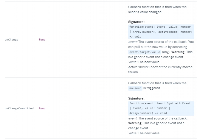
We must create functions that enable us to seek a particular time using the video player slider. To do this, we will create two functions: handlePlayerSeek() and handlePlayerMouseSeekUp().
The handlePlayerSeek() is the function triggered when we seek a particular time of the video (when the slider value changes), while the handlePlayerMouseSeekUp() is the function triggered when the mouseup event is activated.
const handlePlayerSeek = (newValue) => {
    setPlayerState({...playerstate, played: parseFloat(newValue/100)});]
    playerRef.current.seekTo(parseFloat(newValue / 100));
}

const handlePlayerMouseSeekUp = (newValue) => {
    setPlayerState({...playerstate, seeking: false});
    playerRef.current.seekTo(newValue / 100);
}
For the handlePlayerSeek(), whenever the slider moves, automatically we get a new value - this is the parameter passed to the function. We then updated the playerState by keeping all we have in the state and updating only the played value to the newValue (which is a string) divided by 100 since played only takes a value between 0 and 1.
And for the handlePlayerMouseSeekUp(), we passed the parameter of newValue. We updated the playerState by keeping all we have in the state and updating only the seeking value to false. Afterward, we set the video’s current time to the time sought.
We must pass the functions as props to the ControlIcons component by updating your ControlIcons component.
<ControlIcons
 playandpause={handlePlayAndPause}
 playing={playing}
 rewind={handleRewind}
 fastForward={handleFastForward}
 played={played}
 onSeek={handlePlayerSeek}
 onSeekMouseUp={handlePlayerMouseSeekUp}
 />
Next, destructure the newly added props in your ControlIcons.jsx file:
const ControlIcons = ({ playandpause, playing, rewind, fastForward, played, onSeek, onSeekMouseUp }) => { }In order to use the onSeek and onSeekMouseUp props, we need onChange and onChangeCommitted props, respectively.
The snapshot below explains what these props do.
Now, update your prettoslider component with the code below:
<PrettoSlider
 min={0}
 max={100}
 value={played*100}
 onChange={onSeek}
 onChangeCommitted={onSeekMouseUp}
/>
We can now seek a particular video time.
Next, right below the video player slider, we want to display the video’s total played time and length.
To do this, we need two instance methods react-player provides for us. The methods are: getCurrentTime() and getDuration(). The snapshot below explains their use.
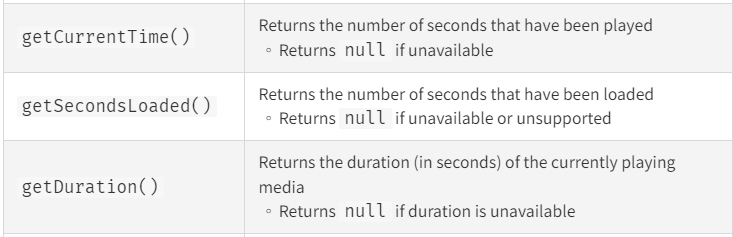
const currentPlayerTime = playerRef.current ? playerRef.current.getCurrentTime() : '00:00';
const movieDuration = playerRef.current ? playerRef.current.getDuration() : '00:00';
The timing values were displayed using ternary operators in the code mentioned above sample. However, we still need to format the time returned to our preferences. For this, a globally scoped function is required.
Here is the globally scoped function (I defined it at the top, outside the App component function):
const format = (seconds) => {
  if (isNaN(seconds)) {
    return '00:00'
  }

  const date = new Date(seconds * 1000);
  const hh = date.getUTCHours();
  const mm = date.getUTCMinutes();
  const ss = date.getUTCSeconds().toString().padStart(2, "0");

  if (hh) {
    return `${hh}:${mm.toString().padStart(2, "0")}:${ss}`
  } else {
      return `${mm}:${ss}`
  }
};
Call the function doing this:
const currentPlayerTime = playerRef.current ? playerRef.current.getCurrentTime() : '00:00';
const movieDuration =  playerRef.current ? playerRef.current.getDuration() : '00:00';
const playedTime = format(currentPlayerTime);
const fullMovieTime = format(movieDuration);
Pass playedTime and fullMovieTime as props to the ControlIcons component. Update the component call using the code below:
<ControlIcons
  playandpause={handlePlayAndPause}
  playing={playing}
  rewind={handleRewind}
  fastForward={handleFastForward}
  played={played}
  onSeek={handlePlayerSeek}
  onSeekMouseUp={handlePlayerMouseSeekUp}
  playedTime={playedTime}
  fullMovieTime={fullMovieTime}
/>
As usual, destructure them inside the ControlIcons.jsx file:
const ControlIcons = ({ playandpause, playing, rewind, fastForward, played, onSeek, onSeekMouseUp, playedTime, fullMovieTime }) => { }Finally, update the timing default value after the prettoslider component with this:
<Typography variant='h7' style={{color:'white'}}>{playedTime}</Typography>
<Typography variant='h7' style={{color:'white'}}>{fullMovieTime}</Typography>
You can now view the played time and the movie duration live as the video plays.
And finally, let’s work on the last category of the third segment. Let’s start with the volume icon. When we click it, we should be able to switch between muted and volume up. In that case, depending on the current volume level, the icon should change to muted or volume-up. Navigate into the App.js file, where we’ll create the function that handles the muting state.
const handleMuting = () => {
    setPlayerState({...playerstate, muted: !playerstate.muted})
}
For the handleMuting(), we kept all that is in the playerstate and updated the muted property to an inverse value of the current state of muted. Pass the function and muted property as props into the ControlIcons component by modifying your code with this:
<ControlIcons
  playandpause={handlePlayAndPause}
  playing={playing}
  rewind={handleRewind}
  fastForward={handleFastForward}
  played={played}
  onSeek={handlePlayerSeek}
  onSeekMouseUp={handlePlayerMouseSeekUp}
  playedTime={playedTime}
  fullMovieTime={fullMovieTime}
  muting={handleMuting}
  muted={mute}
/>
Destructure the muting and muted props in the ControlIcons.jsx file:
const ControlIcons = ({ playandpause, playing, rewind, fastForward, played, onSeek, onSeekMouseUp, playedTime, fullMovieTime,muting, muted }) => { }Next, import the icon that symbolizes volume off or muted.
import { VolumeOff } from '@mui/icons-material';Now, update the whole wrapper for the volume icon with the code below:
<IconButton className='controls__icons' aria-label='reqind' onClick={muting}>
   {
      muted ? (
        <VolumeOff fontSize='large' style={{color:'white'}}/>
         ) : (
        <VolumeUp fontSize='large' style={{color:'white'}}/>
     )
   }
</IconButton>
We conditionally rendered two icons in the aforementioned IconButton wrapper based on the value of the “muted” attribute in the “playerstate”. Additionally, we added an onClick() event to the wrapper and specified the value to be muting.
For the volume slider, just like the PrettoSlider, we have two functions to define, one for the onChange event and the other for the onChangeCommitted event.
//function for the `onChange` event
const handleVolumeChange = (e, newValue) => {
    setPlayerState({...playerstate, volume:parseFloat(newValue/100), mute:newValue === 0 ? true : false, });
}

//function for the `onChangeCommitted` event
const handleVolumeSeek = (e, newValue) => {
    setPlayerState({...playerstate, volume:parseFloat(newValue/100), mute:newValue === 0 ? true : false, });
}
For the functions above, we simply updated the playerstate by keeping all that is in it and the values of the volume and mute properties.
We then pass the function as props:
<ControlIcons
  playandpause={handlePlayAndPause}
  playing={playing}
  rewind={handleRewind}
  fastForward={handleFastForward}
  played={played}
  onSeek={handlePlayerSeek}
  onSeekMouseUp={handlePlayerMouseSeekUp}
  playedTime={playedTime}
  fullMovieTime={fullMovieTime}
  muting={handleMuting}
  muted={mute}
  volume={volume}
  volumeChange={handleVolumeChange}
  volumeSeek={handleVolumeSeek}
/>
Next, we update the volume slider by adding two new props: the onChange event and the onChangeCommitted event, and passing the volumeChange and volumeSeek props as their value, respectively. Also, we update the default value, which defines the volume pitch with the code below:
<Typography style={{color:'#fff', paddingTop:'5px'}}>{volume * 100}</Typography>
<Slider
 min={0}
 max={100}
 value={volume * 100}
 className='volume__slider'
 onChange={volumeChange}
 onChangeCommitted={volumeSeek}
 />
Regarding the playback speed/rate. Here, we want to include a function that lets us change the speed at which the video plays.
In this section, we’ll work with the playbackRate props react-player provides.

We have to create the function that handles the playback rate. This function updates the playerstate by simply keeping all that is in it and updating only playerbackRate value to its parameter (rate).
Here is the function:
const handlePlayerRate = (rate) => {
    setPlayerState({...playerstate, playerbackRate: rate});
}
We have to pass this playerbackRate property from the playerstate as the value for the playbackRate prop that we’ll add to the React Player component.
According to the statement above, your React Player component should have the following props.
<ReactPlayer width={'100%'} height='100%'
  url="http://commondatastorage.googleapis.com/gtv-videos-bucket/sample/TearsOfSteel.mp4"
  ref={playerRef}
  playing={playing}
  muted={mute}
  onProgress={handlePlayerProgress}
  playbackRate={playerbackRate}
/>
In the code snippet above, we added the playbackRate prop to the React Player component.
Next, we have to pass both playerbackRate property from the playerstate and handlePlayerRate() as props to ControlIcons component.
<ControlIcons
  playandpause={handlePlayAndPause}
  playing={playing}
  rewind={handleRewind}
  fastForward={handleFastForward}
  played={played}
  onSeek={handlePlayerSeek}
  onSeekMouseUp={handlePlayerMouseSeekUp}
  playedTime={playedTime}
  fullMovieTime={fullMovieTime}
  muting={handleMuting}
  muted={mute}
  volume={volume}
  volumeChange={handleVolumeChange}
  volumeSeek={handleVolumeSeek}
  playerbackRate={playerbackRate}
  playRate={handlePlayerRate}
 />
Let’s move into the ControlIcons.jsx file, where we’ll create the popover and use the recently passed props.
The first thing we have to do here is to set up the Popover where we’ll embed the various speed rates.
Import Popover component from Material UI.
import Popover from '@mui/material/Popover';Next, destructure the props inside the ControlIcons.jsx file:
const ControlIcons = ({ playandpause, playing, rewind, fastForward, played, onSeek, onSeekMouseUp, playedTime, fullMovieTime, muting, muted, volume, volumeChange, volumeSeek , playRate, playerbackRate}) => { }The Popover component from MUI comes with a series of things: a state, two functions that trigger the opening and closing of the popover, and two variables. You can find them in the code snippet below:
const [anchorEl, setAnchorEl] = React.useState(null);
const handlePopOver = (event) => {
     setAnchorEl(event.currentTarget);
};

const handleClose = () => {
     setAnchorEl(null);
 };

 const open = Boolean(anchorEl);
 const id = open ? 'playbackrate-popover' : undefined;
Let’s systematically activate the popover starting with the displayed value of 1x in the Video player.
The Button Wrappper, which displays the current playback rate of the video, should be updated with the code below:
<Button variant='text' onClick={handlePopOver} className='bottom__icons'>
     <Typography>{playerbackRate}X</Typography>
</Button>
For the code above, we added the onClick event to the Button Wrapper, which we passed the handlePopOver() as its value. After that, we updated the current value of the playback rate using the playbackRate prop.
Immediately after the code above, add this:
<Popover
    id={id}
    open={open}
    anchorEl={anchorEl}
    onClose={handleClose}
    anchorOrigin={{
        vertical: 'top',
        horizontal: 'center',
    }}
    transformOrigin={{
      vertical: 'bottom',
      horizontal: 'center
   }}>
        <Grid container direction='column-reverse'>
                 {
                      [0.5,1,1.5,2].map((rate) => (
                           <Button variant='text' onClick={() => playRate(rate)}>
                               <Typography color={rate === playerbackRate ? 'secondary' : 'default'}>{rate}</Typography>
                           </Button>
                      ))
               }
       </Grid>
</Popover>
In the code above, we simply passed id, open, anchorE!, and onClose as props to the Popover wrapper. We also structured the position of the Popover using the anchorOrigin and transformOrigin. Finally, inside the Popover wrapper, we mapped the values which symbolize the playback rate, then they are passed as the argument to the playRate.
Now, we can toggle through four values for our playback rate. By default, the playback rate is set to 1.
Navigate to the App.js.
Finally, let’s implement the Full-Screen Mode. Remember that we imported screenfull from the screenfull package.
We need to make a reference to the wrapper for the whole video player, i.e., the div with a className of playerDiv.
Create the reference using useRef:
const playerDivRef = useRef(null);Call the reference on the Video player wrapper:
<div className='playerDiv' ref={playerDivRef}></div>Create the function that triggers full-screen mode when we toggle the icon.
const handleFullScreenMode = () => {
    screenfull.toggle(playerDivRef.current);
}
Pass the function as a prop to the ControlIcons component. Update the ControlIcons component with this:
<ControlIcons
  playandpause={handlePlayAndPause}
  playing={playing}
  rewind={handleRewind}
  fastForward={handleFastForward}
  played={played}
  onSeek={handlePlayerSeek}
  onSeekMouseUp={handlePlayerMouseSeekUp}
  playedTime={playedTime}
  fullMovieTime={fullMovieTime}
  muting={handleMuting}
  muted={mute}
  volume={volume}
  volumeChange={handleVolumeChange}
  volumeSeek={handleVolumeSeek}
  playerbackRate={playerbackRate}
  playRate={handlePlayerRate}
  fullScreenMode={handleFullScreenMode}
/>
Destructure the fullScreenMode prop inside the ControlIcons.jsx file.
const ControlIcons = ({ playandpause, playing, rewind, fastForward, played, onSeek, onSeekMouseUp, playedTime, fullMovieTime, muting, muted, volume, volumeChange, volumeSeek , playRate, playerbackRate, fullScreenMode}) => { }Add the onClick event (with the fullScreenMode prop as its value) to the IconButton wrapper where the full-screen icon is embedded.
<IconButton className='bottom__icons' onClick={fullScreenMode}>
      <Fullscreen fontSize='large'/>
</IconButton>
The result for this build should look like this:
Conclusion
In this article, we learned how to build and customize a video player using the react-player package and Mui to style and import the needed icons. However, you can always take the build further by adding some unique features to make the player suit your taste completely.
Here is the source code and the deployed version.
A TIP FROM THE EDITOR: If you are interested in showing videos, please also look at our Picture-In-Picture Video With HTML5 And JavaScript article.
Gain Debugging Superpowers
Unleash the power of session replay to reproduce bugs and track user frustrations. Get complete visibility into your frontend with OpenReplay, the most advanced open-source session replay tool for developers.