
CSS (Cascading Style Sheets) libraries have grown in popularity, and more libraries are now available to help web developers reduce development time and increase productivity.
Ant Design is a CSS library designed to work with React and in React frameworks to assist developers in creating clean and structured user interfaces through its Design System. Using Ant Design in your application makes it simple to include interactive user interfaces. It has over 675k weekly downloads on npm and 83.6k stars on Github.
This article will look at that library, one of the most widely known CSS libraries used in React Applications. Our goal is to create a simple project using Ant Design’s fundamentals.
Getting started with Ant Design
In this section, we will create a React application using the code block below:
npx create-react-app ant-design
cd ant-design
We will be using the stable version 4.24.5 at the time of this article. To gain access to the ant-design Design System, we will install the command in the code block below:
 npm install antd@4.24.5

 or

 yarn add antd@4.24.5
After successfully installing Ant Design in our React application, we must manually import the stylesheet provided by Ant Design. Navigate to index.css and paste the code block below into line 1.
import 'antd/dist/antd.css';Following that, we will update the App.css file with the styles contained in the code block below:
* {
  box-sizing: border-box;
  padding: 0;
  margin: 0;
  font-family: Poppins;
  font-size: 16px;
  font-weight: 500;
}

form {
  display: flex;
  flex-direction: column;
  justify-content: center;
}

label {
  font-size: 16px!important;
}

.Button {
  margin: 5px 0;
  background-color: #2cbeb7;
  border: #2cbeb7;
}

.Input {
  margin: 5px 0;
}


.Span {
  text-decoration: underline;
}

.Header {
  background-color: #000;
  color: #fff;
  font-size: 24px;
  font-weight: bold;
}

.Footer {
  background-color: #000;
  color: #fff;
  text-align: center;
  font-size: 24px;
  font-weight: bold;
}

.Content {
  display: flex;
  justify-content: center;
  align-items: center;
  flex-wrap: wrap;
  gap: 4px;
  font-size: 24px;
  font-weight: bold;
}

.ant-typography {
  font-size: 20px;
  font-weight: bold;
}

.ant-layout-sider-children {
  font-size: 24px;
  font-weight: bold;
}

.Sidebar {
  display: flex;
  justify-content: center;
  align-items: center;
  background-color: #000;
  color: #fff;
}

.Container {
  height: 100vh;
}

.Image {
 height: 600px;
}


.Grid {
  display: flex;
  justify-content: center;
  height: 100%;
}

.col-1 {
  background-color: #f2f4f7;
  color: #fff;
  display: flex;
  flex-direction: column;
  align-items: center;
  justify-content: center;
  height: 100%;
}

.col-2 {
  display: flex;
  flex-direction: column;
  justify-content: center;
  background-color: #fff;
}

.col-2 > .col-2-body {
  display: flex;
  flex-direction: column;
  justify-content: center;
  text-align: center;
  margin: 0 auto;
  width: 70%;
}
Session Replay for Developers
Uncover frustrations, understand bugs and fix slowdowns like never before with OpenReplay — an open-source session replay tool for developers. Self-host it in minutes, and have complete control over your customer data. Check our GitHub repo and join the thousands of developers in our community.
Create Components using Ant Design
In this section, we’ll look at the enriched user interface components that Ant Design provides. There are many options, so I’ll select the top-level components to help improve development productivity and time.
We will look at the following components and how to use them:
Layout
The layout of an application plays a significant role in Web applications; it influences the entire flow of an application, making its content readable and providing the best user experience. This is one of several methods for keeping a user interested in your application.
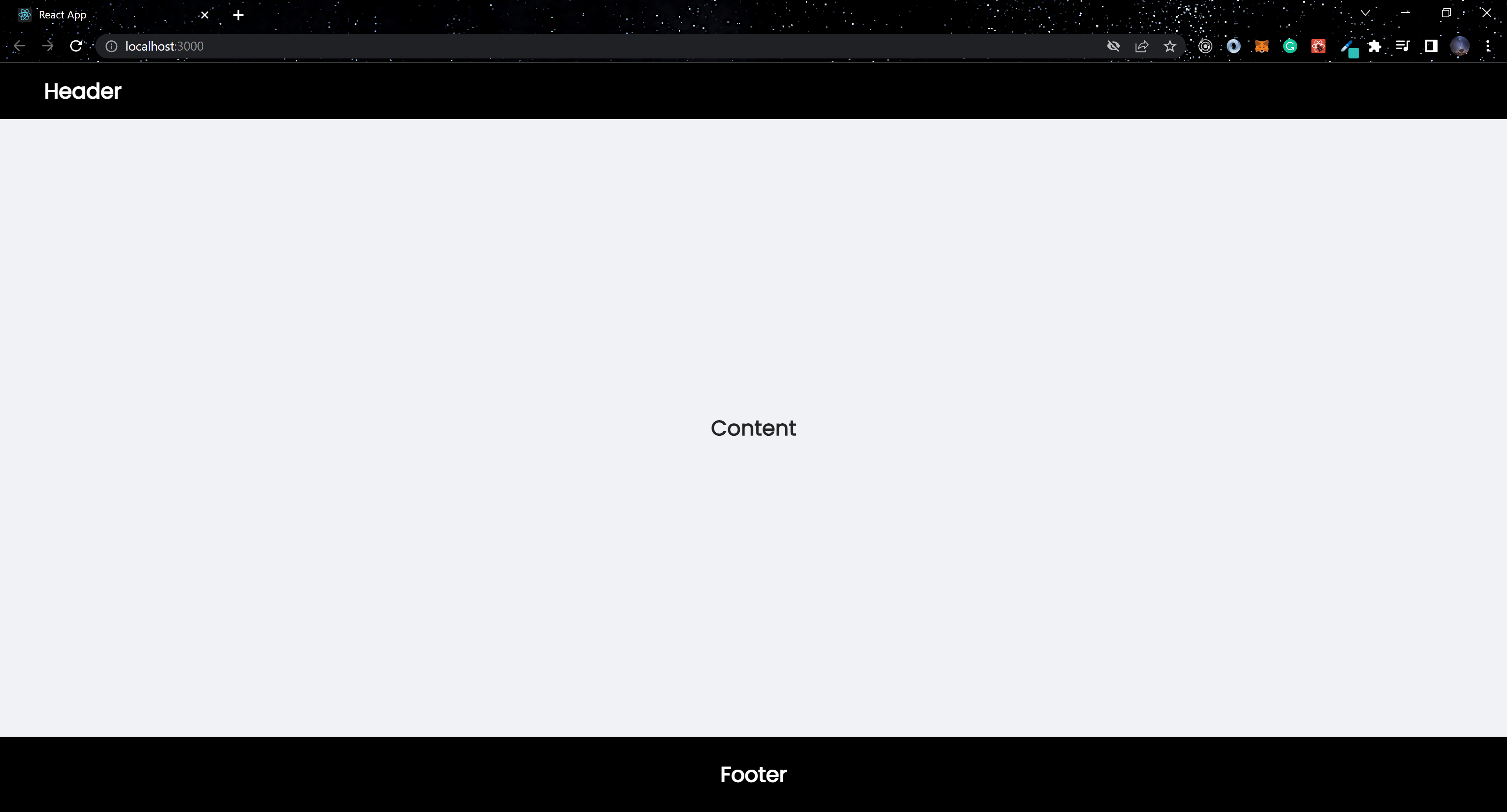
import React from "react";
import "./App.css";

import { Layout, } from "antd";

const { Content, Header, Footer } = Layout;

const App = () => (
  <Layout className="Container">
    <Header className="Header">Header</Header>
     <Content className="Content">Content</Content>
    <Footer className="Footer">Footer</Footer>
  </Layout>
);

export default App;
The layout component wraps Header, Content, and Footer in the code block above. The output of the above code block is shown in the image below.
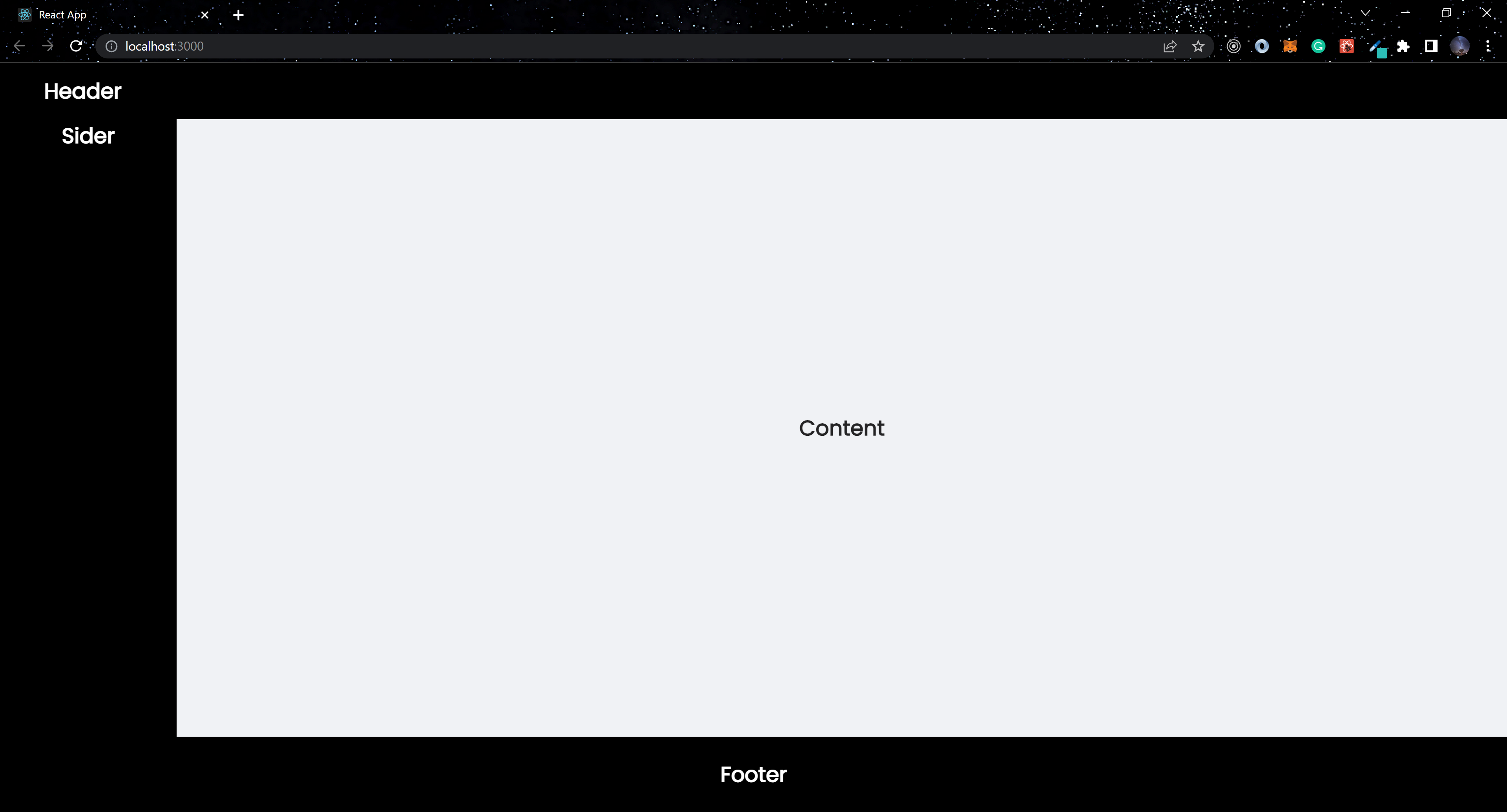
It is also possible to have nested layouts using Ant Design.
...

import { Layout, } from "antd";

const { Content, Header, Sider, Footer } = Layout;

const App = () => (
  <Layout className="Container">
    <Header className="Header">Header</Header>
     <Layout className="Container">
      <Sider className="Sidebar">Sider</Sider>
        <Content className="Content">Content</Content>
     </Layout>
    <Footer className="Footer">Footer</Footer>
  </Layout>
);

...
The Layout component is nested in the above code block by including a sidebar layout, which must also be placed inside the Layout component.
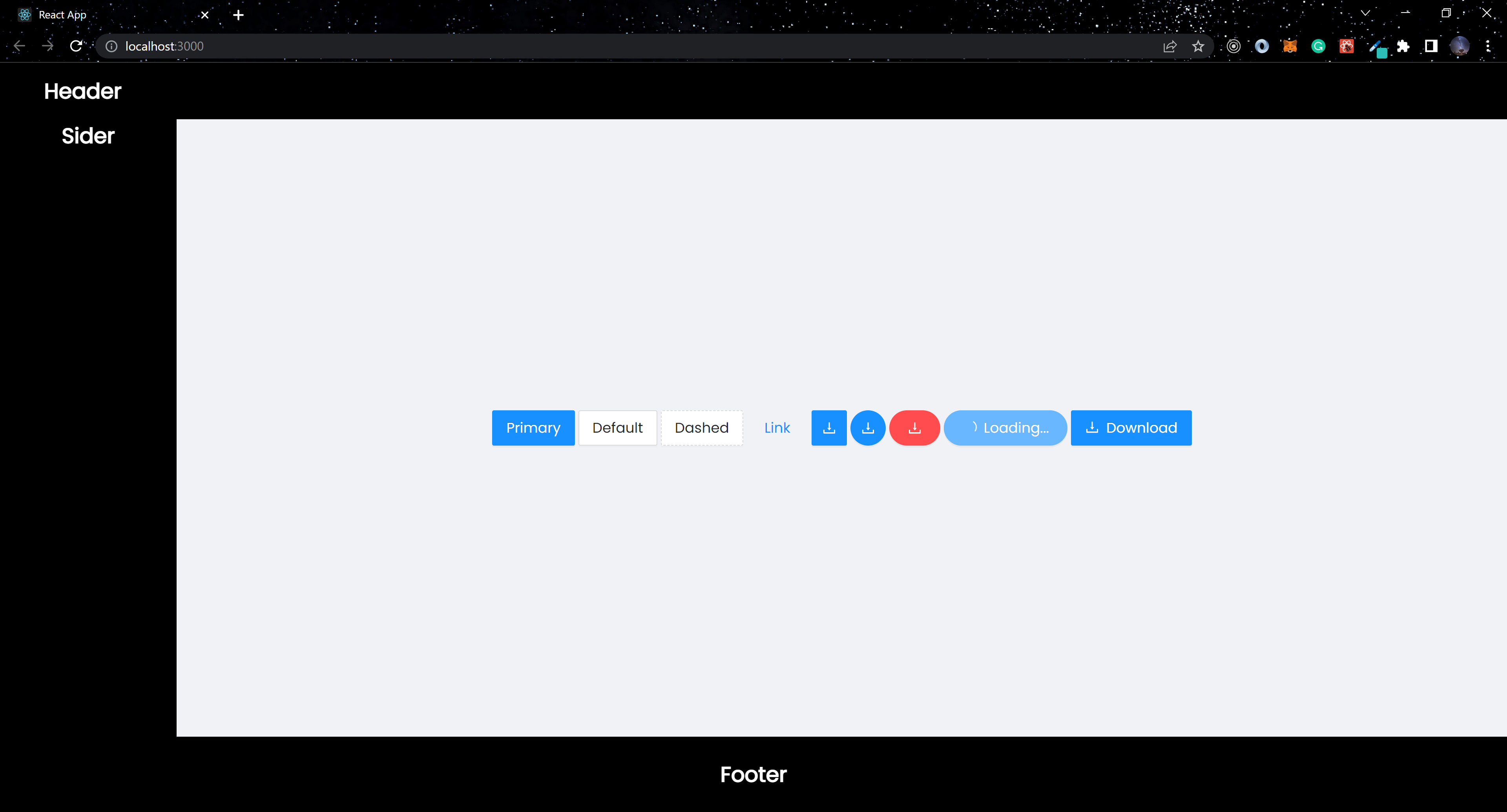
Button
The library includes five different types of buttons, as well as acceptable props. The props also have an impact on the behavior of the buttons. In the code block below, we’ll look at some of these props:
import React, { useState } from "react";
import "./App.css";
import { DownloadOutlined } from "@ant-design/icons";
import { Layout, Button } from "antd";

const { Content, Header, Sider, Footer } = Layout;

const App = () => {
  const [size] = useState("large");

  return (
    <Layout className="Container">
      <Header className="Header">Header</Header>
      <Layout className="Container">
        <Sider className="Sidebar">Sider</Sider>
        <Content className="Content">
          <Button type="primary" size={size}>
            Primary
          </Button>
          <Button size={size}>Default</Button>
          <Button type="dashed" size={size}>
            Dashed
          </Button>
          <br />
          <Button type="link" size={size}>
            Link
          </Button>
          <br />
          <Button type="primary" icon={<DownloadOutlined />} size={size} />
          <Button
            type="primary"
            shape="circle"
            icon={<DownloadOutlined />}
            size={size}
          />
          <Button
            type="danger"
            shape="round"
            icon={<DownloadOutlined />}
            size={size}
          />
          <Button
            type="primary"
            shape="round"
            loading
            size={size}
          >
            Loading...
          </Button>
          <Button type="primary" icon={<DownloadOutlined />} size={size}>
            Download
          </Button>
        </Content>
      </Layout>
      <Footer className="Footer">Footer</Footer>
    </Layout>
  );
};

export default App;
The Button component in the preceding code block has a prop of type, which accepts five values. These values determine the button’s final state. We used the values primary, default, dashed, and link. We also used the loading prop and the icon prop.
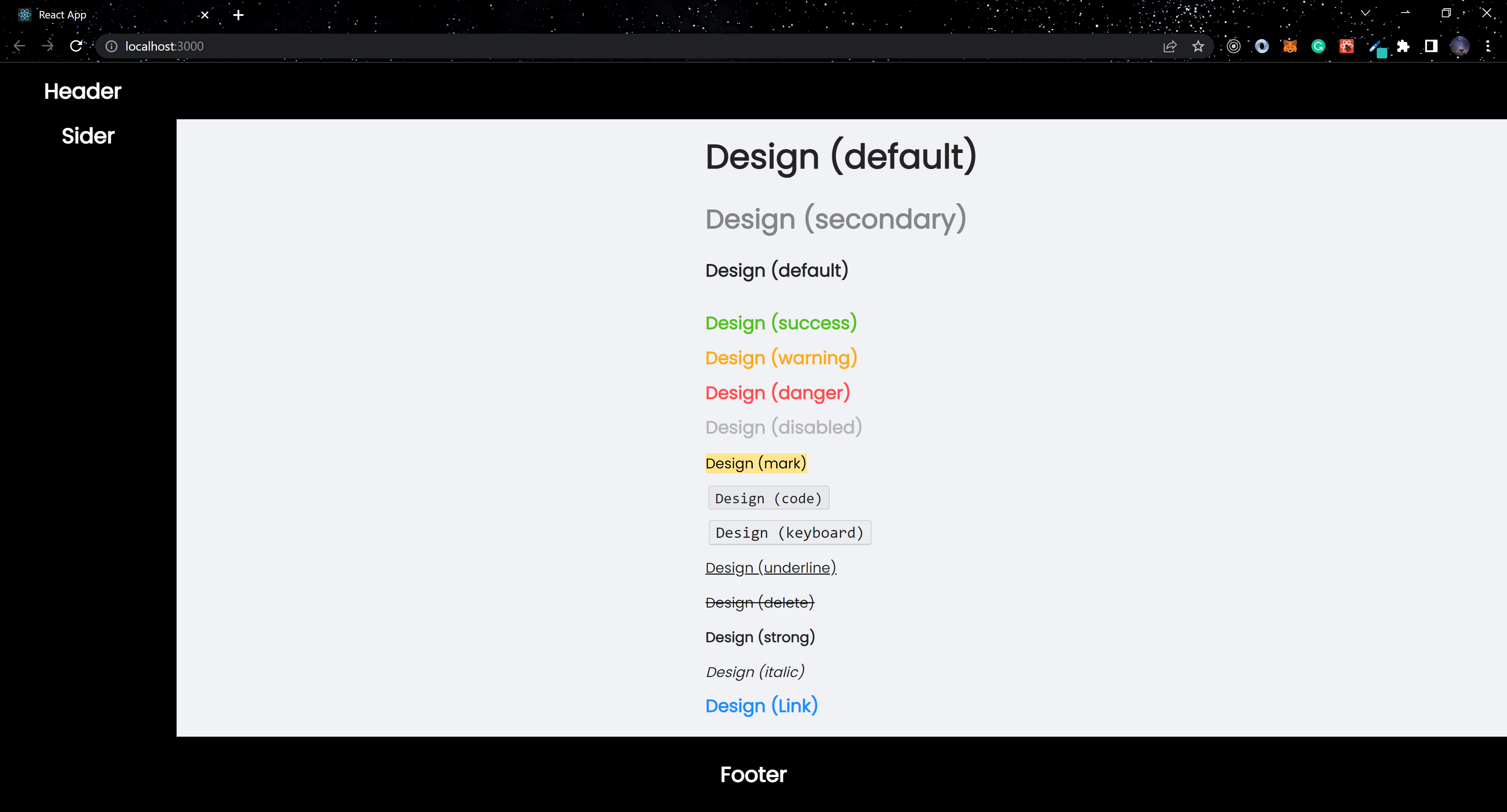
Typography
Typography in Ant Design represents the basic text format in Web applications, including headings, paragraphs, etc. It’s extremely simple to use.
import React from "react";
import "./App.css";
import { Layout, Space, Typography } from "antd";

const { Content, Header, Sider, Footer } = Layout;

const { Text, Link, Title } = Typography;

const App = () => {

  return (
    <Layout className="Container">
      <Header className="Header">Header</Header>
      <Layout className="Container">
        <Sider className="Sidebar">Sider</Sider>
        <Content className="Content">
          <Space direction="vertical">
            <Typography.Title>Design (default)</Typography.Title>
            <Title type="secondary" level={2}>
              Design (secondary)
            </Title>
            <Typography.Paragraph>Design (default)</Typography.Paragraph>
            <Text type="success">Design (success)</Text>
            <Text type="warning">Design (warning)</Text>
            <Text type="danger">Design (danger)</Text>
            <Text disabled>Design (disabled)</Text>
            <Text mark>Design (mark)</Text>
            <Text code>Design (code)</Text>
            <Text keyboard>Design (keyboard)</Text>
            <Text underline>Design (underline)</Text>
            <Text delete>Design (delete)</Text>
            <Text strong>Design (strong)</Text>
            <Text italic>Design (italic)</Text>
            <Link href="https://ant.design" target="_blank">
              Design (Link)
            </Link>
          </Space>
        </Content>
      </Layout>
      <Footer className="Footer">Footer</Footer>
    </Layout>
  );
};

export default App;
Using the Typography component, we have access to Text, Title, and Link in the above code block.
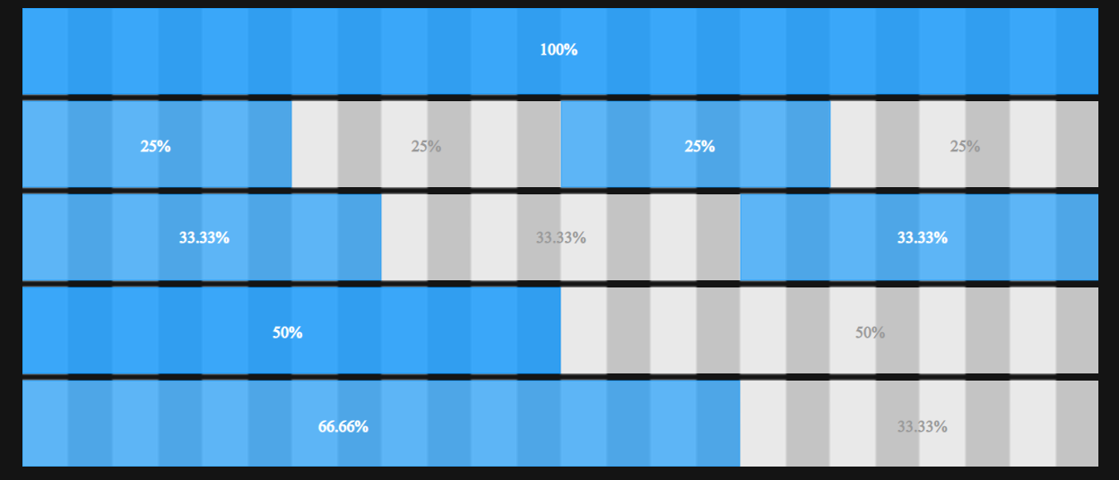
Grid
Ant Design grid systems use the Flex layout and have a 24 Grids System, representing a one-dimensional layout.
...

 <Row>
    <Col span={8} className="col-1">col-12</Col>
    <Col span={8} className="col-2">col-12</Col>
    <Col span={8} className="col-1">col-12</Col>
 </Row>

...
The Row component wraps the Col component, which also has a span prop when the Grid component is used, as shown in the code block above. This determines the size of each column in each row. The total number of valves on each row must equal 24, which takes up the entire row.
Image
The Image component is used to display images, and it includes a fallback prop when images fail to load. The component also includes an interesting prop called preview, which accepts a boolean value.
...

import { Image } from 'antd';
...

 <Image
    width={200}
    preview={true} src="https://zos.alipayobjects.com/rmsportal/jkjgkEfvpUPVyRjUImniVslZfWPnJuuZ.png"
  />
...
The Image component has several built-in features, as shown in the code block above. The preview prop is enabled by default.
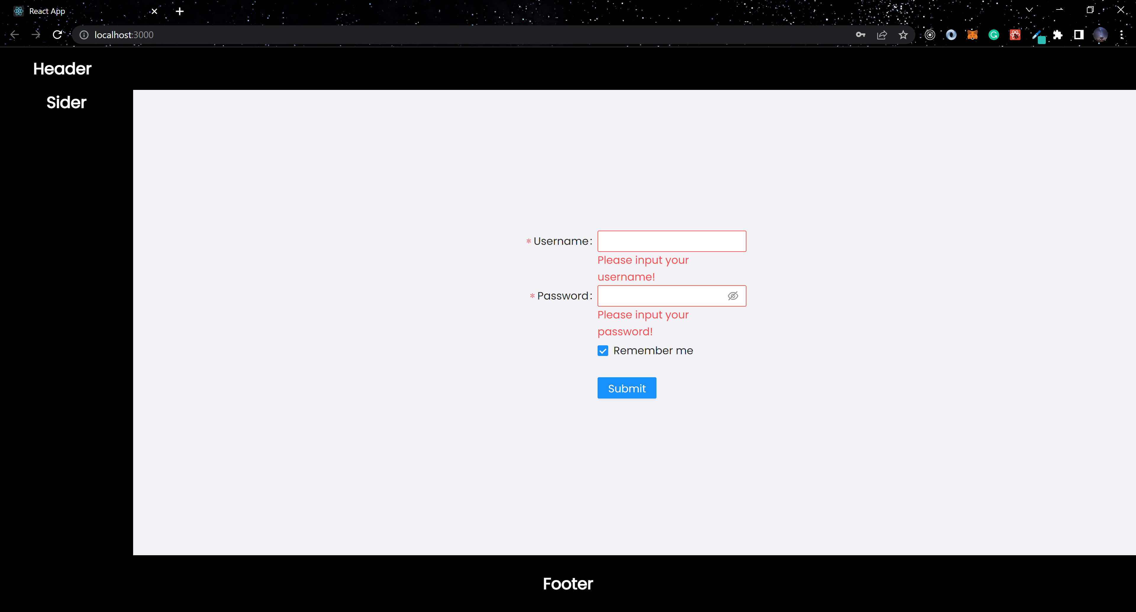
Form
The Form component is a high-performance component that handles data collection and form validation. This also includes Ant Design library default styles.
import React from "react";
import "./App.css";
import { Layout, Button, Checkbox, Form, Input } from "antd";

const { Content, Header, Sider, Footer } = Layout;

const App = () => {

  return (
    <Layout className="Container">
      <Header className="Header">Header</Header>
      <Layout className="Container">
        <Sider className="Sidebar">Sider</Sider>
        <Content className="Content">
          <Form
            name="basic"
            labelCol={{ span: 8 }}
            wrapperCol={{ span: 16 }}
            initialValues={{ remember: true }}
            autoComplete="off"
            className="form"
          >
            <Form.Item
              label="Username"
              name="username"
              rules={[
                { required: true, message: "Please input your username!" },
              ]}
            >
              <Input />
            </Form.Item>

            <Form.Item
              label="Password"
              name="password"
              rules={[
                { required: true, message: "Please input your password!" },
              ]}
            >
              <Input.Password />
            </Form.Item>

            <Form.Item
              name="remember"
              valuePropName="checked"
              wrapperCol={{ offset: 8, span: 16 }}
            >
              <Checkbox>Remember me</Checkbox>
            </Form.Item>

            <Form.Item wrapperCol={{ offset: 8, span: 16 }}>
              <Button type="primary" htmlType="submit">
                Submit
              </Button>
            </Form.Item>
          </Form>
        </Content>
      </Layout>
      <Footer className="Footer">Footer</Footer>
    </Layout>
  );
};

export default App;
Form validation is provided for each Form.Item with the prop rules available in the Form, as shown in the code block above.
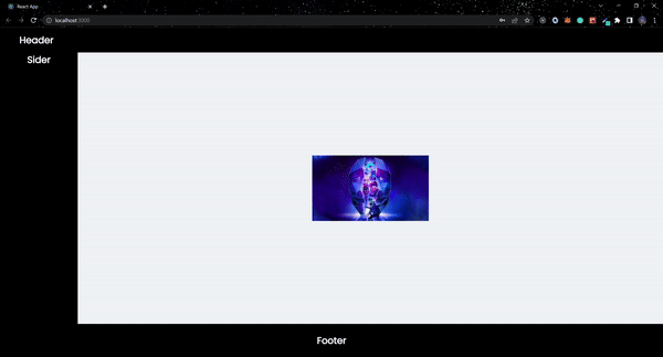
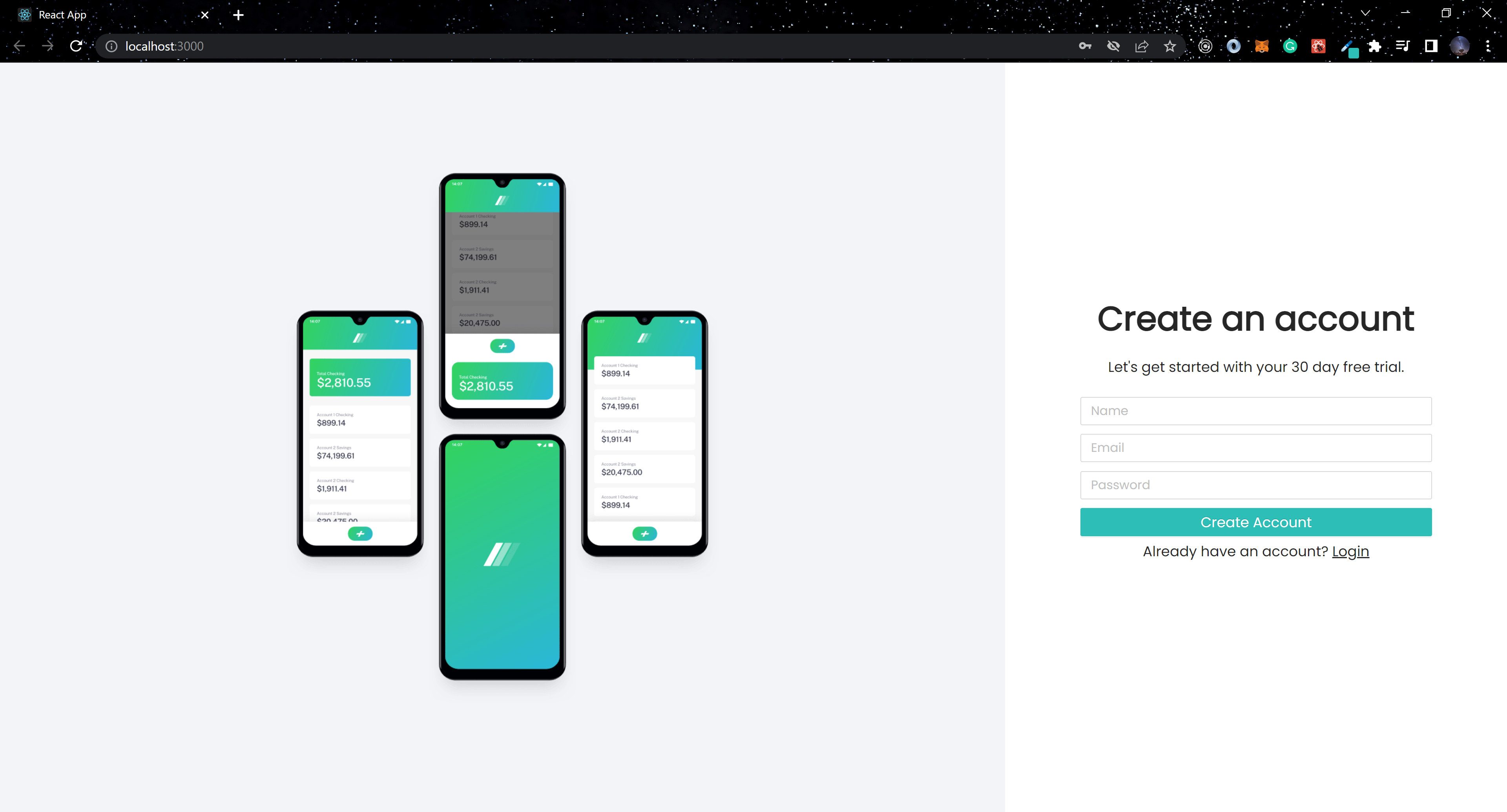
Building a Sign-up Page with Ant Design
In this section, we will build a simple application using some Ant Design components.
import React from "react";
import "./App.css";

import { Layout, Typography, Col, Row, Button, Form, Input, Image } from "antd";

const { Content } = Layout;
const { Title } = Typography;

const App = () => (
  <Layout className="Container">
    <Content>
      <Row className="Grid">
        <Col span={16} className="col-1">
          <Image src="bg.png" preview={false} className="Image" />
        </Col>
        <Col span={8} className="col-2">
          <Content className="col-2-body">
            <Title>Create an account</Title>
            <Typography.Paragraph>
              Let's get started with your 30 day free trial.
            </Typography.Paragraph>

            <Form>
              <Input className="Input" placeholder="Name" type="text" />
              <Input className="Input" placeholder="Email" type="email" />
              <Input className="Input" placeholder="Password" type="password" />
              <Button type="primary" className="Button">Create Account</Button>
            </Form>
            <Typography.Paragraph>
              Already have an account?{" "}
              <Typography.Text className="Span">Login</Typography.Text>
            </Typography.Paragraph>
          </Content>
        </Col>
      </Row>
    </Content>
  </Layout>
);

export default App;
We built a simple sign-up page using Ant Design components from the code block above.
Conclusion
This article outlines how to use Ant Design’s Design System and some of the components it provides. There’s a lot more to Ant Design; to learn more about the library, visit the official documentation. The complete code used in the article can be found in my GitHub Repository, and the live version can also be viewed.
Gain Debugging Superpowers
Unleash the power of session replay to reproduce bugs and track user frustrations. Get complete visibility into your frontend with OpenReplay, the most advanced open-source session replay tool for developers.