Common UI Behaviors that impact Color Blindness
Problems for color blind users that you should consider when doing UI Design

Ensuring digital content is accessible and understandable to all is crucial because it upholds principles of inclusivity, legal compliance, and ethical responsibility. Accessibility fosters equal access to technology, promoting a positive brand image, expanding market reach, and enhancing the user experience. Colors play a crucial role in enhancing user experience online and helping convey a brand’s identity, so we must consider how people with color blindness will experience and interact with our site. This article will discuss common design practices that can hinder or negatively impact a color-blind user.

Discover how at OpenReplay.com.
Color Vision Deficiency, popularly known as Color Blindness, is a condition whereby people have an altered color perception. What this means is that they are unable to distinguish between colors. Color blindness can be total or partial. Total color blindness entails that the individual cannot see colors at all, while partial color blindness entails that the individual has difficulty perceiving certain colors accurately. According to a report from Color Blind Awareness, Color blindness affects about 1 in 12 men and 1 in 200 women. Worldwide, the estimated number of people with color blindness is 300 million. There are two major types of color blindness.
Red-green Color Blindness
Red-green color blindness is a common form of color vision deficiency. It results from a defect in the red or green cones in the retina, responsible for sensing these specific colors. This condition causes confusion between red color and green color. Consequently, individuals with this condition find it challenging to distinguish between the color of ripe tomatoes and green leaves, which may appear almost identical.
Blue-Yellow Color Blindness
Blue-yellow color blindness is an uncommon type of color vision deficiency, affecting the perception of blue and yellow colors due to a defect in the blue cones in the retina of the eye, which are responsible for sensing blue light. This condition has two types: Tritanomaly, complicating the differentiation of blue from green and yellow from red, and Tritanopia, making it challenging to discern blue from green, purple from red, and yellow from pink. Essentially, Blue-yellow Color Blindness makes distinguishing between blue and yellow colors difficult, often causing them to appear mixed up. In contrast, Red-green color blindness poses challenges in differentiating between red and green colors, which can also seem similar.
UI behaviors that break color blindness (According to WCAG)
The Web Content Accessibility Guidelines, also known as WCAG, aim to make web content accessible to everyone. WCAG provides standards for making digital content, including user interfaces (UIs), accessible to a wide range of users, including every color blind person. The following are UI behaviors that create barriers for people with color vision deficiencies, according to WCAG:
Using Only Red and Green for Error and Success Messages (WCAG 1.4.1)
When colors are used exclusively to convey information, individuals with color vision deficiencies may struggle to interpret or understand the data being presented. A typical example would be displaying error messages, success notifications, or required fields without additional cues like icons, text labels, or patterns; individuals with color vision deficiencies may struggle to understand or differentiate the meaning conveyed solely through color. WCAG 1.4.1 advises using additional cues, such as icons or text, in addition to color, to convey the message.
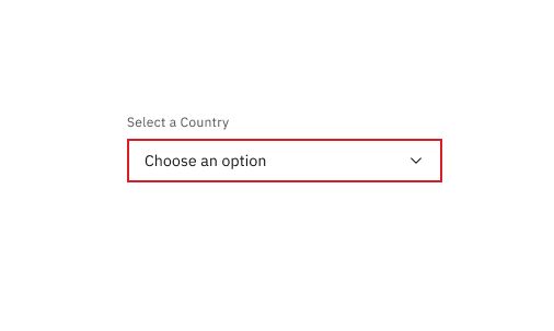
The above image displays a dropdown in a error state. However, because it relies on just color to convey an error, People with visual impairments might find it difficult to distinguish.
Using Different Shades of the Same Color (WCAG 1.4.3)
Depending solely on subtle differences in color scheme shades to convey information can be challenging for color-blind users. They may not perceive these variations, making it hard to understand the content. WCAG 1.4.3 suggests using other distinguishing factors, such as text labels or patterns, in addition to color choice.
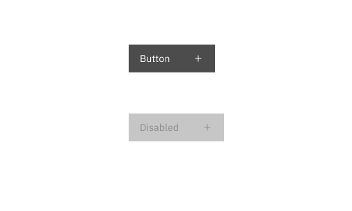 The above image displays a button in two states- normal and disabled. People without visual impairments can easily distinguish between the two states, and know that the button needs to be enabled to proceed. However, people with visual impairments might find it difficult to distinguish between the two and might not be able to perceive the difference.
Using Colors that Contrast Poorly (WCAG 1.4.3)
Poor color contrast between foreground (text or images) and background colors can make it difficult for individuals with color blindness to read or perceive content. Low contrast can cause text to blend into the background, making it illegible or hard to distinguish. WCAG 1.4.3 sets standards for sufficient color contrast to ensure that text is legible against its background.
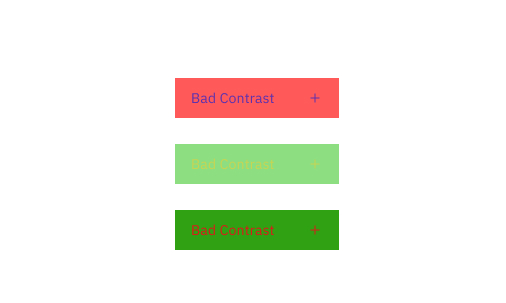
The image above displays three buttons with inadequate color contrast. This lack of contrast can confuse many people, who may struggle to discern the text on the buttons.
Not Testing UIs for Color Blindness (WCAG 1.4.1)
Developers and designers are encouraged by WCAG to test their user interfaces (UIs) to identify and address issues that may hinder people with visual impairments. To test for color blindness, they can use tools such as the Color Oracle or the Color Contrast Checker. These tools are useful in identifying areas of the UI that may be difficult to see for people with color blindness.
How to create accessible UIs for people with color blindness (According to WCAG)
To create a more inclusive user experience, it is important to provide solutions that address the issues discussed. Let’s explore practical strategies to ensure that our design is user-friendly for everyone.
Provide Visual Feedback
The WCAG recommends not relying solely on color for conveying information or interactive elements. Instead, it suggests using additional visual cues such as underlines, borders, or icons in conjunction with colors. This ensures that people who may have difficulty perceiving color distinctions can still understand the content effectively. For elements like links with a focus state, it’s important to provide feedback when people interact with them. If you must remove outlines, consider alternatives like a background or text color, or better yet, provide a customized outline. Following these recommendations can create more inclusive and user-friendly digital experiences for everyone. Code Sample:
<!DOCTYPE html>
<html>
<head>
 <link rel="stylesheet" type="text/css" href="styles.css">
</head>
<body>
 <label for="country">Select your country:</label>
 <select id="country" name="country" required>
  <option value="">Please select a country</option>
  <option value="usa">United States</option>
  <option value="canada">Canada</option>
  <option value="uk">United Kingdom</option>
  <option value="other">Other</option>
 </select>
 <div class="error-message">Please select a country.</div>
</body>
</html>
/* Using both color and icons for visual feedback */
/* Basic styling for the select element */
select {
width: 100%;
padding: 10px;
font-size: 16px;
border: 1px solid #ccc;
border-radius: 5px;
}
/* Error handling styles for the select element */
select:invalid {
border-color: #f00; /* Red border for invalid state */
}
select:valid {
border-color: #ccc; /* Gray border for valid state */
}
/* Error message styles */
.error-message {
color: #f00;
font-size: 12px;
display: none;
}
select:invalid + .error-message {
display: block;
}Output:
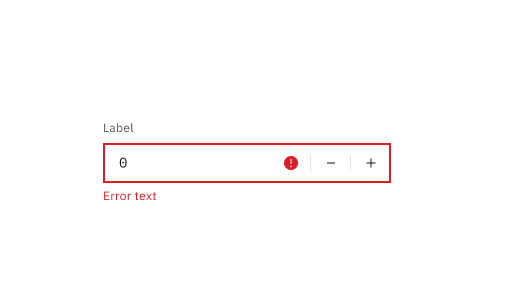
The image above display an input field that provides adequate visual feedback. It makes use of colors, icons, and text to convey information.
Use Colors that Contrast Well
When choosing colors for your website, consider readability and accessibility. To ensure easy reading for people with visual impairments and those in varying lighting conditions, follow WCAG’s guidelines. Aim for a contrast ratio of at least 4.5:1 for regular text. For larger text and important content, 3:1 is enough. Free tools like WebAIM’s Color Contrast Checker can help verify color choices. These steps and tools will help you create an attractive and accessible website for a broad audience.
Code Sample:
/* Good color contrast for text and background */
.element {
 background-color: #1B66C9; /* blue background */
 color: #fff; /* white text */
}
Output:
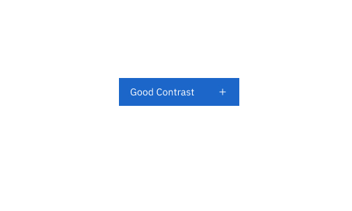
The image above display a button with excellent color contrast. This enhancement can be clear for many people because they won’t struggle to read the text on the buttons.
Add Support for Custom Stylesheets
There are plenty of good reasons to support users in customizing the styles of your website to suit their needs. For instance, A person with a visual impairment might need to enlarge the text on all websites they visit. At the same time, another user with color deficiency might find it easier to navigate websites that display high-contrast colors. By allowing users to personalize their experience, you empower them to make your content more accessible and enjoyable for themselves. Code Sample:
<!doctype html>
<html lang="en">
 <head>
  <meta charset="UTF-8" />
  <title>Custom Stylesheet</title>
  <link rel="stylesheet" href="style.css" />
  <script>
   function loadCustomStylesheet() {
    var stylesheet = document.createElement("link");
    stylesheet.rel = "stylesheet";
    stylesheet.href = document.getElementById("custom-stylesheet").value;
    document.head.appendChild(stylesheet);
   }
  </script>
 </head>
 <body>
  <input type="text" id="custom-stylesheet" />
  <button onclick="loadCustomStylesheet()">Load Custom Stylesheet</button>
 </body>
</html>
The above code creates a webpage that allows people to input the URL of a custom stylesheet, which can then be loaded dynamically into the page.
Conclusion
In conclusion, creating accessible user interfaces (UIs) for people with color blindness is essential because it ensures that individuals with color vision deficiencies can use digital products and services effectively and without discrimination. The following are some resources for designers and developers:
- The Web Content Accessibility Guidelines (WCAG) provide a set of guidelines for making web content more accessible to people with disabilities.
- The A11y Project is a community-driven resource for accessibility information and resources.
- The WebAIM Color Contrast Checker and Contrast Checker by Tanaguru are tools that can help designers and developers test the contrast of their UIs.
- Accessibility Testing Tools such as Axe and WAVE can help designers and developers identify accessibility issues in their UIs.
Truly understand users experience
See every user interaction, feel every frustration and track all hesitations with OpenReplay — the open-source digital experience platform. It can be self-hosted in minutes, giving you complete control over your customer data.
Star on GitHub12k